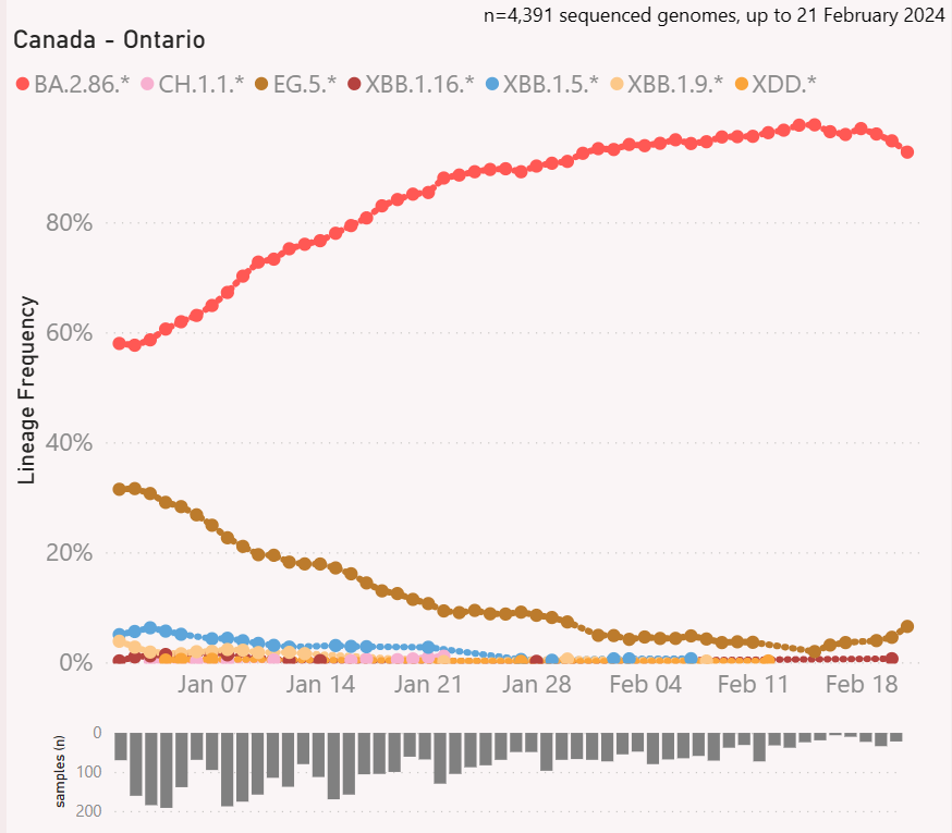
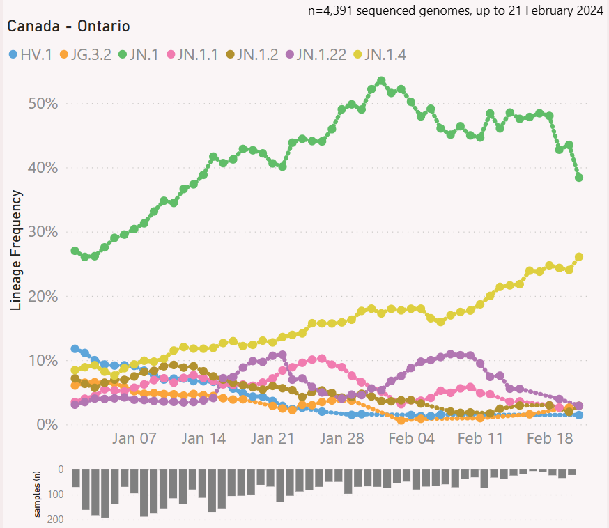
views
Jeff Gilchrist Profile picture
Mar 23 7 tweets 3 min read Read on X
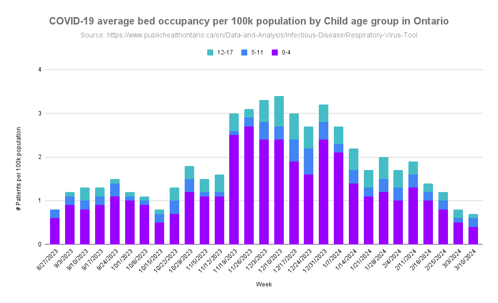
Public Health Ontario (PHO) using different age categories for updated RV tool data

PHO now combines children <1 into a 0-4 age group while before they had separate <1 and 1-4 age categories which makes a big difference in how the impact of children is perceived. 🧵1/
Graph of Ontario hospitalization rate by age group for the 2023-24 surveillance period. Image from:  http://covid.gilchrist.ca/Ontario.html
Graph of COVID-19 average bed occupancy per 100k population by age group in Ontario for the 2023-24 surveillance period. Image from:  http://covid.gilchrist.ca/Ontario.html
PHO stopped updating COVID-19 hospital admissions and now provide bed occupancy in their recent Respiratory Virus Tool update which uses different age categories ( ). 2/publichealthontario.ca/en/Data-and-An…
You can see from the previous Ontario hospitalization rate by age group that children <1 were hospitalized at 81.8 per 100k population which is more than age 60-79 at 77.2 per 100k population. The 1-4 age group is massively smaller at 7.7 per 100k population. 3/ Graph of Ontario hospitalization rate by age group for the 2023-24 surveillance period. Image from:  http://covid.gilchrist.ca/Ontario.html
In the PHO bed occupancy data, you can barely see the 0-4 category compared to the 60-79 age group while infants <1 on their own had higher rates than 60-79. 4/ Graph of COVID-19 average bed occupancy per 100k population by age group in Ontario for the 2023-24 surveillance period. Image from:  http://covid.gilchrist.ca/Ontario.html
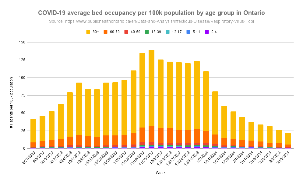
When combined with kids 1-4 the impact of hospitalization on infants <1 is almost completely lost and parents may not realize how high risk infants are for hospitalization from COVID-19. 5/
When you just look at children, you can see the bed occupancy rate for ages 0-4 are the majority of hospitalization per 100k population for kids < 18, most of which would be coming from the <1 category that is now hidden. 6/ Graph of COVID-19 average bed occupancy per 100k population by Child age group in Ontario for the 2023-24 surveillance period. Image from:  http://covid.gilchrist.ca/Ontario.html
@threadreaderapp please unroll

• • •

Missing some Tweet in this thread? You can try to force a refresh
 

Keep Current with Jeff Gilchrist

Jeff Gilchrist Profile picture

Stay in touch and get notified when new unrolls are available from this author!

Read all threads

This Thread may be Removed Anytime!

PDF

Twitter may remove this content at anytime! Save it as PDF for later use!

Try unrolling a thread yourself!

how to unroll video
  1. Follow @ThreadReaderApp to mention us!

  2. From a Twitter thread mention us with a keyword "unroll"
@threadreaderapp unroll

Practice here first or read more on our help page!

More from @jeffgilchrist

Mar 25
Virus update for Ottawa, Canada (Mar 25, 2024)

COVID-19 #Wastewater levels in #Ottawa have finally declined significantly but lower does not mean gone as PCR test positivity rates are still at 7.6% ( ). 🧵1/ covid.gilchrist.ca/Ottawa.html
Graph of COVID-19 wastewater levels in Ottawa, Ontario. Weekly stats available at ( http://covid.gilchrist.ca/Ottawa.html )
RSV WW levels are 7.7x lower than the peak which was much lower than last year. Influenza had much higher peaks this year than last year and while Flu A levels are low, Flu B hit its peak at the beginning of March and is now declining but still above the peak from last year. 2/ Graph of RSV, Influenza A & B wastewater levels in Ottawa, Ontario. Weekly stats available at ( http://covid.gilchrist.ca/Ottawa.html )
Ottawa Public Health (OPH) stopped updating its COVID dashboard and now produces new stats on their updated respiratory virus dashboard ( ). 3/ottawapublichealth.ca/en/reports-res…
Read 12 tweets
Mar 24
#Variant update for #Ontario, #Canada (to Mar. 14, 2024)

The BA.2.86.* #Pirola clan of variants has made most other lineages extinct in Ontario. The SanKey shows the situation is now much simpler and almost exclusively JN.1 and descendants. Graph tools by @Mike_Honey_ 🧵1/
Sankey graph (height of each bar is # of sequences for that variant) showing top variants and their lineages over the past couple of months from PCR test genomic sequencing in Ontario, Canada. Visualization tool was created by @Mike_Honey_ ( https://app.powerbi.com/view?r=eyJrIjoiNzE5YzczODItMDQzMS00M2EzLWFjNWYtMjg3OTY3NTNhZDM3IiwidCI6ImRjMWYwNGY1LWMxZTUtNDQyOS1hODEyLTU3OTNiZTQ1YmY5ZCIsImMiOjEwfQ%3D%3D&pageName=ReportSection32240d6b62ba73667e98 )
Graph of top 7 COVID variant clans from PCR test genomic sequencing in Ontario, Canada. Visualization tool was created by @Mike_Honey_ ( https://app.powerbi.com/view?r=eyJrIjoiNzE5YzczODItMDQzMS00M2EzLWFjNWYtMjg3OTY3NTNhZDM3IiwidCI6ImRjMWYwNGY1LWMxZTUtNDQyOS1hODEyLTU3OTNiZTQ1YmY5ZCIsImMiOjEwfQ%3D%3D
Right now the JN.1 and JN.1.4 Pirola variant are still the most prevalent. The JN.1.11.1 variant, its descendants (KP.*) and other FLiRT variants will be the ones to watch as they start growing in Ontario and may be able to escape immunity from JN.1 infections. 2/ Graph of top 8 COVID variants (JN.1, JN.1.1, JN.1.11.1, JN.1.2, JN.1.22,, JN.1.4, JN.1.7, JN.1.8.1) from PCR test genomic sequencing in Ontario, Canada. Visualization tool was created by @Mike_Honey_ ( https://app.powerbi.com/view?r=eyJrIjoiNzE5YzczODItMDQzMS00M2EzLWFjNWYtMjg3OTY3NTNhZDM3IiwidCI6ImRjMWYwNGY1LWMxZTUtNDQyOS1hODEyLTU3OTNiZTQ1YmY5ZCIsImMiOjEwfQ%3D%3D )
The % positivity from viral tests is quite a mixture now, the original Coronavirus in lead at 8.2% with COVID-19 in 2nd (6.3%) then Entero/Rhinovirus (5%), Human metapneumovirus (4.6%), Influenza A (4%), Influenza B (3.8%), Parainfluenza (3.4%) ( ). 3/ publichealthontario.ca/en/Data-and-An…
Table showing percentage positivity of respiratory virus activity in Ontario. Table from: https://www.publichealthontario.ca/en/Data-and-Analysis/Infectious-Disease/Respiratory-Virus-Tool
Read 8 tweets
Mar 20
A nine year old boy named Matt in Singapore was infected with COVID in January 2024. Unfortunately he developed myocarditis (inflammation of the heart muscle) from the COVID infection and then had a stroke which weakened his left side ( ). 🧵1/ straitstimes.com/life/triple-wh…
From Jan 5 to 16, Matt Aeron Semodio was on ECMO, a life support system that temporarily does the job of the heart and lungs. PHOTO: COURTESY OF MATT AERON SEMODIO’S FAMILY. Image from: https://www.straitstimes.com/life/triple-whammy-nine-year-old-boy-in-singapore-suffers-covid-19-myocarditis-and-stroke
After being admitted to hospital, his heart failed and he was required to be put on the most invasive form of life support extracorporeal membrane oxygenation (ECMO), which temporarily does the job of the heart and lungs. H/T: @MeetJess 2/
His initial stay in the hospital was 5 weeks before he was discharged on Feb. 8, 2024 to recover but then was readmitted again twice for other virus infections on Feb. 11, 2024 for 3 days and then on Feb. 22, 2024 for another infection. 3/
Read 8 tweets
Mar 3
Increased Measles in Canada - Are you protected?

As Public Health crumbles and too few people are getting vaccinated for measles our herd immunity levels have dropped too much and now many people are at risk for a disease we almost eradicated in Canada. 🧵1/ Various symptoms of measles. Fever, Cough, Blocked or running nose, red, sore and watery eyes, spots in mouth, measles rash. Image from: https://www.dailymail.co.uk/health/article-12991379/Symptoms-measles-runny-nose-rash-tell-apart.html
Contents of Post:
* Worldwide Outbreaks
* Symptoms
* How is it Transmitted
* How to prevent Infection
* Damage from Measles
* Measles Depletes Immune Memory
* How long does Vaccine Last
* Breakthrough Infections
* Cleaning the Air

2/
There has been a huge surge in measles cases around the world including cases in the UK and USA. The government is strongly advising everyone in Canada to be vaccinated with 2 doses of measles vaccine, especially before travelling ( ). 3/canada.ca/en/public-heal…
Read 61 tweets
Feb 28
#Variant update for #Ontario, #Canada (to Feb. 21, 2024)

You can see how much the BA.2.86.* #Pirola clan of variants has made a clean sweep since January. The left SanKey shows the variant soup from December while the right is now much simpler. Graph tools by @Mike_Honey_ 🧵1/
Sankey graph (height of each bar is # of sequences for that variant) showing top variants and their lineages over the past couple of months from PCR test genomic sequencing in Ontario, Canada. Visualization tool was created by @Mike_Honey_ ( https://app.powerbi.com/view?r=eyJrIjoiNzE5YzczODItMDQzMS00M2EzLWFjNWYtMjg3OTY3NTNhZDM3IiwidCI6ImRjMWYwNGY1LWMxZTUtNDQyOS1hODEyLTU3OTNiZTQ1YmY5ZCIsImMiOjEwfQ%3D%3D&pageName=ReportSection32240d6b62ba73667e98 )
The Pirola clan still makes up more than 90% of sequences in Ontario but may have reached its peak for now. The JN.1 variant dropped from 50% down to 38% while its child JN.1.4 is gaining ground above 25%. 2/
Graph of top 7 COVID variant clans from PCR test genomic sequencing in Ontario, Canada. Visualization tool was created by @Mike_Honey_ ( https://app.powerbi.com/view?r=eyJrIjoiNzE5YzczODItMDQzMS00M2EzLWFjNWYtMjg3OTY3NTNhZDM3IiwidCI6ImRjMWYwNGY1LWMxZTUtNDQyOS1hODEyLTU3OTNiZTQ1YmY5ZCIsImMiOjEwfQ%3D%3D
Graph of top 7 COVID variants (HV.1, JG.3.2, JN.1, JN.1.1, JN.1.2, JN.1.22,, JN.1.4) from PCR test genomic sequencing in Ontario, Canada. Visualization tool was created by @Mike_Honey_ ( https://app.powerbi.com/view?r=eyJrIjoiNzE5YzczODItMDQzMS00M2EzLWFjNWYtMjg3OTY3NTNhZDM3IiwidCI6ImRjMWYwNGY1LWMxZTUtNDQyOS1hODEyLTU3OTNiZTQ1YmY5ZCIsImMiOjEwfQ%3D%3D )
You can find weekly Ontario stats including variants at ( ) and ( ).

The visualization tool for variants was created by @Mike_Honey_ ( ). 3/covid.gilchrist.ca/Ontario.html
gilchrist.great-site.net/jeff/COVID-19/…
app.powerbi.com/view?r=eyJrIjo…
Read 6 tweets
Feb 17
Particulate Matter (PM) from Showers

After I wrote about PM from ultrasonic humidifiers, people asked how much PM does a hot shower produce? TLDR: Much less for a quick shower, around 12 ug/m^3 compared to 800 ug/m^3 for the ultrasonic. 🧵1/ Graph of particulate matter (PM) levels from a 13 minute hot shower with bathroom exhaust fan running, increasing slightly to 4 ug/m^3 of PM2.5 at end of shower but then jumps to 12 ug/m^3 of PM2.5 after the shower door is opened and PM is released into the room. PM levels back to normal after about 20 minutes of the bathroom door being opened. PM monitor used was Model G from https://co2.click/
But not all PM is equal so look later in the thread for different types of PM that are more dangerous. 2/
The PM monitor was placed on the sink counter beside the shower. Our shower is mostly enclosed with a door but has a 28cm (11 inch) gap at the top to let air in/out. 3/
Read 25 tweets

Did Thread Reader help you today?

Support us! We are indie developers!


This site is made by just two indie developers on a laptop doing marketing, support and development! Read more about the story.

Become a Premium Member ($3/month or $30/year) and get exclusive features!

Become Premium

Don't want to be a Premium member but still want to support us?

Make a small donation by buying us coffee ($5) or help with server cost ($10)

Donate via Paypal

Or Donate anonymously using crypto!

Ethereum

0xfe58350B80634f60Fa6Dc149a72b4DFbc17D341E copy

Bitcoin

3ATGMxNzCUFzxpMCHL5sWSt4DVtS8UqXpi copy

Thank you for your support!

Follow Us!

:(