
#FlagThread
This next flag thread is CITY FLAGS OF AMERICA by STATE
Okay, so today we're not going to do the flag thread, because this one is _really huge_. Today, we're going to talk about how I'm going to do it, and what that means.
This next flag thread is CITY FLAGS OF AMERICA by STATE
Okay, so today we're not going to do the flag thread, because this one is _really huge_. Today, we're going to talk about how I'm going to do it, and what that means.
My normal resource for this is straight up looking at these things on wikipedia, and that's a great, useful resource but contributed by fans and enthusiasts.
It also presents a problem of scale.
It also presents a problem of scale.
Some states-and-territories have a tiny number of city flags; some have an ENORMOUS number. Obviously. I mean, Wyoming has two major cities! Some places that have like, more people than Iceland, have more cities!
Also, a lot of these flags are _unremarkably bad_. Here's a selection - Huntington (West Virginia), Williamsburg (Virginia), Houston (Tejas) - and they're all _mostly_ just like bad _state_ flags, right? 


There's also a wild gap: the bottom _40_ states-and-territories have each less than 10 city flags each, but the top two have _166_ between them.
(Bonus: Would you like to guess what those two are? Bet you'll get one of them wrong!)
(Bonus: Would you like to guess what those two are? Bet you'll get one of them wrong!)
So here's my plan: I'm going to try and limit myself to _five or so_ flags from each state, and I'll knock out the really light states early. That's room for some good ones, some bad ones.
Sound fair?
Sound fair?
This list is going to come from the general position of 'states with fewer flags' leading up into 'states with more flags,' but typically two states a day until things get hairy and we get closer to flag day. Basically I decided to do this too close to Flag Day to do 1 state/day.
Our first lucky pair of states?
KENTUCKY and IDAHO!
We're going to start with Kentucky.
KENTUCKY and IDAHO!
We're going to start with Kentucky.
We're going to start with Kentucky, because it's really easy to use it as an example of teaching the basics of 'bad flags,' because of the three major Kentuckyian flags, they all suck ass.
Our Bad Flag Basics:
- No fine detail
- No text
- No outlines
The Good Flag... Gets:
- Clear symbolism
- 1-5 colours, ideally 3ish
- Replicable by a child
- Replicable by hand and basic folds
- No fine detail
- No text
- No outlines
The Good Flag... Gets:
- Clear symbolism
- 1-5 colours, ideally 3ish
- Replicable by a child
- Replicable by hand and basic folds
Welcome to Frankfort, Kentucky, where we have... just some ugly awful garbage.
Pros: It has only four colours. Ish. Is blue overlaid on orange like a potato print a different colour?
Cons: It looks like a cursed Hardy Boys cover
Pros: It has only four colours. Ish. Is blue overlaid on orange like a potato print a different colour?
Cons: It looks like a cursed Hardy Boys cover

LEXINGTON fulfills the same general problem as state flags do; text, fine details, too busy, too many colours, all that stuff. This is a good example of what we call a 'seal on a bedsheet.' A flag made by taking the state seal (which has a DIFFERENT PURPOSE) on a big field. Sucks

Here's the _current_ LOUISVILLE flag. This flag is amazing, but not why you might think. It has gradients (so it's a computer-made flag), it has text (useless at a distance), and it takes an easy symbol (the fleur de lis) and LOADS IT UP with fine detail. This flag sucks, BUT-

THIS WAS THE LOUISVILLE FLAG UNTIL 2003.
THEY TOOK THIS PERFECTLY GOOD, SERVICEABLE FLAG and replaced it with that ABOMBINATION to, I dunno, 'include more parts' and 'pay honour to King Louis the 14th,' which is a long way to go just to say you liked that Leonardo Dicaprio film
THEY TOOK THIS PERFECTLY GOOD, SERVICEABLE FLAG and replaced it with that ABOMBINATION to, I dunno, 'include more parts' and 'pay honour to King Louis the 14th,' which is a long way to go just to say you liked that Leonardo Dicaprio film

They got _rid_ of this flag. This is the flag they said 'nope, that's too useful and doesn't make us look like weirdoes.'
But okay, let's hop on over to Idaho, which ... might be right next door to Kentucky. I don't know. Have you heard the accent? I'm not from around here. Point is, we're going to IDAHO, which Wikipedia says has _two_ noteworthy flags, which have both 'recently' changed.
From oldest to newest, though, let's start with BOISE, IDAHO.
Seal on a bedsheet. Tons of colours. It's a seal, whose inner section is another seal. You could lose half this flag and what remained would be a better flag and it'd still be a dreadful flag.
Seal on a bedsheet. Tons of colours. It's a seal, whose inner section is another seal. You could lose half this flag and what remained would be a better flag and it'd still be a dreadful flag.
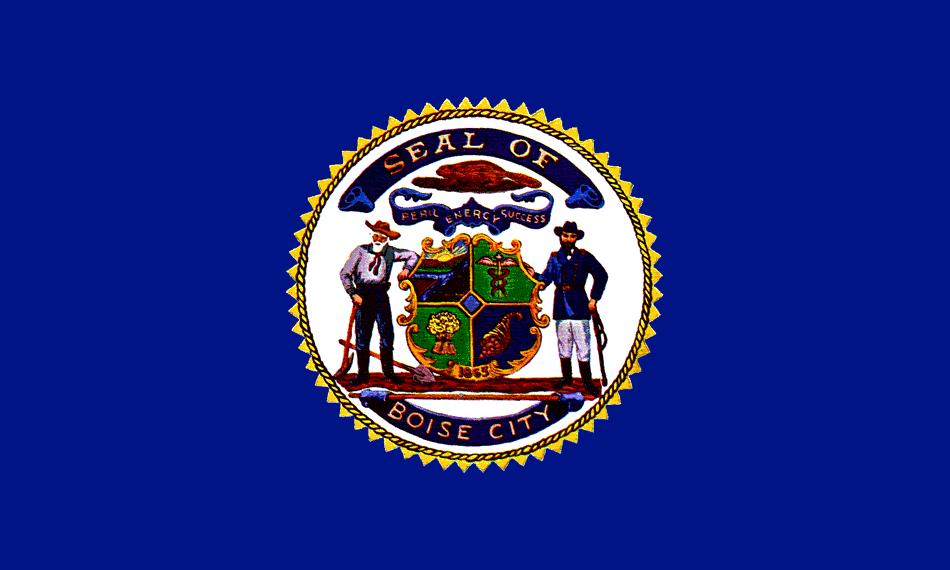
But don't worry, folks, they updated in 2001, to instead make sure their flag looked like the company logo bumper on the front of a cancelled 90s detective series willed into existend to be exclusively watched by Youtube nostalgia nerds mocking its badness.

Now, the new Boise flag has text on it, fine detail, that's bad. But what I particularly like is these crimes aren't even committed in the name of including something badass like how Virginia's state flag breaks the rules to have a lady murdering a tyrant with a tit out.
City
of trees.
It's a title that includes its own yawn.
of trees.
It's a title that includes its own yawn.
But if you're a flag nerd you're going to know the only other interesting Idaho flag. You know what's coming. One of the worst city flags in American history, no joke, no irony.
And one of the best (but not _the_ best glow-ups in American City Flag History)
Welcome...
And one of the best (but not _the_ best glow-ups in American City Flag History)
Welcome...
to POCATELLO (2001-2017)
this is real. This is all happening. This has its copyright information on it. The TM mark is _part of the design_. The TM is copyrighted.
This looks like a company that sells extremely dubious accountancy software that puts umlauts over the $ symbol
this is real. This is all happening. This has its copyright information on it. The TM mark is _part of the design_. The TM is copyrighted.
This looks like a company that sells extremely dubious accountancy software that puts umlauts over the $ symbol
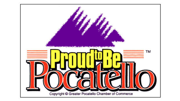
This flag was already called out by Roman Mars of 99% Percent Invisible at a TED talk about, yes, City Flags, which is some kind of Alpha Nerd Pure Sabacc. I won't dwell on it. But it did mean Pocatello noticed their flag was internationally famous for sucking ass at its job.
In 2017, a competition was held to replace the flag, and submissions were taken around the state.
This is what Pocatello flies now:
This is what Pocatello flies now:

Mountains, river, skyline, snow, stars, all done effectively with four colours. Clear symbolism. I assume you can ski in Pocatello, or at least, see some mountains there. I know nothing about Pocatello, except when it's put to a vote the people there pick a fuckin' great flag.
Goooood morning sweethearts and lovelies!
Guess what?
_MORE FLAG THREAD_
Guess what?
_MORE FLAG THREAD_
Today's die roll gave us a MATCHING SET of DAKOTA. I don't know much about Dakotas, but that, I understand, is how they like it. The Wikipedia page for notability has given us a whopping total of five current flags between them, so let's start with the easier one - NORTH.
Bismark, North Dakota, is named directly after the man Otto Von Bismark. Otto Von Bismark was a man of enormous appetite and complex capacity; a bastard and a monarchist to be sure, but if you believe in great man history, he's a pretty legit example. He had a _grandeur_.
And this is the flag of the city that bears his name, or, I must assume, a tire dealership run by BISM and RCKola.
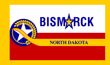
So many of these flags are going to just be hucked on the basis of text or fine detail or unreplicability but this one, this one tries. Four colours (Red-white-yellow-blue), symbolism (wheat and snow), and it's even cut up interestingly.
But that ★ is like the word's anus
But that ★ is like the word's anus
Moving on from Bism★rck North Dakota, Wikipedia suggests GRAND FORKS
Which has decided to go with a 'late 80s vector FPS river-rafting game box' as its aesthetic
Which has decided to go with a 'late 80s vector FPS river-rafting game box' as its aesthetic

Rivers, land, the feathers for symbolism, that's all fine stuff, and it even gets it right that the overwhelming feature of North Dakota is a spread unrelenting whiteness
SOUTH Dakota on the other hand, has Sioux Falls, which yields this genuinely good flag.
No beef. It's good. It's fine. There are ways to improve (this style of star is hard to replicate _correctly_, see also the # of bends in the white and blue line)
No beef. It's good. It's fine. There are ways to improve (this style of star is hard to replicate _correctly_, see also the # of bends in the white and blue line)

"Wow," the savvy reader says. "A good flag. He must be saving up for something that sucks,"
Well, you got me reader. Also, I _love_ that shirt. You look _great_ today, I hope you feel wonderful.
Well, you got me reader. Also, I _love_ that shirt. You look _great_ today, I hope you feel wonderful.
South Dakota is interesting because it has some truly bad flags that are replacements for negotiably equally bad flags, and in one case an actual _denial_ that a flag 'ever really was' a city's flag.
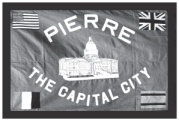
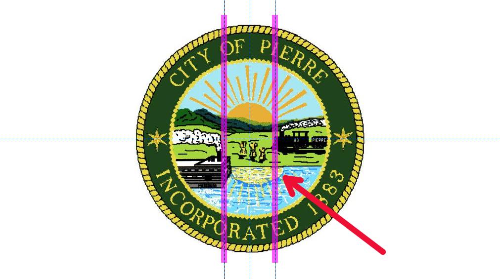
So first up, we have Pierre, South Dakota.
So first up, we have Pierre, South Dakota.

seal on a bedsheet, too busy, text, too amny colours, blank field of white, like, this is a strict f. It's not even entertaining to make fun of.
_But_ Pierre had another, previous flag that the internet has _descriptions_ of but I can't find _pictures_ of, except for one.
_But_ Pierre had another, previous flag that the internet has _descriptions_ of but I can't find _pictures_ of, except for one.
The previous Pierre flag is like a goddamn _cryptid_
It does break another rule, though: Don't put a good flag on your shit flag.
It does break another rule, though: Don't put a good flag on your shit flag.
Next step and the last one for today is RAPID CITY.
Any Rapid City natives here? Anyone who moved there? But ha ha, I kid.
Any Rapid City natives here? Anyone who moved there? But ha ha, I kid.
Alright, so you remember what I said about fine detail being bad? Hard to replicate is bad? Text is bad?
Well, one thing that's really hard to replicate is a human face, because we look at those all the time, and we can tell when something's 'weird' about it.
Anyway,
Well, one thing that's really hard to replicate is a human face, because we look at those all the time, and we can tell when something's 'weird' about it.
Anyway,

Here's the thing. This flag sucks ass.
This flag is an iteration of a flag that may have actually been one of the worst flags in America. I don't say that lightly. Like, easily as bad as the Illinois state flag
This flag is an iteration of a flag that may have actually been one of the worst flags in America. I don't say that lightly. Like, easily as bad as the Illinois state flag
This is the previous flag, which was replaced in '2010 or 2011, we think.' The city was so unaware of this flag, they don't have records of _changing_ it.
Some mayors have denied this was _ever_ the flag.
But here, soak this MSword last minute assignment in.
Some mayors have denied this was _ever_ the flag.
But here, soak this MSword last minute assignment in.

This flag is trying to bootleg the Nintendo Seal of Approval
One final thing. You may know I don't have _tons_ of respect for the American Irish, and their lauded claims to their own heritage.
Well, turns out Rapid City has enough Irish folk that they think they want their own flag, which they put on shirts.
It sucks!
Well, turns out Rapid City has enough Irish folk that they think they want their own flag, which they put on shirts.
It sucks!

this was pointed out to me about the Pierre flag, that sucks, this sucks, the people who made this flag and seal suck,
BACK AT IT AGAIN AT THE KRISPY KREME, today we're going to DELAWARE and HAWAII!
First up, DOVER, Delaware, is interesting because their flags _isn't_ public domain. You can't just jam it into a Wikipedia article, you need specific permission. What that means is, I guess, is I'm breaking the law for this thread. I'm fighting the man, for you, friends.
But I can understand wanting to hide your shame by making this flag as hard to share as possible.

If you strip all the seal elements and text from this, you have a Blue diamond with a yellow diamond inset with a _different_ yellow circle_ inset with a green circle with a white circle - which is _still a bad flag_;.
THICK BLACKLETTER CALLIGRAPHY. THREE TINY SEALS. EACH SEAL HAS A TINY BABY SIBLING SEAL.
Dover must be full of people who are _really big_ into fine embroidery
Dover must be full of people who are _really big_ into fine embroidery
MIDDLETON, Delaware looks like the box cover for an indie game where you have to find why everyone in a stock asset town killed themselves and you keep coming back to a lamppost in the middle of town.
Text, fine detail, clipart, it's Not Goooood
Text, fine detail, clipart, it's Not Goooood

Oh hey, I got some mess all over this WILMINGTON, Delaware flag! Dang, that's a shame, this is a really nice base for a flag as it is. It's a bit too 'top level' for a city flag? like, this looks likea Finnoscandian flag and it's a bit too basic for that?
Let's clean it up,
Let's clean it up,

oh.
well, that's embarassing.
well, that's embarassing.

And as for the whole country-that's-now-a-state-thanks-Pineapple-corporation, HAWAII, they only have one flag on the Wikipedia page of city flags. One of these two flags was from 1969-1981, then 1985-1994, then replaced with the black-text version, where it remains.
S.O.B.
S.O.B.


<interesting tidbit voice> that Honolulu is both a county and a city is a special law that seems to only apply directly to Honolulu
New day, new chunk of FLAG THREAD and today, it's going to be a trip to MONTANA and NEBRASKA.
Nebraska is not a heavily populated state, with only two notable cities with flags. Here's Lincoln, which is an awful flag, but there's an interesting shape in the background with the red and the white and the blue - the tower, circle, that kinda thing could be a good flag.

It's a bad flag - text, ambiguous shapes, hard to replicate, unclear symbolism, but still. Geeze.
OMAHA, Nebraska, has a flag that could be really good if not for the fact that they decided to stamp in the middle of it a covered wagon, to make it look less like a flag and more like your 'died of dysentry' scout badge

Shifting over to Montana we get BILLINGS, which has confused 'city flag' with 'donut shop logo' and 'state motto' with 'central casting subsidiary slogan'

BOZEMAN, Montana, has a flag that is both almost-decent (fine lines, difficult to reproduce but not impossible, good basic symbolism) and deeply revolting to me, personally because I expect this kind of logo to come with a tag line like SWORD WORDS: 13 PSALMS FOR THE HARVEST
Am I building up to the best flag or the worst flag? Well, you should know how things like this go, my friends.
Welcome to HELENA, Montana, a flag with a clip-art oil derrick, an unreproduceable pattern baldness grass and what sure-as-shit looks like _comic sans_ text
Welcome to HELENA, Montana, a flag with a clip-art oil derrick, an unreproduceable pattern baldness grass and what sure-as-shit looks like _comic sans_ text

Having done my research for this thread, I want you to know, ahead of time, that this is not, by any means, the most cursed American City flag
by the way, if at any point I name a city you've lived, please do mention it because I want to know if you've _ever_ seen these flags flying around where you were or if most cities treat their city flags as little bundles of fabric shame
Hey, g'morning america, how are ya. Don't cha know me, it's ya boy, Talen Lee, and this is Jackass, But For Flags, Today? RHODE ISLAND and NEW HAMPSHIRE!
Look, Rhode Island... I assume you think it's part of New England. I mostly identify New England by a unified aesthetic of terrible, _terrible_ flags.
Here's Providence! It sucks!
I like how it has the phrase 'What Cheer!' as it depicts probably the beginning of a genocide
Here's Providence! It sucks!
I like how it has the phrase 'What Cheer!' as it depicts probably the beginning of a genocide

Also, Rhode Island, I get that you want to get those dates straight and make sure people know you were founded, then incorporated, and that you thought meeting the Indigenous people as a moment of 'what cheer' but write those dates down elsewhere. Not on your city flag.
East Providence, I get that you think it's a thing that you should do because Providence does it, but it's a bad flag, it looks like it's for a brand of seagull repellant, and it commits the Usual Bad Flag Sins of American Flags

Warwick, your flag is not your notepad! Put these dates down somewhere important, like a _BOOK_. Don't put them on your FLAG where you will NEVER BE REFERENCING THEM you DING DONGS,

Meanwhile, over in NEW HAMPSHIRE, which let's face it, is an amazing branding effort to get people to treat More Of New England like it's not just the same place that makes all the world's Marshmallow Fluff, here's MANCHESTER.
One of these flags replaced the other. Guess which?
One of these flags replaced the other. Guess which?


Answer: It doesn't matter, they're both just terrible and in most of the same ways
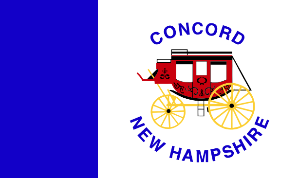
And finally, CONCORD, a place that I am told is very important and has like, a shot or something, and their flag has text, bad clipart, fine details, too many colours and looks like it's the box for the Oregon Trail Board Game Expansion
I'm sorry for rubbishing on New England's flags, New England, but in my defence, they're pretty uniformly terrible.
I tah, we tah, but most importantly, UTAH, and also Vermont!
we're going to start our trip to Vermont by showing an exceptional flag in this thread so far, which is to say, the current (as of 2017) flag for BURLINGTON is uh
not... _garbage_?
not... _garbage_?

This flag isn't actually that remarkably _good_ but it's still one of the best city flags so far because it's not a seal on a bedsheet, it doesn't have text or _clip art_ and it's going to look AMAZING compared to other flags you're going to see today.
But imagery wise, I don't get what this flag's trying to do; it's not obvious. Burlington is -next- to a body of water, but it's not on say, an istmus surrounded by water on both sides. Is the white snow? Is the white ... people? I dunno.
It also kinda looks like someone's white middle class suburban mom trying to make an 'Africanish' design, but that's not a real mark against it.
Anyway, that's probably as good as things get today.
Springfield is _almost_ a good flag, except they kept adding stuff.
Springfield is _almost_ a good flag, except they kept adding stuff.

The red
The green
The compass rose
<- STOP DESIGNING THIS FLAG HERE
The shadow on the compass rose
The black outline of everything
The text
The green
The compass rose
<- STOP DESIGNING THIS FLAG HERE
The shadow on the compass rose
The black outline of everything
The text
I don't know anything about Barre, Vermont except its flag has nipples and sucks ass
this thing looks like a packet of mints sold exclusively to people at creepy late night porn stores
this thing looks like a packet of mints sold exclusively to people at creepy late night porn stores
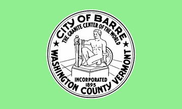
I guess I technically know that Barre, Vermont is the granite centre of the world, at least according to a place called Barre, Vermont that likely most of nobody has heard of
next up, MONTPELIER, VERMONT.
(picks up glass, takes a long, long, long drink)
(picks up glass, takes a long, long, long drink)

Anyway, they replaced this flag in 2017

I mean holy shit, right? How's that for a glow-up?
This new flag is easily one of the just... best flags in America? And I know that being in the top 50% of flags is easy because 90% of your flags are bad, but this one... isn't... bad?
This new flag is easily one of the just... best flags in America? And I know that being in the top 50% of flags is easy because 90% of your flags are bad, but this one... isn't... bad?
So hey, Vermont's doin' okay! Two flags that managed 'not awful!'
Alright, now it's time to dunk on some Mormons.
Alright, now it's time to dunk on some Mormons.
We're going to do things in Utah in a weird order because Utah's aware that its city flags are bad but isn't actually good at fixing those problems because it seems they don't get what the problems _are_ or that they _are_ problems_
Something something Brigham Young something
Something something Brigham Young something
Still, let's start with the best flag in Utah.
Provo.
Provo.

Provo's flag might be a surprise to some of you; like some of these others it was replaced in 2017 because the previous one was _bad_ (and we'll get to it). The thing is, this flag may make you go 'oh, that flag's not bad!' because it doesn't have text on it
here's the thing though: This flag, for all that it manages to avoid _blatant sins_ like text, gradients or fine detail, is still hard to replicate - look at the shape of the highlight on the mountain, or the rays of the sun. The curl of the water.
Somehow, the people of Provo picked a flag that is, again, a seal on a bedsheet, but it's not even a _seal_.
This is miles better than the original Provo flag, but it's still _really bad_ and looks like an ad for a travel agency.
This is miles better than the original Provo flag, but it's still _really bad_ and looks like an ad for a travel agency.
The Next Least Bad flag in Utah is Salt Lake City's, which I'd like to laud for modernising a bunch of Seal On A Bedsheet problem. Two blues, two greens, white and black, and text as well.
Modern fonts don't stop your text being inappropriate for a flag.
Modern fonts don't stop your text being inappropriate for a flag.

Salt Lake City used this flag in 2006 to replace their original city flag, which commemorated [ACTUAL THINGS ABOUT JOSEPH SMITH'S LIFE REDACTED] the city's founding, and is an ugly seal on a bedsheet

So we're going from Least Bad to Most Bad, we're going to Provo to look at its original flag.
Which is a bit of a trick, a sleight of hand I have played on you, my friends, because I don't have _pictures_ of the original flag of Provo.
Which is a bit of a trick, a sleight of hand I have played on you, my friends, because I don't have _pictures_ of the original flag of Provo.
Provo's original flag from 1965, I can't find pictures of on the internet because people are busy making fun of the 1985-2017 flag (as they should, it's bad). What we're told is it's a field of 'red and white' with a P on it.
This is a mock-up of it based on the description.
This is a mock-up of it based on the description.

Now, I can understand wanting to replace this because it's not a good flag but in 1985, overwhelmed with these new fangled 'computerings' and hopped up on being near a coffee (I assume), the Provo council updated their flag
to this
to this

now, some details about this include that the flag was generated at a slightly low resolution, so I have been told that some official flags were made that included the bitmap jaggies (the way the line turns into steps up close).

I know I've mentioned a gas station logo before, but what else could this be? A fibre supplement? Stay regular, stay firm but healthy, with Provo (ask your doctor if Provo is right for you)?
Including a clarification here, because as this thread grows the replies will get lost
https://twitter.com/Talen_Lee/status/1127366728961351680
This flag is in the category of B-class flags for me but at the bottom. It's about the same level as the Australian national flag, for example! But it's also at the bottom end of that flag, because this is a flag you _definitely need_ a stencil or printer to make.
h/t to @SixArmedSweater for provoking the clarification
Hello
is it flags you're looking foooooorrrr
Welcome to Day Seven of our Flag Thread, where we're going to be looking at WYOMING and KANSAS.
is it flags you're looking foooooorrrr
Welcome to Day Seven of our Flag Thread, where we're going to be looking at WYOMING and KANSAS.
Kansas starts us with the city of De Soto, which I assume is named after the car, which exists in a fascinating limbo with a _ghost flag_
That is, Wikipedia says it has a flag, and sources its claim it has a flag. DeSoto's city ordinances mention 'The DeSoto flag.'
That is, Wikipedia says it has a flag, and sources its claim it has a flag. DeSoto's city ordinances mention 'The DeSoto flag.'
The problem is, there are no pictures of this flag, or descriptions of it, even in the official public city paperwork of DeSoto I was able to find, and the CRWflags database, a handy resource for this stuff, has a report from the City Admin saying, no, they don't have a flag.
WoooOOooooOooooOOO, Ghost Flaaag
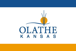
Olathe, Kansas looks like a soap brand.
Topeka couldn't decide between a really good three-colour fielded flag or a seal on a bedsheet and decided to split the difference with another potato-print stencil seal,complete with a bad triangle rubix snake barrier to hold their obligatory stars

And continuing my trend that 'everyone who pays attention to Indigenous people makes better flags' Wichita's flag is really pretty good.
The white-red fields are a tiny bit difficult to represent correctly (note the angles making it difficult to 'fold' to them). But nice, no?
The white-red fields are a tiny bit difficult to represent correctly (note the angles making it difficult to 'fold' to them). But nice, no?

Wyoming was always going to be rough because in addition to being One Of Those Places its population being so small and its general culture being as fixed on Being One Of Those Places is so strong you're going to get a very One Of Those Place spaces
So here's CASPER's flag...
So here's CASPER's flag...

Casper's flag avoids colour variety, which is good. It uses red and white and blue and that's it. It has some symbolism that's easily grasped. This is me being as nice as I possibly can to this over-detailed clipart boxed text seal on a bedsheet piece of trash
Cheyenne's flag calls it the 'city of equality' which I have to assume means this is our first city flag that's just sarcastic

Still I did some digging and out of Wikipedia's list, I was able to find a flag from Wyoming that is a Good Flag.
This is the flag of the Arapaho nation in Wyoming, which was created so their World War 2 Nazi killing volunteers would have a flag to fly of their own.
This is the flag of the Arapaho nation in Wyoming, which was created so their World War 2 Nazi killing volunteers would have a flag to fly of their own.

This Arapaho flag rules, It's sometimes used by a city called Arapahoe in Wyoming, with a population of around 1700 people. This town has 80% Native American population as of the 2000 census.
They have a really good flag.
They have a really good flag.
So uh that's the flag thread for today! There aren't any total trainwrecks like Pocatello, no amazing glow-ups like Montpelier, it's just the way that some times, you're going to have a lot of stunningly bad flags in a culture of bad flaggery
You know what I feel this was a bit thin today, so here's what I mean about Wichita's flag and 'folding.' Here's the original design, with rulers at 10%, 20%, 30%, 40%, and 50% - you can easily get those values by folding the template paper in half.

Note that the emblem doesn't centre on any of those lines, nor do any of the red sections centre on them. Now I'm not saying this flag SHOULD be changed, but here's how it'd look if it was 'made' to fit those fold values
Side by side there's not a lot of difference. Now there may be some specific reason for the proportions they chose, I'm not here to say. But one of these is slightly easier to make when you're working with pens and paper and cutouts


ᴴᵉˡˡᵒ ᵃⁿᵈ ᵍᵒᵒᵈ ᵐᵒʳⁿᶦⁿᵍ, ᶠʳᶦᵉⁿᵈˢ, ᵗʰᶦˢ ᶦˢ ⁿᵒʷ ᵃⁿ ᴬˢᴹᴿ ᶜᶦᵗʸ ᶠˡᵃᵍˢ ᵗʰʳᵉᵃᵈ, ᴵ ʰᵒᵖᵉ ʸᵒᵘ ᶜᵃⁿ ʳᵉᵃᵈ ᵗʰᵉ ʳᵉˢᵗ ᵒᶠ ᵗʰᶦˢ ᵗʰʳᵉᵃᵈ ᵃˢ ᵃ ˢᵉʳᶦᵉˢ ᵒᶠ ʷʰᶦˢᵖᵉʳˢ ᵃˢ ʷᵉ ᵛᶦˢᶦᵗ MISSISSIPPI ᵃⁿᵈ NEW MEXICO.
MISSISSIPPI has the city of Jackson, a city I used to know mainly thanks to a Johnny Cash song. This song is a good song. It paints Jackson as a town of dangerous lawlessness (because it offered no-fault divorce), named after a genocidal maniac.
Here's their old flag.
Here's their old flag.

now, you remember how I said that Helena, Georgia wasn't the Most Cursed flag so far? This one might be. Just because this flag is like the Shroud of Turin for a terrifying mega-racist who was racist even by the standards of the 1800s, full of metal, staring at you unblinkingly
Jackson replaced this flag in _1993_, which is I feel something like a century too late, but it's a _pretty good flag!_ Symbolism here is green for land, blue for water (the river), and the star and lines are showing it as a central crossroads. That's solid work!

So you might be thinking 'oh hey, dang, Mississippi! They got their flag game on!'
They don't.
Welcome to PASS CHRISTIAN, Mississippi.
They don't.
Welcome to PASS CHRISTIAN, Mississippi.

you might not be having an intuitive reaction to this flag, beyond the fine detail and the boxed design but here's the other thing.
This here is the Christian Flag (only used in the US)
This here is the Christian Flag (only used in the US)

Now this intuitive reaction it seems is false; the christian flag is from the 1910s, but the Pass Christian flag dates back to the *mumble mumble mumble*
Uh
that is to say the Pass Christian flag is uh
So here's the controversy. It was captured during the CIVIL WAR OVER SLAVERY WHERE MISSISSIPPI LOST, and mistakenly seen as a 'Confederate flag' that was captured when Pass Christian fell.
that is to say the Pass Christian flag is uh
So here's the controversy. It was captured during the CIVIL WAR OVER SLAVERY WHERE MISSISSIPPI LOST, and mistakenly seen as a 'Confederate flag' that was captured when Pass Christian fell.
But ha ha ha, this wasn't a _confedarate_ flag, how silly is that! It's just a flag made for Confederate soldiers, by Confederate women, that 'represented their love for their men, devotion for their sovereign state, and dedication to the war effort.'
why would you think THAT was Confederatey! Hah, I mean it's barely related! And it just incorporates the uh, magnolia state flag of the sovereign republic of the Mississippi, their flag they seceded under, why would you think THAT was a Confederate flag?!
so yeah fuck this
Here's the flag for GULFPORT MISSISSIPPI, which sounds like a place Jimmy Buffet has _definitely_ gotten _devastatingly_ high and it seems to be an amazing example of someone trying to make a Seal On A Bedsheet with a 1988 CGA adventure game graphics

I went to check to see if this flag is anywhere on the Gulfport official website but... I can't get that website to load, so like, good job there, city of Gulfport. Very 21st century.
There's another website, 'Things To Do In Gulfport' (gulfcoast.org/coastal-commun…) which helpfully loads this perma-FOUT for me.
So, Mississippi. It's 1993 Here.
So, Mississippi. It's 1993 Here.


Shout out to your fout outs
that's enough due diligence, Gulfport's only redeeming feature is a limited colour palette, which it uses to look like Sonny Bonds Is Really In Trouble This Time. Let's move on to LONG BEACH, Mississippi, whose flag contains a compilation of stories about Peter Rabbit Windsurfing

on second thoughts, let's leave Mississippi, how much worse could it get in New Mexico.
OH MY GOD.

This flag is hard to nail down and isn't on official paperwork, but is described as 'the village seal in white on a blue field.' It looks like this.
People of Tijeras, both of you who are on the internet: Your flag is bad. Sorry.
People of Tijeras, both of you who are on the internet: Your flag is bad. Sorry.
that's a sword and rosaries, so we are in the Real Extremely Prince Of Peace hours up in here
Santa Fe, seal on a bedsheet, just sucks unremarkably, puts a better flag on its flag, blackletter text...
I mean, whatcha want, this sucks
I mean, whatcha want, this sucks

Look at this at arm's reach and ask yourself if this is the flag of the Albuquerque chapter of the DSA with those colours and that corner symbol.
This is a bad flag, and it takes the great New Mexico flag and wrecks it with text
This is a bad flag, and it takes the great New Mexico flag and wrecks it with text

okay so if you're following along, I need you to brace yourself because this
this is going to be _rough_. Unironically, looking at this flag _can actually hurt_ and I want you to be aware of that.
We're going to Roswell, New Mexico.
this is going to be _rough_. Unironically, looking at this flag _can actually hurt_ and I want you to be aware of that.
We're going to Roswell, New Mexico.
Okay, so here it is.

If you can hear a test pattern when you look at that flag, you're not alone. This flag has good ideas in its centre - the mountain, sun, landscape trio, for example, and the limited palette - but it's all put together really bad and looks like _ass_
Particularly, the mountain is an irregular shape when it should just be a triangle; the land is made up of a set of lines when it should just be one block shape (yellow maybe). But the worst thing about this flag?
You see that spot in the top left?
What do you think that is?
Take a moment to guess. Just to yourself.
What do you think that is?
Take a moment to guess. Just to yourself.
it's not the moon. After all, the central image of the flag is the sun.
It's not a star, there's a very standard shape for that.
It's not a star, there's a very standard shape for that.
This is Roswell,
New Mexico.
Tick tick tick tick
New Mexico.
Tick tick tick tick
So yeah it's aliens.
The dot represents 'the idea of the stars, like Old Glory,' but 'also the enigmas of the heavens above us, the challenges of the future and the wonder we all experience when we contemplate the mysteries of the universe.'
The dot represents 'the idea of the stars, like Old Glory,' but 'also the enigmas of the heavens above us, the challenges of the future and the wonder we all experience when we contemplate the mysteries of the universe.'
One of the city flags of the United States has a conspiracy theory on it, which puts this flag on the same level of Louisiana's state flag for 'definitely didn't fucking happen'
But we're not done.
we're not done, no.
This is not today's worst flag.
Today's worst flag is a train wreck.
Literally.
we're not done, no.
This is not today's worst flag.
Today's worst flag is a train wreck.
Literally.
Welcome, my friends, to BELEN, NEW MEXICO

would you believe this flag was designed by a mayor with help from a local graphic design company?
"What kind of symbolism is there on this flag?" Well, ha ha
They like trains, yes, but
They like trains, yes, but
the star and text and name are all meant to evoke Jesus' birth, symbolically drawing a connection between Belen and Bethlehem, showing they are a Christian town with Christian ideals.
And the train symbolises a train
And the train symbolises a train
Some replies from @eerian_sadow indicate that:
- Nobody in DeSoto flies their GHOST FLAG
- The Olathe city flag is the tourism office's logo!
- Wichita's flag is popular (which is good!)
- Nobody flies the Topeka flag.
Since in big threads the replies break, preserved here.
- Nobody in DeSoto flies their GHOST FLAG
- The Olathe city flag is the tourism office's logo!
- Wichita's flag is popular (which is good!)
- Nobody flies the Topeka flag.
Since in big threads the replies break, preserved here.
Update via @andrewshead : krqe.com/amp/news/new-m…
Turns out Belen updated their flag to reduce trains, increase Jesus, which I feel is blatant religiously motivated trainsphobia
Turns out Belen updated their flag to reduce trains, increase Jesus, which I feel is blatant religiously motivated trainsphobia
Well now folks let's continue another heavy dose of FLAG THREAD, and today, we're going to go to Wisconsin, and
COUNTRY ROOOOAD
TAKE ME HOOOOME
TO THE PLAAAAACE
THAT AH BELOOOONG
COUNTRY ROOOOAD
TAKE ME HOOOOME
TO THE PLAAAAACE
THAT AH BELOOOONG
First stop in West Virginia is CHARLESTON, the capital and it's pretty good for a minecraft clone menu, but not a good flag. Text, colours - no outlining, I guess. But don't you love the tiny capital dome that looks kinda like a dick

At the top of the thread I mention HUNTINGTON, and here's their city flag:
This is a replacement.
This is an IMPROVEMENT.
Wanna see the previous version? It was the second worst city flag in America, in 2004
This is a replacement.
This is an IMPROVEMENT.
Wanna see the previous version? It was the second worst city flag in America, in 2004

(sits back, takes glass, and a long, long, slow drink through a metal straw)

Clarksburg, West Virginia is SO CLOSE to being a fucking GREAT flag. Like, AMAZINGLY good. It's a nautical overtone, it's got a nice different blue, the star is large enough to divide the flag into regions, it's replicable, even if I got the flag a bit wrong, you'd get it...

... but there's a bunch of text on it.
So close, Clarksburg. So close.
So close, Clarksburg. So close.
Now, all piss taking aside, check out Wheeling, West Virginia's city flag. I don't know what it symbolises, and I'm kinda nervous to check (which side was West Virginia on in the Civil Rights again?) but it's a solid flag and the repeated start design forgives the detail a bit

Next stop, however, is Wisconsin, and I gotta say, I am fond of Wisconsin, because of Donna from that 70s show, who was awesome and could have crushed everyone in that show into powder with her powerful and fearsome hands, but their flags?
their flags are bad
their flags are bad
Let's go with a flag so bad I have to assume it's doing it ironically. Do I need to tell you why this UHT milk-substitute ass label is a bad flag?
the city of Racine! A town renowned for its anvils, nazi cults, nautical stuff and birds wearing nooses, I have to assume, based on this flag.
Note, this is the best version of this flag I could find. Racine is NOT keen on showing off their flag.
Note, this is the best version of this flag I could find. Racine is NOT keen on showing off their flag.

but hey, let's take a break from bad flags and let's look at some not great flag. Specifically, the flag of Beloit.
Beloit's flag has some good ideas; I like the colour choices. The thing is, that intricate central shape is stencilly and teetering towards sealness.
Beloit's flag has some good ideas; I like the colour choices. The thing is, that intricate central shape is stencilly and teetering towards sealness.

I don't give letter ranks in any meaningful way, but if the Australian flag is a middle B, this is a good C. Right? Like, I like some things it's doing but trying good things isn't as important as getting things you do try right.
Now, the best flag you're going to see today.
MADISON Wisconsin... former.
MADISON Wisconsin... former.

So I like this flag. The colours are good, you don't have colours spreading across different colours (like a line of yellow over blue and white); shapes are clear and defined; and the Native American sun is a great symbol I like to see.
But... Wisconsin?
But... Wisconsin?
I associate that sun design with New Mexico and Arizona's Native American groups, and isn't Wisconsin a -bit out of the way- of that neighbourhood?
Anyway, they thought this flag was too good and replaced it in 2018 with...
nearly the same flag, but somehow now much more French
nearly the same flag, but somehow now much more French

Legit, I have no idea why they did this. I don't think this is a bad flag, I just don't get why:
1. The Native American sun was there in the first place
2. They made a conscious choice to get rid of it...
3. In _2018_?
1. The Native American sun was there in the first place
2. They made a conscious choice to get rid of it...
3. In _2018_?
so hey
hey
hey hey
hey
do you think I'm building up to a Best Flag today?
Or do you think today is a day we go out on a fucking horrorshow of a flag
do you have a guess?
got it in mind?
Ready?
Ready?
hey
hey hey
hey
do you think I'm building up to a Best Flag today?
Or do you think today is a day we go out on a fucking horrorshow of a flag
do you have a guess?
got it in mind?
Ready?
Ready?
WELLLLCOME TOOOO MILWAUKEEEEEE

DRINK IT IN, FRIENDS
THIS IS A REAL FLAG.
THIS FLAG HAS BEEN IN USE SINCE _1954_.
THIS FLAG COULD _RETIRE WITH A STATE PENSION_
THIS IS A REAL FLAG.
THIS FLAG HAS BEEN IN USE SINCE _1954_.
THIS FLAG COULD _RETIRE WITH A STATE PENSION_
You could do an article on bad flag design using _just this flag_. It's like it hits almost _every single possible mistake!_
This flag has _three other flags on it_!
try and find a single element on this flag that would be a decent flag on its own!
the fascinating thing about this flag is that it's not bad in the way that Pocatello is bad. Pocatello's old flag is meaningless garbage made by an advertising brand and designed to look corporate.
This is like, people _cared_ about this flag.
But they were also _bad at flags_
This is like, people _cared_ about this flag.
But they were also _bad at flags_
the critics agree:
https://twitter.com/quatoria/status/1128325604816957440
I have been informed that this flag is the result of a competition to create a city flag, and without a clear winner, the city GLUED THEM ALL TOGETHER
Update: Someone who knows about fonts decided to do a deep dive on Santa Fe's flag, and this should take you to the end of their fork of the thread:
https://twitter.com/KamikazeSc/status/1128535729775218688
Hey there, friends. I'm glad to see you. It's been a good day. Love the hair. You're just looking fine.
Oh and.
MORE FLAG THREAD.
Oh and.
MORE FLAG THREAD.
You know what states haven't been mocked for being abysmal, lately, from people who have not and never will connect to the lived experience of these places, especially if they're, you know, a bit 'economically anxious?'
IOWA and ALABAMA.
IOWA and ALABAMA.
Let's start with literally the best flag from Iowa, which is such a great flag that despite being made after the invention of the pencil, nobody bothered to write down what the symbolism of the red smear on the left is. It's there to symbolise... redness. And forgetting things.

This is the flag of DES MOINES, and the white arcs are not, despite my first impression, representative of a bowling alley rental rack, but is meant to represent the three bridges of the Grand Bridge, the Locust Bridge, and the Walnut Street Bridges.
These three bridges, crossing the Des Moines river, are a big honking deal, they're very important and they're also, uh, crumbling and broken and being rebuilt.
And uh, they're being rebuilt in a way that won't look like this flag any more.
welp.gif
And uh, they're being rebuilt in a way that won't look like this flag any more.
welp.gif
this concludes my presentation on the good flags of Iowa.
(clears throat, adjusts tie)
(clears throat, adjusts tie)
and now, a quick ad break.
DAVENPORT provides the finest in lotions and lotion-adjacent products; let our scintillating oils give you stimulating aloe virates and electrolyting your epidermals. Strong enough for a flag, gentle enough for a store brand Old Spice.
DAVENPORT provides the finest in lotions and lotion-adjacent products; let our scintillating oils give you stimulating aloe virates and electrolyting your epidermals. Strong enough for a flag, gentle enough for a store brand Old Spice.

CEDAR RAPIDS mints. Remember when you could get thruppence of candy for a ha'penny down at the general store? We at deliberately engineered corporate old-timey branding do, and that's why we chose this logo, to make you feel too old to make meaningful brand choices. Cheers!

This flag is being scheduled for replacement in 2020, after a 2019 survey classified it as one of the worst flags in America/most likely to have been found first as a scribbled biro drawing on the back page of an indie movie protagonist's notebook
Cedar Rapids is on twitter, by the way, as @CityofCRiowa and like, hey, flag makers, just start with this twitter avatar and _don't mess with it_
RED OAK, IOWA is -
oh you know that's where this flag is from already?
oh you know that's where this flag is from already?

Red Oak Iowa's flag would be bad even without the text, because that tree design is basically impossible to meaningfully replicate without a stencil but, bold choice to try and represent their city with what is _definitely_ the logo for a movie knockoff version of Bain Capital.
This flag is not cursed but the tree it depicts _absolutely is_
HIAWATHA seems to have mistaken 'flag' for 'advertising material for a grain silo magazine bought exclusively by enthusiasts who will never own a grain silo'
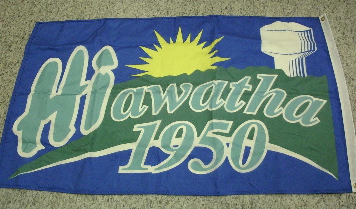
I'm not saying they masturbate to the grain silos here, I'm aiming for 'weird' not 'needlessly sexualised'
and if you did masturbate to grain silos, that's between you and your grain silos
and if you did masturbate to grain silos, that's between you and your grain silos
DUBUQUE is a city name I like knowing as a punchline for a place that people genuinely aren't going to think of, as a sort of 'default unremarkable place' but they really elevated their flag game in terms of laziness and badness.

See it's a seal on a bedsheet, which is bad, and it's boxed, which is bad, then the box is boxed, which is just dreadful but literally none of these choices took more than three clicks in mspaint.
Where Milwaukee is too much work done by too many people who cared too much, and Pocatello is a corporate device crafted by the inhuman people-things that golf and invest, this is a design by a committee where _everyone wanted to knock off early_
Weeewww, that was pretty rough, Iowa! Maybe Alabama's got something that doesn't look like butts to help bring the mood up, huh?
Christ, I had a whole bit about what I thought was the flag, but was actually the seal. Don't worry, no humble pie to eat here, because the flag sucks too
Back in the day VHS tapes had these little stickers on them, reflective, which were like, tamper signals, and they were really shiny and often had repeating patterns on them like torches or keys or whatever, really artless and kinda ugly.
Why do I bring them up?
Anyway,
Why do I bring them up?
Anyway,

The flag of auburn has a lamp that if you've ever done a sunday school should look immediately familiar to you, but I'm sure it has no religious significance at all and was only chosen because these people are really in to the Genie from Aladdin (who can't live here, move on)
Now here's the thing
this might legitimately be the best city flag in Alabama.
this might legitimately be the best city flag in Alabama.
Next in line is Troy, Alabama, which are using a spartan helmet or their interpretation of it to represent their proud town which refuses to issue marriage licenses to anyone in order to avoid ever having to issue them to same-sex couples, since a 2015 court order from Roy Moore

Roy Moore, you might remember, is the dude who was banned from a shopping mall for being a skeezy creeper who hunted underaged girls, and Troy here is smack in Pike County, which thinks he's got it right on giving rights to The Queers.
Their flag has gradients, fine detail, boxing and outlines, and looks more like something you'd draw to go on a football pennant, especially if you're one of the many homophobes who has no idea what the Spartans were actually like
I'm not saying everyone in Troy is a terrible shitty bigot, but I'm saying everyone in Troy who's proud of this flag almost certainly is, and the government they elected is full of unashamed bigots and they can all go fuck themselves.
No 'well if they knew gay people they'd know style,' no comical reference to how gay their flag is because the Spartans loved dick (and I'm sure many of them did), just a much more pointed reminder that civic art reflects the community and this art reflects shitheads.
WELL THAT WENT A BIT DARK, how about we make fun of some generically bad flags in the mean time?
BIRMINGHAM!
Set aside the tiny seal, try and replicate that ring of stars and lines with a protractor and a compass and a kid's school supplies, then imagine how gratifying it'd be to find this flag's designer and give them a kick in the keister
Set aside the tiny seal, try and replicate that ring of stars and lines with a protractor and a compass and a kid's school supplies, then imagine how gratifying it'd be to find this flag's designer and give them a kick in the keister

Enterprise, Alabama, the City of Progress, whose flag depicts, I kid you not, a woman holding a massive boll weevil aloft, because it was the destruction of the boll weevil that led to the town planting non-cotton crops and making money.
It's cute but also, like, what the fuck.
It's cute but also, like, what the fuck.

Mobile Alabama gave the world Jimmy Buffett, for which I am grateful but they also refused to play him on the radio, so I kind of hold a grudge. Fortunately, I don't have to get biased here when ragging on their flag, because it just suuuucks as a seal on a (fancy) bedsheet.

Finally we have the capital flag of MONTGOMERY, ALABAMA and like... you know I have to research these places. I don't live here. I don't know shit about these places.
Let me tell ya, this wikipedia list of nicknames paints a very conflicting image
Let me tell ya, this wikipedia list of nicknames paints a very conflicting image

Now, you might want to point to the fine lines, the text on the flag, the colour count of five, the complex overlap of leaves and stars at the top and bottom, or maybe you'd just point out this flag is racist as fuck

I get that these people want to celebrate the confederacy because what more bravely and wholly represents Montgomery's values like a willingness to risk your own life and die in the name of slavery as long as it hurts black people the most, like the bigoted losers they are?
I had a followup but this was better:
https://twitter.com/SaddestRobots/status/1128671650340323330
Alabama's state flags are awful, but they're awful in a very sincere, true way, because they represent places that hold to awful values, espoused and maintained by awful people.
If you're in Alabama, and you're affected by this, I'm sorry. If you're not, send something nice to someone who is.
Update on some more racism from Alabama's flags:
https://twitter.com/herdingbats/status/1128672015173472257
sorry, all the friendos who tuned in for the hilarity of Pocatllo and Provo! Alabama just sucks really bad and it's all Alabama's fault!
Gosh, Alabama was a real pisser, wasn't it? Let's try something a bit more fun!
Today, we're going to ALASKA and CONNECTICUT
Today, we're going to ALASKA and CONNECTICUT
Also we're getting to the stage where states are having a LOT of flags, and a lot of those flags are kinda unimpressively similar. So we're just going to blow through some of these: HOMER, HOUSTON, THORNE BAY, and KETCHIKAN are just seals on bedsheets


The thing I like about arranging these flags all in one spot is they look a shocking amount like an array of products you'd see in the toiletries cupboard of an old-timey sailor in a yellow raincoat
Wasilla's a city with elements of a good flag, like the powerful sun imagery, and the vertical breaks between sun/mountains/moose/grass/water. But the whole thing is handled like a first-timer's photoshop experiment, and is all outlined. Awful, just dreadful.

There's a gradient, fine detail on the grass, the mountains have just enough detail to be bad but not enough to look good, and the ring around the lake is really complex for no return. What the fuck, Wasilla? this should be on the _news_

WRANGELL, which is the name of a He-Man villain and ANCHORAGE have the same kind of seal-on-a-bedsheet problem. Anchorage is too detailed, and has text, but I'll at least say there's a good idea at the heart of the anchor design.
The plane's a bit much, but anyway
The plane's a bit much, but anyway


JUNEAU, ALASKA used to have this flag, which commits the sin of including a much better flag on their flag - the Alaskan state flag in the corner. It COULD have been a decal or a component of the greater design, but they box it
_twice_
What's with double boxing things, America?
_twice_
What's with double boxing things, America?

The good news is they got rid of that bad design, even though it has the interesting two-headed sea-duck design I have to assume is of indigenous design.
The bad news is they replaced it with this
The bad news is they replaced it with this

It's really hard to tell which of these flags is worse! I mean this one absolutely looks like a Chamber of Commerce job but the colours are a bit nicer and more restful. The previous flag has less text that treats people like doofuses, though, and more interesting symbolism.
Now here's an interesting one. SEWARD is the city where Benny Benson came from, and he's the dude who made the absolutely killer Alaskan state flag. You remember how I said the Native people of America know their flags better than the white ones? Well, there's more proof.
Here's the current Seward flag, and it's probably the best city flag in Alaska.
I can just imagine this flag being made and someone going: Surely that symbolism's alraedy used
surely
I mean it's a mountain, snow, and a star. Surely we're copying someone else.
Then they find out they're not because other cities have like, bait box ads on their flags
surely
I mean it's a mountain, snow, and a star. Surely we're copying someone else.
Then they find out they're not because other cities have like, bait box ads on their flags
Anyway, here's the flag of NORTH POLE, ALASKA

this flag cries out against its own existence, a green-and-white NO that we will not heed. "It's an NP," we tell ourselves. "The flag LOVES being like this."

Now, looking at the offerings in Connecticut, I am assuming this is a part of New England, just based on the common flag mistakes?
Connecticut has twenty-five city flags. Of those flags, _23_ of them are Seals on a Bedsheet, and _one_ is good.
And the best Connecticut flag is still not actually _good_. It looks like a gazebo wearing a cop helmet
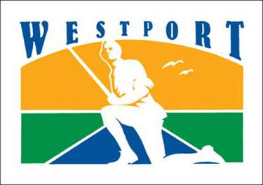
Alright, let's get the interestingly bad one out of the way then I'll run down a text list of the ass ones. WESTPORT looks like it wants to sell you Old Person Insurance, like funeral insurance or Taking A Tumble health insurance or Crapping Yourself At The DMV insurance
here's a sample of the others that are All Bad; if you're searching my history to find it, I'm sorry, but your city's flag was bad in an incredibly generic, unfunny way and I have a life to live. I will name all the cities in the next tweet so you can find 'em.


The generic Seal-on-a-Bedsheet failure flags of Connecticut are *deep breath* Ansonia, Bridgeport, Bristol, Brookfield, Danbury, East Hartford, Enfield, Greenwich, Groton, Hartford, Mansfield, Milford (tragically), New Haven, Norwalk, Orange, Prospect, Salem, Southington,
Stafford, Stamford, Trumbull, Vernon, Waterbury and Westport.
They're all just seals on a bedsheet. They're not even fun to make fun of. They _are_ all bad, just bad in the same way, and the best of them is barely meaningfully better than the worst.
They're all just seals on a bedsheet. They're not even fun to make fun of. They _are_ all bad, just bad in the same way, and the best of them is barely meaningfully better than the worst.
Here it is. This is the best that Connecticut can offer with the town of NEW MILFORD, from the French, 'Home of the new hot moms.'
It's not even doing that much good! I mean, two non-matching greens? The detailed gazebo? It's a _gazebo_?
It's not even doing that much good! I mean, two non-matching greens? The detailed gazebo? It's a _gazebo_?
This flag also looks kinda like the kekistan flag, which isn't it's fault - it predates that flag by a lot.
I think this would be a _good_ flag, not just the best Connecticut flag, if the gazebo was a bit more abstracted, but... hey. This is the best Connecticut can do.
I think this would be a _good_ flag, not just the best Connecticut flag, if the gazebo was a bit more abstracted, but... hey. This is the best Connecticut can do.
I'm not going to lie, it was kinda nice browsing a bunch of flags that were generically bad though and not 'oh, well, that's super obviously racist, and THAT'S super obviously racist, and-'
Redbubble does let me print bedsheet designs.
https://twitter.com/CaspianCMonster/status/1129165077322461184
Context on where Connecticut is, which is useful because part of my brain thought it was the mountain state where you need oxygen tents
https://twitter.com/newhaights/status/1129179050705076228
Hi America! I'm sorry about the bad news about Grumpy Cat today, but let's have a good ole chortle at the city flags of NEVADA and NORTH CAROLINA
Nevada has fewer flags, so we'll start there. There are two cities in Nevada that matter - sorry everywhere else, but you know I'm right - and they both have historical flags, and new flags.
Let's start with LAS VEGAS' 1968 flag.
Let's start with LAS VEGAS' 1968 flag.

it's not just a seal on a bedsheet but it's a _really detailed_ seal. Look at that sun!
They put the seal on a field, with a good divider, a good colour scheme, but they keep the seal, the text, and the fine detail.
It sucks!
It sucks!

LOOKS LIKE THOSE BAD FLAG MAKERS MADE A BAD FLAGS. WHAT A BUNCH OF BAD FLAG MAKERS.

This is still in use, by the way. You won't see it in the place you think of as 'Vegas' because it's very pointedly _not_ in Las Vegas, that's another area called Paradise.
Reno on the other hand, used to have this flag.
I think by now if you're following this flag thread, you know why this is bad, but we'll at least give them this: Bold shapes, clear symbolism, simple colour choices.
But uh
it's fuckin' shit
I think by now if you're following this flag thread, you know why this is bad, but we'll at least give them this: Bold shapes, clear symbolism, simple colour choices.
But uh
it's fuckin' shit

Reno replaced their flag in February _this year_ and in the process made theirs the best flag in the whole state, which... isn't competition. But this is one of the best city flags in America!

BONUS NEVADA CONTENT: There's a place in Nevada called 'ELKO.' I don't think it exists, because rather than a city flag they have this ice cream logo instead?

This isn't a city flag, it's a branding effort for a Dippin Dots knockoff
This isn't a city flag, this is a type of mint that only gets made in Finland and tastes of salt
This isn't a city flag, this is a seniors-only dispeptic solution that's made entirely from deer horn
and uhhh
that's it.
That's literally all the city flags I could find in Nevada on Wikipedia, but you know, that's a bit thin.
LIGHTNING ROUND.
that's it.
That's literally all the city flags I could find in Nevada on Wikipedia, but you know, that's a bit thin.
LIGHTNING ROUND.
CARSON CITY: Text, seal, fine detail, colours. This sucks ass!
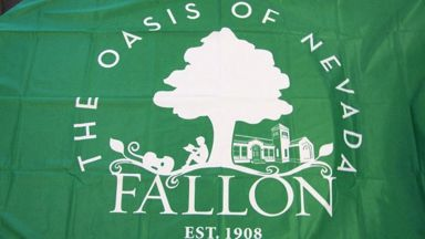
FALLON: Looks like the jumpsuits of a cult that is planning on burying all the members under a tree!
FERNLEY: Illustrated like the cover of a children's book and _not a good one_
HENDERSON: Text, fine detail!
FALLON: Looks like the jumpsuits of a cult that is planning on burying all the members under a tree!
FERNLEY: Illustrated like the cover of a children's book and _not a good one_
HENDERSON: Text, fine detail!


MESQUITE: Early 90s software company that pirates all its fonts, proud of the whole 'colonialism' thing!
JEAN: Looks like a peanut butter logo!
SPARKS: Early education services for your special needs cat.
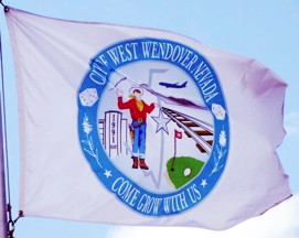
WEST WENDOVER: Our evil giant golfer cowboy will terrify and delight!
JEAN: Looks like a peanut butter logo!
SPARKS: Early education services for your special needs cat.
WEST WENDOVER: Our evil giant golfer cowboy will terrify and delight!


Oh, and WINNEMUCCA: Shows that a seal on a bedsheet isn't necessarily the only way to do text and fine detail on a flag that's a worthless piece of trash!

break while I grab a drink. Talk amongst yourselves. Do you think North Carolina will be better? Worse?
(it's always going to get worse)
ASHEVILLE NORTH CAROLINA, which can at least hold itself high as Most Likely To Be Cross-Stitched and it has text and finde detail, so y'know, that's not good. But in the grand scheme of things it's actually pretty decent. Like, you can fix this flag by JUST removing things.

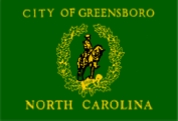
DURHAM! I don't know what this flag represents but it like, it's actually a flag. It's just good. It's just fulfilling the basic requirements of the form without doing something weird or racist. Holy shit, well done North Carolina. Please don't ruin it.

So, MANTEO, This is a good flag?
But we know it's a good flag because it's the flag of England?
If you're going to copy notes off another student, maybe don't copy the most popular notes ever?
But we know it's a good flag because it's the flag of England?
If you're going to copy notes off another student, maybe don't copy the most popular notes ever?

Oh uh hey so there's an idea here, CHAPEL HILL but um, it looks more like a horror movie imprint label trying to evoke the Hills Have Eyes here. Good colours, but that middle silhouette is really too detailed and needs a stencil.

This flag's RALEIGH bad

WINSTON-SALEM - what's with all the 'Salems' having shit-ass flags? - which I want to point out only because it has the word 'urbs' on it, which I know is a Latin word but it also sounds like a combination of Suburbs and Irritable Bowel Syndrome

When the time comes to host your Christmas-themed Hallmark re-enactment engagement party, we at Holly Springs will be proud to serve you with the full complement of our four (4) trained actors and numerous varieties of tinsels

Hey what's the goods the dude on that flag is a super double racist
There are Charlottes, and this is not one of the good ones

I think some people confuse 'welcome to city sign' with 'city flag'

But here's the best of the worst in North Carolina. Here at Fuquay-Varina, we pride our software on its excellent productivity and connectivity. Now shipping for the latest of 386 business power computers, our software will bring your accountancy to life in sixteen whole colours!

By the way, this is the end of the thread's double-up days! From hereon out, it should be one state a day!
You know, I need to cheer myself up a bit, so hey, let's go for some FLAG THREAD.
Now today we're just going to one state! We've gotten out of the 'too few cities' states! No more of blasted hellscapes filled with cows and The Wildlings!
We're going to PENNSYLVANIA.
Now today we're just going to one state! We've gotten out of the 'too few cities' states! No more of blasted hellscapes filled with cows and The Wildlings!
We're going to PENNSYLVANIA.
ALLENTOWN (population: at least one Allen) has a nice base field, and I genuinely like this colour pairing, I say, hoping and knowing there's always the chance it could be super racist. They stick a seal on it, ruining what was a hopeful start.
things don't look good, people.
things don't look good, people.

I'll give Pennsylvania this: Their bad flags are at least trying to look like flags, which is to say, they're trying to look like New England's flags, which are terrible. Here's HARRISBURG, which I assume has a Harris.
I'm seeing 'uniodised salt company.'
I'm seeing 'uniodised salt company.'

From New England style, to Old England style, and by Old England, I mean the Saxons, and by the Saxons, I mean the Germans. Good grief, this is some Prussian-ass clipart flag seal.
I ain't local, but Pittsburgh, your city flag is the flag of an Evil Empire of Cops
I ain't local, but Pittsburgh, your city flag is the flag of an Evil Empire of Cops

Philadelphia does the 'seal on a bedsheet' thing but it's not just a seal on a bedsheet, it's also a really weirdly over-loaded seal. There's eight really obvious symbols that are clearly all meant to mean something, there's a lot of choices obviously made here, but it says what?

I call these 'seals on a bedsheet' but it's a bit false because so far they've all had featured fields. But the seal is still the sin. This time, ERIE wants to push into areas of new, less interesting sins, going for a Seal with less colour but _more fine detail_

But everyone can say 'Well, we're not Lancaster.'

Joking aside, though, the city of EASTON has a pretty good flag, a strongly decen flag. I'd personally rather that corner be a side rather than a quarter of the overall field, but this is easily as good a flag as the Australian flag, probably a bit better.

okay, so here's some #flagthread bonus content
I want this to be true, but I can't find proof it's true beyond a redditor sharing it, and they've deleted their account, so for all I know it's total bullshit.
but you remember that Milwaukee trainwreck of a flag?
I want this to be true, but I can't find proof it's true beyond a redditor sharing it, and they've deleted their account, so for all I know it's total bullshit.
but you remember that Milwaukee trainwreck of a flag?
turns out there's a push to replace the Milwaukee flag with this, the People's Flag of Milwaukee

now, this flag is an absolute fucking stunner. First it's just aesthetically nice as a flag; it has four colours, they're distinct, and it doesn't look like Just Another American Style Flag.
Second the symbolism here is doing _work_; it's evoking a sunset or sunrise over water (don't know which you'd see in Milwaukee); the three lines of the reflection are emblems of the three rivers and three founding towns of Milwaukee. That's great stuff.
this is all public info, but here's the weird extra bit:
Apparently, there are Guerilla Flag Enthusiasts who are _stealing old flags_ and replacing them with these at night.
Apparently, there are Guerilla Flag Enthusiasts who are _stealing old flags_ and replacing them with these at night.
I don't know if that's true
but I hope it is
but I hope it is
ANOTHER SMALL BONUS. Do you remember this old, probably-real, probably-also-fake Rapid City South Dakota flag?

Well here's someone helpfully providing the font they seem to have used, what the actual hell.
https://twitter.com/Swordians/status/1130114329959981056
WELL HEY THERE, PARDNER
guess where we're going
We're goin' on dawn to ARIZONA.
Grab a drink, it's going to be a _thing_
guess where we're going
We're goin' on dawn to ARIZONA.
Grab a drink, it's going to be a _thing_
I've found that your attention tends to be drawn to the shittiest flags, and the earliest flags. So today, I'm going to show you the two best flags in all of Arizona, up front, and those of you who want to claim supriority of state can just go do your own thing, right?
Lovers of garbage will have to stick around and
trust me, you want to this time.
trust me, you want to this time.
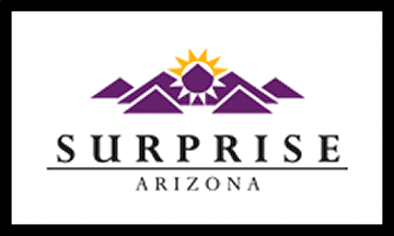
First of all we have MESA, ARIZONA, Which is, unequivocally, one of the really good city flags in America. I am not a fan of the asymmetrical/off-centre cactus, but this, this 2006 flag? It's pretty sweet. Bold colours, clear symbolism, symmetrical, it's good!

PHOENIX, Arizona has a preeeeetty good flag as far as designing a faction logo for a tabletop war game goes, but the symbol is a little too detailed and too possible to mess up to make a good flag. It gets some points on all fronts, but it's still a B-grade flag.

PEORIA has a pretty good idea for a flag - three stars, three mountains, three ... somethings...? but the fact these bars are all transluscent white set to like, 25% makes this hard to render without digital tools.

A good way to look at a flag is as a number of fields of colour; if you strip out those white bars, this is three fields, with three stars on top,and that's _good_. With these white bars, it's _28_ fields!

Sooo
that's the good stuff.
That's as goooood as it gets.
How you doing. You hydrated? feeling okay?
that's the good stuff.
That's as goooood as it gets.
How you doing. You hydrated? feeling okay?
Because could this _BE_ any more of a _BAD FLAG_?
Welcome to CHANANDLER, ARSICONA.
The symbolism is good. The fact it looks like an agribusiness logo that specialises in cabbages that turn into meat, that's less so.
Welcome to CHANANDLER, ARSICONA.
The symbolism is good. The fact it looks like an agribusiness logo that specialises in cabbages that turn into meat, that's less so.

The thing that's really amazing about the flag of CHIMBLER is that this flag is almost never used, anywhere, for anything. It was adopted _around_ 1985 or 86, not sure, no official date.
There are probably only 20 of these printed flags _that exist_ and it's mostly in storage
There are probably only 20 of these printed flags _that exist_ and it's mostly in storage
GLENDALE, on the other hand, wants to present you with an array of threatening robot drone faces, and yet, by turning the 'A' into 'AZ' - for the state! - it wants to show you it's a set of faceless robot drones that have, you know, a sense of fun!

SCOTTSDALE.
Shit.
Shit.

TEMPE. Worse than Scottsdale.

TEMPE's flag has a foil version that only appears in japanese boosters.

Totally unironically, I have a love of TUCSON. That's because of the song TUCSON OR BUST by the Desert Bus crew, a song that's now _ten years old_ and narrativises the story of the Desert Bus videogame. I love this song. No irony. No joke.
Their flag is ass, though.

Still, I want to say something nice: The yellow and purple pair of colours for this basic frame are nice.
Everything else is utter garbage. Fine detail. Negative space! Two different lighting schemes. Inconsistant shading. Two different forms of symbolism for the sun. The _rope_
Everything else is utter garbage. Fine detail. Negative space! Two different lighting schemes. Inconsistant shading. Two different forms of symbolism for the sun. The _rope_
Ah, yes, from the esteemed cultural stance of TUTSONU,
https://twitter.com/inurashii/status/1130129967734579205
Thought you'd seen the worst?
What I love about this boxed bran logo of a flag is that this is the improved, updated version they chose in _2004_. And the website that used to have the old flag has bee nreplaced by a website where this is smack centre:

alright, now, we have tapped out on the flags that are currently in use in Arizona. Okay? Making fun of former flags is cheap, it is unnecessary, and it doesn't do anything but get laughs at the expense of tastes long past.
So let's do that.
HERE'S PHOENIX!
So let's do that.
HERE'S PHOENIX!

What's best? The _yellow text on white_, that disappears at _close range_ let alone at flag size in distance? Or is it the bird that is a chicken, an eagle, and probably a phoenix, all at once, _by average_ ?
Remember though, that flag we started with? The MESA city flag? MESA's got a great flag.
Now.
Now.

(takes a long, long, drink, waiting for the hooting and hollering to grow)
okay, okay, okay.
So it's a bad flag. It's got a gradient. It's made like a gas station logo that only services -other gas stations-. It's a design that suggests this was made by an ad exec on a dare trying to convince someone to print ten thousand copies of an awful design
So it's a bad flag. It's got a gradient. It's made like a gas station logo that only services -other gas stations-. It's a design that suggests this was made by an ad exec on a dare trying to convince someone to print ten thousand copies of an awful design
But what I love about this flag is that - and you might not notice this, Fox didn't believe me at reading distance.
'Quality Service' is subtly bolded.
It's not _bold_ bold. It's a subtly heavier weighted version of the same font.
This flag has four different fonts on it.
'Quality Service' is subtly bolded.
It's not _bold_ bold. It's a subtly heavier weighted version of the same font.
This flag has four different fonts on it.
In conclusion, Arizona is a land of contrasts.
Scottsdale is replacing their flag, which is good, but they haven't done it yet and aren't obligated to do it.
I kinda like this one. The rope is just on the 'fleur de lis' side of 'fin detail' for me, so I can deal with it
I kinda like this one. The rope is just on the 'fleur de lis' side of 'fin detail' for me, so I can deal with it

Also, everyone out there who's sharing this thread, first, thank you, second, you do know that you're not just offering it to your friends and followers like I'm _done_.
We're at day 14, and we've done 26 states.
We have _24 days to go_.
This thread is a _commitment_
We're at day 14, and we've done 26 states.
We have _24 days to go_.
This thread is a _commitment_
Preserving for the future

you know, I'm using a spreadsheet to track this (because spreadsheets are cool) and y'know
you might be wondering, just how many GOOD flags are you seeing? Just _how bad_ is it?
Here. By volume, you've seen 11% flags that manage 'decent.'
And these numbers aren't trending up.
you might be wondering, just how many GOOD flags are you seeing? Just _how bad_ is it?
Here. By volume, you've seen 11% flags that manage 'decent.'
And these numbers aren't trending up.

and I know I don't label shit well, but:
Seals on a Bedsheet: 51%
Total trainwrecks: 28%
Single big sin (flags with just text or outlines): 8%
No-Fuck-Ups 'Decent': 2%
Good: 6%
Great: 5%
Seals on a Bedsheet: 51%
Total trainwrecks: 28%
Single big sin (flags with just text or outlines): 8%
No-Fuck-Ups 'Decent': 2%
Good: 6%
Great: 5%
GOOD MORNING, friends!
We're going to ILLINOIS!
We're going to ILLINOIS!
okay, let's just knock this one out straight away. CHICAGO. It's literally one of the best flags in America. It's better than most of the best state flags, and uhhh
the people of Chicago know it, and are _apparently_ pretty insufferable about it. So here. Check it out.
the people of Chicago know it, and are _apparently_ pretty insufferable about it. So here. Check it out.

the stars symbolise the four times the city has burned down and the blue bars represent the rivers on either side.
I like this flag but the way Chicagoans were all 'OO OO HAVE YOU DONE ILLINOIS YET???' felt like whatever I said about it would be a letdown.
I like this flag but the way Chicagoans were all 'OO OO HAVE YOU DONE ILLINOIS YET???' felt like whatever I said about it would be a letdown.
Roman 'Bruno' Mars did a piece about how great this flag is. Go listen to him on about it.
but the people of Illinois, they are just like people of any state; they can have a single good city flag mixed in with some total donkeys and sure, Chicago's great.
But check out their second best flag, of BELLEVILLE, which I put in the 'good, but a single mistake.'
But check out their second best flag, of BELLEVILLE, which I put in the 'good, but a single mistake.'

That horn or bugle or whatever is just too detailed to make this a great flag. And this is the _second best_.
Illinois' SPRINGFIELD could be a GOOD flag, but won't you look at that, they label it so you don't mix it up with some other Springfield's flag.

don't even give you the proper , smh
OAK LAWN has
has
yeah, this is pretty much a train wreck. Fine detail on the seed, then a seal, and the seal has a tinier seal on it, lots of fine detail, hard to replicate, and yeah, it looks like garbage.
has
yeah, this is pretty much a train wreck. Fine detail on the seed, then a seal, and the seal has a tinier seal on it, lots of fine detail, hard to replicate, and yeah, it looks like garbage.
Good thing Illinois has Chicago, or the whole state's flags would be nothing but ass, right
S and the three Tildes would be a pretty good flag on its own, and the text is an obvious mistake, but don't you love how the letters of SWANSEA are fancied up, to make sure you know this is a -classy- brand of soap that used to be made of swan fat.

Hell, check out ELGIN here, which I particularly love because it's got that sign of a good flag, the registered trademark sign, but also because the official version on wikipedia is transparent.

DES PLAINES (French for 'The Planes') has a flag that extols dignity, determination and decency, lists important dates, gives you a map to the town and spells it out _twice_.
You know, in case you forgot what flag it is
You know, in case you forgot what flag it is
But hey, you remember Chicago's red, white, and blue theme, with the surroundings of blue, the star imagery and all?
Well, here's what would happen if that flag was designed as a schoolteaching stencil for extremely haunted children
Well, here's what would happen if that flag was designed as a schoolteaching stencil for extremely haunted children

I don't want to diminish Chicago at all, and it's a great flag, but DARIEN is a strong reminder that there's no _place_ that's got consistantly good flags. Illinois' flags are all pretty bad, and Chicago stands apart _really_ far.
Verifying the Chicagoans Are Kinda Insufferable thing
https://twitter.com/TiredMoa/status/1130774193119858691
GOOD MORNING everyone! Today's city flag thread won't be too long, because we're going to LOUISIANA!
As is tradition (now, because I did it twice) I'm going to start with the best flags and then we're going to move on. Which means first up, we're going to NEW ORLEANS!
Honestly, this is pretty fine.
Honestly, this is pretty fine.

I have a stance that a Fleur De Lis is a pretty complex 'flag component,' up there with the ermine, that can kinda get away with being complicated the way a star can be complicated. I'd rather it be something else, but this is very aggressively French.
LAFAYETTE is the next best, and you see here the complexity creep. There's a good base here - the three fields with symbols in them?
What's weird here is this flag, even if it's officially right, isn't the common city flag of Lafayette, which is the ACADIAN flag (right)
What's weird here is this flag, even if it's officially right, isn't the common city flag of Lafayette, which is the ACADIAN flag (right)


They are meaningfully different - the first uses a unique fleur de lis (which looks like corn), the latter uses a standard shape.
Either way, I'm not that wild about it, but it's hardly dire. About the level of the Australia flag, yeah?
Either way, I'm not that wild about it, but it's hardly dire. About the level of the Australia flag, yeah?
We next step over to SHREVEPORT, which is a standard-issue seal on a bedsheet which includes the Louisiana symbol of a Pelican, a symbol that I will remind you is on their state flag feeding its young its own blood like some kind of vampire.

BOSIER CITY which I have to assume at some point was involved in the production of Dr Quinn, Medicine Woman based on this 90s TV-production-ass flag logo.
The river is a nice touch but it it's hard to replicate without a stencil, and the star and it get fussy. Also, bad text.
The river is a nice touch but it it's hard to replicate without a stencil, and the star and it get fussy. Also, bad text.

I don't know where WESTWEGO is but I bet the people there are very proud of their Frenchness and not very proud of their flag

There's this odd flag for the 'combined Lafayette government' which I understand is trying to show a river and a bridge over it, but which looks a lot like a close-up on a tennis ball

Curves aren't a _sin_ but they do make your flag harder to work with than straight lines or whole circles.
And then there's HI OPERATOR
CAN YA PUT ME ON THROUGH
I GOTTA DUNK ON THE FLAG
OF BATON ROUUUGE
CAN YA PUT ME ON THROUGH
I GOTTA DUNK ON THE FLAG
OF BATON ROUUUGE
Most seals on a bedsheet have text on them but for some reason this is a much more egregious example; like it wasn't enough to have a seal with a better flag on it (and it's not even a _complete_ British flag!) but they wanted to put some title-ass curlyfont.
This flag has so few things on it and yet half of them are bad.
Hey friends, it's time for the FLAAAG THREAD
And we're going to do a bit of a shakeup!
And we're going to do a bit of a shakeup!
I said we weren't going to do any more double-up days, days where two states got one day.
The problem is, by the randomiser, today would give us NEW JERSEY. Ready?
The problem is, by the randomiser, today would give us NEW JERSEY. Ready?
ATLANTIC: Seal on a bedsheet
BAYONNE: Seal on a bedsheet
JERSEY CITY: Seal on a bedsheet
NEWARK: Seal on a bedsheet
TRENTON (old): Seal on a bedsheet, replaced by
TRENTON (new): Seal on a bedsheet.
BAYONNE: Seal on a bedsheet
JERSEY CITY: Seal on a bedsheet
NEWARK: Seal on a bedsheet
TRENTON (old): Seal on a bedsheet, replaced by
TRENTON (new): Seal on a bedsheet.


New Jersey is typically regarded as like a tasteless dumping ground of perpetually moistened grunge, a place where you can buy plastic lawn flamingo versions of lions holding up a clear crystal ball to that reads CASA DE LEONES but this?
This is just New England for cowards
This is just New England for cowards
So New Jersey takes more time to type out than glean. Sorry New Jersey, your flags aren't just bad, they're -boringly- bad. They're -tediously- bad. You don't even have a good old fashioned proper fucking train wreck.
I guess what I'm saying is: Hey, New Jersey! Get more tasteless, or more tasteful, but like, either way, do something so I don't think when I'm looking over your designs I'm in _boring Connecticut_
So we're doing two states today (which means I get freed up to maybe split one of the other states over two days later on because we have some BIG FLAGS coming up). And our second state...
OREGON!
OREGON!
First up, image as a cryptid from the edge of forever, captured through an old black-and-white camera in old timeyville, is the flag of BROOKING, OREGON.
I have no colour information, but if we're as charitable as possible (let's guess it's just white and blue), this is still a bad flag, with the text. It's not actually dreadful, and fixing the text might get this flag into the 'no major mistakes' category!
Anyway, with all the dignity of a dreamcatcher showing an airbrushed Sad Native American image, we have the town of Chiloquin, which I guess I didn't ned to look up and I could just, you know
look on the flag.
I feel like this is a campground logo, and probably racist
look on the flag.
I feel like this is a campground logo, and probably racist
Come to COQUILLE, OREGON, where you can SAVE SAVE SAVE on fishing supplies and fishing supply related products! We have rods and reels and chum and chuck and bait and spong and milt and it's all twenty percent off on our boxed soupcan label of a store sign!

YOU SEE THIS, NEW JERSEY? THIS
THIS IS WHAT I EXPECTED
This OVERLITERAL, OVERLOADED, UGLY AS HELL, UNREPLICABLE MSPAINT-ASS CRY FOR HELP FROM THE FLAG FACTORY!
Corvallis Attano will have his revenge
THIS IS WHAT I EXPECTED
This OVERLITERAL, OVERLOADED, UGLY AS HELL, UNREPLICABLE MSPAINT-ASS CRY FOR HELP FROM THE FLAG FACTORY!
Corvallis Attano will have his revenge

'what will we put on our flag'
'I dunno, maybe just like, make it clear so people know our town is meant to, like, exist'
'oh yeah so they don't think we're like, a virtual town'
'yeah, very good idea that'
'I dunno, maybe just like, make it clear so people know our town is meant to, like, exist'
'oh yeah so they don't think we're like, a virtual town'
'yeah, very good idea that'
This is where they grow cottages for export, right?

EUGENE has a weird situation where it does have a flag, but since they changed the _website's logo_ in 2010, they've taken the flag down because they don't currently match. Nine years on, they haven't updated their flags to the new design, nor technically obsoleted the old one.
The new website logo is the new city seal, and THAT looks like THIS, so expect this on a bedsheet

Now, you know there are some things you don't do, and most of these flags kind of combine a lot of the sins at once, so how bad they are in one way is always a synthesis.
By contrast, GRESHAM seems to be aiming for a high score in 'fine detail' sins and fine detail alone
By contrast, GRESHAM seems to be aiming for a high score in 'fine detail' sins and fine detail alone
Now not to dunk on people's trauma but while looking up this flag I found that Gresham has a place called the 'healing field' where they have planted 'Honour flags' for every dead person who died on 9/11.

ironically, that two towers flag isn't completely bad
Anyway, here's a Flag Of Honour. It is not good. I don't feel like I need to explain why this flag is bad.
I guarantee whoever made these flags is overcharging for them.
Anyway, here's a Flag Of Honour. It is not good. I don't feel like I need to explain why this flag is bad.
I guarantee whoever made these flags is overcharging for them.

And now, we're GOING TO CAMP (bom bom), WE'RE GUNNA HAVE A BALL (bom bom), WE'RE GOING TO CAMP TO GET AWAAAAY FROMMM IT ALLL-
wait what do you mean it says _City_
That's the city flag?
Not a 'convinced a rich kid to let me go yachting with them' merit badge?
wait what do you mean it says _City_
That's the city flag?
Not a 'convinced a rich kid to let me go yachting with them' merit badge?

Do I know anyone from MILWAUKIE, Oregon?
Because they do have _a_ flag; it's described on their website. The description is the city seal, on a blue field. Then there's the seal itself, which is only described, not shown, except as a website header graphic
Because they do have _a_ flag; it's described on their website. The description is the city seal, on a blue field. Then there's the seal itself, which is only described, not shown, except as a website header graphic
So I have constructed this flag, as charitably as I can from what they say they use:
And thanks to me beign the person who made it, it's one of the best flags in Oregon.
It's still not GOOD,
And thanks to me beign the person who made it, it's one of the best flags in Oregon.
It's still not GOOD,

CITY OF NEWBERG, the 'Spring Man' of Oregon flags

NORTH BEND, a town whose flag communicates their city values of liking bridges and Christmas Cards from back when they were printed on the kind of linotype that gave the factory workers gout

This flag of ST HELENS is notable for having been designed in 1976 when these were cutting edge 3d graphics worth dozens of dollars.
This flag is 'current' as of 1999, but no modern evidence of it showed up.
It's also one of the few city flags whose subject fucking exploded.
This flag is 'current' as of 1999, but no modern evidence of it showed up.
It's also one of the few city flags whose subject fucking exploded.

There are a lot of Salems in America, and I don't know which one is the witch one, but I do know that I can confidently say all the other ones have better flags than this one, which I think is a logo for a late 90s Friends knockoff comedy about I want to say an... arborist.

"I know mom said I had a green thumb, I just didn't know I had _ten_ of them," the laugh track rolls, Thaaat's Salem!
Wikipedia tells me TROUTDALE has a city flag, but TROUTDALE'S wikipedia page tells me it _doesn't_ and the CRW archive has never heard of TROUTDALE which is a tragedy because with a name like TROUTDALE, that flag is going to be amazingly tragic
West Linn's flag comes with the kenny g cd used to sell you on this commemorative plate of a flag

The city flag of THE DALLES could also double as the stylish DVD cover for a failed tv pilot of a show about a guy who works in a mint factory but who's got a screenplay for a tv show just bursting free and one day he'll come back to his small town and have sex with his hot boss
KEIZER doubles up as the logo of a 1982 version of esports where players had to wear horse blinders while trying to two-on-one each other at legally distinct versions of FIGHTERS OF STREET
Also, the three stars and the K makes this feel _kinda_ KKK-y? Maybe fix that?
Also, the three stars and the K makes this feel _kinda_ KKK-y? Maybe fix that?
Albany gets some points for trying to pass off other homework as this homework but the result is still a pretty ugly ass flag that's mostly just screaming out its initial at an uncaring universe
let me be clear: this is one of the _best_ flags in Oregon and that's not saying much
Come to LA GRANDE (French for The Grand), where the most inspiring thing we can imagine is looking at a lump of coal through a cellar window, suggesting you will be cold and underground and sad

aaand
_finally_
Finally finally finally
FINALLY.
AFTER ALL THAT...
Portland.
A flag of the least sins. A flag that somehow manages to be twee without breaking the rules. A flag that for all its style is still ultimately, skewed towards a star of whiteness.
_finally_
Finally finally finally
FINALLY.
AFTER ALL THAT...
Portland.
A flag of the least sins. A flag that somehow manages to be twee without breaking the rules. A flag that for all its style is still ultimately, skewed towards a star of whiteness.

The Portland flag is legitimately, a good flag, and part of what makes me comfortable to say that is this:
This is the historical Portland flag, and the new one iterates on these ideas, improves them, and keeps the best distinctive elements. It's garbage, and the new one's good
This is the historical Portland flag, and the new one iterates on these ideas, improves them, and keeps the best distinctive elements. It's garbage, and the new one's good

oh and one final last one
the city of Aurora reports as of 2011, they don't have a flag.
But in 2002, this is what they said was their city flag.
I think I'd deny it too.
the city of Aurora reports as of 2011, they don't have a flag.
But in 2002, this is what they said was their city flag.
I think I'd deny it too.

Saving some of these for the thread at large
https://twitter.com/kazuyuki_s19/status/1131299380122853376
FLAG THREAD, FLAG THREAD, FLAG THREAD, FLAG THREAD.
And today, we're going to SOUTH CAROLINA.
This is one of my first hits for googling 'SOUTH CAROLINA FLAGS.'
This is gunna be _fine_, I'm sure
And today, we're going to SOUTH CAROLINA.
This is one of my first hits for googling 'SOUTH CAROLINA FLAGS.'
This is gunna be _fine_, I'm sure
First up, and I'm leading with the best flag because that's the easiest way to do this, here's the city of CLINTON, SOUTH CAROLINA, and
this is great. Not only is this great, but the rationale for adopting it and the design's symbolism are all excellently chosen.
this is great. Not only is this great, but the rationale for adopting it and the design's symbolism are all excellently chosen.
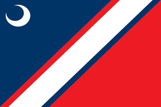
the long and short of it is this flag is about South Carolina wanting to symbolise the things in the state that aren't divisive symbols, which meant team colours yes, but religious symbols, no. The moon is from the state flag, and the fields with mutual borders for community.
This was designed by a child and won council votes. It's a great flag. It's also a lesson in how the design of a good flag is not the task of some vast study; the principles are all simple and easy to grasp if you bother to DO THE READINGS,
Stepping down from that, the next best flag is Kiawah Island, which isn't... good? It's finely detailed and it's a seal on a bedsheet, but the seal avoids multicolour problems and it doesn't involve text. If you have a seal on a bedsheet, this is... unterrible

Moncks Corner, South Carolina almost has a better flag, but that tree is just too complex, even moreso than the symbol on Kiawah Island. It's a shame, becaues the symbolism here is really good - the moon for the state, sky, grass, water and a local tree.

now let's talk shittiness
ARCADIA LAKES, have you considered a colour theme for your flag that isn't 'butterscotch piss yellow'

BLUFFTON's flag is a white field with the city seal on it, which is bad and we know that's bad but let's momentarily highlight how this flag clearly is designed to fly outside a Margaritaville knockoff

CLOVER had this flag in 2011, and it's almost good but they put text on it, and then since then, they reported not having a flag? So they either misplaced this one or decided to obsolete it rather than fix its one minor error.

That text, by the way?
"THE TOWN WITH LOVE IN THE CENTER"
"THE TOWN WITH LOVE IN THE CENTER"
I think at this point, these two posts constitute doxing @JEBWrench and I'm sorry
Columbia is a seal on a bedsheet but I would like to also ad, wouldn't you want to avoid bringing up cotton and justice in the same breath if you were any of the Confederate states? That seems to me to be a bit of an oversight

What daufusk

Now THAT'S what I call EDGEFIELD
This picture of this flag, the only one the FOTW database could find, was from when this town flew its flag at half mast for a respected politician
Strom Thurmond
_fuck_ Edgefield and their shitass seal on a bedsheet
This picture of this flag, the only one the FOTW database could find, was from when this town flew its flag at half mast for a respected politician
Strom Thurmond
_fuck_ Edgefield and their shitass seal on a bedsheet

I have to assume at a certain point these flags that look like ads for products are literally just exactly that - product logos that some rich company is paying a town to mass produce.
But the town is _called_ Fountain Inn
But the town is _called_ Fountain Inn

if you live in Fountain Inn, you don't become an INMAN but if you live in INMAN are you an INMANPERSON and are you likely to get beaten for that kind of 'political correctness' from a bunch of southern snowflakes who can't take a joke? Who knows, the flag sucks

I say 'don't put a good flag on your bad flag' but also don't put a bad flag on your shitty as fuck flag'
IVA, South Carolina has this flag, which has text on it and a four-colour rainbow of who-gives-a-shit, and there's a sela on it. This flag is not in use despite having been located in 2010.
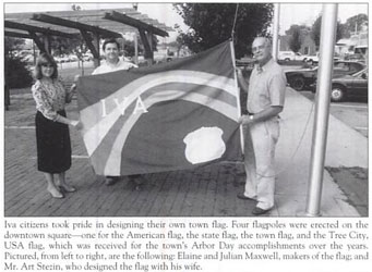
Now, this town went and got me
because this is the town of PICKENS...
... which is a county with one town in it, called LIBERTY.
The moon, again, South Carolina state symbol. God, I wish they'd stick to building on that. It was almost replaced with this seal ass thing.
because this is the town of PICKENS...
... which is a county with one town in it, called LIBERTY.
The moon, again, South Carolina state symbol. God, I wish they'd stick to building on that. It was almost replaced with this seal ass thing.


MAULDIN, a brand of swimsuit oil

MYRTLE BEACH is one of those flags with that undenying hallmark of quality, a trademark symbol and the finest graphics 1992 could buy

NORTH CHARLESTON, seal on a bedsheet
NORTH CHARLESTON (former), still a seal on a bedsheet

PENDLETON, good flag ruined by seal

RIDGEWAY, seal, State symbolism, bedsheet
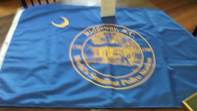
ROCK HILL, euphemistic logo for cream designed to do something positive for anuses, so things can go into them, but not any fun sex stuff, also shout out for the custom RO ligature on the txt that shouldn't be on the flag

SENECA, a town I know because of a bit joke in a 80s YAF novel called THE COMPUTER NUT about an alien on the internet and the flag has pyramids, you know, the Seneca pyramids, that you'd need aliens to construct
(x-files theme plays)
(x-files theme plays)

WILLIAMSTOWN, seal on a grandma's special decorative bedsheet

But there's always a worst.
Always.
Are you read? Braced? Deep breath?
Always.
Are you read? Braced? Deep breath?
Ssssooooooooooooooooooooooooooooooooooooooooooooooooooooooooooooooooooooooooooooooooooooooooooooooooooooooooooooooooooooooooooooooooooooooooooooooooooooooooooooooooooooooooooooooooooooooooooooooooooooooooooooooooooooooooooooooooooooooooooooooooooooooooooo
EASLEY, South Carolina.
EASLEY, South Carolina.

I feel bad picking on this because in 2009, the artist was graduating high school? But the thing is, the CLINTON flag was made by someone _even younger_ so they like, _they_ got it right.
This is the state flag, the national flag, a seal, and an artwork of the city. At once.
This is the state flag, the national flag, a seal, and an artwork of the city. At once.
important reference material

Here's the unfork: CHARLESTON, CHARLESTON and CHARLESTON
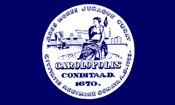


Here's Silvercat Tyger making good points about these flags
https://twitter.com/SilvercatTyger/status/1131572897854574593
Good morning, American friends. We're going to our next state, but we're going to do something a tiny bit different today.
Namely I'm going to show you what's _probably_ the best flag in the state - easily top two - and I'm going to give you a few minutes to guess where we are.
Namely I'm going to show you what's _probably_ the best flag in the state - easily top two - and I'm going to give you a few minutes to guess where we are.
Your time starts now.

I'll also accept guesses about what the hell this is
Five minutes up.
Five to go.
Five to go.
This is mean of me.
But this is the flag of CONCRETE, WASHINGTON, which is also the representation of the town's biggest landmark, which is 'the biggest concrete silo in the state.'
But this is the flag of CONCRETE, WASHINGTON, which is also the representation of the town's biggest landmark, which is 'the biggest concrete silo in the state.'

so is this REALLY the best flag in the state? Not... quite? But ALMOST? Like, the only contender for a BETTER flag in Washington state is the BELLINGHAM flag.
Bellingham's flag is honestly decent! But two things:
1. Looks like a D
2. It really reminds me of a golf course logo
Bellingham's flag is honestly decent! But two things:
1. Looks like a D
2. It really reminds me of a golf course logo

It's not that close; you can point to the clear imagery and distinctive meaningful object of CONCRETE vs the generic golf green of BELLINGHAM, and Bellingham is just a nicer flag to look at
but it's SAD that these two are even CLOSE for the #2 spot!
but it's SAD that these two are even CLOSE for the #2 spot!
#3 is probably ABERDEEN, which has a limited palette but it's also very clearly just a great big A.
it's very hard for this symbol to be anything BUT a big-ole A?
it's very hard for this symbol to be anything BUT a big-ole A?

And now from here, the quality jumps off a cliff; here, let's look at some butt-ass quality garbage junk-rubbish, like OLYMPIA, which looks like an educational game about finding Olympia on a map, and nothing else

SPOKANE's a cult

When I'm on the road, there's a lot on my mind. How can I be sure my SUV is going to take care of my family in the tight curves? That's why I lubricate with Richland Industrial Oils and Richland compressor products.

TACOMA makes a better game than a flag

VANCOUVER (The American One) describes itself as having a 'colourful' past, which I must interpret as being 'sketchy as fuck'

And now we're at Seattle - or rather, this historical flag of Seattle. Historical flags are easy prey for being bad (and when we get to Texas, BOY HOWDY). But this, okay, it's a bad flag, it's a seal on a bedsheet, _probably_ racist?

They replace it with this.
Which somehow wants to have all the boringness of the original, all the weaknesses of a seal on a bedsheet, and just the most EXTRA UNREPLICABLE GARBAGE spilled all over the damn flag!
Which somehow wants to have all the boringness of the original, all the weaknesses of a seal on a bedsheet, and just the most EXTRA UNREPLICABLE GARBAGE spilled all over the damn flag!

Seattle is the home of @Card_Kingdom, a Kingdom of Cards who are not sponsoring this thread
(but I mean if they wanna)
(but I mean if they wanna)
Now, what's interesting is that for all these flags are bad, they're _all_ better than the state flag of Washington, which I want to dredge out just to give it another grotesque kicking
If you've read this far, you know the principles and can see how _bad it is_
If you've read this far, you know the principles and can see how _bad it is_

It's midnight here, so it's morning there, which means it's time for our next state. We're going to GEORGIA.
Content warning: This will feature some Confederate-ass flags. Sorry, folks.
Content warning: This will feature some Confederate-ass flags. Sorry, folks.
Now, I've taken to, traditionally, showing the best flag in the state first.
i don't actually have that option right now? Because every flag in Georgia is bad but they're also _about as bad as one another_. It is a state of the most mediocre badness, notable only for racism
i don't actually have that option right now? Because every flag in Georgia is bad but they're also _about as bad as one another_. It is a state of the most mediocre badness, notable only for racism
So hey, here's Sugar Hill, which is a seal on a bedsheet, but also this is the best shot I have of it. With only this information, this flag gets to get the coveted crown of 'least fucking awful'

SAVANNAH goes for a double-boxed seal on a bedsheet. It sucks, and also fails to use the obvious visual metaphor of the rolling fields of golden grain that so typify Savannah

Columbus pulls out a rare power move; it boxes a _seal_ inside another seal. It's named after a monster. It's a bad flag, a bad symbol, and it's just
like
it's just bad? What can I tell you? Georgia's flags suck.
like
it's just bad? What can I tell you? Georgia's flags suck.

PEACHTREE CITY is a really bad flag, and it has that same sort of 'looks like a product' logo. Without a clear shot I'm going to guess this is advertising for a aspirin that uses a duck as its logo

ATLANTA.
Seal.
Bedsheet.
Fine detail.
Text.
Unreplicable flames.
Welcome to Georgia, we hate good flag design like how we hate people who need birth services
Seal.
Bedsheet.
Fine detail.
Text.
Unreplicable flames.
Welcome to Georgia, we hate good flag design like how we hate people who need birth services

Here's a BRUNSWICK. I don't know if it's old or new. The irony is, without the seal it'd be the best flag in the state. But we don't get to have that, do we?

The city of AUGUSTA has had two flags; one, a decent flag that follows basic rules, and one that decided that wasn't shitty enough and smacked down a seal next to it. This has been replaced, but the design isn't available on Wikipedia.

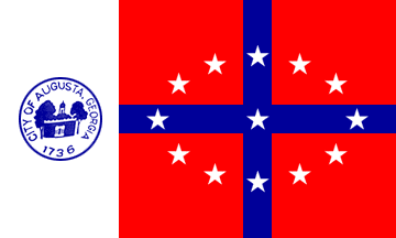
now, you can see why picking the best flag out of that crop of shit is hard. But at least TRENTON makes it easy to find a worst flag.
The Confederate flag, ie, the flag of Loving Slavery, Losing Because We Suck And Are Bad People, is pretty decently designed. So put a seal on it
The Confederate flag, ie, the flag of Loving Slavery, Losing Because We Suck And Are Bad People, is pretty decently designed. So put a seal on it

Hey while I have your attention, with the news about the whole abortion laws in places like Georgia, remember that the shitty awfulness of the people in government who hate women - and make no mistake, they absolutely do - are not representative of the culture or the states.
Anyway, be nice to queer people around you lately, its' been a shit few months.
Hell: georgia knows that, and tried to make their own GEORGIA PRIDE FLAG
(sips drink for a long long while)
(sips drink for a long long while)

So with this terrible assortment of flags, I went digging to see if smaller cities had flags, if there were any other oddballs in there and I think the good news is we have one.
DECATUR (pronounced d'kay-tur) has a flag straight out of the Happy Family Teachings books
DECATUR (pronounced d'kay-tur) has a flag straight out of the Happy Family Teachings books

hey, everyone. Hey. Hey. Wake up. C'mon honey. Get your shoes on. We're at Flag Thread.
Where are we, you might ask? Well, let's go to the state that up until last year, I mostly knew as the home of Governer Lapage, one of the most stunningly racist and evil idiots you'll ever hear of, a man never elected by a majority who spouted racism and transphobia for years.
The good news is he's out, so I get to instead upgrade it to 'Connecticut Three' or 'New Jersey Two' if I'm feeling meanspirited. This is a state that LOVES its seals on a bedsheet!
Still, as is per tradition, we start with the best flag in the state and, just like Georgia, it's pretty hard! I had to go REAL deep in on this state and what I found was mostly just bad. Just unremarkably, consistantly bad.
That said, with much deliberation I was able to dig up a small handful of flags to recommend before we get into the meaningless shittiness and meanspirited dunking on people who I should feel sorry for, but who could have avoided this by opening a book in the past century.
MADAWASKA is a town of four thousand people, in a fairly remote part of Maine if I read this map right. Their flag is, well, it's the French flag, plus a star. And that's not me saying it - that's their city ordinance describing the flag. French Flag+Star.
And y'know, it works!
And y'know, it works!

Second to that is this flag of WASHINGTON, Maine, which... I mean, I like the base this flag's built on (the design is the same as the Washington DC flag and used to be Washington's personal military symbol), but this kind of craps up a good flag with complexity.

Now I want to make it clear, this is still one of the best flags in the state; it's a flag that certainly can reach the lofty status of me shrugging, wrinkling my nose and going, 'yeah, sfine,' but it compares so poorly to what Washington DC did by comparison.
Finally, in position #3, we have the flag of LINCOLN COUNTY, Maine, which I can give faint praise of being built on sound principles if not execution. Meaningful symbol, clear colours and no overlapping bits.
The tree is too hard to replicate though, and that's all the flag has.
The tree is too hard to replicate though, and that's all the flag has.

If you were waiting for me to comment on the flags of AUGUSTA, AUBURN, BANGOR, BIDDEFORD, EASTPORT, GREENBUSH, PORTLAND, NORTH YARMOUTH, NEWCASTLE, LISBON, LINCOLN, KITTERY, THOMASTON, WALDOBORO, WELLS, WISCASSET, YARMOUTH, HANCOCK COUNTY, or WASHINGTON COUNTY?
Fine: It sucks!
Fine: It sucks!

I almost thought about doing research into how racist it was to have a Native American headdress-wearing dude on your city flag, then realised the odds lean heavily into 'almost certainly really racist' and stopped caring.
Maine does have this flag that lacks the common sins - it's lacking text and it's not a seal and its colour selection is dare I say good, but it's still a shit flag because the ship is too detailed.
Look at the negative space on the spinnaker! (is that the spinnaker?)
Look at the negative space on the spinnaker! (is that the spinnaker?)
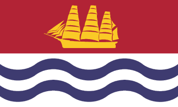
WINTHROP, Maine has a flag that almost certainly is not used, because this is the only photo I could find of it and it's, uh, somewhat obviously dated to be over forty years old, and taken with some kind of heliograph

oh and the shitty boat flag is BATH.
SUMMER has the same 'French Flag Plus' aesthetic as our best state flag did earlier, and I am not typing that name from memory for fear of doing a racism, but this one decides to put the Seal on a Bedsheet on a French Flag, burning good ideas with bad.

AROOSTOOK COUNTY has a flag that I will give this: it has a clear symbol and good palette.
It is also a picture of the state or a really shit drawing of a handgun, and has text. Garbage.
It is also a picture of the state or a really shit drawing of a handgun, and has text. Garbage.

And we are winding down and getting to the end of Maine's available flags, so you gotta expect a really bad one to finish, right? A finale? Some sort of grand thesis?
The thesis is that the town of LUBEC is so high on a minor geographic curiosity they put it on their flag.
The thesis is that the town of LUBEC is so high on a minor geographic curiosity they put it on their flag.

I like how they also invoke the spirit of Where's Wally with the lighthouse.
MAINE; once in my mind a governorship owned by a stunning monster of a failed human, now a place with a lot of really awful flags going unused in basements, because they suck
I'm sorry for dunking on your state's flags, Maine, but in my defense, they suck and you have a lot more money in your budget for fixing them than I'm getting paid to make fun of them
If you're curious about the breakdown of flag types, by the way, and why I say 'most American flags suck' here's how we're going so far with 278 flags categorised.

if we ditch all the total train wrecks (which is flags like Elko, Belen, anything that isn't _also_ a Seal on a Bedsheet) and focus on the flags that manage 'okay if they fix something' and better, it's still fuckin' grim

Important jib clarification
https://twitter.com/sophistoche/status/1132816561708777472?s=19
Is it not said in the game of flag threads, you flag, or you thread?
Welcome friends.
We're going to OKLAHOMA.
Welcome friends.
We're going to OKLAHOMA.
Now, some of you out there might be going 'oboy oboy oboy' because Oklahoma is one of those states that has a Chicago-calibre flag (and obviously some total donkeys as well). For anyone who doesn't know, here's a few moments to try and guess where we're starting in OK.
Well, time's up, we're going to TULSA.
TULSA has a beautiful palette, it references indigenous art without just straight copying it, it has clear iconography and it also looks really aesthetically beautiful. Honestly, eat shit Chicago.
TULSA has a beautiful palette, it references indigenous art without just straight copying it, it has clear iconography and it also looks really aesthetically beautiful. Honestly, eat shit Chicago.

Still there can be no bright light without a dark shadow, and when I see a star on a flag in a southern state I'm often left going 'wait, is that klan-ny? Is that confederate-ey?'
As it happens this flag is from 2018, so not so likely. Anyway, moving on.
As it happens this flag is from 2018, so not so likely. Anyway, moving on.
Here's your SEAL ON A BEDSHEET roundup; ALTUS, DEL CITY, OKLAHOMA CITY, MIDWEST CITY, your flags are basic, and suck;


EL RENO, EDMOND, PERKINS and SALLISAW are also all SoBs, but shout out to Perkins for the squint-o-vision version of their flag accidentally including Babar


Check out that El Reno flag
That thing is blue steel pencil textured.
That thing is blue steel pencil textured.
Now, here's a really weird one, a flag that kind of defies my buckets of great/good/decent/fix-the-text-and-we'll-talk/seal/trashfire setup. This is the flag of NORMAN, which isn't a _good_ flag, as you know, text.
But it's also not... -trash-. It's -interesting-.
But it's also not... -trash-. It's -interesting-.
In case you didn't catch it, this flag is flown vertically, not horizontally, and it's a three-colour design that mostly relies on negative space. It's probably a hard one to replicate too, but it also, unlike most hard-to-replicates doesn't look like ass.
Kinda weird, huh?
Kinda weird, huh?
it still needs to fix the text, and will go into the fix-it-and-we'll-talk bucket but I don't know if this is a _great_ flag hiding in a bad flag, or a just a decent flag with an obvious mistake.
BROKEN ARROW, Oklahoma, deserves some major points for having probably the single easiest symbolism to ever use for a flag that it then pisses away by not letting the symbol stand on its own
JUST DO A ARROW THAT IS BROKEN, DAMNIT. DON'T PUT YOUR DEGREE ON THE FLAG.
JUST DO A ARROW THAT IS BROKEN, DAMNIT. DON'T PUT YOUR DEGREE ON THE FLAG.

like, it's a trash fire and it did it its own way
DURANT, Oklahoma, is this week's Most Like a Funeral Home Logo design

GROVE, Oklahoma has me torn; is it a matchbook for a hotel where someone in the lobby asks if you've ever tried swinging, or is it a box for a brand of cigarettes that definitely aren't bootleg malboros? It's hard to say.

SAND SPRINGS is the second worst Oklahoma flag and I think this one deserves a special callout for actually using the word 'symbol' on the flag. Like, this flag is the only flag so far that has made it clear that it thinks it knows that symbolism exists, and then flouts it.
so that's not the worst, right? Not even with those letters hugging curved corners awkwardly.
Ready?
Braced for it?
Ready?
Braced for it?
Hiiiii friends.
Welcome to Bartlesville, Oklahoma, where this flag has been in use for TWELVE YEARS.
Welcome to Bartlesville, Oklahoma, where this flag has been in use for TWELVE YEARS.

What to start with? The clearly wordart mask? The gradient field that... again, looks like it was made with a copy of Word's watermark tool? The action lines on the balls?
Maybe the derreck that's ejaculating the entire city skyline into existence, or maybe the skyline that's sounding down the derreck?
For me, my favourite part of this flag is the hamfisted .gif-zone alpha transparencies around the dreamcatcher that's being used to represent a city that is 80% white?
Oklahoma: Chicago may think they've got the best city flag, but you can give 'em a run for their money and then show them some utter dogshite too.
Btw, if you've lost track, the remaining states/territories are, alphabetically, Arkansas, California, Colorado, Florida, Indiana, Maryland, Massachusetts, Michigan, Minnesota, Missouri, New York, Ohio, Puerto Rico, Tennessee, Texas, and Virginia.
Hey friends! Flag thread! Arkansas!
And you know how I start with the best flag, then clear out the seals and then show you the worst flag of the state?
Arkansas is a place that doesn't really have a 'best' flag. It doesn't have any good flags. It doesn't have a 'okay' flag.
And you know how I start with the best flag, then clear out the seals and then show you the worst flag of the state?
Arkansas is a place that doesn't really have a 'best' flag. It doesn't have any good flags. It doesn't have a 'okay' flag.
Arkansas is a state whose flags all include text, and if they didn't have the text they would still be bad. _All of them_.
Still, let's be thorough, shall we?
Still, let's be thorough, shall we?
BEEBE: This would be a good logo for a frat that fucks trains
BELLA VISTA: Claiming this tile gets you a house cube, and at least two trade cubes
BENTONVILLE: Bentonville publishing, bringing you the finest catalogue of novelisations of Johm Wayme movies
BETHEL HEIGHTS: Crap.
BELLA VISTA: Claiming this tile gets you a house cube, and at least two trade cubes
BENTONVILLE: Bentonville publishing, bringing you the finest catalogue of novelisations of Johm Wayme movies
BETHEL HEIGHTS: Crap.


BRYANT: Holy shit, Word can do text all curved on the top but not the bottom!
CABOT: Hey at least we can't see it.
CHEROKEE VILLAGE: god I hope this isn't racist
CONWAY: Looks like a brand of salt shakers for online atheists
CABOT: Hey at least we can't see it.
CHEROKEE VILLAGE: god I hope this isn't racist
CONWAY: Looks like a brand of salt shakers for online atheists


FORT SMITH: If you could just get over the fucking seals, people,
FAYETVILLE: 'The people rule' except the people who are black, or women
JACKSONVILLE: Oh look an airplane pew pew pew
LITTLE ROCK: This is seriously in competition for least-garbage-ass
FAYETVILLE: 'The people rule' except the people who are black, or women
JACKSONVILLE: Oh look an airplane pew pew pew
LITTLE ROCK: This is seriously in competition for least-garbage-ass


LAKE CITY: This is probably an incomplete image from which to draw conclusions but it definitely sucks
MARKED TREE: The tree looks haunted
MAUMELLE: You can do cool things with those links. Shame they didn't.
MONTICELLO: A board game board, and not for a good game
MARKED TREE: The tree looks haunted
MAUMELLE: You can do cool things with those links. Shame they didn't.
MONTICELLO: A board game board, and not for a good game


NORTH LITTLE ROCK: Don't look for the loss or you'll find it
WEST MEMPHIS: Again, don't mention cotton
TEXARKANA: Graphing calculator app makers
RUSSELLVILLE: The word 'meh' spelled in piss.
WEST MEMPHIS: Again, don't mention cotton
TEXARKANA: Graphing calculator app makers
RUSSELLVILLE: The word 'meh' spelled in piss.


ROGERS: Gosh look all that fine detail that just blurs away into fucking nothing
PARAGOULD: It's just numb now isn't it? We're all just inured to this ghastly overdetailed diagram of an object that could be made an abstract icon SO EASILY, and yet, it fucking wasn't. So sad.
PARAGOULD: It's just numb now isn't it? We're all just inured to this ghastly overdetailed diagram of an object that could be made an abstract icon SO EASILY, and yet, it fucking wasn't. So sad.


So we have no goods. We have a bunch of shit.
We have, however, two 'most bads,' which is pretty cool. I have a hard time telling which of these two is the worst of the flags.
We have, however, two 'most bads,' which is pretty cool. I have a hard time telling which of these two is the worst of the flags.
GREENWOOD. It's a detailed logo for a mall, I guess, but two things I find comically bad about this. One; it has a better flag on it and two bad flags on it.
Two, uh, it has a _time_ on it? A really specific time? And it's ... 11.35?
Early lunch?
Two, uh, it has a _time_ on it? A really specific time? And it's ... 11.35?
Early lunch?
And finally...
Well, Hot Springs. Hot Springs. Hot Springs. It's called Hot Springs.
Is it wise to buy bulk mineral water off the dark web? It says it's good for the purity of my essence.
Well, Hot Springs. Hot Springs. Hot Springs. It's called Hot Springs.
Is it wise to buy bulk mineral water off the dark web? It says it's good for the purity of my essence.

I am _politely_ referring to all these flags as 'seals on a bedsheet,' because none of them are really properly train wrecks. They all just make the same basic mistakes because they all seem to think they're doing a fine job of what they are.
(takes the mic off the stand) and ANOTHER thing, what is THE DEAL with FLAG THREADS?
Do we got anyone in here tonight from INDIANA? We got ourselves any Hoosiers? People who don't mind sounding like an aborted sneeze? People who hated Mike Pence before it was mainstream?
Do we got anyone in here tonight from INDIANA? We got ourselves any Hoosiers? People who don't mind sounding like an aborted sneeze? People who hated Mike Pence before it was mainstream?
I might have my states mixed up, I'm not from around here. Either way it's important that everyone should fucking hate Mike Pence.
Anyway, INDIANA! It's a state with a large number of cities and those cities have flags, and some of those flags, gasp and shock, -are good-?
Anyway, INDIANA! It's a state with a large number of cities and those cities have flags, and some of those flags, gasp and shock, -are good-?
Like, there's more than one that deserves being spoken about in terms of things like symbolism and mild improvements rather than thrown out wholesale and restarted. How messed up is that?
Still, we want to start strong and play down to the guff, so let's go with the good stuff.
Still, we want to start strong and play down to the guff, so let's go with the good stuff.
Here in the category of 'good, but,' we have LAFAYETTE. Now, there's a bunch of good stuff here - the corners, the star, the colour choice. But the curve is tricky to set and trickier to replicate _perfectly_. It doesn't get you much and it disappears when the flag moves.
Mishandling curves is going to be a _thing_
CLARKESVILLE is pretty good! I don't like the detail on the swordhandle and I think it could be made into more of a symbol and less of a decal, and make the blade symmetrical to make it easier to replicate, but gosh if that isn't just a solid, decent flag.

Also, weirdly, if you'd told me this was the flag of Calais I'd have believed you
FISHERS is also really decent; the second line's orientation and the dullness of the nubbins on the end of it are kinda a problem but I've seen a few version that reorient the crosspiece, which is also... weird? Either way, it's... fine!

The thing is if there weren't _literally hundreds_ of seal-on-a-bedsheet and trash-fire garbage flags underneath it, this would be a flag I'd be comfortable calling 'bad' because of those notes. But it's got a lot of complete crap to compete with
Also I don't know if the top right corner is an error on the wiki page or if that's actually how the flag is meant to look
WEST LAFAYETTE is one single detail away from being great. Get rid of the finely detailed, hard to replicate wreath and you've got a really good flag. As it is, again, just 'pretty decent.' It's in the one-mistake basket for me.

SOUTH BEND is a pretty good flag, but by making its central line curved it gets harder to replicate, which is a bummer, and also, when it's on a flag and moving in the wind, you won't really appreciate the damn curve, so it's a wasted bit of spent effort

The best flag in Indiana then winds up here, at INDIANAPOLIS, (French for 'City of Indiana'), which has a clear crossroad imagery, non-overlapping colours, and it's not tied directly to a super racist story, which is cool.

The best thing about this flag is it replaced a previous flag that was designed, and, according to city records, 'never unfurled for lack of interest.'
Mods, Change My Name to Never Unfurled For Lack Of Interest
Now let's talk about a shitty cavalcade of Seals on Bedsheets.
WINONA LAKE: Church camp ass flag
WESTFIELD: what if 'TBD' was a flag
WEST BADEN: Look just go with the white lines and gold circle and you'd have a FINE flag
WARSAW: My first joke was pretty inappropriate so let's not
WESTFIELD: what if 'TBD' was a flag
WEST BADEN: Look just go with the white lines and gold circle and you'd have a FINE flag
WARSAW: My first joke was pretty inappropriate so let's not


VINCENNES: Bert from Seasame Street collected this flag by mistake
VALPARAISO: I'm guessing this is a college town, and not a good college or a good town
TIPTON: Don't use banners like speech bubbles you fucking dorks
TERRE HAUTE: from the French 'haughty ground'
VALPARAISO: I'm guessing this is a college town, and not a good college or a good town
TIPTON: Don't use banners like speech bubbles you fucking dorks
TERRE HAUTE: from the French 'haughty ground'


TELL CITY: Okay this place doesn't exist, right? This is the flag of a paper town someone invented as a grade school project
SPEEDWAY: you were
_so close_
SEYMOUR: See less of it
SCHERERVILLE: The distorted 6 seems to be _part of the design_
SPEEDWAY: you were
_so close_
SEYMOUR: See less of it
SCHERERVILLE: The distorted 6 seems to be _part of the design_


RICHMOND: Fuckin rival Mathnet ass flag
REMINGTON: We couldn't even bother to suck interestingly
PORTAGE: Thanks to our confused imagery, it looks like Pepe Le Pew is stalking a boat on our flag
PLYMOUTH: Not The One People Care About, Another One!
REMINGTON: We couldn't even bother to suck interestingly
PORTAGE: Thanks to our confused imagery, it looks like Pepe Le Pew is stalking a boat on our flag
PLYMOUTH: Not The One People Care About, Another One!


PLAINFIELD
okay look this one deserves a special space all for itself because I am absolutely impressed at the way this flag, designed in _2008_, manages to look like the company logo on the attract mode of a Pole Position knockoff from a company advertising itself as NANKO
okay look this one deserves a special space all for itself because I am absolutely impressed at the way this flag, designed in _2008_, manages to look like the company logo on the attract mode of a Pole Position knockoff from a company advertising itself as NANKO

NEW ALBANY: Without the text this AWANA-ass flag would still be bad for having way too much fine detail
MUNCIE: This seal depicts 'a rider,' and I can't find out who they are. Probably an old racist.
MOORESEVILLE: Ditch the text
MONTICELLO: bisected orange ass flag
MUNCIE: This seal depicts 'a rider,' and I can't find out who they are. Probably an old racist.
MOORESEVILLE: Ditch the text
MONTICELLO: bisected orange ass flag


LOGANPORT: Uncomfortable bad depiction of Indigenous American
MISHAWAKA: I am always uncomfortable with depictions of Indigenous Americans but boy holy shit does calling it 'the princess city' ramp that discomfort into fucking space
LA PORTE: French for 'the port'
KNOX: Knope.
MISHAWAKA: I am always uncomfortable with depictions of Indigenous Americans but boy holy shit does calling it 'the princess city' ramp that discomfort into fucking space
LA PORTE: French for 'the port'
KNOX: Knope.


LAKEVILLE: Proud of our past? And pictures of Indigenous settlements? Goodness.
HAMMOND: ... I am so fucking worried these are all super racist
GREENWOOD: Greenwood's Pride and Progress is a Forgotten Realms book about Elminster fucking a 19 year old novelist
GREENVILLE: Bad.
HAMMOND: ... I am so fucking worried these are all super racist
GREENWOOD: Greenwood's Pride and Progress is a Forgotten Realms book about Elminster fucking a 19 year old novelist
GREENVILLE: Bad.


GREENSBURG: I have to assume the distortion is not part of the design but it's a good example of how these detailed flags look when moved by the air
GREENFIELD: Even abstracted seals suck ass
GOSPORT: Go fish
GOSHEN: Ditch the text, abstract the leaves.
GREENFIELD: Even abstracted seals suck ass
GOSPORT: Go fish
GOSHEN: Ditch the text, abstract the leaves.


I'd like to stop here to mention that a number of these flags were uploaded to the database by the tireless work of one Chad Crabtree, and I'd like to say, Thanks Chad. Thad.
GARY: Nothing but respect for my Pokemon League Champion. Bonus, black person hand.
FRANKLIN: Cut out the seal and this is a pretty good flag
FORT WAYNE: indian_brave.pcx detected
FERDINAND: It's got _an_ idea, but it completely fails to deliver on it.
FRANKLIN: Cut out the seal and this is a pretty good flag
FORT WAYNE: indian_brave.pcx detected
FERDINAND: It's got _an_ idea, but it completely fails to deliver on it.

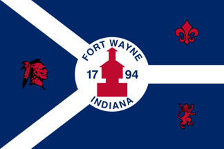

FAIRVIEW: Oh boy, fine line ink art
EVANSVILLE: French for 'Evan's place.' Simple SOB
DANVILLE: French for 'Dan's place.' Complex SOB
COLUMBUS: French for 'fuck THAT guy.' Looks like a powerpoint slide for a company that manages PR for oil slicks that kills baby ducklings
EVANSVILLE: French for 'Evan's place.' Simple SOB
DANVILLE: French for 'Dan's place.' Complex SOB
COLUMBUS: French for 'fuck THAT guy.' Looks like a powerpoint slide for a company that manages PR for oil slicks that kills baby ducklings


COLUMBIA: it's wheat, not a nuke
CHARLESTON: Not like the one in the song
CARMEL: I have a knee-jerk reaction against this kind of protestant Bible theft, but also, text, seal, fuck this
BROWNSBURG: Like a logo for supplements. For poopin'.
CHARLESTON: Not like the one in the song
CARMEL: I have a knee-jerk reaction against this kind of protestant Bible theft, but also, text, seal, fuck this
BROWNSBURG: Like a logo for supplements. For poopin'.


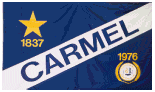

BORDEN: How bad is your flag that you can't even manage 'best flag to depict a strawberry in America'
BEECH GROVE: That city seal is a fucking megachurch.
BATESVILLE: There is an other side of 'caring too much,' you know
AVILLA: 'Equal Faith Family Friends.' FUCK this.
BEECH GROVE: That city seal is a fucking megachurch.
BATESVILLE: There is an other side of 'caring too much,' you know
AVILLA: 'Equal Faith Family Friends.' FUCK this.


These things all scream to me of the aesthetics embraced by ACE, the sort of no-tie collared-shirt buttoned-to-the-top on weekends bible-verse quoting grammar nitpicking Wholesome Block Ass Colours horrorshow bullshit that makes Mormonism look edgy.
But holy shit, that was a lot of Just Pretty Bad, right?
Well, here's our worst and then we'll get onto ... weird.
BERNE.
Well, here's our worst and then we'll get onto ... weird.
BERNE.

BERNE is a bad flag but I want to make it clear that it's bad because it's boxed, got calligraphy on it and this bear is too detailed to make a good flag design. I am not criticising the bear. This bear has seen shit. This bear has had a lot asked of it, and it is doing its best.
Now, finally, here we have.. the weird one.
The thing I love about this flag that is not, as you might imagine, a flag for demiromantic deer-fucking furries, is that as far as symbolism goes, it's stunningly basic in a way I almost want to applaud.
The thing I love about this flag that is not, as you might imagine, a flag for demiromantic deer-fucking furries, is that as far as symbolism goes, it's stunningly basic in a way I almost want to applaud.

Now it's a bad flag - the wavy lines are wasted effort (as before), and the antlers aren't symmetrical or easily replicated (not even a simple rule on how they work), but the flag still is doing something I kind of love.
This is the flak of ELKHART.
And you know what?
Nobody's going to forget where this flag belongs when it's named that.
And you know what?
Nobody's going to forget where this flag belongs when it's named that.
Fox 100% nails what I wanted to say about Ferdinand
https://twitter.com/MunchlaxRegrets/status/1133753282784944129
Hey there friends!
Do you know what it's time for now?
That's right! FLAG THREAD!
And we're going to COLORADO!
Do you know what it's time for now?
That's right! FLAG THREAD!
And we're going to COLORADO!
Colorado's pleasantly challenging because it has an array of flags that aren't _bad_, and yes, it has a collection of shitass flags too. You know the drill.
Let's start with the worst best flag they got.
COMMERCE CITY, which is 'a silver emblem' and 'possibly a tree.'
Let's start with the worst best flag they got.
COMMERCE CITY, which is 'a silver emblem' and 'possibly a tree.'

I laud the understatedness of it. The name of the city makes me suspect this was a Chamber of Commerce gig, and they tried to make somethign that wasn't awful. Does look a bit like the silhouette of a lego tree though.
LOVELAND is... tricky, too. Like the fine details and the measurements of the mountains are all kind of difficult. It's _good_, it really is, but it's lacking the sort of thought that goes into a _great_ simple design like this.
Also, Loveland??
Also, Loveland??

GOLDEN, same thing; it's got one or two good lessons internalised but it's missing a few really important ones. Like, abstract visualisation of the horizon, mountains, simple colours, that's the stuff you want!
But while it's not very fine detail, it's still a bit too detailed.
But while it's not very fine detail, it's still a bit too detailed.

DENVER has just, well, a really good flag. It's a bit of a basic thing - 'we are a place in the mountains' - but it's doing the job, it doesn't look ugly.
Fun tidbit! It's got a great big M on it, but doesn't look bad for it!
Fun tidbit! It's got a great big M on it, but doesn't look bad for it!

THORNTON is a lot like Golden. It's good - but it's a tiny bit away from being great. The two different line weights (there's a thin blue and a thick blue line) is what pushes this from 'great' to good.
It is also very difficult to grasp the symbolism - city ordinance don't say
It is also very difficult to grasp the symbolism - city ordinance don't say

Also in the 'good, interesting' category, COLORADO SPRINGS. This is an interesting example of how you can reduce a seal down into crucial details and get something that works. You can draw most of this shape with folds, which is _pretty nice_.

Overall, I give this collection pretty much consistently positive set of rankings. These are all quite good!
Now, let's roll up our sleeves and delve into the NIckelback Album that is The Rest Of Them.
GEORGETOWN: Fine detail, irregular mountains, bighorn sheep being fucked by a letter
WHEAT RIDGE: What exactly would you expect
VAIL: Fine detail and a logo that looks... kinda fashy? Almost manages 'decent!'
PUEBLO WEST: Oh we'll _get_ to Pueblo.
WHEAT RIDGE: What exactly would you expect
VAIL: Fine detail and a logo that looks... kinda fashy? Almost manages 'decent!'
PUEBLO WEST: Oh we'll _get_ to Pueblo.


PARKER: That's literally a street light! That's your town's icon!?
LEADVILLE: You called the city of lead deposits leadville? Really?
LAS ANIMAS: From the French 'the anime'
LA JUNTA: here's a deer anus.
LEADVILLE: You called the city of lead deposits leadville? Really?
LAS ANIMAS: From the French 'the anime'
LA JUNTA: here's a deer anus.


CENTENNIAL: This was to 'instil public pride' and be 'easily identifitable,' and you know what, you got halfway there
COLLBRAN: Notice the ALMOST INVISIBLE bottom text?
EDGEWATER: Pilgrims Progress ass flag
ESTES PARK: Hey, at least the sheep PROBABLY isn't racist
COLLBRAN: Notice the ALMOST INVISIBLE bottom text?
EDGEWATER: Pilgrims Progress ass flag
ESTES PARK: Hey, at least the sheep PROBABLY isn't racist


EVANS: This is a milkshake flavouring logo
FEDERAL HEIGHTS: The system-standard serif font says a lot
FORT COLLINS: And the counterpart in sans serif, with a poo brown border
FORT LUPTON: Here's a horse's butt
FEDERAL HEIGHTS: The system-standard serif font says a lot
FORT COLLINS: And the counterpart in sans serif, with a poo brown border
FORT LUPTON: Here's a horse's butt


BLACK HAWK: I mean, you get points for colour selection and no gradients I guess. But text, fine details.
AURORA: Oh god, simplify the FUCK out of this
ASPEN: what the _fuck_ is this
ARVADA: Oh tangrams, I hate these
AURORA: Oh god, simplify the FUCK out of this
ASPEN: what the _fuck_ is this
ARVADA: Oh tangrams, I hate these


And that gets us through the Seals And Bads.
But we have two flags that are Just Frickin' Awful. And you may know one of them already, because I namedropped it.
But we have two flags that are Just Frickin' Awful. And you may know one of them already, because I namedropped it.
He's a cop on the edge. They shot him, with cocaine bullets and cop-killer guns at a hair metal concert. Now he's out for revenge, against Revenge, his rival, on whom he wants Vengeance.
And his name... is PUEBLO.
And his name... is PUEBLO.

WESTMINSTER, what's with this Encarata-ass bonus cd flag

So there's Colorado, a state of weirdly specific bad designs with at least two deer anuses on their flags. And some good stuff!
Hey friends! Anyone here from TENNESSEE? Because that's where our Flag Thread parks next!
Here's the flag of MARYVILLE which gets the distinguished response of a shrug, a snort, and an 'oh huh, yeah, cool, guess it's fine.' It's made by rotating a pattern, which is cool, the iconography is simple and I kinda feel bad my gut reaction was 'ew.'
Pretty good!
Pretty good!

That's our 'good.' Tennessee then moves straight into 'no sins,' which is this Spring Hill flag. Hey, it's a hill! And the sky! And a star!
I don't like the curve, because it's hard to replicate properly, but you're not going to miss it. So yeah, you know what, also, okay!
I don't like the curve, because it's hard to replicate properly, but you're not going to miss it. So yeah, you know what, also, okay!

This concludes the Tennessee city flags that are 'okay.'
But the problem is, the rest of the flags in Tennessee aren't _funny bad_. They're just bad bad. They're boring bad. And now, I will attempt to make ugly, bad, badly made flags funny, as a series of desperate one-liners.
But the problem is, the rest of the flags in Tennessee aren't _funny bad_. They're just bad bad. They're boring bad. And now, I will attempt to make ugly, bad, badly made flags funny, as a series of desperate one-liners.
ALCOA: The venn diagram of 'local government' and 'shadow government'
ARLINGTON: Not that one or that one or that one. seal isn't even anything cool.
BARTLET: The West Wing kinda sucks
CHATTANOOGA: So does Alan Jackson
ARLINGTON: Not that one or that one or that one. seal isn't even anything cool.
BARTLET: The West Wing kinda sucks
CHATTANOOGA: So does Alan Jackson


Special shout out to BRISTOL, which is a Tennessee city flag and also a Virginia city flag. They make this flag by taking two bad flags and jamming them together, with a little soupcon of Confederate Shit

CLARKSVILLE: Text is bad, bright yellow on red text is also bad. Seal on a bedsheet.
CLEVELAND: Wow, every comedian since 1980 is right, Cleveland sucks
CLIFTON: YOU WERE SO CLOSE TO BEING THE BEST FLAG then you WROTE ON IT
COLLIERVILLE: Twee 1960s-YAF-book-cover ass flag
CLEVELAND: Wow, every comedian since 1980 is right, Cleveland sucks
CLIFTON: YOU WERE SO CLOSE TO BEING THE BEST FLAG then you WROTE ON IT
COLLIERVILLE: Twee 1960s-YAF-book-cover ass flag


KNOXVILLE: Not only a bad flag but the colours were chosen to represent 'bravery, loyalty, faith and coal,' and if that ain't beat all.
KINGSPORT: Golf supply store
JOHNSON CITY: A flag for terf genies
GREENVILLE: It's sad this is 'above average' for this state
KINGSPORT: Golf supply store
JOHNSON CITY: A flag for terf genies
GREENVILLE: It's sad this is 'above average' for this state


GOODLETTSVILLE: Confederate shit, fuck this flag
GALLATIN: Look at all that detail you can't look at because YOU DON'T PUT FINE DETAIL ON FLAGS
FARRAGUT: Seal, silhouette, but, shout out to the silhouette being of a non-Confederate admiral
ELIZABETHTON: Confederate shit, ftf.
GALLATIN: Look at all that detail you can't look at because YOU DON'T PUT FINE DETAIL ON FLAGS
FARRAGUT: Seal, silhouette, but, shout out to the silhouette being of a non-Confederate admiral
ELIZABETHTON: Confederate shit, ftf.


EAST RIDGE: CONFEDERATE SHIT, FUCK THIS FLAG
LAKELAND: From the French 'the place with a lake'
LEBANON: Could be a good flag if you took shit away
LEXINGTON: Not that one, not that one, _abombinable_ curved serif text.
LAKELAND: From the French 'the place with a lake'
LEBANON: Could be a good flag if you took shit away
LEXINGTON: Not that one, not that one, _abombinable_ curved serif text.


CROSSVILLE: ... huh. Hey, take the text away and that's pretty sweet.
CUMBERLAND MEDICAL CENTRE: I mean it is what it says on the tin, but maybe it shouldn't say that on the tin
MEMPHIS: Stop putting cotton on your flags, slave states
NASHVILLE: Ah, Pasty Los Angeles
CUMBERLAND MEDICAL CENTRE: I mean it is what it says on the tin, but maybe it shouldn't say that on the tin
MEMPHIS: Stop putting cotton on your flags, slave states
NASHVILLE: Ah, Pasty Los Angeles


OAKLAND: This flag could be just six fields and it'd be okay, then they went and added about eight more
WAYNESBORO: Waynesboro! Waynesboro!
SEVIERVILLE: (long, slow drink)
SCOTTS HILL: Confederate shit, fuck this flag
WAYNESBORO: Waynesboro! Waynesboro!
SEVIERVILLE: (long, slow drink)
SCOTTS HILL: Confederate shit, fuck this flag


RED BANK: Good flag on bad flag
PORTLAND: Still not the best depiction of a strawberry on a city flag
PIGEON FORGE: This could be an Australian flag, it's that bad
PARSONS: Planes, trains and ... wheat
PORTLAND: Still not the best depiction of a strawberry on a city flag
PIGEON FORGE: This could be an Australian flag, it's that bad
PARSONS: Planes, trains and ... wheat


PARIS: Oh hey, holy shit, it's like a cool idea - the triangle cut in a French flag. But then the seal. Fuck it.
Still, I know that @0xabad1dea kind of loves pointing out the clipart collections used on some of these flags, so check out COLLINWOOD, design circa 2002.
I think we've seen _those sports balls_ on a previous flag.
I think we've seen _those sports balls_ on a previous flag.

If you're curious, here's our current breakdown. As states get more populated, the number of cities go up, and as that happens, we just get more Seals On A Bedsheet. It was as low as 51% at one point!

At this point, 90% of all city flags in America are failing the most basic standard rules for making a good flag. That is an impressive failure rate.
Oo! This was one of the states I was waiting for in our FLAG THREAD -
It's VIRGINIA!
It's VIRGINIA!
There is one town I was really hoping would have a flag so I could rag on it, because I was pretty convinced that it wouldn't have a good flag, and it'd be racist, and that's LYNCHBURG. It turns out, Lynchburg doesn't have a city flag.
Cowards.
Cowards.
Get a flag and come on the podcast and fight me, Lynchburg
This isn't a flag, but here's the seal of Lynchburg. Weirdly, this is actually a pretty okay seal as they go because one of the core wants of a seal is for it to be _very hard_ to replicate.
which is kinda silly now we have printers, but whatever.
which is kinda silly now we have printers, but whatever.

Now before I dive into the cavalcade of shit that comes in the iconography of a state that's kinda-sorta-not-quite over the Civil War (it is _not_ over the Civil War), there are a handful of flags in Virginia that count as _actual flags_.
They're not _good_ flags, though.
They're not _good_ flags, though.
CROZET is a good first draft of a flag. The square shape is not a problem, it's just a bit odd (typically, that's for battle standards). The three roses are too detailed, but this design did come from _SIMPLIFYING_ the city seal rather than _ADDING_ to it. So, y'know, points.

ANNANDALE is in the same camp; it's a good first draft. What you do after this is you show the flag to someone at a distance then ask them to draw it. Just the _shape_ of the tree is hard, let alone all the fine groupings. Flags are _fields_, not points.

HAMPTON ROADS; the uneven bulging of the hills in the background is a bit annoying (make it so they peak in a standard way!) but really, this is pretty acceptable. Symmetry, symbolism, limited palette. It's probably the best VA flag.
It's a bit ugly and fluro, but whatever.
It's a bit ugly and fluro, but whatever.

LEESBURG has a bit of the Maryland problem, where in order to accommodate two ideas you could build a flag around, it tried to do all of them at once. The flowers are again, too detailed with fine lines. But really, the checkerboard line and a flower could work together nicely.

TANGIER ISLAND is a decent flag though it lacks for a pleasant visual depth; black and dark blue butting against one another is relatively easily lost and you wouldn't get the symbolism if you weren't told it
(the black line is the state border in the bay)
(the black line is the state border in the bay)

SPRINGFIELD... well, god help me I kinda like this. It has a clear visual signifier (butterfly, a symbol of change and potential), it symbolises a thing (the city's prominent crossroads _and_ city animal, a butterfly) and the colour palette is pretty nice and different.

the Springfield flag was designed by an eleven year old.
He got a thousand dollars.
now let's talk shitty seals
SALEM: Not that one or the other one
ALEXANDRIA: Busy seal on a bedsheet, and Virginians should be careful with the scale/justice imagery
ALTAVISTA: This is a defunct search engine and it shows
ASHLAND: Silhouette map of the city area, lol
SALEM: Not that one or the other one
ALEXANDRIA: Busy seal on a bedsheet, and Virginians should be careful with the scale/justice imagery
ALTAVISTA: This is a defunct search engine and it shows
ASHLAND: Silhouette map of the city area, lol


BEDFORD: looks like a sleeping person's butt.
BERRYVILLE: A rival gazebo approaches! Protect yourself Milford!
BRECKENRIDGE: Someone squashed a white spider on this flag
BRIDGEWATER: is that factory _floating in the river_?
BERRYVILLE: A rival gazebo approaches! Protect yourself Milford!
BRECKENRIDGE: Someone squashed a white spider on this flag
BRIDGEWATER: is that factory _floating in the river_?


BRISTOL: it sucked yesterday too
CHESAPEAKE: Weird that that name in this state has a pair of dudes so white they look like glowing mormons on it
COLONIAL HEIGHTS: "Depicts a tree and a building." Thanks, flag archive.
HOPEWELL: Keep _just the rope_ and it could be okay
CHESAPEAKE: Weird that that name in this state has a pair of dudes so white they look like glowing mormons on it
COLONIAL HEIGHTS: "Depicts a tree and a building." Thanks, flag archive.
HOPEWELL: Keep _just the rope_ and it could be okay


HERNDON: This seal has a seal in it
HAMPTONS: England, plus a seal, and a return address
GRETNA: Roadside fudge store tourist trap ass sign
GORDONSVILLE: From the French 'Gordon's place'
HAMPTONS: England, plus a seal, and a return address
GRETNA: Roadside fudge store tourist trap ass sign
GORDONSVILLE: From the French 'Gordon's place'


FREDERICKSBURG: This was designed to look like a coat of arms, instead of a flag, showing it can fail at two things at once
FRANKLIN: This tree is probably not a racist
FALLS CHURCH: Apparently, never flown anywhere, as of the last mention in... 1998!
FAIRFAX: Sealception.
FRANKLIN: This tree is probably not a racist
FALLS CHURCH: Apparently, never flown anywhere, as of the last mention in... 1998!
FAIRFAX: Sealception.


DUMFRIES: This is according to the helpful fotw people, 'the only proof such a flag exists.'
DANVILLE: From the French, 'Dan's place'
MANASSAS: Rich In Historic Interest is one of those sentences that sounds like someone rearranged the letters of a blatant lie
NEWPORT: ™
DANVILLE: From the French, 'Dan's place'
MANASSAS: Rich In Historic Interest is one of those sentences that sounds like someone rearranged the letters of a blatant lie
NEWPORT: ™


NORFOLK: beer label ass flag
PETERSBURG: See how the eagle looks like a yellow smear?That's why you don't do fine detail.
PORT ROYAL: Praise the sun!
PORTSMOUTH: Your flag's not a progress bar you weirdoes, you don't need to track the dates there
PETERSBURG: See how the eagle looks like a yellow smear?That's why you don't do fine detail.
PORT ROYAL: Praise the sun!
PORTSMOUTH: Your flag's not a progress bar you weirdoes, you don't need to track the dates there


POQUOSON: I said listen to the indigenous people with flag designs, not 'put them in your seals on bedsheets.'
WYTHEVILLE: Surge's gym ass flag
WOODSTOCK: No! Just the star and the green! Stop adding to it!
WINCHESTER: Literally a bootleg of the Winchester UK flag
WYTHEVILLE: Surge's gym ass flag
WOODSTOCK: No! Just the star and the green! Stop adding to it!
WINCHESTER: Literally a bootleg of the Winchester UK flag


WILLIAMSBURG: French for 'Bill's lunch'
WAYNESBORO: If it looked good they'd have taken a clearer picture
VIRGINIA BEACH: If it's so Virginian why's it a phallic symbol seal
VINTON: Vini, Vidi, Virginia
WAYNESBORO: If it looked good they'd have taken a clearer picture
VIRGINIA BEACH: If it's so Virginian why's it a phallic symbol seal
VINTON: Vini, Vidi, Virginia


SUFFOLK: Oh no, they got cute with a seal. An attempt to make Milwaukee feel better.
STRASBURG: Nice fields. Shame about the sheep and generic jars
STAUNTON: Nazi-lookin' Seal, which is a shame. She (Staunton) was apparently cool.
SOUTH BOSTON: aka 'nobody cares Boston'
STRASBURG: Nice fields. Shame about the sheep and generic jars
STAUNTON: Nazi-lookin' Seal, which is a shame. She (Staunton) was apparently cool.
SOUTH BOSTON: aka 'nobody cares Boston'


That's our Seal On A Bedsheet rundown! But there are three towns that need their flags set aside for special mention!
Before I go in on our last three towns, some colour commentary from experienced locals:
Re: The PEAKS OF OTTER which sound _adorable_
https://twitter.com/0xabad1dea/status/1134831745289916416
Re: Danville, which sounds like Virginia's Gundagai
https://twitter.com/0xabad1dea/status/1134832487606169605
okay, so here we go, BOWLING GREEN, which I am pretty sure is the site of the Bowling Green Massacre that didn't happen. You might think that that didn't happen somewhere else, but I'm very confident it didn't happen here.

Here's FARMVILLE, a town whose flag literally looks like as much of a placeholder as its name. I wanted to actually perk it up a bit and maybe extol the city's virtues but uh, turns out the most notable person from the town oversaw the Tuskegee Syphilis experiments! So uhhhhhhhh,

Finally, we have RICHMOND.
This Richmond flag is honestly pretty close to a good flag. The human figure and perspective are a bad idea for replication but at least it's not heavily detailed or add a ton of colours. But this flag was brought to my attention, so I read about it.
This Richmond flag is honestly pretty close to a good flag. The human figure and perspective are a bad idea for replication but at least it's not heavily detailed or add a ton of colours. But this flag was brought to my attention, so I read about it.

This is literally a man's shape, in white.
this, according to the city, 'symbolizes the tens of thousands of anonymous individuals, composed of a multiplicity of nationalities and races, who through the ages determined Richmond’s homogeneous character'
this, according to the city, 'symbolizes the tens of thousands of anonymous individuals, composed of a multiplicity of nationalities and races, who through the ages determined Richmond’s homogeneous character'
That's their best idea for symbolising 'anonymous individuals' of 'a multiplicity of races.'
A white man.
A white man.
From 1914-1933, the city used the colourised flag here, which is a coloured form of this black-and-white flag. The motto reads 'SIC ITUR AD ASTRA,' or 'this is the way to the stars.'
So you might ask, why'd they change it? It's bad, but not worse than any neighbouring flags.
So you might ask, why'd they change it? It's bad, but not worse than any neighbouring flags.


It's because this flag is double sided, and, officially, it was 'too expensive' to keep producing the two-sided version.
Do you want to see the obverse of the old Richmond flag, friends?
'How bad could it be?' you might wonder
Content Warning: Confederate Shit

If you're curious about what that Latin means, it says 'Vindicated by God.'
I'm just going to take a few minutes for the yikes to settle in because if this doesn't fucking horrify you as a piece of civic art you don't seem to get why I'm mad about this kind of shit in the first place.
The flag was 'rarely flown since the 1930s, and almost never in the 1960s, as it was considered offensive by the city's _majority black_ population.'
anyway, that deeply enraging horrorshow aside, some levity about what a fucking nothinburger of Growling Been:
https://twitter.com/0xabad1dea/status/1134839900434501635
• • •
Missing some Tweet in this thread? You can try to
force a refresh


