
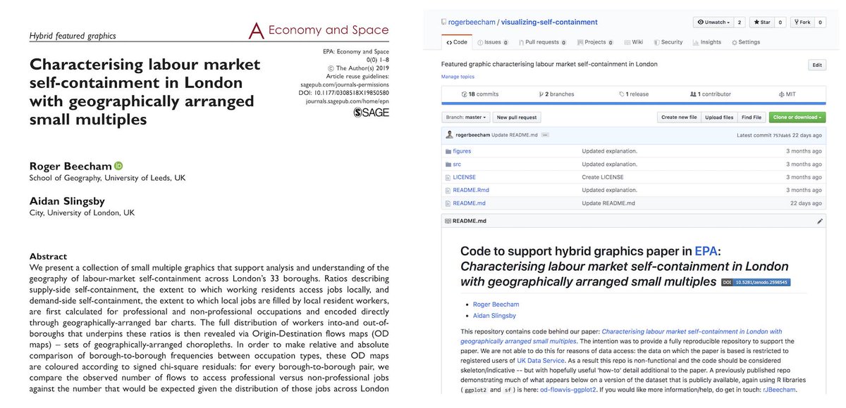
New @economyandspace short graphics paper with @aidanslingsby applying @gicentre techniques (including @xenografics) to explore labour market self-containment in London. Here's an attempt to re-present the analysis. (repo+paper - bit.ly/2KKLoDC) (1/25) 
LM self-containment is quantified using 2 ratios: supply-side - extent to which local residents access local jobs rather than commute elsewhere for work; demand-side - extent to which local jobs filled by local residents rather than workers commute in from nearby areas. (2/25)
In the paper we quickly explore self-containment ratios by London borough and occupation type. Here's an initial look: boroughs ordered left-to-right according to demand-side ratios with professional (purple) and non-professional (green) jobs shown separately. (3/25)
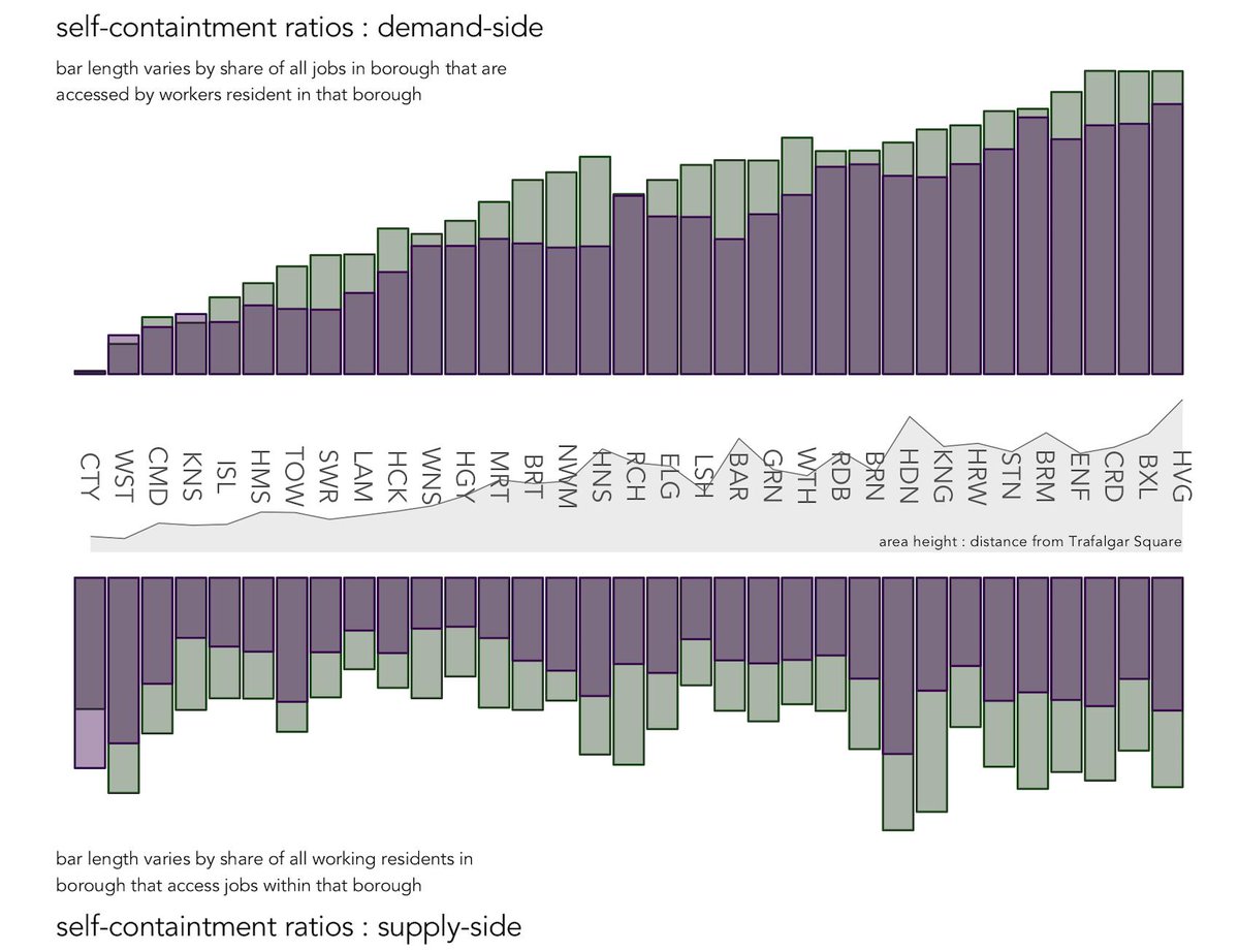
Headline: job-rich boroughs (CTY, WST) are associated with very low demand-side self-containment and prof jobs are associated with lower self-containment (both supply- and demand-) than non-prof jobs - the purple bars are almost always shorter than the green bars. (4/25)
I've tried to give some geographic context here - the x-axis labels also show each borough's distance from central London. Alternatively, we could reorder bars, grouped by borough, on their approximate geographic position, using @Afterthefloodco's layout. (5/25)
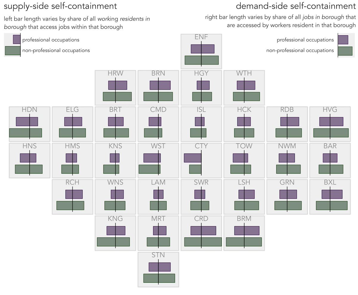
The new arrangement reinforces the higher self-containment scores for more obviously discrete, outer London boroughs: CRD, BRM and KNG in the south, HDN in the west and HVG in the east. Borough acronyms here: bit.ly/2IbcIt5. (6/25)
Behind these ratios there is a more interesting distribution of borough-to-borough (origin-destination) commutes that, when ordered by frequency, follow a pareto-type shape. Here's a rotated rank-size area chart for KNG, again with prof and non-profs compared. (7/25)

Destination boroughs to which KNG residents commute-out (left) and origin boroughs from which workers commute-in to KNG (right) are ordered bottom-to-top by frequency; these boroughs are labelled in axes and connecting lines show diffs in rank btw prof- and non-profs. (8/25)
The modal borough-borough commute by far (in bold) is residents living and working within borough. After this, the spread/diversity with which residents commute-out and non-resident workers commute-in is greater for prof job types - the pareto shape is less extreme. (9/25)
With a job-rich borough (CTY) the pattern is reversed: the spread of in-/out- commuting is greater amongst non-profs, especially so for in-commuting (right). Notice the switches in rank here (axes) suggesting a different *geography* of in-commuting btw prof and non-profs. (10/25)

Again, we can attempt between-borough comparison by generating charts for each borough, arranged according to their approximate geographic position. (11/25)

The rank-size area charts usefully characterise a 1d distribution of OD commutes behind LM self-containment ratios, but there are additional questions around the *geography* of this commuting behaviour ... (12/25)
...From which parts of the city do job-rich boroughs such as WST and CTY draw workers and how does this vary by occupation type? To which parts of the city do workers living in outer London boroughs commute and how sensitive to distance is commuting from those boroughs? (13/25)
To explore this, we generate contingency tables where each cell is an OD commute and frequencies of prof and non-prof jobs are compared. Tables are created for each borough and differently based on whether boroughs are destinations (commutes-in) or origins (commutes-out). (14/25)
Where CTY is a destination (workplace) borough, for example, we compare the frequencies of prof vs. non-prof workers commuting in from neighbouring boroughs against what would be expected given the relative number of those jobs available in CTY. (15/25)
An aside: We use signed chi-square residuals for comparing these frequencies. This has advantages over alternative measures of effect size (such as risk ratios) in that saliency is given to relative differences that are also large in absolute magnitude... (16/25)
... This adjustment is necessary since, given the heavy-tailed shape of OD commutes, there are several OD commute pairs with low counts, which may register large effect sizes, but on small absolute differences, if risk ratios were used. (17/25)
Here's a choropleth map of the signed difference values. There *is* a contrasting geography of in-commuting with non-profs overrepresented amongst those commuting in from east London and profs overrepresented amongst those commuting in from west London. (18/25)

Again, we can place choropleths for each borough according to their approximate geographic position to study all borough-borough commutes - this now becomes a full OD map (bit.ly/2I5YCJy). (29/25)
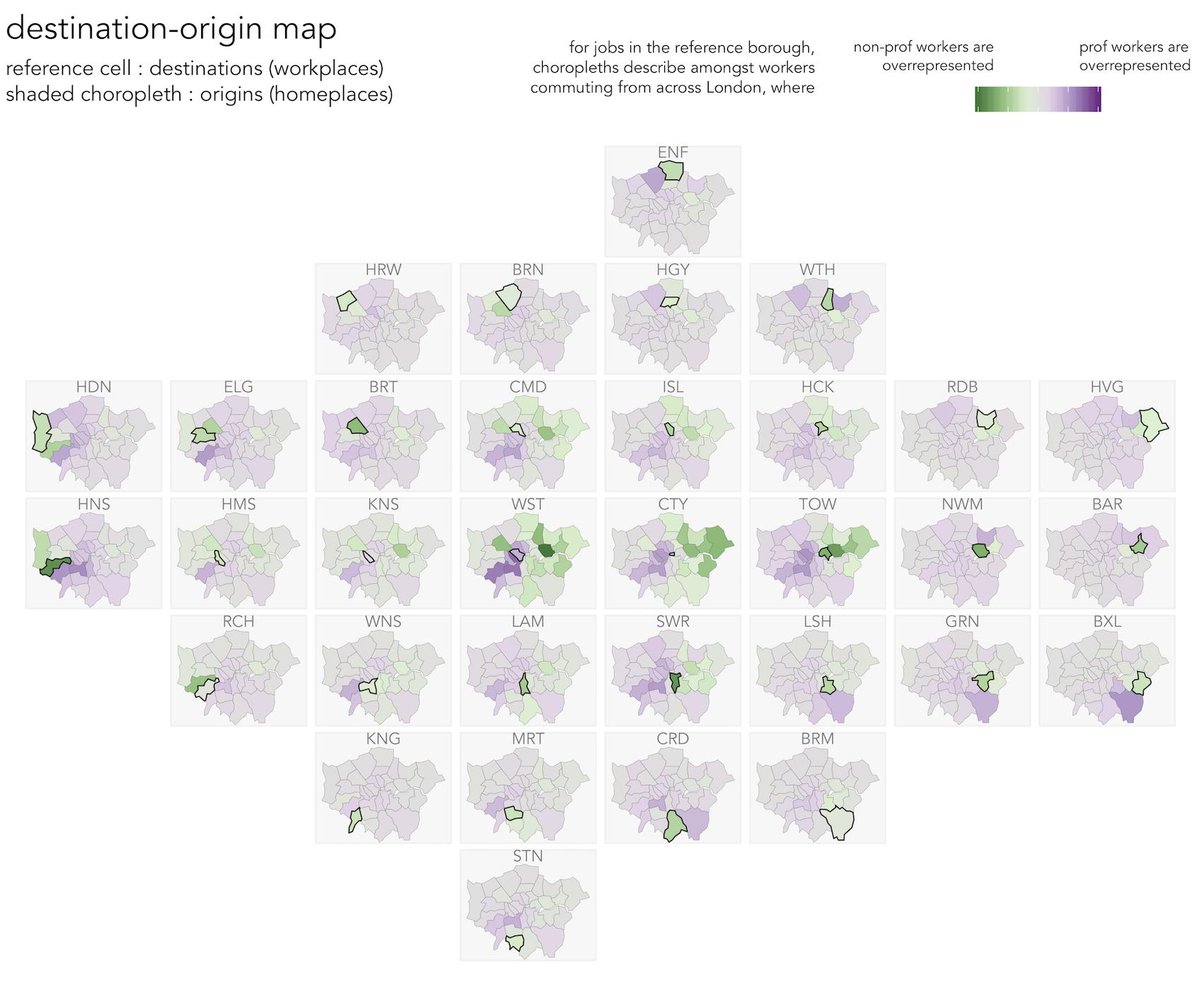
The updated map reflects differences in London’s socio-economic geography: as well as the non-prof commutes from east London, particularly salient is the darker purple showing high numbers of profs from WNS and RCH. (20/25)
Also, the fact that outside of central London, labour markets are more localised for non-profs - the reference cells are coloured green with the exceptions of CTY and WST. (21/25)
Finally, we explore this by switching the encoding to show out-commuting - making the reference boroughs origins and shading choropleths by destination. (22/25)

The new layout confirms that non-prof commuting is indeed more localised - reference boroughs and immediate neighbours are green; central boroughs are purple. But also that, even for profs into central London from outer boroughs – geography matters... (23/25)
...For boroughs to SE (BRM, GRN and SWR) darker purples are for jobs filled in TOW and CTY (boroughs in east London). For boroughs to west (HNS ELG), darker purples for jobs filled in WST, HMS. (24/25)
Code and further discussion at this github repo: github.com/rogerbeecham/v…. (25/25)

