Revisiting a tweet I botched a couple of days ago...Looks to me like Acemoglu, Autor, et al. argue that trade with China can explain at most something like 20% of the drop in manufacturing employment from 1999 to 2011. google.com/url?sa=t&sourc… /1
Not to minimize the impact on these workers. The point is that 80% of the drop would've happened anyway. Great industrial dreamers and national conservatives of the world, you are not going to get manufacturing jobs back. /2
In part, because busy 2-earner families demand cheap services. In part because they demand cheap goods, and technology makes goods ever cheaper. /3
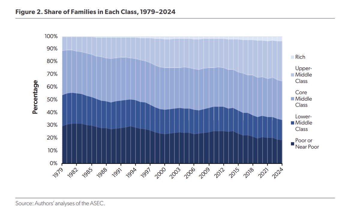
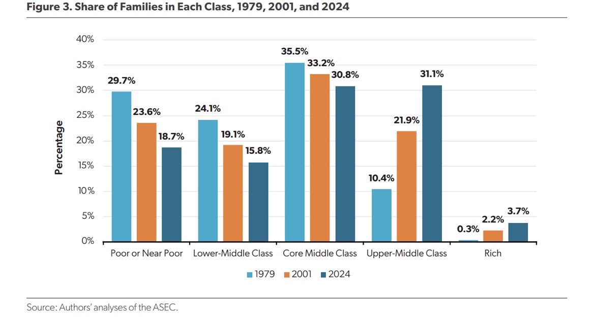
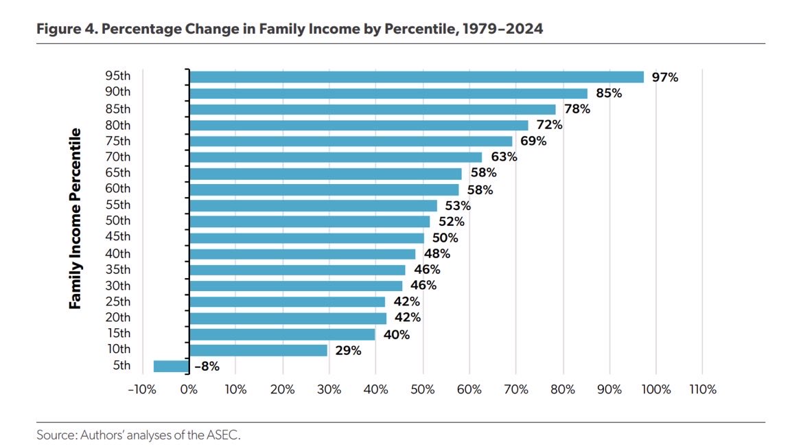
Also, median hourly pay for men and women, annual earnings, and household incomes are at all-time highs. Poverty is at an all-time low. Unemployment is at 50-year low. So we have that going for us.
• • •
Missing some Tweet in this thread? You can try to
force a refresh
My latest for @CivitasOutlook is out: “The American Dream Is Not a Coin Flip, and Wages Have Not Stagnated”
How many people are really better off than their parents? How many think they are? You’ll be surprised.
Declensionists sometimes point to objective measures to argue that we’re going down the tubes. Often, though, they get the details wrong.
Other times they argue that upbeat empirical claims must have problems because they don’t accord with Americans’ “lyin’ eyes”.
But what if the best objective measures align with subjective measures? And what if both told the same fairly upbeat story? That would be bad for declensionists.
What happened to hourly pay over the past 50+ years? That’s the topic of my latest paper.
One answer (from @AmerCompass) is this— it rose by 1% over the 50 years from 1972 to 2022.
That’s not right—though it’s only off by a factor of about 30, so…
Another answer, from @EconomicPolicy, also giving the misimpression that pay has lagged productivity:
And here’s a similar chart from @hamiltonproj (also wrongly suggesting pay growth has not kept pace with productivity growth):
OK, here are the charts I couldn't update in time for our event. 1. Median household income: Down from 2021, sure, but also down from 2019. Still a 30% real increase from 1979 if you use chained CPI linked to PCE. (33% post-tax).
BTW, those figures exclude employer health coverage and are pulled down over time by the rising share of retirees. Not American Carnage.
2. Median household income, female head, no spouse present: Down from 2021 but up from 2019. A 60% rise since 1979 whether looking at the pre-tax income or post-tax income including SNAP, school lunches, energy assistance.
This chart from @JonHaidt (via @arpitrage) leads me to ask: what if some of the decline in mental health during the smartphone era is due to overly pessimistic news being easily consumable & shareable for the first time coinciding with the Great Recession?
Obviously wouldn’t explain the pre-1985 rise in the chart, which is also interesting.
This would be an ironic development given the way media has covered the mental health decline.
This Matt Desmond article on poverty is definitely in the running for most embarrassing-or-dishonest piece I’ve ever read. There is not a credible poverty measure that doesn’t show a big decline in poverty over the long run. nytimes.com/2023/03/09/mag…
Here are some leading estimates of child poverty. Even the official poverty measure—which no one thinks is good—shows a drop.
Here’s the best paper I know of, by my colleague @kevincorinth and others, which finds that by contemporary standards of poverty, the overall rate fell from 70% to 10% nber.org/system/files/w…