Do you struggle to letter your comics? Do you find it boring? I've just released my basic lettering guide, aptly named Comic Lettering Basics, for anyone who wants to start learning how to improve their lettering!
🗯️physical evegwood.storenvy.com/products/29822…
🗨️PDF gumroad.com/l/letteringbas…
🗯️physical evegwood.storenvy.com/products/29822…
🗨️PDF gumroad.com/l/letteringbas…
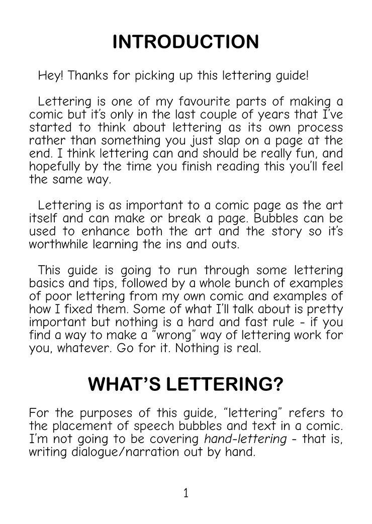
The first half of the guide walks you through the different aspects of lettering, and the second half is full of examples of poor lettering from my own work and how I changed it!
I wanted to talk about examples of good lettering I've seen out in the wild, so this is turning into a thread!
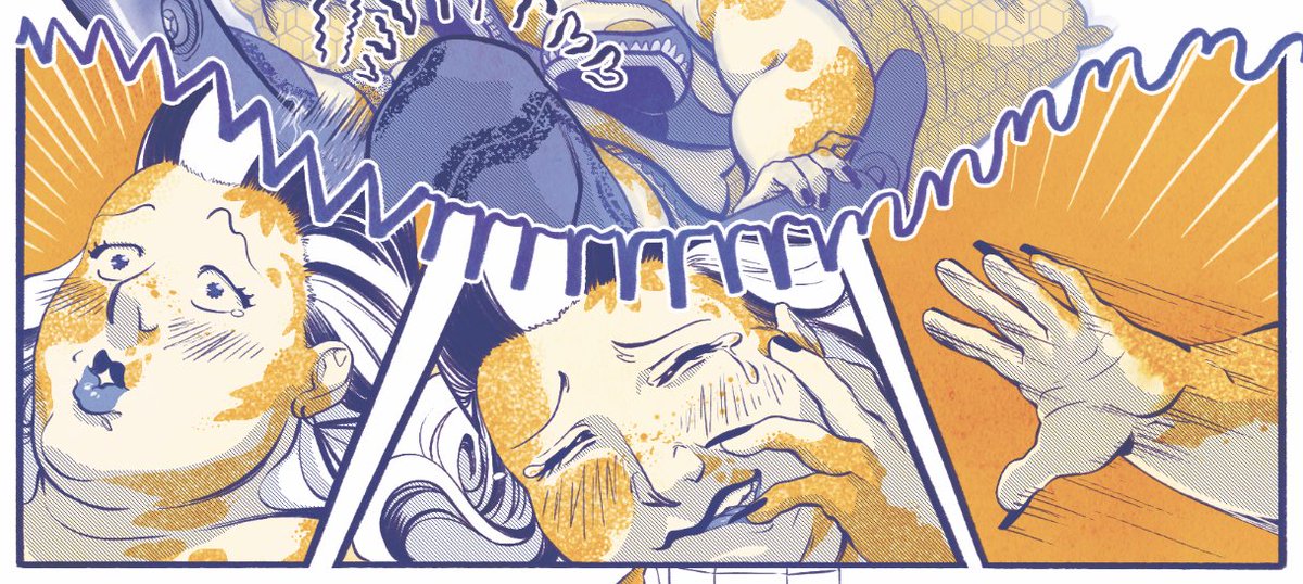
The first (and my favourite) example is this spread from Godshapers, written by @sispurrier, drawn by @jonasgoonface, and lettered by @colinbell.
The first (and my favourite) example is this spread from Godshapers, written by @sispurrier, drawn by @jonasgoonface, and lettered by @colinbell.
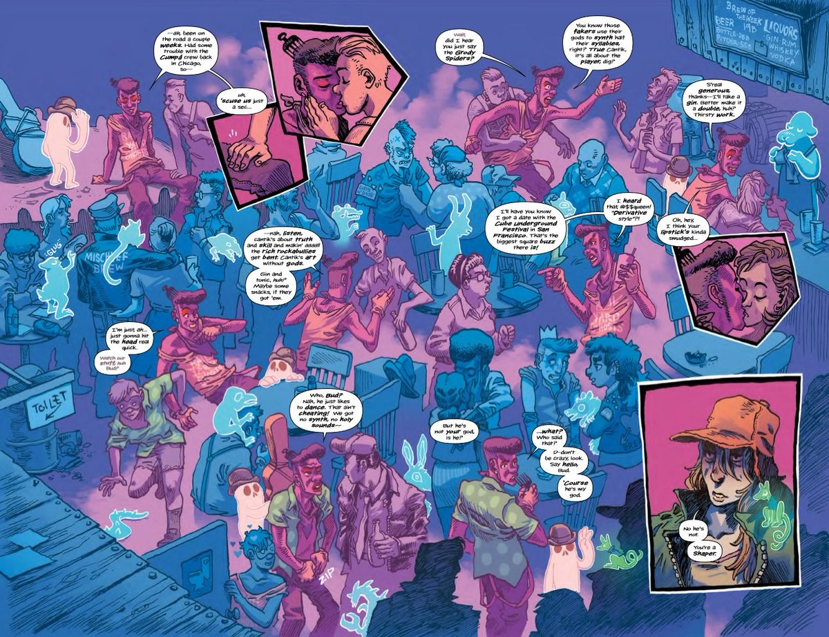
Jonas uses shapes and colours to guide your eye through the crowd but it would be really easy to ruin that with poorly placed bubbles. Colin's lettering works with the flow of the art!
Here's an explanation from Jonas about how he laid the page out
Here's an explanation from Jonas about how he laid the page out
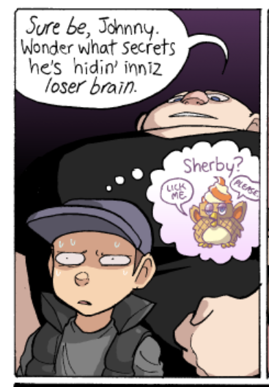
@paranaturalzack uses creative lettering in Paranatural (paranatural.net) to easily indicate tone or pace of speech. Their bubbles/text vary wildly in colour and shape, and sometimes they include images in a bubble alongside words, which is SUCH a great idea.
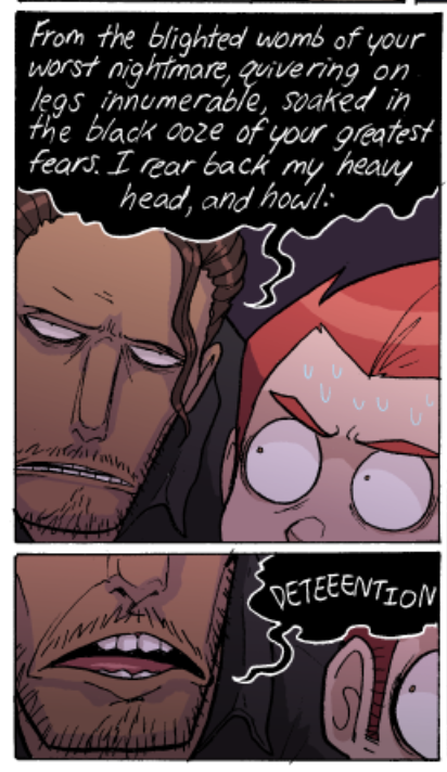
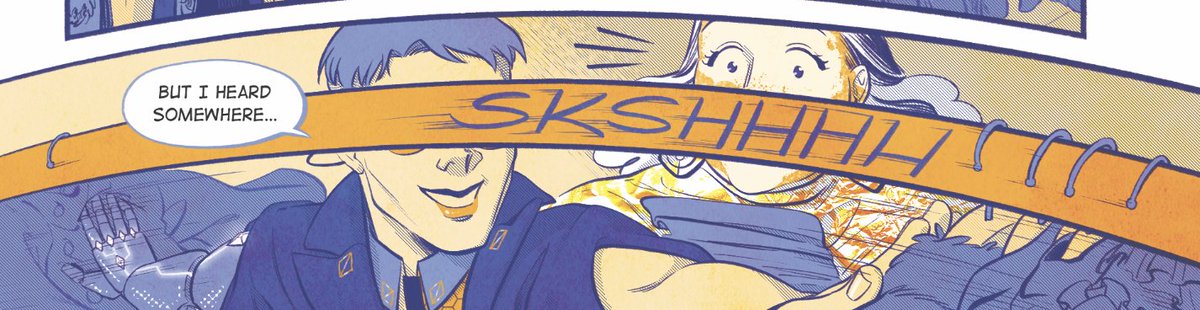
@jadedlyco's sound effects in their comic for @ComeTogetherAn are TOP TIER. Sound effects are integrated into the art rather than simply being placed on top of the page and you can Feel the sound they're representing just by how Jade changes up the lettering style.
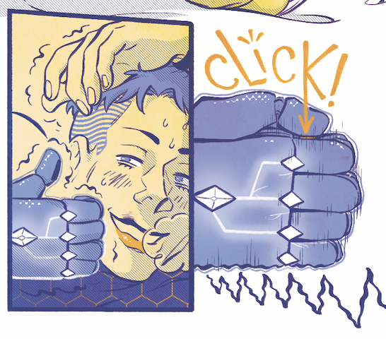
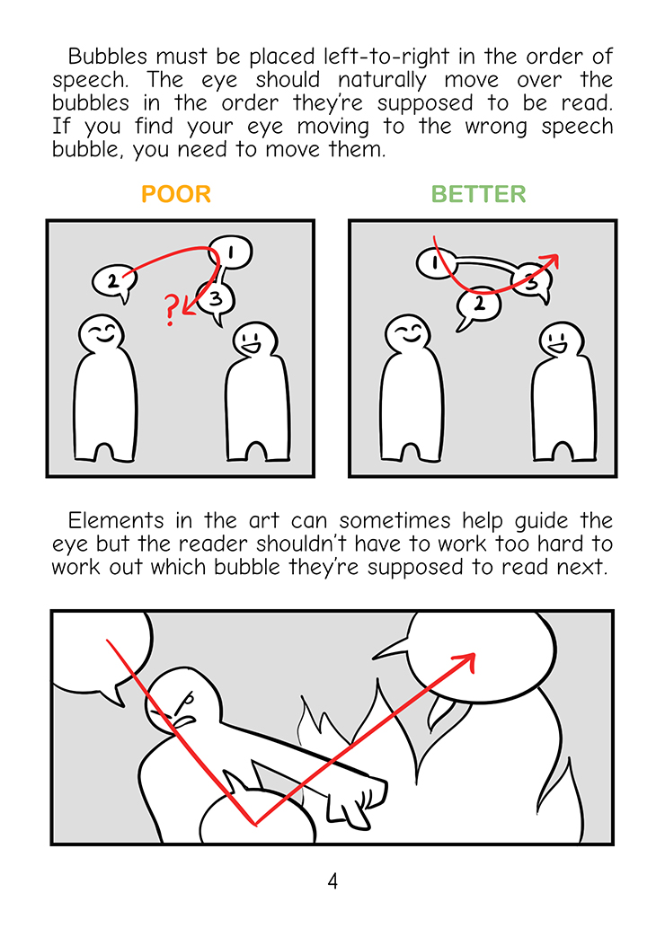
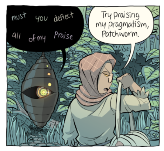
You don't have to go crazy with lettering for it to be good. More often than not, you don't notice good lettering, because it doesn't draw attention to itself by being bad. Here are some examples of good lettering that fits with the style of the comic:
Tiger, Tiger (tigertigercomic.com) by @petra_nordlund
The hand-drawn bubbles and grey fill match the greyscale colour palette, and bubbles are placed perfectly to pace the page.
The hand-drawn bubbles and grey fill match the greyscale colour palette, and bubbles are placed perfectly to pace the page.
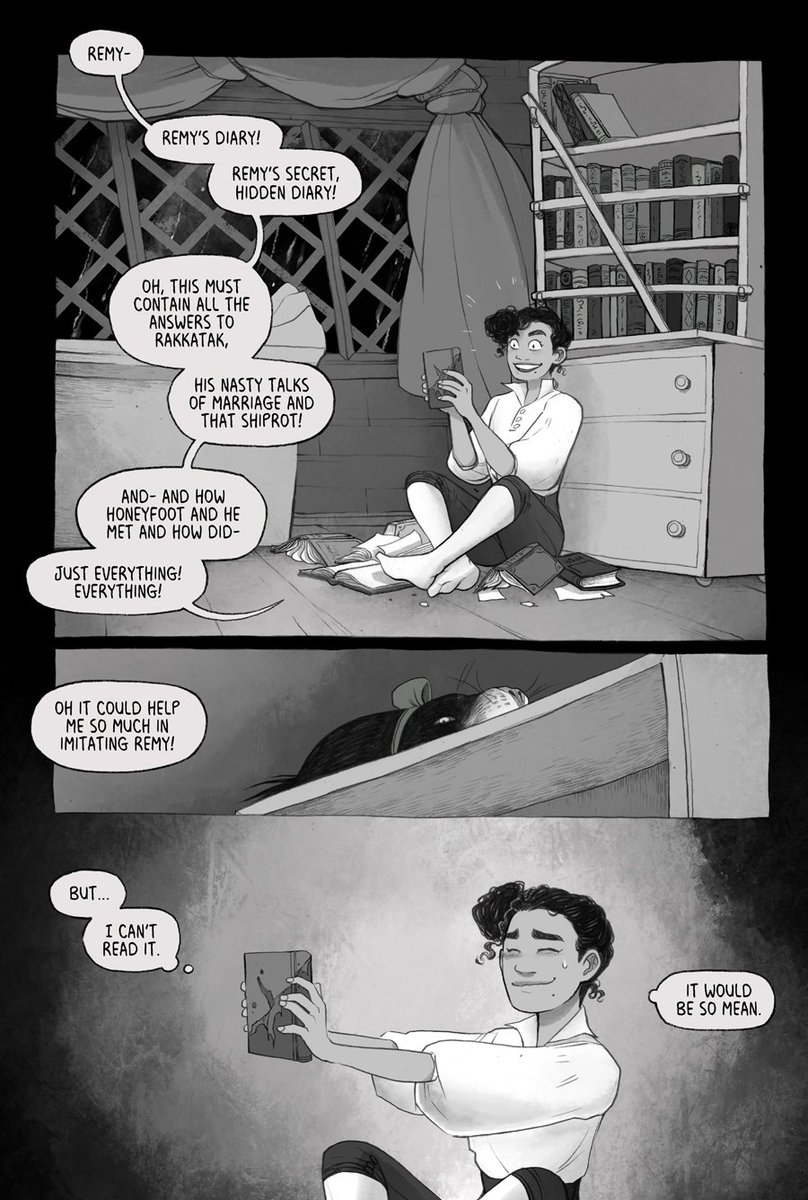
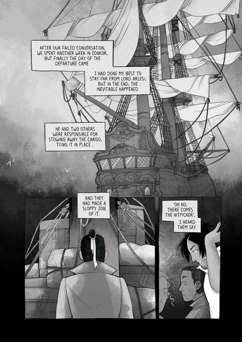
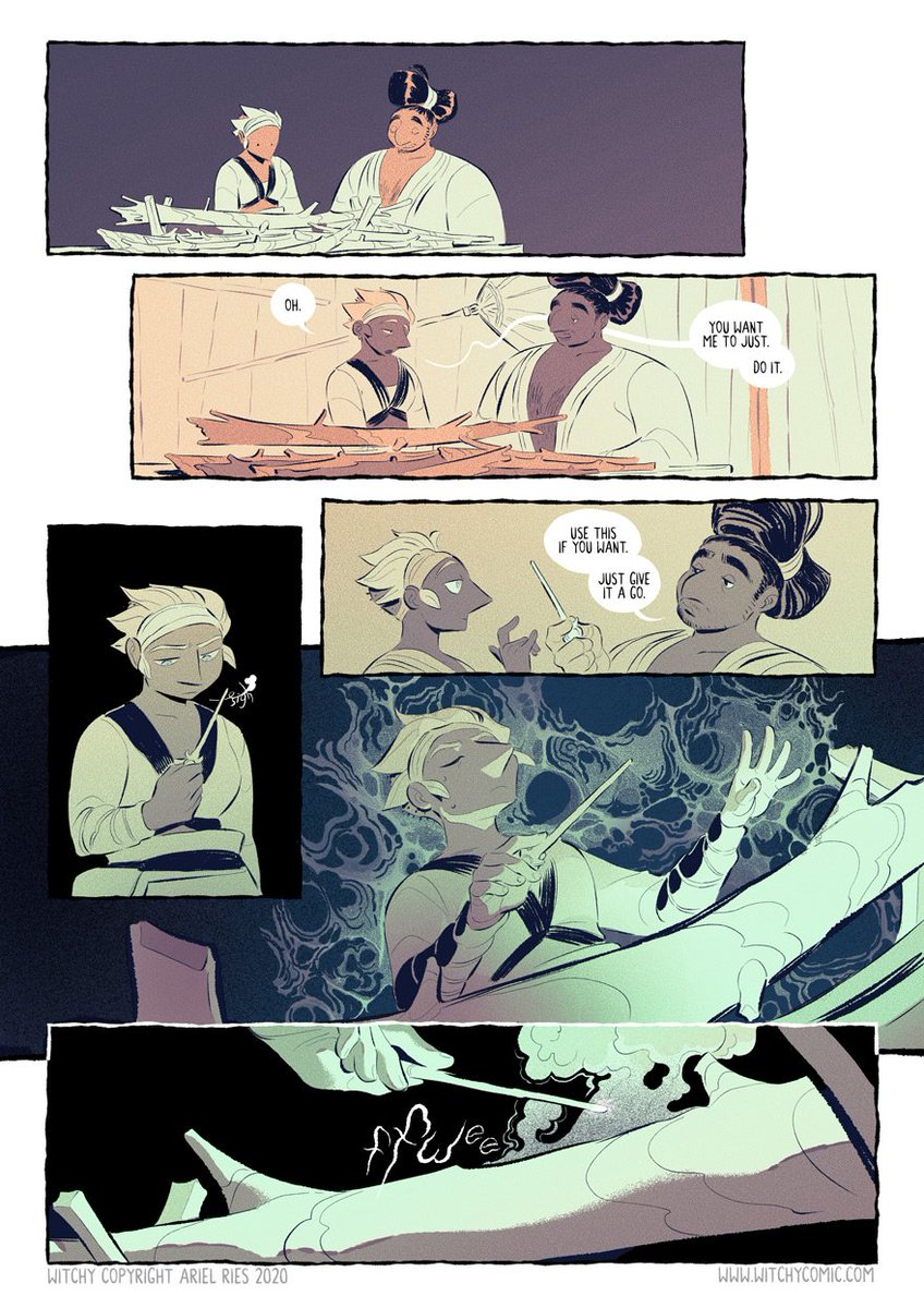
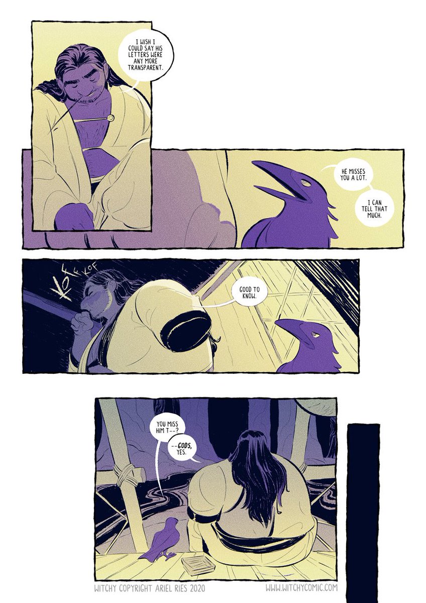
Witchy (witchycomic.com) by @cousineggplant
The comic is uses a limited colour palette and minimal lines, so having lineless bubbles really suits the page and doesn't make them stand out dramatically. Lines are only included on a bubble when it would otherwise get lost.
The comic is uses a limited colour palette and minimal lines, so having lineless bubbles really suits the page and doesn't make them stand out dramatically. Lines are only included on a bubble when it would otherwise get lost.
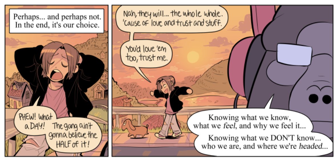
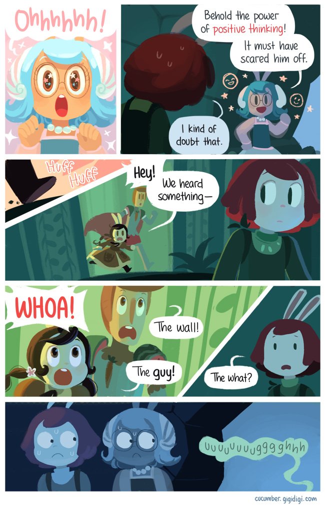
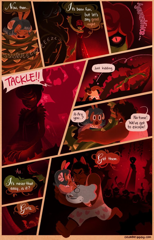
Cucumber Quest (cucumber.gigidigi.com) by @gigideegee
The rounded hand-lettering matches the comic's bouncy style. Gigi also uses coloured bubbles to show tone, and by matching the colours with the page's colour palette they blend into the art and make the page look cohesive.
The rounded hand-lettering matches the comic's bouncy style. Gigi also uses coloured bubbles to show tone, and by matching the colours with the page's colour palette they blend into the art and make the page look cohesive.
If you're finding that your lettering just isn't working and you're not sure where you're going wrong, I can do consultations reviewing 3 of your pages for £10. I'll edit the lettering on those pages and give you overall feedback. More info here: forms.gle/yTGbApKtMFxCaj… ✨