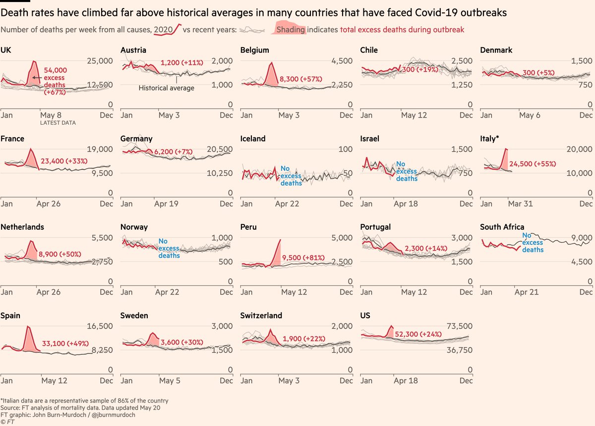
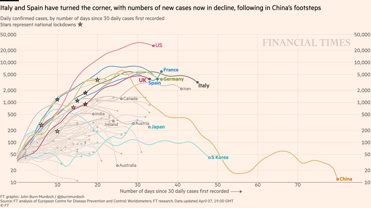
NEW: Tue 7 April update of coronavirus trajectories
Big changes here, so tonight’s thread will be fewer charts and more explanations.
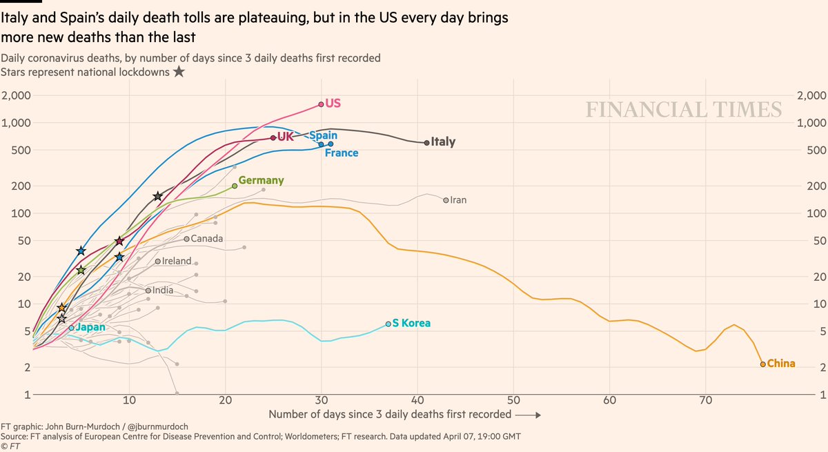
Here’s the revamped daily deaths chart. I’ve switched from a 7-day rolling average to true daily numbers*
All charts: ft.com/coronavirus-la…
Big changes here, so tonight’s thread will be fewer charts and more explanations.
Here’s the revamped daily deaths chart. I’ve switched from a 7-day rolling average to true daily numbers*
All charts: ft.com/coronavirus-la…

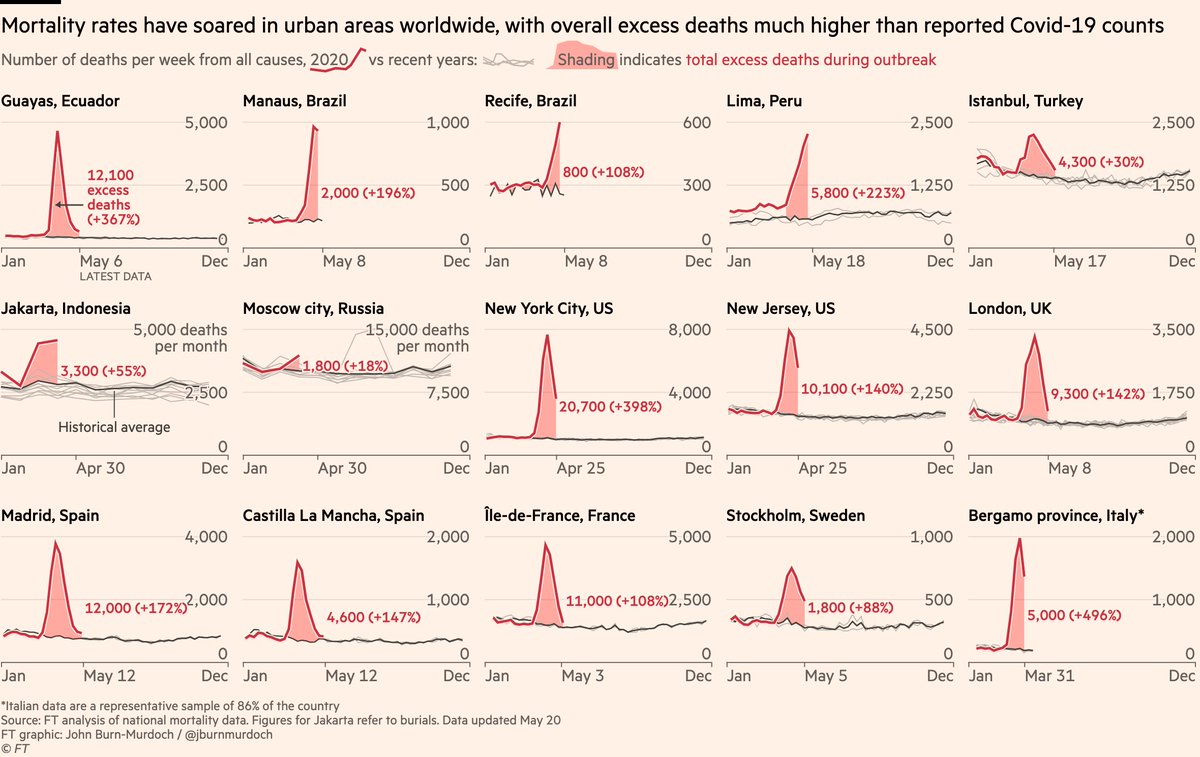
*Well, not strictly true daily numbers. Here’s what true daily numbers look like:
Good luck following any path on that...
Good luck following any path on that...
Noisiness of the raw daily data prompted us to go with a rolling average, and as you can see that gives us much smoother, easier-to-follow lines.
But it has drawbacks, too: because it’s affected by the last 7 days, latest point doesn’t match up with number in the news that day.
But it has drawbacks, too: because it’s affected by the last 7 days, latest point doesn’t match up with number in the news that day.
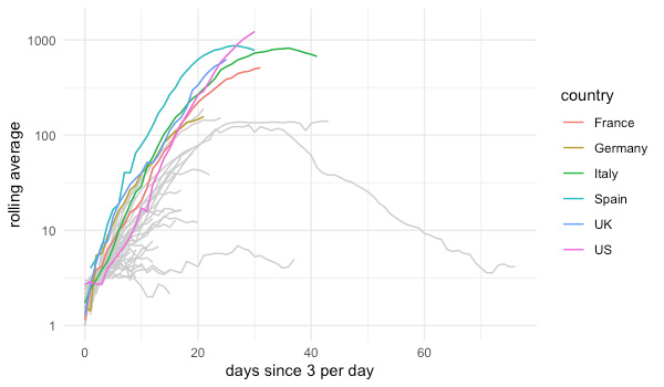
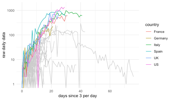
So now we come to today’s compromise: we’re using a spline function to smooth each line, such that we get nice smooth, traceable curves, but every point on the line is more faithful to that day’s true data point than the rolling average was.
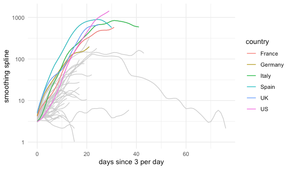
We can see that here.
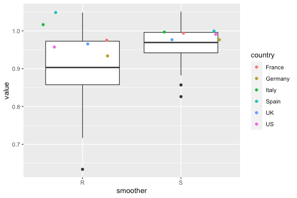
On the left is how well the rolling average points matched up to that day’s value; on the right is how well the new spline method does.
The target is a value of 1, and the spline gets us much closer to that, for the average country and for all countries.
On the left is how well the rolling average points matched up to that day’s value; on the right is how well the new spline method does.
The target is a value of 1, and the spline gets us much closer to that, for the average country and for all countries.
Spline isnt perfect either. Still get swings as data jumps around from day to day. Those jumps are often false precision due to lags in reporting. Part of me prefers the rolling avg as it better represents medium-term trends, but folks didn’t like that it was always "out of date"
e.g if we look at daily numbers for the UK, Sun & Mon were both down on the previous day, yet our rolling average saw a continued upward trend where the spline would have read them as a dip.
Here’s yesterday’s data plotted using the rolling average (left) and the spline (right)
Here’s yesterday’s data plotted using the rolling average (left) and the spline (right)
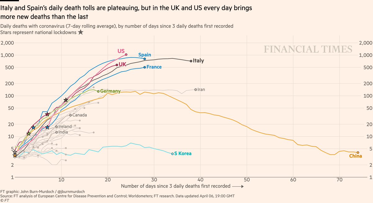
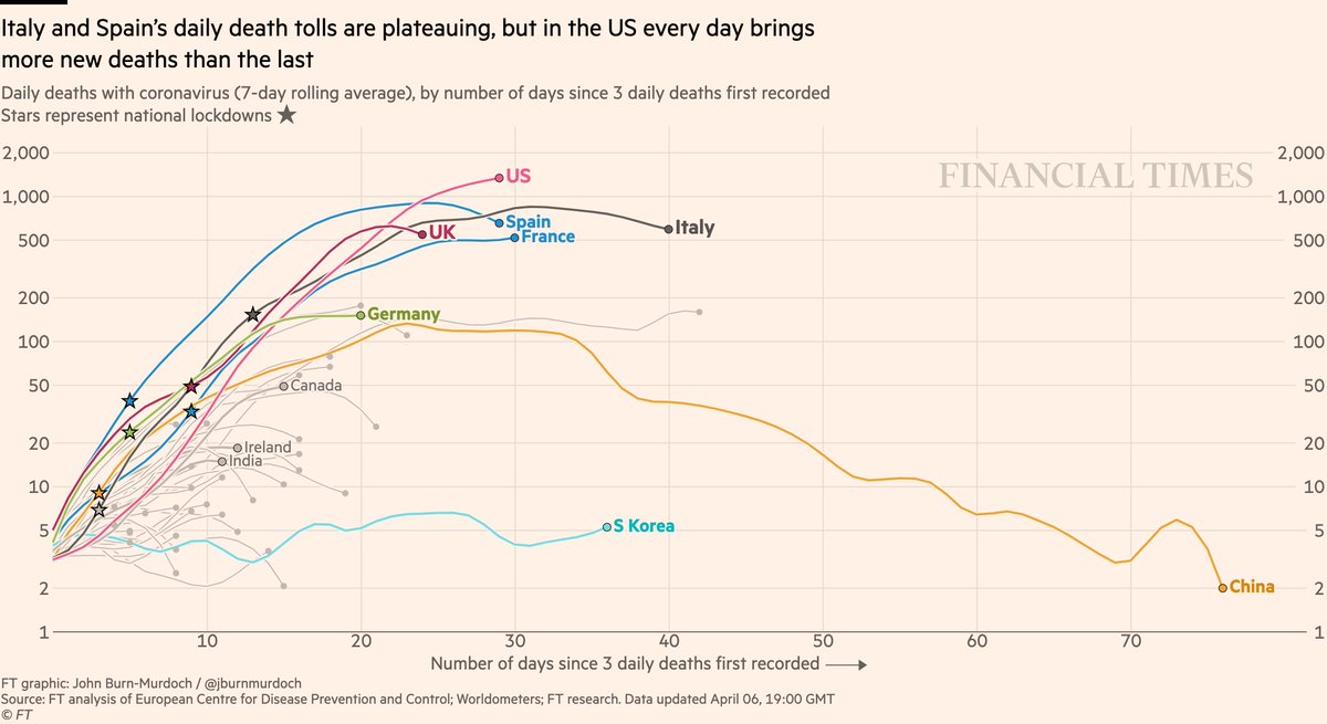
So, here’s the new version again:
• UK curve has flattened due to two dips then a spike. Wait and see what the week brings
• Germany trending upwards
• Japan now on the chart and trending up 📈
All charts: ft.com/coronavirus-la…
• UK curve has flattened due to two dips then a spike. Wait and see what the week brings
• Germany trending upwards
• Japan now on the chart and trending up 📈
All charts: ft.com/coronavirus-la…
What do you think?
• Rolling average, because it irons out false precision from noisy daily reporting and highlights medium-term trends?
• Spline, because we still have smoothness for following individual lines, but we’re also more faithful to that day’s reported data point?
• Rolling average, because it irons out false precision from noisy daily reporting and highlights medium-term trends?
• Spline, because we still have smoothness for following individual lines, but we’re also more faithful to that day’s reported data point?
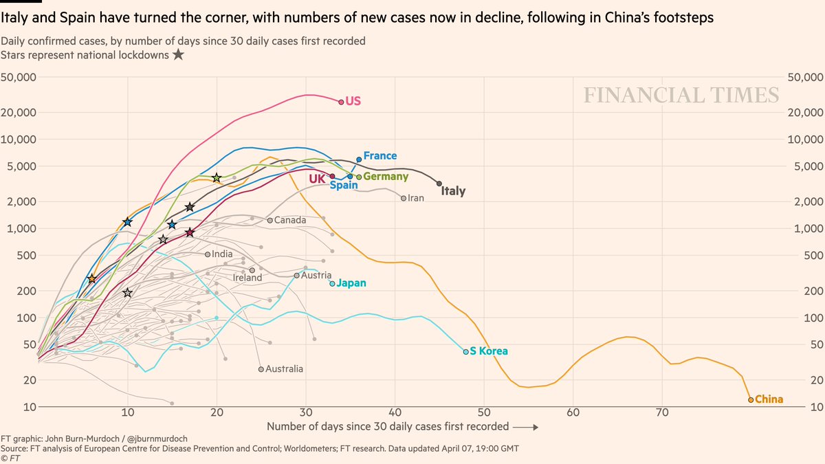
And now the other charts. First, the spline method for new daily cases:
• New confirmed US cases may have peaked, same for UK. Does this mean outbreaks have peaked? Time will tell
• Austria cases trending down; they plan to start easing lockdown next week
• New confirmed US cases may have peaked, same for UK. Does this mean outbreaks have peaked? Time will tell
• Austria cases trending down; they plan to start easing lockdown next week
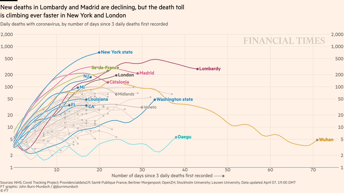
Now regions:
• The spline still sees New York’s daily deaths trending upwards every day, same for London
• New Jersey announced record new death toll today, sending its curve bending back up
• Washington state now starting to trend up long after initial cases
• The spline still sees New York’s daily deaths trending upwards every day, same for London
• New Jersey announced record new death toll today, sending its curve bending back up
• Washington state now starting to trend up long after initial cases
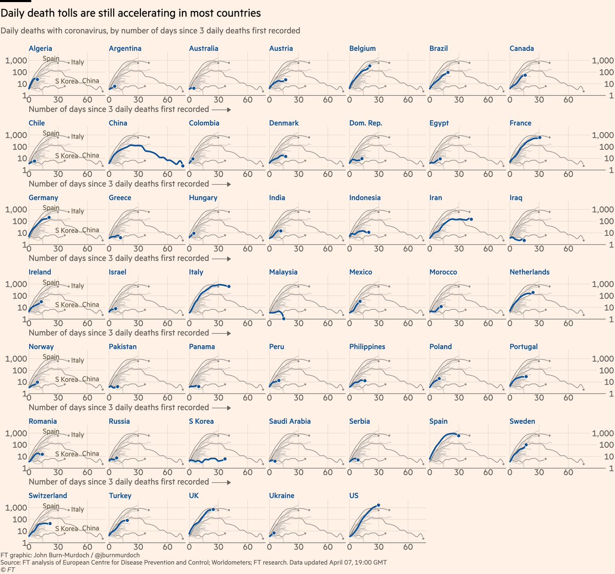
And finally small multiples for daily deaths for 47 countries:
Hopefully this also gives some insight into the huge amount of work that goes into these behind the scenes, the amount of thought that goes into every pixel, and the constant compromises that must be made.
The charts you see every night are just the last step in a giant process.
The charts you see every night are just the last step in a giant process.
I’d also add that digging into the innards of this today, and playing more attention to the raw daily numbers for smaller countries, has left me very concerned about data quality.
Vast amounts of the data coming in from individual countries is essentially junk.
Vast amounts of the data coming in from individual countries is essentially junk.
Take Ecuador, where according to the data, deaths are trending downwards into single digits, yet literal vultures are circling overhead as coffins lie in the streets ft.com/content/5e9704…
This is one of countless examples.
Look at the lines arcing downwards in the lower left. I’m skeptical that more than one or two are truly containing the outbreak.
Data quality is a fundamental problem, but one advantage of the rolling avg is it irons out those daily quirks.
Look at the lines arcing downwards in the lower left. I’m skeptical that more than one or two are truly containing the outbreak.
Data quality is a fundamental problem, but one advantage of the rolling avg is it irons out those daily quirks.
Far more likely is that lower curves for developing countries represent massive under-testing, and an overwhelmed health statistics infrastructure.
Even in developed countries we know the stats are flawed, but this will be worse elsewhere: ft.com/content/c07e26…
Even in developed countries we know the stats are flawed, but this will be worse elsewhere: ft.com/content/c07e26…
So maybe the rolling average will return tomorrow, as it removes the illusion that daily numbers really represent any kind of "ground truth", and better represents what they *do* show:
A foggy picture of general trends in messy outbreaks that are incredibly difficult to track.
A foggy picture of general trends in messy outbreaks that are incredibly difficult to track.
I’m still glad I did the splines, even if it did keep me up until 1am:
• It demonstrates why we opted for the rolling average in the first place
• It highlights the problems with the raw data
• It was a useful exercise to undertake that will come in useful in future
🤓😀😵😴
• It demonstrates why we opted for the rolling average in the first place
• It highlights the problems with the raw data
• It was a useful exercise to undertake that will come in useful in future
🤓😀😵😴
Oh, one final thing before I log off:
Courtesy of a brilliant tip-off from @Crick247, here’s a very interesting bit of weekly "seasonality" in reported UK daily deaths:
Every Sunday and Monday, reported deaths are lower than Saturday. Every Tuesday, they rise sharply 🧐
Why?
Courtesy of a brilliant tip-off from @Crick247, here’s a very interesting bit of weekly "seasonality" in reported UK daily deaths:
Every Sunday and Monday, reported deaths are lower than Saturday. Every Tuesday, they rise sharply 🧐
Why?
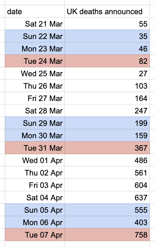
My theory:
• We know these numbers are allocated to a day based on when they can be reported, not when that person died
• We also know they are deaths that occurred before the day of reporting
• NHS England only reports a death once family members have been informed
• We know these numbers are allocated to a day based on when they can be reported, not when that person died
• We also know they are deaths that occurred before the day of reporting
• NHS England only reports a death once family members have been informed

• Hunch: NHS either make fewer attempts or find it harder to get through to relatives over the weekend (or some other bit of processing slows at wknds)
• So despite deaths occurring on Sat & Sun, fewer get processed over the weekend, depressing the reported numbers on Sun & Mon
• So despite deaths occurring on Sat & Sun, fewer get processed over the weekend, depressing the reported numbers on Sun & Mon

• And then on Mon, that processing/informing bottleneck is cleared, resulting in a glut of deaths in Tuesday’s report
• This happened like clockwork today
• This happened like clockwork today

Almost forgot: dinner tonight (last night?) was an amazing mushroom risotto.
Usually we cook together, but this one was painstakingly prepared while I sat at my laptop growing increasingly exasperated with spline functions.
My girlfriend is the real hero behind the charts 😍
Usually we cook together, but this one was painstakingly prepared while I sat at my laptop growing increasingly exasperated with spline functions.
My girlfriend is the real hero behind the charts 😍