
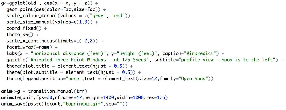
I took my three point "windup" charts and animated them.
Note Steph Curry's quick release. The animation starts at the beginning of each player's shooting motion. The ball is out of Steph's hands much sooner than the rest.
Derived from 2013-2016 tracking data.
1/
Note Steph Curry's quick release. The animation starts at the beginning of each player's shooting motion. The ball is out of Steph's hands much sooner than the rest.
Derived from 2013-2016 tracking data.
1/
Here is the overhead view (the path the ball traces if viewed from directly above the player).
While the profile view all looks like a variation of an S-curve, there's a lot more variety here from player to player.
Very little wasted movement in Steph's shot.
2/
While the profile view all looks like a variation of an S-curve, there's a lot more variety here from player to player.
Very little wasted movement in Steph's shot.
2/
Lebron's chart has a "perfect loop" quality about it.
Lesson learned: small multiples + animation can make for compelling data visualization.
4/
4/
• • •
Missing some Tweet in this thread? You can try to
force a refresh


