My Authors
Read all threads
There is a reason. When the original trilogy was made, Aurebesh did not exist yet. Joe Johnston had created a writing system that was used on a few screens and props throughout the trilogy. This writing system didn't map to any real-world language, so when characters were 1/
reversed or inverted, it didn't really matter.

This writing system is most visible on the Star Destroyer screen in Return of the Jedi, checking code clearance for the stolen shuttle.

In 1994, Stephen Crane developed Aurebesh based on the symbols he could see on that screen, 2/
for use in the table-top game Star Wars Miniatures Battles. Presumably, he copied them from a paused VHS tape, as some of them differ significantly from Johnston's designs, but in ways that would be forgivable given the bloom on the VHS version of the film.

Around the same 3/
time, the Special Edition versions of the films were being produced, and Stephen Crane's design for Aurebesh was used to replace plain old English on the Death Star's tractor beam controls.

In the late 90s, inspired by the Special Edition releases and the upcoming Prequels, a 4/
number of fans decided it would be cool to create their own Aurebesh fonts, deriving their shapes from Stephen Crane's designs, but including other elements they saw on screen.

For instance, why were the letters on screen sometimes flipped? Perhaps it could be a capital/lower 5/
case distinction? They ran with that.

I'm still in the process of doing the GeoCities archeology to figure out who did it first (I will add it to the bottom of the thread when I figure it out).

This was a thriving time for the Star Wars font-making community, and most 6/
Star Wars fonts that you'll find have their origins sometime between 1998 and 2004.

Episode I introduced numerous additional writing systems (Trade Federation, "Boonta", Outer Rim Basic), which these online font-enthusiasts created and shared around.

Something not accounted 7/
for among these fan-made fonts, is the variation of Aurebesh seen in Anakin's naboo-starfighter. It's notable for several reasons:

1) It contains R2D2's first and last directly translatable lines in Star Wars

2) It contains a typo (home => homie)

3) It is a new version of 8/
Aurebesh, seen here and never again, and nobody has made a font of it, please someone make a font of it

4) Among the changes to the design is that the letter A is backwards (and not just for capital letters)

Attack of the Clones continued the supply of new scripts with the 9/
introduction of Mandalorian and Geonosian, (both by Philip Metschan), and at least one unidentified script.

It also introduced "Star Wars 76." This was a font designed by Metschan, based on Joe Johnston's original design. Metschan's font only contains A-U, as one goal was to 10/
avoid looking to much like English. Getting back to your original question, relative to the Star Destroyer screen, these letters were all flipped 180 deg.

For the font-fans, Revenge of the Sith was a bit of a disappointment. Where each of the previous two films introduced 11/
several brand new writing systems, Episode III only gave us one, in the form of the warning screen on Mustafar. And so they tapered off in their creation of fonts.

I've not been able to contact any of them, as most of their email addresses are long-since defunct. But their 12/
influence nevertheless carries on:

Since the pre-2004 Aurebesh fonts set the standard for fonts to come, most every Aurebesh font created between 1998 and 2019 included reversed capital letters.

The ease and availability of these fonts has made it difficult to shake off, 13/
even as inverted/reversed capitals have been declared not-canon.

From video-games to official publications and advertisements, these fan-made fonts still get used from time to time, and if you can't easily read Aurebesh yourself, you're unlikely to even notice that there's 14/
something amiss.

So my answer is this: It's not laziness.

In 1976, it didn't matter.
In 1998, it seemed the only way to reconcile with what was onscreen.
In 2013, that's the way it's always been.
In 2015, what is and isn't canon means a lot of things get reevaluated 15/
In 2020, this well may be the least important thing you think about today.

I don't believe the backwards capitals will ever die out completely, because freeware has staying power, and "canon" can't repel staying power of that magnitude.

But as LFL has developed their own 16/
official fonts for Aurebesh, and continues to discourage the use of fonts from other sources, we will see them less and less in official media, at least. 17/17
Missing some Tweet in this thread? You can try to force a refresh.

Enjoying this thread?

Keep Current with AurekFonts

Profile picture

Stay in touch and get notified when new unrolls are available from this author!

Read all threads

This Thread may be Removed Anytime!

Twitter may remove this content at anytime, convert it as a PDF, save and print for later use!

Try unrolling a thread yourself!

how to unroll video

1) Follow Thread Reader App on Twitter so you can easily mention us!

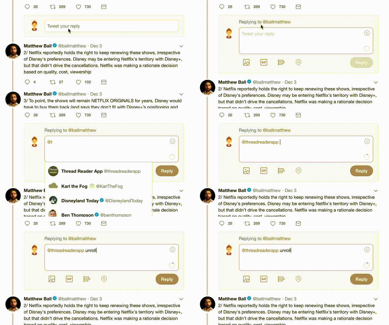
2) Go to a Twitter thread (series of Tweets by the same owner) and mention us with a keyword "unroll" @threadreaderapp unroll

You can practice here first or read more on our help page!

Follow Us on Twitter!

Did Thread Reader help you today?

Support us! We are indie developers!


This site is made by just two indie developers on a laptop doing marketing, support and development! Read more about the story.

Become a Premium Member ($3.00/month or $30.00/year) and get exclusive features!

Become Premium

Too expensive? Make a small donation by buying us coffee ($5) or help with server cost ($10)

Donate via Paypal Become our Patreon

Thank you for your support!