
Leading up to my Landing Page course, here are 100 Landing Page hot tips over the next 100 days.
Simply follow this thread 👇 or get em dripped to email: onepagelove.com/100
🔥 Landing Page Hot Tip #01 - Utilize testimonials to further highlight features & answer doubts:
Simply follow this thread 👇 or get em dripped to email: onepagelove.com/100
🔥 Landing Page Hot Tip #01 - Utilize testimonials to further highlight features & answer doubts:

🔥 Landing Page Hot Tip #02 is showcase testimonials from a similar demographic to your potential customer.
Selling enterprise-level support software? Curate testimonials from enterprise-size businesses:
(bonus guide: how to request great testimonials: onepagelove.com/requesting-tes…)
Selling enterprise-level support software? Curate testimonials from enterprise-size businesses:
(bonus guide: how to request great testimonials: onepagelove.com/requesting-tes…)

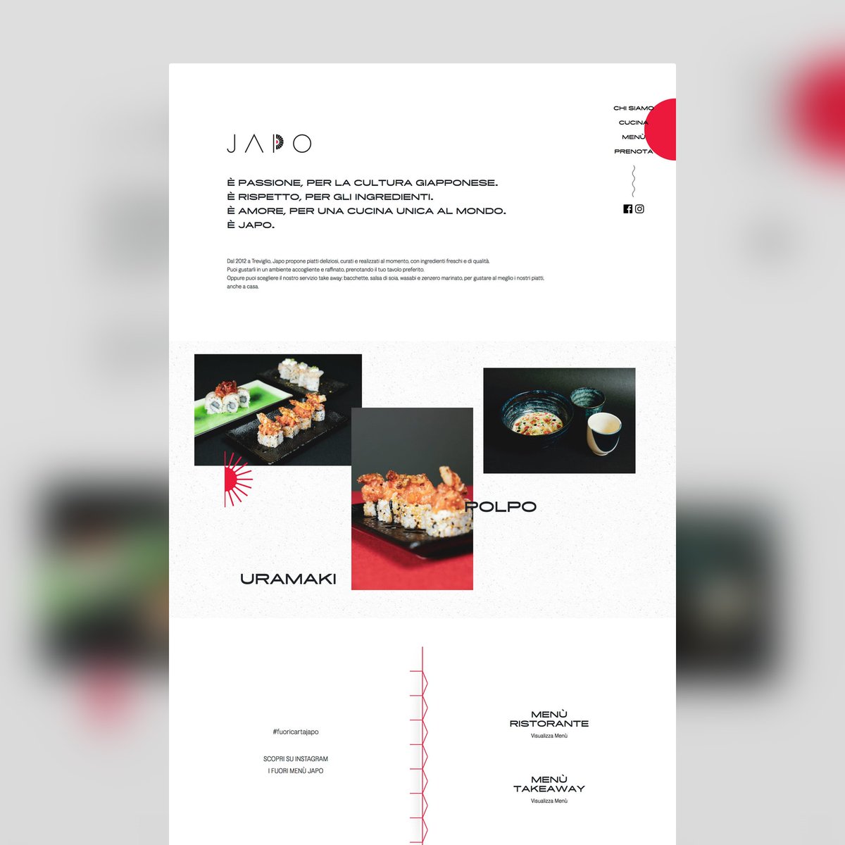
🔥 Landing Page Hot Tip #03 is fewer images, better images.
Good imagery builds trust and trust is the foundation for conversions.
Spend the money.
Get a photoshoot of your team, your product, your food. The ROI of a professional photoshoot is pretty much guaranteed.
Good imagery builds trust and trust is the foundation for conversions.
Spend the money.
Get a photoshoot of your team, your product, your food. The ROI of a professional photoshoot is pretty much guaranteed.


🔥 Landing Page Hot Tip #04 is spice up those Call-To-Action (CTA) buttons.
You are excited to share your product/service.
🚫 Click Here
🚫 Sign Up
Use _actionable_ phrases.
✅ Discover the wonders of science
✅ Request a call from our agents
✅ Unlock creativity for only $19
You are excited to share your product/service.
🚫 Click Here
🚫 Sign Up
Use _actionable_ phrases.
✅ Discover the wonders of science
✅ Request a call from our agents
✅ Unlock creativity for only $19

🔥 Landing Page Hot Tip #05 is when in doubt, double the padding.
"Whitespace" is not just breathing room for your content but breathing room for the visitor.
Digestible content improves focus and allows for a better understanding of your offering.
"Whitespace" is not just breathing room for your content but breathing room for the visitor.
Digestible content improves focus and allows for a better understanding of your offering.

🔥 Landing Page Hot Tip #06 is resonate with the visitor's problem using your intro copy.
Then explain _exactly_ what your product/service does in the subtext, removing all verbose words🗑
Let the visitor feel your offering was destined for them, in the simplest way possible.
Then explain _exactly_ what your product/service does in the subtext, removing all verbose words🗑
Let the visitor feel your offering was destined for them, in the simplest way possible.

🔥 Landing Page Hot Tip #07 is avoid center-aligned or justified paragraph text.
When applied to long paragraphs, it can create quite a difficult reading experience. Resulting in fatigue.
A good rule-of-thumb is any paragraph beyond two lines should be left or right-aligned.
When applied to long paragraphs, it can create quite a difficult reading experience. Resulting in fatigue.
A good rule-of-thumb is any paragraph beyond two lines should be left or right-aligned.

🔥 Landing Page Hot Tip #08 is replace, don't add.
Aim to replace old content when new content arrives.
Your LP with 8 testimonials, does not need a 9th. Remove the weakest of the bunch.
The goal is to persuade your visitors with as little as possible, not as much as possible.
Aim to replace old content when new content arrives.
Your LP with 8 testimonials, does not need a 9th. Remove the weakest of the bunch.
The goal is to persuade your visitors with as little as possible, not as much as possible.

🔥 Landing Page Hot Tip #09 is to set a single objective.
Effective Landing Pages have only one objective, not a few.
🚫 Sell our eBook + promote our job board
✅ Sell our eBook
The beauty of a Landing Page is the single canvas to persuade the visitor to do one thing.
Effective Landing Pages have only one objective, not a few.
🚫 Sell our eBook + promote our job board
✅ Sell our eBook
The beauty of a Landing Page is the single canvas to persuade the visitor to do one thing.

🔥 Landing Page Hot Tip #10 is to create a text color hierarchy.
The biggest tell a Landing Page was rushed is a maximum contrast #000000 text on a #FFFFFF background.
Soften the blow with an off-white background and a subtle grey/color text hierarchy.
The biggest tell a Landing Page was rushed is a maximum contrast #000000 text on a #FFFFFF background.
Soften the blow with an off-white background and a subtle grey/color text hierarchy.

🔥 Landing Page Hot Tip #11 is to remove your main website navigation.
If your LP sits within a bigger website, hiding your navigation will prevent a potential customer wandering.
Your Landing Page has only one objective and sending visitors to other pages is not one of them.
If your LP sits within a bigger website, hiding your navigation will prevent a potential customer wandering.
Your Landing Page has only one objective and sending visitors to other pages is not one of them.

🔥 Landing Page Hot Tip #12 is to use your footer for pre-sale support.
If your visitor has not committed by the end of the scroll, they still have doubts.
Insert your FAQs, along with support details.
This area could be the difference between a visitor and a customer.
If your visitor has not committed by the end of the scroll, they still have doubts.
Insert your FAQs, along with support details.
This area could be the difference between a visitor and a customer.
🔥Landing Page Hot Tip #13 is to highlight your Unique Selling Proposition (USP) among your features.
A long feature list/grid can be overwhelming for a first time visitor.
Begin with your highlighted USPs.
Emphasizing the benefits of choosing you over the competition.
A long feature list/grid can be overwhelming for a first time visitor.
Begin with your highlighted USPs.
Emphasizing the benefits of choosing you over the competition.

🔥 Landing Page Hot Tip #14 is to offer more pricing tiers.
🚫 Tier down by stripping your core offering
✅ Tier up with additional features/benefits
"Give people who would be happy to pay you more money, the opportunity to pay you more money." - @adamwathan
🚫 Tier down by stripping your core offering
✅ Tier up with additional features/benefits
"Give people who would be happy to pay you more money, the opportunity to pay you more money." - @adamwathan


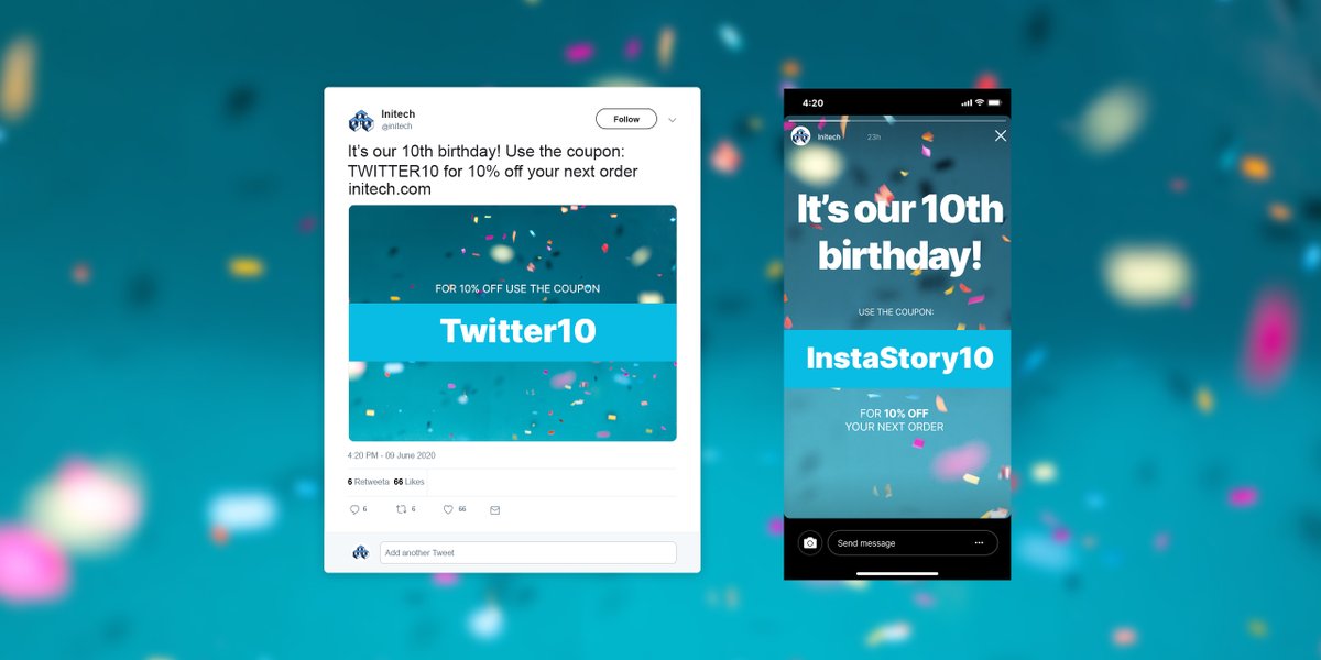
🔥 Landing Page Hot Tip #15 is to track marketing efforts using specific coupons leading to your LP.
"We are 10! Use this coupon for 10% off:
🚫 Bday10
✅ Twitter10
✅ InstaStory10
Dedicated coupons will surface effective channels while feeling exclusive to your audience.
"We are 10! Use this coupon for 10% off:
🚫 Bday10
✅ Twitter10
✅ InstaStory10
Dedicated coupons will surface effective channels while feeling exclusive to your audience.
🔥 Landing Page Hot Tip #16 is to embed your forms.
🚫 [Click here to Sign Up]
✅ (Enter your email) + [Sign Up]
Remember with every page load your conversion rate drops, so try capture those leads as soon as possible.
🚫 [Click here to Sign Up]
✅ (Enter your email) + [Sign Up]
Remember with every page load your conversion rate drops, so try capture those leads as soon as possible.


🔥 Landing Page Hot Tip #17 - If you are marketing to everyone, your message is resonating with no one.
Identify your audience and research the subject matter to craft LP copy your targeted community will appreciate.
🚫 Join the biggest Lord of the Rings fan club online
✅
Identify your audience and research the subject matter to craft LP copy your targeted community will appreciate.
🚫 Join the biggest Lord of the Rings fan club online
✅

There are two ways to experience horror.
The first is to rent an R-rated gory film.
The second is to sit behind someone while they interact with your Landing Page.
🔥 Landing Page Hot Tip #18 is to sit with someone from your target market & study what it took for a conversion.
The first is to rent an R-rated gory film.
The second is to sit behind someone while they interact with your Landing Page.
🔥 Landing Page Hot Tip #18 is to sit with someone from your target market & study what it took for a conversion.
🔥 Landing Page Hot Tip #19 is to set a max-width for your typography.
100% width <p>'s are difficult to read on bigger resolutions.
Typography optimization can get _very_ technical but try aim for 55-100 characters per line (CPL).
Learn more about CPL: pearsonified.com/characters-per…
100% width <p>'s are difficult to read on bigger resolutions.
Typography optimization can get _very_ technical but try aim for 55-100 characters per line (CPL).
Learn more about CPL: pearsonified.com/characters-per…

🔥 Landing Page Hot Tip #20 is to highlight a testimonial from an opinion leader, well known to your target audience.
Consider how much this Landing Page testimonial would influence a designer looking for an icon pack.
(tip taken from my #WCEU talk: )
Consider how much this Landing Page testimonial would influence a designer looking for an icon pack.
(tip taken from my #WCEU talk: )

🔥 Landing Page Hot Tip #21 is don't overkill with animations.
Gratuitous scroll transitions no longer wow while subtle animations are timeless and show intent.
Just because you can, does not mean you should.
Gratuitous scroll transitions no longer wow while subtle animations are timeless and show intent.
Just because you can, does not mean you should.
🔥 Landing Page Hot Tip #22 is to consider a color scheme.
A carefully crafted Landing Page color scheme stands out and takes effort.
An effort your visitor would assume carries into your event, product or service.
A carefully crafted Landing Page color scheme stands out and takes effort.
An effort your visitor would assume carries into your event, product or service.


Landing Page Hot Tip #23 is to avoid the word cheap.
Positioning your offering as "cheaper" raises concerns the competition is perhaps more quality.
🚫 cheaper
✅ more affordable
✅ economical
✅ cost-effective
Positioning your offering as "cheaper" raises concerns the competition is perhaps more quality.
🚫 cheaper
✅ more affordable
✅ economical
✅ cost-effective
🔥 Landing Page Hot Tip #24 is to remind visitors why they are signing up for early access.
🚫 Sign up for our BETA!
Why?
Sign up for our BETA and
✅ ...begin organizing your
✅ ...secure legacy pricing
✅ ...start saving time
🚫 Sign up for our BETA!
Why?
Sign up for our BETA and
✅ ...begin organizing your
✅ ...secure legacy pricing
✅ ...start saving time
🔥 Landing Page Hot Tip #25 is to integrate a sticky header navigation if your Landing Page is long.
A sticky header is not only convenient for the visitor to navigate page sections but also keeps that CTA button visible at all times👆
A sticky header is not only convenient for the visitor to navigate page sections but also keeps that CTA button visible at all times👆
🔥 Landing Page Hot Tip #26 is to use fewer fonts.
Multiple typefaces, each with a few weights, can add unnecessary load time.
Ever considered pairing your primary typeface with a native system font?
ps. here are 40 Google Fonts curated by @typewolf: typewolf.com/google-fonts
Multiple typefaces, each with a few weights, can add unnecessary load time.
Ever considered pairing your primary typeface with a native system font?
ps. here are 40 Google Fonts curated by @typewolf: typewolf.com/google-fonts
🔥 Landing Page Hot #27 is to step into your visitors shoes.
📱Load your LP on mobile
💬Read all the text aloud
👆Use the navigation
💳Now checkout
The above will surface overlooked areas where you are losing conversions.
Once confident, see Hot Tip #18
📱Load your LP on mobile
💬Read all the text aloud
👆Use the navigation
💳Now checkout
The above will surface overlooked areas where you are losing conversions.
Once confident, see Hot Tip #18
https://twitter.com/robhope/status/1271413302703337472
🔥 Landing Page Hot Tip #28 is to space using ratios.
Set a base size like 8px, then define your padding using multiples of 8, eg:
Tiny gaps = 8
Small gaps = 16
Medium gaps = 32
Big gaps = 64
Ratios helps align your content better and can really tighten a Landing Page design.
Set a base size like 8px, then define your padding using multiples of 8, eg:
Tiny gaps = 8
Small gaps = 16
Medium gaps = 32
Big gaps = 64
Ratios helps align your content better and can really tighten a Landing Page design.

🔥 Landing Page Hot Tip #29 is to add personality.
A portrait of the person behind this service.
The desk where these posters were illustrated.
Even a subtle animation of your signature.
These are the little touches we appreciate as humans.
People want to support people.
A portrait of the person behind this service.
The desk where these posters were illustrated.
Even a subtle animation of your signature.
These are the little touches we appreciate as humans.
People want to support people.
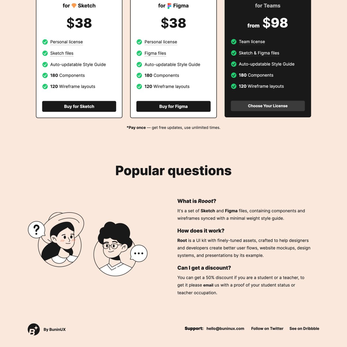
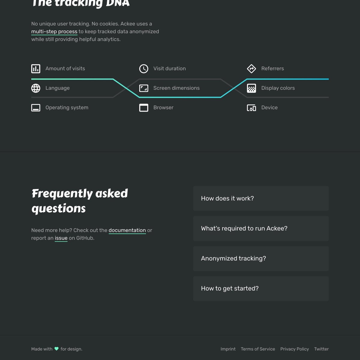
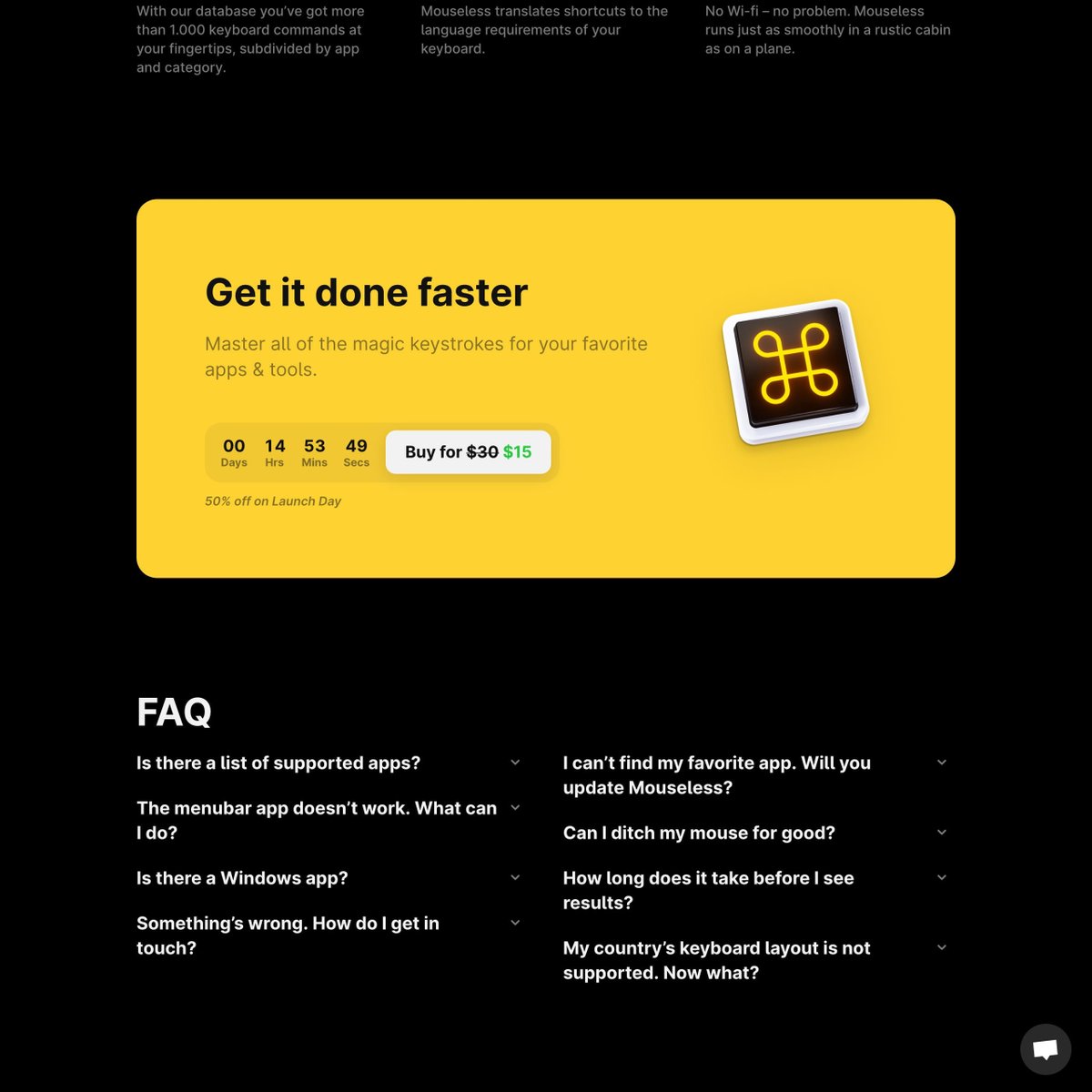
🔥 Landing Page Hot Tip #30 is to curate the Frequently Asked Questions.
A dozen unordered FAQs is not helpful for your visitor.
💬 Frequently asked only
📊 Ordered by popularity
Your visitor is after pre-sale FAQs, so start by porting anything post-sale to your support page.
A dozen unordered FAQs is not helpful for your visitor.
💬 Frequently asked only
📊 Ordered by popularity
Your visitor is after pre-sale FAQs, so start by porting anything post-sale to your support page.

🔥 Landing Page Hot Tip #31 is to replace those GIFs with video.
Video Pros:
⚡️ Better performance
🎨 More colors
🍃 Less file size
👆 Ability to pause
This Figma Tip video by @trongawesome is a 1.9mb GIF or a 290kb MP4
Video Pros:
⚡️ Better performance
🎨 More colors
🍃 Less file size
👆 Ability to pause
This Figma Tip video by @trongawesome is a 1.9mb GIF or a 290kb MP4
🔥 Landing Page Hot Tip #32 is to offer an annual discount.
Offering a saving for a 12 month commitment can really help boost cashflow for your SaaS.
Note how @unbounce have a Monthly/Annual switcher with a crystal clear "Save 10%" badge on the annual tab.
Offering a saving for a 12 month commitment can really help boost cashflow for your SaaS.
Note how @unbounce have a Monthly/Annual switcher with a crystal clear "Save 10%" badge on the annual tab.
🔥 Landing Page Hot Tip #33 is to deconstruct your About paragraph.
Remove all verbose words then add just one _adjective_ for spice:
We build _effective_ goal-tracking software
Your LP visitor cannot be persuaded to take action if they don't understand what your service does.
Remove all verbose words then add just one _adjective_ for spice:
We build _effective_ goal-tracking software
Your LP visitor cannot be persuaded to take action if they don't understand what your service does.

🔥 Landing Page Hot Tip #34 is to run a regular speed test.
Speed Tests tend to surface the use of too many fonts, images or scripts:
⚡️
developers.google.com/speed/pagespee…
⚡️
tools.pingdom.com
The poor results can act as a to-do-list & even a fun optimization game if you allow it.
Speed Tests tend to surface the use of too many fonts, images or scripts:
⚡️
developers.google.com/speed/pagespee…
⚡️
tools.pingdom.com
The poor results can act as a to-do-list & even a fun optimization game if you allow it.

🔥 Landing Page Hot Tip #35 is to put your name on it.
A common concern a LP visitor has is how well will this be supported.
"If I commit, will I get help? Who actually built this? Are they improving it?"
Taking ownership eases fears while showing confidence.
Be proud of it.
A common concern a LP visitor has is how well will this be supported.
"If I commit, will I get help? Who actually built this? Are they improving it?"
Taking ownership eases fears while showing confidence.
Be proud of it.

🔥 Landing Page Hot Tip #36 is to align using a grid.
Layout grids keep your Landing Page tidy by positioning with constraints.
@materialdesign do a great job explaining the differences between columns, gutters, and margins:
→ material.io/design/layout/…
Layout grids keep your Landing Page tidy by positioning with constraints.
@materialdesign do a great job explaining the differences between columns, gutters, and margins:
→ material.io/design/layout/…

🔥 Landing Page Hot Tip #37 is to add a splash of color.
Color psychology goes deep but a burst in a Landing Page no doubt adds excitement.
And when excited, we tend to try new things.
Color psychology goes deep but a burst in a Landing Page no doubt adds excitement.
And when excited, we tend to try new things.


🔥 Landing Page Hot Tip #38 is to invest in an icon library.
Having a go-to icon pack helps speed up LP development while keeping the aesthetic consistent.
My personal fav is streamlineicons.com but @iconfinder is a great resource to find a style, then purchase the pack.
Having a go-to icon pack helps speed up LP development while keeping the aesthetic consistent.
My personal fav is streamlineicons.com but @iconfinder is a great resource to find a style, then purchase the pack.

@iconfinder @webalys 🔥 Landing Page Hot Tip #39 is to reorder copy before images on mobile.
Responsive designs are great but are you ordering for a mobile scrolling experience?
LP product images without context can be difficult to decipher.
Help? Try Flexbox order:
→ developer.mozilla.org/en-US/docs/Web…
Responsive designs are great but are you ordering for a mobile scrolling experience?
LP product images without context can be difficult to decipher.
Help? Try Flexbox order:
→ developer.mozilla.org/en-US/docs/Web…

🔥 Landing Page Hot Tip #40 is to offer a free teaser.
⏳ 14 day free trial of your SaaS
📖 2 of the 14 eBook chapters
🛠 80 icons out the full library
📱 1 of the 10 mobile wallpapers
Teasers are a great way for visitors to experience more without having to pay upfront.
⏳ 14 day free trial of your SaaS
📖 2 of the 14 eBook chapters
🛠 80 icons out the full library
📱 1 of the 10 mobile wallpapers
Teasers are a great way for visitors to experience more without having to pay upfront.
🔥 Landing Page Hot Tip #41 is to code your own social share buttons.
Embedding a fleet of social share buttons adds dozens of unnecessary requests to your LP load.
Consider hard coding them, including fun pre-composed text.
This is my go-to tool:
→ sharelinkgenerator.com
Embedding a fleet of social share buttons adds dozens of unnecessary requests to your LP load.
Consider hard coding them, including fun pre-composed text.
This is my go-to tool:
→ sharelinkgenerator.com
🔥 Landing Page Hot Tip #42 is to add Open Graph meta tags.
These tags add an image + alongside text to LP links shared on social media. Simply put, meta tag optimized links are clicked more than those without.
metatags.io by @moeamaya helps generate & preview them:
These tags add an image + alongside text to LP links shared on social media. Simply put, meta tag optimized links are clicked more than those without.
metatags.io by @moeamaya helps generate & preview them:
🔥 Landing Page Hot Tip #43 is to emphasize time-saving.
Most SaaS offerings are trying to streamline our operations & save us time.
Note the top 3 features in the @Ghost Membership LP are all time-saving.
How are you telling visitors they are a payment away from saving time?
Most SaaS offerings are trying to streamline our operations & save us time.
Note the top 3 features in the @Ghost Membership LP are all time-saving.
How are you telling visitors they are a payment away from saving time?

🔥 Landing Page Hot Tip #44 is to kern your big type.
Font Kerning is a tricky subject as not all typefaces need it but experiment with your bigger fonts.
Reducing the spacing between characters in your big intro copy can really tighten your Landing Page design.
Font Kerning is a tricky subject as not all typefaces need it but experiment with your bigger fonts.
Reducing the spacing between characters in your big intro copy can really tighten your Landing Page design.
🔥 Landing Page Hot Tip #45 is don't neglect Retina optimization.
Retina Displays have higher density pixels, needing bigger imagery to appear crisp.
Clear infographics and crisp app screenshots leave a wonderful first impression, especially if your target market are designers.
Retina Displays have higher density pixels, needing bigger imagery to appear crisp.
Clear infographics and crisp app screenshots leave a wonderful first impression, especially if your target market are designers.
🔥 Landing Page Hot Tip #46 is to remove the obstacles to demo your product.
You are confident your SaaS offering will satisfy your potential customer. Why not get visitors to experience it asap?
@carrd allows a full website build before asking for an email address.
You are confident your SaaS offering will satisfy your potential customer. Why not get visitors to experience it asap?
@carrd allows a full website build before asking for an email address.
🔥 Landing Page Hot Tip #47 is to lower the risk.
Aim for low friction onboarding, emphasizing post-purchase security.
✅ Free trial
✅ No credit card required
✅ 2 year warranty
✅ 24/7 support
✅ 30 day money back guarantee
@squarespace position 2 of these next to the CTA 👏
Aim for low friction onboarding, emphasizing post-purchase security.
✅ Free trial
✅ No credit card required
✅ 2 year warranty
✅ 24/7 support
✅ 30 day money back guarantee
@squarespace position 2 of these next to the CTA 👏

🔥 Landing Page Hot Tip #48 is to keep brand capitalization consistent.
LPs with different case name variations look unprofessional and can even be confusing.
✅ Starbucks
🚫 Star Bucks
🚫 starbucks
🚫 StarBucks
Try avoid ALL CAPS but once you've chosen a style, stick with it.
LPs with different case name variations look unprofessional and can even be confusing.
✅ Starbucks
🚫 Star Bucks
🚫 starbucks
🚫 StarBucks
Try avoid ALL CAPS but once you've chosen a style, stick with it.
🔥 Landing Page Hot Tip #49 is to keep vertical spacing consistent.
Often overlooked is the padding between your Landing Page section dividers.
A simple yet consistent spacing rule, applied throughout the long-scrolling page, can really tighten up the design.
Often overlooked is the padding between your Landing Page section dividers.
A simple yet consistent spacing rule, applied throughout the long-scrolling page, can really tighten up the design.

🔥 Intermission Landing Page Hot Tip is to create haste.
Consider offering a discount within a diminishing timeframe to encourage a quicker purchase.
On the Hot Tip Ebook pre-sale, note the countdown timer under the CTA with a % saving reminder:
→ onepagelove.com/100
Consider offering a discount within a diminishing timeframe to encourage a quicker purchase.
On the Hot Tip Ebook pre-sale, note the countdown timer under the CTA with a % saving reminder:
→ onepagelove.com/100
🔥 Landing Page Hot Tip #50 is to suggest a pricing option.
Sure, some visitors are price conscious but a good portion don't want to spend time investigating.
They simply want the pricing option with the best value.
@leeerob says this had a huge impact:
Sure, some visitors are price conscious but a good portion don't want to spend time investigating.
They simply want the pricing option with the best value.
@leeerob says this had a huge impact:
https://twitter.com/leeerob/status/1269992463319674881


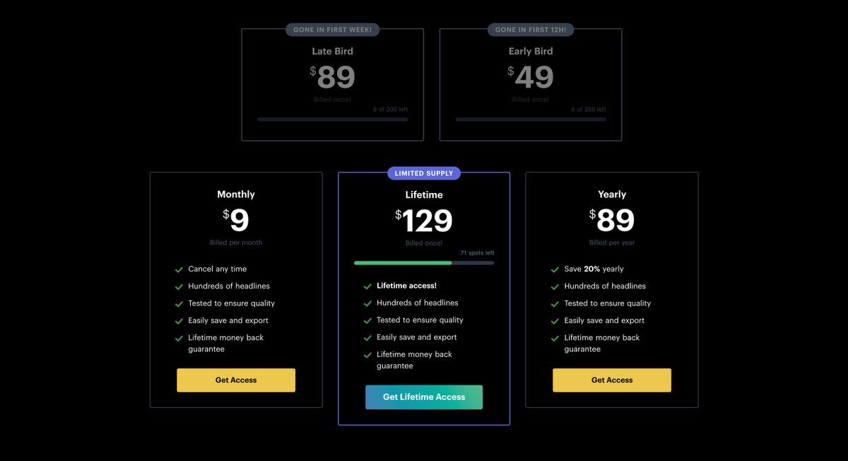
🔥 Landing Page Hot Tip #51 is to increase demand by limiting supply.
Headlime.io has limited lifetime pricing spots. Once sold, the price goes up.
This worked wonders for launch with both lifetime $49 + $89 selling out, boosting cashflow significantly vs MRR sales.
Headlime.io has limited lifetime pricing spots. Once sold, the price goes up.
This worked wonders for launch with both lifetime $49 + $89 selling out, boosting cashflow significantly vs MRR sales.
🔥 Landing Page Hot Tip #52 is to add social proof.
⭐️ Customer Ratings
💬 Testimonials
🏆 Service Awards
📊 Critic Reviews
🥇 Industry Rankings
📰 Press Features
Nothing beats a good old fashioned recommendation and social proof helps whisper them to your Landing Page visitor.
⭐️ Customer Ratings
💬 Testimonials
🏆 Service Awards
📊 Critic Reviews
🥇 Industry Rankings
📰 Press Features
Nothing beats a good old fashioned recommendation and social proof helps whisper them to your Landing Page visitor.
🔥 Landing Page Hot Tip #53 is to focus on solving copy first.
Spending time polishing a badly worded LP is counter-intuitive.
What problem do you solve?
Where will you take them?
Weak or confusing copywriting will sink those conversions no matter how well designed the LP.
Spending time polishing a badly worded LP is counter-intuitive.
What problem do you solve?
Where will you take them?
Weak or confusing copywriting will sink those conversions no matter how well designed the LP.
🔥 Landing Page Hot Tip #54 is to consider dark mode.
There is something remarkable about a LP with a strong, dark color scheme.
If your design feels a bit conventional, why not dabble with dark.
Here are 25 beautifully Dark-Schemed LPs for refs:
→ onepagelove.com/dark-schemed-l…
There is something remarkable about a LP with a strong, dark color scheme.
If your design feels a bit conventional, why not dabble with dark.
Here are 25 beautifully Dark-Schemed LPs for refs:
→ onepagelove.com/dark-schemed-l…


🔥 Landing Page Hot Tip #55 is to align your marketing.
A Google Ad for freelance time-tracking software landing on a page highlighting time-tracking for teams is confusing.
Which Landing Page do you think would perform better:
A Google Ad for freelance time-tracking software landing on a page highlighting time-tracking for teams is confusing.
Which Landing Page do you think would perform better:

🔥 Landing Page Hot Tip #56 is to increase the contrast of your button text.
A common mistake is keeping your LP link color the same throughout your elements.
This can lead to low contrast CTA buttons.
usecontrast.com is a great tool to check WCAG color contrast ratios
A common mistake is keeping your LP link color the same throughout your elements.
This can lead to low contrast CTA buttons.
usecontrast.com is a great tool to check WCAG color contrast ratios

🔥 Landing Page Hot Tip #57 is to only A/B test high traffic pages.
A/B testing (aka split-testing) with low data will lead to inconclusive and even misleading results.
The same time used to optimize and market your Landing Page is more effective until your traffic increases.
A/B testing (aka split-testing) with low data will lead to inconclusive and even misleading results.
The same time used to optimize and market your Landing Page is more effective until your traffic increases.
🔥 Landing Page Hot Tip #58 is to minimize the options.
Do you really need:
📊 5 pricing plans?
📝 7 required fields in your enquiry form?
🎨 16 product color choices?
"The time it takes to make a decision increases with the number and complexity of choices." ~ Hicks Law
Do you really need:
📊 5 pricing plans?
📝 7 required fields in your enquiry form?
🎨 16 product color choices?
"The time it takes to make a decision increases with the number and complexity of choices." ~ Hicks Law
🔥 Landing Page Hot Tip #59 is to try font smoothing.
Simply put, adding the CSS font-smooth property to a font will slim it down, slightly.
This won't look great for all fonts but try it on fonts feeling a bit chunky.
@szafranek explains it very well:
szafranek.net/blog/2009/02/2…
Simply put, adding the CSS font-smooth property to a font will slim it down, slightly.
This won't look great for all fonts but try it on fonts feeling a bit chunky.
@szafranek explains it very well:
szafranek.net/blog/2009/02/2…
🔥 Landing Page Hot Tip #60 is to liven with illustrations.
Illustrated characters, devices & elements can really bring a LP to life.
Aim to commission illustrations from a designer, else start here:
- blush.design
- streamlineicons.com/ux
- humaaans.com
Illustrated characters, devices & elements can really bring a LP to life.
Aim to commission illustrations from a designer, else start here:
- blush.design
- streamlineicons.com/ux
- humaaans.com


@webalys @streamlinehq @blushdesignapp @pablostanley @bakkenbaeck @vincentapp_io @pine_io 🔥 Landing Page Hot Tip #61 is to trim the <head> fat.
Taking ea line out your LP <head> source code:
- What does it do?
- Do we need it?
- If not, delete
As tedious as it sounds, knowing what is delivering to visitors is good practice and your future LPs will benefit from it.
Taking ea line out your LP <head> source code:
- What does it do?
- Do we need it?
- If not, delete
As tedious as it sounds, knowing what is delivering to visitors is good practice and your future LPs will benefit from it.

🔥 Landing Page Hot Tip #62 is to add an email to your error messages.
If your LP payment integration offers msg customization, include a support email address for when a problem persists.
This _catch_ can potentially convert dozens of disgruntled visitors into happy customers.
If your LP payment integration offers msg customization, include a support email address for when a problem persists.
This _catch_ can potentially convert dozens of disgruntled visitors into happy customers.

🔥 Landing Page Hot Tip #63 is to add a radial burst behind your product imagery.
With the addition of a drop-shadow on the image, a background radial burst can really add depth to a Landing Page design.
→ cssgradient.io is my go-to tool for gradient code
With the addition of a drop-shadow on the image, a background radial burst can really add depth to a Landing Page design.
→ cssgradient.io is my go-to tool for gradient code


🔥 Landing Page Hot Tip #64 is to delay the chat bot.
If needed, only kick that bugger off once visitors have scrolled to FAQ/pricing.
A corner notification upon arrival wrecks concentration and we can't afford to distract visitors while they decipher what we do.
.
.
.
.
.
🤖
If needed, only kick that bugger off once visitors have scrolled to FAQ/pricing.
A corner notification upon arrival wrecks concentration and we can't afford to distract visitors while they decipher what we do.
.
.
.
.
.
🤖
🔥 Landing Page Hot Tip #65 is to offer a demo down-sell.
Calls aren't for everyone.
If your LP suggests "hopping on a call" for high-end sales, offer an alt:
📞Don't want to jump on a call?
📖Download our buyers guide
"...has done wonders for our revenue"
~ @kevintylermead
Calls aren't for everyone.
If your LP suggests "hopping on a call" for high-end sales, offer an alt:
📞Don't want to jump on a call?
📖Download our buyers guide
"...has done wonders for our revenue"
~ @kevintylermead
🔥 Landing Page Hot Tip #66 is to open non-essential links in a new tab.
Open links to documentation, support, privacy and demos in a new browser tab, keeping the Landing Page within a tabs reach.
An obvious one, but surprisingly overlooked 👆
Open links to documentation, support, privacy and demos in a new browser tab, keeping the Landing Page within a tabs reach.
An obvious one, but surprisingly overlooked 👆
🔥 Landing Page Hot Tip #67 is to use "negative space" filters when searching stock images.
A hero img with neg space accommodates headline text well, preventing overlapping elements.
My go-to resources @unsplash @StocksyUnited have "negative space" & "copy space" tags/filters.
A hero img with neg space accommodates headline text well, preventing overlapping elements.
My go-to resources @unsplash @StocksyUnited have "negative space" & "copy space" tags/filters.

🔥 Landing Page Hot Tip #68 is hint to scroll.
Sometimes I see long-scrolling LPs with spacious content above the fold, but no indication there is more info further down.
3 solves:
🔻 Subtle down arrow
ℹ️ Learn More CTA that scrolls
📜 Elements that flow into the next section:
Sometimes I see long-scrolling LPs with spacious content above the fold, but no indication there is more info further down.
3 solves:
🔻 Subtle down arrow
ℹ️ Learn More CTA that scrolls
📜 Elements that flow into the next section:

🔥 Landing Page Hot Tip #69 is to offer a fast shipping option.
📦 "Delivered to your door within 48hrs across the UK"
If logistically possible, a fast shipping tier will start converting those impatient visitors weighing up an alternative item stocked at the mall.
📦 "Delivered to your door within 48hrs across the UK"
If logistically possible, a fast shipping tier will start converting those impatient visitors weighing up an alternative item stocked at the mall.
🔥 Landing Page Hot Tip #70 is to integrate an in-page product demo.
These clever LPs put in the extra effort by demonstrating their actual product in-page, resulting in a spectacular first impression.
Twitter thread:
Article:
onepagelove.com/clever
These clever LPs put in the extra effort by demonstrating their actual product in-page, resulting in a spectacular first impression.
Twitter thread:
https://twitter.com/robhope/status/1290621775227822082
Article:
onepagelove.com/clever
🔥 Landing Page Hot Tip #71 is don't take a shortcut on website hosting.
Cheap, shared hosting will end up costing a lot more (through downtime, hacks, sluggish speeds, slow support and in-turn frustrated customers) vs the compared "savings" to a reputable host.
Cheap, shared hosting will end up costing a lot more (through downtime, hacks, sluggish speeds, slow support and in-turn frustrated customers) vs the compared "savings" to a reputable host.
🔥 Landing Page Hot Tip #72 is to reassure during checkout.
Nerves are high.
Settle them with a customer rating reminder + choice testimonial, positioned near the checkout form.
Note how LearnUX @greg_rog reassure by showing how payments appears on your statement incl dates:
Nerves are high.
Settle them with a customer rating reminder + choice testimonial, positioned near the checkout form.
Note how LearnUX @greg_rog reassure by showing how payments appears on your statement incl dates:
🔥 Landing Page Hot Tip #73 is to personalize the success message.
The nerds call this Lead Nurturing but think of it like a cherry on top🍒
When I paid for my @heyhey acc, this popped up. I shared it with maybe 5 ppl and saw the same message shared 10+ times on social media:
The nerds call this Lead Nurturing but think of it like a cherry on top🍒
When I paid for my @heyhey acc, this popped up. I shared it with maybe 5 ppl and saw the same message shared 10+ times on social media:

🔥 Landing Page Hot Tip #74 is to steer clear of a header carousal.
A Landing Page journey always starts with the visitor identifying with the intro copy.
This copy is not meant to dance off the side of the page mid-sentence.
A Landing Page journey always starts with the visitor identifying with the intro copy.
This copy is not meant to dance off the side of the page mid-sentence.

🔥 Landing Page Hot Tip #75 is to boost confidence with payment method logos.
💳 Add accepted payment methods near your Landing Page pricing tables, main CTA buttons and footer.
Here is a brilliant free set by @flatroundicons on @iconfinder in PNG + SVG:
iconfinder.com/iconsets/payme…
💳 Add accepted payment methods near your Landing Page pricing tables, main CTA buttons and footer.
Here is a brilliant free set by @flatroundicons on @iconfinder in PNG + SVG:
iconfinder.com/iconsets/payme…

@flatroundicons @iconfinder 🔥 Landing Page Hot Tip #76 is to soft launch with discount.
After a 👍 live test, send an email with an exclusive saving to a select audience.
Soft launches allow for kinder & more detailed feedback while ensuring your LP Commerce pipeline is watertight before announcement 💦
After a 👍 live test, send an email with an exclusive saving to a select audience.
Soft launches allow for kinder & more detailed feedback while ensuring your LP Commerce pipeline is watertight before announcement 💦
🔥 Landing Page Hot Tip #77 is to implement smooth scroll.
Clicking a nav pricing link and jumping to a pricing section can feel like a fast page load.
Integrating "smooth scroll" will graceful transport them, previewing additional content and can even prevent the back button⬅️
Clicking a nav pricing link and jumping to a pricing section can feel like a fast page load.
Integrating "smooth scroll" will graceful transport them, previewing additional content and can even prevent the back button⬅️
🔥 Landing Page Hot Tip #78 is to define a visual hierarchy.
The principle orders content by significance but also suggests the order to follow.
Most visitors eyes are also accustomed to follow a Z-pattern:
1 - 2
3 - 4
Does your Landing Page visually order your story?
The principle orders content by significance but also suggests the order to follow.
Most visitors eyes are also accustomed to follow a Z-pattern:
1 - 2
3 - 4
Does your Landing Page visually order your story?
🔥 Landing Page Hot Tip #79 is to remove inactive social media accounts.
Linking to accs last updated 3yrs ago gives the impression the offering is poorly supported.
👆Particularly important for subscriptions where the visitor is in a deeper research phase before committing.
Linking to accs last updated 3yrs ago gives the impression the offering is poorly supported.
👆Particularly important for subscriptions where the visitor is in a deeper research phase before committing.
🔥 Landing Page Hot Tip #80 is to wrap your screenshots in a device.
A device mock-up, with a subtle drop shadow, can really bring your digital product to life within your Landing Page.
Device mock-up tool:
shotsnapp.com
LPs with devices:
onepagelove.com/tag/devices
A device mock-up, with a subtle drop shadow, can really bring your digital product to life within your Landing Page.
Device mock-up tool:
shotsnapp.com
LPs with devices:
onepagelove.com/tag/devices


🔥 Landing Page Hot Tip #81 is to set a content max-width.
📈Stats indicate bigger resolution browsing is on the rise.
Audiences differ but 20% of my LP desktop visits are 1920px.
Containing your LP will prevent elements floating on big resolutions, disrupting the experience.
📈Stats indicate bigger resolution browsing is on the rise.
Audiences differ but 20% of my LP desktop visits are 1920px.
Containing your LP will prevent elements floating on big resolutions, disrupting the experience.
🔥 Landing Page Hot Tip #82 is to prove you are established.
🗓 Founded in 2006
🔋 Powering 50k businesses
⏰ 400m hours tracked
💰 $13bn paid invoices
Years in the game with revenue/customer/operating stats thrown in, is a lethal combo to reduce a sign up risk decision.
🗓 Founded in 2006
🔋 Powering 50k businesses
⏰ 400m hours tracked
💰 $13bn paid invoices
Years in the game with revenue/customer/operating stats thrown in, is a lethal combo to reduce a sign up risk decision.

🔥 Landing Page Hot Tip #83 is to strategically position testimonials.
🏆 Start with your best testimonial above the fold. This will encourage a scroll + reduce bounce rates.
💬 Then position customer compliments relevant to the specific LP topic, strengthening their pitch.
🏆 Start with your best testimonial above the fold. This will encourage a scroll + reduce bounce rates.
💬 Then position customer compliments relevant to the specific LP topic, strengthening their pitch.


🔥 Landing Page Hot Tip #84 is to focus on people, not search engines.
Search traffic is gold but Google is an unpredictable beast right now.
Focusing on copy resonating with visitor's problems, along with delivering a solid solution, is a smarter play.
Search traffic is gold but Google is an unpredictable beast right now.
Focusing on copy resonating with visitor's problems, along with delivering a solid solution, is a smarter play.
https://twitter.com/JohnONolan/status/1226739953800859650
🔥 Landing Page Hot Tip #85 is to show them how it works.
Spend some time here.
Use numbered lists.
The more visual the better.
If you can show your Landing Page visitor just how easy it is to get started. They are more likely to give it a try.
Spend some time here.
Use numbered lists.
The more visual the better.
If you can show your Landing Page visitor just how easy it is to get started. They are more likely to give it a try.


🔥 Landing Page Hot Tip #86 is to include an explainer video.
Well thought out LP explainer vids can help improve conversions for complex products or services.
Conversely, a rushed explainer vid w/o budget or refined script, will hurt your conversions.
Well thought out LP explainer vids can help improve conversions for complex products or services.
Conversely, a rushed explainer vid w/o budget or refined script, will hurt your conversions.
🔥 Landing Page Hot Tip #87 is to focus on form UX.
Fancy form layouts with too many required fields will drop conversions.
✅ One column
✅ Minimal required fields
✅ Labels near top-left
@CrazyEgg published a brilliant Form UI/UX visual guideline:
→ crazyegg.com/blog/guides/gr…
Fancy form layouts with too many required fields will drop conversions.
✅ One column
✅ Minimal required fields
✅ Labels near top-left
@CrazyEgg published a brilliant Form UI/UX visual guideline:
→ crazyegg.com/blog/guides/gr…

🔥 Landing Page Hot Tip #88 is to consider lifetime pricing for your SaaS.
If your overheads are low consider a once-off pricing option for subscribers.
@dannypostmaa from Headlime.io said this strategy significantly boosted short-term cashflow he could reinvest.
If your overheads are low consider a once-off pricing option for subscribers.
@dannypostmaa from Headlime.io said this strategy significantly boosted short-term cashflow he could reinvest.

🔥 Landing Page Hot Tip #89 is to focus on the benefits, not the features.
Unfortunately LP visitors aren't impressed by technical features, nor resonates with them.
☀️🧴🌊 Focus on how your sunscreen allows hrs of fun in the sun, not the years of R&D.
Unfortunately LP visitors aren't impressed by technical features, nor resonates with them.
☀️🧴🌊 Focus on how your sunscreen allows hrs of fun in the sun, not the years of R&D.
https://twitter.com/shl/status/1283040429848629249
🔥 Landing Page Hot Tip #90 to alternate section background colors.
Consider a slightly darker bg color for every alt LP section. This will also contain content better.
🌶 To add spice, try:
Wavy lines:
→ onepagelove.com/tag/wavy-line-…
Diagonal lines :
→ onepagelove.com/tag/diagonal-l…
Consider a slightly darker bg color for every alt LP section. This will also contain content better.
🌶 To add spice, try:
Wavy lines:
→ onepagelove.com/tag/wavy-line-…
Diagonal lines :
→ onepagelove.com/tag/diagonal-l…


🔥 Landing Page Hot Tip #91 to bring it to life.
Skeuomorphism is making digital items resemble their tangible real-world counterpart.
If you are selling a book, consider a book mock-up to bring it to life in your LP.
Try picture frames, drop-shadows, textures, aerial views...
Skeuomorphism is making digital items resemble their tangible real-world counterpart.
If you are selling a book, consider a book mock-up to bring it to life in your LP.
Try picture frames, drop-shadows, textures, aerial views...


🔥 Landing Page Hot Tip #92 is to keep your copywriting tone positive.
🚫 Chat software that doesn’t sell your info
✅ Chat software focused on privacy
🚫 Don’t be negative
✅ Keep it positive
Position your offering as a confident solution, not a snarky competitor.
🚫 Chat software that doesn’t sell your info
✅ Chat software focused on privacy
🚫 Don’t be negative
✅ Keep it positive
Position your offering as a confident solution, not a snarky competitor.
🔥 Landing Page Hot Tip #93 is to emphasize the value.
A "$79 Design Systems Course worth $249" doesn't offer much appeal, other than -$170.
"..includes a D.S. blueprint for Figma/PS (save 10hrs) and a private Slack."
🚫 Save $170
✅ Get learning, assets, time-saving & access
A "$79 Design Systems Course worth $249" doesn't offer much appeal, other than -$170.
"..includes a D.S. blueprint for Figma/PS (save 10hrs) and a private Slack."
🚫 Save $170
✅ Get learning, assets, time-saving & access
🔥 Landing Page Hot Tip #94 is to consider parity pricing.
Simply put, offering a discount for people earning a weaker currency.
Not only will you increase revenue, but you’ll achieve what you set out to do - help more people and engage meaningfully with a bigger community.
Simply put, offering a discount for people earning a weaker currency.
Not only will you increase revenue, but you’ll achieve what you set out to do - help more people and engage meaningfully with a bigger community.

🔥 Landing Page Hot Tip #95 is to reuse your winning templates.
Try spend only 20% of your time on your LP arrangement and 80% on your content.
Here is a collection of 300+ LP templates I've curated over the past few years if you need a kick-start:
onepagelove.com/templates
Try spend only 20% of your time on your LP arrangement and 80% on your content.
Here is a collection of 300+ LP templates I've curated over the past few years if you need a kick-start:
onepagelove.com/templates
🔥 Landing Page Hot Tip #96 is don't get too fancy.
Parallax, transitions, custom cursors, color switchers...
Avoid dwelling on them if you are new to LPs or not making sales. Spend time on in-page demos or a remarkable product.
Once sales are flowing, you earned some flair 💫
Parallax, transitions, custom cursors, color switchers...
Avoid dwelling on them if you are new to LPs or not making sales. Spend time on in-page demos or a remarkable product.
Once sales are flowing, you earned some flair 💫
🔥 Landing Page Hot Tip #97 is to reinvest your profits.
Once your LP is converting, it's time for the specialists to step in.
1st is a copywriter. Let them be the officiator that marries your LP tone & your target audience with linguistic flair 😜
Repeat for imagery, icons...
Once your LP is converting, it's time for the specialists to step in.
1st is a copywriter. Let them be the officiator that marries your LP tone & your target audience with linguistic flair 😜
Repeat for imagery, icons...
🔥 Landing Page Hot Tip #98 is to test new narratives.
We hammer on about LP copy resonating with a visitor’s specific — singular — problem. But what if your offering solves a few problems *really* well?
Definitely not enough characters, so I'll let the Audiobook take it away..
We hammer on about LP copy resonating with a visitor’s specific — singular — problem. But what if your offering solves a few problems *really* well?
Definitely not enough characters, so I'll let the Audiobook take it away..
🔥 Landing Page Hot Tip #99 is to make it fast.
Google favors fast websites and visitors will decipher your offering quicker.
Speed through optimization means you’ve probably also tightened security and trimmed the fat.
When we aim for speed in a Landing Page, everybody wins⚡️
Google favors fast websites and visitors will decipher your offering quicker.
Speed through optimization means you’ve probably also tightened security and trimmed the fat.
When we aim for speed in a Landing Page, everybody wins⚡️
🔥 Landing Page Hot Tip #💯 is don’t forget the WHY.
Why is it part of your life’s journey?
📖 This is why I wrote the accessibility guide
An offering positioned within a compelling story is easier to understand & support.
When you share why you care, others start caring too.
Why is it part of your life’s journey?
📖 This is why I wrote the accessibility guide
An offering positioned within a compelling story is easier to understand & support.
When you share why you care, others start caring too.
Wow, 100 days later that's a wrap folks. I'm unsure how buried this thread is but if you got this far, thank you!
🎟 For the sneaky bunch about to "unroll" - here's an UNROLL coupon for $10 off:)
That's 100 beautifully presented Hot Tips for $39:
gumroad.com/l/hottips/unro…
🎟 For the sneaky bunch about to "unroll" - here's an UNROLL coupon for $10 off:)
That's 100 beautifully presented Hot Tips for $39:
gumroad.com/l/hottips/unro…
• • •
Missing some Tweet in this thread? You can try to
force a refresh


