My Authors
Read all threads
Folks: masks almost certainly help prevent the spread of COVID-19, but the severe flaws in this study render it completely meaningless.

It's like a who's who of basic quantitative fallacies, measurement issues, causal inference failures, and misleading interpretations.
It's hard to write a summary critique of this paper, because it commits ... all of them, plus some creative ones for fun.

You've got ecological fallacy, inappropriate projections, NO treatment of statistical uncertainty (!!!!), attributed causality, non-generalizability, etc.
Already a call for retraction in the works.

I agree; this should never have been published, and should be retracted immediately. And unfortunately, the retraction is going to do more damage to our credibility, but it's the only way forward.
I want to write a critical here, but array of problems with this paper is truly dizzying; it is one of the worst peer-reviewed papers I have seen in months, excepting those with fraudulent data.

But I haven't seen anyone else breaking things down yet, so here we go?
Disclaimers:

1) The paper is terrible, and that means that it says NOTHING useful about masks one way or another

2) This is going to be a bit ramble-y, in part because there are so many errors, and in part because I'm doing this off the cuff.
To preserve my sanity; I am going to restrict myself to only three(ish) errors: 1) attribution of causal differences by interrupted linear projection (that hurt to write), 2) the same for between-country aggregated units, and 3) basic statistics.
The paper takes a geographic region's cases over time, takes a linear trendline of that in the "before" period from some policy, projects it forward, and assumes that any deviation from that projection is causally attributable to the thing they claim happens at this time.
For starters, they project it forward with what looks like a linear trendline (made in Excel maybe????).

The assumption made is that cases would have continued along linearly for the entire projected period, except for whatever happened on day 26?
Why day 26? ¯\_(ツ)_/¯

Probably because it gives them a good r2, which is also meaningless; causality does not care about your r2.

But there are two underlying assumptions here: a) that it would have continued to be linear, and b) the only thing that happened was policy change.
Lets start with a) the linearity assumption, because it's bonkers. There is absolutely no reason to believe, nor any reason given, that infectious disease has a linear progression in population.

Sure, it looks kinda linear-ish for a bit, but all curves do at some point/level.
So, to do this with even an absolutely minimal amount of credibility, they would have had to make a model projection that wasn't absolute nonsense. Even a really basic SEIR model would have been better here.

But a linear trendline?? Absolutely not.
Then there is the causal attribution problem. Even had their linear (ugh) model been reasonable, they are causally attributing all changes to one change in policy.

I don't know about y'all, but seems to me that a lot of things were happening over those months, not just policy.
In fact, a ton of stuff happened concurrently. People's behaviors responded to more than just policy. An economic crisis happened. Just about everything in all aspects of life happened concurrently with policy changes.

But nope, just policy, I guess.
(jumping back) Also worth noting: the original linearity is largely an artifact of a lot of things, including testing itself growing linearly (h/t @CivicNetworks), while actual infections almost certainly did NOT grow linearly over that period of time.
Now take the above, and take it to an extreme when we get to figure 3, when they spline out all of these lines and attribute all changes in the linear slopes to specific policies at specific dates. Specifically, masking orders.
Of course, there's another problem here: there are undefinable and stochastic time lags between policy orders and when we see their effects in infections, cases, etc, generally on the order of weeks.

ctrl-f for "lag"? Nothing.
We are now a lot of tweets in, and we've done an ok, but still just tip of the iceberg, job with problem 1 of the 3 I listed.

Moving on to 2: attribution of causality to aggregated differences between three (!) regions' epidemics at different times.
There is a sort of implied difference-in-difference-style evaluation here if we're being really generous.

But to lay it out, the paper attributes all relative differences between the epidemic in these regions to policy (ish).

Hard to know where to even start with this one.
These are not the same places or times. The policy responses themselves are embedded in those differences inherently in times and places. So many other things happened concurrently, and differently, in these other places.

Italy≠Wuhan≠NY.
* note: yes, I know, they don't need to be exactly equal for diff-in-diff, but the general idea applies.

Speaking of three places: we have three places. That's more or less the n for this study. 3. It's a multi-level problem, but for the level of interest it's 3.
Speaking of n of 3, WHERE ARE THE STATS????

Not a whiff of even an attempt at statistical uncertainty. Not a standard error, confidence interval, p-value, statistical model.

Absolutely nothing.

How is that possible???
How can a paper, which makes policy conclusions based on quantitative data (which is to say statistics) not have a SINGLE statistic of uncertainty reported??? (no, r2 does not count, but that's a separate conversation).

Truly, that is BAFFLING.
It is truly dismaying, and a slap in the face to all of us who work hard to produce rigorous meaningful work in a time of crisis.

It does absolutely nothing but damage to the conversation about masks, policy, and the role of science and expertise.
PNAS should retract this paper, but more importantly, should seriously review and reform its editorial and review policies to understand how this happened, and prevent another of these from happening again.
You may be wondering: How can a paper this obviously bad get published in such a prestigious and high impact journal like PNAS?

Well, the answer is, in part, because this isn't just a regular submission; it's a "Contributed Submission." pnas.org/page/authors/j…
Contributed submissions are a sort of insider fast track publication route for people elected to the National Academy of Sciences. These papers are peer reviewed, though worth noting that regular peer review is never perfect, and contributed submissions are not regular papers.
Looks like the original tweet was deleted (wise choice from the original author).

Direct link to paper here: pnas.org/content/early/…
Missing some Tweet in this thread? You can try to force a refresh.

Keep Current with Noah Haber

Profile picture

Stay in touch and get notified when new unrolls are available from this author!

Read all threads

This Thread may be Removed Anytime!

Twitter may remove this content at anytime, convert it as a PDF, save and print for later use!

Try unrolling a thread yourself!

how to unroll video

1) Follow Thread Reader App on Twitter so you can easily mention us!

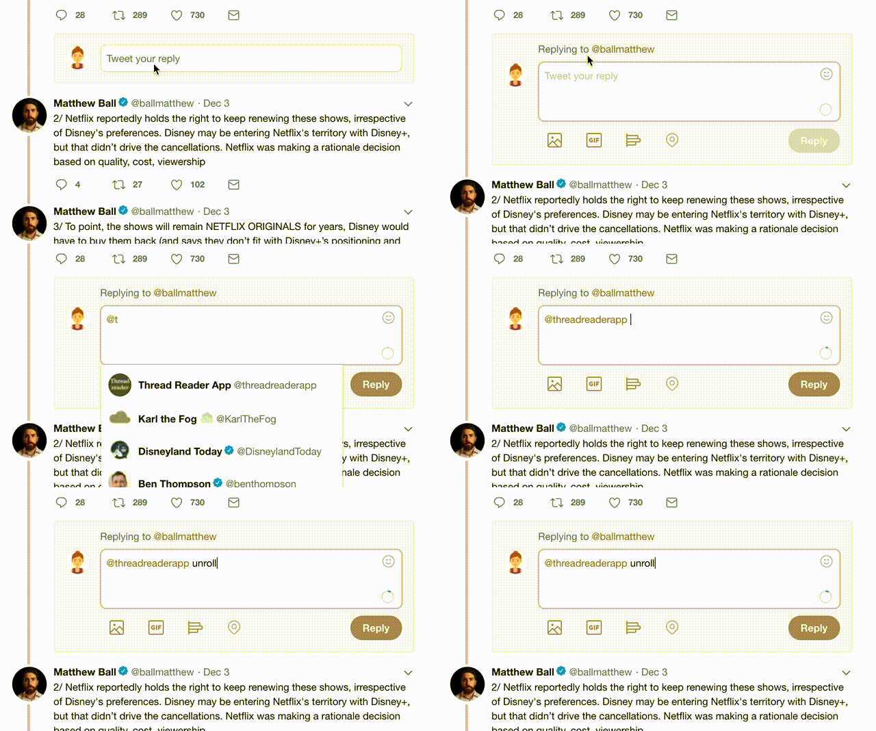
2) Go to a Twitter thread (series of Tweets by the same owner) and mention us with a keyword "unroll" @threadreaderapp unroll

You can practice here first or read more on our help page!

Follow Us on Twitter!

Did Thread Reader help you today?

Support us! We are indie developers!


This site is made by just two indie developers on a laptop doing marketing, support and development! Read more about the story.

Become a Premium Member ($3.00/month or $30.00/year) and get exclusive features!

Become Premium

Too expensive? Make a small donation by buying us coffee ($5) or help with server cost ($10)

Donate via Paypal Become our Patreon

Thank you for your support!