FOOD & SUPPLEMENTS🍱🍎.
I thought 🧠⬇️
So, this is a UNISEX product niche, right? So, why is that looking at the ads, it seems like the niche is very much divided in products for MALES🧑💻 and 👩💻FEMALES?
WOW! I am very happy FOOD IS FOR EVERYONE! Especially Pizza 🍕🍕
- The food products for males look very “MANLY” - Look at this beer! Great for a night out with the boys.👨🔧👨✈️
- For women, products looked “gorgeous”? - This hummus looks delicious! Definitely for the next night with the gals! 👩✈️👩🚀
Why ads are so effective at making food & supplements look so much attached to a specific gender?
Is it the words used? (Copywriting)📝 Is it the music on the video ads?🎧 Is it the story told? (Storytelling)🎭
“E-commerce brands/ Digital agencies design their female-targeted ads with the delicate hues. Shiner purple, hotter pinks, for example. Male ads often contain bolder colors like black & blue, to appeal to men as more “masculine” & “strong.” 🧠🧠🔥
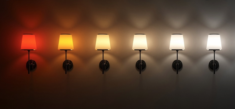
Lighting is very important to make your product look good! In fact, it is one of the most important tools for any photography/videographer out there!🖥🎥📷📸
So, how do advertisers use it?🤨🤨
Anyway, What do you think about it?
How do you use color and lighting to convey a feeling?
How do you segment your audience?
So, here it is!!
meetadbox.com


