Devin Korwin Profile picture
Jun 30, 2020 14 tweets 6 min read Read on X
Thread on color in painting! This will be a 3-part series with everything you ever wanted to know about color. What actually is color, and how do we use it? How come it is so hard to make a painting look natural if we start in black and white and then add color after?
Let’s start at the beginning with the basics in this thread. First, color is a 3D space that you could imagine yourself walking around in. We know this because there are 3 variables. If we plot only 2 of them, for example value and saturation, we can easily see that this is 2D.
This 2D space is familiar to us, we see it in the Photoshop/Procreate color picker. Once we add a third variable, hue, we have depth to our graph. Value is the amount of light, saturation is the purity of the light, and hue is the wavelength of the light (more on this later).
In this 3D space, hue loops around the outside. In Photoshop, hue is laid out as a strip, but it could be thought of as a continuous color wheel. When we change just value and saturation we are exploring a flat 2D plane, and when we move the hue we are moving through 3D space.
By lowering saturation, we are actually adding in the opposite, or complement, of the color. If we add blue to a pure yellow, it desaturates and passes through the land of grey, and then comes out the other side of the color world until eventually we get to a pure blue.
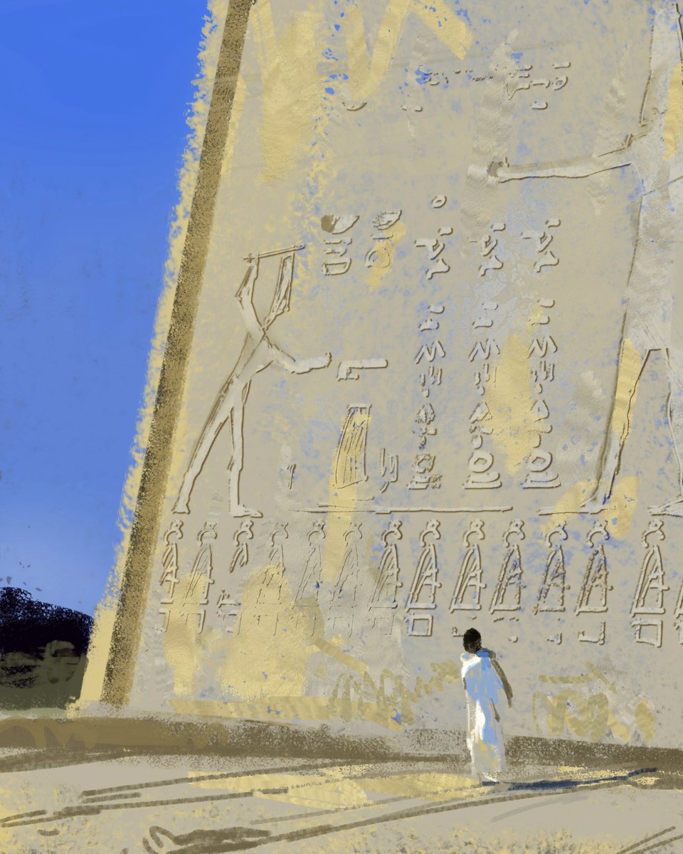
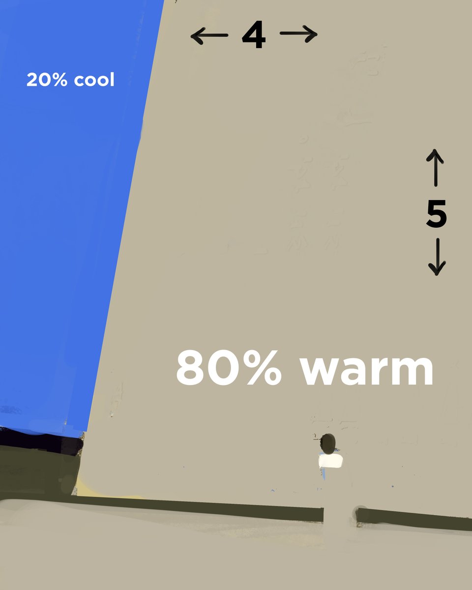
By desaturating blue, we are adding yellow, and thus making it warmer. This is why a greyer version of yellow is cooler, even though it is still technically a yellow hue. Temperature is relative, so we are comparing two colors to each other.
If we have a yellow object reflecting red light, we can walk around the edge of the world instead of going through the center. Instead, we could shift the hue and move through the oranges. It might even desaturate a bit because it is losing purity from the light mixing.
How do we know how far to move through the 3D color world? This depends on the materials and the intensity of the light. All that we see is due to reflection, materials determine the properties of it. A chrome sphere will strongly reflect the color of a blue light source.
A strong blue light on skin, with its unique material properties, will have the resulting color be pulled to the color of the light source but not all the way, resulting in pinks.
For more about materials and how everything we see is due to reflections, check out my thread on specular highlights!
Stay tuned for part 2, and if you've enjoyed this, check out my ebook! It has all of my previous tutorials greatly expanded upon and with lots of bonuses like a glossary, recommended reading, and all the artists names right there with the examples! gumroad.com/l/YPtf
This color series is included and expanded on as part of my new book! gumroad.com/l/cfv2
In addition to color, it puts all of the fundamentals in context so that you can understand how painting works and focus on the fun part!

• • •

Missing some Tweet in this thread? You can try to force a refresh
 

Keep Current with Devin Korwin

Devin Korwin Profile picture

Stay in touch and get notified when new unrolls are available from this author!

Read all threads

This Thread may be Removed Anytime!

PDF

Twitter may remove this content at anytime! Save it as PDF for later use!

Try unrolling a thread yourself!

how to unroll video
  1. Follow @ThreadReaderApp to mention us!

  2. From a Twitter thread mention us with a keyword "unroll"
@threadreaderapp unroll

Practice here first or read more on our help page!

More from @devinkorwin

Jul 4, 2022
What is composition? Composition, at its core, is decision making about relationships. Is your canvas ratio 3:2? Will that be divided in half equally with light and dark? Will half of that dark area be warm, and the rest of the canvas cool? Each of these choices is composition! ImageImage
Overly rigid formulas using math is not a great way to learn composition, because it does not lead to listening and trusting yourself. Composition is design, and design is intuitive. Theory is just a possible explanation as to why something works, not a rule or a process. Image
If you ever encounter a rule, like the rule of thirds, know that it is only named that way because it is an effective tool that is very commonly used. The rule of thirds creates motion, but where motion is not desired, it is not the right decision to make. Image
Read 6 tweets
Jun 11, 2022
Drawing tip: don't look at the thing you are drawing!
This might seem counter intuitive at first, but if you look, take a second to memorize, look away, and then draw, you will get a lot more accuracy *and* train your visual memory too
Try drawing something completely behind you!
Take a look at this photo of Sorolla painting, he would have had to turn his head to the side to see his subject. Painters of the past did not always put their canvases right next to the subject so that they could see both in one field of vision Image
Check out these examples of students at classical ateliers doing the same thing, they were not flicking their eyes back and forth to the subject and drawing/painting rapidly. They were observing, then turning back. Image
Read 5 tweets
Mar 27, 2022
Thread on finishing paintings! What does it mean to finish or detail a painting? What does the word rendering even mean? Here's a thread on 3 different strategies for finishing work, when to know that it is "done," and the pitfalls we might encounter along the way.
Here’s one of my sketches compared to the finished version. They look very similar when viewed small. I’m trying to solve the biggest problems first, loose but accurately. By focusing on the big picture, the details will relate to the whole and not distract and weaken the picture
When I was first starting, I often heard the advice to turn off your brain and enjoy adding details, and I was very discouraged that when I would try to detail paintings it would just get worse. I thought this was something that was easy for others, but not for me…
Read 13 tweets
Feb 7, 2022
Let's talk about one of my favorite paintings and some of the reasons why I think that it works so well: a thread on detail, edges, gesture, composition, and shape design.
Notice how all of the detail in the painting is grouped into two main areas, an big area of complexity and interest, and a simple area to contrast and "activate" the complexity. If everything is detailed, then nothing is.
The main figure has a really interesting edge relationship with the background. Notice how with lost edges the values look the same, and with hard edges they look very different. Soft edges are somewhere in between. Look at the image really small to see this even more clearly!
Read 7 tweets
Jun 25, 2021
My new tutorial is on sale for today only! I'll also pick one random retweet to give it to for free, and if you already picked it up I'll refund the cost! Use this link to get the discount:
gumroad.com/l/advancedbasi…
This tutorial goes over the mental side of art, my detailed process, how to study in a sustainable way, as well as all of the fundamentals needed to confidently understand painting
The rest of my gumroad is also 50% off! Pick up my two ebooks with these links:
gumroad.com/l/YPtf/summers…
gumroad.com/l/cfv2/summers…
These two volumes include pretty much everything I know about painting, including color theory made practical and understandable
Read 4 tweets
Jun 18, 2021
Are diagrams like these bad for artists? Will they restrict creativity and and instill a bunch of rules of composition that you have to follow? Are the lines and shapes completely made up? What if I don't get it? A thread. 🧵
Will they restrict creativity? No, not as long as you know what they are for. Take music theory, it is great at analyzing how a Mozart symphony works, but it does not work at all as a step by step guide to writing an amazing piece of music.
This is analysis done after an artist had a great idea and made the work, it says nothing about what process you should use, theory should never do that. These are for recognizing where contrast is, since art is a language that uses contrast in different ratios to show feelings.
Read 9 tweets

Did Thread Reader help you today?

Support us! We are indie developers!


This site is made by just two indie developers on a laptop doing marketing, support and development! Read more about the story.

Become a Premium Member ($3/month or $30/year) and get exclusive features!

Become Premium

Don't want to be a Premium member but still want to support us?

Make a small donation by buying us coffee ($5) or help with server cost ($10)

Donate via Paypal

Or Donate anonymously using crypto!

Ethereum

0xfe58350B80634f60Fa6Dc149a72b4DFbc17D341E copy

Bitcoin

3ATGMxNzCUFzxpMCHL5sWSt4DVtS8UqXpi copy

Thank you for your support!

Follow Us!

:(