
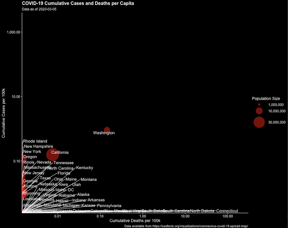
As a surge has built across the south, we’ve been waiting for the deaths. We know they lag. This animation (from the great @_christiantesta) shows that lag. It plots cases/100k against deaths/100k for each state over time in the first surge 1/n
At first the cases build up. You can see the points jostling to climb the y-axis (cases) then after a while states detach themselves from and head toward the upper right as deaths mount. First WA, and CA. But they controlled their outbreaks, at least initially 
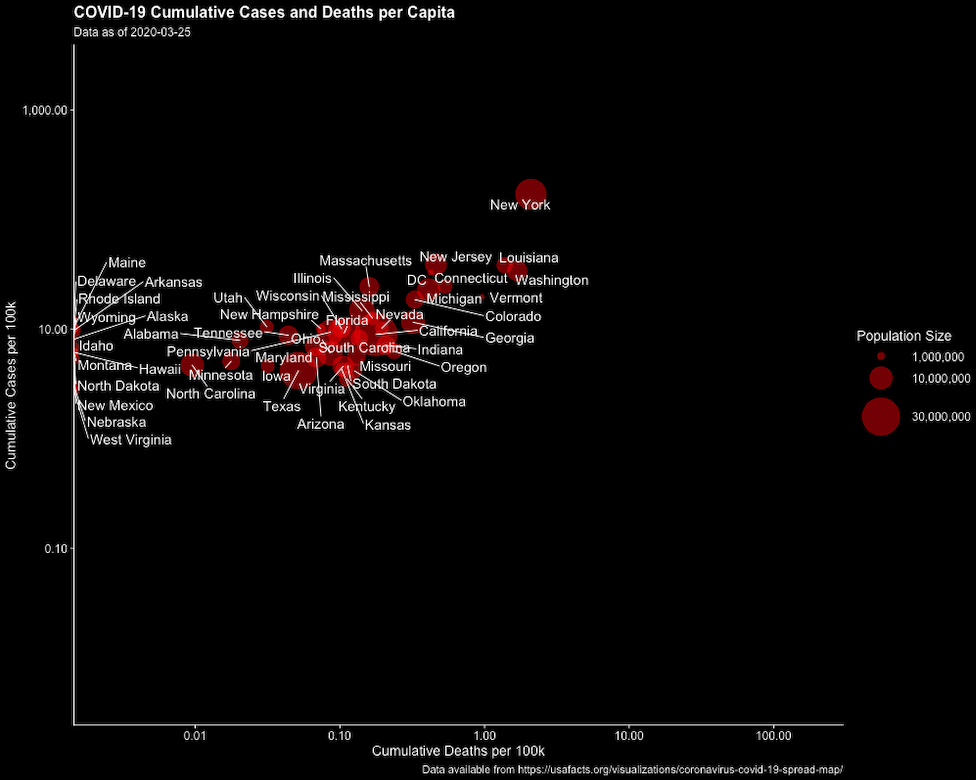
Then the surge. NY and NJ take off along with LA (fueled by Mardi Gras). The rest of the country follows behind (note log axes btw) 3/n
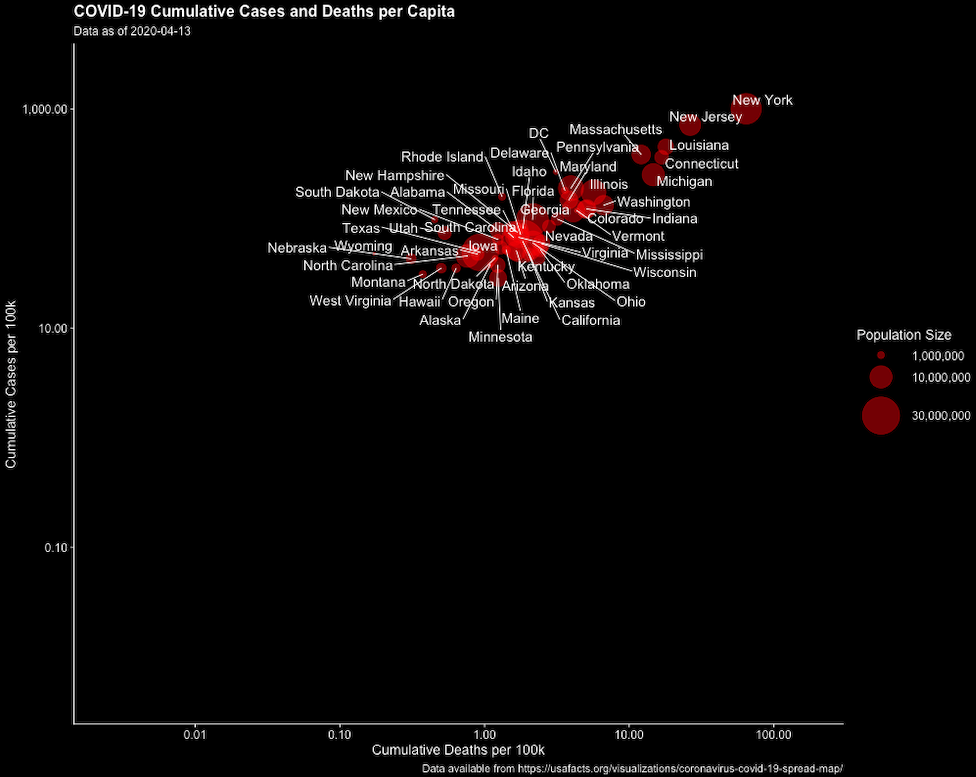
Eventually the last holdout on the Y axis WY joins the rest. It's still only April 13th 4/n
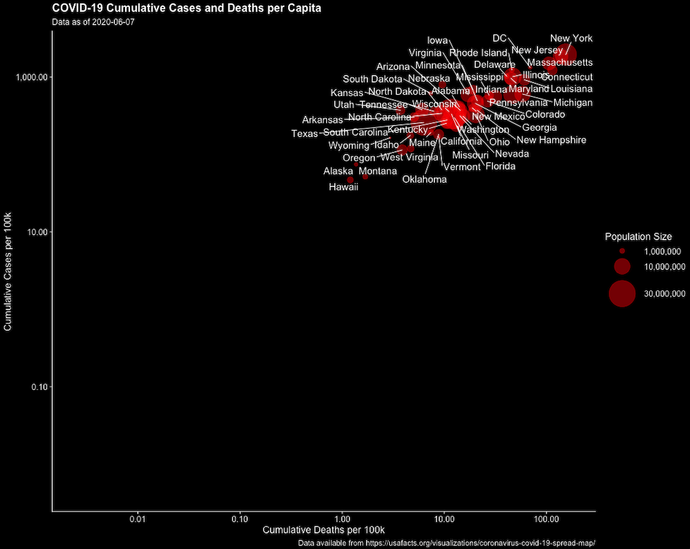
And this is earlier this week. You can read the working paper here which explains it more cdn1.sph.harvard.edu/wp-content/upl…
And likewise see a fullsize version if you are on a computer github.com/ctesta01/anima… what does this mean for the future? 5/n
And likewise see a fullsize version if you are on a computer github.com/ctesta01/anima… what does this mean for the future? 5/n
Well, some have trumpeted that for all the surge in cases across the south, the numbers of deaths have remained relatively low. I’ve been saying for a while that if you want to use that metric, it might not look so good in a few weeks and☝️🏽is part of the reason why 6/n
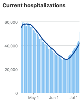
We know how this works. 1st the cases, then a few weeks down the line the hospitalizations. People can linger in hospital for some time, so the numbers there build and systems begin to be overwhelmed. Other parts of healthcare are damaged by the need to focus on the pandemic. 7/n
And then come the deaths. They lag for multiple reasons – including not only the time it takes for the disease to do its work but because we expect them to accelerate once the virus gets into vulnerable populations and many infections in the south have been in younger people. 8/n
(Note that while young people can get seriously ill and have bad symptoms for a long time, they are at much lower risk of death from SARS-CoV-2 infection) 9/n
This is shown rather well by the data from @COVID19Tracking. Cases hit their national nadir on June 8th (a weekend, not coincidentally) 10/n
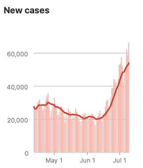
Cases start to increase and the 7 day average for hospitalizations starts to move upward on June 23rd 11/n
And there it is - everyday this week so far more than 800 new deaths. I don't think that's a blip 12/n
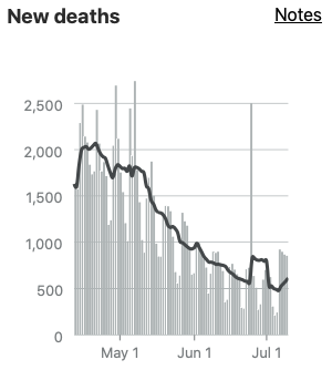
As I have written many times, for all that there's a lot we don't know about this infection, there's plenty we do. And something we know is that deaths are a lagging indicator. Cases have climbed through the last month. We know what's coming 12/end

