My Authors
Read all threads
I see some mistakes people make with their Cv and I created this thread to point some of them out before you send out your CV this week.

A thread
MAKE SURE YOU HAVE YOUR CONTACT INFORMATiON ON
YOUR RESUME.

Name
Email address: Make sure to use a professional-looking email address. Also, never use your work email address on your resume. For example - badboy4life@gmail.com is not a good idea
Phone number
LinkedIn address
USE JOBSCAN (BiTLY.COM/ATSHACK) AND COMPARE YOUR RESUME TO THE JOB DESCRiPTiON BEFORE SENDiNG IT OUT
It is a tool where you can upload your job description, and your resume and see the matching keywords.
Keywords are important for you to get the highest relevancy search for
both the ATS and for human eyes when scanning your
resume.

DO NOT USE PERSONAL PRONOUNS (I, ME, ETC) RATHER USE ACTiVE VERBS TO DESCRiBE YOUR JOB (MANAGED,
ORGANiZED, LED)

ADD A SKiLLS SECTiON AND USE THiS AREA TO HiGHLY
SPECiFiC SKiLLS THAT ARE JOB-RELATED.
This section is not about elaborating your soft skills. Try to pick the relevant skills mentioned in the job description and match with your skills to be put in this section.

DON'T INCLUDE YOUR PHOTO UNLESS YOU ARE AN
ACTOR OR MODEL
Unless you are an actor, model, realtor or applying for a role which requires your physical appearance to be included, don’t put it on your
resume.
This is tricky, because photos not only create bias, but they are a straight disqualification for some recruiters. At times the
moment they see the photo on the resume, it gets dumped to the rejected bin, no matter how
well qualified you are for the job.
Don’t get confused with the trendy resume templates you find online, just follow the basics. No photo required on the resume, unless the job demands it.
Always use a reverse chronological order to showcase your work experience, starting with the most recent company you have worked with, then diving to the others

SAVE YOUR RESUME AS SOME VERSiON OF YOUR NAME
"HANSEL PRAISE RESUME" AND NOT
" UPDATED RESUME".
AVOiD ADDiNG FANCY GRAPHiCS AND DiAGRAMS UNLESS YOU'RE A CREATiVE PROFESSiONAL.

Fancy designs and diagrams are not helpful on a resume.
You may be disqualified or rejected, because the recruiter couldn’t read your resume properly and got distracted.
Keep your resume simple
and easy to read.

I hope with these few points of mine I have been able to convince and not to confuse you that hannytalker lol don't mind me. Have an awesome week ahead.
Missing some Tweet in this thread? You can try to force a refresh.

Keep Current with Hansel🇳🇬

Profile picture

Stay in touch and get notified when new unrolls are available from this author!

Read all threads

This Thread may be Removed Anytime!

Twitter may remove this content at anytime, convert it as a PDF, save and print for later use!

Try unrolling a thread yourself!

how to unroll video

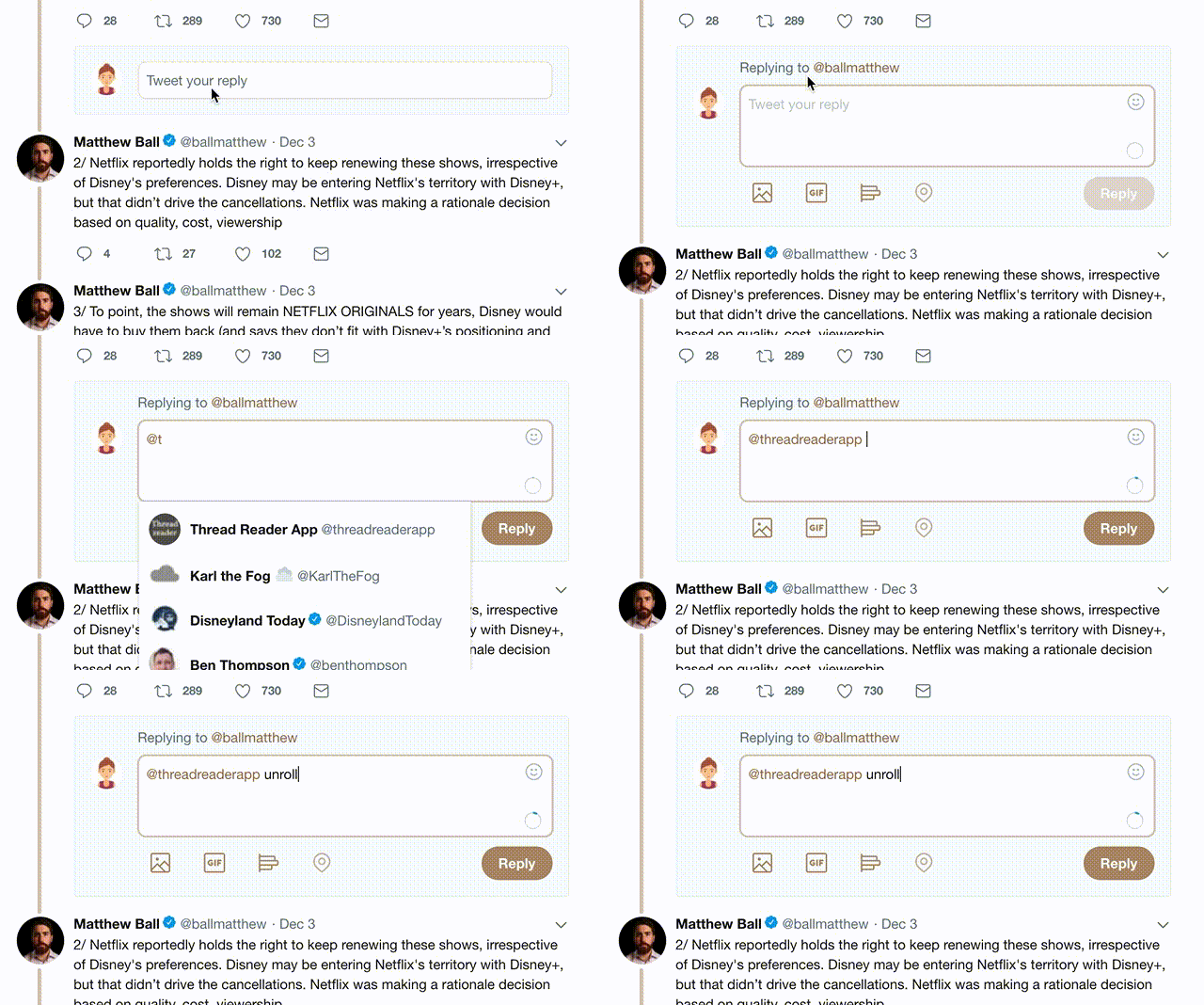
1) Follow Thread Reader App on Twitter so you can easily mention us!

2) Go to a Twitter thread (series of Tweets by the same owner) and mention us with a keyword "unroll" @threadreaderapp unroll

You can practice here first or read more on our help page!

Follow Us on Twitter!

Did Thread Reader help you today?

Support us! We are indie developers!


This site is made by just two indie developers on a laptop doing marketing, support and development! Read more about the story.

Become a Premium Member ($3.00/month or $30.00/year) and get exclusive features!

Become Premium

Too expensive? Make a small donation by buying us coffee ($5) or help with server cost ($10)

Donate via Paypal Become our Patreon

Thank you for your support!