, 21 tweets, 11 min read
My Authors
Read all threads
The 5-year-long story of "featured images" on Ahrefs Blog.

[ 📚 A THREAD]

...

Please give me some likes/retweets/comments if you'll enjoy this story ;)
When I joined Ahrefs back in 2015 and took over their blog, my goal was to make it the world's best SEO blog.

And other than producing top-notch content, I wanted to make our blog visually and aesthetically pleasing.

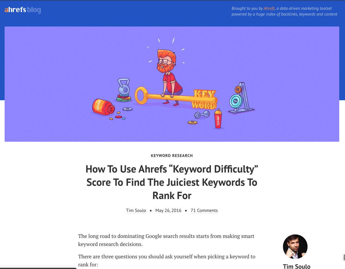
Here's where it all started:
If I remember correctly, back in the day we were using some free stock photos/illustrations for our article's "featured images."

Sometimes we would ask our designer to add some text to them to make them more relevant.

I didn't like them.
Featured images are very important, b/c every social network would pull them and display them in users' feeds.

So if we wanted our content to catch an eye of people on social networks, we needed to develop a consistent style that would help people to identify Ahrefs' articles.
I didn't like any of the styles that we tried. 😕

And frankly, I didn't believe that we could develop a "recognisable" style of featured images while using stock photos.

But I didn't have a solution for that problem. And that bothered me a lot.
Things exacerbated to a critical point when we updated our blog design to make it more stylish and more "reader-friendly."

Everyone loved our new design.

But it became obvious that we could no longer tolerate those "generic" stock images on our stylish new blog.
At that time I was following @Groove blog and they had those small but beautiful illustrations at the top of each article.

They were clearly custom made, because there was a consistent style to them.

I loved them!
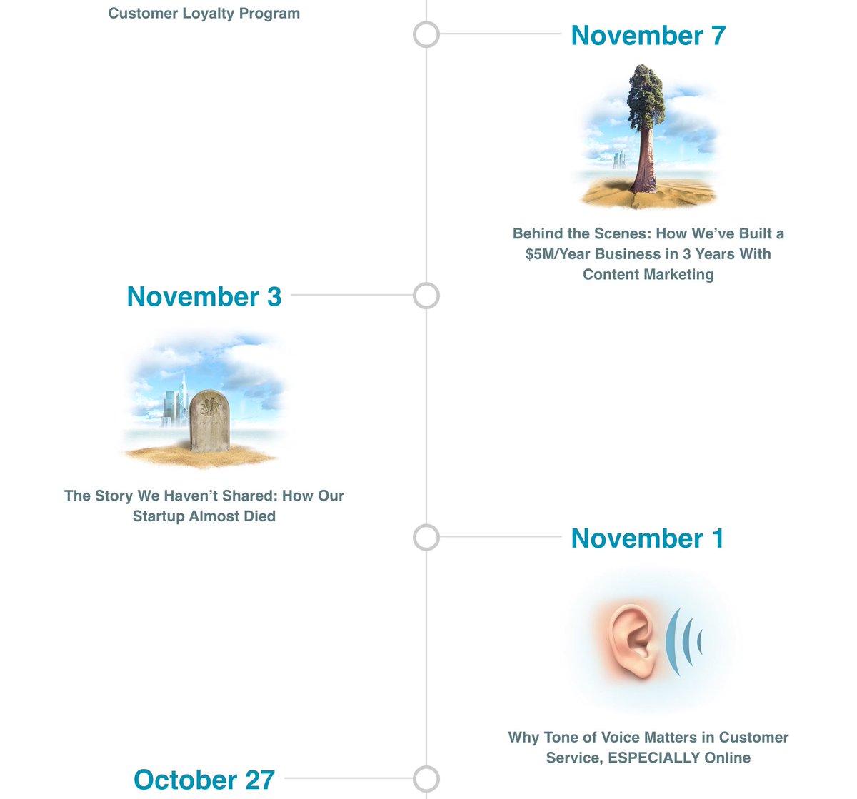
I really wanted to have something similar on our own blog, so I pitched the idea to @botsbreeder

Luckily, Dmitry was a fan of good design too, so he allowed me to hire a contractor to do illustrations for our blog articles.

I opened behance.net & started searching.
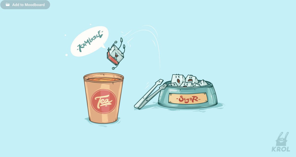
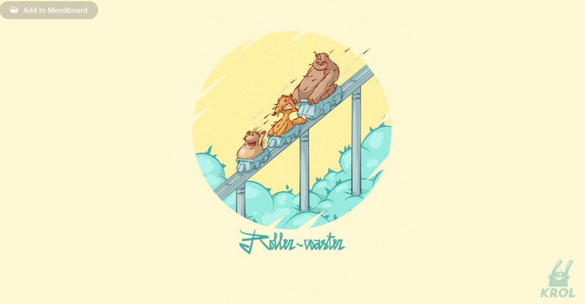
I saw these illustrations at Behance, and that style resonated with me.

So I sent a private message to the author, @krolone , and asked if he was open for some freelance work.

He said he was. 🥳
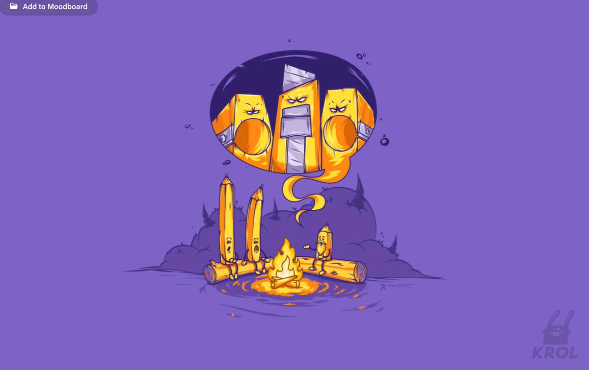
And so @krolone started drawing custom images for each new article we published.

Our output was about 1 post per week and he never failed us! 💪

We got quite a bit of positive feedback from people in our industry, as they saw those images in their social feeds.
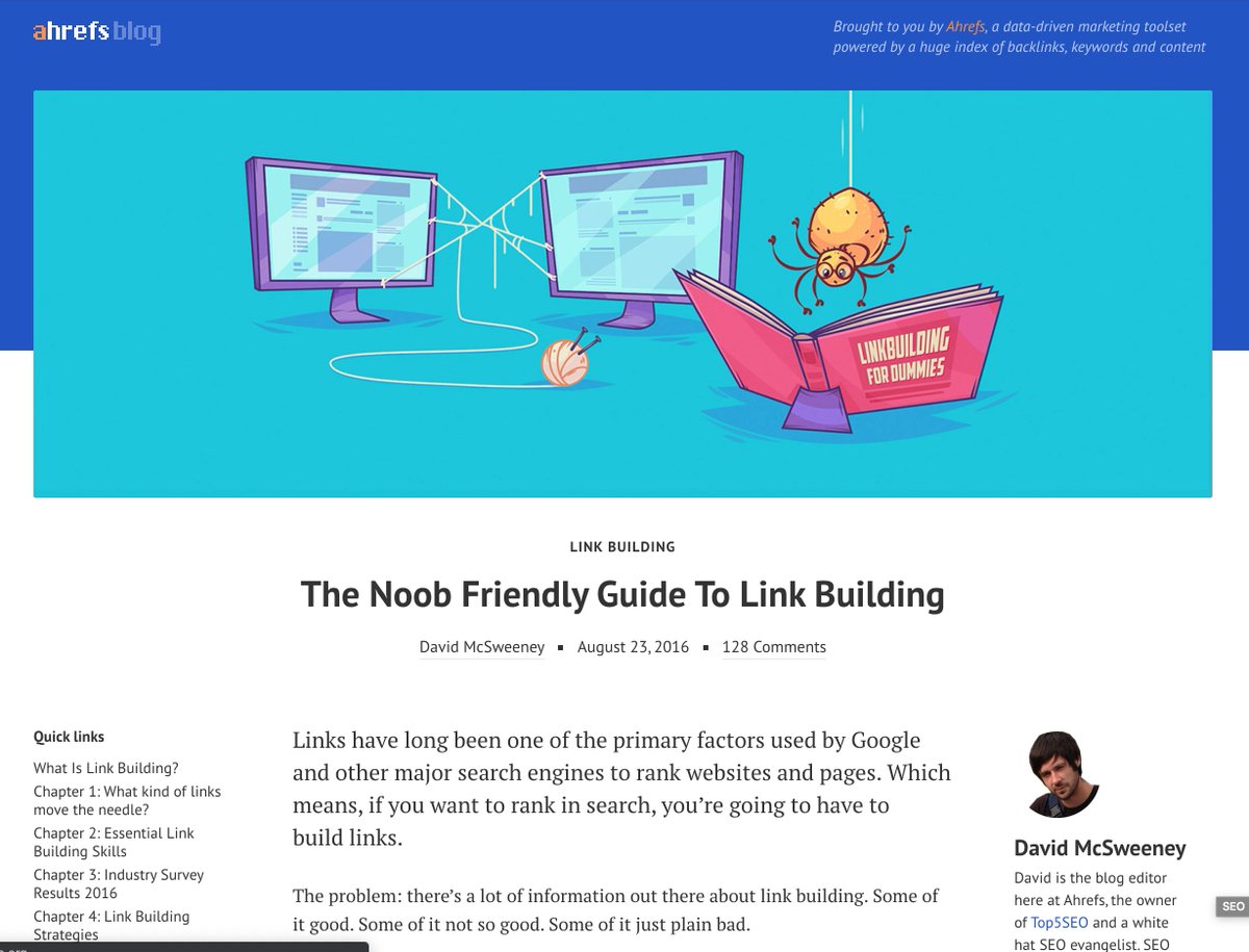
Money-wise, each illustration like that was costing us $300.

But we thought that this investment was perfectly justified.

Other than making our content more visible on socials, those quality illustrations implied that our content was just as good.

en.wikipedia.org/wiki/Associati…
Process-wise, we were the ones coming up with ideas of situations that we could depict, which would be relevant to the topic of the article.

And @krolone would then bring it to life with his unique twists :)
So then one day he draw this beard-guy for one of our posts...

We knew it was love at first sight. 😍
So we started using that beard-guy in all our blog illustrations.

Everyone loved him! :)

He basically became a mascot of our blog.
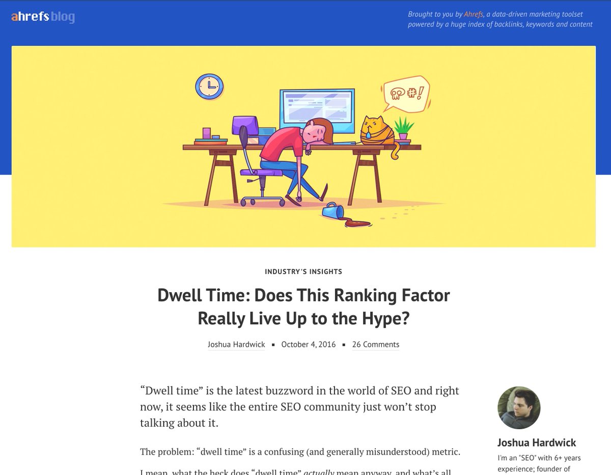
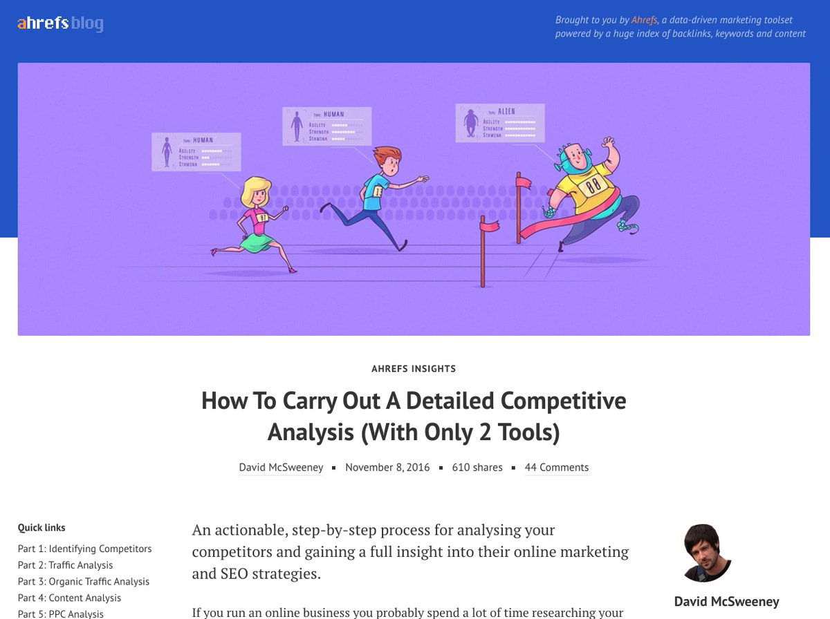
Finally we have developed a style of featured images for our articles that was unique and immediately recognizable.

Our beard guy even made it to the physical word, appearing on our banners and flyers at SEO conferences.
And then we met him in real life!

Turned out he was working at @PitchboxApp all this time 😆

After a few years of working with @krolone as a freelance contractor, we decided to hire a full-time illustrator to our team.

But it wasn't @krolone . I didn't offer him a job, because I thought he was overqualified to be our full time illustrator.

¯\_(ツ)_/¯
As much as we loved our featured images, there were two problems with them:

1. They were too big & detailed to be appreciated on mobile phones.

2. It was hard to fit any text next on them for Tw/Fb sharing & advertising.
So we went back to the drawing board, with a goal to develop a new style of images, which would look good even on small screens of mobile phones and which would allow us to put some text next to them.

And I like what we ended up with.

(Though I still miss the beard-guy 🥺)
But back to the concept of Association Fallacy..

Some of our articles are more important than others. And we want readers to know it the second they open them.

Which we thought a beautiful big detailed illustration could solve.

So our art-director has developed a new style.
And that's the end of the story. Hope you enjoyed following how our "featured images" have been improving over the past 5 years.

Let me know if you have any further questions!
Missing some Tweet in this thread? You can try to force a refresh.

Keep Current with Tim Soulo

Profile picture

Stay in touch and get notified when new unrolls are available from this author!

Read all threads

This Thread may be Removed Anytime!

Twitter may remove this content at anytime, convert it as a PDF, save and print for later use!

Try unrolling a thread yourself!

how to unroll video

1) Follow Thread Reader App on Twitter so you can easily mention us!

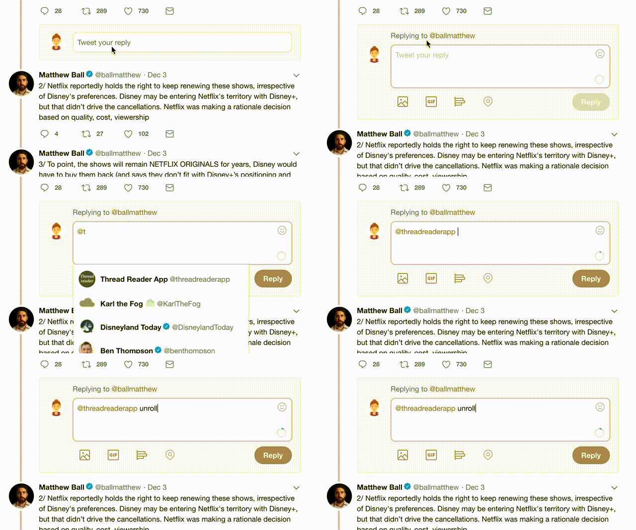
2) Go to a Twitter thread (series of Tweets by the same owner) and mention us with a keyword "unroll" @threadreaderapp unroll

You can practice here first or read more on our help page!

Follow Us on Twitter!

Did Thread Reader help you today?

Support us! We are indie developers!


This site is made by just two indie developers on a laptop doing marketing, support and development! Read more about the story.

Become a Premium Member ($3.00/month or $30.00/year) and get exclusive features!

Become Premium

Too expensive? Make a small donation by buying us coffee ($5) or help with server cost ($10)

Donate via Paypal Become our Patreon

Thank you for your support!