Is there a seasonal component to the COVID-19 mortality rate?
A thread with some figures with @ChikinaLab on what seems to be a question of underestimated importance. 🧵 1/8
Slightly longer version here: math.cmu.edu/~wes/aus.html
A thread with some figures with @ChikinaLab on what seems to be a question of underestimated importance. 🧵 1/8
Slightly longer version here: math.cmu.edu/~wes/aus.html
Backstory:
Much of the coverage of summer second waves has noticed the reassuring feature that the mortality rate seems to be lower. Possible theories explaining this include different age-distributions of cases, or that the effect is actually an illusion from more testing. 2/
Much of the coverage of summer second waves has noticed the reassuring feature that the mortality rate seems to be lower. Possible theories explaining this include different age-distributions of cases, or that the effect is actually an illusion from more testing. 2/
Another explanation for the effect could be that there is a seasonal effect on mortality rates. There is some precedent for the plausibility of this (👇) and it's important to note that it is unclear what we should expect to be driving the effect... 3/
(e.g., weather vs lengths of days), so it is not implausible that an effect could be present even in relatively warm locations.
Obviously it is important to understand if the effect is seasonal, because seasons have a tendency to return.
One way to examine the seasonality... 4/
Obviously it is important to understand if the effect is seasonal, because seasons have a tendency to return.
One way to examine the seasonality... 4/
hypothesis is to compare the experience of Australia's second wave to that of Northern Hemisphere countries.
Indeed, Australia's second wave seems more deadly, not less, and this appears to be the case even in an age stratified analysis. 5/8
Indeed, Australia's second wave seems more deadly, not less, and this appears to be the case even in an age stratified analysis. 5/8
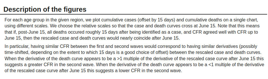
Example 1: Here are cumulative cases and deaths in FL for ages 55-65. The relative scale is chosen so that the cumulative curves intersect at June 15th.
Later, the derivative for the death curve is lower than the derivative for the case curve, suggesting a lower later CFR.
6/8
Later, the derivative for the death curve is lower than the derivative for the case curve, suggesting a lower later CFR.
6/8
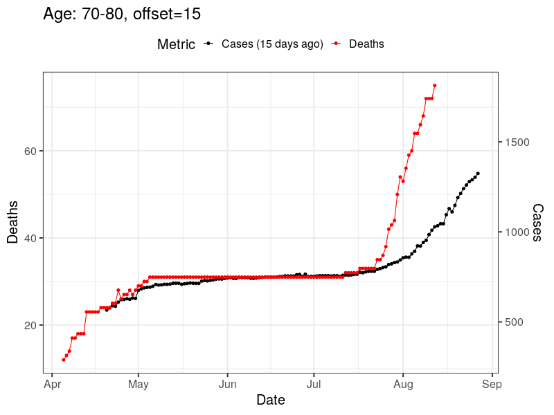
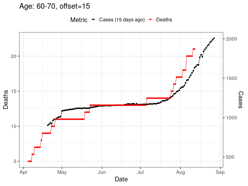
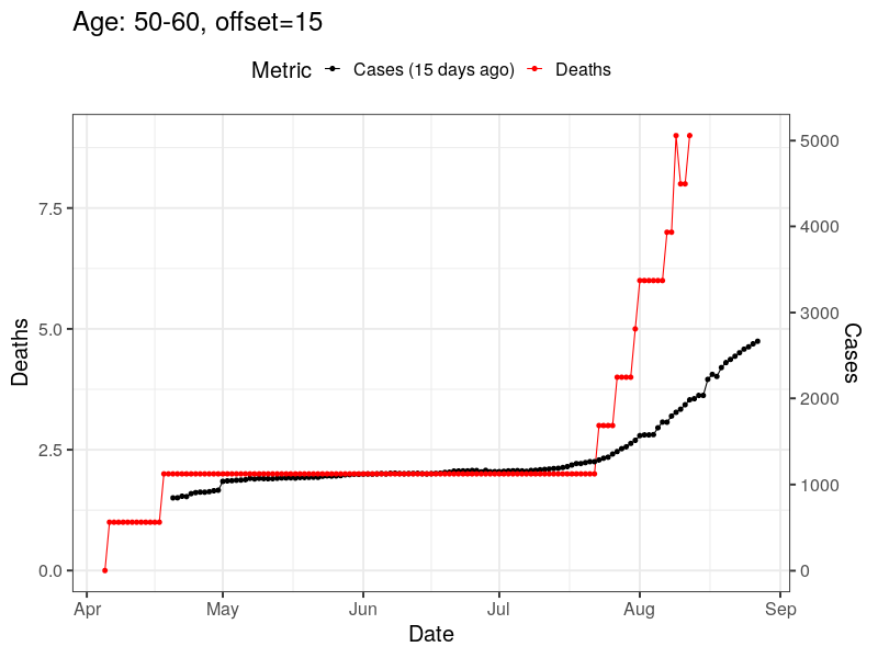
Example 2: The same for Australia, ages 50-60.
The derivative of the death curve is greater after June 15, suggesting a higher later CFR.
(In these plots, cases and deaths are offset by 15 days.)
7/8
The derivative of the death curve is greater after June 15, suggesting a higher later CFR.
(In these plots, cases and deaths are offset by 15 days.)
7/8

These figures are intended as a basic first-pass, and not an answer to the question of the role in seasonality for COVID mortality.
But this issue could be very important and we hope it attracts more attention and careful analysis.
More figures here:
math.cmu.edu/~wes/aus.html
8/8
But this issue could be very important and we hope it attracts more attention and careful analysis.
More figures here:
math.cmu.edu/~wes/aus.html
8/8
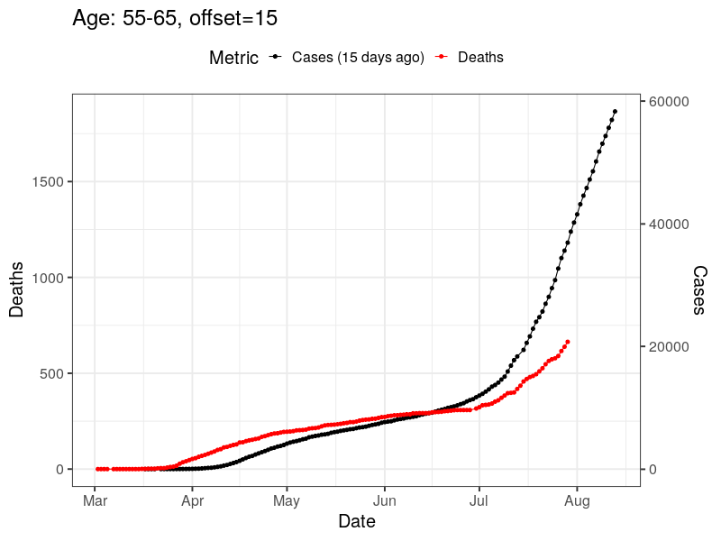
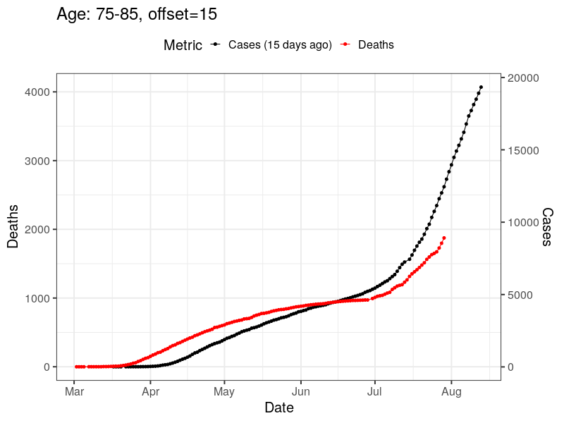
For people that don't leave Twitter, here are the figures for the three age groups first for Florida:

And then for Australia:
And the longer explanation of the figures: