My Authors
Read all threads
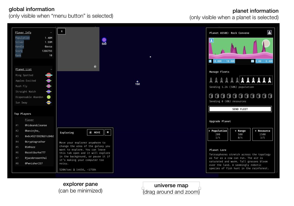
This text is not really about the game “Dark Forest" as much as it's a general description of the principles I use when approaching User Experience design, which just happens to apply to the zksnarks ethereum game for anyone interested in improving UX: medium.com/@avsa/a-dark-f…
But since I'm not paid anything to get you to click medium links I'll make a short summary in this thread. Anyone can "redesign” something that it already simple to use. The most interesting work happens when you see a software the is compelling concept but terribly confusing.
Also, never mistake "redesign" for "restyling”. The game developers describe their UI as “Hacker aesthetic" and that's a completelly valid stylistic choice you can respect. Software (specially games!) should have different flavors. UX work is fixing things underneath the "skin”
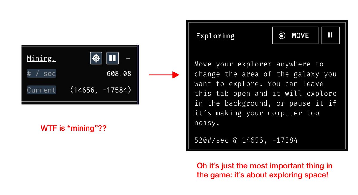
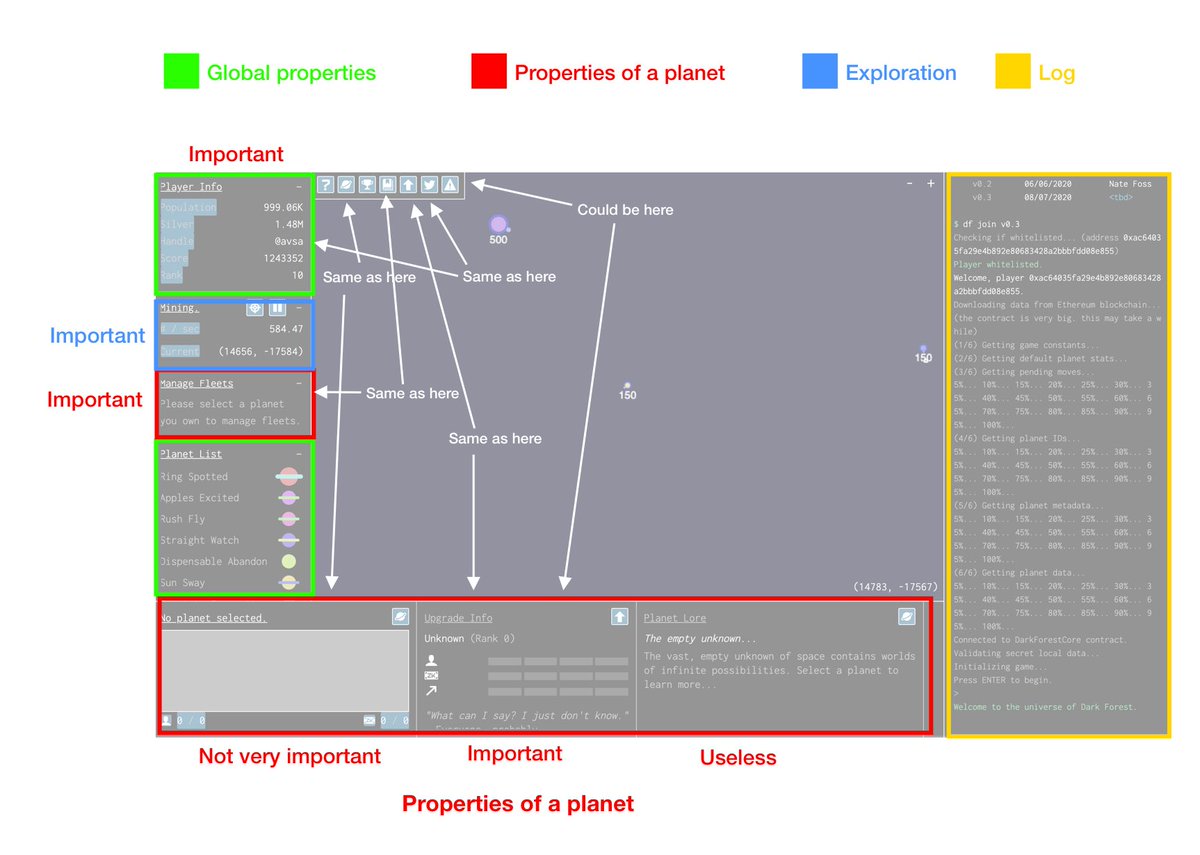
Good design often includes stuff that is not done in a design software: figuring out better names for stuff, finding what pieces of the software are important and what should be either hidden or removed. Reducing clutter is specially important
It's a bit like applying the Marie Kondo method, but to a design: figure out what stuff belongs to which drawer, put some things together, separate others, throw away if it brings no joy. Noticed that the whole toolbar, one of the most important UX elements, was 100% redundant.
Sometimes, just by reorganizing you can improve your experience 10x. Hide the stuff that isn't completelly necessary behind a click, show elements when they are relevant and the result is that the first time the user loads the app, they see a much more clutter free view.
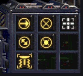
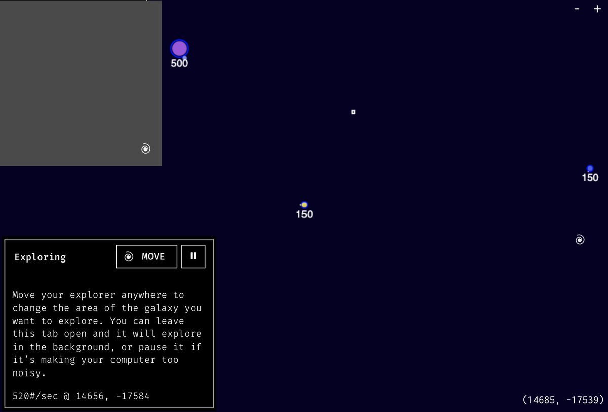
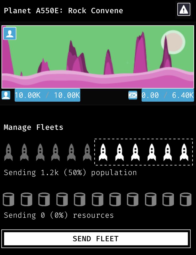
However don't focus too much on removing elements, think also when adding one might be necessary. For an app that is all about moving spaceships around, there was no button for doing that, it's done via dragging. Adding one (as an alternative) increases discoverability.
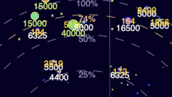
Tons of further UX polishing on any app can be done by small things like an algorithm that better decide where to place text boxes so they don't overlap. This will never show up in your beautiful photoshop mockup, you need to *use* the software a lot, to find these pain points.
Which is my final message to both designers and developers: speak the same language! I could've easily proposed tons of ways to make the little circles look nicer and more “planety", but that is not a priority. Don't sit on a high chair, sometimes the floor just needs scrubbing.
Missing some Tweet in this thread? You can try to force a refresh.

Keep Current with Alex Van de Sande (avsa.eth)

Profile picture

Stay in touch and get notified when new unrolls are available from this author!

Read all threads

This Thread may be Removed Anytime!

Twitter may remove this content at anytime, convert it as a PDF, save and print for later use!

Try unrolling a thread yourself!
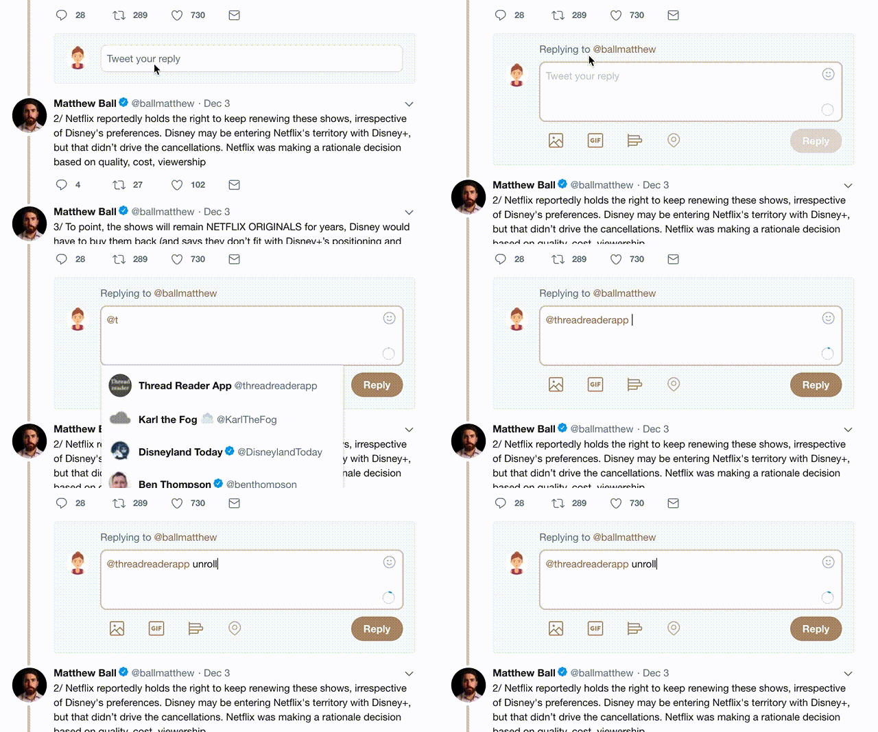
how to unroll video

1) Follow Thread Reader App on Twitter so you can easily mention us!

2) Go to a Twitter thread (series of Tweets by the same owner) and mention us with a keyword "unroll" @threadreaderapp unroll

You can practice here first or read more on our help page!

Follow Us on Twitter!

Did Thread Reader help you today?

Support us! We are indie developers!


This site is made by just two indie developers on a laptop doing marketing, support and development! Read more about the story.

Become a Premium Member ($3.00/month or $30.00/year) and get exclusive features!

Become Premium

Too expensive? Make a small donation by buying us coffee ($5) or help with server cost ($10)

Donate via Paypal Become our Patreon

Thank you for your support!