STATS QUIZ!
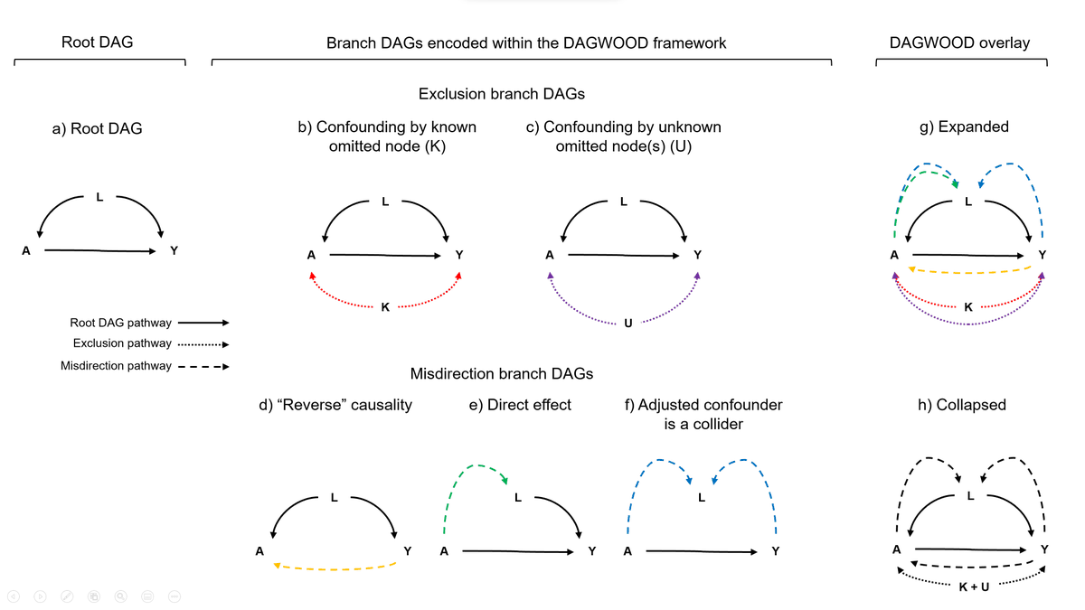
I have the datapoints below. Nothing hidden, no tricks, just a bunch of data making roughly an ellipse.
In your head, draw what you think the ordinary least squares line (i.e. good ol' y= mx+b) line looks like for these data.
I have the datapoints below. Nothing hidden, no tricks, just a bunch of data making roughly an ellipse.
In your head, draw what you think the ordinary least squares line (i.e. good ol' y= mx+b) line looks like for these data.
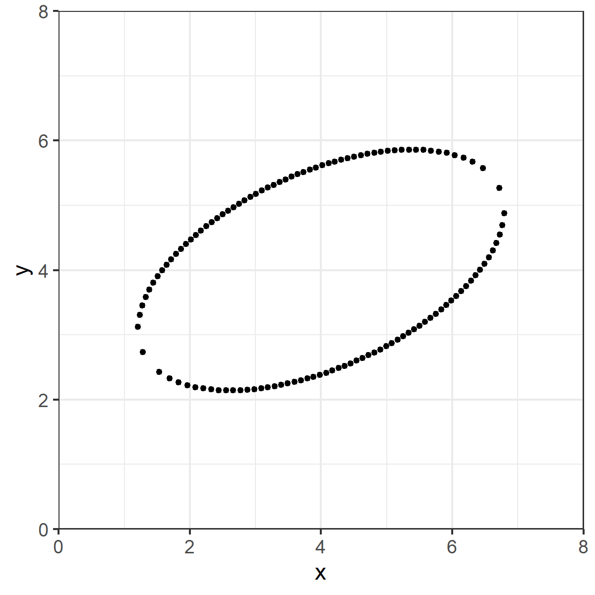
Is this what you drew?
Seems "obvious" right?
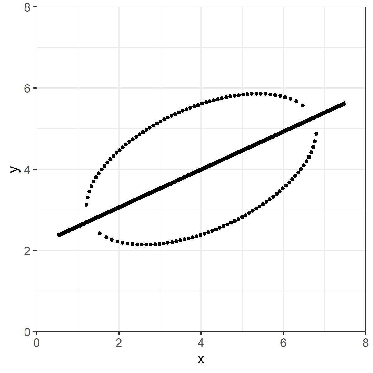
Except that's not the OLS line.
The red dashed line is the OLS line.
What's going on here?
Except that's not the OLS line.
The red dashed line is the OLS line.
What's going on here?
Ordinary least squares is the line which minimizes the VERTICAL squared distances.
Take a vertical line on the data, and draw a midpoint between the top and bottom of the ellipse. Do that for all points.
OLS is the line that minimizes the sum of those (squared) distances.
Take a vertical line on the data, and draw a midpoint between the top and bottom of the ellipse. Do that for all points.
OLS is the line that minimizes the sum of those (squared) distances.
In your head, you were probably trying to find the line that minimizes the TOTAL distance, not just the distance on the vertical.
That's the ORTHOGONAL (or total) least squares line. Totally natural, and it isn't wrong. Makes you wonder why we care only about the vertical, eh?
That's the ORTHOGONAL (or total) least squares line. Totally natural, and it isn't wrong. Makes you wonder why we care only about the vertical, eh?
RABBIT HOLE TIME!
What we are implying here is that Y is the DOMINANT axis.
That's great and fine if we are trying to predict Y from X, or estimate how much X causes Y.
But you've heard the phrase "it's just association" right?
What we are implying here is that Y is the DOMINANT axis.
That's great and fine if we are trying to predict Y from X, or estimate how much X causes Y.
But you've heard the phrase "it's just association" right?
If all we care about is that X and Y move together, we shouldn't have a dominant axis at all! We'd probably want to use something more like TLS.
In other words, the form of our estimates pushes us toward prediction/causation thinking, even if we really don't want to.
In other words, the form of our estimates pushes us toward prediction/causation thinking, even if we really don't want to.
Small clarification OLS is (was a bit unclear):
The OLS line is the line in which the sum of the squared vertical distances from the line and the datapoints are minimized.
The midpoint bit is an illustration for intuition, not strictly how OLS actually "works"
The OLS line is the line in which the sum of the squared vertical distances from the line and the datapoints are minimized.
The midpoint bit is an illustration for intuition, not strictly how OLS actually "works"
The above thread was inspired by one from @kareem_carr here:
For more thought provoking stuff on axis dominance and graphical displays, check out @CT_Bergstrom and @jevinwest's "Diamond Plot" idea.
arxiv.org/abs/1809.09328
https://twitter.com/kareem_carr/status/1304552047790845952
For more thought provoking stuff on axis dominance and graphical displays, check out @CT_Bergstrom and @jevinwest's "Diamond Plot" idea.
arxiv.org/abs/1809.09328
I've neglected finishing the code for it, but I've been playing with an alternative take on the Diamond Plot: the Rotatogram.
Instead of fixed axes / moving regression line, the (orthogonal) regression line is fixed vertically or horizontally, and the axes rotate around it.
Instead of fixed axes / moving regression line, the (orthogonal) regression line is fixed vertically or horizontally, and the axes rotate around it.
Some followups from the responses:
@cdsamii pointed out that this is apparently the literal cover example of David Freedman's "Statistical Models" text. Maybe one day, I'll have a truly original idea. ¯\_(ツ)_/¯
@cdsamii pointed out that this is apparently the literal cover example of David Freedman's "Statistical Models" text. Maybe one day, I'll have a truly original idea. ¯\_(ツ)_/¯
https://twitter.com/cdsamii/status/1305128029811810304
As many have noted, principal components analysis (PCA) is also based on the idea of orthogonal least squared distances. In this simple example, PCA, orthogonal least squares, total least squares and Deming regression are functionally equivalent and get you that symmetrical line.
Most importantly, the main point of this exercise is to understand what question you are asking of the data vs. what question the method you employ is asking of the data.
This doesn't mean PCA or orthogonal regression is "better," it's just asking a different question than OLS.
This doesn't mean PCA or orthogonal regression is "better," it's just asking a different question than OLS.
• • •
Missing some Tweet in this thread? You can try to
force a refresh