Important new paper published in @NatureFoodJnl. Looks at the impact of rising temperatures on 18 staple crops across the world.
A couple of interesting findings below ↓↓
nature.com/articles/s4301…
A couple of interesting findings below ↓↓
nature.com/articles/s4301…
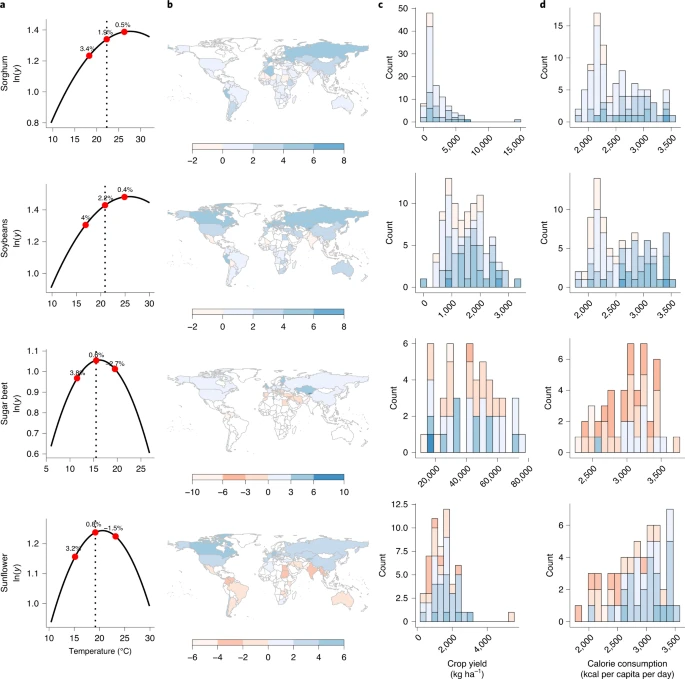
Yields tend to show inverse-U response to temp. Different countries lie on different parts of curve.
As expected, for most crops it's lower-lat, warmer countries that see negative response to temp rise.
Maps show response to 1°C rise (red = yield decline; blue = increase).
↓
As expected, for most crops it's lower-lat, warmer countries that see negative response to temp rise.
Maps show response to 1°C rise (red = yield decline; blue = increase).
↓

Some higher-latitude countries see yield increases across many crops.
Most crops show a yield decline globally. But there are a few exceptions: soybeans, sorghum, potatoes show yield increase nearly everywhere.
Useful to know for crop selection.
↓
Most crops show a yield decline globally. But there are a few exceptions: soybeans, sorghum, potatoes show yield increase nearly everywhere.
Useful to know for crop selection.
↓

Overall, rising temperatures will impact yields in poorer, more food-insecure countries the most.
But there are agricultural practices & inputs which can counter some of these impacts: irrigation in particular; also fertilizers & pesticides can offset some of these declines.
But there are agricultural practices & inputs which can counter some of these impacts: irrigation in particular; also fertilizers & pesticides can offset some of these declines.

• • •
Missing some Tweet in this thread? You can try to
force a refresh


