9/30 Weekly covid19-projections.com Update:
We forecast 24,000 (13-42k) additional reported deaths in the US by November 1 (~750/day).
Nov 1 Total Deaths Forecasts:
Today: 230k (219-248k)
Last week: 223k (213-238k)
2 weeks ago: 219k (208-233k)
4 weeks ago: 219k (205-240k)
We forecast 24,000 (13-42k) additional reported deaths in the US by November 1 (~750/day).
Nov 1 Total Deaths Forecasts:
Today: 230k (219-248k)
Last week: 223k (213-238k)
2 weeks ago: 219k (208-233k)
4 weeks ago: 219k (205-240k)

We increased our forecasts over the past week after incorporating several new factors:
- A potential loss of immunity after >6 months
- Further relaxation of policies
- Increased interactions (school reopenings, return to work, etc)
- Plateau in cases/hospitalizations
- A potential loss of immunity after >6 months
- Further relaxation of policies
- Increased interactions (school reopenings, return to work, etc)
- Plateau in cases/hospitalizations
There is currently a lack of consensus among the top models about the short-term deaths forecasts.
Our model and the COVIDhub ensemble model both suggest a possible plateau in reported deaths over the next few weeks.
Our model and the COVIDhub ensemble model both suggest a possible plateau in reported deaths over the next few weeks.

Here's the week-over-week status of important metrics:
Tests: ⬆️ 9% (good)
Cases: ⬇️ 3% (good)
Positivity rate: ⬇️ 10% (good)
Hospitalizations: ⬆️ 3% (bad)
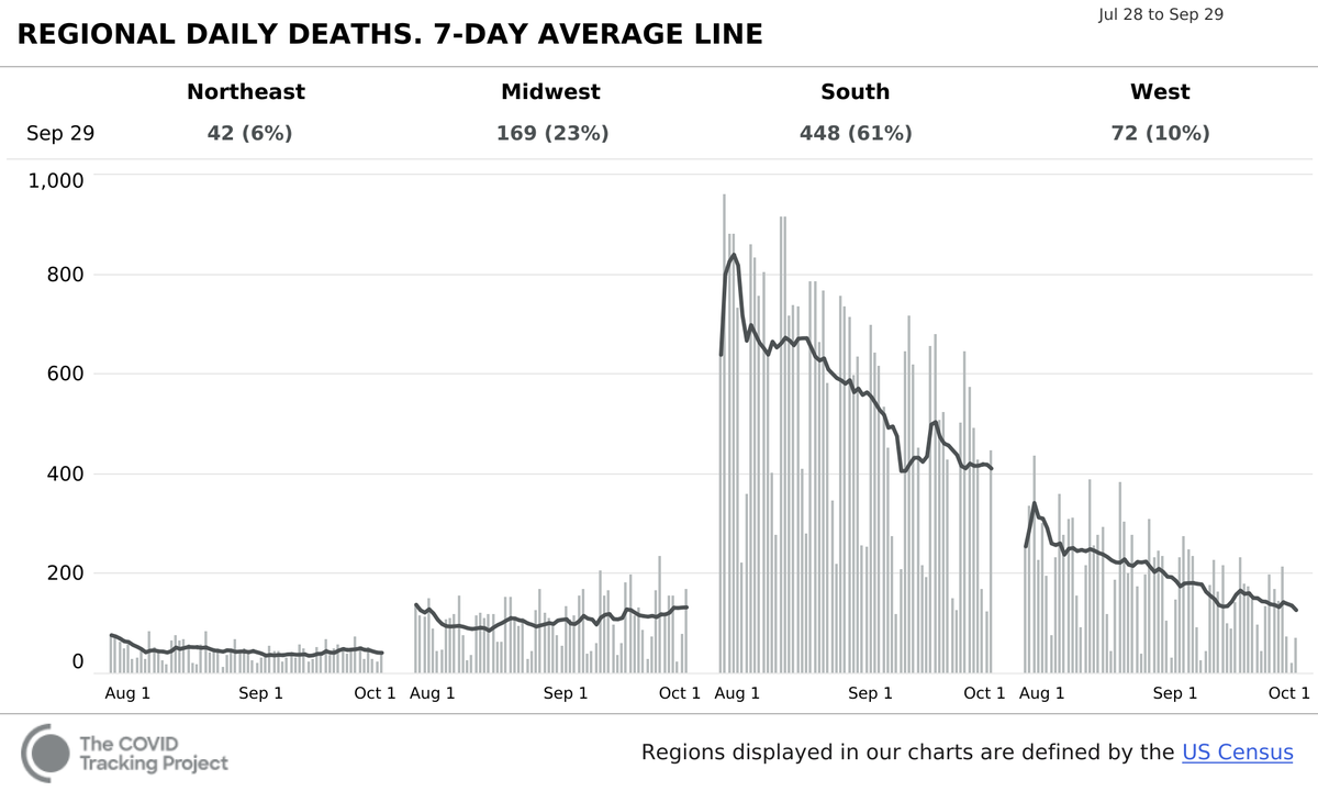
Deaths: ⬆️ 4% (bad)
The clear, consistent decline in hospitalizations and deaths over the past 2 months seems to be over.
Tests: ⬆️ 9% (good)
Cases: ⬇️ 3% (good)
Positivity rate: ⬇️ 10% (good)
Hospitalizations: ⬆️ 3% (bad)
Deaths: ⬆️ 4% (bad)
The clear, consistent decline in hospitalizations and deaths over the past 2 months seems to be over.
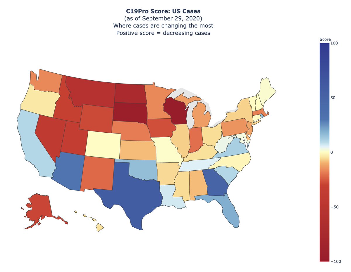
There is a clear increase in cases in the Midwest/Great Plains/Rocky Mountains states.
Most states that were hard-hit over the summer have yet to see an increase in cases, but that could change soon.
Most states that were hard-hit over the summer have yet to see an increase in cases, but that could change soon.
Moving forward, deducing trends from case data alone is going to get increasingly murkier, because of these confounding factors:
- Reporting backlogs
- Conflating rapid antigen test results
- Increase in testing (e.g. last 2 weeks: 35% increase in testing, 20% increase in cases)
- Reporting backlogs
- Conflating rapid antigen test results
- Increase in testing (e.g. last 2 weeks: 35% increase in testing, 20% increase in cases)
Looking at test positivity can be tricky as well, due to the first two reasons from above, and also from the way the percentages are calculated.
Below is a good thread about the nuances of test positivity.
Below is a good thread about the nuances of test positivity.
https://twitter.com/TheLawyerCraig/status/1310270673235980288
Deaths also have their own issues due to the heavy reporting lag.
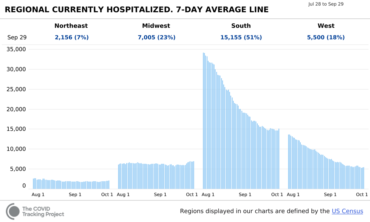
That's why I now believe that hospitalizations are the best indicator of what is *currently* happening.
And nationwide hospitalizations are at a clear plateau, and may trend upwards. This is concerning.
That's why I now believe that hospitalizations are the best indicator of what is *currently* happening.
And nationwide hospitalizations are at a clear plateau, and may trend upwards. This is concerning.

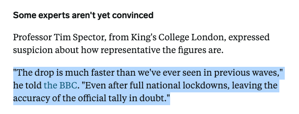
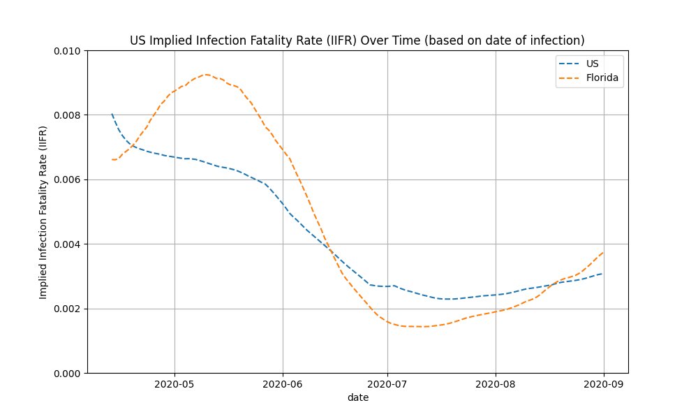
I said in July that Florida and other states have a low implied IFR, and hence may be undercounting deaths.
It turns out that those states were just very slow in reporting deaths. We're in 2020, but somehow it can take weeks to report a death.
It turns out that those states were just very slow in reporting deaths. We're in 2020, but somehow it can take weeks to report a death.
https://twitter.com/youyanggu/status/1286795355561107457
Per my calculations, the implied IFR for Florida has now exceeded the US implied IFR, which is expected given FL's higher median age.
The US implied IFR is now ~0.3%. Once you adjust for age and the undercounting of deaths (compared to excess deaths), you get a 0.4-0.7% IFR.
The US implied IFR is now ~0.3%. Once you adjust for age and the undercounting of deaths (compared to excess deaths), you get a 0.4-0.7% IFR.
With that said, it's better to cite IFR by age group. The CDC estimates the following:
0-19: 0.003%
20-49: 0.02%
50-69: 0.5%
70+: 5.4%
But this is only based on data up until April. Treatment has likely improved since then.
cdc.gov/coronavirus/20…
0-19: 0.003%
20-49: 0.02%
50-69: 0.5%
70+: 5.4%
But this is only based on data up until April. Treatment has likely improved since then.
cdc.gov/coronavirus/20…
To conclude, it seems that the fall wave is inevitably here. But how severe this becomes is still very much uncertain.
Regions that were largely spared in Mar-Aug may be more susceptible. This does not mean that other regions can let their guards down - no place is immune.
Regions that were largely spared in Mar-Aug may be more susceptible. This does not mean that other regions can let their guards down - no place is immune.
Our confidence intervals expands as we head towards November to account for the increased uncertainty.
We must prepare for the worst and hope for the best. The actions we take over the next few weeks can set the course for what's to come.
/END
We must prepare for the worst and hope for the best. The actions we take over the next few weeks can set the course for what's to come.
/END
• • •
Missing some Tweet in this thread? You can try to
force a refresh