We can't understand the present if we don't understand the past.
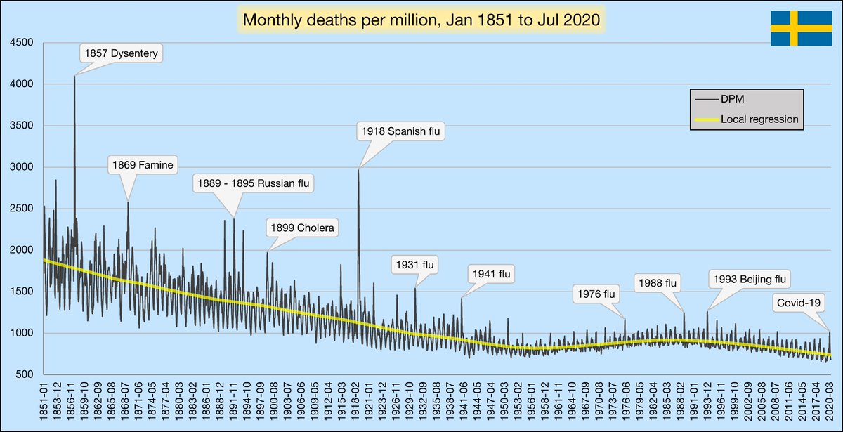
This thread will show you the history of death and disease outbreaks in Sweden. Source data was all retrieved from Statistics Sweden. Here are monthly DPM since 1851:
(repost - caption typo fixed + improvements)
This thread will show you the history of death and disease outbreaks in Sweden. Source data was all retrieved from Statistics Sweden. Here are monthly DPM since 1851:
(repost - caption typo fixed + improvements)
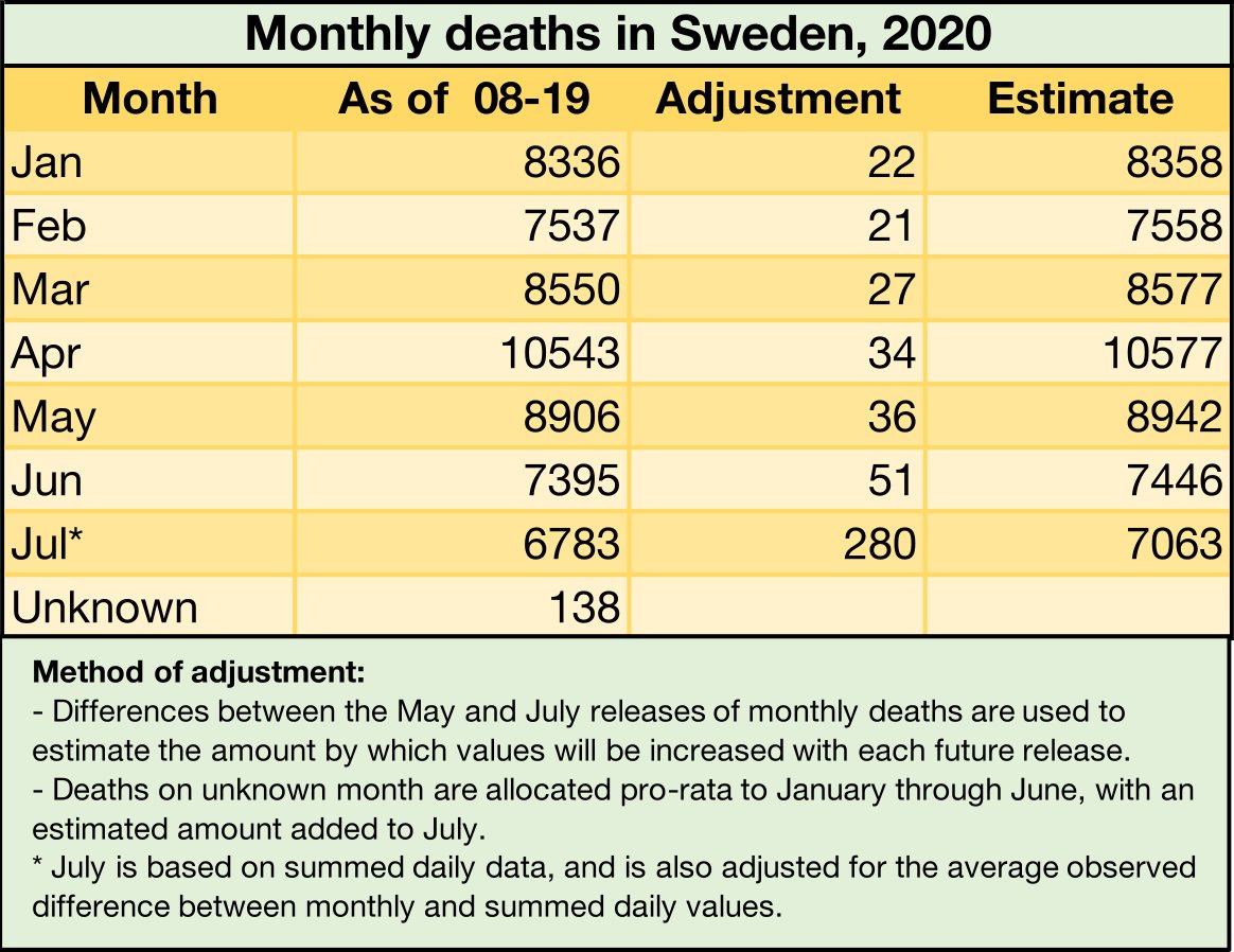
These are the values I used for 2020. I've tried to be conservative - where there's a chance deaths might be understated, I've methodically adjusted them upwards. Also - I started this project over a month ago, so newer data is now available. These are still good though.
Winter has the most months with high mortality due to disease and harsh conditions. So, to make annual figures, I'll be summing from July to June whenever possible. This will give a good idea of what a season looked like.

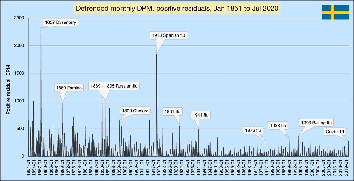
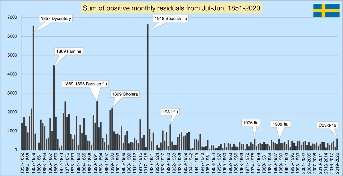
The yellow line in the first chart is a LOESS regression. It's like a moving average, but more robust and tracks better with the center. It measures our changing expectation of mortality. Here are only the positive differences between the monthly DPM and the yellow line:
Now, I'll sum these positive residuals from Jul-Jun for each 12 month period. This shows us how bad a season has been after removing the effect of the changing level of expected mortality. It's important to remember that 2019-2020 includes a flu season in addition to Covid-19.
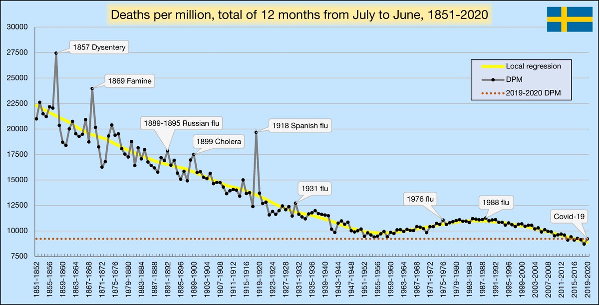
Here are the overall deaths/million for each Jul-Jun period. Notice how variance plummeted in the 1950s with the introduction of advanced healthcare. Even with Covid-19, Sweden's absolute mortality rates are at all-time historical lows.
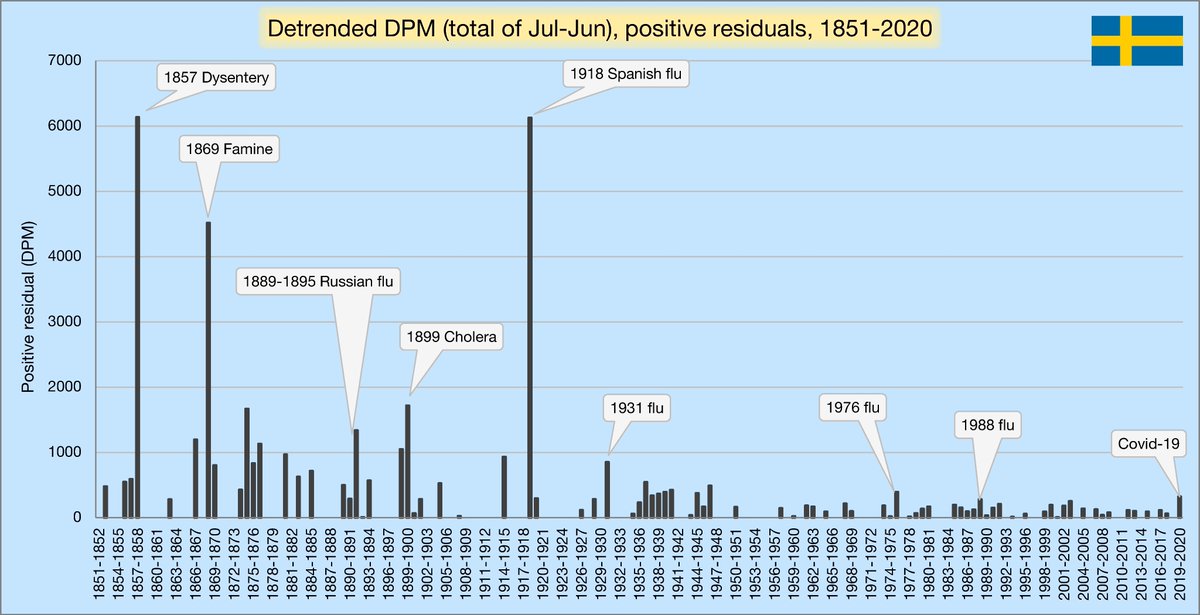
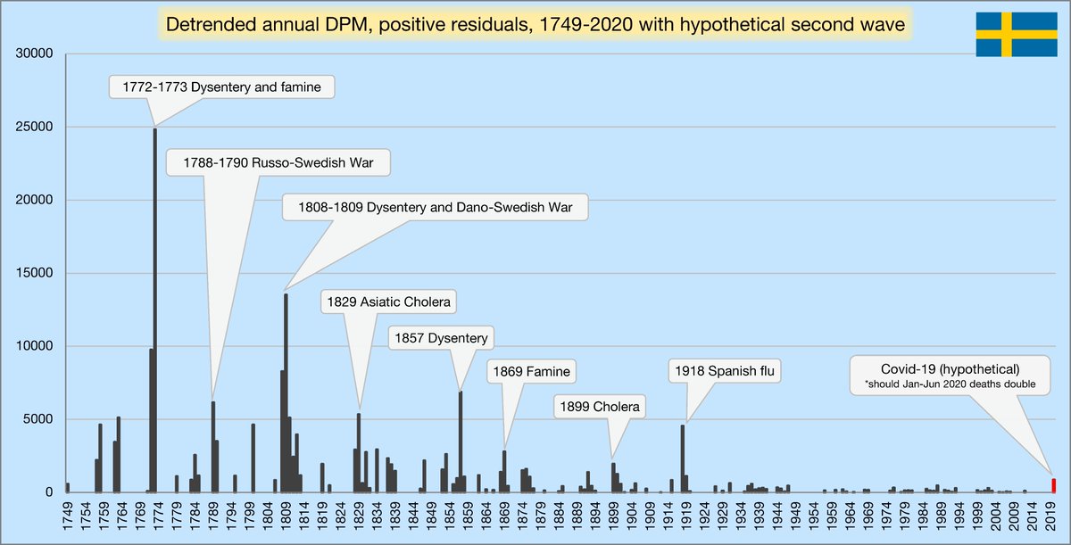
I've detrended the previous chart, showing just the positive differences. The meaning is very similar to that of the chart in tweet 5. I'm removing the effect of changing baseline mortality to only look at the spikes:
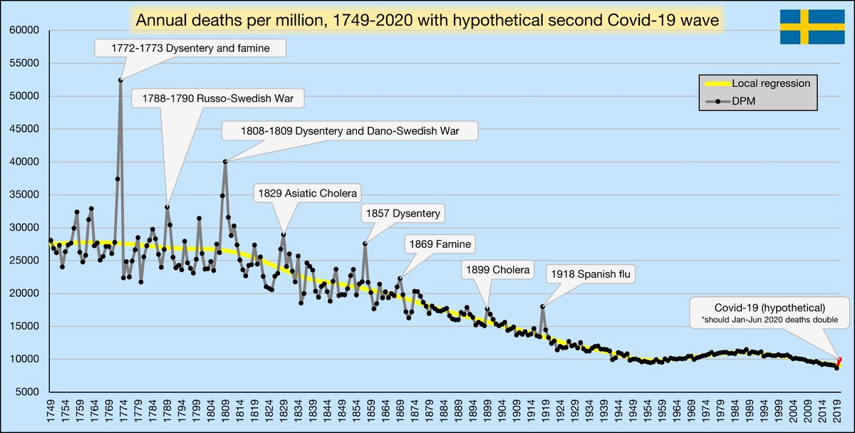
Sweden records monthly deaths since 1851, but annual data goes back to 1749. It shows just how brutal human history has been. In 1773, a staggering 1 in 19 Swedes died.
I also show what 2020 would look like if Sweden experienced a second Covid-19 wave, doubling Jan-Jun deaths.
I also show what 2020 would look like if Sweden experienced a second Covid-19 wave, doubling Jan-Jun deaths.
This is the previous chart, but detrended. We can clearly see how the advancement of civilization and technology has led to better conditions and drastically fewer events of extreme death.
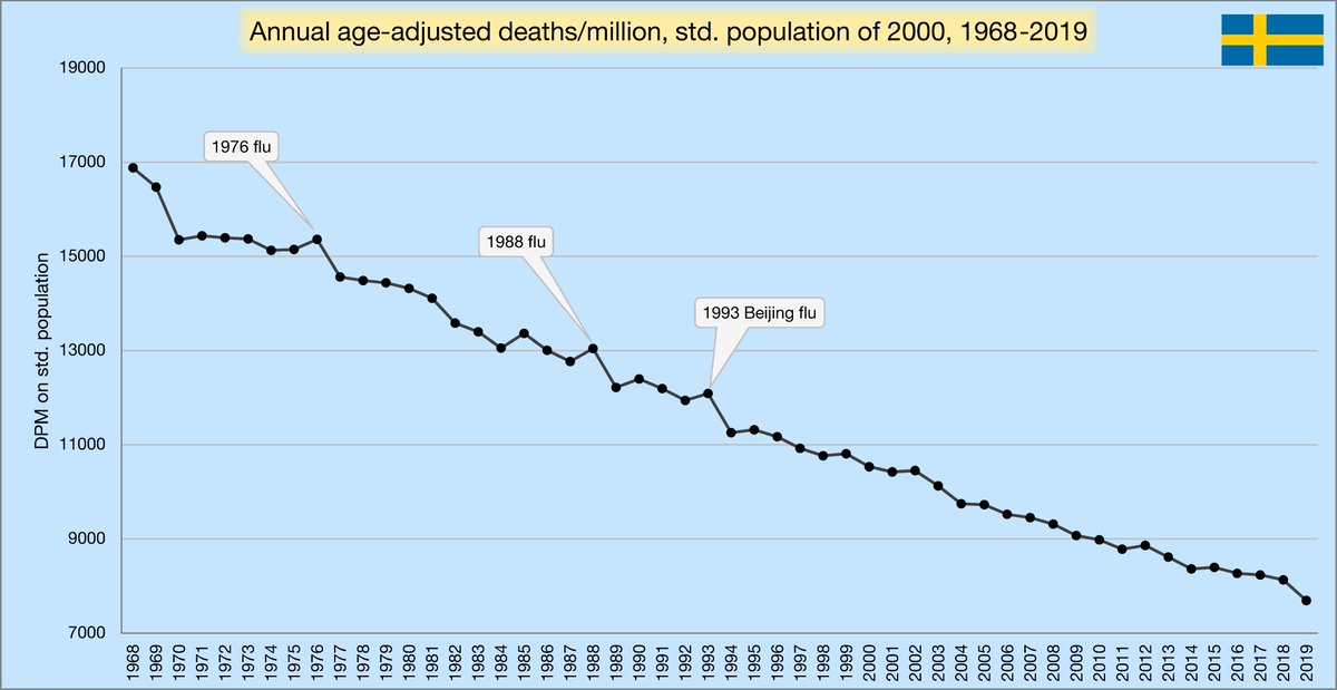
Just adjusting for population doesn't give a full picture. Age adjustment shows what each year would have looked like if it happened to a population with the same age profile. I use the population of 2000. Sadly, I can't go back further than 1968.
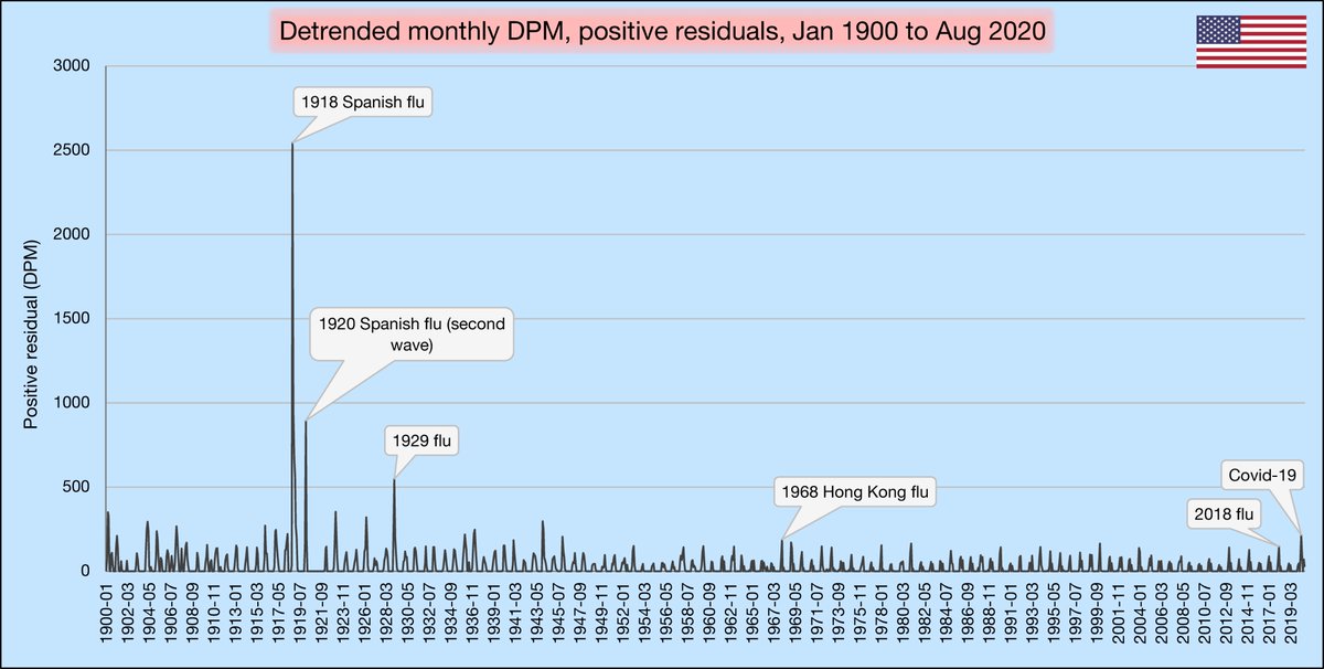
If you want to see what earlier years might have looked like for Sweden, these are the age-adjusted death rates for the USA from 1900-2019.
https://twitter.com/VoidSurf1/status/1313777657268633600
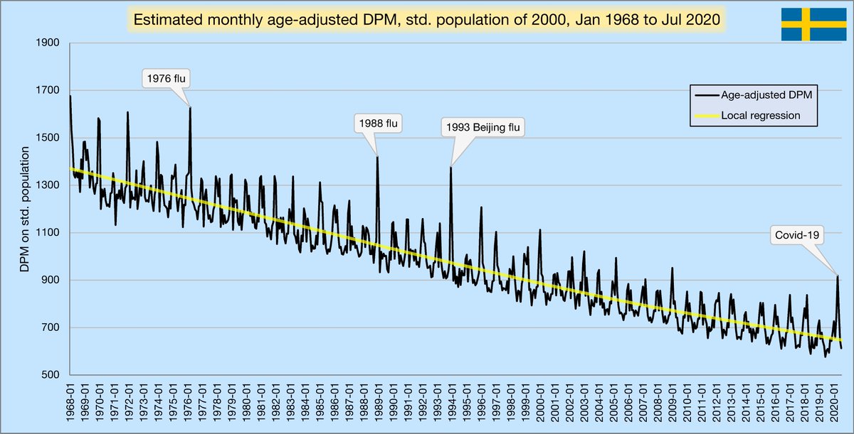
Monthly figures aren't available by age group for the whole period, so I made an estimate by weighting by the proportion of all deaths in each month, per year. It's not perfect, but it should be close.
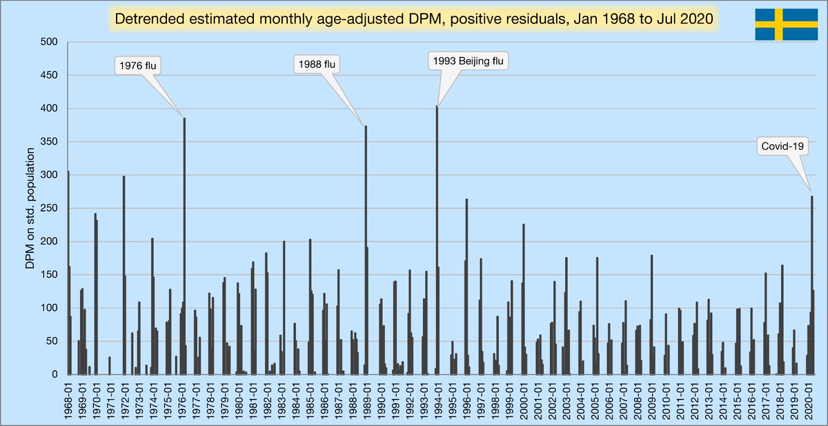
I've detrended the previous chart here. Clearly, Sweden has had several jumps that were significantly more severe than April 2020 in the past 52 years.
Finally, I'll sum the monthly age-adjusted death rates for each Jul-Jun period. We can now see 2019-2020 in a historical context. Sweden has gone back 2 years to the level seen in the 2017-2018 season.
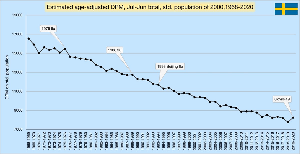
I hope this information gives people some perspective on what we're dealing with today. Our ancestors dealt with conditions much harsher than even the worst of Covid-19. Even after adjusting for declines in DPM, the spike caused by Covid is much milder than past major pandemics.
Sweden has taken a very measured approach. It hasn't experienced an unprecedented disaster, even in the context of the past 50 years. While all deaths are tragic, the consequences of extreme mitigation measures are also tragic and long-lasting. We have to find a balance.
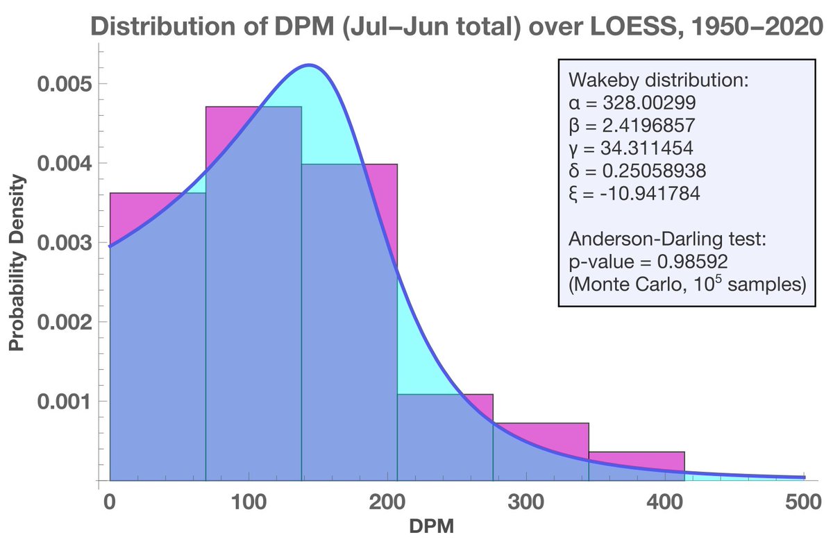
As an extra, I've also played around with fitting probability distributions to some of these numbers. It's challenging since most aren't IID. Here's one I found. The Wakeby distribution pops up very frequently in relation to mortality.
Thanks to @HaraldofW, @boriquagato and @gummibear737 for inspiring me to do this. Your work is very important in educating the public during a time when it's difficult to find a balanced perspective in the media. Keep up the great work.
Sources:
pastebin.com/c9YvbEyZ
pastebin.com/c9YvbEyZ
This is a repost of an earlier thread. I fixed a typo with a caption where I labeled the dysentery outbreak in 1857 as happening in 1957. I've also added a few more captions to some charts and a list of sources.
Check out a similar analysis of the USA here:
https://twitter.com/VoidSurf1/status/1313777624674709506
• • •
Missing some Tweet in this thread? You can try to
force a refresh