Last Friday, Macron floated the idea of a new general lockdown in France. Ouch. And because I’m fed up with reading so much garbage and contradictory stuff on Covid, I decided to have a hard look at the French data. A (long but important) thread.
The questions I want to answer:
How bad is the 2nd wave?
How fast is it growing?
Does it affect only young people as some claim?
Is Covid really treated better?
Is the fatality rate really going down?
Can the government stop the 2nd wave quickly enough?
How bad is the 2nd wave?
How fast is it growing?
Does it affect only young people as some claim?
Is Covid really treated better?
Is the fatality rate really going down?
Can the government stop the 2nd wave quickly enough?
All important questions.
BTW this is French data but I suspect the data looks the same all over Western Europe, with time lags.
BTW this is French data but I suspect the data looks the same all over Western Europe, with time lags.
FIRST QUESTION.
How bad is the 2nd wave? The most important thing to know is this: forget cases data, they are useless because the first wave was grossly underestimated (a factor between 10x and 20x imo).
How bad is the 2nd wave? The most important thing to know is this: forget cases data, they are useless because the first wave was grossly underestimated (a factor between 10x and 20x imo).
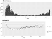
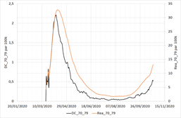
So what can we use? Hospital data, which is consistent, homogenous, and objective. But how? There are so many data series to look at. Let’s start simply with ICU+Hospitalisations for all age groups. 
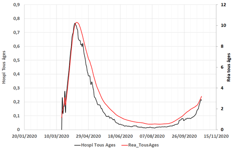
It looks like we’re still quite away from the peak, but growing fast. Is this biased by a specific age group or another effect?
To double-check I used a PCA to identify the main factor in all hospital time series. It turns out one factor explains 80% of the variance (of 40 series!) so this is clearly the pandemic factor, and here’s what it looks like over time.
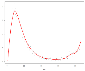
We’re growing dangerously fast towards the previous peak.
But how fast? That’s QUESTION 2.
But how fast? That’s QUESTION 2.
You’ve all heard about R, the famous reproduction number…that no one can reproduce because it’s so complex to estimate!
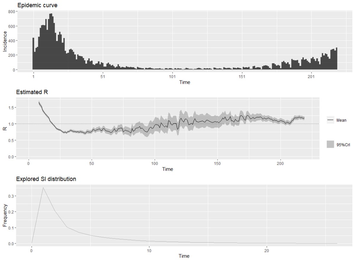
See e.g. the recent thread of @gro_tsen. One main problem is again the shitty case data. Here’s what R estimates look like with EpiEstim, (state of the art)
See e.g. the recent thread of @gro_tsen. One main problem is again the shitty case data. Here’s what R estimates look like with EpiEstim, (state of the art)
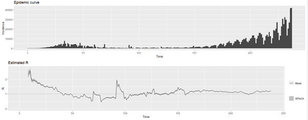
If you really believe the left part of the chart I have a bridge to sell to you. How can we get around this problem? By using hospital data, again.
Sure, it’s not a proper “epidemic incidence data” per se, but if the % of people going in ICU or hospital is more or less constant, the curves have the same shape and R are the same. Here are the R estimates we get using hospital incidence data.
Daily hospital arrivals
Daily ICU arrivals
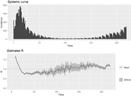
Daily deaths
Very interestingly, all estimates are consistent, as you can see below with a comparison of current R estimates for all series. (sorry, I’m lazy, labels still in French “réanimations” = ICU)
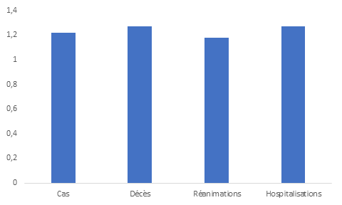
So that’s our answer: R is approximately 1.2, which means numbers double every 20 days and we should get to the (dramatic) ICU peak in 25 days.
QUESTION 3: does Covid hit mostly the young now? Short answer: No, that’s bullshit. Detailed answer now.
First clue, let’s look, for each age group, at its share of total Covid ICU, Hospi, Deaths data, compared to the demographic share. No big surprise there, except the ICU share of the very old which is important and I’ll discuss later.
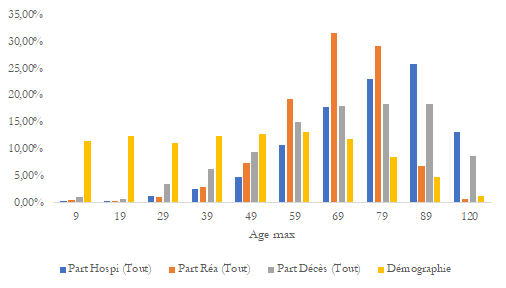
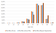
Did that change over time? I split in three groups: all data, data before first peak and data since September. I get this.
First in hospital
First in hospital

In ICU
And deaths
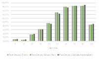
If you can spot a change there… you’re good, and it’s only in ICU data for the very old. The rest is almost perfectly stable.
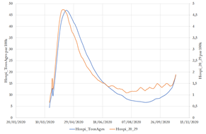
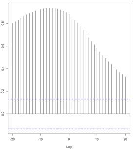
If you still don’t believe it, here’s a chart showing the (rescaled) hospitalization data for all age groups vs. the 20-29-year-old, per 100k. The two curves are almost perfectly superposed which means there’s no real difference in 1st wave and second wave.
You can use all statistics (hospitalisations, deaths, ICU) and age groups and you will get to a similar conclusion. Except one: ICU for 80+. This is the most horrible chart I know. Older people are now getting A LOT in ICU.
In a way it’s good, it means they get treatment, but unfortunately, what it also means is that hospitals were so swamped in the 1st wave that they had to make horrible ethical choices and had to let the oldest die without any possibility of intensive care. Grim.
What it also explains is the fact that hospitalizations grow less quickly than ICU in the second wave: that’s because we have more older people going into ICU than before.
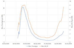
Another relevant question: do older people in hospitals lag younger ones? In other terms, is it the young who infect the old? Here’s a cross autocorrelogram of 20-29 yo vs 80-89 yo.
Yes, it’s not symmetrical so the young get in the hospital first, but the effect is small (correlation weighed- lag is 2.7 days)
FOURTH QUESTION.
How bad is the disease now compared to the first wave?
It’s impossible to use fatality rates or hospitalization rates to answer that question because (AGAIN) cases data from the first wave are USELESS.
How bad is the disease now compared to the first wave?
It’s impossible to use fatality rates or hospitalization rates to answer that question because (AGAIN) cases data from the first wave are USELESS.
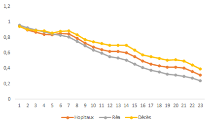
So let’s look at the other possible "transition": the share of people in the hospital going to ICU (but we have to be careful with the oldest age groups, see above). That’s what I get with all age groups.
The very good news is that for the same hospitalization rate, we have now approx. 25% less ICU. Clearly, hospital doctors are better equipped to deal with the disease. But it’s not true for everyone. The effect is strong for younger age groups.
But fades away for older age groups.
FIFTH QUESTION.
Does Covid kill less? I’m not a big fan of that question, because it makes the disease a kind of binary thing (you die or not) and ignores possibly long-lasting consequences.
Does Covid kill less? I’m not a big fan of that question, because it makes the disease a kind of binary thing (you die or not) and ignores possibly long-lasting consequences.
Still, I can't deny it’s an important question.
If you look at a representative age group (70-79, other curves are similar) we get the same message as earlier: you die less (almost half less !) going to the hospital now than in the first wave.
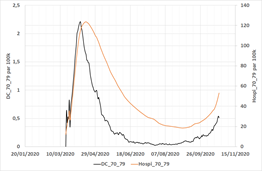
However, this effect is also fading away as you’re older.
The reverse is true for ICU! There is no improvement in the fatality rates in ICU for the 60-69 age group, but it’s getting better for older people (which I suspect is due to the very different ICU admission policy for older people)
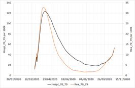
The daily mortality rates in hospitals and ICU confirm this view (here for the 70-79 age group).
Those curves also show a worrying trend: the daily mortality in hospitals is increasing, suggesting a lower quality of care as some hospitals get swamped again. (There is also obviously a lagging effect)
SIXTH QUESTION: can the government stop it quickly enough?
Yeah, I’d really like to know the answer to that one.
Yeah, I’d really like to know the answer to that one.
First, it’s clear that the incidence data (hospi, ICU or deaths) is strongly autocorrelated as the auto correlogram below shows. You’re not stopping this overnight.
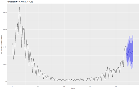
The best approach to see what’s going on with autocorrelated data is to use an ARIMA model, and here’s the 1-week forecast of hospital incidence taking into account the weekly seasonality.
The problem with that kind of model is obviously that it misses the bigger point: how does R move over time? There are two main drivers imo: the number of social contacts and precautionary measures taken during those contacts.
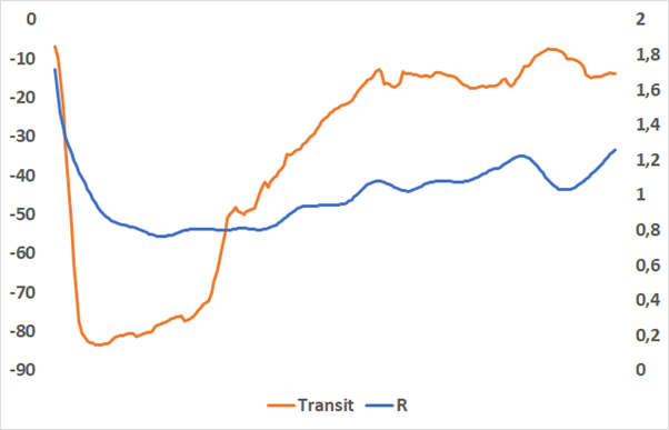
Hard to have a view on the second topic, but the first can be measured using Google mobility data. When I correlate GMD with rolling estimates of R I find that the key variable is “transit” (but “Home” is also very useful.)
Indeed, if you plot Transit vs R with a 12-day lag, you get this (yeah, I know, borderline chart crime, but this is not an easy thing to estimate!)
I’ve used another approach which is to fit an optimized VARMA model on both series and to measure the so-called impulse function, i.e. how long does it take for the changes in one variable to feed into the second variable.
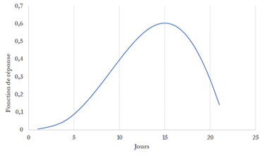
14 days are necessary to get a full effect, 8 days will get you half the job done.
What’s the general conclusion of this?
In France, 2nd wave is like 25th march on 1st wave, growing fast (R=1.2, doubling every 20 days, ICU peak in 25 days.)
There’s no difference in the age split of the pandemic in 1st and 2nd wave expect that now older people go into ICU
In France, 2nd wave is like 25th march on 1st wave, growing fast (R=1.2, doubling every 20 days, ICU peak in 25 days.)
There’s no difference in the age split of the pandemic in 1st and 2nd wave expect that now older people go into ICU
Hospital care is better (25% better) but deteriorating.
There’s no big difference for older people.
There’s no big difference for older people.
Based on Google mobility data, any measure will feed into hospital data with a 10-14 lag.
We should (could?) see the impact of curfew soon in the data.
If we don’t, the government will have a week (more or less) to decide new measures.
We should (could?) see the impact of curfew soon in the data.
If we don’t, the government will have a week (more or less) to decide new measures.
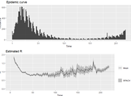
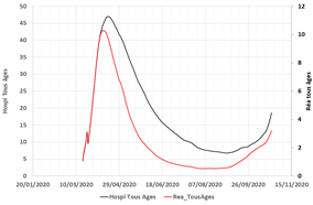
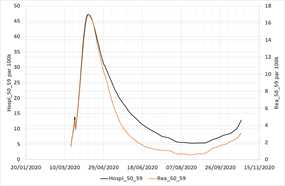
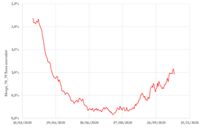
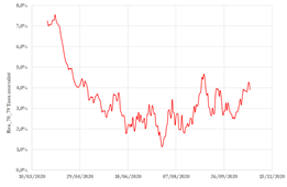
With better resolution sorry

With better resolution
With better resolution

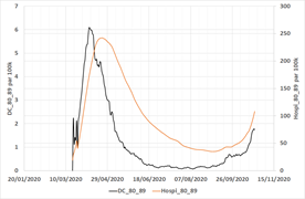
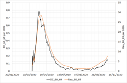
(I should point out that all charts comparing age groups are rescaled for a size effect among each group!)
Thanks to @BiasedStats for spotting an error in this chart (and another one); I plotted the wrong column of data for deaths (the conclusion is exactly the same, though).

And this one had the same error

• • •
Missing some Tweet in this thread? You can try to
force a refresh