
Disneyland Paris famously had the most name and logo changes of any Disney resort. Over the next weeks I'll try to have a fairly comprehensive look at the many graphic marks we’ve seen over the past 35 years, posting one a day when I’ll manage. 

The Euro Disneyland project was first announced in 1986 with this logo. While Tokyo Disneyland had recently opened with an appropriately modern logo for the futuristic metropolis, Imagineers at first went for a hint of classic old-world charm to represent the European resort.

For most of the resort’s development, this logo based on the very European typeface Albertus was found on blueprints, press releases or memos. At this point, the resort as a whole was planned to be called “Euro Disneyland” while its theme park was going to be the Magic Kingdom.

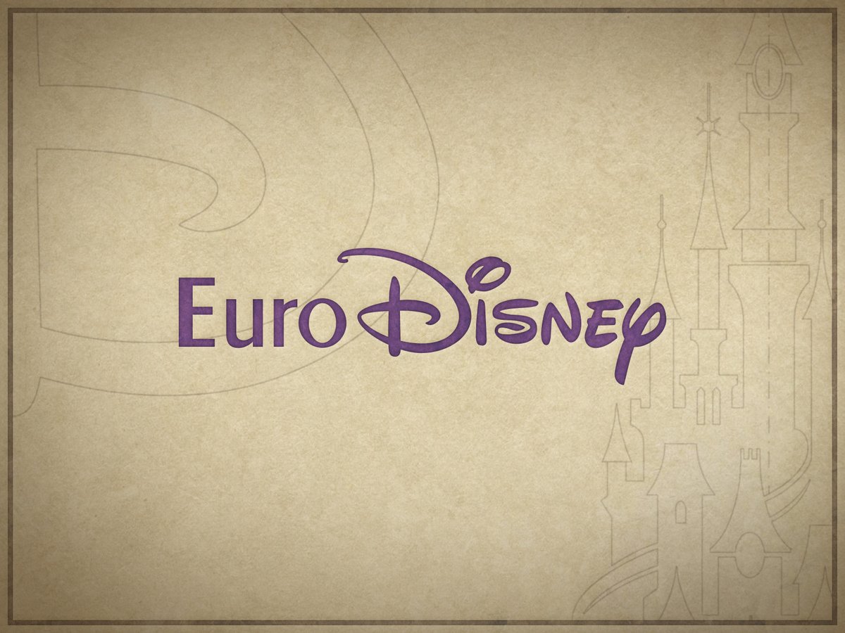
When the resort became Euro Disney, or Euro Disney Resort, or Euro Disney Resort Paris, or (as considered at one point) Espace Euro Disney, this version was printed on some early merchandise sold at the preview center… which incidentally took over the name Espace Euro Disney.

Some early merchandise graphics came even closer to the final Euro Disney logo by using the Walt Disney logotype (which, while existing since the 1950s, had only become the standard Disney logo a few years earlier) and sometimes even a heavy stroke underlining the name.

A similar version of the logo, with unassuming sans serif letters instead of Albertus, was featured on merchandise sold in the park until a few years after opening, from the famous yellow rain ponchos to postcards, autograph books, t-shirts and various product packaging.
In 1991 the (very contemporary) Euro Disney graphics chart was finalised by US firm sussman/prejza, featuring bold geometric shapes and primary colors inspired by Mickey Mouse. The character himself was derived from the Walt Disney Company logo, only adjusting one arm position.

Several alternate versions of the Euro Disney logo were developed for specific uses, such as this stacked variant for narrow spaces. The Futura typeface family used here, geometric but appealing, would stay prominent in the resort’s branding for a while.

The theme park, now named Euro Disneyland, received its own logo with the word “land” custom-lettered in the style of the Walt Disney logotype. This principal version was featured (with or without the castle graphic) on most printed materials from park tickets to guide maps.

A subtly different variant (note the “land” lettering) was used in a few specific cases, most notably on food packaging and the giant letters over the parking lot entrance. As for why… your guess is as good as mine!

Yet another slightly different version, featuring Tinker Bell in the vein of the Disneyland Hotel logo, was used by Walt Disney Imagineering on the initial series of attraction posters.

A gradual transition started in late 1993. For one thing it was found most Europeans were unfamiliar with the concept of a resort… To avoid confusion, the Euro Disney Resort name was slowly phased out, often replaced by Euro Disneyland which inherited the former’s bold stroke.

Around that time, “Paris” was timidly added to the logo. During this transition period, the logotype was often accompanied by Mickey as the sorcerer’s apprentice (in the exact same pose as the old Euro Disney Mickey), best known today from the resort’s long-time road signage.

By spring 1994, the word “Paris” ceased to be a minor complement and appeared as an integral part of the name, eclipsing “Euro” in visual importance. It was felt that the term Euro was mostly associated with economics while Paris was a universal dream holiday destination.

The transition was completed on October 1, 1994, when the resort officially dropped its “Euro” prefix and became Disneyland Paris. During the first months, several different logos coexisted (alongside old Euro Disney graphics, a few of which remain to this day).

One common variation mostly appeared on merchandise, such as clothing, calendars, bags or even the reedition of Sam McKim’s original Euro Disneyland fun map. In some cases “Paris” was even written in a different typeface (possibly Helvetica).
Another briefly used version was more similar to the final logo while still using the same elements as past logos. From here on out, we say goodbye to Futura type or the original 1991 “land” letters.

For the final new Disneyland Paris logo, the “land” letters were redrawn from scratch, with more dynamic lines, while Futura made way for fellow classic 1920s typeface Gill Sans. This logo would remain in place unchanged for the next seven years with only minor variations.

• • •
Missing some Tweet in this thread? You can try to
force a refresh


