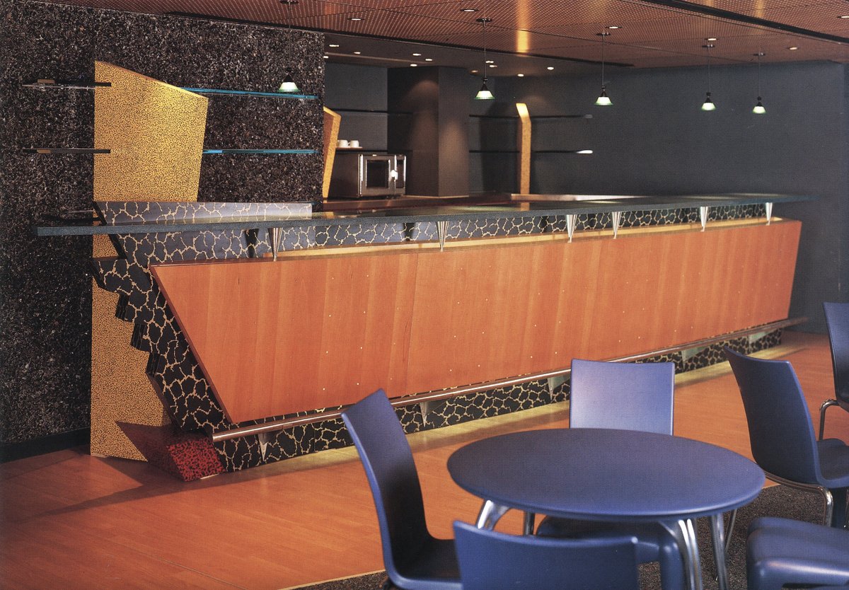
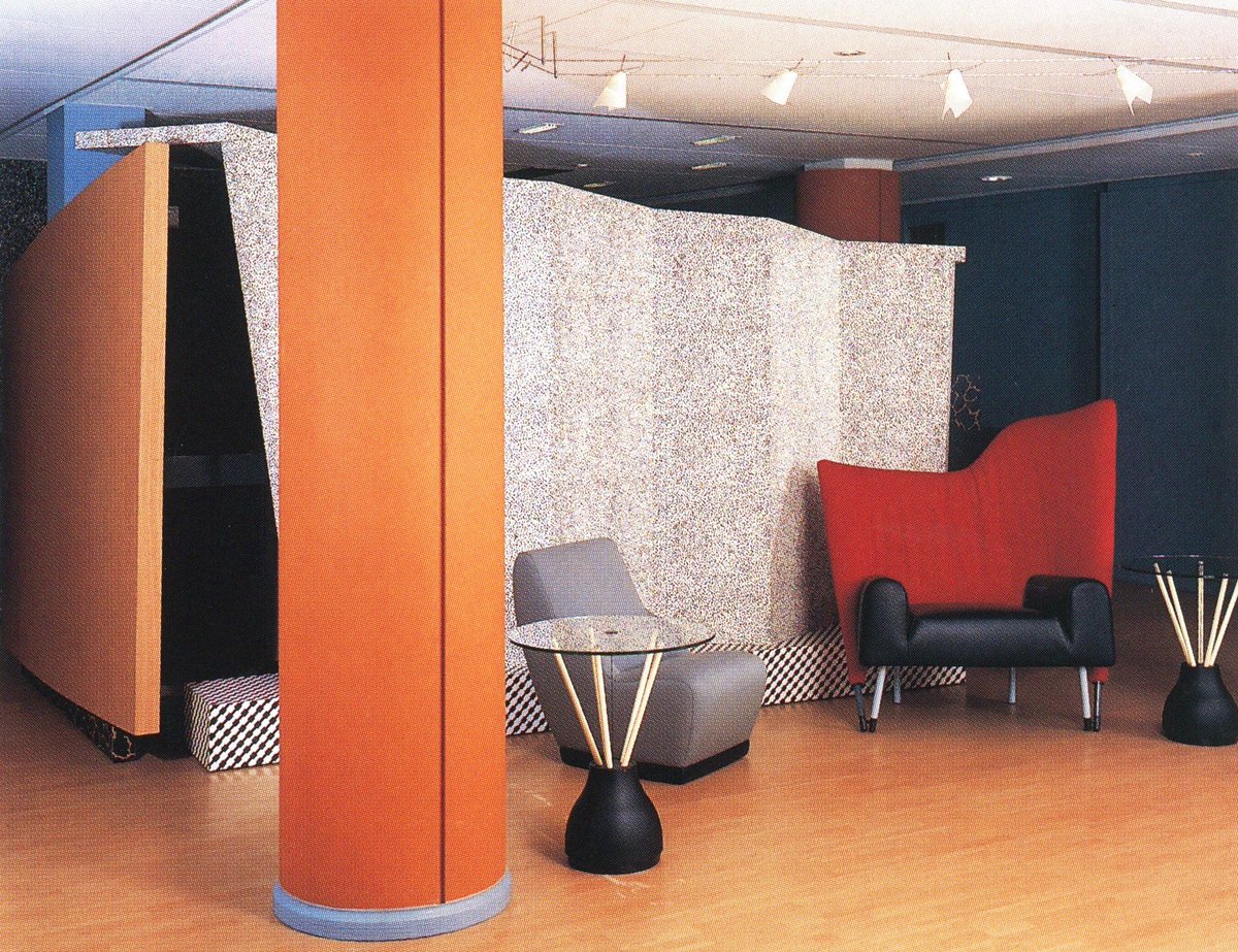
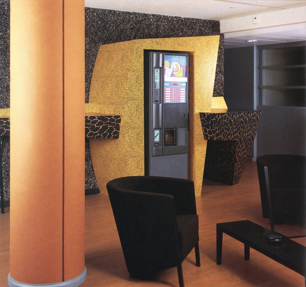
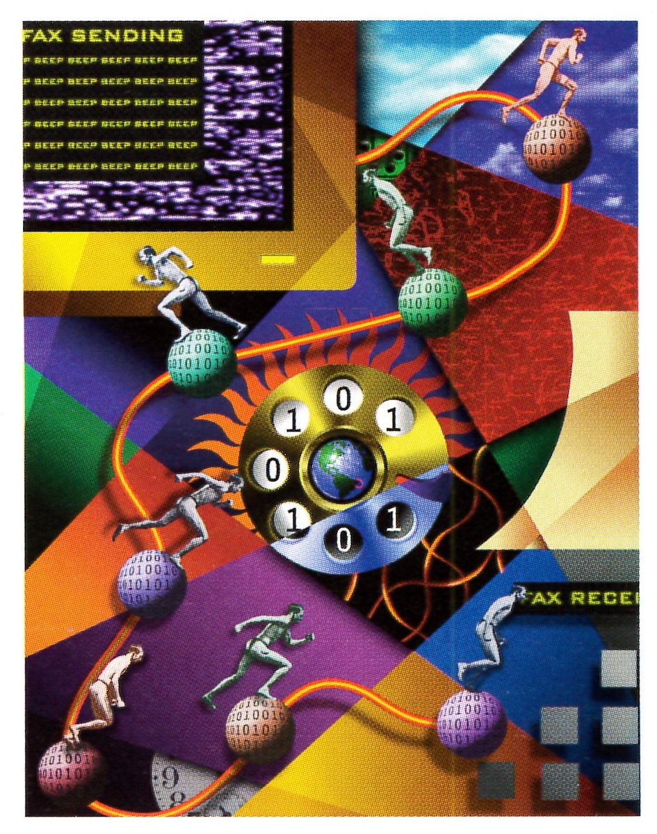
Thread: Wonderful, wild, and (mostly defunct) food-centric retail designs from 'Food Presentation & Display' by the legendary Martin Pegler (1992)


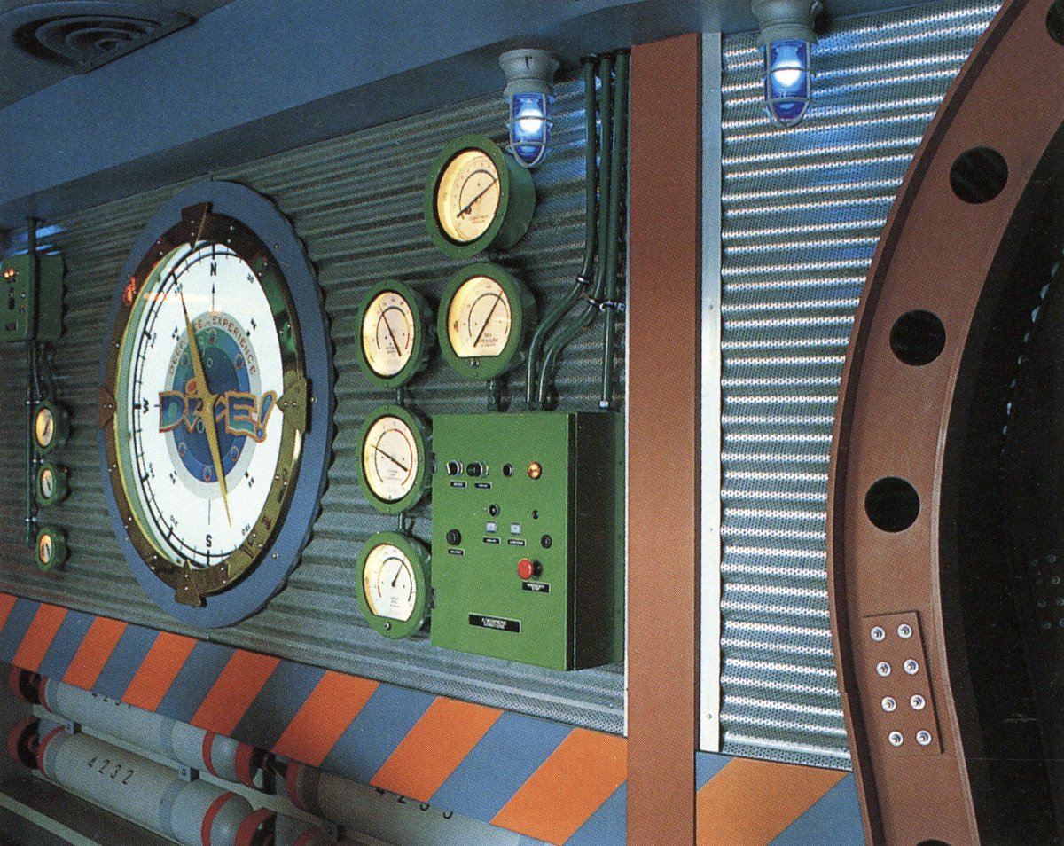
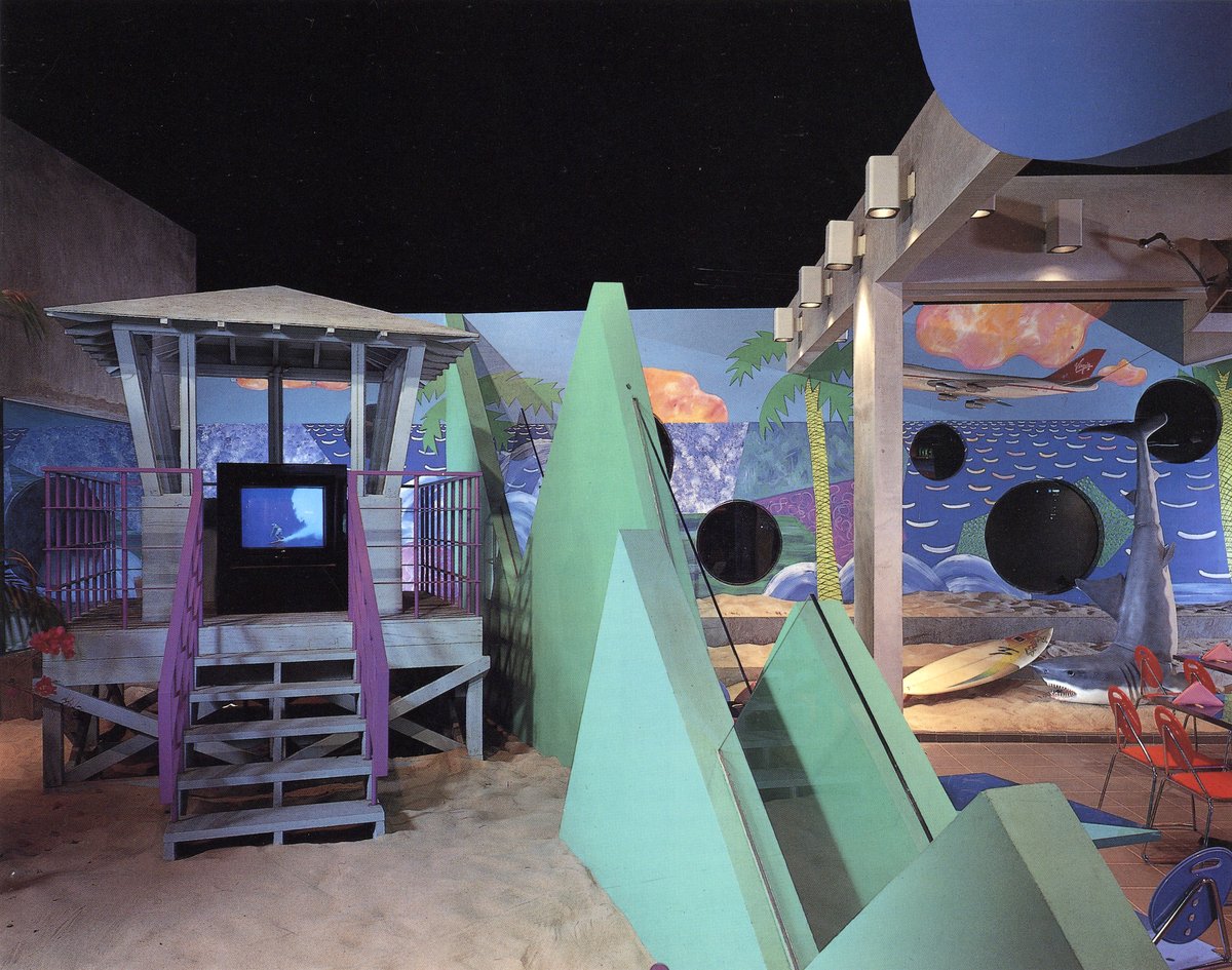
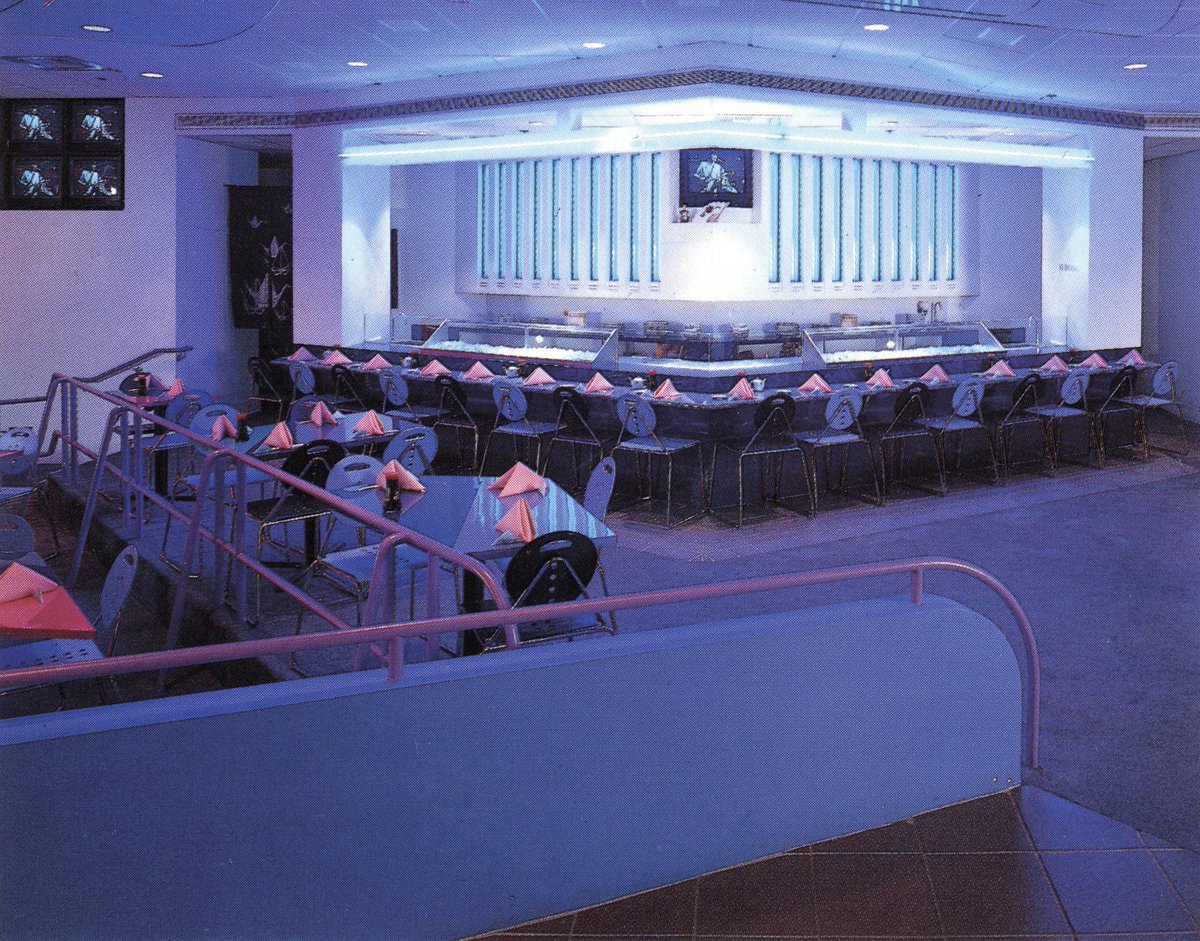
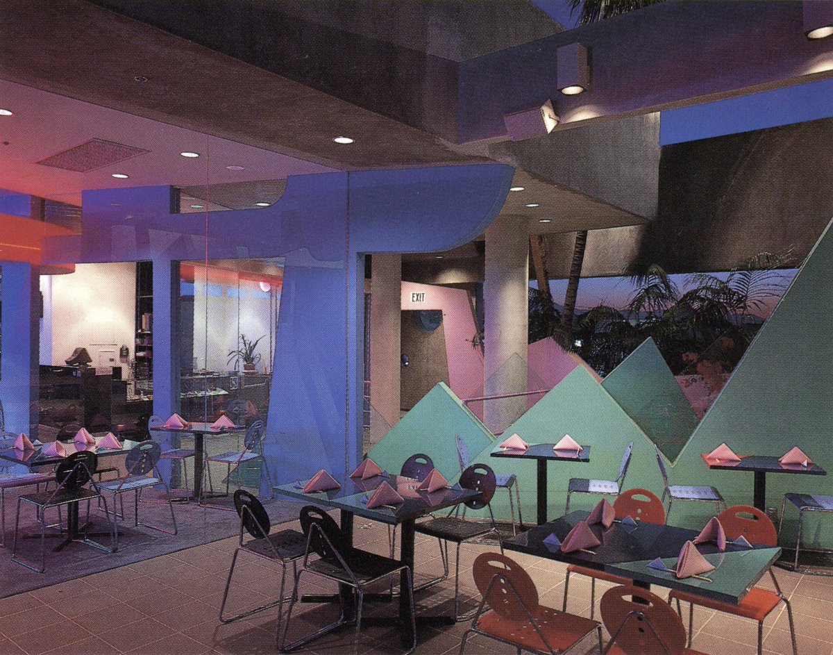
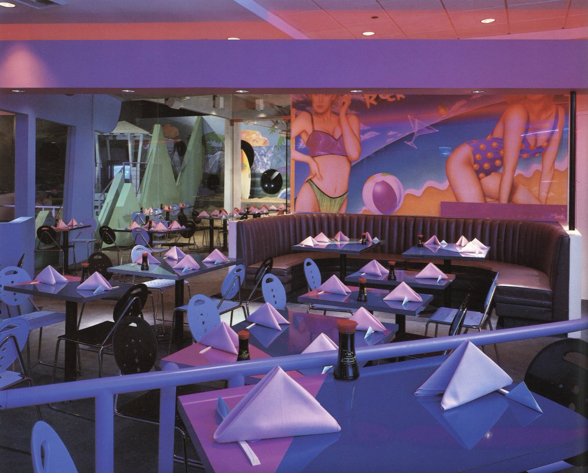
#1: California Beach Rock 'N Sushi - Melrose Ave, Los Angeles, CA - Designed by Ted Tokio Tanaka
I had posted some images of this one before, though I had no idea it had an 'indoor beach' with prop sharks, TVs, and painted murals!


I had posted some images of this one before, though I had no idea it had an 'indoor beach' with prop sharks, TVs, and painted murals!
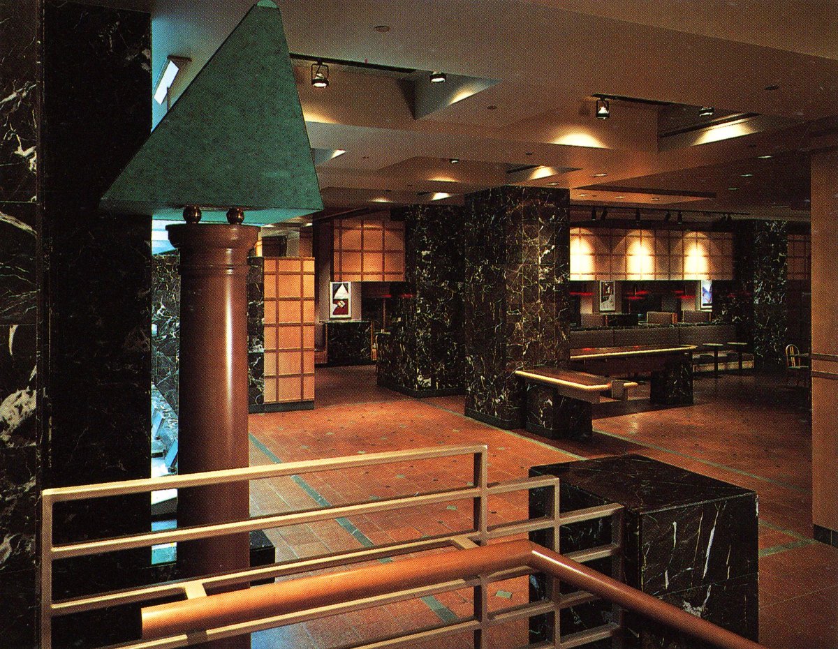
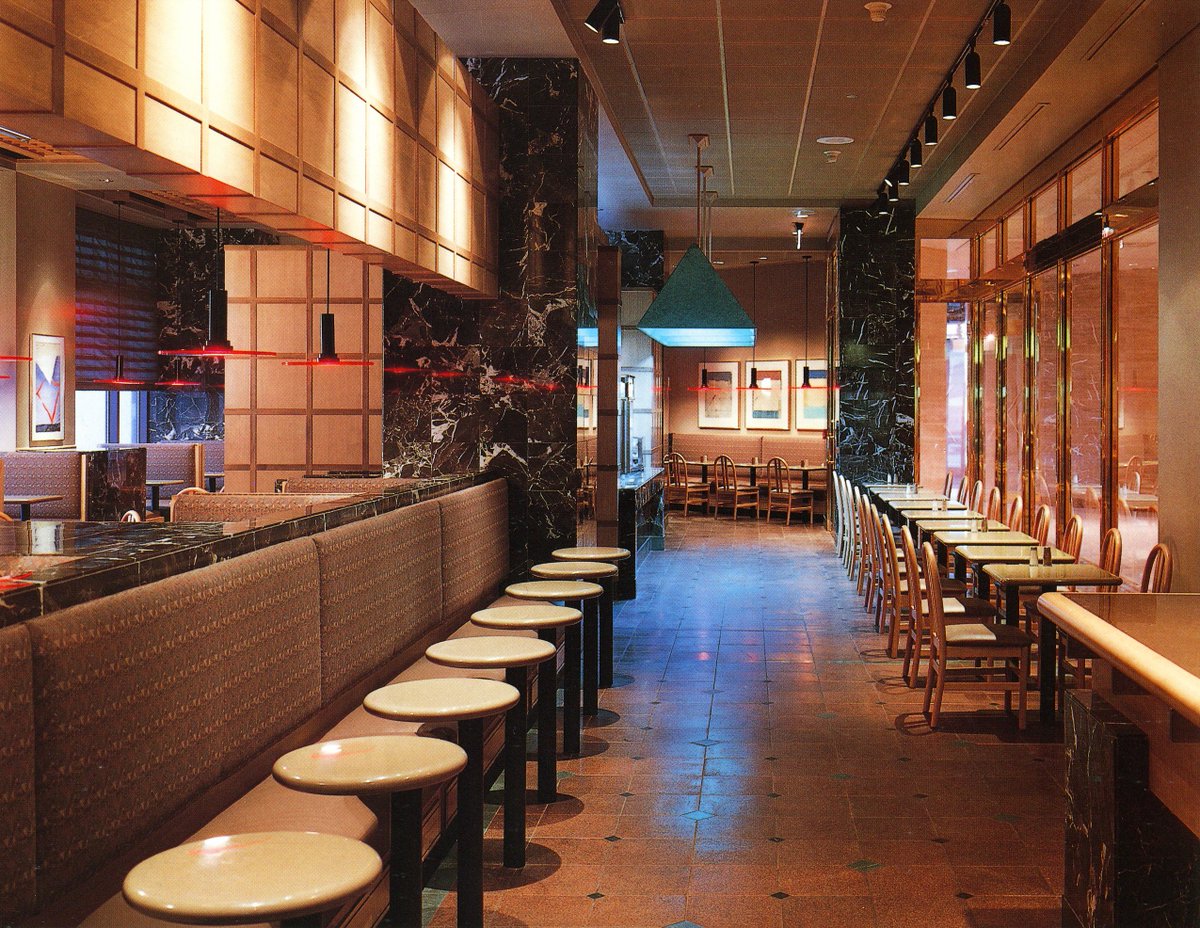
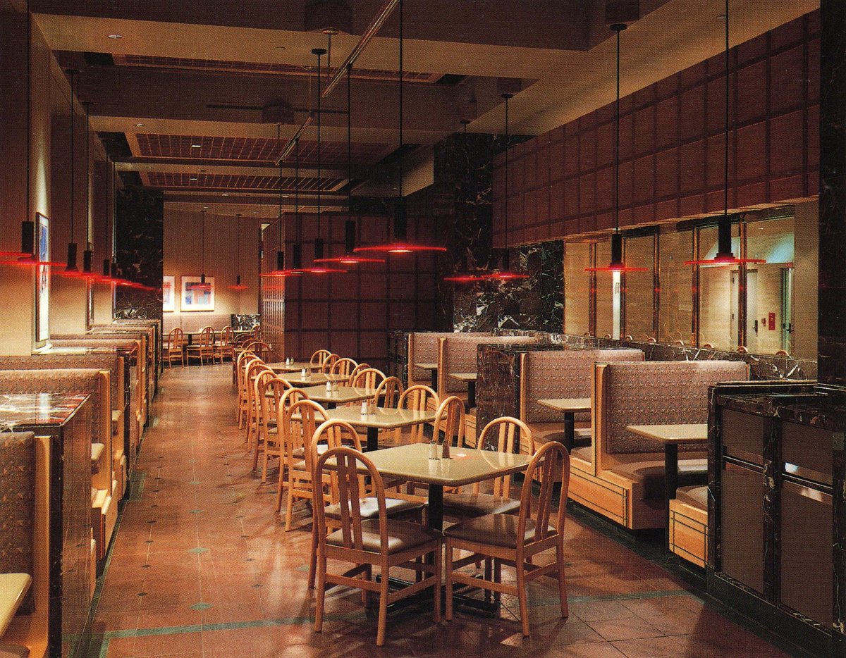
Finally found the 'Frasurbane' McDonalds, a surprisingly sophisticated design located in 3 Nationwide Plaza, Columbus OH (year unknown)
Designed by Bohm-NBBJ Architects


Designed by Bohm-NBBJ Architects

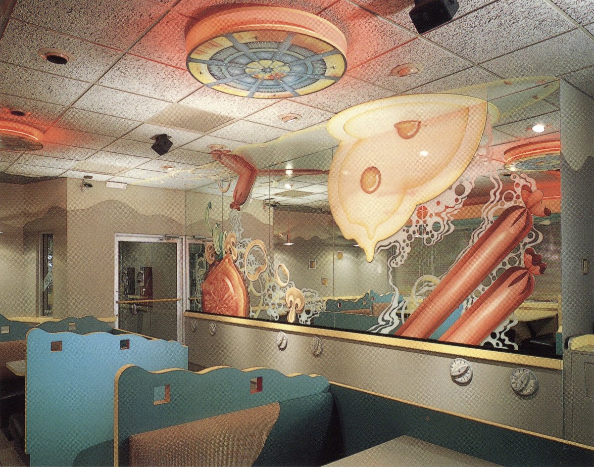
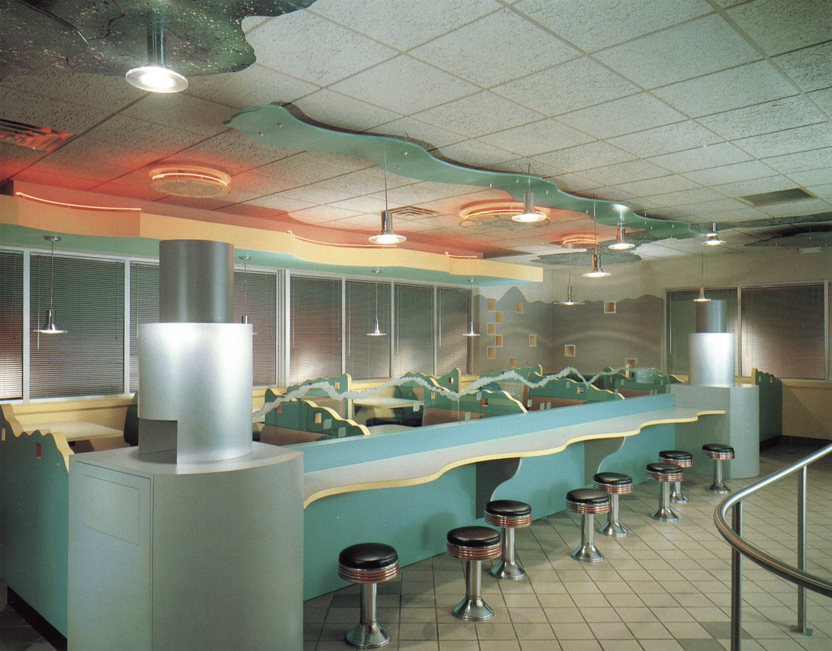
Byron's Hot Dog Stand - Chicago, IL
Tied to the 'oversized object Pop Surrealism' trend of the 1970s, this restaurant featured a 20' mirrored glass 'grill' with food cutouts applied to the surface. Also, there's some sort of 'deconstructed burger' design in the 2nd image.

Tied to the 'oversized object Pop Surrealism' trend of the 1970s, this restaurant featured a 20' mirrored glass 'grill' with food cutouts applied to the surface. Also, there's some sort of 'deconstructed burger' design in the 2nd image.
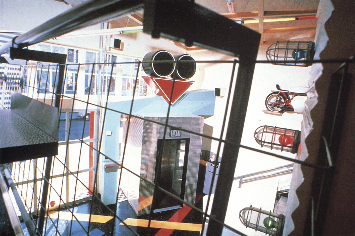
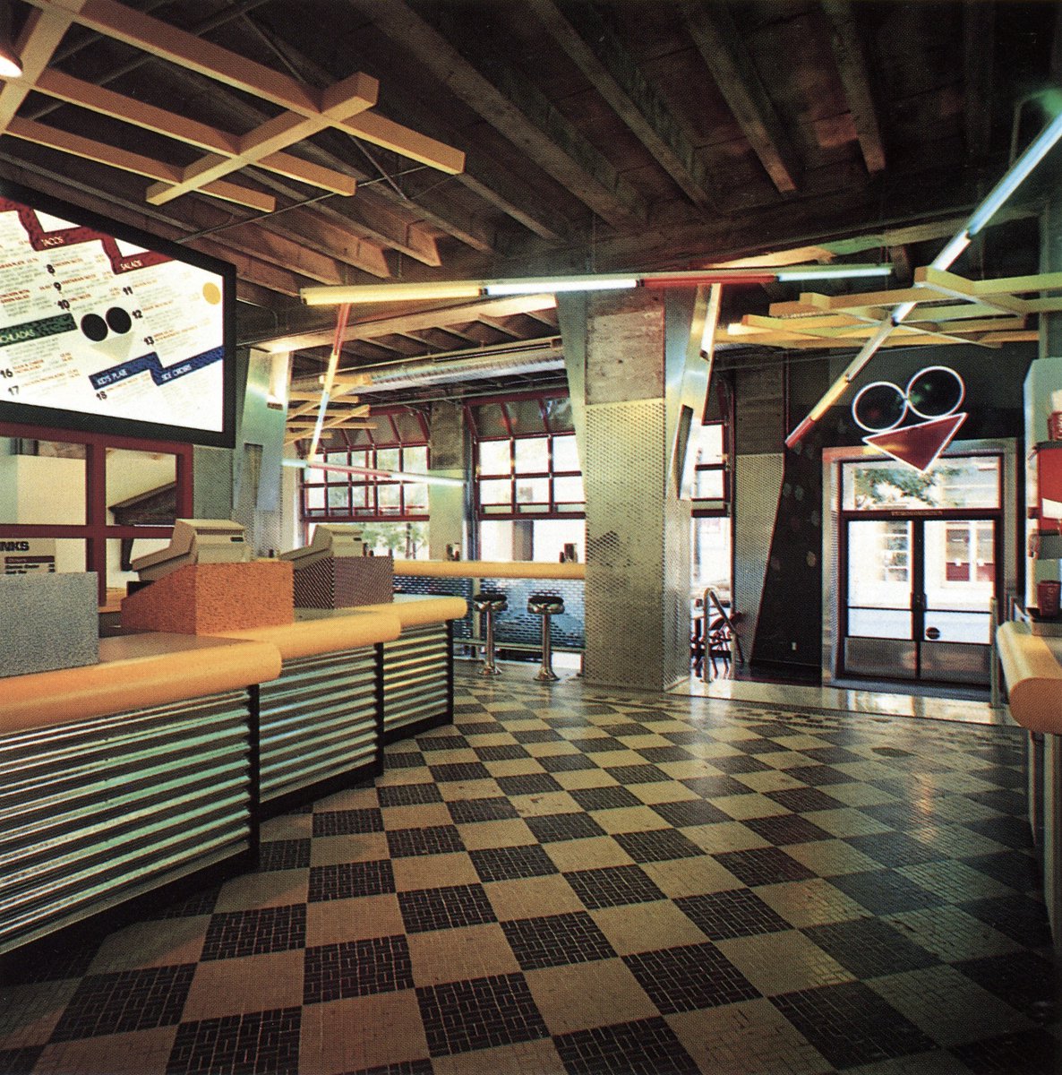
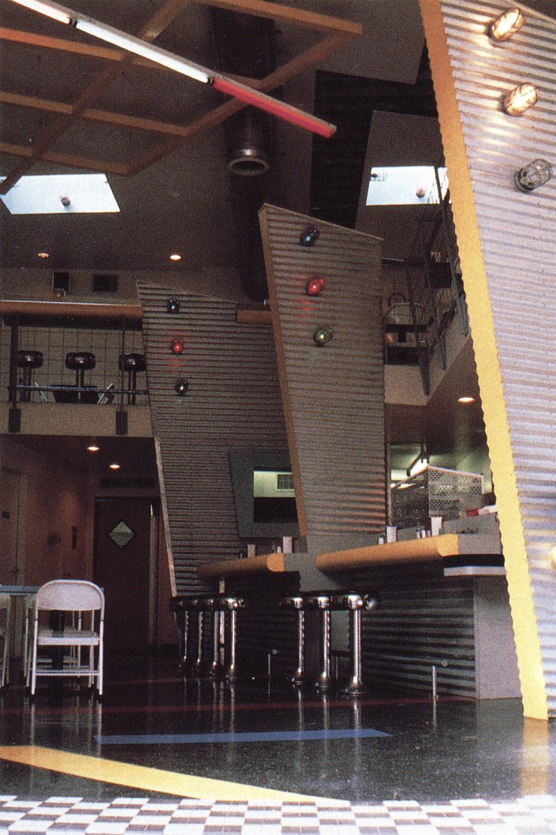
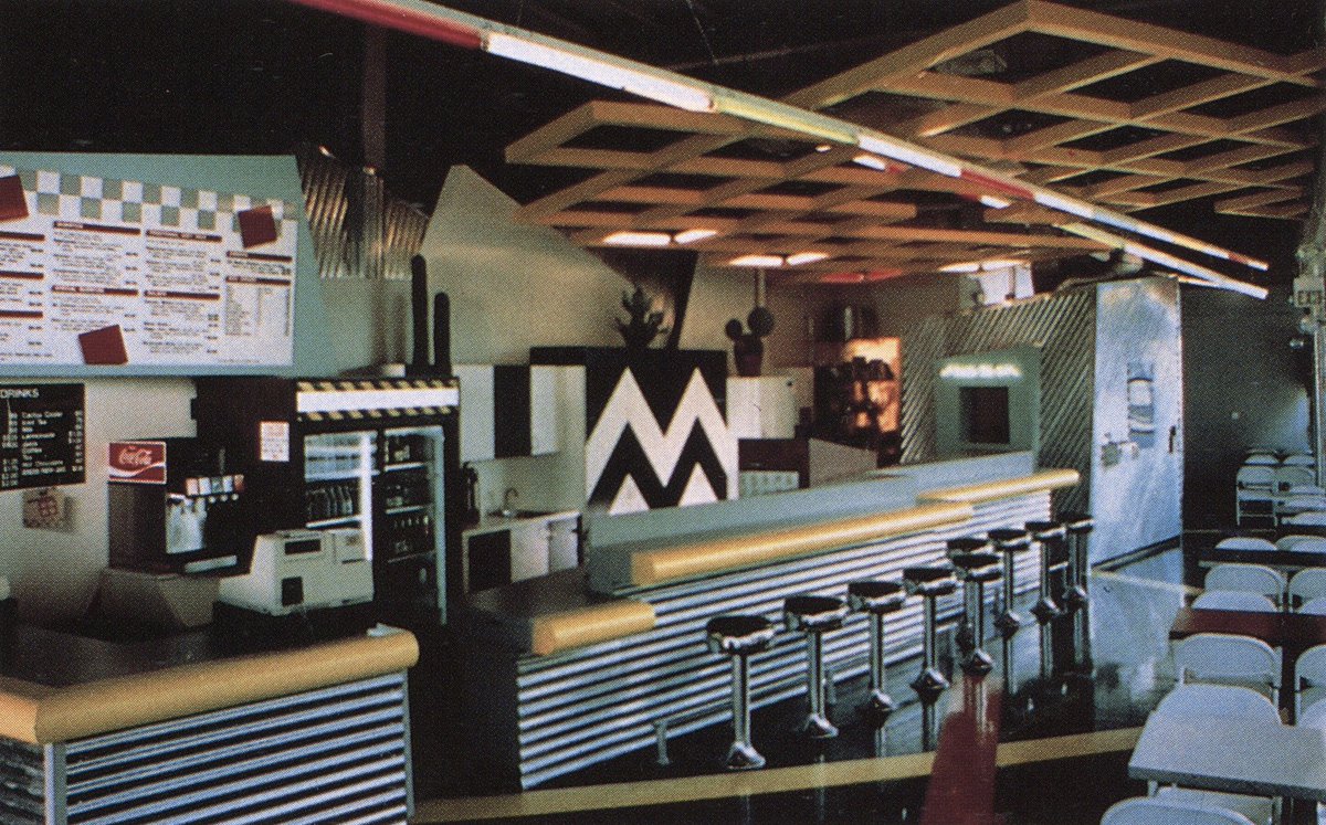
This one's for Portland; 'Macheesmo Mouse', a defunct health food/mexican restaurant popular in the 1980s-90s.
A wild mix of various 1980s design trends: Gehry-ish industrial deconstructivism, Memphis patterns, little bit of diner kitsch


A wild mix of various 1980s design trends: Gehry-ish industrial deconstructivism, Memphis patterns, little bit of diner kitsch
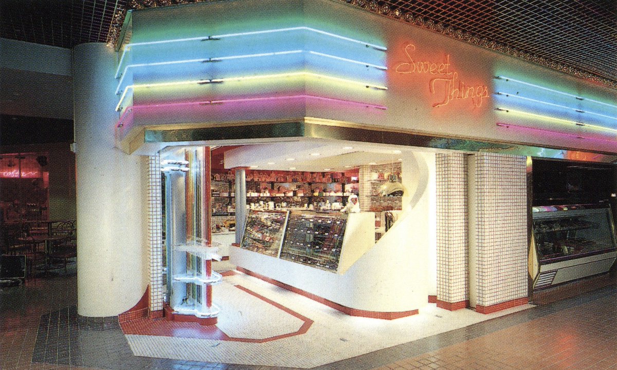
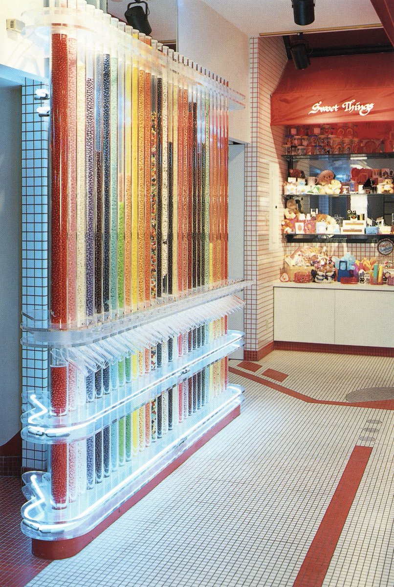
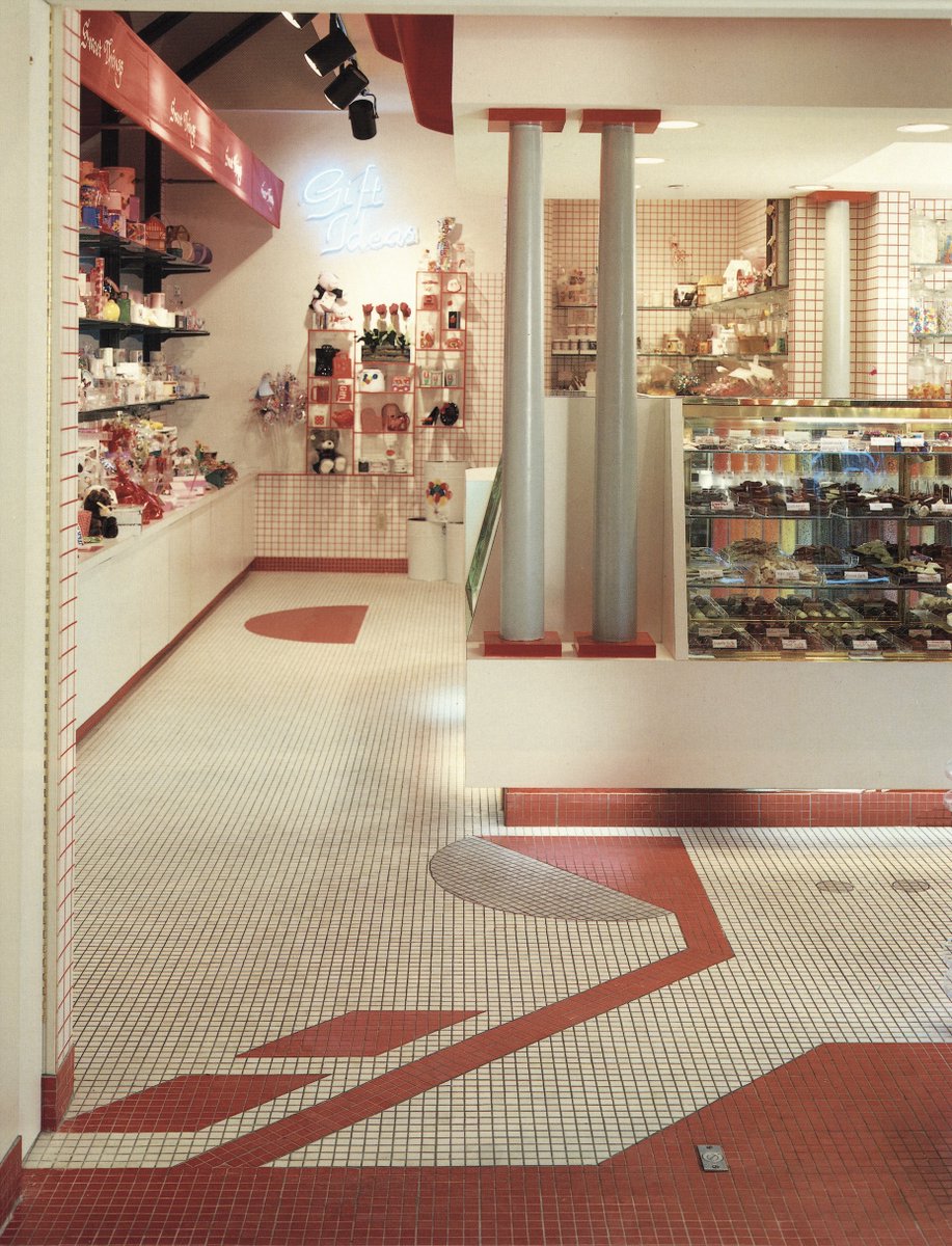
Sweet Things candy store - Claypool Center, Indianapolis - Ballinger Design Associates
"To the left of the entry are neon-lit floor-to-ceiling lucite tubes designed to hold and dispense assorted jelly beans"


"To the left of the entry are neon-lit floor-to-ceiling lucite tubes designed to hold and dispense assorted jelly beans"
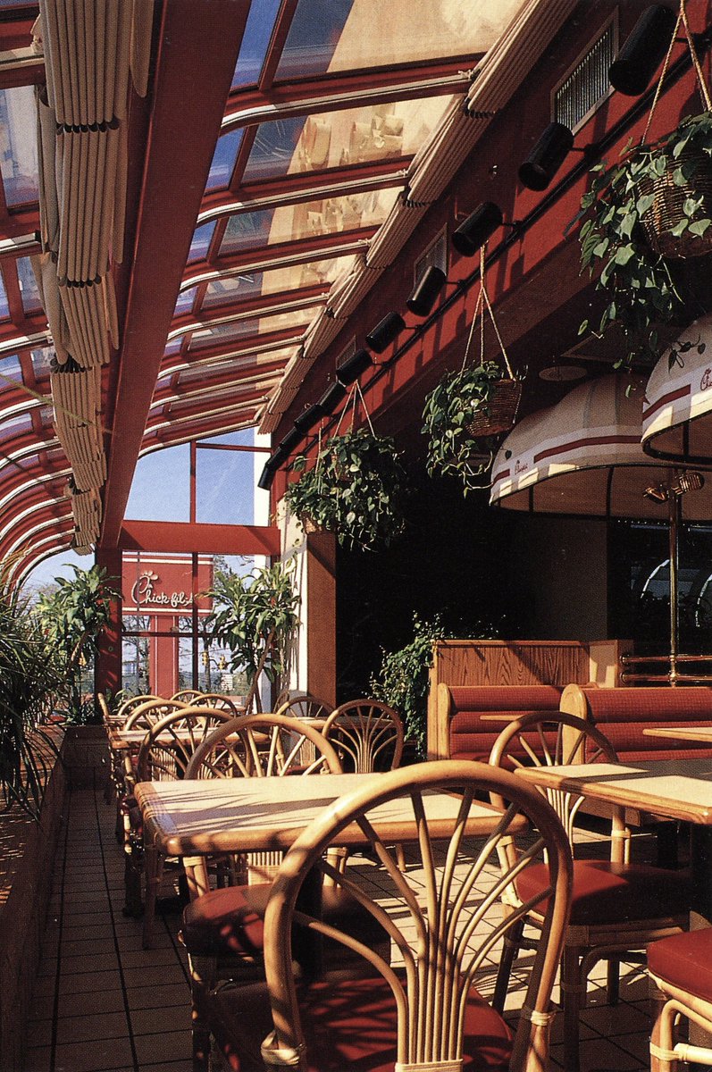
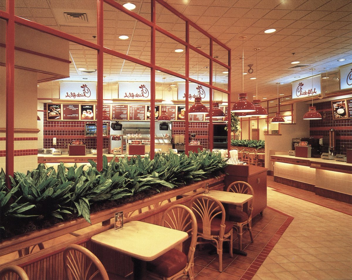
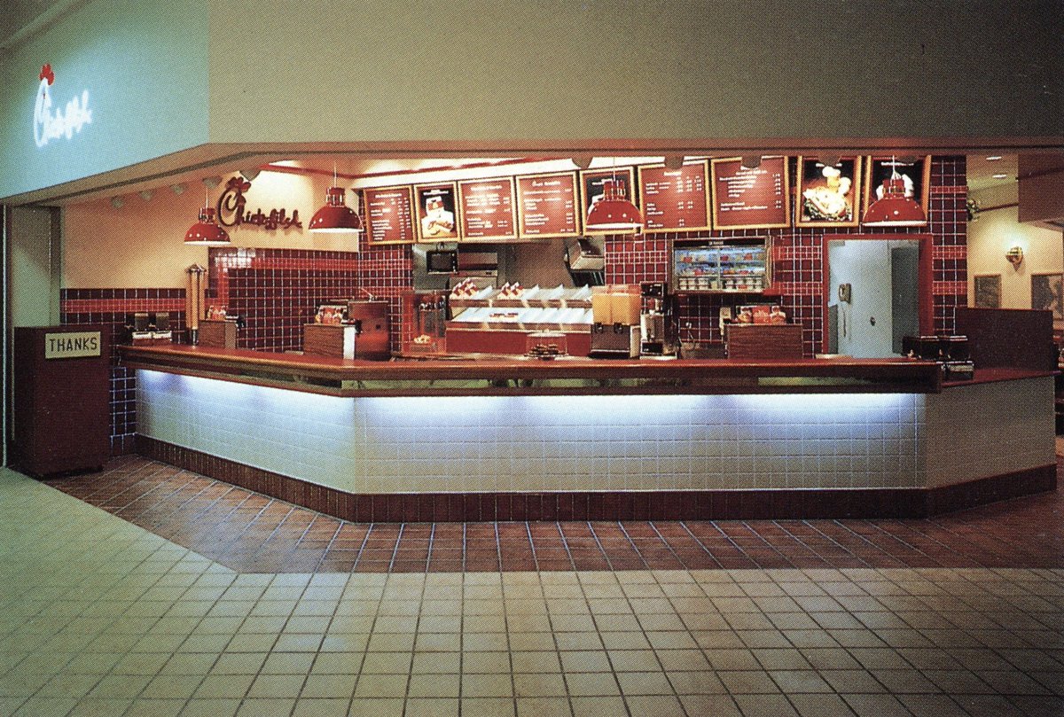
This one's interesting, a Chic-Fil-A prototype restaurant that I assume didn't take off. It has the popular 'garden solarium' design seen in Wendy's restaurants, and some leftovers from both the 'Gay Nineties' (1890s) revival style & the 70s 'Eco-Shed' environmental look. 


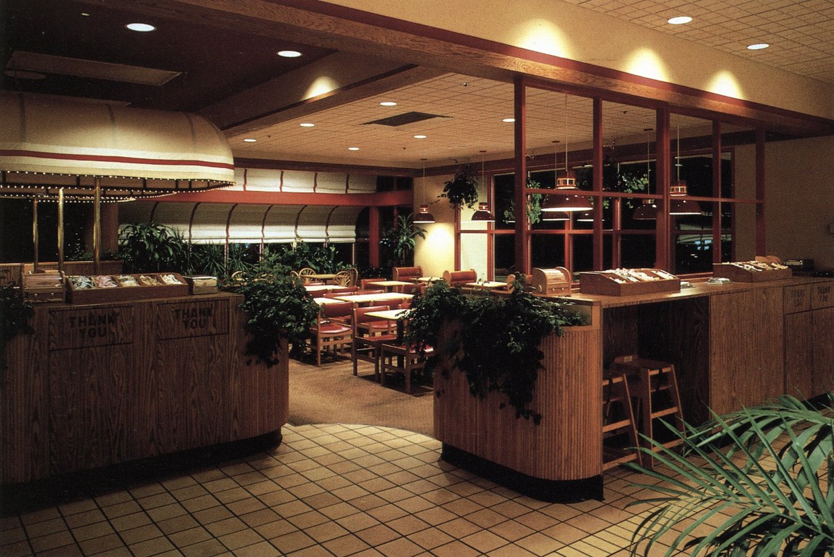
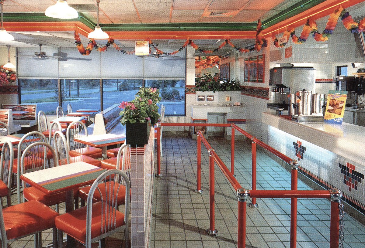
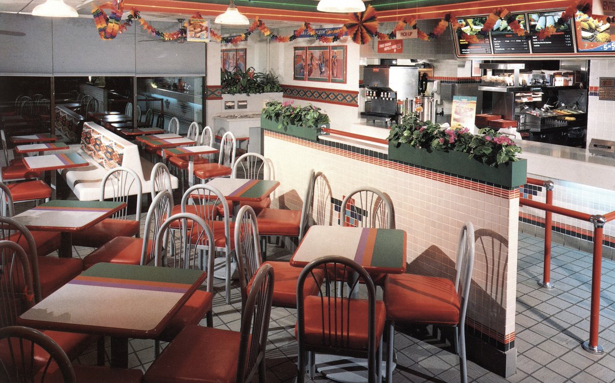
This Taco Bell in Winston-Salem must have existed in that strange period between their 1970s-80s 'earthy southwestern' aesthetic, and the 90s 'purple-teal-pink contempo-eclectic geometric' style. 

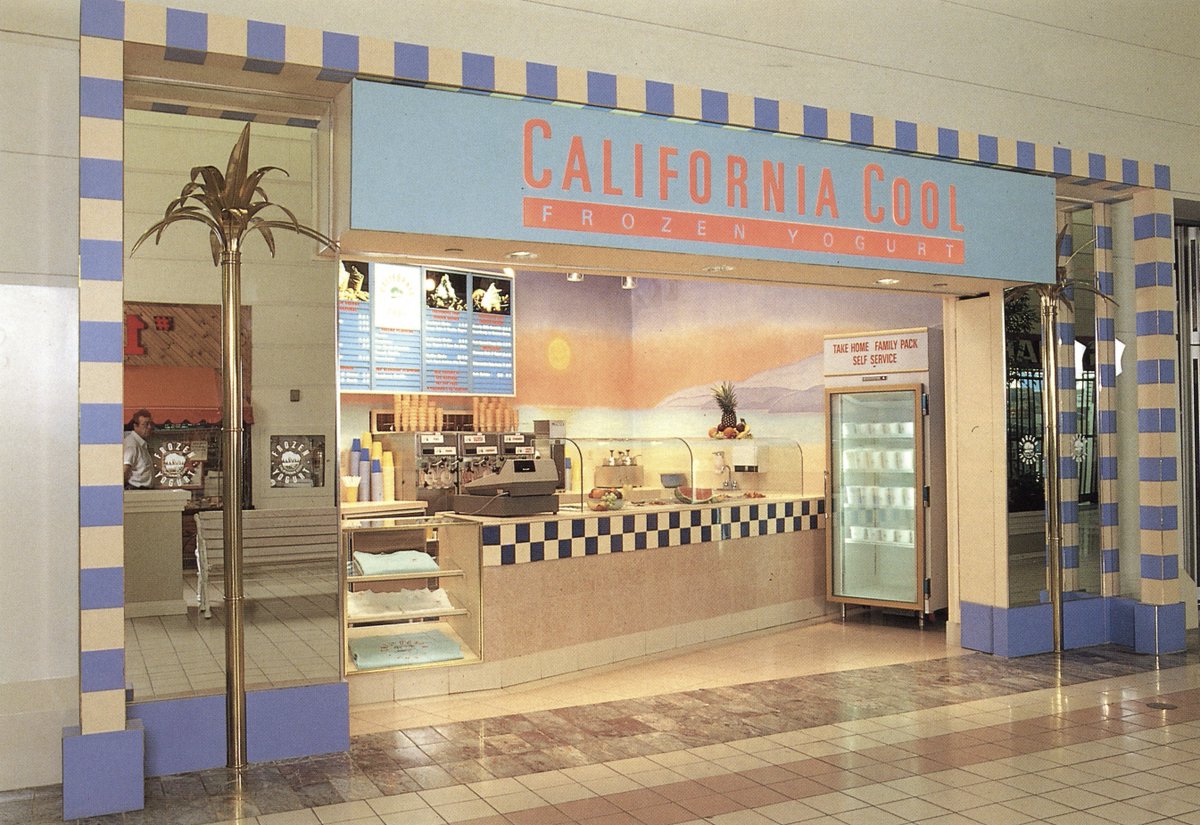
Various frozen yogurt, ice cream, and candy/gift establishments featured in the book.
California Cool, with it's vaguely Egyptian tiling & Hans Hollein palm trees, and 'Georgie Porgie' (3-4), named for a children's rhyme I have no recollection of.


California Cool, with it's vaguely Egyptian tiling & Hans Hollein palm trees, and 'Georgie Porgie' (3-4), named for a children's rhyme I have no recollection of.
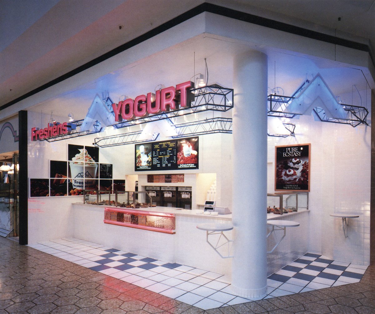
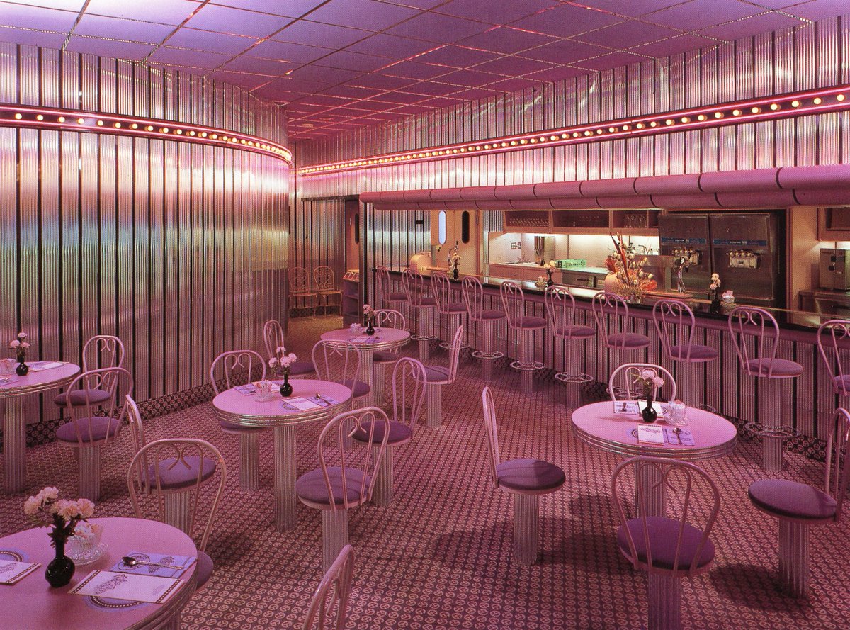
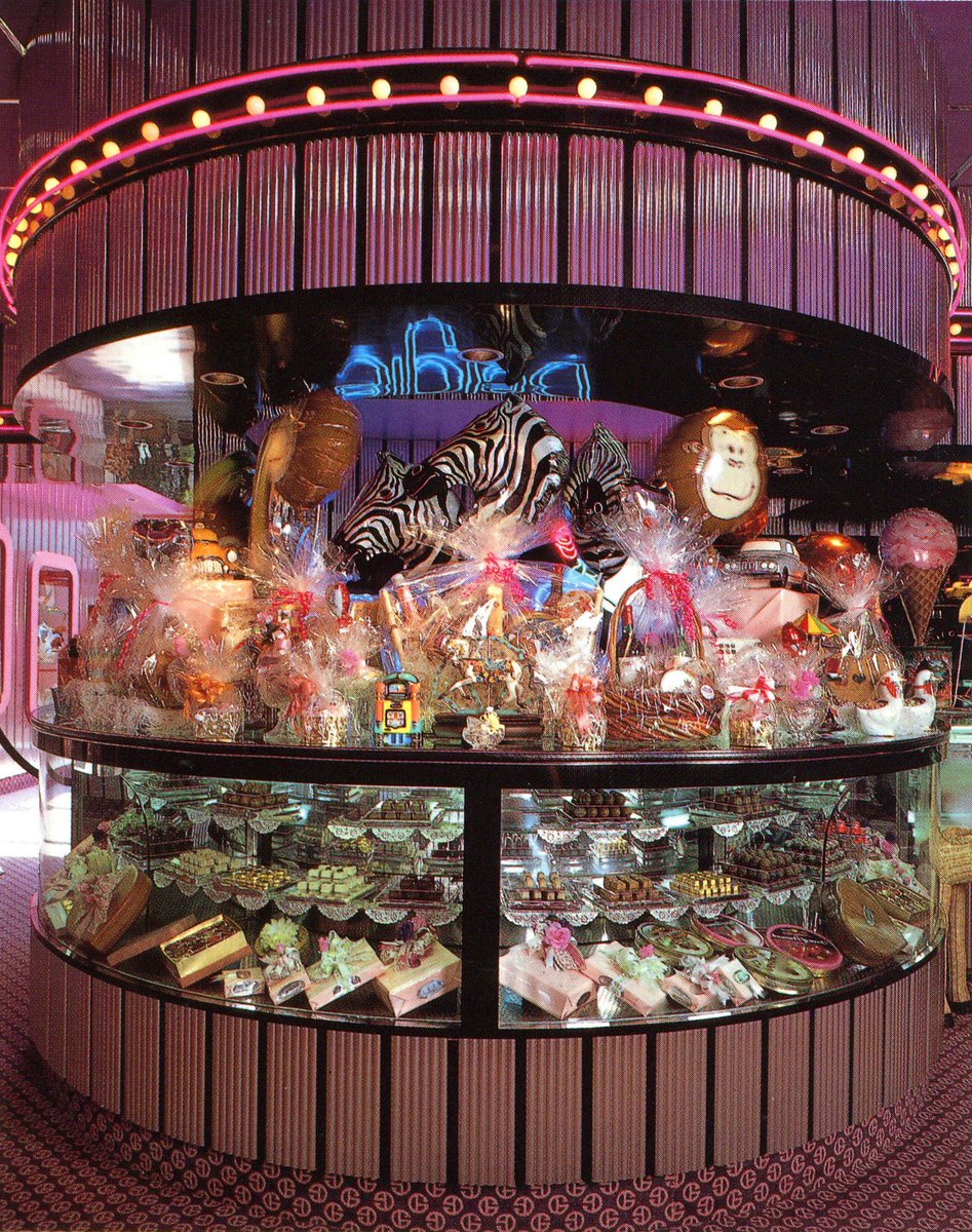
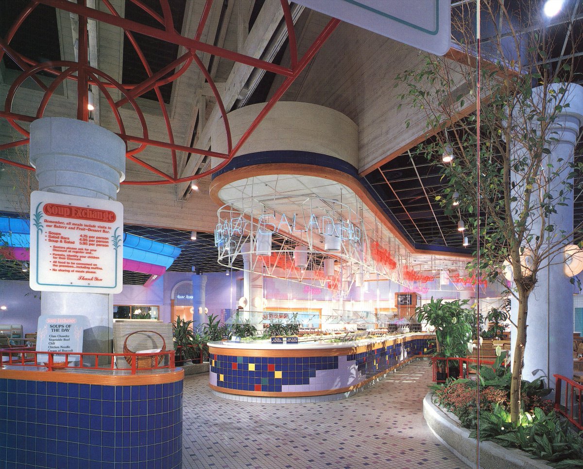
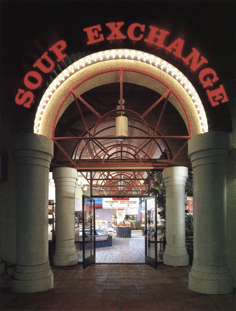
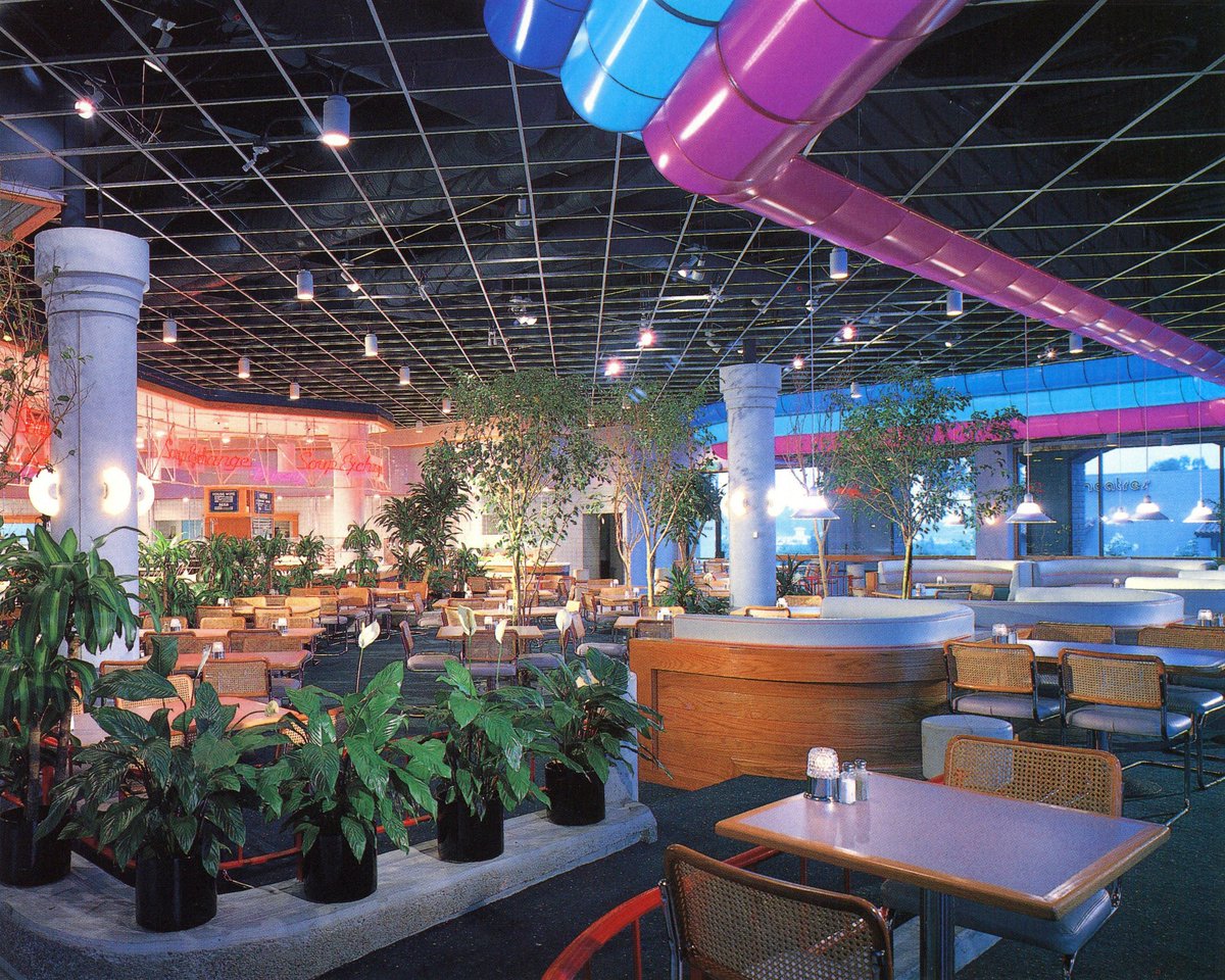
A blast from the past, soup/salad buffet-style restaurants like this one, Soup Exchange in Oceanside, CA.
A hybrid of many different 1980's aesthetics, in particular 'festival marketplace' and that gridded high-tech PoMo style. I love those colorful fabric(?) banners esp.


A hybrid of many different 1980's aesthetics, in particular 'festival marketplace' and that gridded high-tech PoMo style. I love those colorful fabric(?) banners esp.
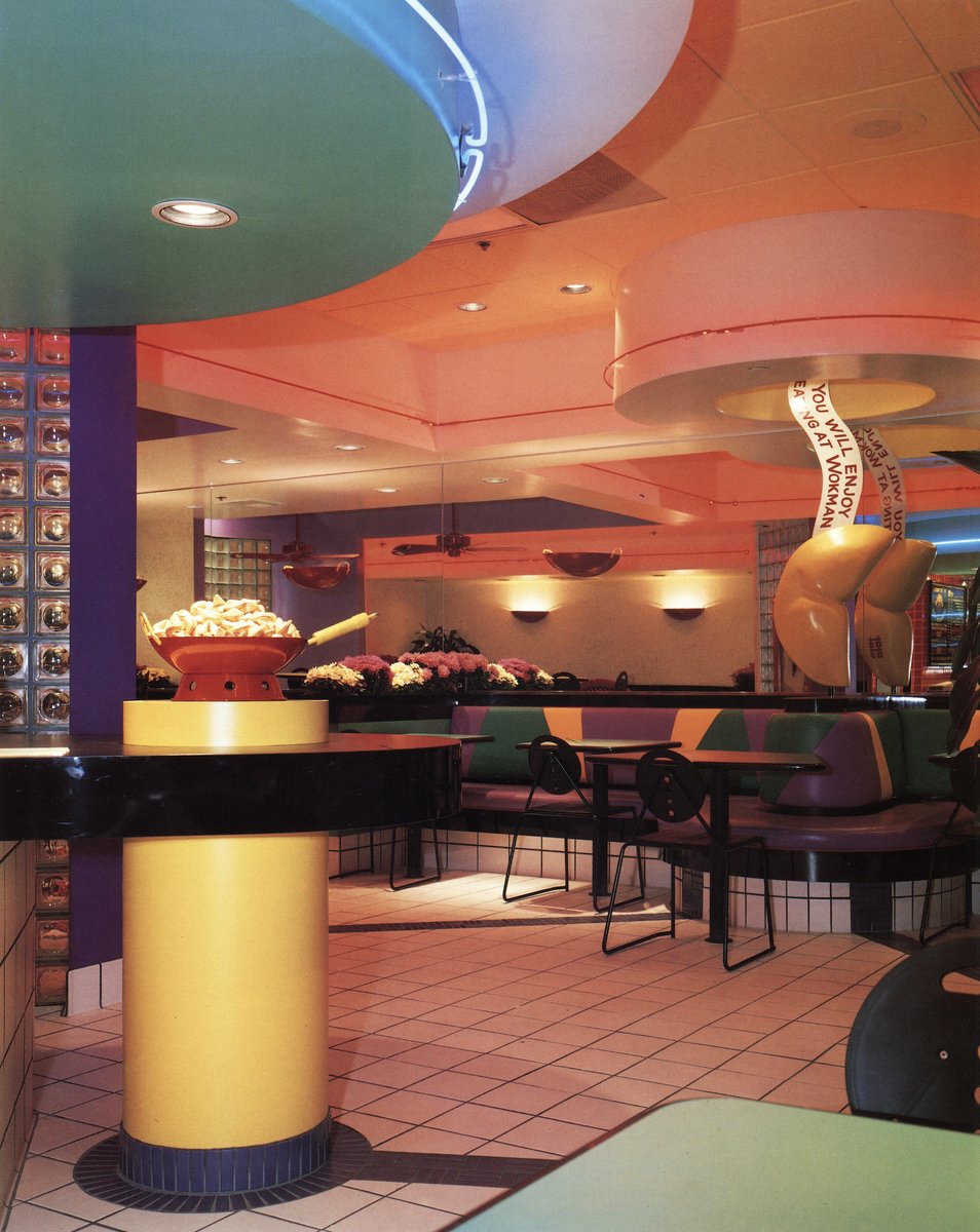
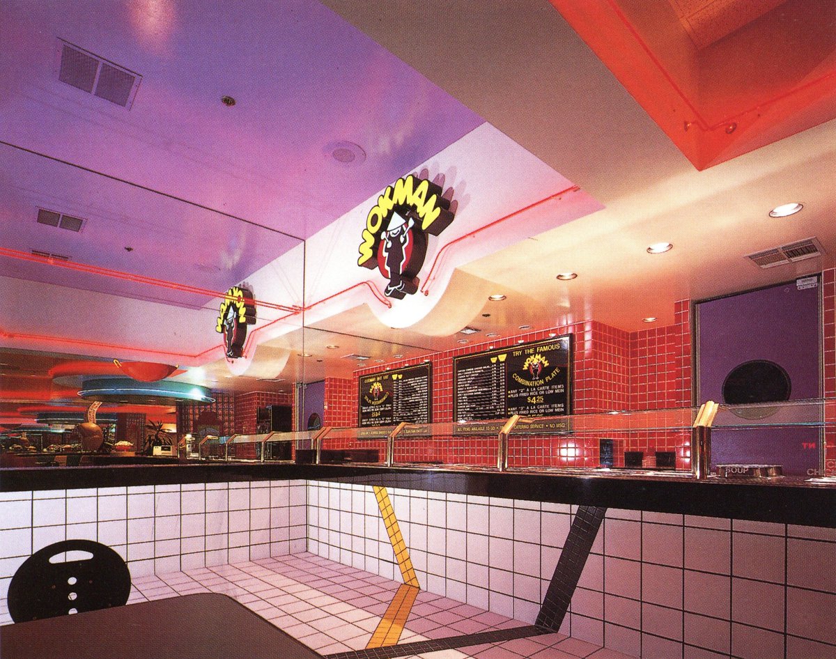
Wokman - Mission Viejo, CA
So many hallmarks of fun, colorful, and pop-arty 1980s design! The description mentions that 'blue & white' are colors of death in Chinese culture, and are to be avoided per the guidance from the owners; I hadn't heard of that before!


So many hallmarks of fun, colorful, and pop-arty 1980s design! The description mentions that 'blue & white' are colors of death in Chinese culture, and are to be avoided per the guidance from the owners; I hadn't heard of that before!
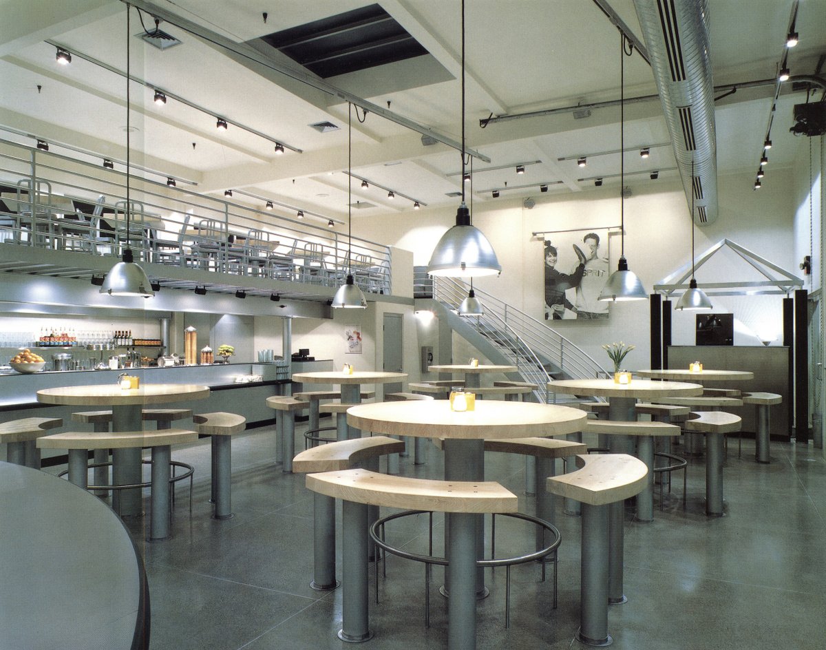
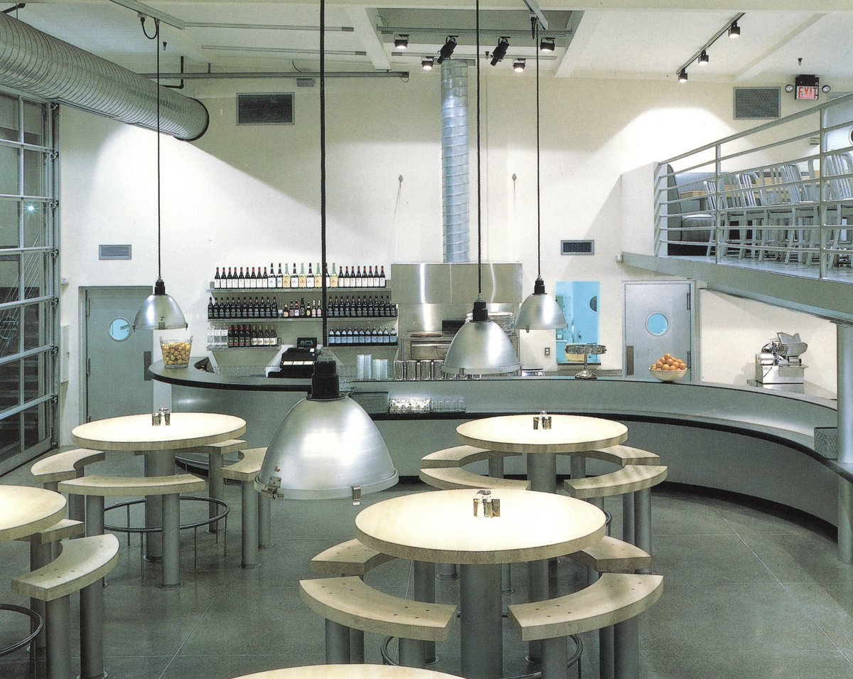
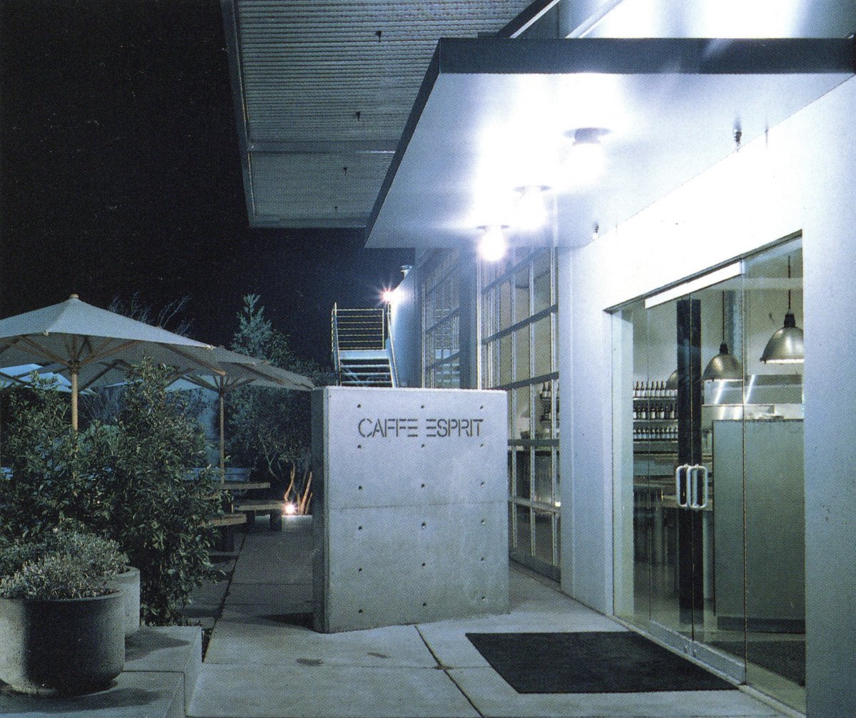
And now for something totally different: 'Caffe Esprit' in San Francisco. Esprit definitely had some of the best branding design of the 1980s, and their restaurant feels quite ahead of its time, super minimal and industrial 



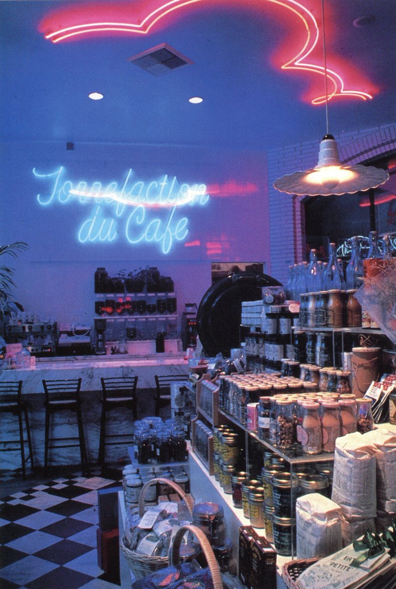
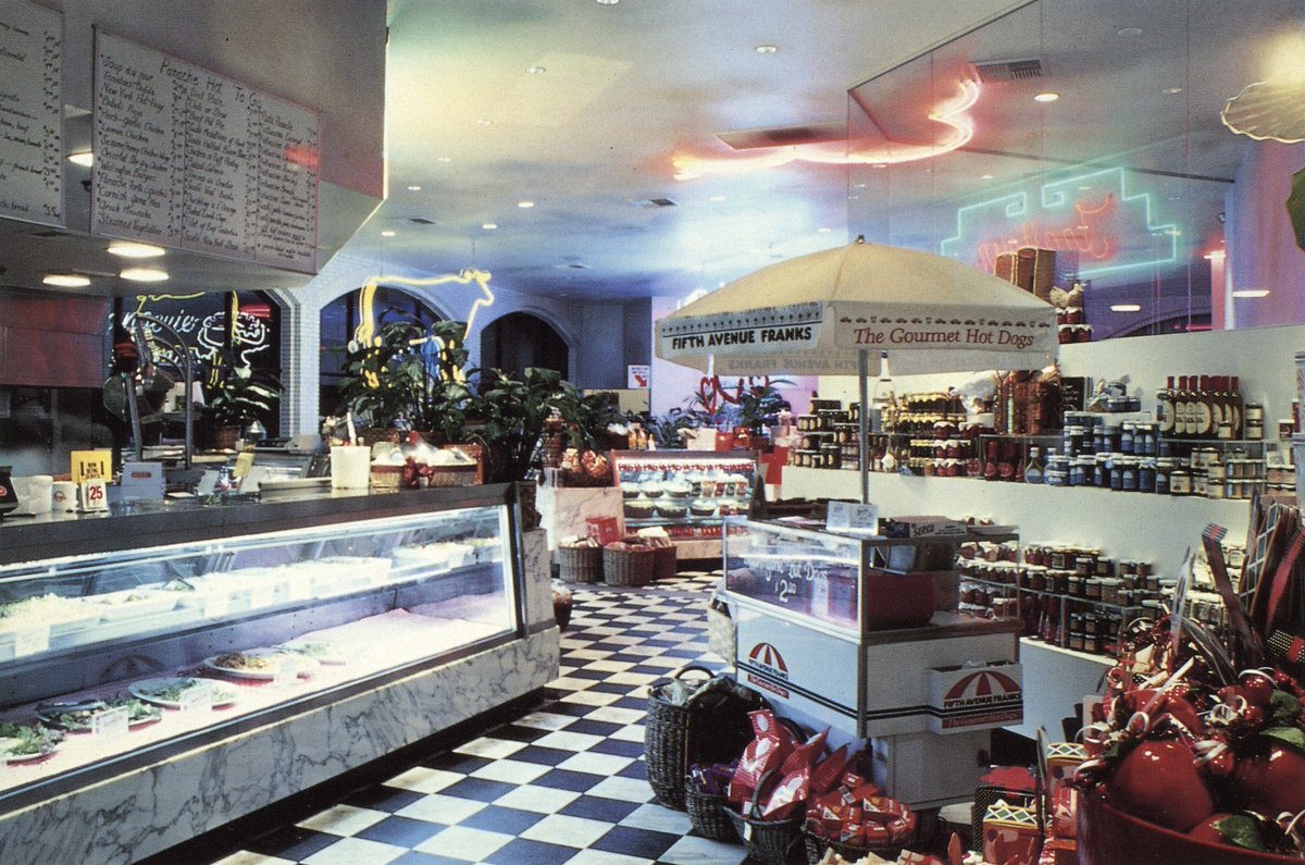
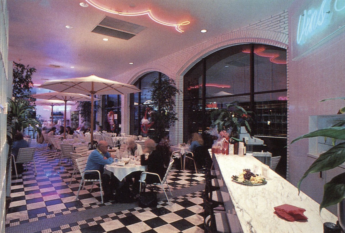
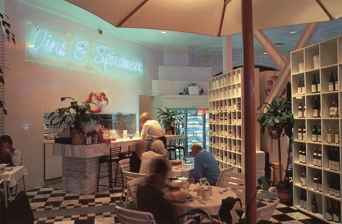
Love the atmosphere of this grocery store, 'Panache' in Fullerton, CA. It was definitely a boomer yuppie hangout judging by the name, the 'wine & spiritorium', and basically everything else. Also, it was designed by Michael Bolton (no relation I assume) 


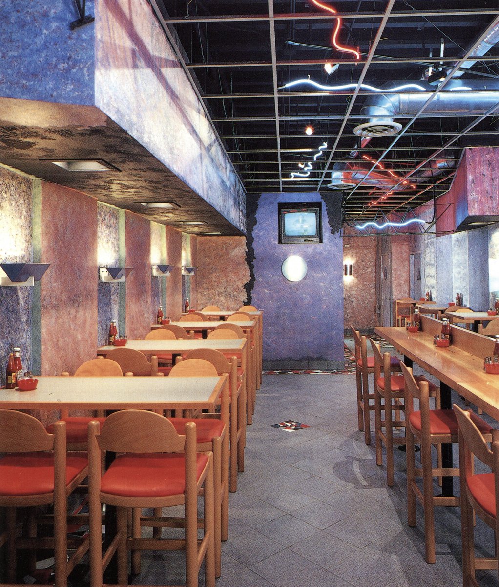
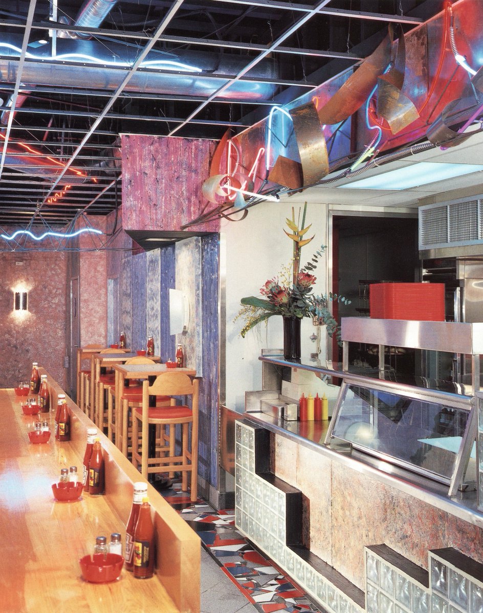
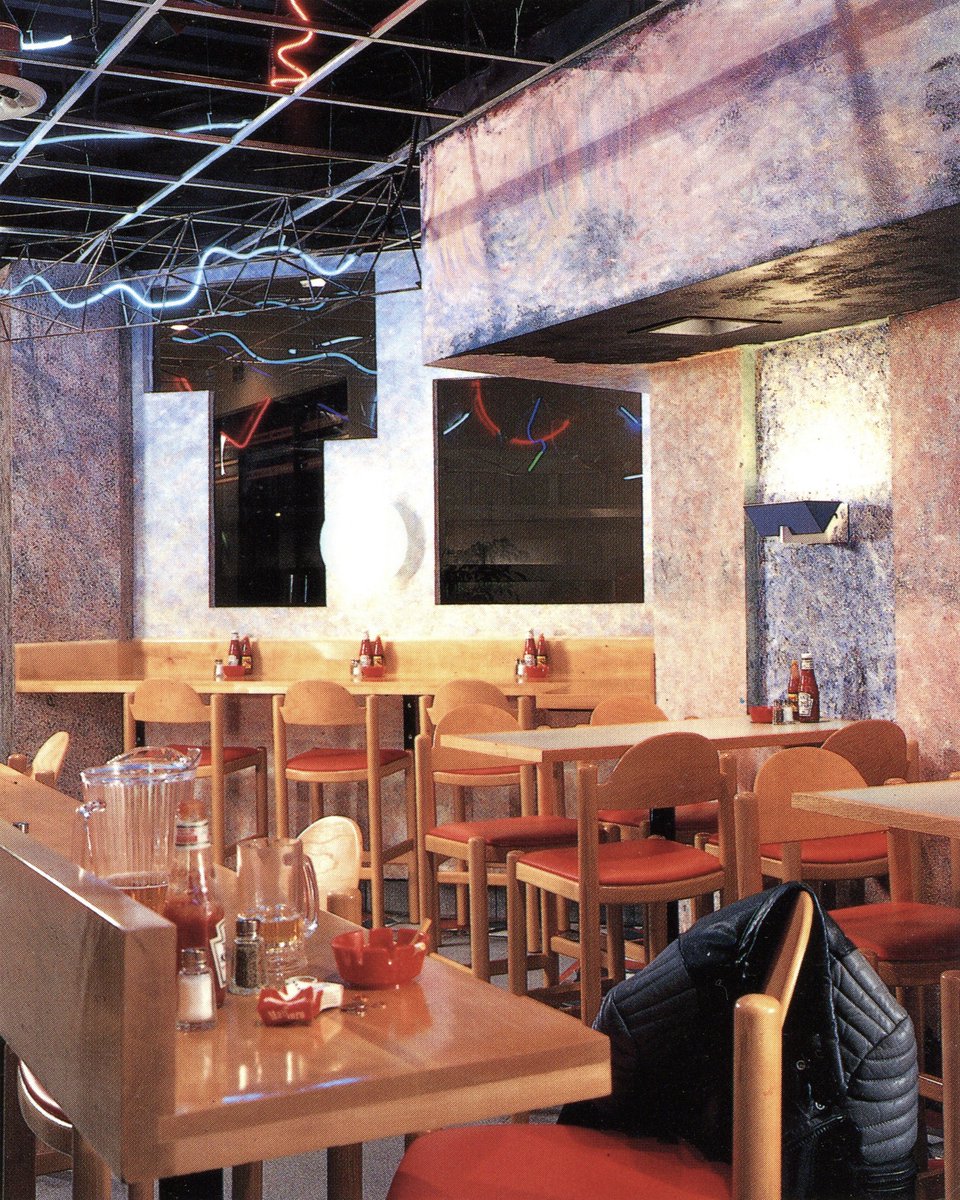
Hunter's Hamburgers, a Marina Del Rey burger joint filed to brim with metallic-neon scribble sculptures, pomo faux ruin motifs, gridded ceilings, and an overload of faux-finishes.
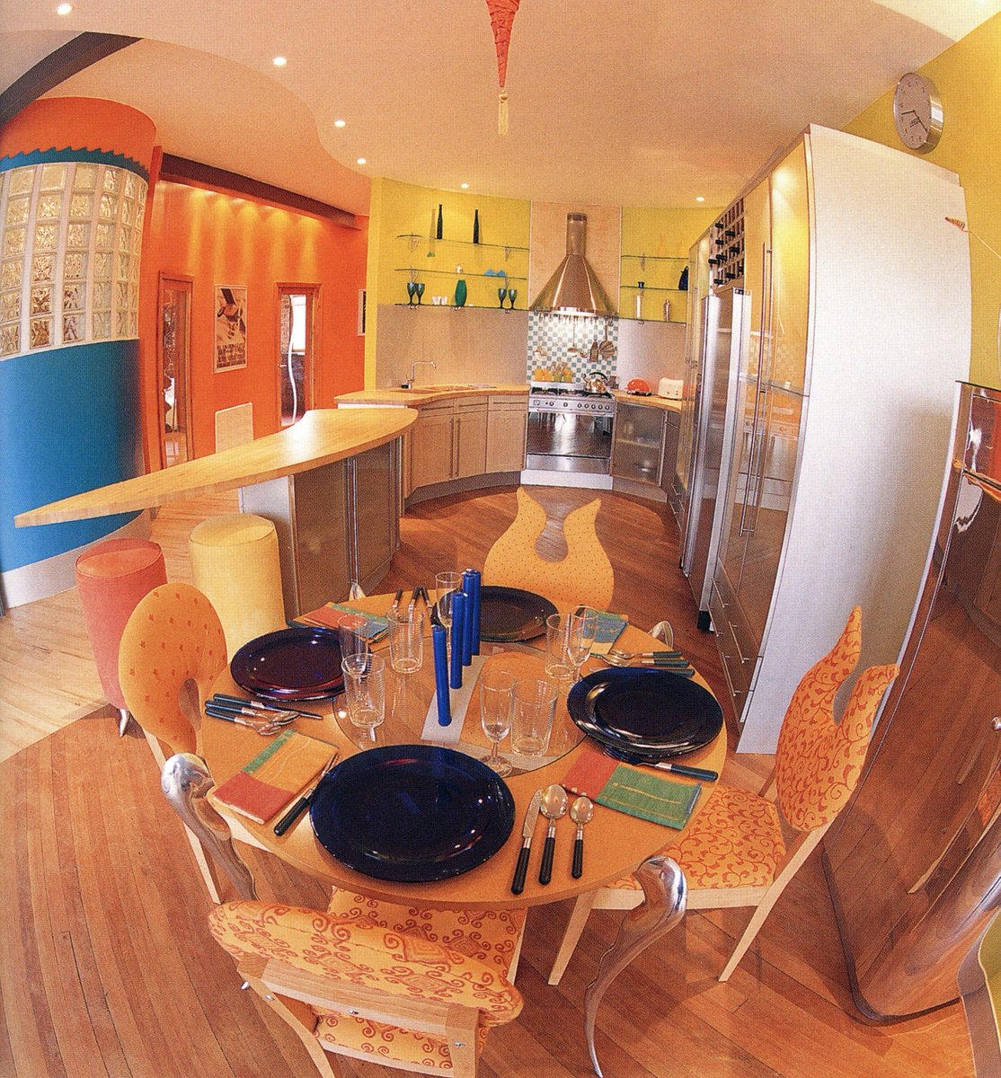
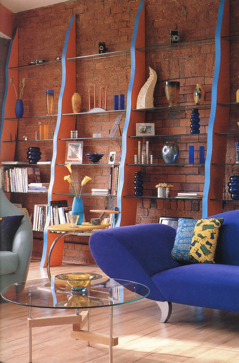
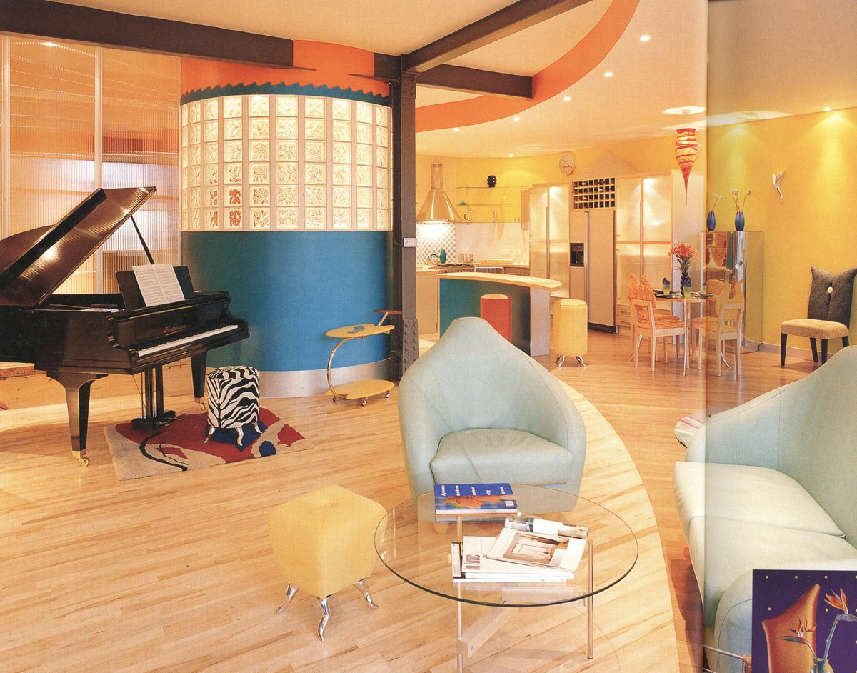
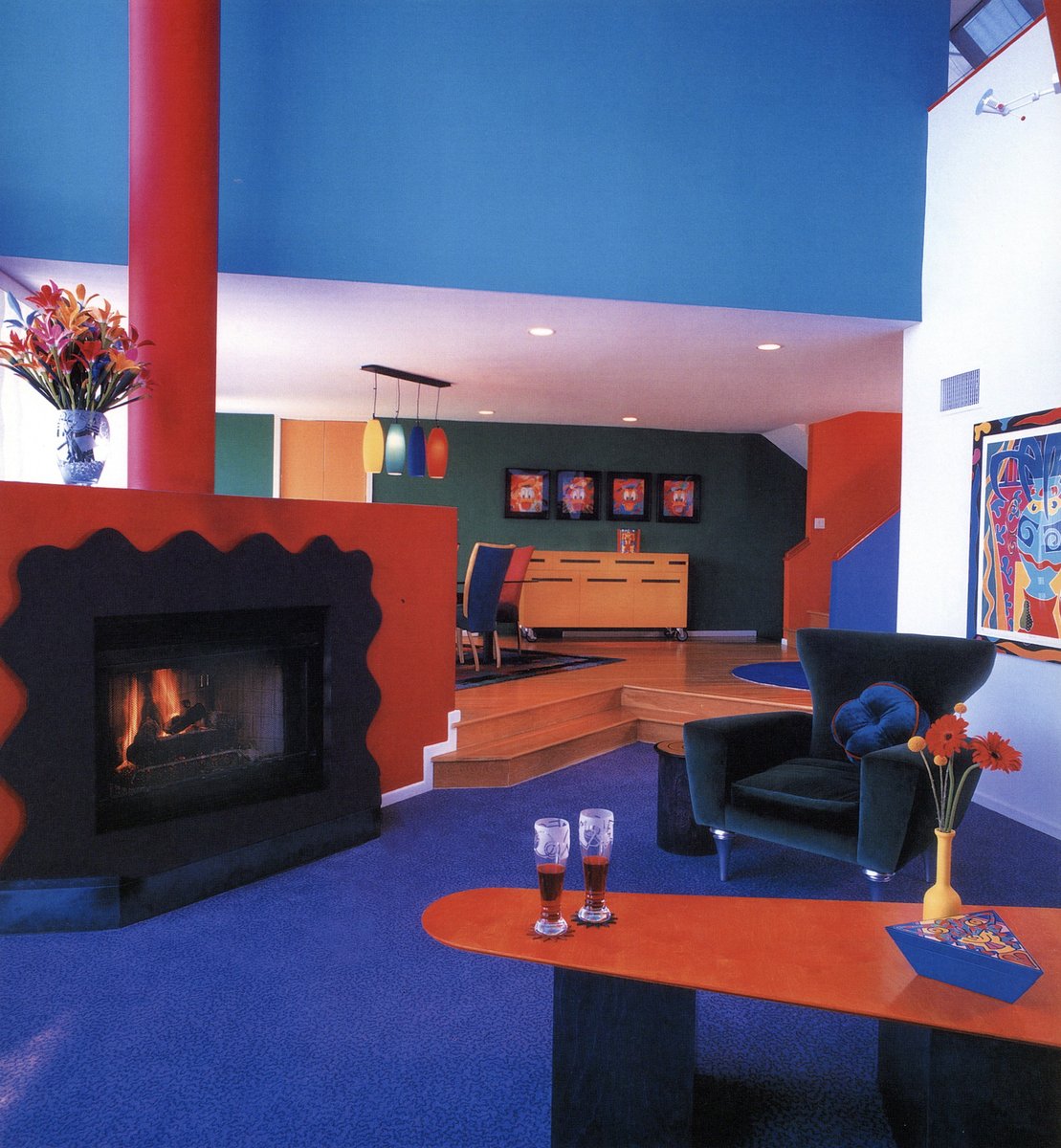
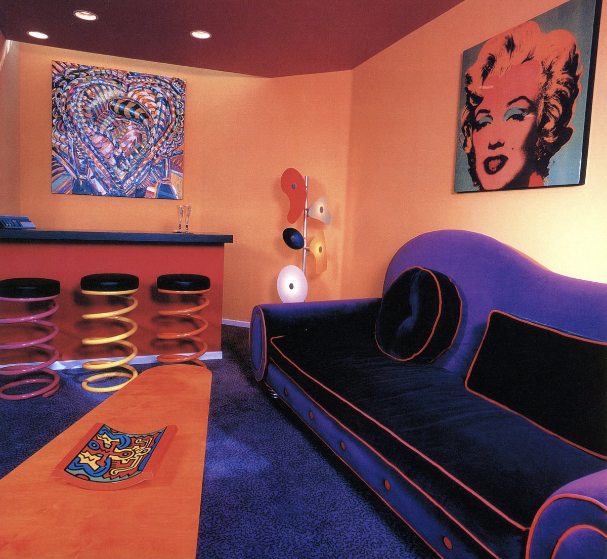
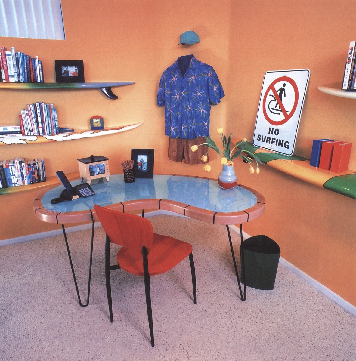
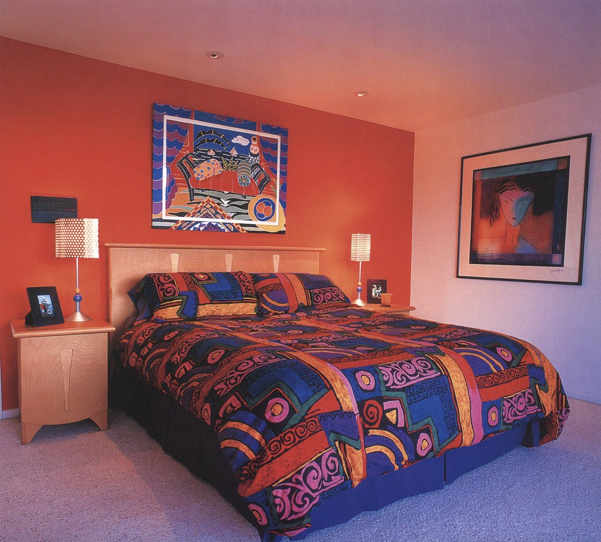
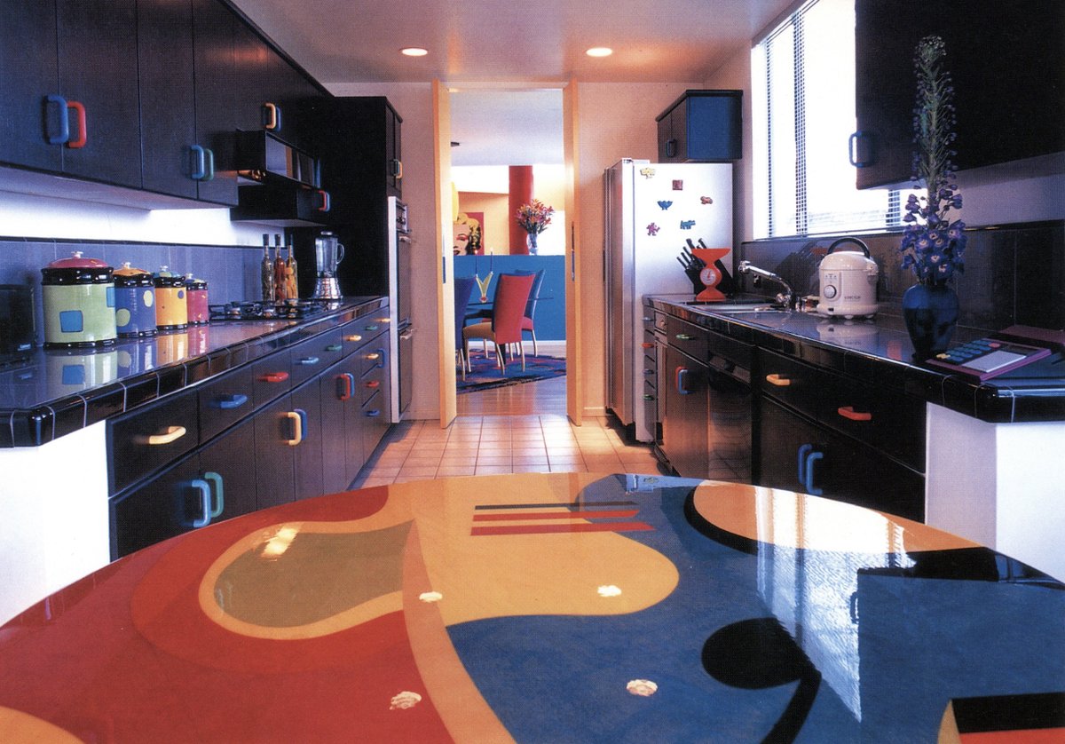
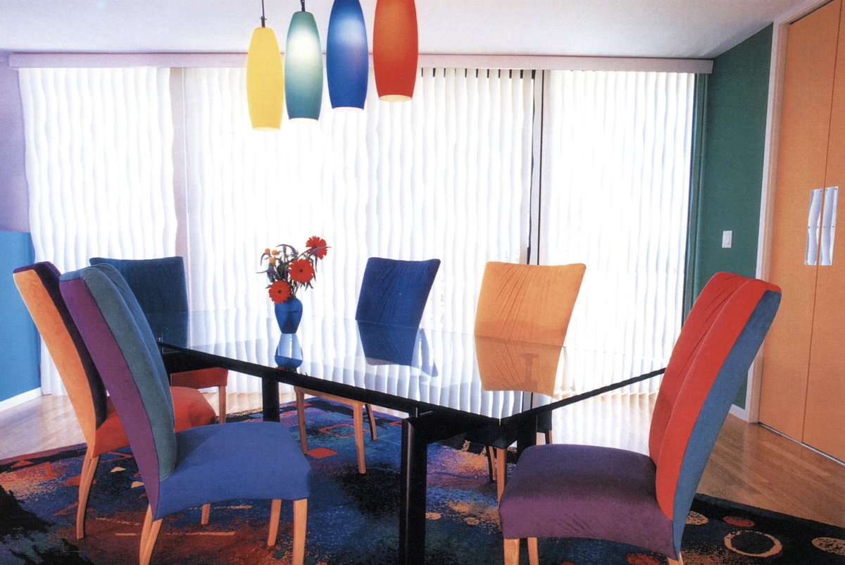
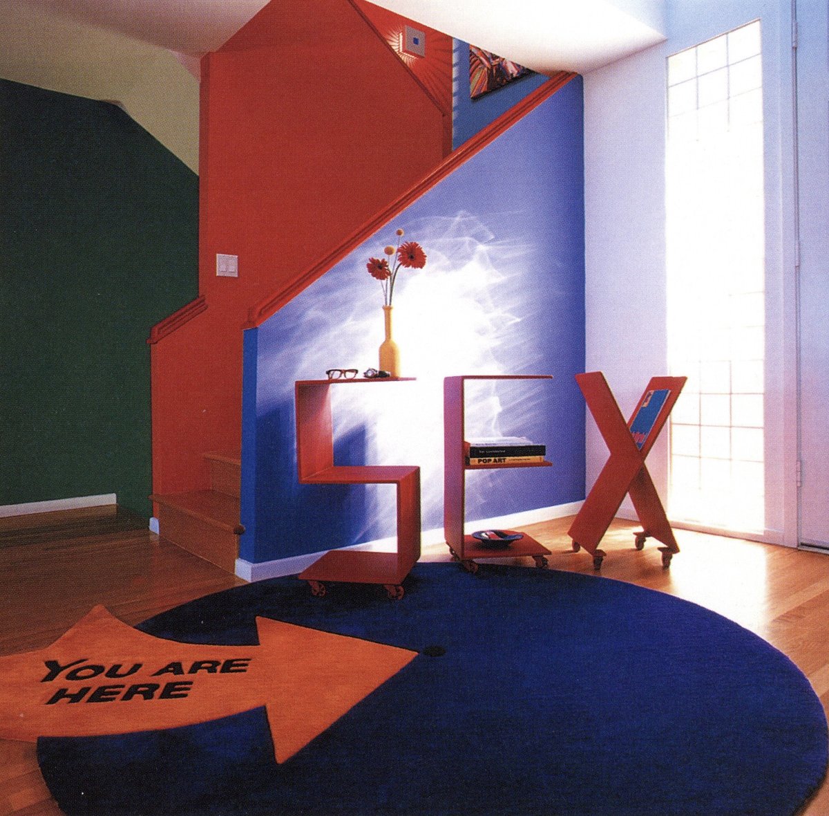
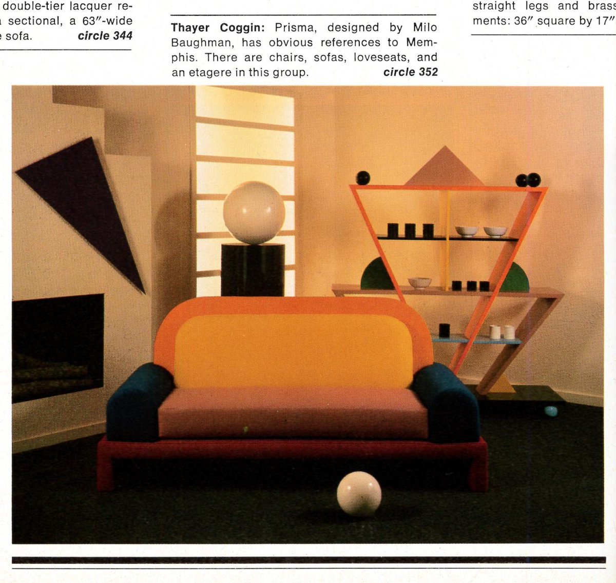
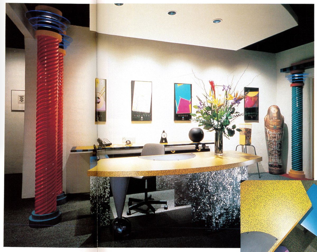
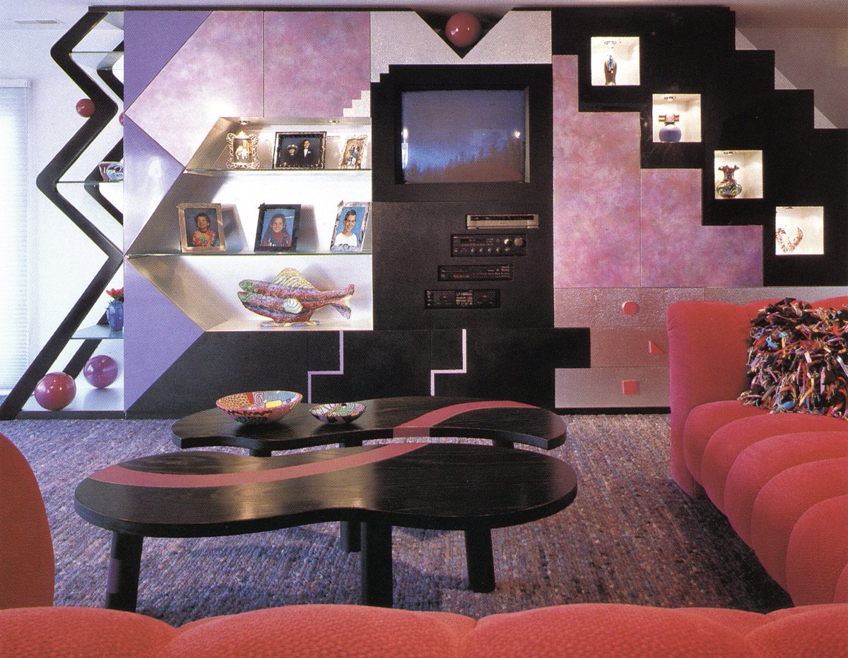
The last image is of a midwest home interior by Bobbi Packer, just noticed the similarity!


The last image is of a midwest home interior by Bobbi Packer, just noticed the similarity!
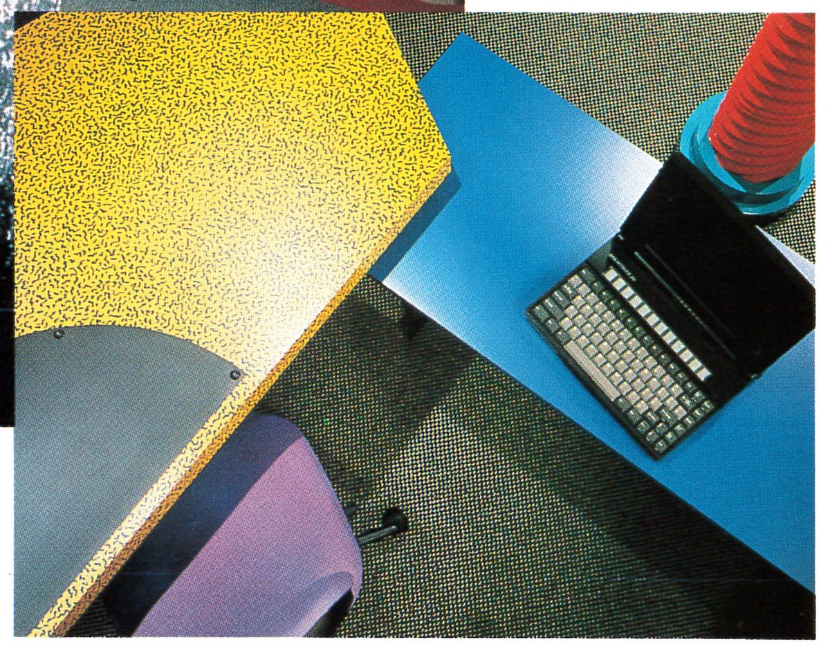
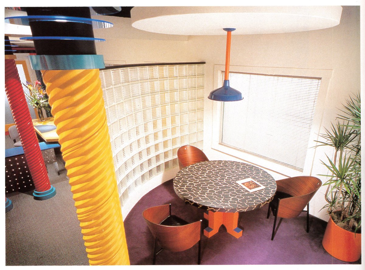
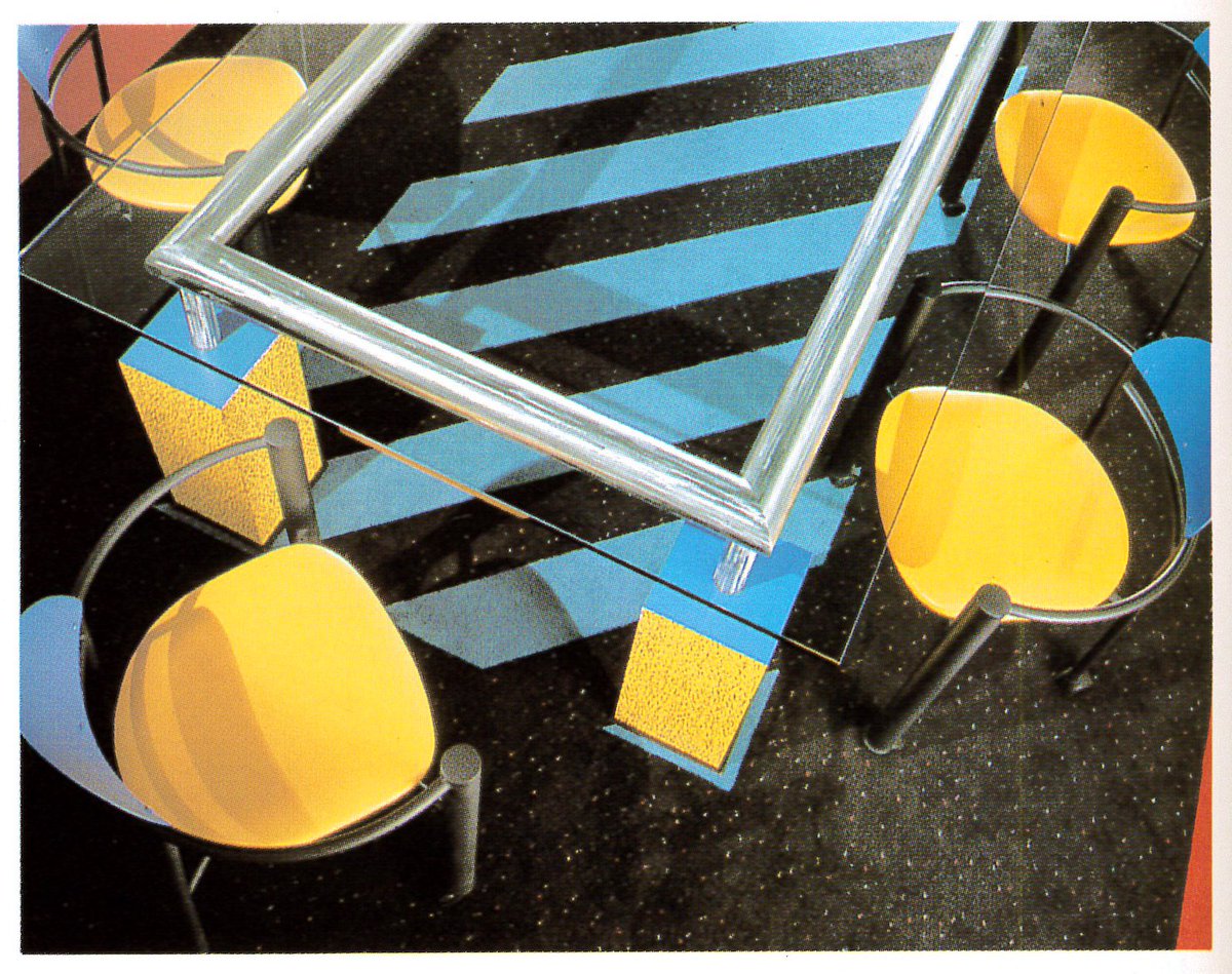
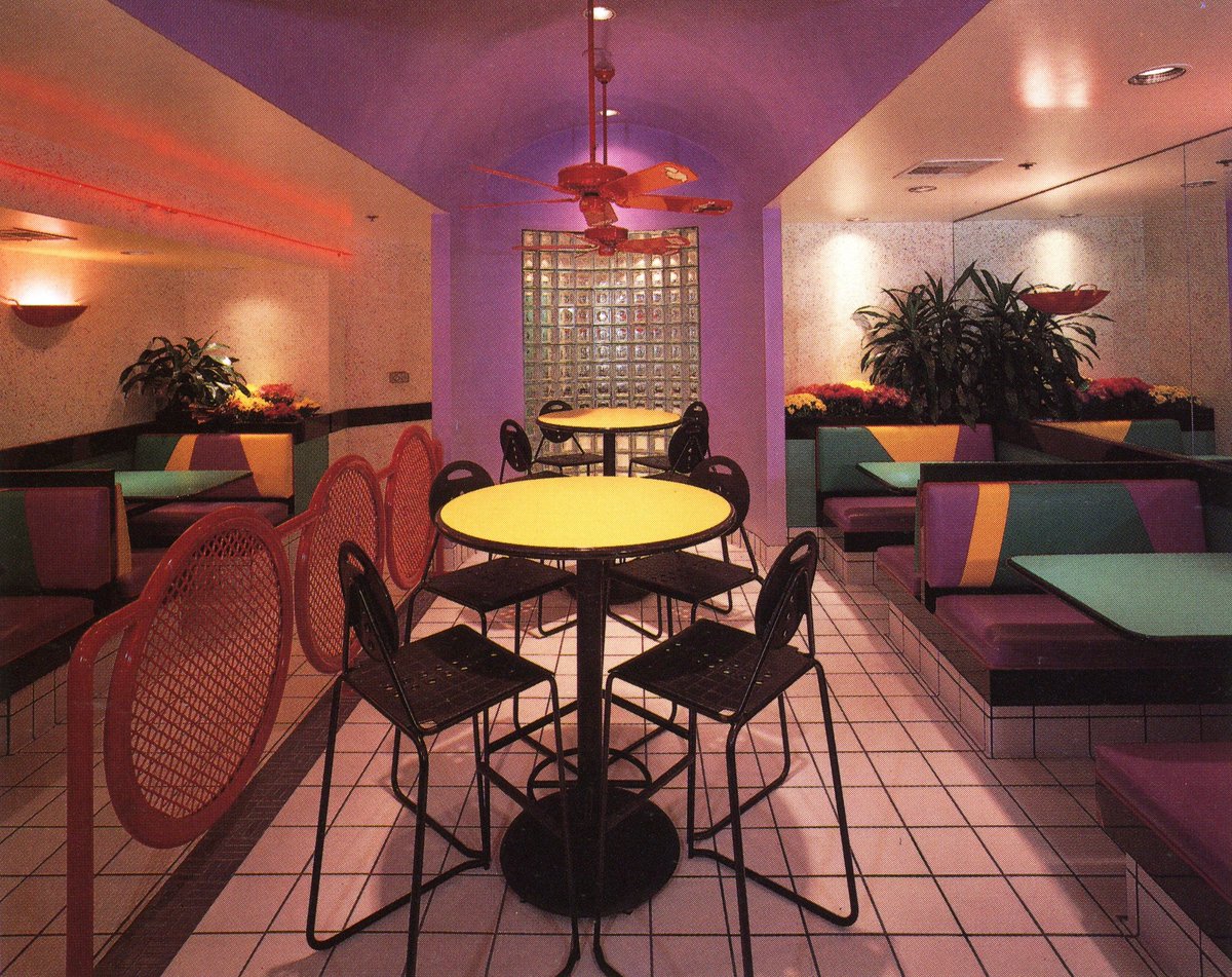
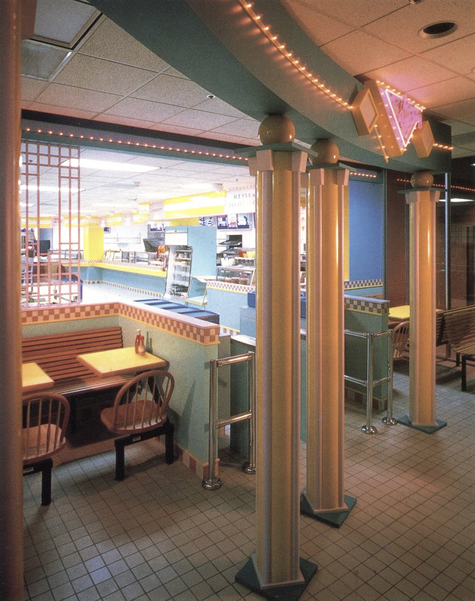
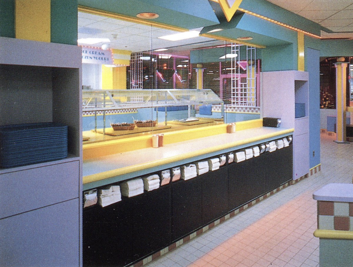
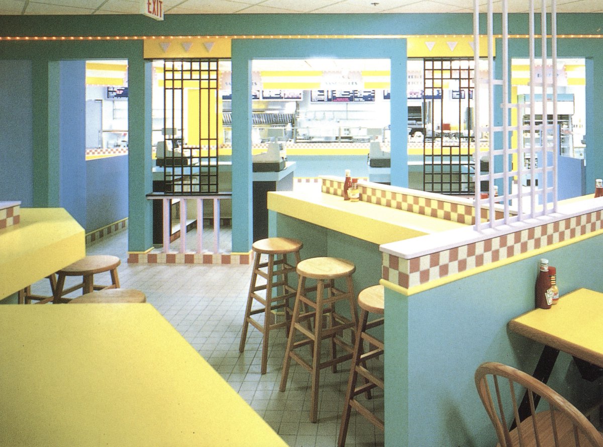
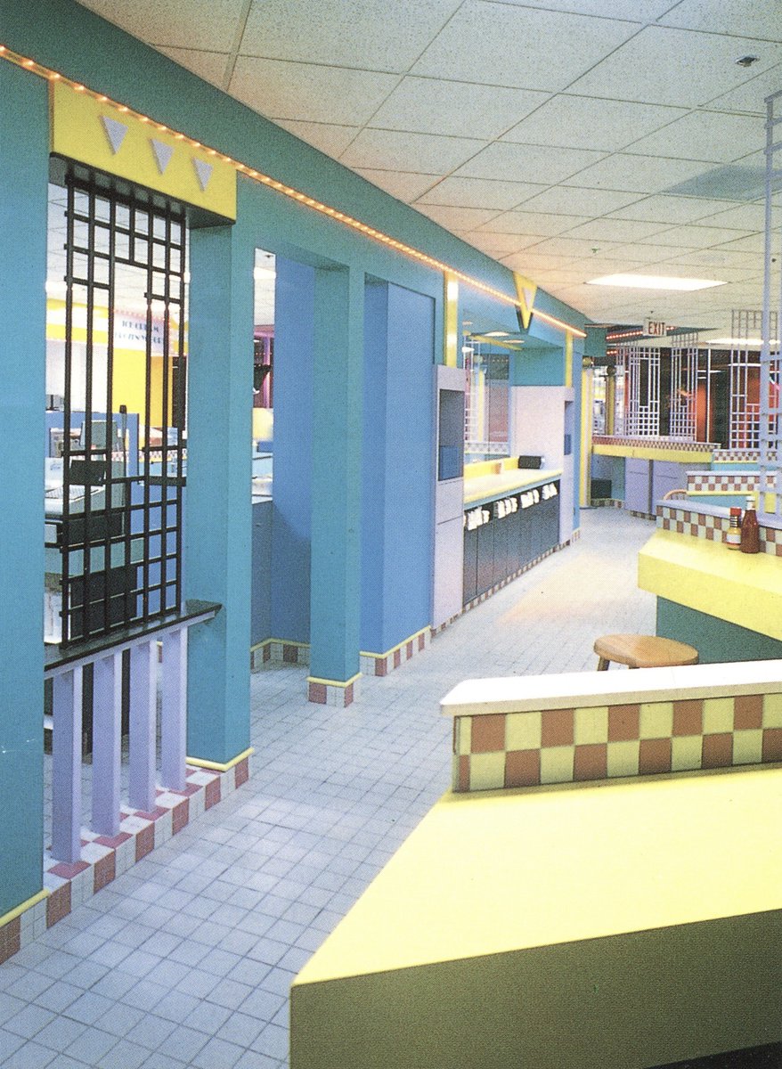
From the post cover image: 'The Feastery' fast food restaurant in Rosslyn, and wow there is no record of this place ever existing. The entry mentions 'Memphis influences', and while I enjoy the fun colorful shapes, it's quite overbearing with that intense yellow. 


Done for tonight, but I have more (including the section on mall food courts!) from the book if y’all would like a part 2 tomorrow
• • •
Missing some Tweet in this thread? You can try to
force a refresh


