Consistency matters, they say...🤔
Starting from today, I'll post one UI tip per day for the next 50 days!
Follow this thread 👇
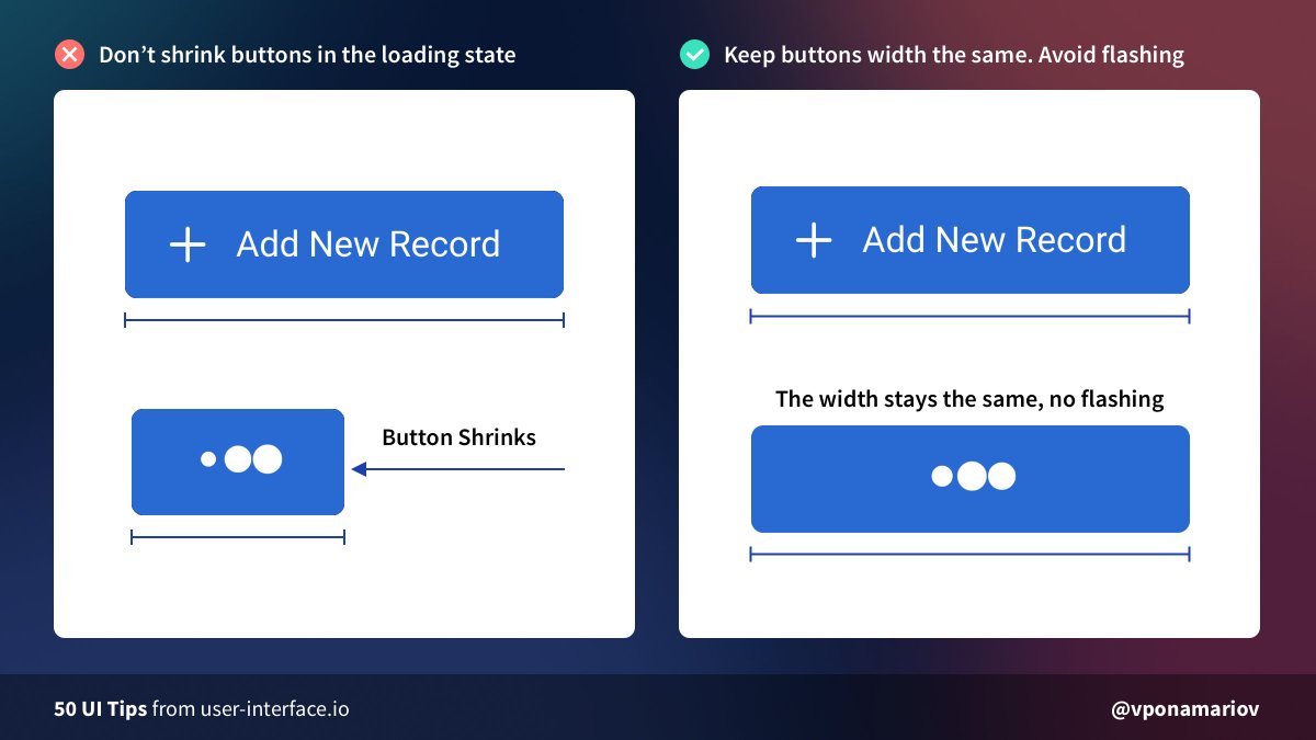
💡Tip #01 - Set the fixed width of your buttons if they have a loading state
Otherwise, they'll shrink when loading, and it looks terrible.
Starting from today, I'll post one UI tip per day for the next 50 days!
Follow this thread 👇
💡Tip #01 - Set the fixed width of your buttons if they have a loading state
Otherwise, they'll shrink when loading, and it looks terrible.
💡Tip #02 - Don't hide tips if it's unnecessary
Developers tend to hide tips under icons/tooltips/popups.
In this case, your users will be forced to hover every icon to read the tip.
It'd be better to show tips right away, if possible. 😊
Developers tend to hide tips under icons/tooltips/popups.
In this case, your users will be forced to hover every icon to read the tip.
It'd be better to show tips right away, if possible. 😊

💡Tip #03 - Show progress bars for complex forms
They help users to identify which step they are on AND how many steps are left (!)
The latter will increase conversion of completing the form because of the "Goal Gradient Effect".
Further reading:
They help users to identify which step they are on AND how many steps are left (!)
The latter will increase conversion of completing the form because of the "Goal Gradient Effect".
Further reading:
https://twitter.com/vponamariov/status/1366791289493192704

💡 Tip #04 - Show the most frequent options at the beginning
Working with the interface should be simplified as much as possible ☝️
If most of your users live in the US, then you'll make their life easier just by putting the country on top
Working with the interface should be simplified as much as possible ☝️
If most of your users live in the US, then you'll make their life easier just by putting the country on top

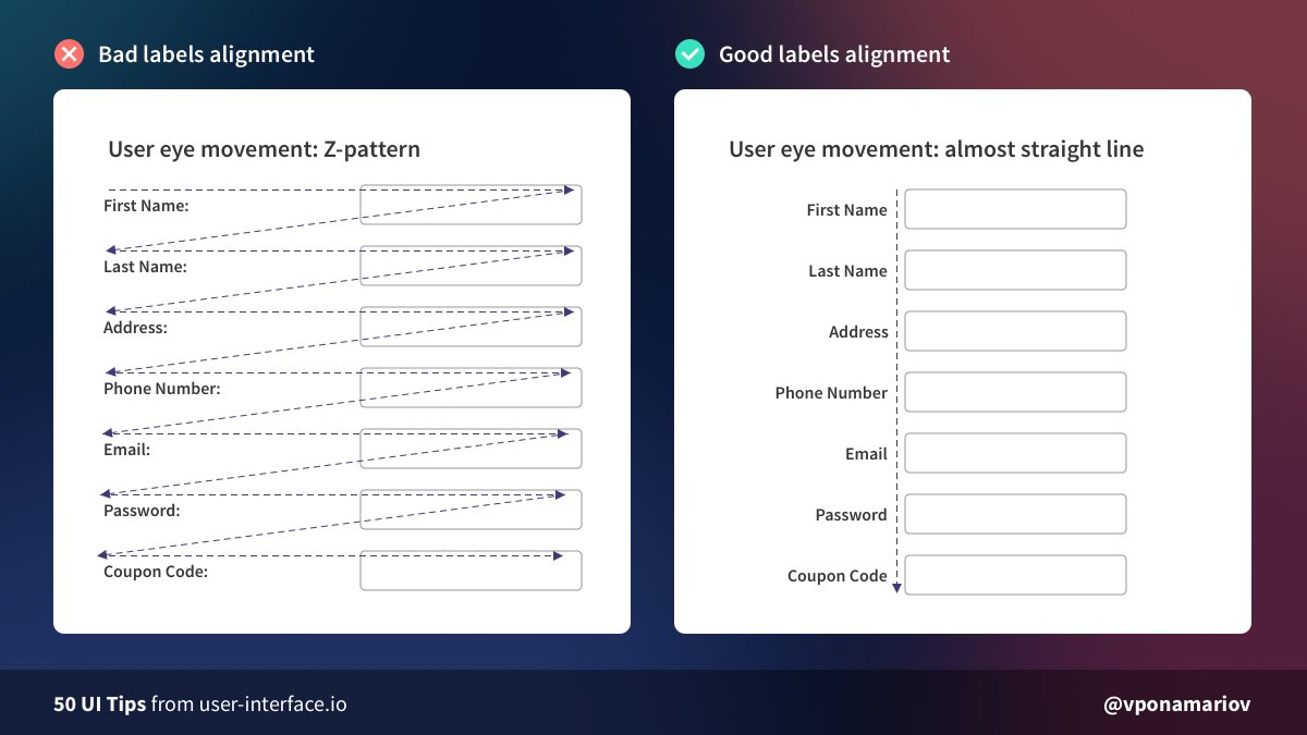
💡 Tip #05 - Avoid Z-Patterns
❌ First case: the eye moves in a "Z" pattern, increasing cognitive load.
✅ Second case: the eye moves almost by a straight line, much better.
It's still better to use one-column layout thought. But if you use 2 columns, take this into account.
❌ First case: the eye moves in a "Z" pattern, increasing cognitive load.
✅ Second case: the eye moves almost by a straight line, much better.
It's still better to use one-column layout thought. But if you use 2 columns, take this into account.
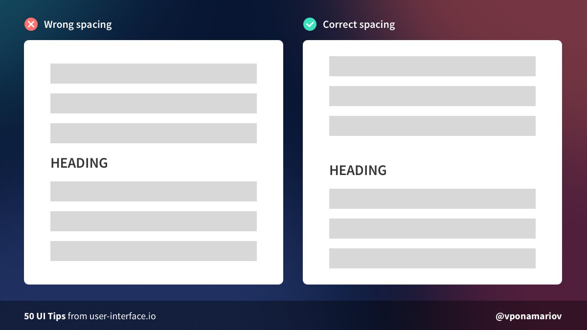
💡Tip #06 - Pay attention to heading margins in text
Quite a common mistake is having the wrong margin between two paragraphs.
❌ In the first case, it's not obvious which paragraph the heading belongs to
Take a look at this gestalt law:
Quite a common mistake is having the wrong margin between two paragraphs.
❌ In the first case, it's not obvious which paragraph the heading belongs to
Take a look at this gestalt law:
https://twitter.com/vponamariov/status/1367117054663413762
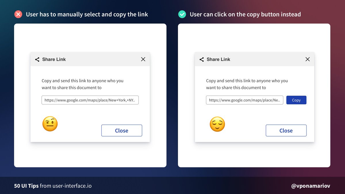
💡Tip #07 - Make it easy to copy things to the clipboard
It might be inconvenient for users to copy such things as URLs, tokens, etc. They might be using a touchpad or mobile phone.
The solution is: add a copy button 😌
The fewer actions required => The happier user is
It might be inconvenient for users to copy such things as URLs, tokens, etc. They might be using a touchpad or mobile phone.
The solution is: add a copy button 😌
The fewer actions required => The happier user is
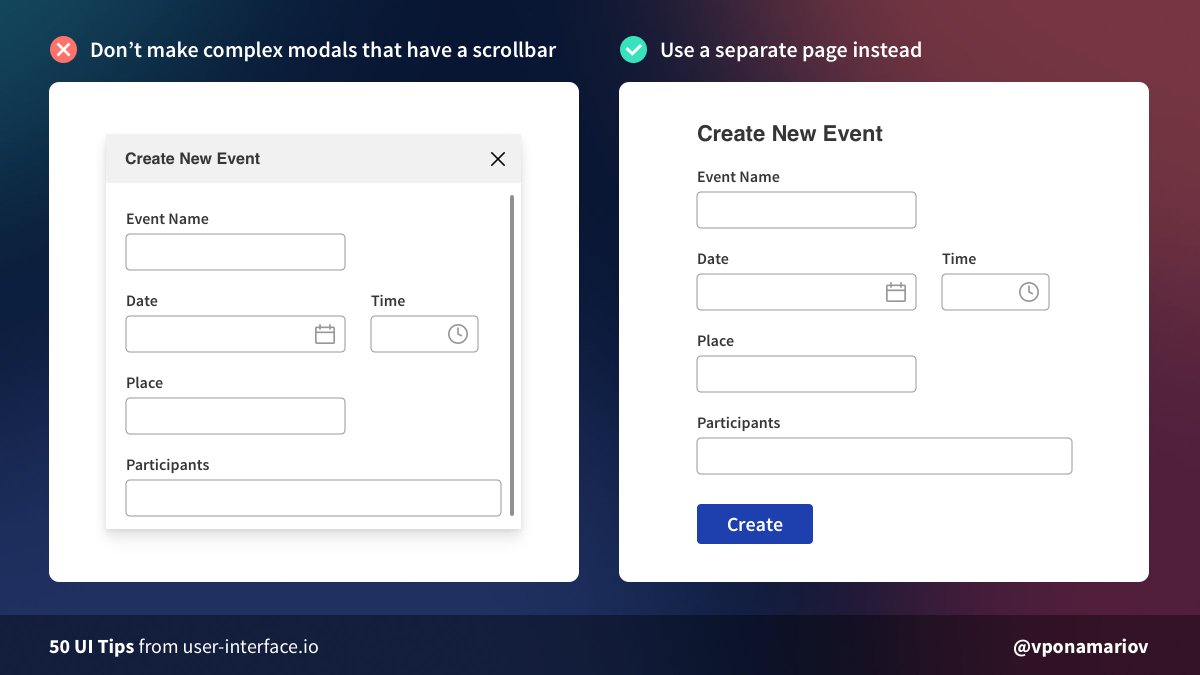
💡Tip #08 - Don't make complex modals that have a scrollbar, use a separate page instead
It looks like an easy solution to put everything in a modal.
But modals have a lot of disadvantages and should be used carefully.
Further reading:
nngroup.com/articles/modal…
It looks like an easy solution to put everything in a modal.
But modals have a lot of disadvantages and should be used carefully.
Further reading:
nngroup.com/articles/modal…
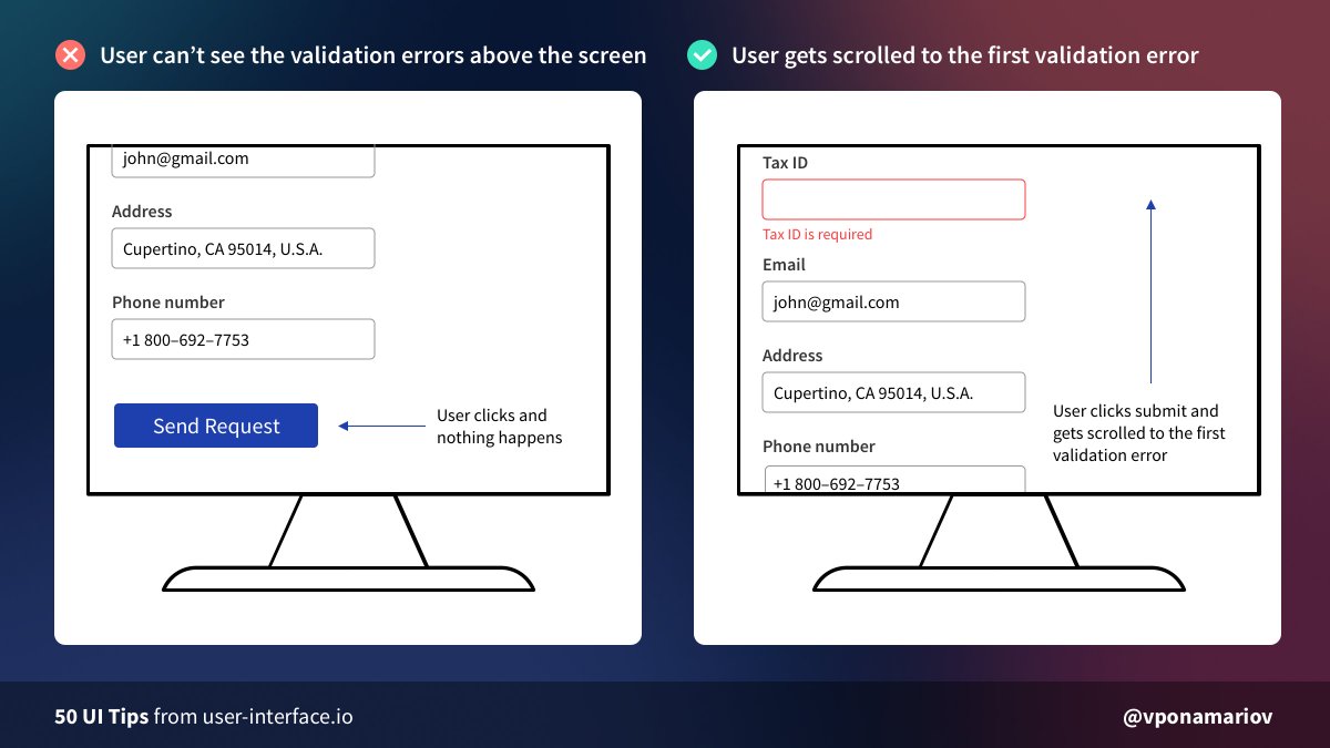
💡Tip #09 - Scroll the user to the first failed input in big forms on submit
Sometimes the form is so long that it doesn't fit the screen.
The user clicks the submit button and nothing happens for him. 🤷♂️
It's a good idea to scroll him to the first error instead ☺️
Sometimes the form is so long that it doesn't fit the screen.
The user clicks the submit button and nothing happens for him. 🤷♂️
It's a good idea to scroll him to the first error instead ☺️
💡Tip #10 - Watch your table borders
🔸Don't use #000!
🔸For small tables, you can even omit borders by increasing space between rows.
🔸For large tables, you'll need some kind of divider: striped rows or borders
🔸No need for having border over the whole table
🔸Don't use #000!
🔸For small tables, you can even omit borders by increasing space between rows.
🔸For large tables, you'll need some kind of divider: striped rows or borders
🔸No need for having border over the whole table

💡 Tip #11 - Don't leave the users on their own
It's a general UX rule.
If an error occurred, it won't help the user if you show him "Oops, something went wrong!" 🤔
Instead, tell him what he should do next. Always provide further instructions.
It's a general UX rule.
If an error occurred, it won't help the user if you show him "Oops, something went wrong!" 🤔
Instead, tell him what he should do next. Always provide further instructions.

💡Tip #12 - Avoid redundancy in texts
You don't need to tell users that they should enter THEIR email, it's already obvious.
Sometimes you can omit headings and titles since content speaks for itself 👆
You don't need to tell users that they should enter THEIR email, it's already obvious.
Sometimes you can omit headings and titles since content speaks for itself 👆

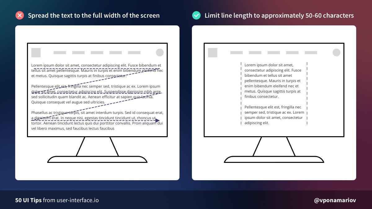
💡Tip #13 - Limit the line length of your text
❌ If the text is too wide our eyes move in "Z-pattern"
✅ Limit your line length to ~50-60 characters for better readability.
Not a strict rule though, just make sure it's easy to read
❌ If the text is too wide our eyes move in "Z-pattern"
✅ Limit your line length to ~50-60 characters for better readability.
Not a strict rule though, just make sure it's easy to read
💡Tip #14 - Don't hide password rules
🔸If you have 1-2 password rules, display them right away somewhere near the input
🔸If you have complex rules, then make sure that while the user types his password, you highlight satisfied rules
🔸If you have 1-2 password rules, display them right away somewhere near the input
🔸If you have complex rules, then make sure that while the user types his password, you highlight satisfied rules

💡Tip #15 - Require fewer fields
Remember: every form is a barrier for users 🚧
The less effort we ask from the user, the more willingly he'll make it.
We can skip names, phone numbers, email/password confirmations.
We can even skip the password and generate it instead!
Remember: every form is a barrier for users 🚧
The less effort we ask from the user, the more willingly he'll make it.
We can skip names, phone numbers, email/password confirmations.
We can even skip the password and generate it instead!

💡Tip #16 - Use tick icons
People don't read long texts on landing pages🙅♂️
Instead, they scan it. Usually without spending much time. So you don't have many chances to hook people's attention.
Ticks help a lot to make the landing more scannable.
People don't read long texts on landing pages🙅♂️
Instead, they scan it. Usually without spending much time. So you don't have many chances to hook people's attention.
Ticks help a lot to make the landing more scannable.

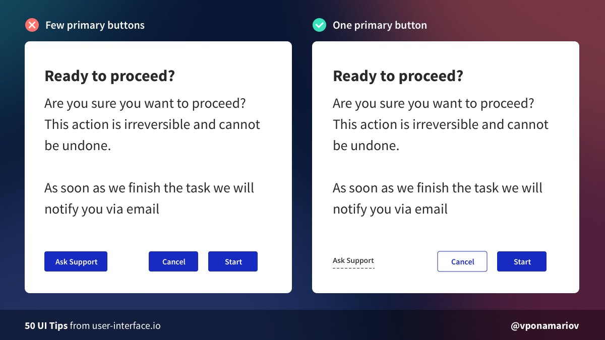
💡Tip #17 - Don't use many primary buttons
❌ Having few primary buttons distracts users. They have to spend some time focusing their attention on the most important action
✅ Use one primary button per page. One page. One form. One primary action.
❌ Having few primary buttons distracts users. They have to spend some time focusing their attention on the most important action
✅ Use one primary button per page. One page. One form. One primary action.
💡Tip #18 - Provide further feedback
This trick I saw in @asana login form.
When the user failed to log in, especially for few times, it might turn out he forgot his password.
Display the hint after a failed attempt, thus showing that you care about the user.
This trick I saw in @asana login form.
When the user failed to log in, especially for few times, it might turn out he forgot his password.
Display the hint after a failed attempt, thus showing that you care about the user.

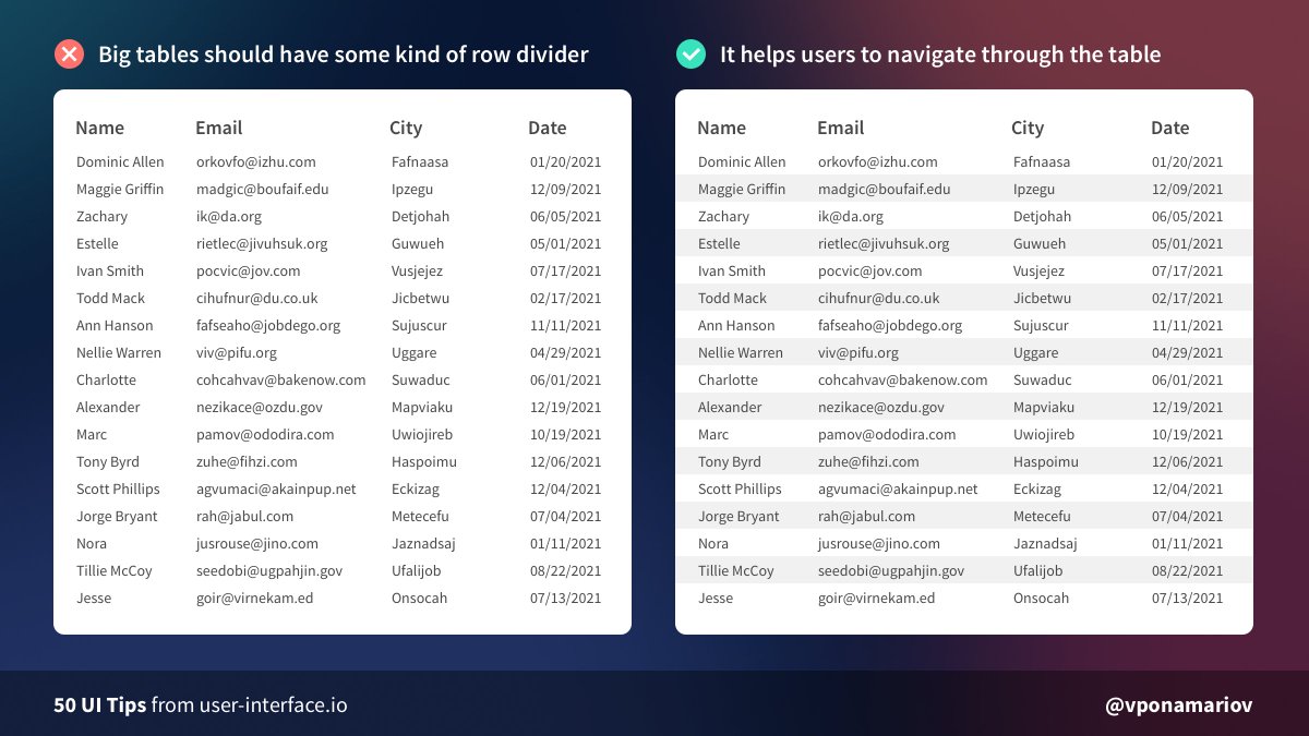
💡Tip #19 - Stripe tables with big data sets
🔸For small tables, you can remove borders/striping to reduce visual noise
🔸For big tables, it becomes hard to scan rows. So a divider or a zebra striping help users. Don't stripe small tables though!
🔸For small tables, you can remove borders/striping to reduce visual noise
🔸For big tables, it becomes hard to scan rows. So a divider or a zebra striping help users. Don't stripe small tables though!
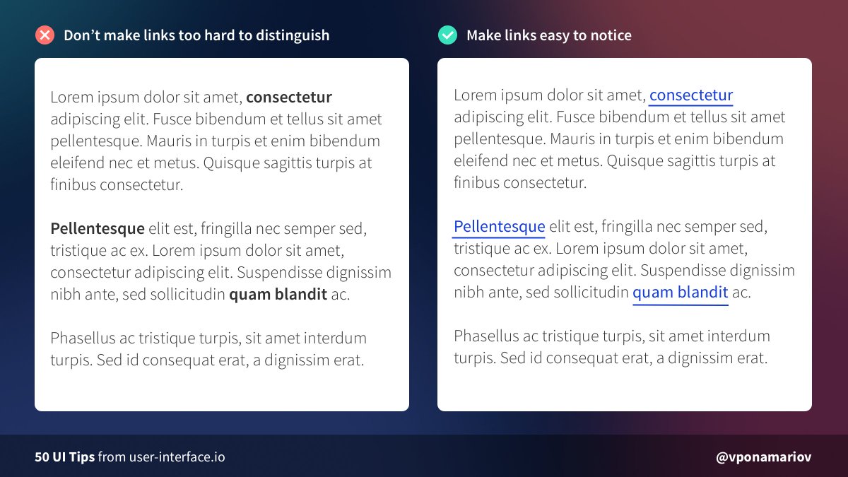
💡Tip #20 - Make links look like links
My favorite example:
Could you find the link? 🧐
In menus/headers/etc it's usually easy to find them.
But in some places (especially texts) people sometimes really make them hard to notice.
My favorite example:
https://twitter.com/vponamariov/status/1374391016178946060
Could you find the link? 🧐
In menus/headers/etc it's usually easy to find them.
But in some places (especially texts) people sometimes really make them hard to notice.
💡 Tip #21 - Don’t use dots for swiping gallery images
❌ Dots are hard to hit. Check out Fitt’s law.
✅ Use controls that are easy to interact with.
Big rectangles with arrows, thumbnails, parts of prev/next pictures.
It should be easy to hit controls, that's it.
❌ Dots are hard to hit. Check out Fitt’s law.
✅ Use controls that are easy to interact with.
Big rectangles with arrows, thumbnails, parts of prev/next pictures.
It should be easy to hit controls, that's it.

💡 Tip #22 - The smaller the font size is, the bigger the line-height multiplicator should be
If the font-size is big, it's already easy to read, so the line-height multiplicator can be small
If the font-size is small, you should increase line-height for better readability
If the font-size is big, it's already easy to read, so the line-height multiplicator can be small
If the font-size is small, you should increase line-height for better readability

💡 Tip #23 - Consider removing borders
Developers tend to put borders everywhere to visually separate blocks.
But having many borders doesn't look great. 🙄
You can use backgrounds or shadows to reduce visual clutter and make the UI feels lighter.
Developers tend to put borders everywhere to visually separate blocks.
But having many borders doesn't look great. 🙄
You can use backgrounds or shadows to reduce visual clutter and make the UI feels lighter.

💡Tip #24 - Increase clickable area
When the clickable area is small it's hard for users to hit the element.
You can add an invisible area (usually made with paddings) for making it easier.
Also, check the Fitts law if you haven't already☝️
When the clickable area is small it's hard for users to hit the element.
You can add an invisible area (usually made with paddings) for making it easier.
Also, check the Fitts law if you haven't already☝️

💡 Tip #25 - Use skeletons instead of loaders
Skeletons have two advantages
1. You show in advance what the content will look like
2. You can avoid expanding the content area. You can do the same with loader but it will look much worse.
Skeletons have two advantages
1. You show in advance what the content will look like
2. You can avoid expanding the content area. You can do the same with loader but it will look much worse.

💡 Tip #26 - Don't justify text
Justified text is not only difficult to read for dyslexic users but for non-dyslexic users as well.
This is because it creates large uneven spaces between letters and words.
Justified text is not only difficult to read for dyslexic users but for non-dyslexic users as well.
This is because it creates large uneven spaces between letters and words.

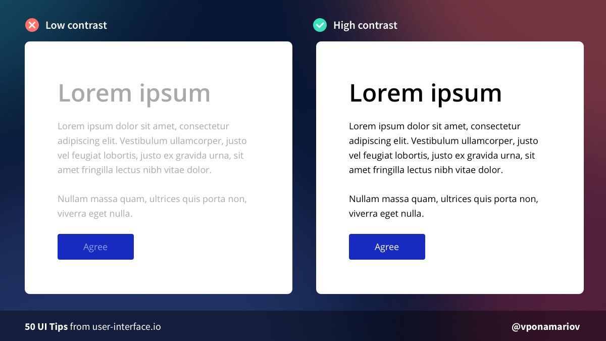
💡 Tip #27 - Check your contrast
Low contrast is a very often mistake.
You can easily check your contrast using chrome developer tools, or any other tools that are available.
Web Content Accessibility Guidelines (WCAG) 2.1 describes contrast levels. AAA is the best.
Low contrast is a very often mistake.
You can easily check your contrast using chrome developer tools, or any other tools that are available.
Web Content Accessibility Guidelines (WCAG) 2.1 describes contrast levels. AAA is the best.
💡Tip #28 - Your icons should be consistent
By consistency, I mean:
- Having the same style, e.g. flat icons vs 3D icons
- Same path width
- Filled / Outlined icons
- Multi-colored / Single-colored
This is not that easy to do, so it'd better use some consistent icon pack.
By consistency, I mean:
- Having the same style, e.g. flat icons vs 3D icons
- Same path width
- Filled / Outlined icons
- Multi-colored / Single-colored
This is not that easy to do, so it'd better use some consistent icon pack.

💡 Tip #29 - Help users to fill your forms
Validation is cool, but have you tried making it so simple that users fill the form on the first try?
You can help them
🔸Provide masks
🔸Pre-fill data if possible (e.g. current date)
🔸Provide hints in advance
🔸Autocomplete controls
Validation is cool, but have you tried making it so simple that users fill the form on the first try?
You can help them
🔸Provide masks
🔸Pre-fill data if possible (e.g. current date)
🔸Provide hints in advance
🔸Autocomplete controls

💡 Tip #30 - Set reasonable width of inputs
The width of inputs can help users understand what type of content you're asking for.
You don't have to fill the whole available space 🙅♂️
Along with grouping related inputs inline, you can make the form look much better
The width of inputs can help users understand what type of content you're asking for.
You don't have to fill the whole available space 🙅♂️
Along with grouping related inputs inline, you can make the form look much better

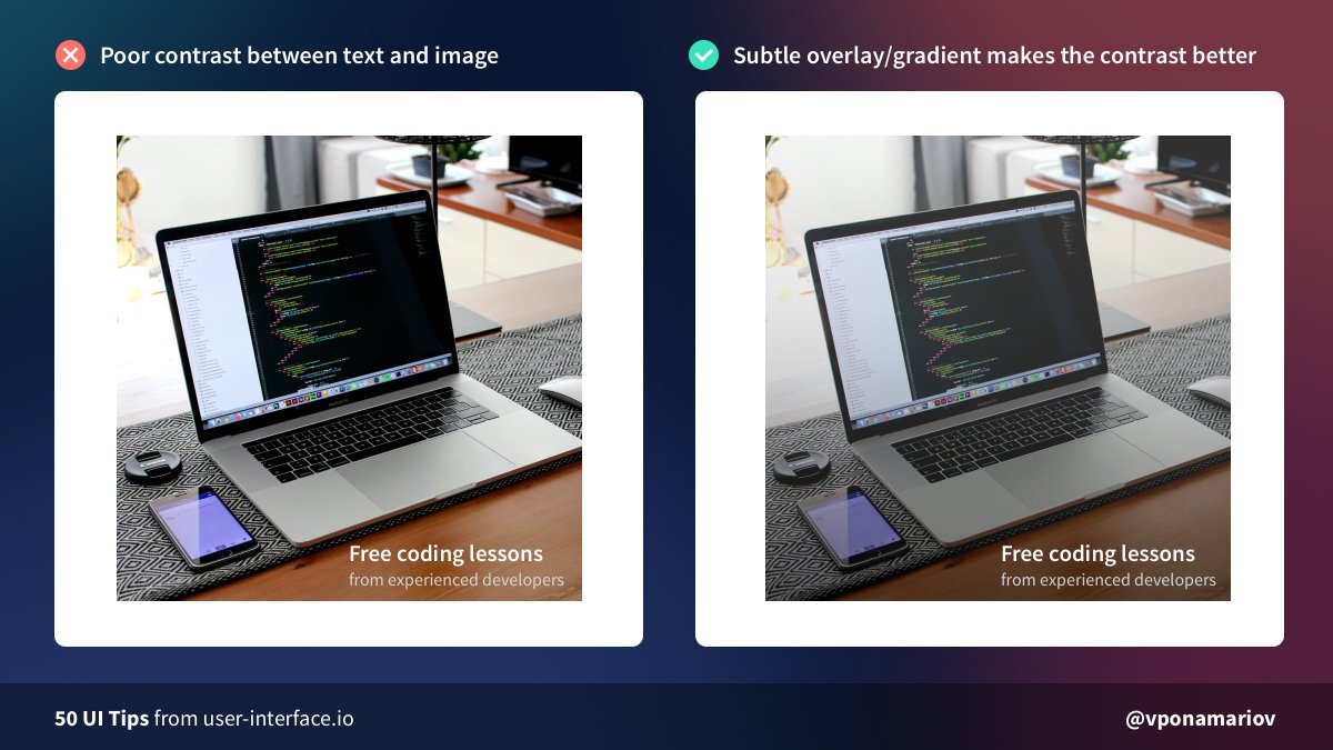
💡 Tip #31 - Add overlay/gradient/shadow/whatever on your pictures in order to improve contrast for the text you put on them.
Without an overlay, the text might have poor contrast thus it'll be hard to read.
Overlay solves this 💪
Without an overlay, the text might have poor contrast thus it'll be hard to read.
Overlay solves this 💪
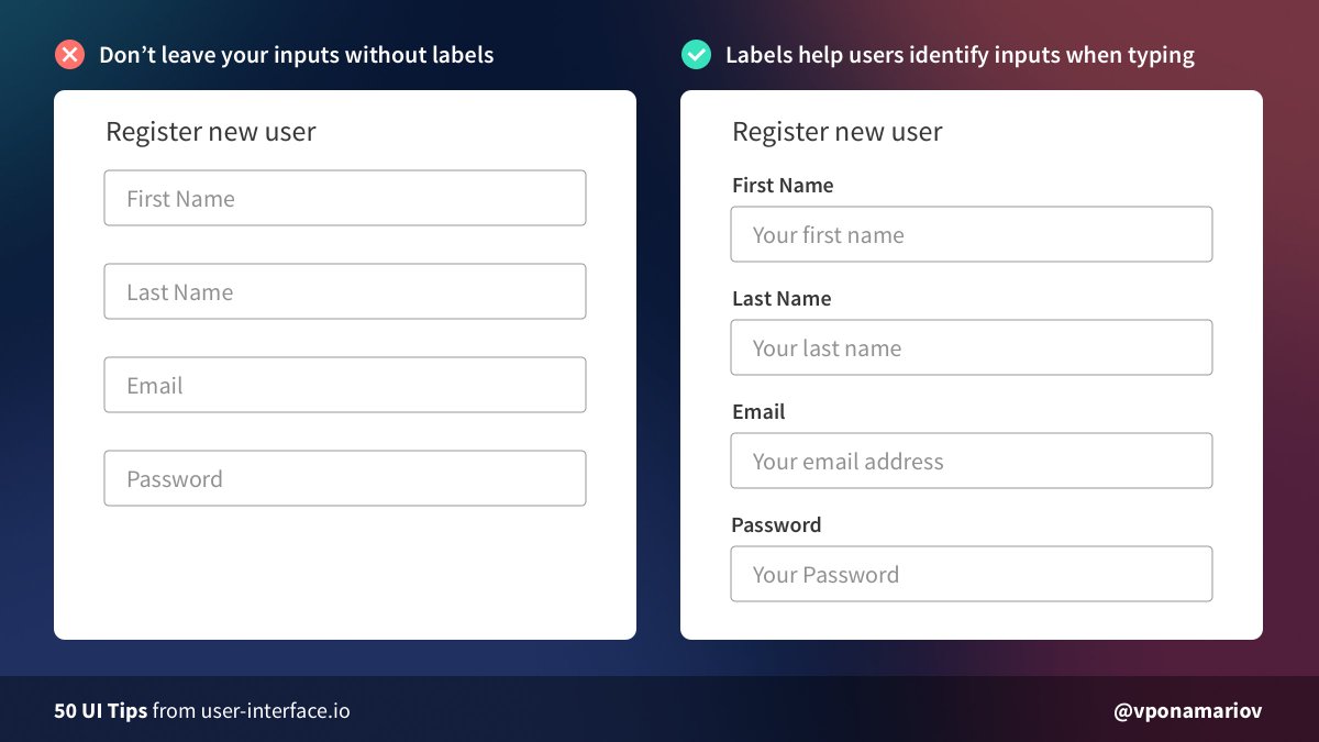
💡 Tip #32 - Don't hide input labels
Placeholders don't replace labels. 🙅♂️
When the user entered something in an input, the placeholder disappears leaving the user without no clue what the field means.
An only exception is maybe a login form with only two inputs.
Placeholders don't replace labels. 🙅♂️
When the user entered something in an input, the placeholder disappears leaving the user without no clue what the field means.
An only exception is maybe a login form with only two inputs.
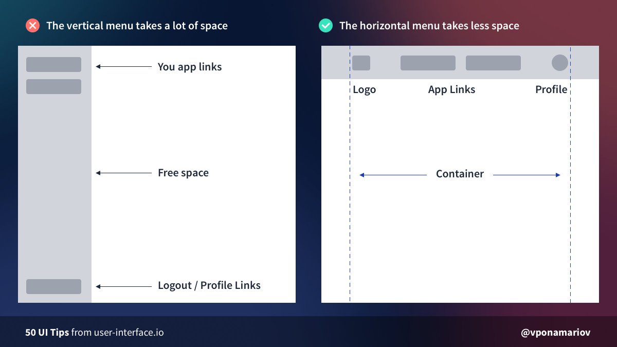
💡 Tip #33 - Try the horizontal menu if you don't have many links
When you use a vertical menu and you don't have many links you end up with a lot of free space.
Then you try to add more links to fill the space but this is artificial.
Instead, try the horizontal menu.
When you use a vertical menu and you don't have many links you end up with a lot of free space.
Then you try to add more links to fill the space but this is artificial.
Instead, try the horizontal menu.
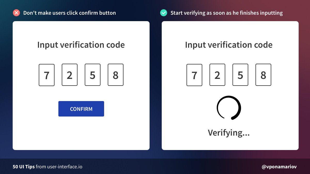
💡 Tip #34 - Don't make users click the confirm button when validating verification codes
Validation codes are usually not long and the chance of mistake is relatively small, so you can check them right away.
If the user made a mistake you can re-validate on change.
Validation codes are usually not long and the chance of mistake is relatively small, so you can check them right away.
If the user made a mistake you can re-validate on change.
💡 Tip #35 - Consider both positive feedback as well as negative
Two cases:
1. User is wrong - you show him errors
2. User is right - you may show him that he is doing well
In some cases, like filling complex inputs/forms, it can add some assurance for users.
Two cases:
1. User is wrong - you show him errors
2. User is right - you may show him that he is doing well
In some cases, like filling complex inputs/forms, it can add some assurance for users.

💡 Tip #36 - Group related elements together
If you have more than 5-7 items in a row, try to break them into logical groups.
It's not that easy to navigate through a lot of elements. We are usually comfortable with up to 5-7 elements in a group.
If you have more than 5-7 items in a row, try to break them into logical groups.
It's not that easy to navigate through a lot of elements. We are usually comfortable with up to 5-7 elements in a group.

💡 Tip #37 - Don't forget that the data can be large
It's a VERY common issue when data overflows its container.
There is no single approach to this.
You can:
🔸Use dots (text-ellipsis)
🔸Use "Show more" expanders
🔸Hide some data under tooltips, icons
and so on.
It's a VERY common issue when data overflows its container.
There is no single approach to this.
You can:
🔸Use dots (text-ellipsis)
🔸Use "Show more" expanders
🔸Hide some data under tooltips, icons
and so on.

💡 Tip #38 - Watch your shadows!
A common mistake is to take the box-shadow property, play with it a bit, and think that you got a nice shadow.
But usually, it looks bad.
A good solution is to find an existing collection of shadows and use them.
A common mistake is to take the box-shadow property, play with it a bit, and think that you got a nice shadow.
But usually, it looks bad.
A good solution is to find an existing collection of shadows and use them.

💡 Tip #39 - Don't put hints in placeholders
If you put the description of what users should type in the textarea, then after they start typing the hint disappears.
And they'll simply forget what they should type.
Solution: put hints near textareas, e.g. below them.
If you put the description of what users should type in the textarea, then after they start typing the hint disappears.
And they'll simply forget what they should type.
Solution: put hints near textareas, e.g. below them.

💡 Tip #40 - If the number of options is small, don't use dropdowns
1. Dropdowns require two clicks to select an option + sometimes require some scrolling
2. They may have poor UX on mobile
If you have 3-6 options, just display them right away.
1. Dropdowns require two clicks to select an option + sometimes require some scrolling
2. They may have poor UX on mobile
If you have 3-6 options, just display them right away.

💡 Tip #41 - Make it clear that you have something below the fold
❌ In the first picture, there is no hint that there is content below.
✅ In the second picture, it's clear. You don't even need arrows or pointers asking users to stroll down.
❌ In the first picture, there is no hint that there is content below.
✅ In the second picture, it's clear. You don't even need arrows or pointers asking users to stroll down.

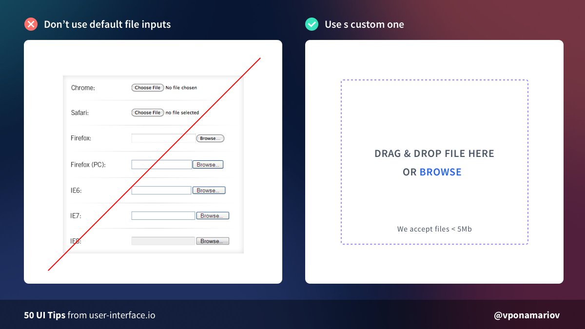
💡 Tip #42 - Don't use default file inputs
Just don't 😡
They look different everywhere, they have poor UX, they look ugly.
Use a custom one with:
✅ Proper validation
✅ Drag&Drop area
✅ Hints, if they are necessary
✅ Good looking UI
Just don't 😡
They look different everywhere, they have poor UX, they look ugly.
Use a custom one with:
✅ Proper validation
✅ Drag&Drop area
✅ Hints, if they are necessary
✅ Good looking UI
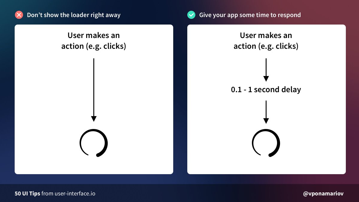
💡 Tip #43 - Don't show loaders right away
If the action takes less than ~0.1 - 1 sec don't show loaders.
The user attention won't switch in ~0.5 seconds, but the request might take less time.
Nice article about it from @smashingmag
smashingmagazine.com/2016/12/best-p…
If the action takes less than ~0.1 - 1 sec don't show loaders.
The user attention won't switch in ~0.5 seconds, but the request might take less time.
Nice article about it from @smashingmag
smashingmagazine.com/2016/12/best-p…
💡 Tip #44 - Consider removing confirmation dialogs
If the action is not that critical, it's a good practice to allow users to undo the action instead of always asking them "are you sure?"
You have at least two options
- Simple undo
- Moving items to trash, temporarily
If the action is not that critical, it's a good practice to allow users to undo the action instead of always asking them "are you sure?"
You have at least two options
- Simple undo
- Moving items to trash, temporarily

💡Tip #45 - You can use a different layout for empty state
Usually, developers add an alert saying "there are no items", even if it's because some filters applied.
But when the user hasn't added anything, you can use a completely different presentation.
Usually, developers add an alert saying "there are no items", even if it's because some filters applied.
But when the user hasn't added anything, you can use a completely different presentation.

💡Tip #46 - Label your icons
Icons don't have any unified standards and they can easily confuse users.
Even for some common icons, it takes some time to figure out their meanings.
So generally it's better to label them, if possible
Icons don't have any unified standards and they can easily confuse users.
Even for some common icons, it takes some time to figure out their meanings.
So generally it's better to label them, if possible

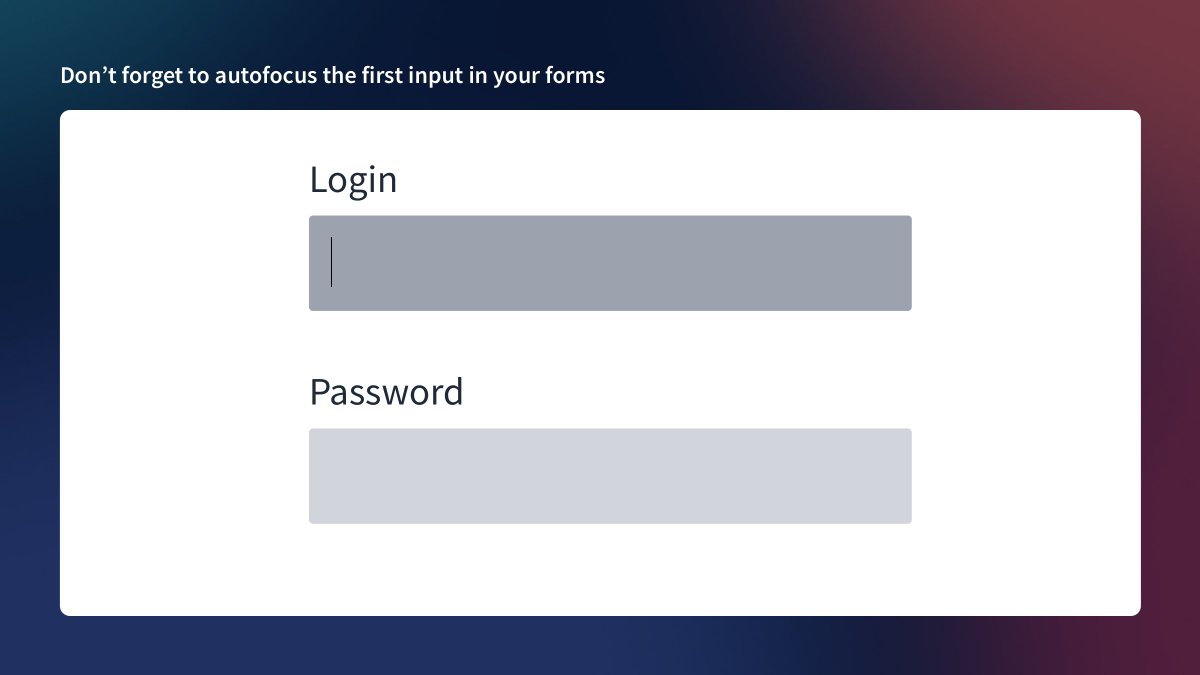
💡 Tip #47 - Don’t forget to autofocus the first input in your forms
Very simple.
Autofocus the first input, and save the user a click.
That's it 🤷♂️
Very simple.
Autofocus the first input, and save the user a click.
That's it 🤷♂️
💡 Tip #48 - Display the date when your article was published
I often google something and find related articles, but there is no date.
So, I'm not sure how fresh the articles are.
E.g., if there is the "Top 10 plugins for Figma" article, how can I be sure they are actual? 🤔
I often google something and find related articles, but there is no date.
So, I'm not sure how fresh the articles are.
E.g., if there is the "Top 10 plugins for Figma" article, how can I be sure they are actual? 🤔

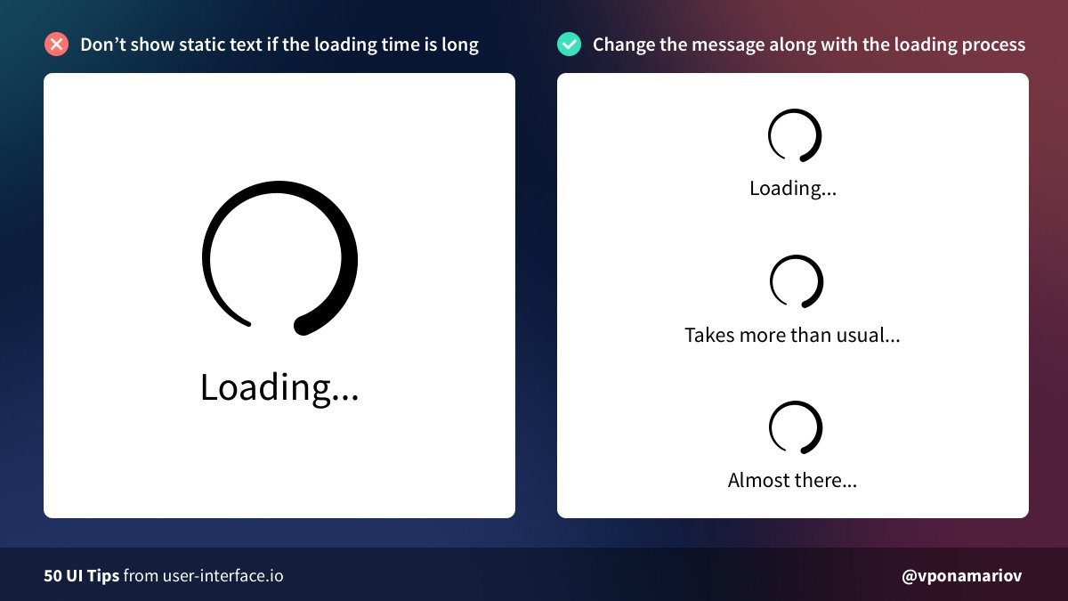
💡 Tip #49 - If the loading time is long, change how the loader looks.
Sometimes it happens that requests take more time than usual.
In this case, you can change the loader a bit (e.g. by changing the text), so that users don't have the feeling that your app is stuck.
Sometimes it happens that requests take more time than usual.
In this case, you can change the loader a bit (e.g. by changing the text), so that users don't have the feeling that your app is stuck.
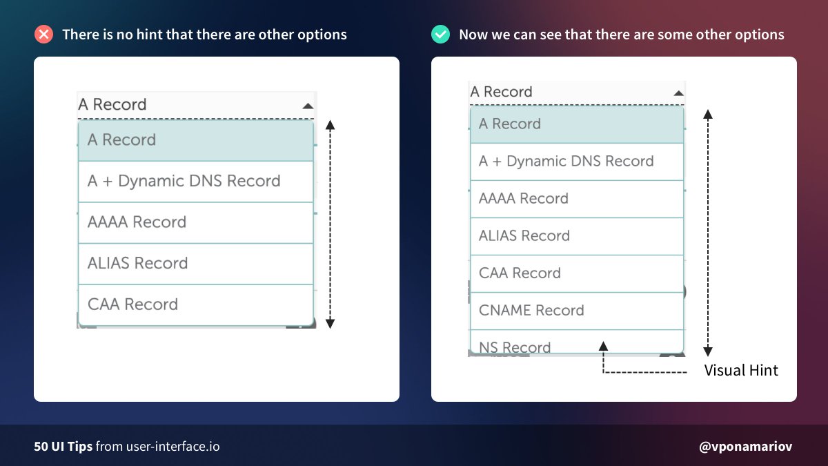
💡 Tip #50 - Make sure that there is a visual hint that the dropdown has more options
If there is no scroll (e.g. on Mac OS until you hover the scroll area), it's impossible to guess that it has some other options.
The solution is to make visible the part of the latest option
If there is no scroll (e.g. on Mac OS until you hover the scroll area), it's impossible to guess that it has some other options.
The solution is to make visible the part of the latest option
• • •
Missing some Tweet in this thread? You can try to
force a refresh