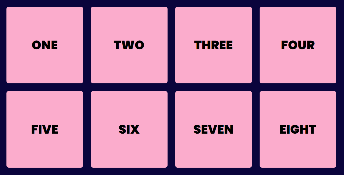
Start appyling display: flex; property to parent element
This will take the all the elements in horizontal direction
{ 2 / 16 }

This will take the all the elements in horizontal direction
{ 2 / 16 }

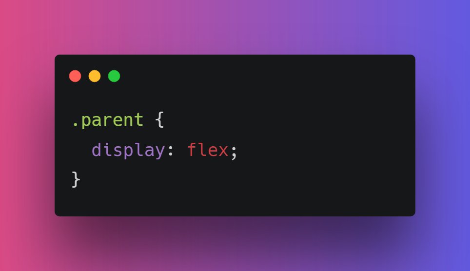
You can also change the direction of elements. For doing so, you need to mention the "flex-direction" property
The flex-direction property specifies the direction of the items within the flex container
{ 3 / 16 }
The flex-direction property specifies the direction of the items within the flex container
{ 3 / 16 }

After applying row, row-reverse, column and column-reverse in flex-direction
They all are pretty intuitive.
{ 4 / 16 }


They all are pretty intuitive.
{ 4 / 16 }


If we have a large number of element in flex container, it can destroy the widht of elements
As you can see our elements have shrunk a bit. This is becasue we haven't applied the flex-wrap property.
{ 5 / 16 }
As you can see our elements have shrunk a bit. This is becasue we haven't applied the flex-wrap property.
{ 5 / 16 }

📌 flex-wrap
It defines whether the flex items are forced in a single line or can be flowed into multiple lines depending on screen size. It persist the width of elements
.parent {
flex-wrap: wrap;
}
{ 6 / 16 }
It defines whether the flex items are forced in a single line or can be flowed into multiple lines depending on screen size. It persist the width of elements
.parent {
flex-wrap: wrap;
}
{ 6 / 16 }
Moving forward, I think this is right time to understand what main and cross axes are👇
We can align elements wihtin Flexbox in accordance with these two axis.
{ 7 / 16 }
We can align elements wihtin Flexbox in accordance with these two axis.
{ 7 / 16 }

Time to align flexible items within flex container
🔹 Justify-content: For horizontal alignment
🔹 Align-content: For vertical alignment
{ 8 / 16 }
🔹 Justify-content: For horizontal alignment
🔹 Align-content: For vertical alignment
{ 8 / 16 }

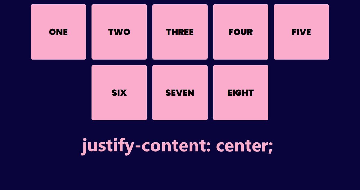
The justify-content property aligns the items within flex container.
- flex-start
- flex-end
- center
- space- between (Items will equal space between them)
- space-around (equal space b/w elements with half left side and half right side)
- space-evenly
{ 9 / 16 }


- flex-start
- flex-end
- center
- space- between (Items will equal space between them)
- space-around (equal space b/w elements with half left side and half right side)
- space-evenly
{ 9 / 16 }


You can also position a particular item inside flex container.
For this we have, align-self property
For example:
{ 11 / 16 }

For this we have, align-self property
For example:
{ 11 / 16 }


You can pass following values in align-self
- auto
- stretch
- center
- flex-start
- flex-end
- baseline
- intial
- inherit
Play with code here: w3schools.com/cssref/playit.…
{ 12 / 16 }
- auto
- stretch
- center
- flex-start
- flex-end
- baseline
- intial
- inherit
Play with code here: w3schools.com/cssref/playit.…
{ 12 / 16 }
Alright! Moving even further next we have is "order"
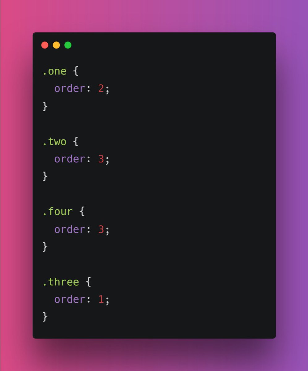
If you want to change the ordering of the items within flex container. You can use order property that specifies the order of an item relative to the rest of the items inside the same flex container.
{ 13 / 16 }

If you want to change the ordering of the items within flex container. You can use order property that specifies the order of an item relative to the rest of the items inside the same flex container.
{ 13 / 16 }

📌 flex-grow
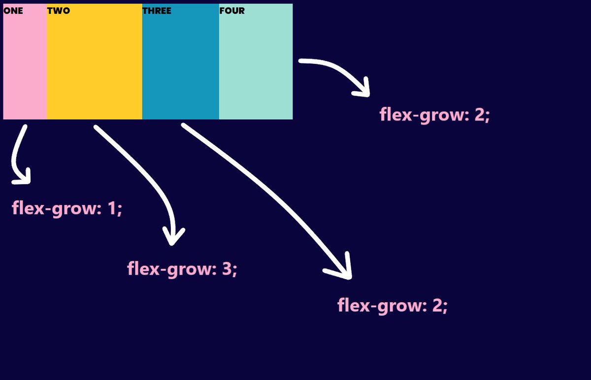
The flex-grow property specifies how much the item will grow relative to the rest of the flexible items inside the same container.
{ 14 / 16 }

The flex-grow property specifies how much the item will grow relative to the rest of the flexible items inside the same container.
{ 14 / 16 }

Similarly we have "flex-shrink" property
The flex-shrink property specifies how the item will shrink relative to the rest of the flexible items inside the same container.
{ 15 / 16 }
The flex-shrink property specifies how the item will shrink relative to the rest of the flexible items inside the same container.
{ 15 / 16 }
I think that's pretty much it for this thread. Did I miss some points? Add below.
Thanks for reading this ❤️
{ 16 / 16 }
Thanks for reading this ❤️
{ 16 / 16 }
• • •
Missing some Tweet in this thread? You can try to
force a refresh

