NEW: a deep-dive into the situation in India, where a devastating second wave is overwhelming hospitals and crematoriums, eclipsing global records as it goes ft.com/content/683914…
250,000 new cases every day, and test positivity is soaring suggesting many are still missed
250,000 new cases every day, and test positivity is soaring suggesting many are still missed
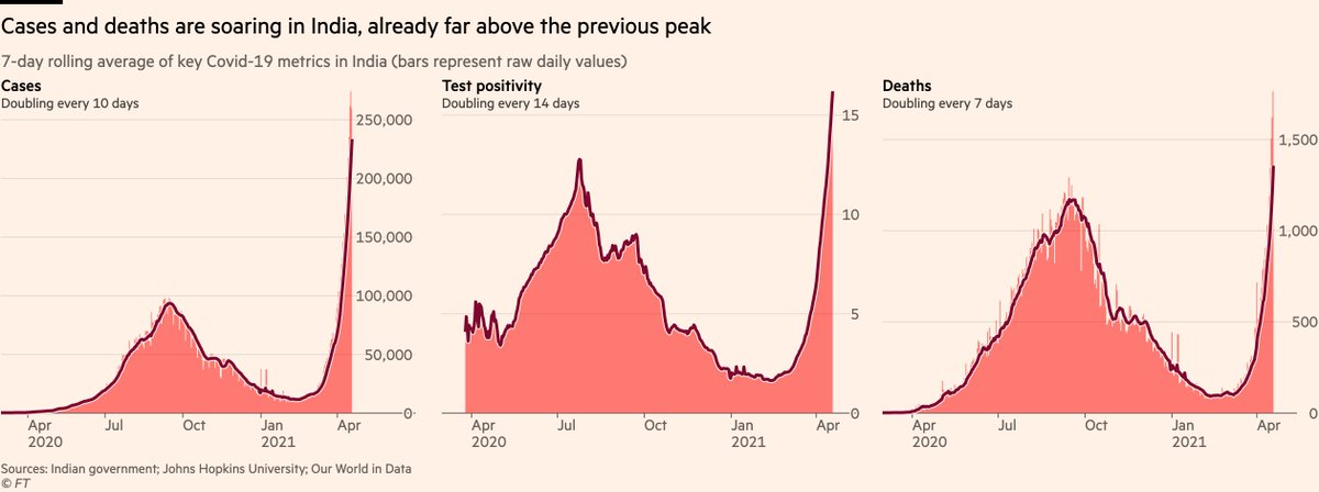
To put this into a global context, much has been made of the resurgences in Europe and North America over recent weeks, but India’s wave has accelerated straight past all of them.
The situation there really is beyond what we’re seeing anywhere else worldwide.
The situation there really is beyond what we’re seeing anywhere else worldwide.
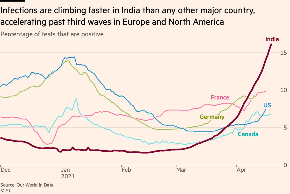
In many parts of the country including the capital Delhi, cases are doubling every five days. Compared to the steady rise seen in the first wave last year, the current climbs are almost vertical. 
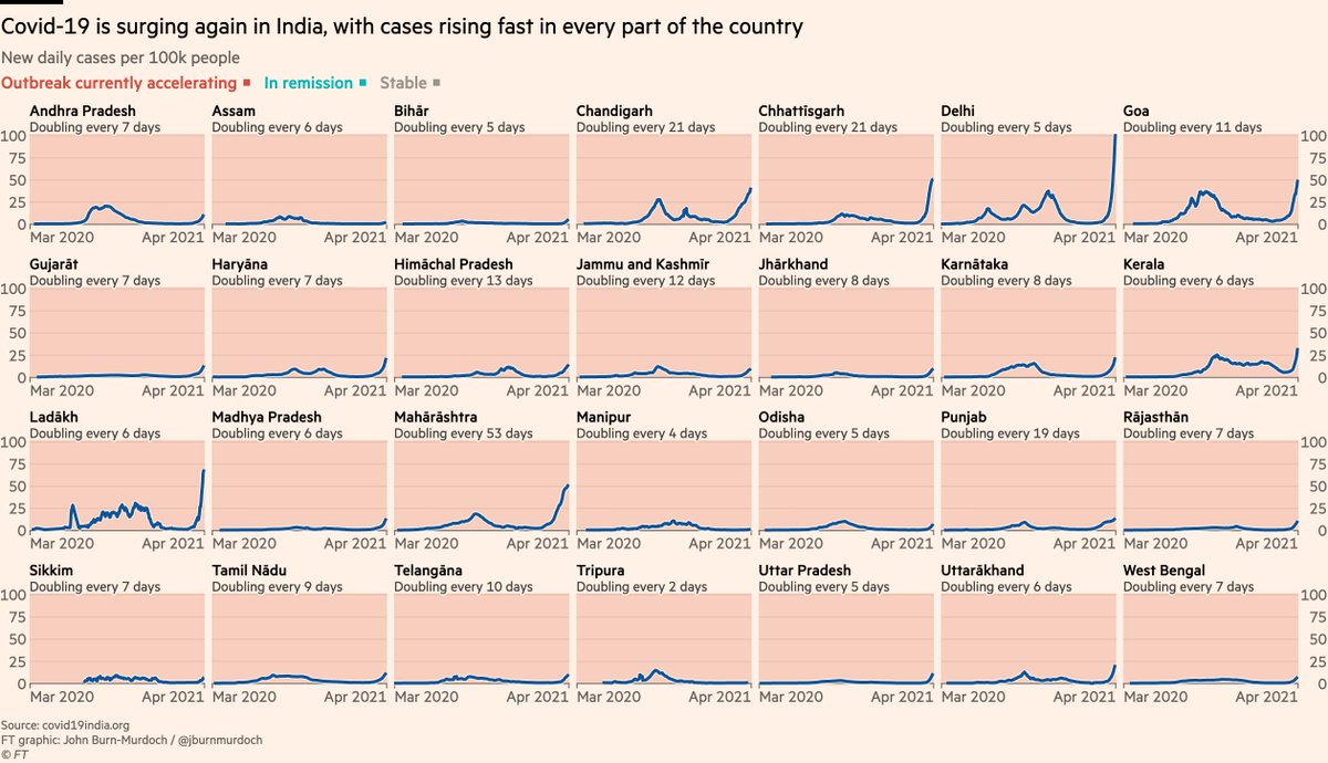
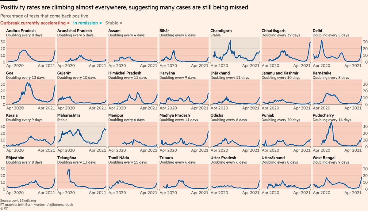
And in many places, test positivity is rising at the same pace. Even as more and more tests are done, the share of them that come back positive is still climbing, suggesting tens of thousands of cases are going undetected. 
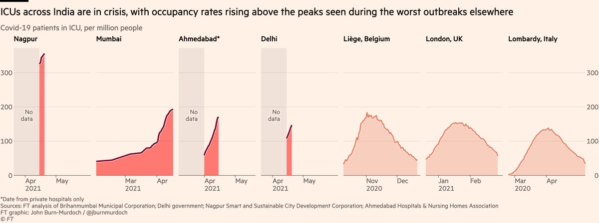
All of this is feeding through into a crisis in hospitals beyond what we’ve seen anywhere else in the world over the whole pandemic.
ICUs are twice as full in Nagpur as they ever got in Lombardy last March. Mumbai’s ICU’s are more full than Liège was in Belgium’s brutal peak.
ICUs are twice as full in Nagpur as they ever got in Lombardy last March. Mumbai’s ICU’s are more full than Liège was in Belgium’s brutal peak.
The stories on the ground are grim.
Authorities have taken emergency measures, requiring than any and all oxygen produced anywhere in the state be sent to hospitals as supplies run out.
Authorities have taken emergency measures, requiring than any and all oxygen produced anywhere in the state be sent to hospitals as supplies run out.

With thousands simply unable to find a hospital bed, death tolls are mounting at a similarly rapid pace.
But a look at this chart shows another issue: although official Covid death counts are rising, the numbers themselves remain incredibly low.
And I stress in-*credible*
But a look at this chart shows another issue: although official Covid death counts are rising, the numbers themselves remain incredibly low.
And I stress in-*credible*
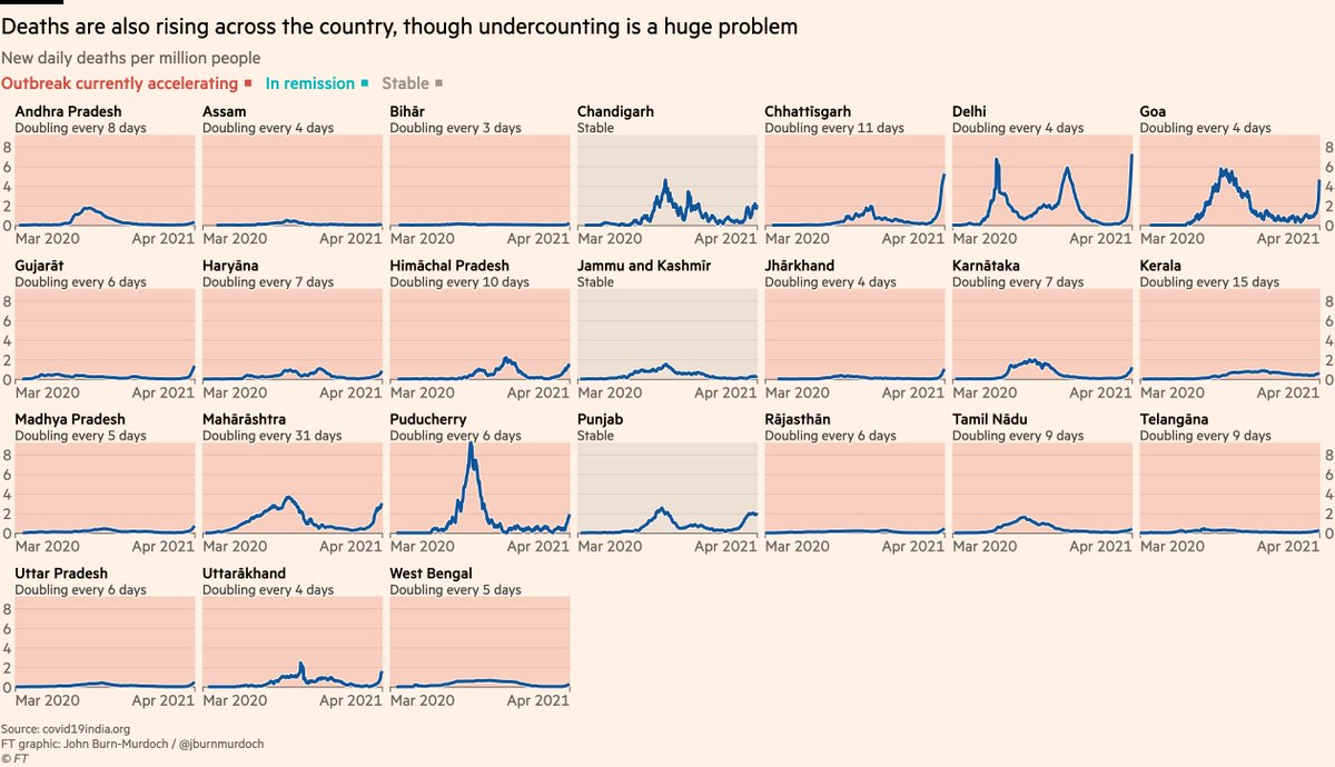
Essentially, none of those numbers are correct; all are vast undercounts.
I collated local news reports (HT @muradbanaji) across seven districts, finding that overall, numbers of Covid victims who have been cremated are 10x larger than official Covid death counts in same areas.
I collated local news reports (HT @muradbanaji) across seven districts, finding that overall, numbers of Covid victims who have been cremated are 10x larger than official Covid death counts in same areas.
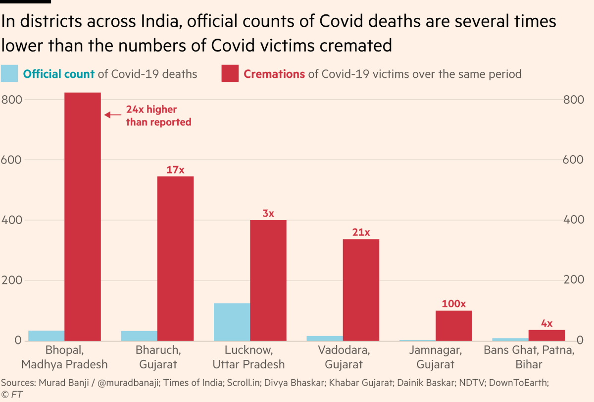
If applied nationally, that would mean that instead of 1,700 deaths per day, India is currently seeing 17,000.
And as more reports come in, that undercounting estimate has been rising, so the true toll may be higher still.
And as more reports come in, that undercounting estimate has been rising, so the true toll may be higher still.
Read our full story here with @b_parkyn @jyots43 @SJFindlay @AnnaSophieGross for more, including the debate over the role of the new variant B.1.617 in driving the surge ft.com/content/683914…
• • •
Missing some Tweet in this thread? You can try to
force a refresh


