NEW thread: here’s the latest data on how vaccines are fighting Covid.
My India tweets earlier were grim, but these are more optimistic
Vaccines are working in the UK ✅, working in the US ✅, and contrary to alarmist reports, they’re working in Chile ✅ ft.com/content/d71729…
My India tweets earlier were grim, but these are more optimistic
Vaccines are working in the UK ✅, working in the US ✅, and contrary to alarmist reports, they’re working in Chile ✅ ft.com/content/d71729…
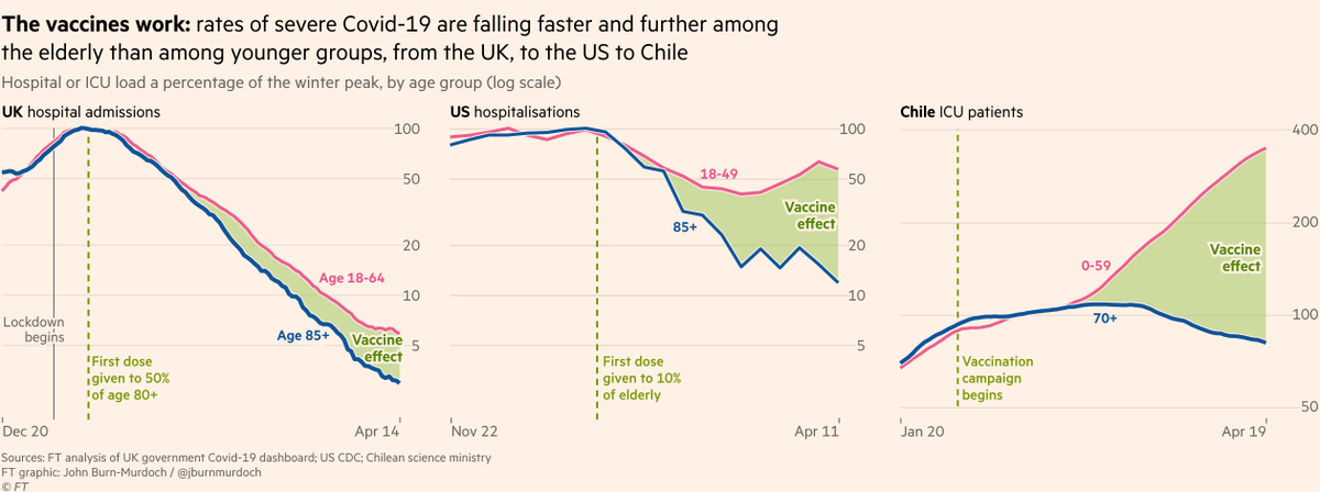
First, some more detail on the UK.
Cases, hospital admissions and deaths have fallen steeply among all groups (the 'restrictions effect'), but have fallen furthest and fastest among the older, most-vaccinated groups (vaccine effect).
Cases, hospital admissions and deaths have fallen steeply among all groups (the 'restrictions effect'), but have fallen furthest and fastest among the older, most-vaccinated groups (vaccine effect).
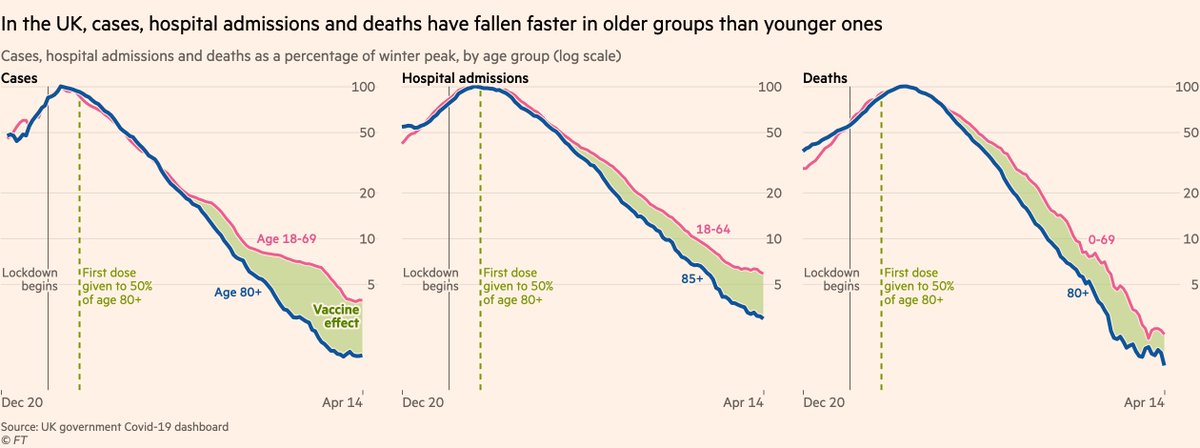
(For anyone wondering why the UK deaths lines are getting bumpy, that’s a good thing:
The numbers are now so small — 20 Covid deaths per day — that random variation starts making things look noisy)
The numbers are now so small — 20 Covid deaths per day — that random variation starts making things look noisy)
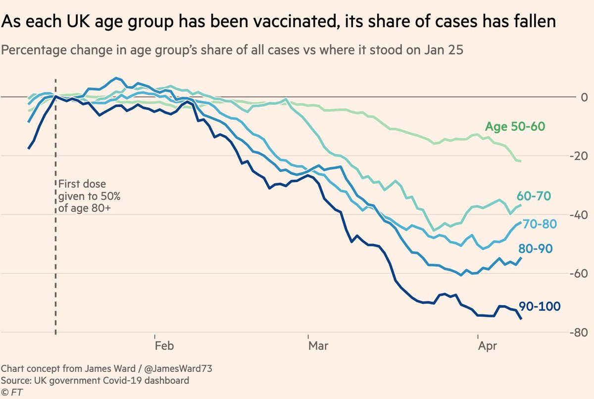
And it’s not just the very elderly who are benefiting. This chart (concept from @JamesWard73) shows that as UK vaccinations have progressed down through the age groups, so has the vaccine effect, with under-60s the latest to join the party.
It’s amazing how clear the pattern is!
It’s amazing how clear the pattern is!
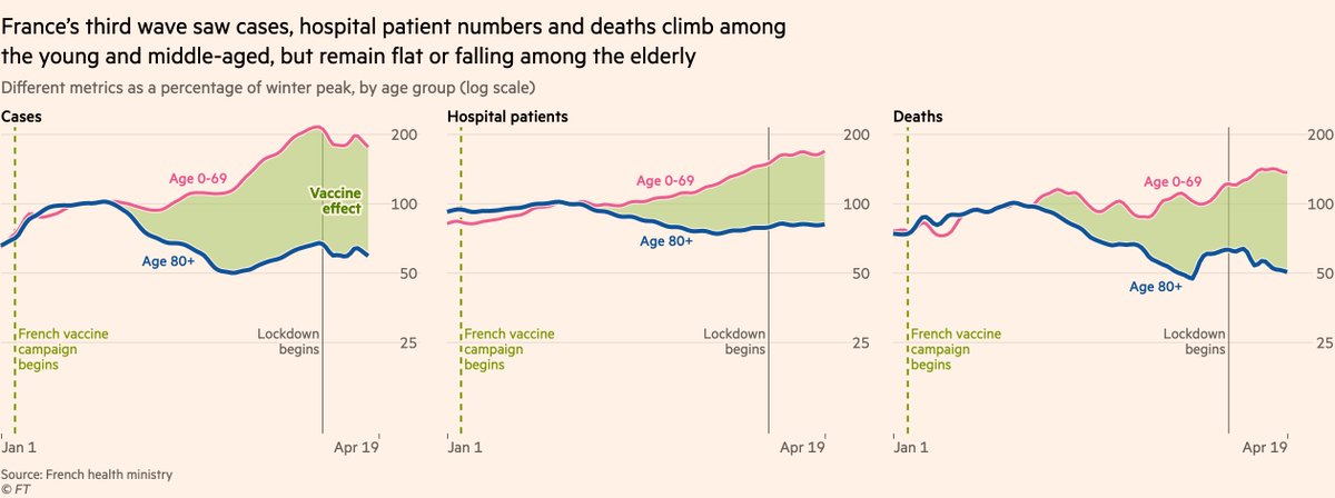
Next, to France, where a third wave has hampered progress, but the same tell-tale signs of vaccinations are evident
Cases and hospitalisations rose in March, but climbed far slower among the most-vaccinated age groups. Deaths kept falling among the elderly despite 📈 among young
Cases and hospitalisations rose in March, but climbed far slower among the most-vaccinated age groups. Deaths kept falling among the elderly despite 📈 among young
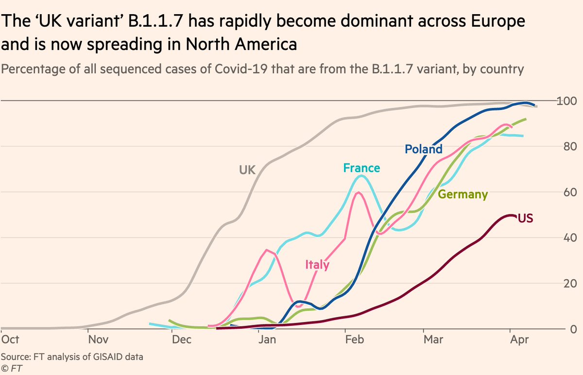
The resurgence of the pandemic in France — and many other countries in recent weeks — was fuelled by the arrival of the 'UK variant' B.1.1.7.
By March, it had become the dominant variant across all of Europe and is now spreading across North America.
By March, it had become the dominant variant across all of Europe and is now spreading across North America.
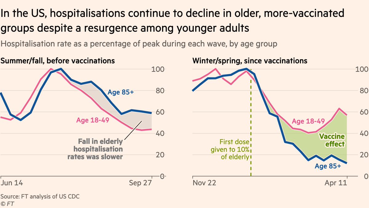
B.1.1.7’s arrival in the US threatened one of the world’s most impressive vaccination rollouts, but as in France the data suggest the vaccines are prevailing 🙌
B.1.1.7 sent hospitalisations rising, but only among the [less vaccinated] young. Rates among elderly continue to drop
B.1.1.7 sent hospitalisations rising, but only among the [less vaccinated] young. Rates among elderly continue to drop
Sternest test for vaccines has come in Chile, where China’s Sinovac jab was rolled out during a third wave.
But again, the data suggest they’re working.
ICU occupancy has more than doubled among younger adults 📈, but is falling among age groups prioritised for vaccination 📉🙌
But again, the data suggest they’re working.
ICU occupancy has more than doubled among younger adults 📈, but is falling among age groups prioritised for vaccination 📉🙌
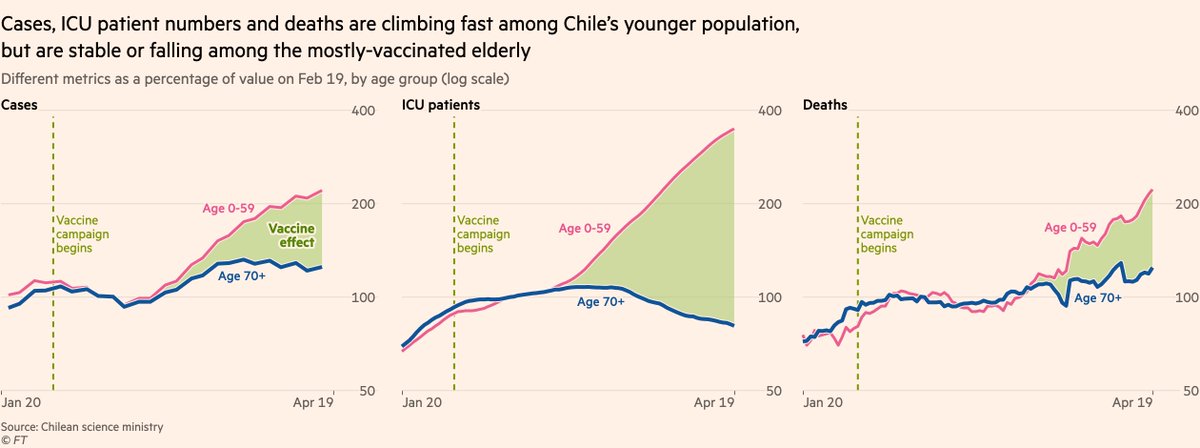
It’s the true that Sinovac is less effective than the likes of Pfizer, AstraZeneca and Moderna, especially after one dose (read @DubeRyan’s WSJ story here wsj.com/articles/first…), but after two doses, it delivers good efficacy and is keeping people out of ICU, saving lives.
So we now have clear, real-world data from many countries showing that third wave or no third wave, B.1.1.7 or no B.1.1.7 (and there’s lots of P1 in Chile, too), the vaccines are reducing infections, reducing hospitalisations and reducing deaths 🙌
To be clear, the planet as a whole is still far from out of the woods.
Many countries are still battling new outbreaks. The situation in India is dreadful, and it has so far only delivered a first dose to 8% of its population.
(UK 49% ,US 39%, France 19%)
Many countries are still battling new outbreaks. The situation in India is dreadful, and it has so far only delivered a first dose to 8% of its population.
(UK 49% ,US 39%, France 19%)
https://twitter.com/jburnmurdoch/status/1384782949879517185
Aside from India, Latin America remains a grim hotspot.
Uruguay has reported a surge in its daily Covid-19 death toll from 1.15 per million on March 1 to 18.55 on April 15, putting it third highest in the world. Deaths are still climbing right across the continent.
Uruguay has reported a surge in its daily Covid-19 death toll from 1.15 per million on March 1 to 18.55 on April 15, putting it third highest in the world. Deaths are still climbing right across the continent.
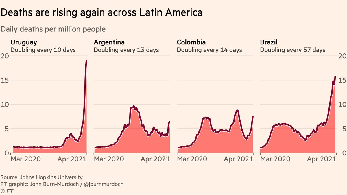
Greater availability of Covid-19 data in the western world has at times given the impression the US, UK and Europe have been the hardest hit, but a more comprehensive analysis shows Latin America has unquestionably suffered the most, with all of the top five death tolls worldwide
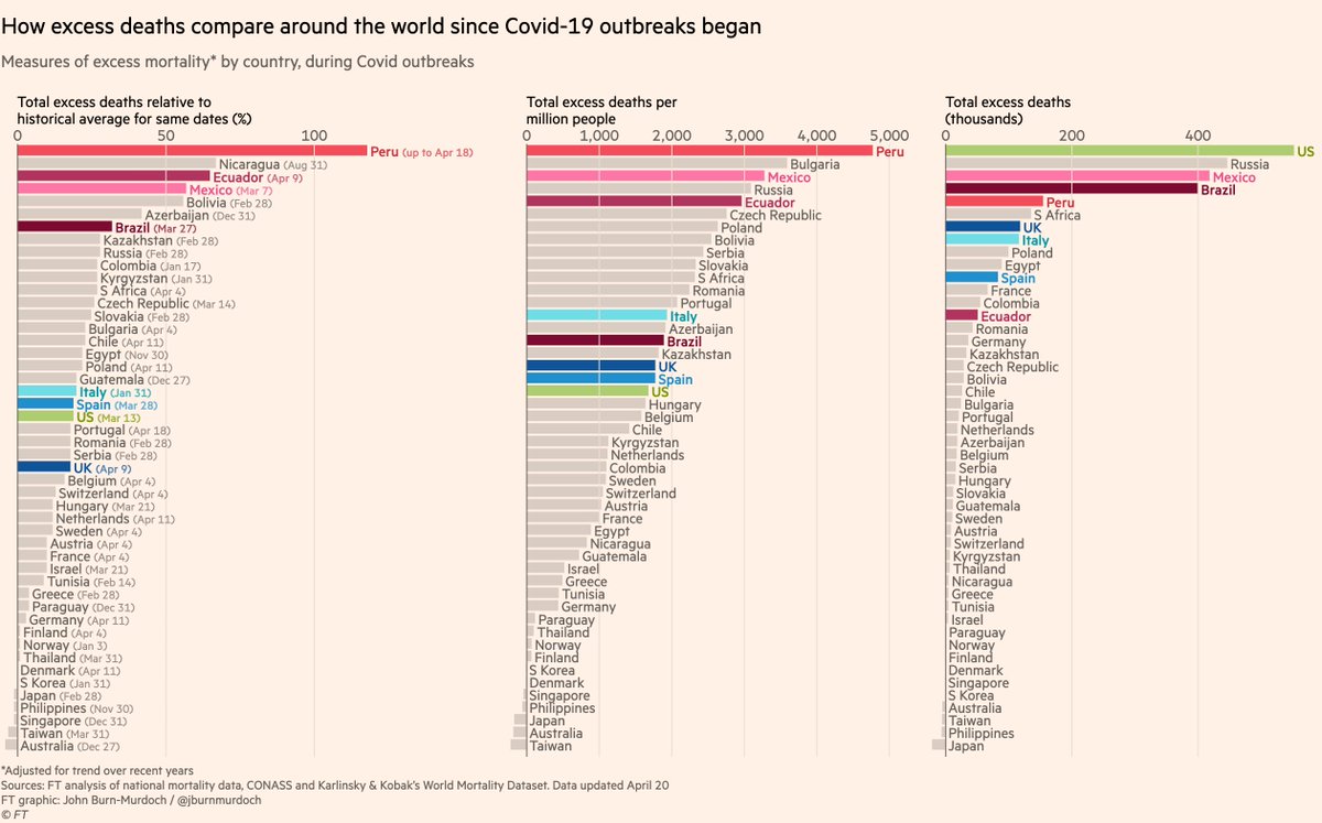
(NB there’s no comprehensive excess deaths data in India, but local news reports show that Covid deaths are being vastly undercounted in districts across the country, so if India was in that global chart I would it expect it to be climbing the rankings)
https://twitter.com/jburnmurdoch/status/1384782984138694658
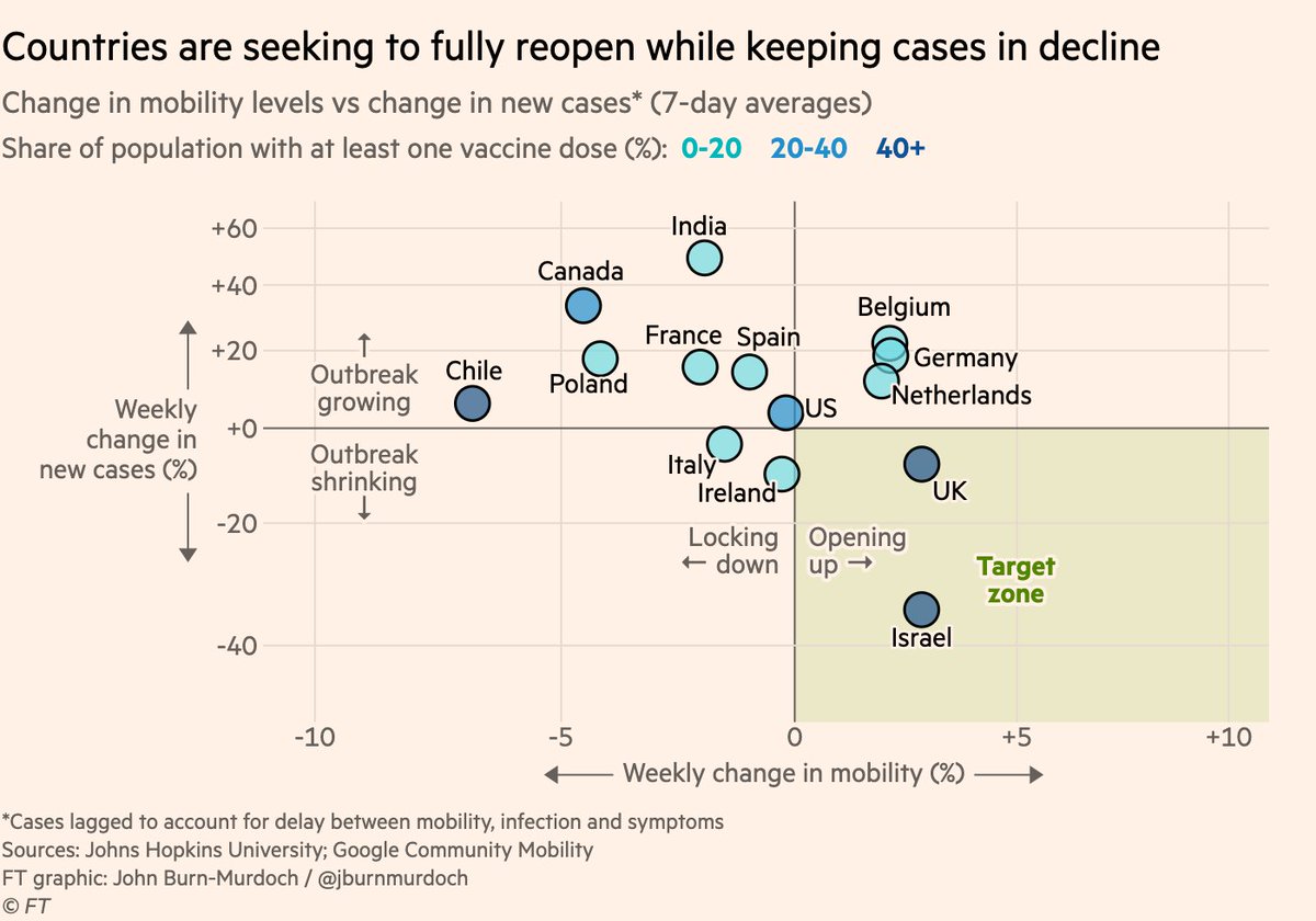
But I don’t want do end this thread on a negative note.
This is a story about how vaccines will get us out of this, and several countries are nearly there.
The bottom-right quadrant here is the ultimate goal: more people socialising at bars & cafés, while cases continue to fall
This is a story about how vaccines will get us out of this, and several countries are nearly there.
The bottom-right quadrant here is the ultimate goal: more people socialising at bars & cafés, while cases continue to fall
Here’s my full story on how vaccines are prevailing ft.com/content/d71729…
As usual, do hit me up with any questions and comments, and you can keep track all of the FT’s Covid-19 coverage here: ft.com/coronavirus
• • •
Missing some Tweet in this thread? You can try to
force a refresh