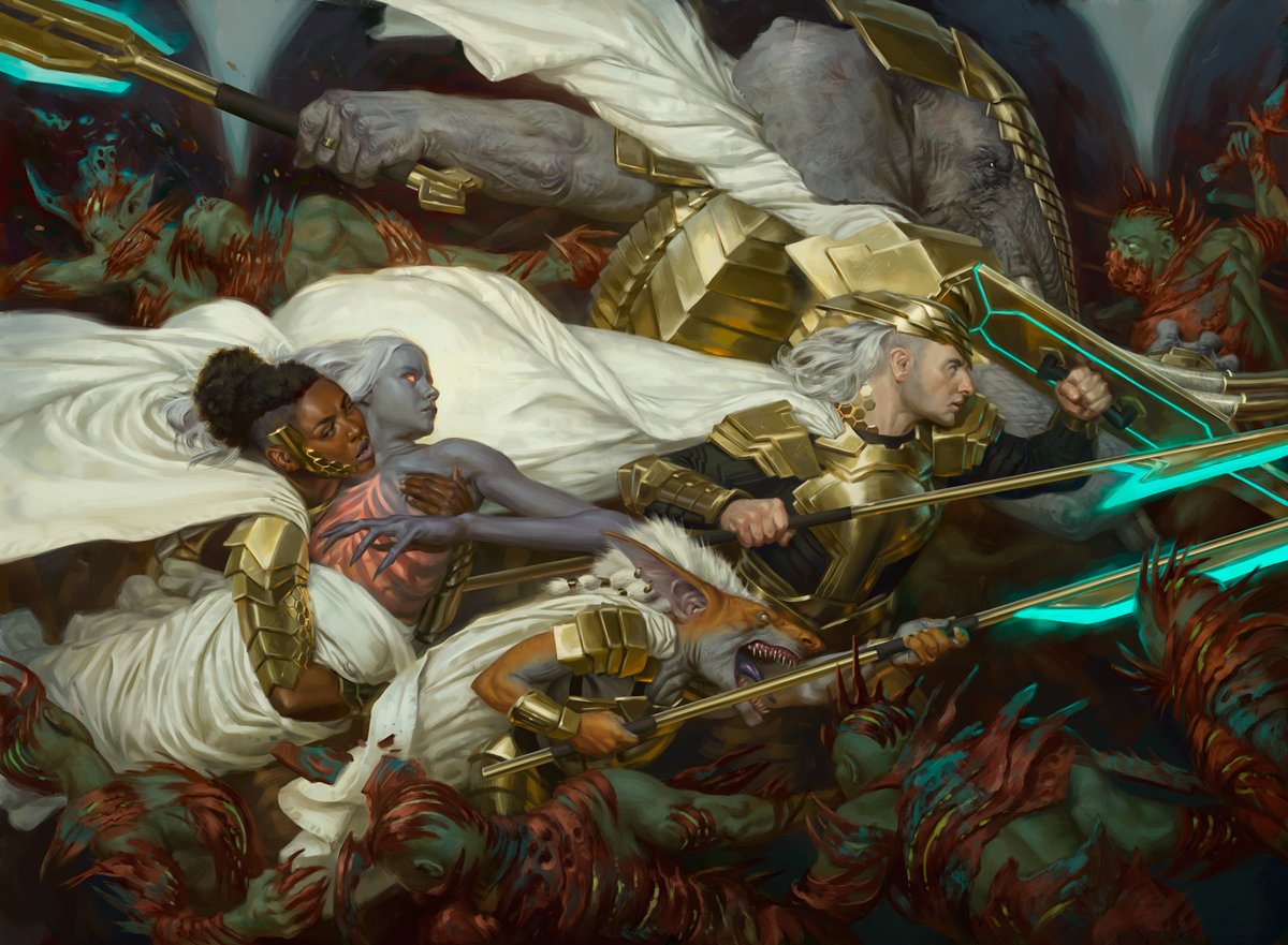
"Xanathar Key Art" for #MTGDND
AD Mari Hall
The only piece I illustrated for the D&D crossover, this was a difficult but very rewarding packaging piece, and I was more than happy to paint my boy Xanathar again! It might be the only, but I feel I made it count. Thread ->
AD Mari Hall
The only piece I illustrated for the D&D crossover, this was a difficult but very rewarding packaging piece, and I was more than happy to paint my boy Xanathar again! It might be the only, but I feel I made it count. Thread ->
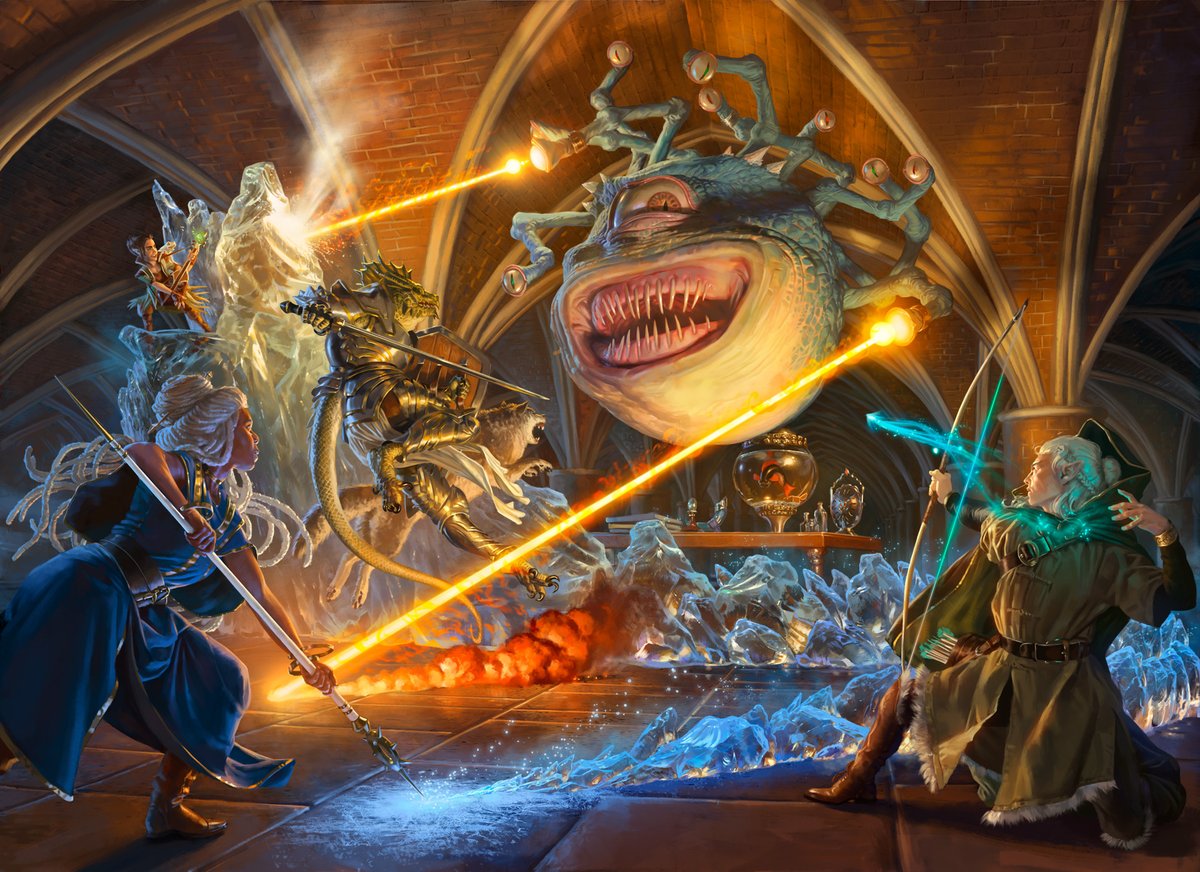
Might not be the best idea to share the exact briefs, so here's my short version. Was also approached to paint an actual Xani card but... last summer was tough. I did good work for Strix but fam and work stuff burned me out. Needed time away. It's a bit of a shame because -> 
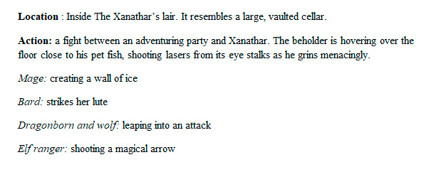
D&D is much closer to my heart than MTG, actually have experience paying it/ttrpgs. but like I said, this was a large image that speaks to the heart of rpg adventuring, so no regrets. I needed that time to rest. Here's my very rough pencil sketches: 
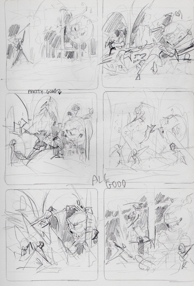
The brief initially called for the party to be mostly on the left, with Xanathar on the right. I sent in a couple options, with one that featured Xani a bit closer to the middle. Would be hard to show the party essentially from behind, but I felt a central comp might be better 

The first revision I sent addressed the issue of priority. the beholder needed to be the star. One option is to make him bigger, the other is to make him more central. I sent both these options in 
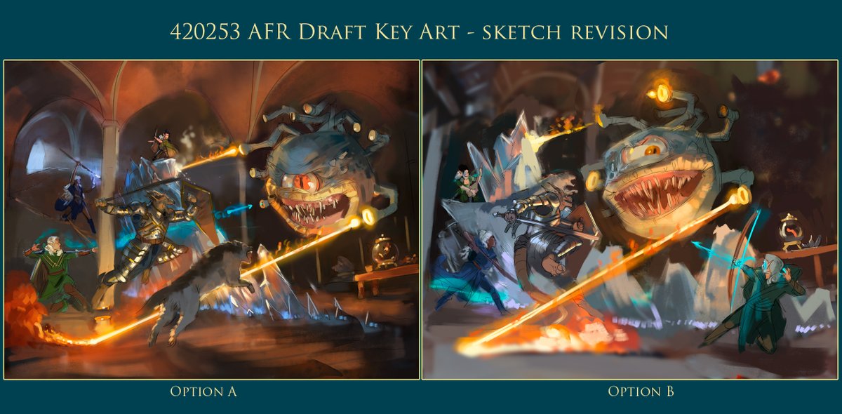
This 3rd revision focused on pulling the viewer more into the scene. I loved painting the cover for Xanathar's guide to everything, and it was a treat to try to add more world-building to his lair. 
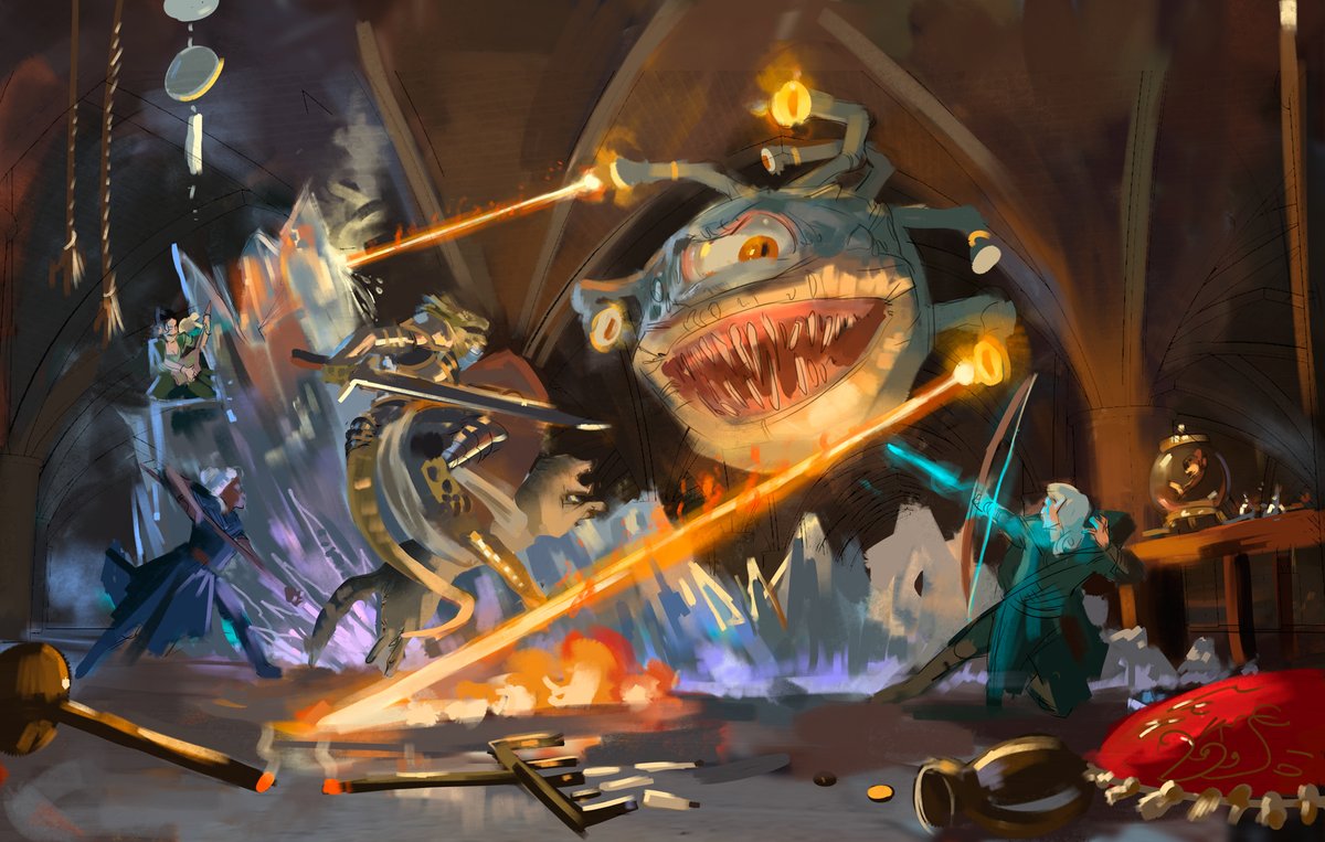
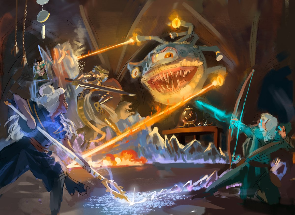
Last one. Fish under Xani for centrality, snaking ice magic. Bard's in the BG as she's featured prominently in other art I was given as ref. If she was closer I would 100% asked @christinabindon to model for her, as from what I've seen I think they look really similar XD 
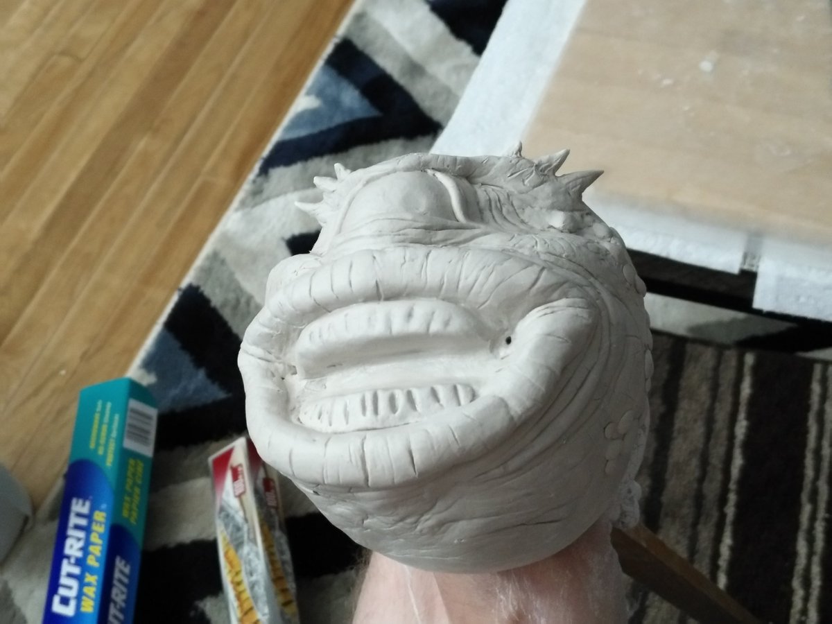
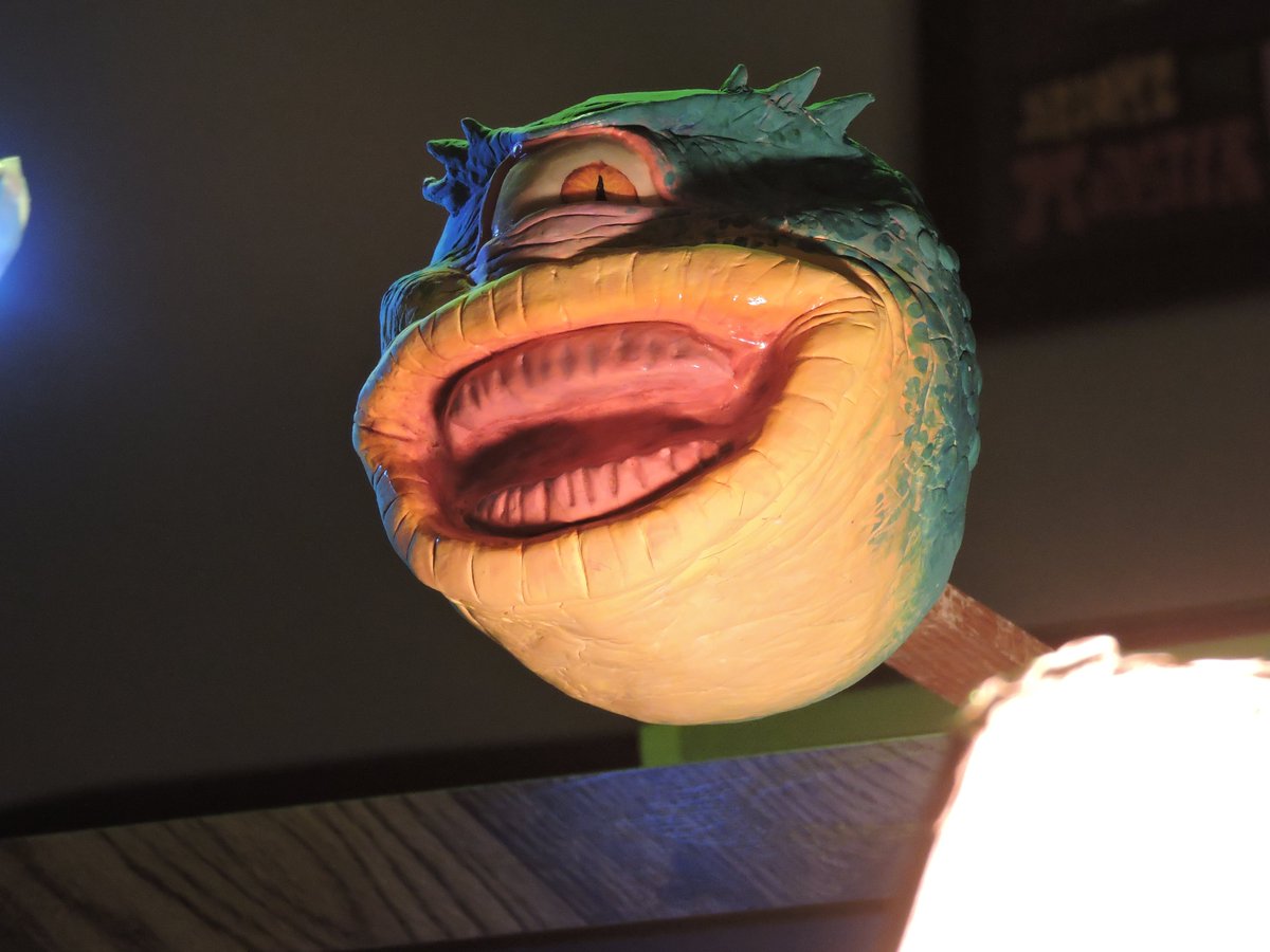
Since he's the star, figured I may as well make a clay model of Xanathar. started with a stick + tin foil ball core around it as a base for mounting, then sculpted and painted a basic Xani adding clear nail polish for the wet bits. no teeth or stalks, too fiddly + didnt need them 




And ice! Transparent reflective objects like ice, glass gems etc don't behave like opaque items in terms of lighting. So I got some fake ice chunks from the craft store and lit them below (for the magic) and warmly from the tops and sides for the fire. 


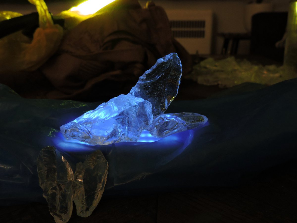
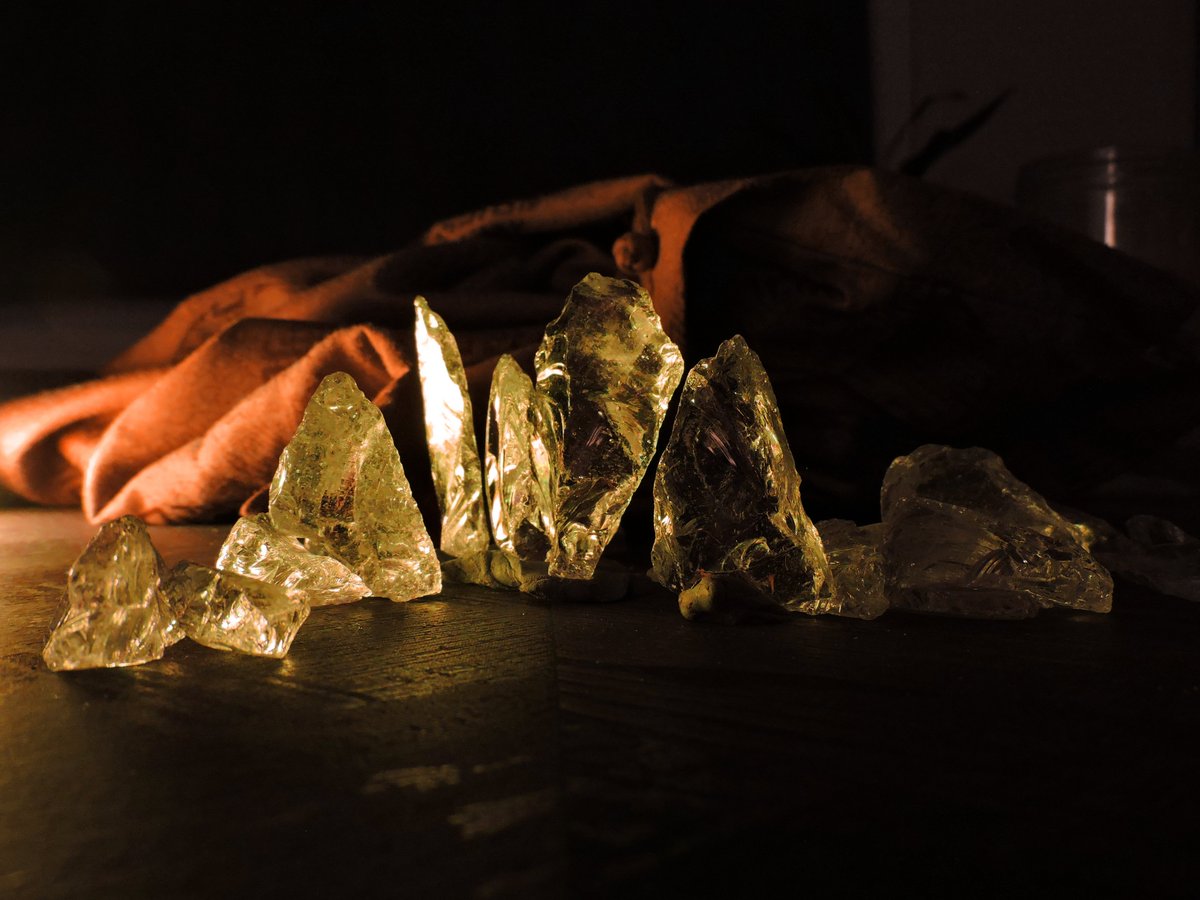
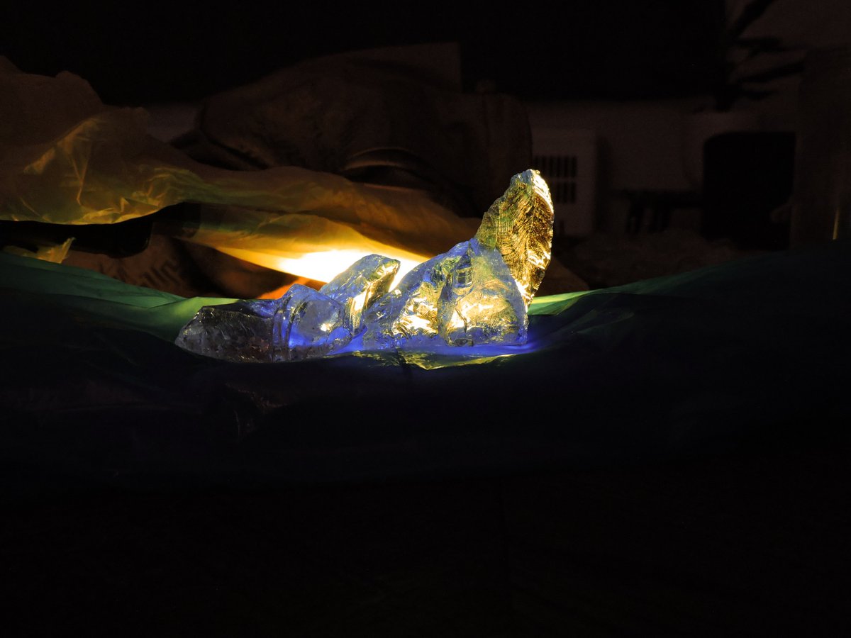
I wanted this to be a more high-detailed piece so I took my time with my figure reference too (except for the paladin, I don't have plate armor :P) I used a couple apps to help with lighting and skin tones for the mage. A free-to-use 3d model helped with the bg 
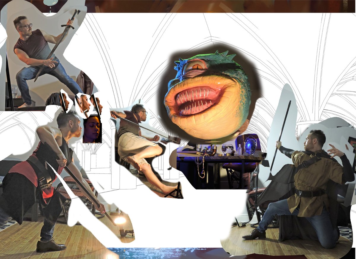
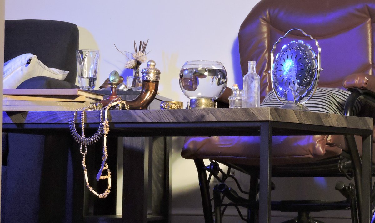
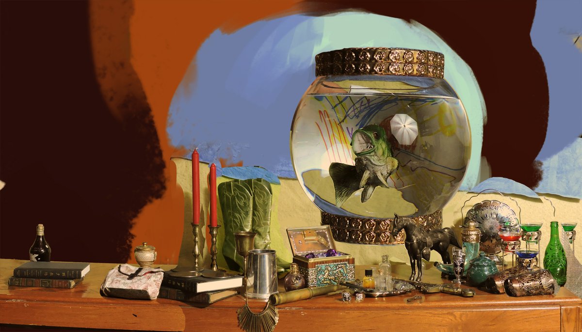
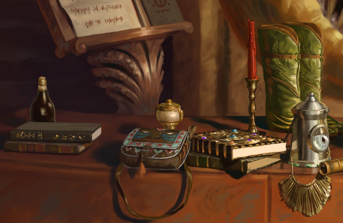
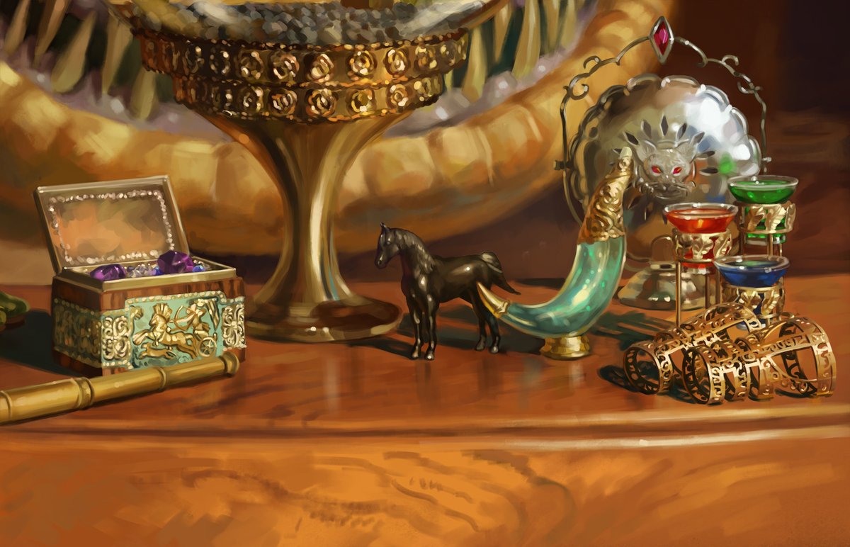
Particularly fun was attempting a minimal representation of the various items on Xanathar's desk as per the cover I illustrated previously 


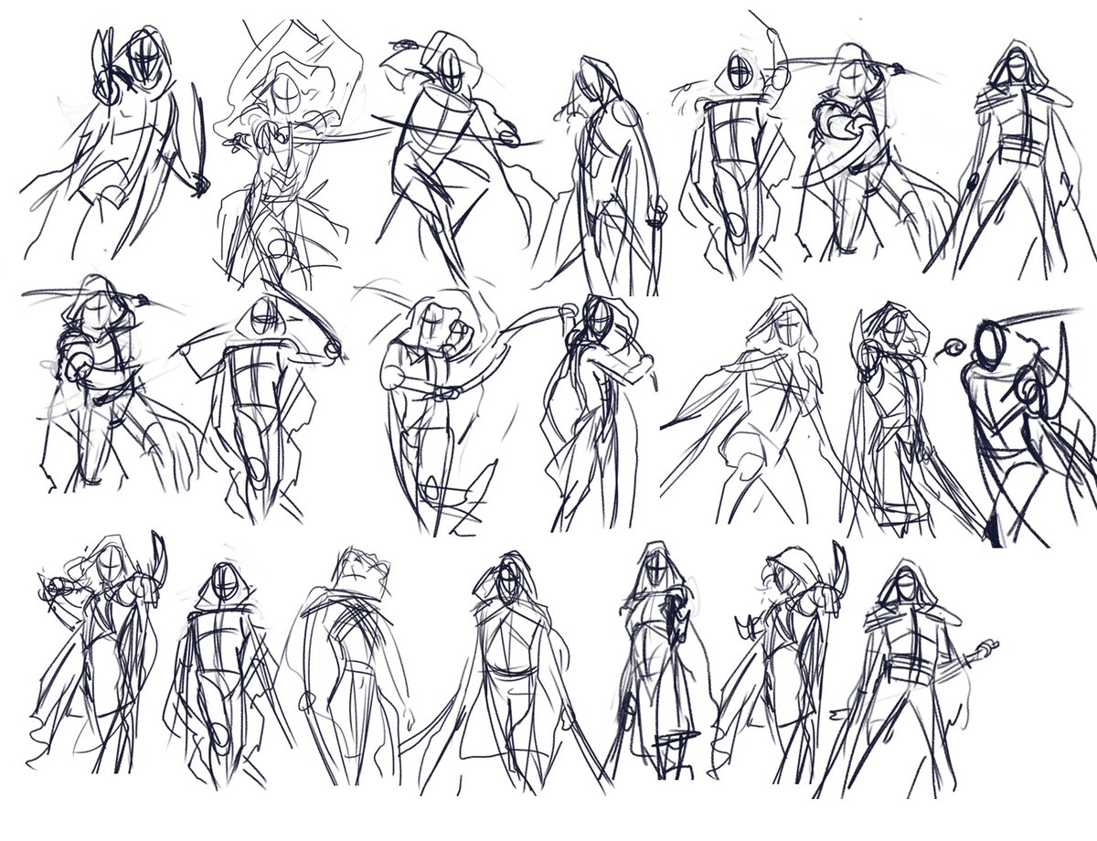
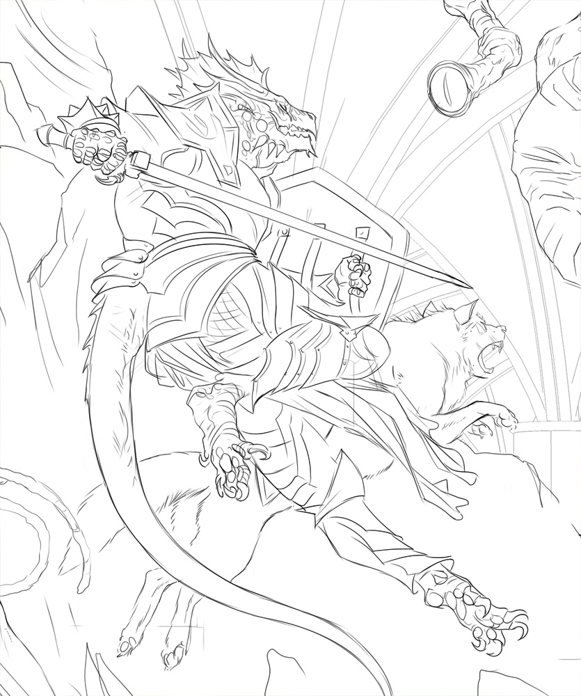
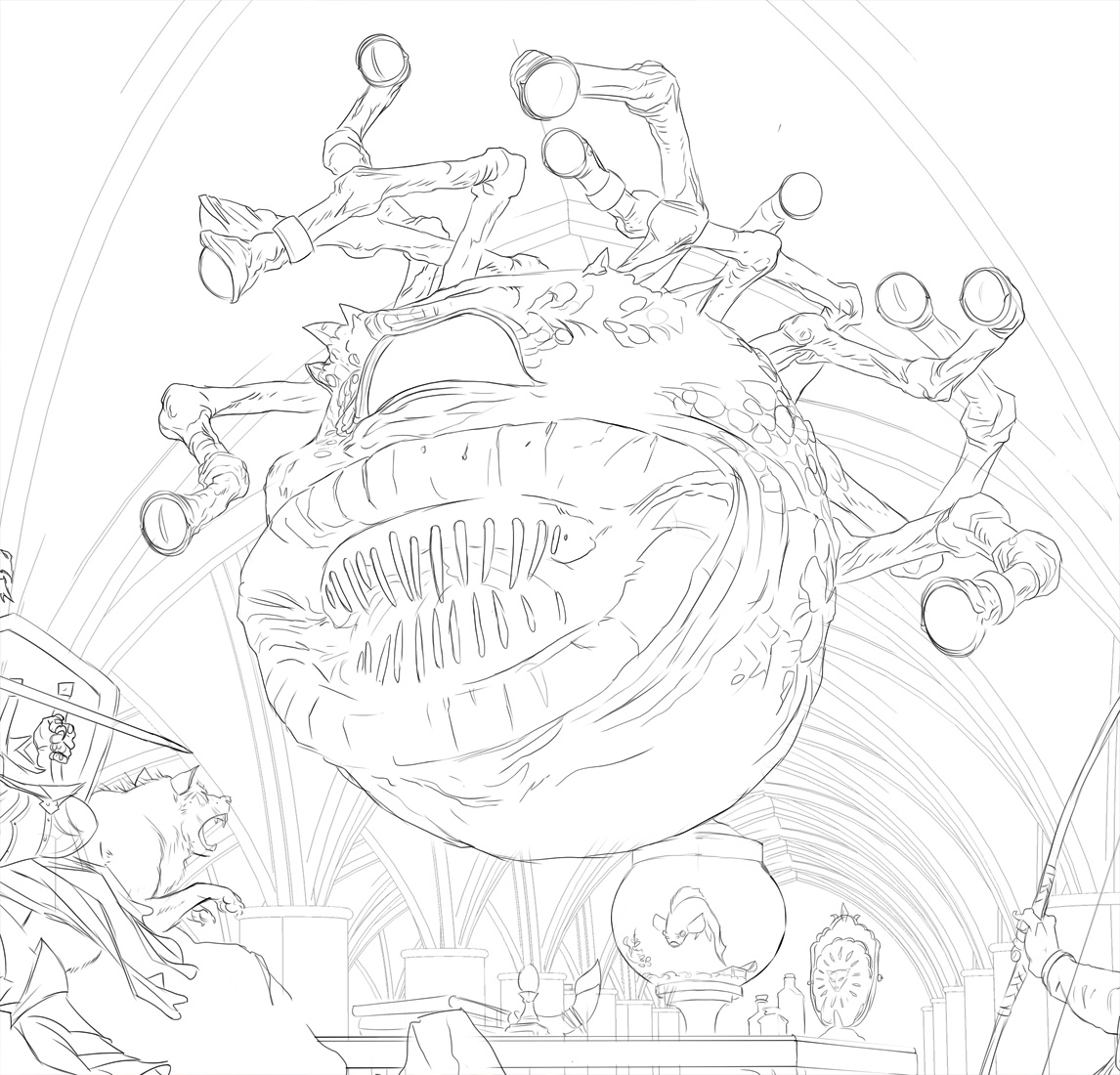
Sketch time - start with simple shapes and gesture, and bit by bit resketch the whole scene. I'm trying to capture the gestures and energy of my reference without sticking too closely. My energy and body type might not be perfect for the scene as is 


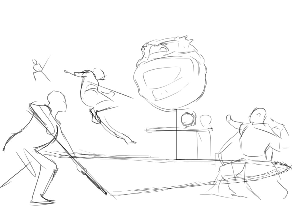

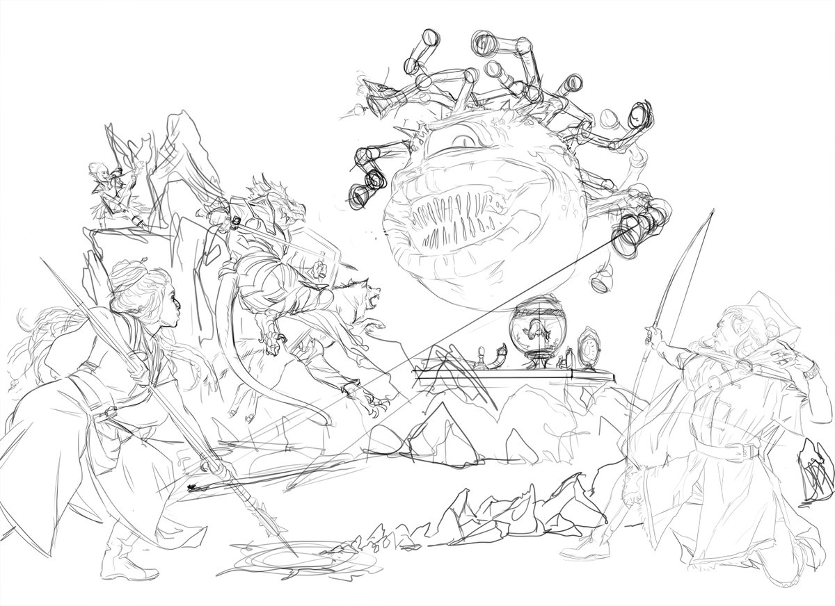

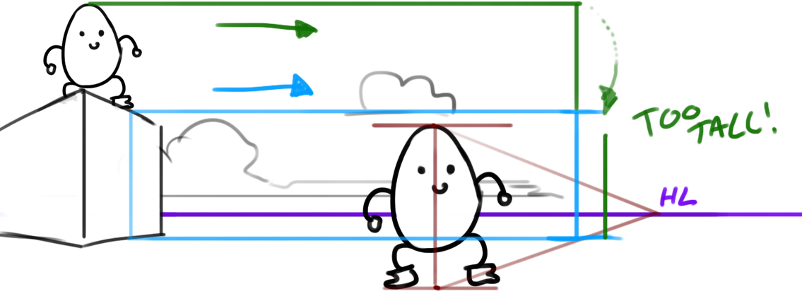
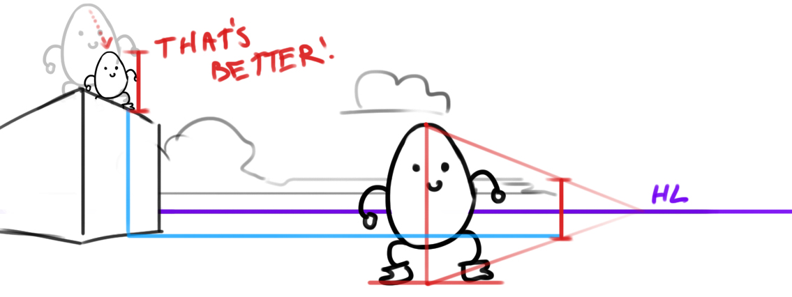
A gif of the sketch progress. You'll notice i used some weird perspective lines for a moment there. What I'm trying to do is to make sure all of the figures when placed in perspective are the correct relative sizes ->
Some close ups of the final sketches. As always I'm not trying to achieve "finalized" smooth linework. these are just guides to show me where the forms are. 


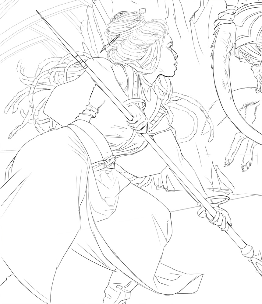
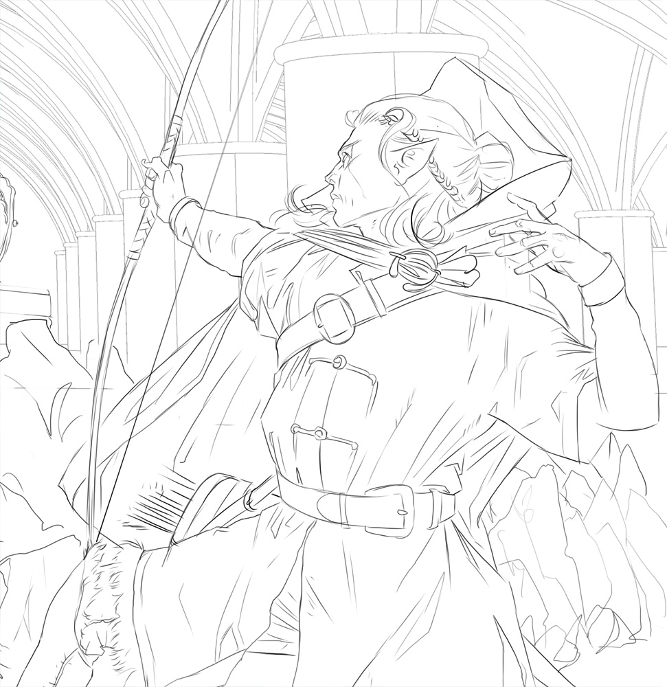
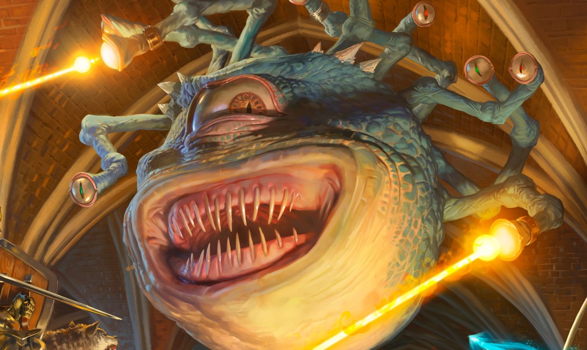
Second gif, it's tough to show gif progress for this one as I regularly merged and re-saved things. it's a large file, and I was worried of crashes. I was so happy with my maquette I essentially dropped it in and painted over it.
But not all was well with Xanathar! Apparently there was something... "off" about his mouth, despite it being exactly as the cover version. I wasn't told specifics, but I was more than happy to make some changes. Less wet, thinner, not yellow.
Details! I loved the idea of Xanathar's goldfish being ready to fight. "let me at them!", as it presses it's head menacingly against the side of his bowl. 


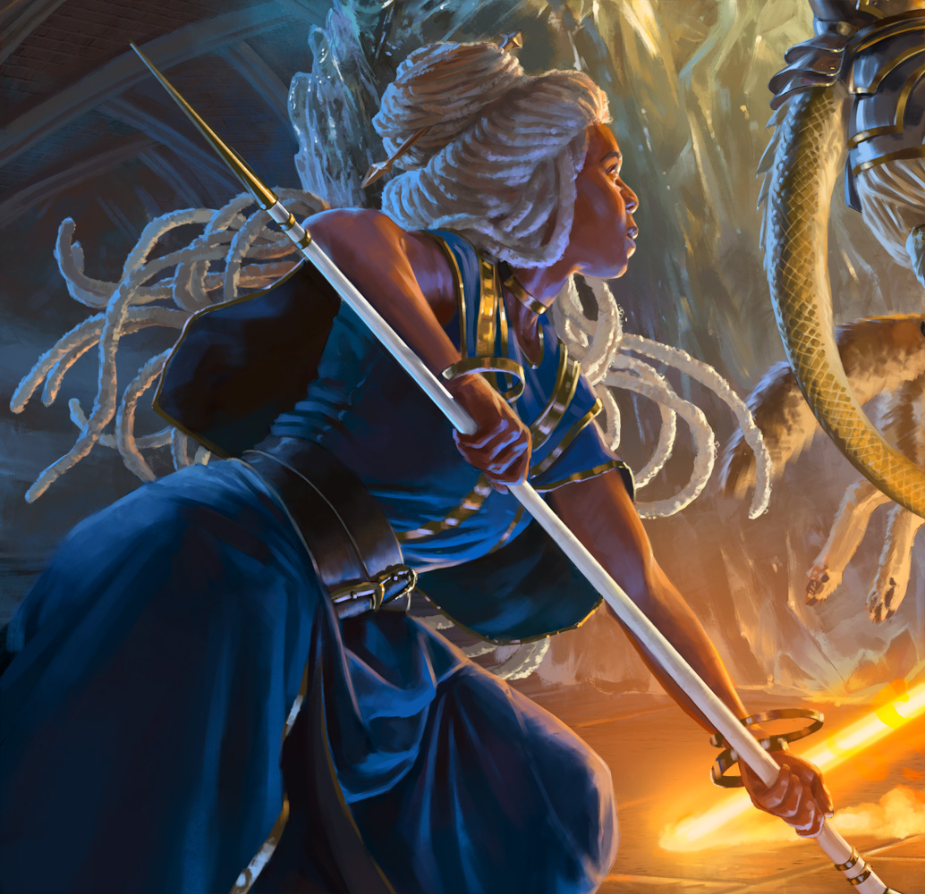
And character details. With good reference and a solid line sketch, working on characters is a real joy for me. You'll see these folks portrayed a lot this set, and it'll be fun to see how other artists interpreted them.
Thanks for reading!


Thanks for reading!
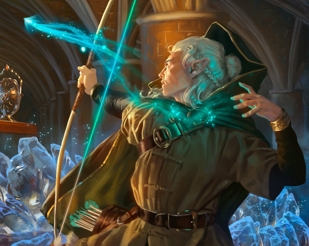
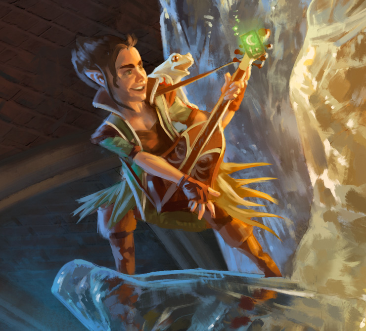
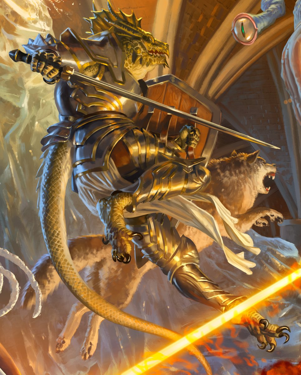
This thread and the feedback is getting out of hand! Just letting you know that while I might not be able to keep up with the comments, I really appreciate all the kind words :)
• • •
Missing some Tweet in this thread? You can try to
force a refresh


