Pulp Librarian Profile picture
May 16, 2021 21 tweets 10 min read Read on X
Today in pulp I'm looking at some of the many illustrators who worked for Ladybird Books.

The following thread may bring back memories...
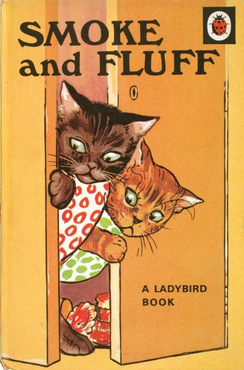
Ladybird Books began in 1914, but they really hit their stride from the 1940s onwards. Their distinctive hardback design with a bright, bold cover illustration made them hugely appealing to young readers.

Let's look at some of the people who helped make those iconic covers.
Angusine Jeanne (A.J.) Macgregor illustrated many of the early Ladybird titles. She was born in Birmingham in 1879, where she later studied art before becoming a children's book illustrator. She began working for Ladybird in 1940.
As well as an illustrator A.J. Macgregor authored a number of children's stories. However her work for Ladybird consisted solely of illustrations, particularly for the Animal Rhymes series of verse stories by W. Perring.
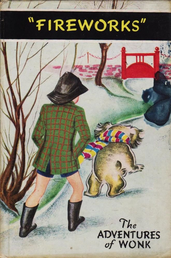
Joan Kiddell-Monroe was a prolific illustrator who is best known for her Oxford Myths and Legends series for OUP. However she also illustrated the Adventures of Wonk series for Ladybird in the 1940s.
Wonk was a mischievous koala who along with his friend Peter regularly got into trouble. These books are now quite rare as the wartime paper stock used for printing them was somewhat fragile.
Septimus Scott was born in Sunderland in 1879 and studied at the Royal College of Art before working in advertising. He is well known for his L&NER railway posters, but he also illustrated the 1950s Uncle Mac series of Ladybird stories.
Percy Bell Hickling had a long career in magazine illustration, drawing for Punch, Black and White and The Strand magazine in the 1920s and '30s. In 1949 he illustrated the Animal Tales stories for Ladybird Books.
Noel Barr wrote the Animal Tales series as a set of morality stories, with each animal having a habit or trait which they overcame. Ned The Lonely Donkey is probably the most famous book of the series and Hickling's full colour illustrations for it set a wonderful tone.
The Well Loved Tales series of Ladybird books was first published in 1964. Created as easy reading titles their covers were provided by two artists: Robert Lumley and Eric Winter.
Robert Lumley was born in London in 1920 and later set up Broad Oak Studios in Essex. He would often use local buildings and people as models for his work.
Eric Winter studied at Hornsey Art School before specializing in commercial art. As well as drawing for Eagle comic and Girl magazine he designed the Abbey National building society logo in 1950.
John Berry illustrated all 20 titles of the Ladybird People At Work range. Born in Hammersmith in 1920 he enlisted in the RAF at the start of WW2. His ability as a painter was quickly recognised and he became the only official War Artist to have been recruited from the ranks.
People At Work covered the main industries in Britain in the 1960s and '70s - from mining and railways to pottery and farming - as well as the uniformed services.
Ladybird produced a range of Bible Stories, which were staple reading at many a Sunday School. Kenneth Inns illustrated these in the 1950s with Clive Uptton working on the series in the 1960s.
History was certainly Ladybird's forte. Beginning in 1956 the Adventure From History range brought Kings, Queens, explorers and writers to life for many school children. John Kenny was the main illustrator for the early titles in this range.
Frank Hampson went on to illustrate a number of the later Ladybird history titles...
...with Gorge Nunez and Eonaald Jackson working on the Great Civilizations series.
Harry Wingfield worked across the full range of Ladybird books in the 1960s and '70s. His distinctive style is instantly recognisable and closely associated with Ladybird Books.
As is Martin Aitchison, who illustrated many of the Peter and Jane illustrations for the Key Word Reading Skills series. In fact I've barely scratched the surface of the many artists who have worked for Ladybird Books over the years.
If you want to learn more about the people behind Ladybird Books then you'll want to visit Ladybird Fly Away Home - one of the best fan sites available: ladybirdflyawayhome.com

That's it for my look at Ladybirds today. More another time...

• • •

Missing some Tweet in this thread? You can try to force a refresh
 

Keep Current with Pulp Librarian

Pulp Librarian Profile picture

Stay in touch and get notified when new unrolls are available from this author!

Read all threads

This Thread may be Removed Anytime!

PDF

Twitter may remove this content at anytime! Save it as PDF for later use!

Try unrolling a thread yourself!

how to unroll video
  1. Follow @ThreadReaderApp to mention us!

  2. From a Twitter thread mention us with a keyword "unroll"
@threadreaderapp unroll

Practice here first or read more on our help page!

More from @PulpLibrarian

Feb 9
In the 1970s a fascinating engineering battle took place between America and Japan for control of the future. The prize was the world we live in now. And one of the key battles took place on your wrist.

This is the story of the digital watch... Image
'Digital' is a magical marketing word. Like 'laser' or 'turbo' it suggests progress, mastery and the future. People like those ideas. They like them enough to spend a lot of money on products that have them, especially if they can be a first adopter. Image
And so it was with the wristwatch. Electronic quartz watches were already a thing by the 1960s: an analogue movement driven by a quartz crystal resonator, powered by a small button battery.

But one American company was setting out on a new timekeeping odyssey... Image
Read 22 tweets
Feb 5
Today in pulp... let's look back at a Shōjo manga artist whose work celebrated friendships between women: Jun'ichi Nakahara. Image
Jun'ichi Nakahara was born in Higashikagawa in 1913 and worked as an illustrator, a fashion designer and a doll maker. His work is highly regarded in Japan and he was a significant influence on modern manga art. Image
In the '20s and '30s Nakahara often drew for Shōjo no Tomo ("Girl's Friend") magazine. The style at the time was for demure, dreamlike imagery, but Nakahara added to this large expressive eyes, often reflecting the light. Image
Read 11 tweets
Feb 2
Today in pulp I try to decipher 1980s Japanese street style, with the help of Olive: The Magazine for Romantic Girls!

This may involve frills... Image
Street style is an ever-changing mix of styles, brands, attitudes and poses with various influences. And you normally have to be in the right place at the right time to capture it. Image
Which is where magazines come in! Photograping, documenting and deconstructing fashion never goes out of style, and in the late 1970s Japanese youth had one key guide to help them: Popeye! Image
Read 13 tweets
Feb 1
In February 1974 something profound and inexplicable happened to author Philip K Dick that changed his life forever. Was it an illness, a psychotic reaction, or something truly mystical?

Today in pulp I look back at the exegesis of Philip K Dick... Image
Philip K Dick was both prolific and influential. In his youth he came to the conclusion that, in a certain sense, the world is not entirely real and there is no way to confirm whether it is truly there. Image
By the end of the 1960s Philip K Dick had published over 40 novels and stories, as well as winning the 1963 Hugo Award for The Man In The High Castle. But he still struggled financially. Image
Read 18 tweets
Jan 29
What with you being so busy and everythign you may not have visited your local library in a while.

So come with me on a virtual library tour, courtesy of stock photography, to see what we do for a living... Image
The enquiries desk is normally your first stop in a library, and this is where you will meet The Angry Librarian!

Why is she angry? Because people keep asking her stupid questions! Image
"Are you open?"
"Do you have a toilet?"
"That chair's wobbly!"
"Why isn't it available in audiobook?"
"Someone else is on the computer and that's not fair!"

On and on it goes... Image
Read 11 tweets
Jan 29
Today in pulp I look at the original white stripes: the world of dazzle camoflague! Image
Traditional pattern camoflague had been used by the British Royal Navy to break up a ship's outline for some time. But in 1917 artist Norman Wilkinson presented the Admiralty with a different idea - camoflague that confused enemy rangefinders. Image
Dazzle - known in the US as Razzle Dazzle - would use high contrast colours in irregular patterns to make it difficult for enemy gunners to calculate a ship's range and bearing. This would (hopefully) lead to them taking up a poor firing position when they attacked. Image
Read 12 tweets

Did Thread Reader help you today?

Support us! We are indie developers!


This site is made by just two indie developers on a laptop doing marketing, support and development! Read more about the story.

Become a Premium Member ($3/month or $30/year) and get exclusive features!

Become Premium

Don't want to be a Premium member but still want to support us?

Make a small donation by buying us coffee ($5) or help with server cost ($10)

Donate via Paypal

Or Donate anonymously using crypto!

Ethereum

0xfe58350B80634f60Fa6Dc149a72b4DFbc17D341E copy

Bitcoin

3ATGMxNzCUFzxpMCHL5sWSt4DVtS8UqXpi copy

Thank you for your support!

Follow Us!

:(