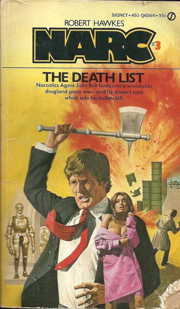
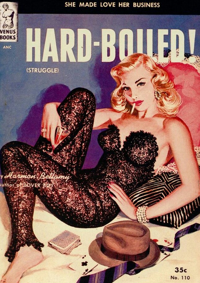
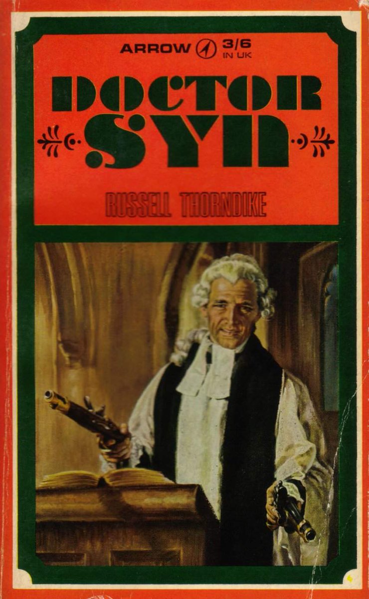
Today in pulp, one of the most influential and outrageous illustrators of the Italian Italian fumetti scene: Emanuele Taglietti!
This will be interesting...
Emanuele Taglietti was born in Ferrara in 1943. His father worked as a set designer for director Michaelangelo Antonioni, often taking Emanuele with him on set.
In the 1960s Taglietti moved to Rome, where he studied stage design. He began a successful career as an assistant art director, working for Federico Fellini and Marco Ferreri.
Tiring of set design Taglietti became interested in the booming comics industry in Italy. His friend Dino Leonetti introduced him to the work of artists such as Averardo Ciriello and Frank Frazetta, and encouraged him to move into comic illustration.
In the mid-1970s Italian news-stands were full of Fumetti Sexy, a home-grown type of erotic comic. At their peak publishers were releasing a new 100-page comic every three days, and artists who could work quickly were in high demand.
Edifumetto was the largest publisher of Fumetti Sexy. Founded by Renzo Barbieri in the early 1970s their offices were in Milan, but they were happy for Taglietti to work from home in Ferrara.
Taglietti would start a cover painting by using photographic references before painting in acrylic. Finishing touches were added with tempera. The finished canvas was normally 25 cm x 36 cm, with Taglietti often painting ten a month.
Taglietti did most of the covers for Sukia, the popular vampire-themed fumetti that began in 1978. Sukia's look was based on the actress Ornella Muti.
Zora La Vampira was another vampire-based fumetti that Taglietti worked on for Edifumetto. Zora is a 19th century aristocrat possessed by the spirit of Dracula.
Ulula the Werewolf was launched in 1981 by Edifumetto and riffs on the early legends which describe werewolves as beautiful women temptresses.
Playcolt was a more straightforward crime series from Edifumetto, featuring a rich American playboy who fights the Mafia.
In a similar vein .44 Magnum was a fumetto about a glamorous (and slightly familiar!) private eye.
In contrast La Poliziotta was a far from straightforward comic, featuring the very erotic adventures of the NYPD.
Alas by the end of the 1980s the popularity of Fumetti Sexy died away. Taglietti left Edifumetto to work as an oil painter, as well as an evening-class teacher. He currently works on murals and watercolours.
Fumetti Sexy could never be published today: its content is too outrageous and sometimes too crude to find a mainstream market. However the cover art of Emanuele Taglietti is still highly collectable.
Korero Press published an anthology of Emanuele Taglietti's artwork in 2015, which is well worth a look, and his original work still comes up at auction quite regularly. It's certainly a conversation starter if you hang it in the hall!
And that's it for my look back at the work of Emanuele Taglietti. I hope you enjoyed it!
More pulp artists another time...
• • •
Missing some Tweet in this thread? You can try to
force a refresh
In the 1970s a fascinating engineering battle took place between America and Japan for control of the future. The prize was the world we live in now. And one of the key battles took place on your wrist.
This is the story of the digital watch...
'Digital' is a magical marketing word. Like 'laser' or 'turbo' it suggests progress, mastery and the future. People like those ideas. They like them enough to spend a lot of money on products that have them, especially if they can be a first adopter.
And so it was with the wristwatch. Electronic quartz watches were already a thing by the 1960s: an analogue movement driven by a quartz crystal resonator, powered by a small button battery.
But one American company was setting out on a new timekeeping odyssey...
Today in pulp... let's look back at a Shōjo manga artist whose work celebrated friendships between women: Jun'ichi Nakahara.
Jun'ichi Nakahara was born in Higashikagawa in 1913 and worked as an illustrator, a fashion designer and a doll maker. His work is highly regarded in Japan and he was a significant influence on modern manga art.
In the '20s and '30s Nakahara often drew for Shōjo no Tomo ("Girl's Friend") magazine. The style at the time was for demure, dreamlike imagery, but Nakahara added to this large expressive eyes, often reflecting the light.
Today in pulp I try to decipher 1980s Japanese street style, with the help of Olive: The Magazine for Romantic Girls!
This may involve frills...
Street style is an ever-changing mix of styles, brands, attitudes and poses with various influences. And you normally have to be in the right place at the right time to capture it.
Which is where magazines come in! Photograping, documenting and deconstructing fashion never goes out of style, and in the late 1970s Japanese youth had one key guide to help them: Popeye!
In February 1974 something profound and inexplicable happened to author Philip K Dick that changed his life forever. Was it an illness, a psychotic reaction, or something truly mystical?
Today in pulp I look back at the exegesis of Philip K Dick...
Philip K Dick was both prolific and influential. In his youth he came to the conclusion that, in a certain sense, the world is not entirely real and there is no way to confirm whether it is truly there.
By the end of the 1960s Philip K Dick had published over 40 novels and stories, as well as winning the 1963 Hugo Award for The Man In The High Castle. But he still struggled financially.
What with you being so busy and everythign you may not have visited your local library in a while.
So come with me on a virtual library tour, courtesy of stock photography, to see what we do for a living...
The enquiries desk is normally your first stop in a library, and this is where you will meet The Angry Librarian!
Why is she angry? Because people keep asking her stupid questions!
"Are you open?"
"Do you have a toilet?"
"That chair's wobbly!"
"Why isn't it available in audiobook?"
"Someone else is on the computer and that's not fair!"
Today in pulp I look at the original white stripes: the world of dazzle camoflague!
Traditional pattern camoflague had been used by the British Royal Navy to break up a ship's outline for some time. But in 1917 artist Norman Wilkinson presented the Admiralty with a different idea - camoflague that confused enemy rangefinders.
Dazzle - known in the US as Razzle Dazzle - would use high contrast colours in irregular patterns to make it difficult for enemy gunners to calculate a ship's range and bearing. This would (hopefully) lead to them taking up a poor firing position when they attacked.