
🤔 What's the best way to structure your classes and markup when building UIs with Tailwind CSS?
Here are some of the rules I follow to build things that are consistent, easy to understand, and straightforward to componentize 👇
Here are some of the rules I follow to build things that are consistent, easy to understand, and straightforward to componentize 👇

Sort classes generally from the outside in (in terms of the box model) putting things that affect layout before things that don't, while also trying to group related classes.
This lets you see the things that are going to have the biggest impact quickly.
This lets you see the things that are going to have the biggest impact quickly.

☝️This is a bit of an art, but hoping to automate in the near future!
I've been working on nailing the recommended class order a bit lately — check out my list so far on GitHub:
github.com/tailwindlabs/t…
(Inspired by @mdo's advice on Code Guide! 🙏)
I've been working on nailing the recommended class order a bit lately — check out my list so far on GitHub:
github.com/tailwindlabs/t…
(Inspired by @mdo's advice on Code Guide! 🙏)
Group responsive classes together by screen size, following the same order that the classes would override each other in.
This makes it easy to see all the classes that would be applied at a breakpoint at the same time.
This makes it easy to see all the classes that would be applied at a breakpoint at the same time.

Group state variants together, and do that within each breakpoint — again to make related changes easy to find.

Use screen size prefixes even in situations where it's not technically necessary because a class has no effect without being paired with another class.
It's a few more characters, but it's much more clear to other people on the team.
It's a few more characters, but it's much more clear to other people on the team.

Prefer top and left margins over bottom and right margins.
Why? Because having a rule just makes it one less thing to ever think about, and you'll move faster.
Why? Because having a rule just makes it one less thing to ever think about, and you'll move faster.
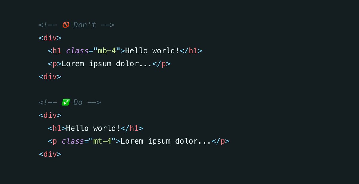
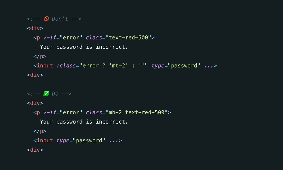
Exception: If a margin is needed because of an optional element that is sometimes shown and sometimes not, always put the margin on that element, even if it means using a bottom or right margin.
This makes the code simpler and eliminates extra conditional logic.
This makes the code simpler and eliminates extra conditional logic.
When the complexity and effort is equal, always prefer the solution that makes elements easy to delete.
This makes things easier to componentize and reuse.
This makes things easier to componentize and reuse.

Always put margins on the outer-most element possible.
If you don't, people will wonder why and assume it's for some special purpose, which slows people down when trying to understand the code.
If you don't, people will wonder why and assume it's for some special purpose, which slows people down when trying to understand the code.

Always try to make elements in a loop identical, using techniques like negative margin and `flow-root` on a parent element to counteract unintended spacing.
This lets you avoid dynamic/conditional logic and makes things easier to break up.
This lets you avoid dynamic/conditional logic and makes things easier to break up.

Use the `space-x/y-{n}` utilities (or `gap` if you can!) to handle the space between items instead of repeating yourself.
This makes it easier to adjust the spacing, and better captures your intent for other people reading the code.
This makes it easier to adjust the spacing, and better captures your intent for other people reading the code.

Don't use the `space-x/y-{n}` utilities for adding space between just two items, especially when those items each contain many lines of code.
This can make it annoying to find where the spacing is coming from in complex templates.
This can make it annoying to find where the spacing is coming from in complex templates.

Implement the same visual patterns using the same code patterns, even if it's possible to optimize in some situations and use fewer HTML elements.
This makes things much easier to componentize and turn into a system.
This makes things much easier to componentize and turn into a system.

• • •
Missing some Tweet in this thread? You can try to
force a refresh
