Victor Profile picture
Jun 22, 2021 7 tweets 3 min read Read on X
UI Lesson 🔖

The search input might not be that easy as you think.

Here are some tips and tricks on how to properly make it.

🧵👇
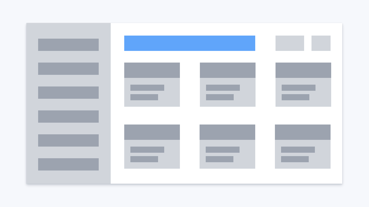
1. Place the search input in a reasonable place.

The most common place is somewhere in the header. Users should be able to easily find it. Image
2. Do not hide it under an icon.

❌ It makes it harder for users to find where the search input is

❌ It requires an additional click for revealing the input Image
3. Don't leave the input without a placeholder

The placeholder gives two advantages.

1. It'll be even easier to find the search input

2. You can provide context. E.g. if your site is an e-commerce shop, you can use "Search products" as a placeholder text. Image
4. Use magnifying glass icon.

This is one of the most powerful indicators that the input is a search input.

It's just a convention, everybody knows what the icon means. Image
5. Make sure your search input has enough width.

It should be wide enough for common search queries. Image
6. Consider enhancing search with the following techniques

1. Autocomplete - you complete the user sentence with possible outcomes

2. Auto-suggest - you provide the user options BEFORE they start typing

3. Recent search - you show users shortcuts with their latest searches Image

• • •

Missing some Tweet in this thread? You can try to force a refresh
 

Keep Current with Victor

Victor Profile picture

Stay in touch and get notified when new unrolls are available from this author!

Read all threads

This Thread may be Removed Anytime!

PDF

Twitter may remove this content at anytime! Save it as PDF for later use!

Try unrolling a thread yourself!

how to unroll video
  1. Follow @ThreadReaderApp to mention us!

  2. From a Twitter thread mention us with a keyword "unroll"
@threadreaderapp unroll

Practice here first or read more on our help page!

More from @vponamariov

May 1, 2024
How to design almost any UI element.

A curated list of 61 articles 👇
Buttons
---

1. Button Design – Get Site Visitors to Actually Click Your Buttons by @uxpin


2. Designing button states: Tutorial and best practices by @edwche / @LogRocket


3. The Definitive Guide to Buttons in UX: Part 1 by Lauren Waage

uxpin.com/studio/blog/bu…
blog.logrocket.com/ux-design/desi…
medium.com/@lwaage2019/th…
Text fields
---

1. Text fields from Material Design


2. Text Fields Design from Radek (this one is impressive!🤩)


3. UI Designer’s Guide to Creating Forms & Inputs from @molly_hellmuth

m2.material.io/components/tex…
thestory.is/en/journal/tex…
uiprep.com/blog/ui-design…
Read 22 tweets
May 24, 2023
Today I turned 34.

Here is an updated version of the most helpful tweet I've ever posted.

How to design almost any UI element?

A curated list of 34 articles 👇
Buttons.

1. How To Design Better Buttons by @101babich and @smashingmag

👉 smashingmagazine.com/2016/11/a-quic…

2. Desperately seeking squircles

👉 figma.com/blog/desperate…
Thanks @Southclaws and @figma

3. Designing A Better Back Button UX

👉 smashingmagazine.com/2022/08/back-b…

Thanks @vitalyf Squircled button
Text fields

4. Text fields & Forms design — UI components series

👉 uxdesign.cc/text-fields-fo…

from @uxdesigncc by Taras Bakusevych

5. Validate it. The right way.

👉 dev.to/vponamariov/va…

By me :) Input anatomy
Read 18 tweets
Nov 23, 2022
Five UI/UX tips to improve your landing pages 👇

#SketchDesignChallenge 🔥
1/5. Poor text contrast on images.

Make sure that

🔷 the text on images is easy to read
🔷 it doesn't cover any important objects behind it (e.g. faces or products)
🔷 text contrast is good everywhere, not only on images
2/5. Navigation.

Don't hide navigation under hamburger icons on desktop devices.

That will hinder users to find necessary pages.
Read 6 tweets
Oct 17, 2022
CSS Tip ☝️

I needed to make a pill component that should have had a 1px border.

But when on hover it should be doubled.

It wasn't that easy, and here is why.
If you simply make a 2px border on hover it will increase the height and width of the pill.

Since you don't know in advance what the width is, and probably the pill might be multiline, I don't think using fixed height/width is a good solution.
Instead, what I did is - I used shadows.

The first border is 1px shadow, and the second border (in the hover state) is 2px shadow.

And that's basically it.

A simple, yet nice trick.
Read 4 tweets
Oct 17, 2022
Some things designers should learn by themselves
by Michael McWatters (link at the end)

I SO MUCH liked this that I'm going to share some parts from the article 👇
🔸 32% of your time will be spent labeling buttons.

🔸 Blood will be shed over any question that begins, “Should designers…”.

🔸 All the research in the world is no match for your CEO’s opinion.
🔸 The design will fail on one platform, and that platform will be the one your boss uses.

🔸 The delta between what you designed and what gets shipped can be measured in light years.
Read 9 tweets
Sep 6, 2022
One UI/UX problem. Seven examples. One thread 🔥

Clickable area.

Do you make it right? Let's find out 👇
1/7. Sidebar menus.

Make sure that sidebar links have enough clickable space.
2/7. Vertical navigation.

A typical case is when the navigation links of a landing page don't have extra clickable space.
Read 8 tweets

Did Thread Reader help you today?

Support us! We are indie developers!


This site is made by just two indie developers on a laptop doing marketing, support and development! Read more about the story.

Become a Premium Member ($3/month or $30/year) and get exclusive features!

Become Premium

Don't want to be a Premium member but still want to support us?

Make a small donation by buying us coffee ($5) or help with server cost ($10)

Donate via Paypal

Or Donate anonymously using crypto!

Ethereum

0xfe58350B80634f60Fa6Dc149a72b4DFbc17D341E copy

Bitcoin

3ATGMxNzCUFzxpMCHL5sWSt4DVtS8UqXpi copy

Thank you for your support!

Follow Us!

:(