#FilmTwitter
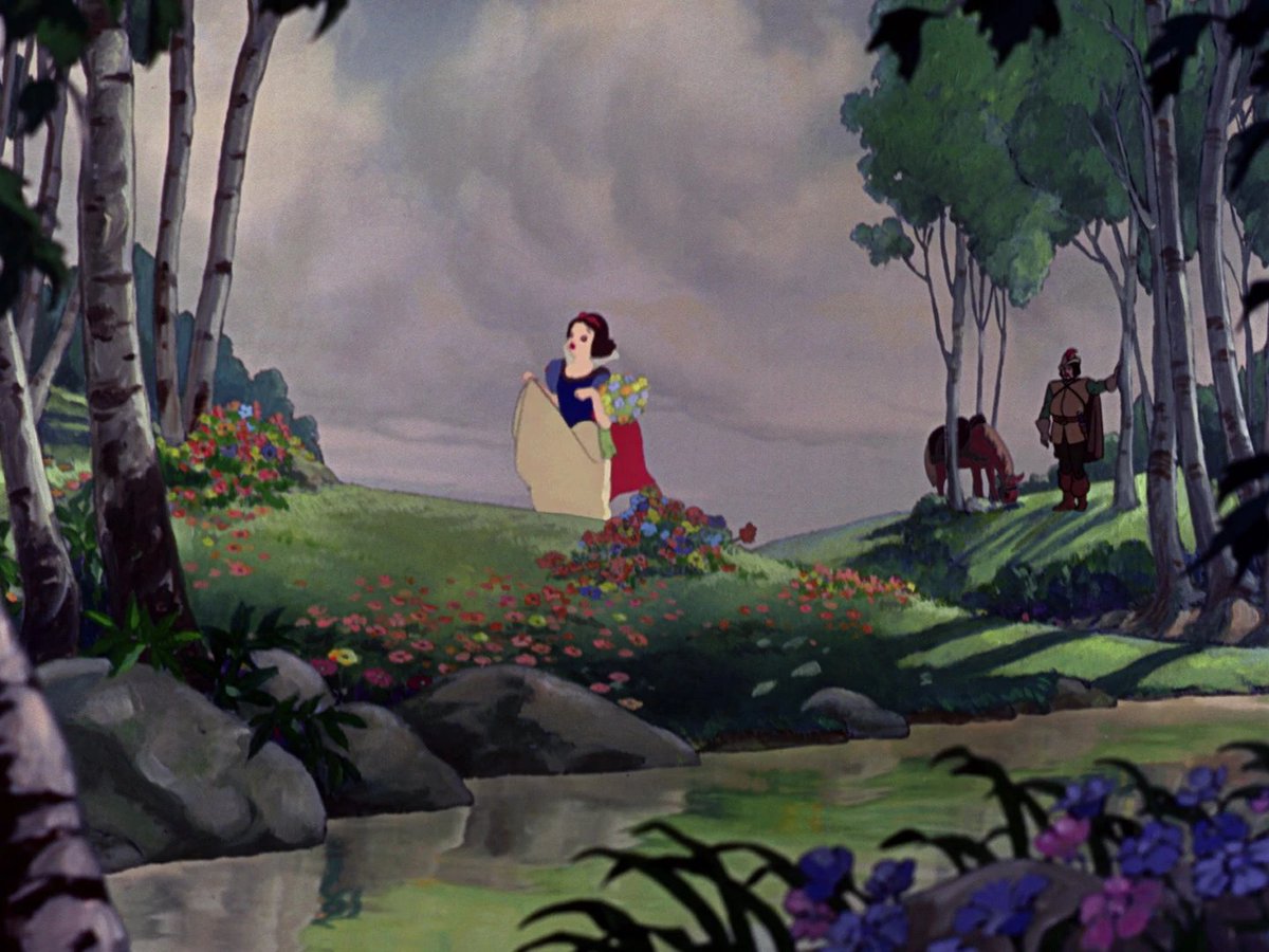
Snow White is still one of the best animated films. It not only forged feature animation but recaptured the particular dark optimism of the European fables.
I think the scene where Snow White wakes up in bed is still THE most important scene in animation history.
Why that one?
What we have to remember about animation is that it was not SELF-EVIDENT that it would stylize characters based on their personality. It could have been used (for someone less artistic, it would have been) simply to turn realistic people into animated forms.
Instead, however, Disney used animation to translate essential characteristics of personality into physical traits, which defined the art of animation forever.
When Snow White wakes up in bed, she names the dwarfs by SIGHT based on the artistic process of drawing them.
To an audience that had never seen an animated film, Snow White is teaching them how they work and how to watch them. The drawings reveal personality to the audience as they do to her.
Her ability to name them (ours to recognize the logic) is the test for animation AS a concept.
There's a reason Eisenstein (Battleship Potemkin) called Snow White the greatest film ever made. You can feel its influence on Welles, Fellini ...
"Spectacle synthesis" was the term he used. Where diffuse and concentrated feelings meet in one representation. That's Snow White.
• • •
Missing some Tweet in this thread? You can try to
force a refresh
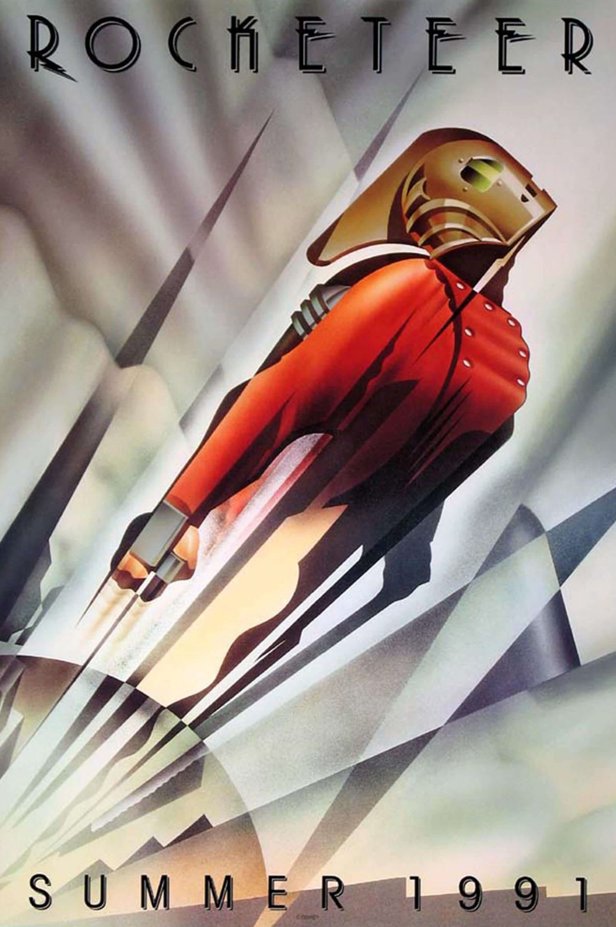
At some point, posters started forcing the head of every credited actor into the design. But what I loved about posters growing up, especially for comic book movies, was their ability to encapsulate the entire feeling of the experience in one image. It was a bottled-up vibe ...
And it may not seem important (it's just the poster), but it points to what's gone out of the experience since then. Like the posters, the films are too often concerned w/ clean, star-powered symmetry at the expense of the stylistic voice at the heart of the material.
Plus from a graphic design standpoint, the "stacked heads" format works better in a traditional medium. Other than the sheer talent of Struzan, who popularized the style, composited photos just can't match each other as well as paintings.
#FilmTwitter
Oof. The writing in Obi-Wan Kenobi has passed the point of leniency.
In Part IV (spoilers), they kill a rebel to kidnap Leia and probe her mind for the base, while letting Obi-Wan escape to lure him into saving her... and let him go.
Even discounting that a force mind probe makes A New Hope moot, this show isn't keeping track of anything. People teleport all over, they talk in crowded rooms and the writers "decide" that no one can hear them. They overlook obvious alternatives (probing the mind of the pilot).
The end of Part III is an example. How did Obi-Wan escape if Vader didn't want him to? Why would he want him to escape if he DIDN'T want him to get away on the base?
Absolutely nothing about that exchange makes sense. The writers are obsessed w/ writing their own escape hatches.
Arcs like Poe outgrowing the hot-head hero persona are good ideas, but if it was thematic that his plan was bad, Holdo's should have been great. "Releasing escape pods" is not complex enough to justify putting the audience through the runaround. That gap obscures the theme.
The same applies to Rose and Finn. A great plan executed well that still failed might have been relevant. But a comedy of errors doesn't have as clear a point since better heroes MIGHT have succeeded, which is beside the point. The themes are reverse-engineered, not demonstrated.
#FilmTwitter
Regardless of anything else, Obi-Wan Kenobi has an astonishing lack of attention to the logic of its action.
People teleport constantly for convenience, bad guys "lose" good guys even though they're RIGHT THERE, Leia outruns adults constantly. It's so distracting.
As an example of the exact opposite, Part 3 of Clone Wars (2003) is an immaculately attentive presentation of space and POV. The action never loses the audience for a SECOND.
Obi-Wan's creators seriously need to take notes. You couldn't pass a film class w/ what they're doing.
You know "out of sight, out of mind?" This is "out of frame, out of mind." Like that roof chase in Part 2. HOW did Reva lose them? The director just snapped their fingers and teleported everyone to the next scene w/ no connecting visual logic.
I rarely say this. But this is a demeaning film. Its POV is sexist in a way that makes everyone worthless. It's SO cynical. It has the rare dishonor of being a film I hate thematically far more than the actors and visuals deserve.
The reason is not just its execution, which prioritizes cheesy narration to sell every small emotional detail, falsely excusing the visuals from being as creative as they could be. That just makes it boring.
What makes it truly vile is its completely unempathetic worldview.
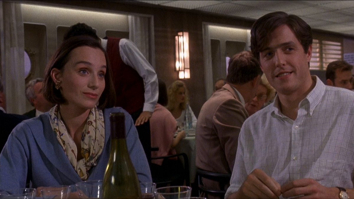
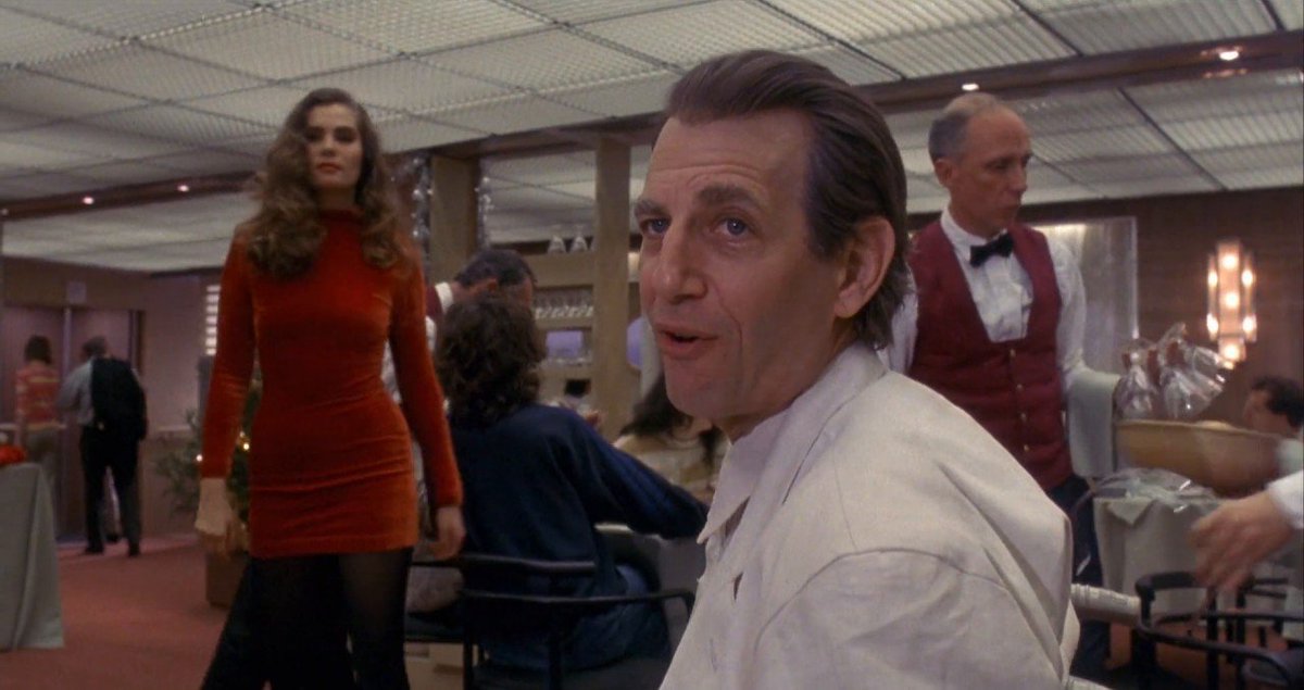
Movies that lack empathy for men are not uncommon but rarely are they this ambitious. Every male drive and desire is shown as evil in Bitter Moon, utterly condemnable. Even the capacity to love is portrayed as WEAKNESS. A man's desire to kill himself is portrayed as inevitable.
Instead of him just vanishing from the entire 2nd act and waking up after a literal nap for the ending, I would include him!
I love the idea of the Clover Organization being beaten by a normal guy, not because of his strength, but his normalness.
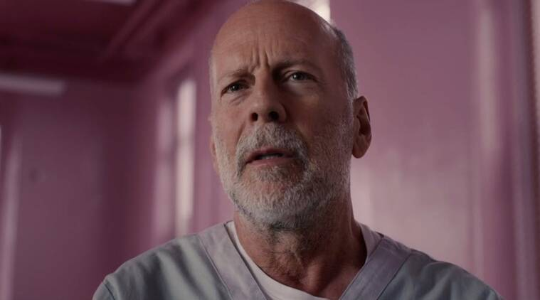
And I know M. Night craved subversion. But David does NOT seem like he's been doing this for 20 years. He and his son are shown to be PITIFULLY disorganized and unambitious if you think about it.
Their last scene together is in the hardware store! It's so painfully underwritten.