NEW: probably the most important Covid chart I’ve made
As Delta goes global, it’s a tale of two pandemics, as the heavily-vaccinated Western world talks of reopening while deaths across Africa and Asia soar to record highs
My story with @davidpilling ft.com/content/fa4f24…
As Delta goes global, it’s a tale of two pandemics, as the heavily-vaccinated Western world talks of reopening while deaths across Africa and Asia soar to record highs
My story with @davidpilling ft.com/content/fa4f24…

Here’s another version, zooming in on the last few months.
In two well-vaccinated European countries, weeks of surging cases are reflected by only a sliver of deaths.
In eight countries where very few are vaccinated, surging cases are mirrored in surging deaths as before.
In two well-vaccinated European countries, weeks of surging cases are reflected by only a sliver of deaths.
In eight countries where very few are vaccinated, surging cases are mirrored in surging deaths as before.

A grim gulf is opening up between the wealthy, mostly vaccinated world and the poorer, mostly-unprotected.
In the UK, vaccines have reduced the case-fatality rate roughly 12-fold, from ~2% to 0.16%
In Namibia, Tunisia, Malaysia and Indonesia, death rates have never been higher.
In the UK, vaccines have reduced the case-fatality rate roughly 12-fold, from ~2% to 0.16%
In Namibia, Tunisia, Malaysia and Indonesia, death rates have never been higher.
For those of us in the UK, US and Europe it’s easy to feel like the pandemic is on its way out.
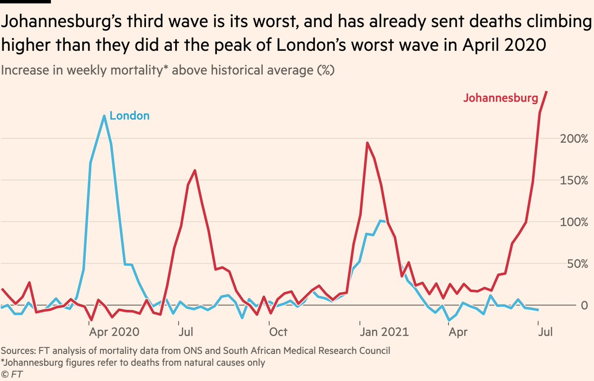
But tell that to the people of Gauteng province in South Africa (home to Johannesburg and Pretoria), where the current wave has produced more deaths than any wave before.
But tell that to the people of Gauteng province in South Africa (home to Johannesburg and Pretoria), where the current wave has produced more deaths than any wave before.

And as ever, those numbers understate the true toll.
Johannesburg alone has recorded 5,635 excess deaths from natural causes in this wave, 40% more than the official total of Covid deaths for the whole province.
Jo’burg’s current death rate is worse than London’s in April 2020.
Johannesburg alone has recorded 5,635 excess deaths from natural causes in this wave, 40% more than the official total of Covid deaths for the whole province.
Jo’burg’s current death rate is worse than London’s in April 2020.
To be clear, the Western world is not out of the woods yet either.
In England, hospital & ICU admissions are now above the level where restrictions were introduced last year and continue to rise at the same rate as in previous waves.
Tomorrow England completes its reopening 🤔
In England, hospital & ICU admissions are now above the level where restrictions were introduced last year and continue to rise at the same rate as in previous waves.
Tomorrow England completes its reopening 🤔

And that’s a country where 95% of people aged 65+ have been fully vaccinated.
In the US, far fewer elderly people are vaccinated, especially in certain states, and this could have a dramatic impact on how their Delta wave unfolds in terms of severe outcomes.
In the US, far fewer elderly people are vaccinated, especially in certain states, and this could have a dramatic impact on how their Delta wave unfolds in terms of severe outcomes.

Indeed, hospital and ICU admissions are already rising faster (in some cases much faster) in Arkansas, Florida, Mississippi, Missouri and Nevada than they did in the winter wave last year.
That’s a marked contrast to the situation in England.
That’s a marked contrast to the situation in England.

Here’s the same data plotted relative to the winter peak.
Florida and Missouri already have more Covid patients in ICU now than they did at the same stage of their winter wave. Other states are heading that way.
Florida and Missouri already have more Covid patients in ICU now than they did at the same stage of their winter wave. Other states are heading that way.

You may also have noted Catalonia (Spain) on those last two charts, another location where hospital and ICU admissions are following very similar paths to the pre-vaccine waves.
Essentially, a lot of places are finding out what happens when you reduce the risk of hospital admission per case (vaccines) but then multiply that ratio by a lot more cases (over-enthusiastic reopening with millions still unvaccinated).
The road ahead is anything but smooth.
The road ahead is anything but smooth.
It’s absolutely right that we (mostly-vaxxed countries) are having conversations about the way out of this. Endless restrictions can’t be the answer
There must be an acceptable level of risk, but what is that level? It’s not clear we’re currently below it
There must be an acceptable level of risk, but what is that level? It’s not clear we’re currently below it
https://twitter.com/rupert_pearse/status/1416289114828251138
One option could be to follow France’s lead and further incentivise vaccination for the small proportion of people who have yet to get a jab
(story from @AnnaSophieGross ft.com/content/74ebba…)
(story from @AnnaSophieGross ft.com/content/74ebba…)

Another could be to keep in place the most low-friction restrictions (e.g wearing masks in poorly ventilated indoor spaces) for an additional length of time, or during winter seasons.
Another option: requiring proof of immunity for admittance to mass indoor events.
Another option: requiring proof of immunity for admittance to mass indoor events.
Ploughing blithely on with reopening in the absence of any measures doesn’t have a great record so far.
The Netherlands rapidly u-turned on their reopening last month after cases rocketed. Catalonia has reintroduced a curfew.
The Netherlands rapidly u-turned on their reopening last month after cases rocketed. Catalonia has reintroduced a curfew.

In a sense, all eyes are now on England as a test case for whether "vaccinate all adults who want the jab, then reopen" is a blueprint for emerging relatively smoothly from the pandemic, or whether it’s promptly followed by another u-turn.
So there you have it.
As usual, please reply here or DM with any questions, feedback etc.
I’m hoping to dig more into the English data this week, and will keep tracking all of the metrics shown in the above charts.
As usual, please reply here or DM with any questions, feedback etc.
I’m hoping to dig more into the English data this week, and will keep tracking all of the metrics shown in the above charts.
(I update 20-30 Covid charts every day on the situation in the UK and abroad, but don’t usually have time to tweet them these days. If in future there’s a particular chart of mine here that you want to see an updated version of, let me know and I’ll do my best to provide it.)
• • •
Missing some Tweet in this thread? You can try to
force a refresh