A picture of SARS-CoV-2 variants in the USA.
Plotting the lineage percentages of new sequences each day over the past 6 months. Visualized using covidcg.org @CovidCg
Red = Alpha variant
Dark blue (outlined) = Delta variant
Plotting the lineage percentages of new sequences each day over the past 6 months. Visualized using covidcg.org @CovidCg
Red = Alpha variant
Dark blue (outlined) = Delta variant

@CovidCg Under the blue wave of Delta which was first detected in the USA in Feb 2021, there is a green sliver indicating the newer AY.3 sublineage of Delta.
This means that almost all of the most recent USA sequences on the GISAID database are Delta.
This means that almost all of the most recent USA sequences on the GISAID database are Delta.

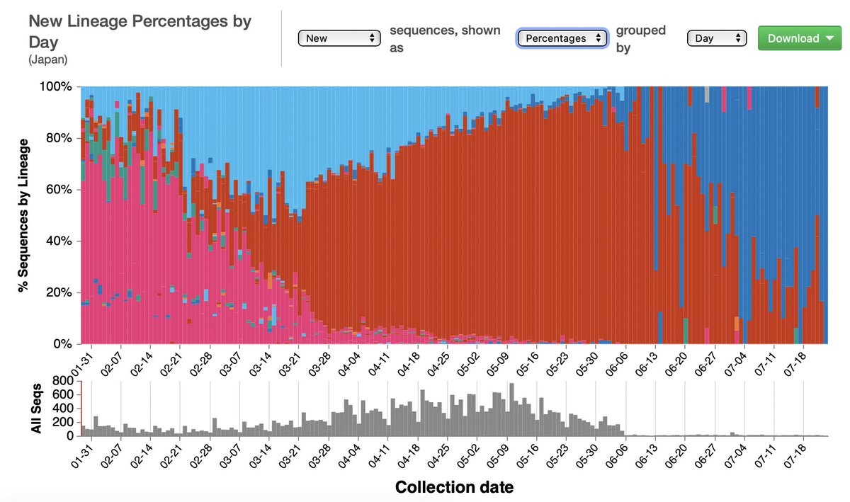
@CovidCg The same type of plot for Japan visualized on covidcg.org @CovidCg
New lineage percentages by day over the past 6 months.
Red = Alpha
Dark blue = Delta
Light blue = lineage R.1 (no greek letter)
New lineage percentages by day over the past 6 months.
Red = Alpha
Dark blue = Delta
Light blue = lineage R.1 (no greek letter)
@CovidCg Similar plots for India, same data from the past 6 months visualized two ways.
Left: new lineage % per day
Right: new lineage counts per day
Red = Alpha (B.1.1.7)
Pink = Kappa (B.1.617.1)
Dark blue = Delta (B.1.617.2)
covidcg.org @CovidCg
Left: new lineage % per day
Right: new lineage counts per day
Red = Alpha (B.1.1.7)
Pink = Kappa (B.1.617.1)
Dark blue = Delta (B.1.617.2)
covidcg.org @CovidCg


@CovidCg Plots for Singapore.
Red = Alpha; Blue = Delta
Importantly, these numbers do not reflect actual case counts in each country.
The data plotted show the sequences from each country collected and shared with the GISAID database.
Red = Alpha; Blue = Delta
Importantly, these numbers do not reflect actual case counts in each country.
The data plotted show the sequences from each country collected and shared with the GISAID database.


@CovidCg On the covidcg.org homepage you can track SARS-CoV-2 sequencing and sharing efforts by country.
Some of the countries sequencing many of their cases relative to case count are selected and shown here (dark blue bubbles).
Some of the countries sequencing many of their cases relative to case count are selected and shown here (dark blue bubbles).

@CovidCg The covidcg.org homepage also shows the rise and fall of lineages (variants) in each continent.
Right now the Delta is rising everywhere, but in South America, the Gamma (P.1) is still more prevalent.
Right now the Delta is rising everywhere, but in South America, the Gamma (P.1) is still more prevalent.

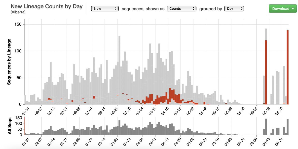
@CovidCg For Canada, due to sampling pattern, it's better imo to split it into its provinces.
Let's start with Alberta. Covidcg.org allows users to select lineages of interest. For example, Gamma is shown in blue in one plot, and Alpha is shown in red in the next plot.
Let's start with Alberta. Covidcg.org allows users to select lineages of interest. For example, Gamma is shown in blue in one plot, and Alpha is shown in red in the next plot.

@CovidCg Not sure what happened to British Columbia, Canada but the last sequences shared with GISAID were collected on May 12, 2021.
Blue = Gamma (P.1)
Red = B.1.438.1
Pink (bottom, outlined) = B.1.2
Sliver of pink in the middle = Kappa (B.1.617.1)
Blue = Gamma (P.1)
Red = B.1.438.1
Pink (bottom, outlined) = B.1.2
Sliver of pink in the middle = Kappa (B.1.617.1)

@CovidCg Ontario has a strange sampling pattern where, if this is accurate, all sample sequences shared were collected from patients on the last day of each month. The sheer number of sequences shared by Ontario each month makes it better imo to analyze each Canadian province separately.

@CovidCg Another way to compare the Canadian provinces is using the Compare Locations feature in covidcg.org
Here the new Delta % per week is plotted for each province. In other words, each point shows what % of the virus sequences are Delta that week for each province.
Here the new Delta % per week is plotted for each province. In other words, each point shows what % of the virus sequences are Delta that week for each province.

@CovidCg The same plot for the seven US states with the most sequences shared on GISAID.
The % of SARS-CoV-2 sequences that are Delta each week is steadily rising across the board.
Visualized on covidcg.org
The % of SARS-CoV-2 sequences that are Delta each week is steadily rising across the board.
Visualized on covidcg.org

@CovidCg A similar plot for the same 7 states but this time showing the % of sequences that are Alpha over the past 6 months.

@CovidCg Another plot of the % of sequences that are from the B.1.2 lineage over the past 6 months.
B.1.2 used to be quite prevalent in some US states but was overtaken by Alpha, which has now been overtaken by Delta.
B.1.2 used to be quite prevalent in some US states but was overtaken by Alpha, which has now been overtaken by Delta.
Going to stop with the rainbow plots for today.
The amazing thing is that covidcg.org @covidcg was built by and is actively maintained by only 2.5 (2 full-time, 1 part-time) brilliant & diligent individuals, leveraging data shared with GISAID.
covidcg.org/?tab=acknowled…
The amazing thing is that covidcg.org @covidcg was built by and is actively maintained by only 2.5 (2 full-time, 1 part-time) brilliant & diligent individuals, leveraging data shared with GISAID.
covidcg.org/?tab=acknowled…
@CovidCg The website's first year anniversary is coming up on Aug 26, 2021 and we'll have some super new features released by then.
For more info about this public resource, please see our @eLife publication that was released this February.
elifesciences.org/articles/63409
For more info about this public resource, please see our @eLife publication that was released this February.
elifesciences.org/articles/63409
• • •
Missing some Tweet in this thread? You can try to
force a refresh