Pulp Librarian Profile picture
Aug 6, 2021 12 tweets 4 min read Read on X
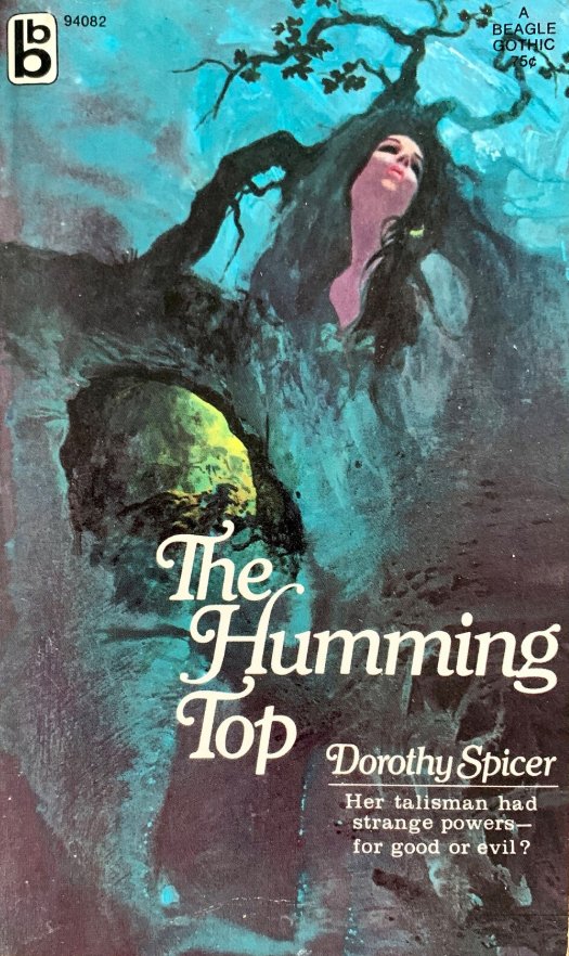
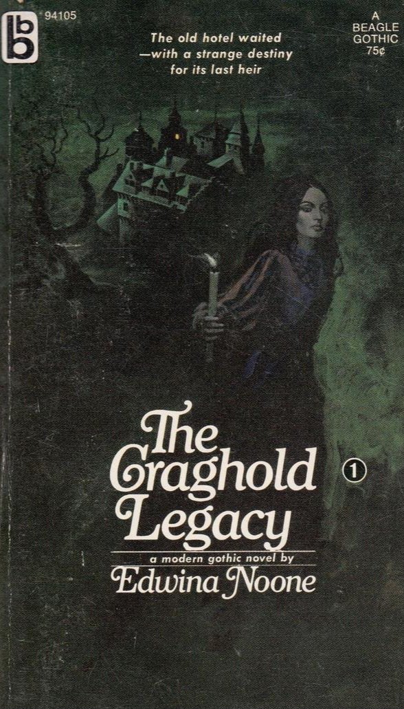
Time once again for my occasional series "Women with great hair fleeing gothic houses!"

And today it's a Queen-Sized Gothic special... Image
'Queen-Size' is a polite way of saying large print, which is a format that has a lot going for it. For a start it's much easier to read! Image
However for years the standard size for a paperback book was the dimensions of a coat pocket. Paperbacks were meant to be read on the train or bus, so they had to be compact. The US term for them was 'pocket books.' Image
Fonts were serif - normally Baskerville or Times New Roman - and sometimes as small as 10 point. Text margins were very narrow and line spacing was tight. It was a constant battle to fit readability into as small a space as possible, and it didn't suit all audiences. Image
So in 1964 Frederick Thorpe, a publisher from Leicester, began reprinting classic novels in 16 point to help older people with sight problems enjoy them. Initially the main market for these was public libraries, but they soon made their way into the world of paperbacks. Image
A larger font means a larger book, but not necessarily a longer read. So gothic romance publishers coined the phrase Queen-Sized to indicate a normal length novel that was just in a larger print. Image
Nowadays anything 14 point and over is considered large print, but size isn't the only way to improve readability: more use of white space, wider line spacing and better paper stock all help. Image
Yet it wasn't until the mid-1970s that publishers began to abandon the convention that a paperback had to fit into an overcoat pocket. Sizes gradually increased as the market for hardbacks began to reduce. You'd struggle to get most modern paperbacks into a small handbag! Image
The distinction between paperback and hardback has also become blurred over the last 40 years and one is no longer seen as superior to the other. In fact some modern paperbacks have been made deliberately bigger to suggest higher literary quality. Image
If you self-publish it's still a good idea to keep to 12 or 13 point in a serif font. Chapter headings can be sans-serif for contrast, but it's best to stick to two or three typefaces to ensure consistency. Image
Larger fonts and book sizes are one of the many ways that gothic romance influenced modern publishing. As a genre it's done a lot to change how we view the humble paperback, as well as how we market and promote it. Image
More women with great hair fleeing gothic houses another time!

Mind how you flee... Image

• • •

Missing some Tweet in this thread? You can try to force a refresh
 

Keep Current with Pulp Librarian

Pulp Librarian Profile picture

Stay in touch and get notified when new unrolls are available from this author!

Read all threads

This Thread may be Removed Anytime!

PDF

Twitter may remove this content at anytime! Save it as PDF for later use!

Try unrolling a thread yourself!

how to unroll video
  1. Follow @ThreadReaderApp to mention us!

  2. From a Twitter thread mention us with a keyword "unroll"
@threadreaderapp unroll

Practice here first or read more on our help page!

More from @PulpLibrarian

Apr 26
It was the biggest manhunt in Britain: police, the press, aeroplanes, psychics all tried to solve the disappearance. In the end nobody really knew what happened. It was a mystery without a solution.

This is the story of Agatha Christie's 11 lost days... Image
By 1926 Agatha Christie's reputation as a writer was starting to grow. Her sixth novel - The Murder of Roger Ackroyd - had been well-received and she and her husband Archie had recently concluded a world tour. But all was not well with the marriage. Image
In April 1926 Agatha Christie’s mother died. Christie was very close to her: she had been home-schooled and believed her mother was clairvoyant. The shock of her sudden death hit the author hard. Image
Read 18 tweets
Apr 23
Many readers have asked me over the years what my definition of pulp is. I've thought about it a lot, and the definition I keep coming back to... well it may surprise you.

Let me try and set it out. Image
There are lots of definitions of pulp out there: in books, in academic papers and on the web. And most circle back to the same three points: the medium, the story type and the method of writing. Image
Pulp is of course a type of cheap, coarse paper stock. Its use in magazine production from the 1890s onwards led to it becoming a shorthand term for the kind of fiction found in low cost story magazines. Image
Read 29 tweets
Apr 18
let's take a look at the extraordinary work of Victorian illustrator and cat lover Louis Wain! Image
Louis Wain was born in London in 1860. Although he is best known for his drawings of cats he started out as a Victorian press illustrator. His work is highly collectable. Image
Wain had a very difficult life; born with a cleft lip he was not allowed to attend school. His freelance drawing work supported his mother and sisters after his father died. Aged 23 he married his sisters' governess, Emily Richardson, 10 years his senior. Image
Read 13 tweets
Apr 15
Over the years a number of people have asked me if I have a favourite pulp film. Well I do. It's this one.

This is the story of Alphaville...
Alphaville: une étrange aventure de Lemmy Caution (1965) was Jean-Luc Godard’s ninth feature film. A heady mix of spy noir, science fiction and the Nouvelle Vague at its heart is a poetic conflict between a hard-boiled secret agent and a supercomputer’s brave new world. Image
British writer Peter Cheyney had created the fictitious American investigator Lemmy Caution in 1936. As well as appearing in 10 novels Caution featured in over a dozen post-war French films, mostly played by singer Eddie Constantine whom Godard was keen to work with. Image
Read 21 tweets
Apr 10
Al Hartley may have been famous for his work on Archie Comics, but in the 1970s he was drawn to a very different scene: God.

Today in pulp I look back at Hartley's work for Spire Christian Comics - a publisher that set out to spread the groovy gospel... Image
Spire Christian Comics was an offshoot of Spire Books, a mass-market religious paperback line launched in 1963 by the Fleming H. Revell company. The point of Spire Books was to get religious novels into secular stores, so a move into comic books in 1972 seemed a logical choice. Image
The idea was to create comic book versions of popular Spire Books like The Cross and the Switchblade; David Wilkinson's autobiographical tale of being a pastor in 1960s New York. It had already been turned into a film, but who could make it into a comic? Image
Read 14 tweets
Apr 4
Given the state of the stock market I thought I'd share my pulp guide to money. What is it? Where does it come from? And does it make us happy?

Let's take a look...
Money is just a token, like a football sticker. In itself it has no intrinsic worth. However it is desirable because, well, football!

Initially the value of all stickers is the same, because there's an abundant supply... Image
However as you fill up your sticker album the value of your existing stickers drops and the value of your missing ones rises.

This is due to scarcity: the law of supply and demand starts to determine worth and value, rather than which team you support. Image
Read 19 tweets

Did Thread Reader help you today?

Support us! We are indie developers!


This site is made by just two indie developers on a laptop doing marketing, support and development! Read more about the story.

Become a Premium Member ($3/month or $30/year) and get exclusive features!

Become Premium

Don't want to be a Premium member but still want to support us?

Make a small donation by buying us coffee ($5) or help with server cost ($10)

Donate via Paypal

Or Donate anonymously using crypto!

Ethereum

0xfe58350B80634f60Fa6Dc149a72b4DFbc17D341E copy

Bitcoin

3ATGMxNzCUFzxpMCHL5sWSt4DVtS8UqXpi copy

Thank you for your support!

Follow Us!

:(