Georgii and Vladimir Stenberg were graphic designers from Moscow who produced a range of amazing constructivist film posters during the 1920s.
Let's look at some of their work...
Let's look at some of their work...

Vladimir and Georgii Stenberg were born in Moscow in 1899 and 1900 respectively. Their father was a Swedish artist who encouraged their interest in both painting and graphic design.
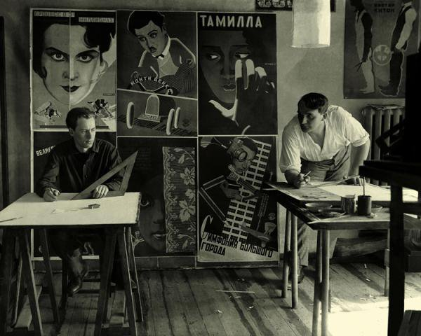
The Stenberg brothers were students at the Stroganov School of Applied Art when they first started to design posters. They founded the Society of Young Artists in 1919 and held their own constructivist art exhibition in 1922.

Visual arts were strongly supported in the early Soviet Union. Russia had a 60% illiteracy rate in the 1920s, so films and posters were widely used for mass communication.

The Stenberg bothers produced over 300 movie posters from 1923 until Georgii's death in 1933. They covered both Russian cinema and Hollywood imports.

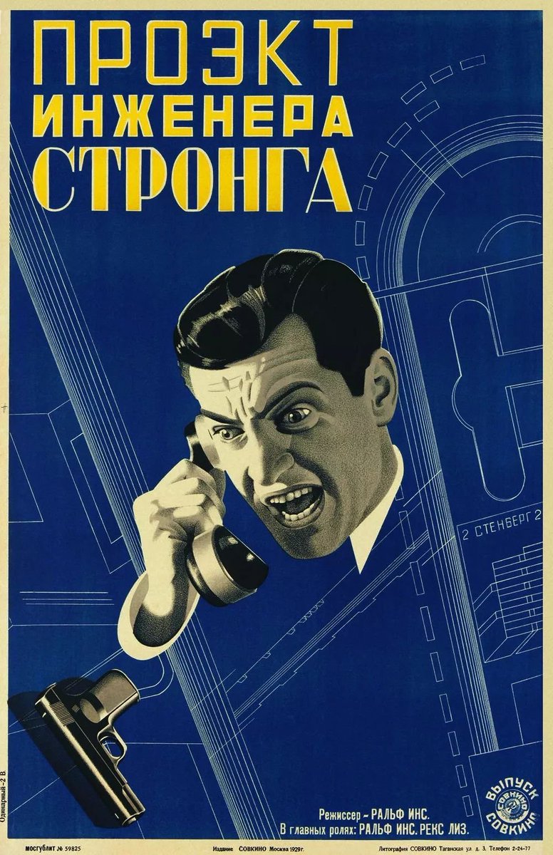
Constructivism tries to make the audience an active viewer of the artwork; the Stenberg brothers used a playful mix of forced perspective, implied movement, expressive typography and bold colour to achieve this.

However their work wasn't pure constructivism; many avant garde influences - along with an expert knowledge of how film worked - helped create a unique approach to poster design.

As well as cinema posters the Stenberg brothers worked on magazine posters, set design and sculpture.

Much of what we take for granted in graphic design today was either pioneered by Georgii and Vladimir Stenberg or was shaped into effective and striking poster work.

It's both amazing and instructive to see the way the Stenberg brothers reinterpreted the Hollywood films for a Soviet audience: Buster Keaton and Mary Pickford were both given the constructivist treatment.


The Stenberg brothers understood the fundamental truth of poster design: no matter how clever or complex you may want to be, you only have a fleeting second to get across the emotion and the action of what you want to say.
Georgii and Vladimir Stenberg's work is as striking and captivating today as it was in the 1920s: bold, witty and direct. You can read more about them here: moma.org/interactives/e…
More posters another time...
More posters another time...

• • •
Missing some Tweet in this thread? You can try to
force a refresh