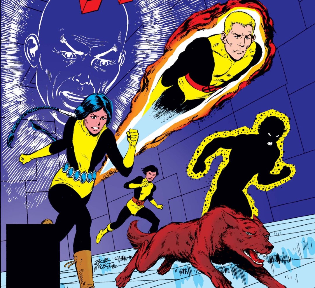
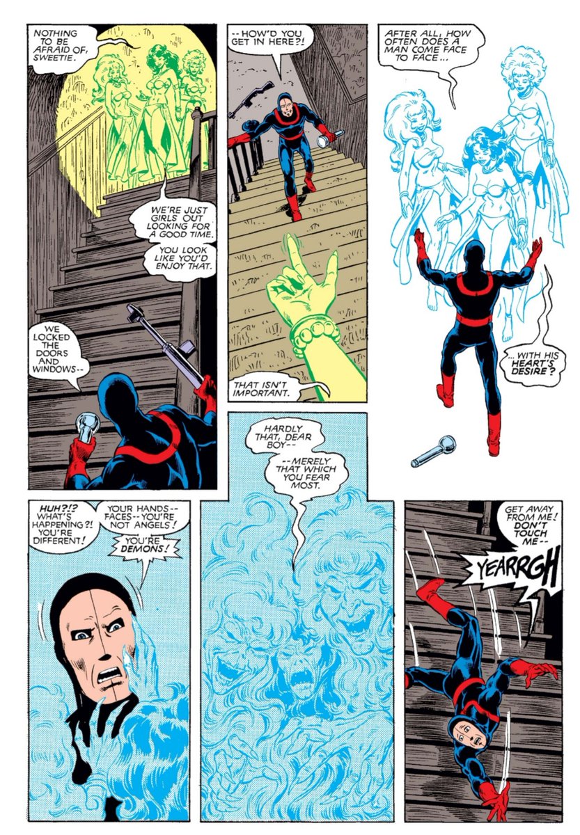
The visual dynamism of any given comic is usually ascribed to the talent of the immediate visual team, but having something dynamic to draw is sort of step 1 and, in that light, Bob McLeod’s designs for the New Mutants are genuinely remarkable. #xmen#newmutants 1/7
With Cannonball, McLeod made the decision to have his legs literally disappear when he’s blasting (by which I obviously mean blastin’). It’s a simple, but very surreal choice that establishes through visual metaphor the synergy between Sam’s body and his eruptions. 2/7
Dani’s power doesn’t always have a consistent visual language, but the concept of it is carte-blanche for nightmarish horror images in which someone’s worst fear can be sprawled across the panel to dramatic effect whenever needed. 3/7
Wolfsbane’s power is a sort of tried and true one (especially in the comics medium which has a rich werewolf history) thus allowing illustrators to tap into the infinite lexicon of werewolf imagery that’s out there in order to create dramatic and primal representations. 4/7
Sunspot is ingenius – a simple silhouette with visible eyes and (usually) surrounding Kirby crackle (aka Kirby dots). It’s elegantly simple, visually efficient, and conveys a sense of mystery, power, and a sort of visual absence that is deeply compelling. 5/7
This tradition in New Mutants would continue with other creations and other creators, including Warlock, Illyana’s Darkchylde iterations, Magma (co-created by McLeod and Sal Buscema) and, of course, Cable. 6/7
The point is just that McLeod’s character designs gave him and others a whole lot to work with on the visual level, setting the stage for future visual artists to make or enhance their fame while working on the title, whilst also making the stories themselves more interesting 7/7
• • •
Missing some Tweet in this thread? You can try to
force a refresh
In the Classic X-Men #2 backup story "First Friends" Claremont finally fills in one of the most notorious gaps in his own X-Men continuity: the initial cultivation of Ororo’s friendship with Jean. #xmen 1/8
In the story that unfolds, Jean has invited Ororo alone to a social gathering at her Manhattan loft. Her logic is “There are so many guys in the X-Men, we gals have to stick together” thus establishing an intentional construction of a sororal community. 2/8
From there Claremont falls into some of his familiar interpretations of feminine bonding: being naked in front of each other, wearing each other’s clothes, and going shopping together. This isn’t to say these things can’t work, of course, just that he does this a lot. 3/8
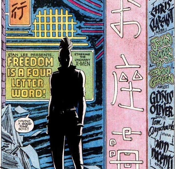
Arguably the most poignant costume transformation in UXM is that of Storm’s embrace of a costume that signifies the punk subculture (or counterculture) and digging a bit deeper into what it represents can illuminate the full significance of that shift on her character. 1/8 #xmen
The punk movement is often badly misunderstood in the popular zeitgeist. It isn’t about wrecking, it’s about resisting. Even the concept of anarchism contains a number of beautiful ideals at its core, including an enhanced commitment to community and love. 2/8
Claremont shows complete awareness of the significance of Ororo’s transformation in the form of Kitty’s reaction, which surfaces the same misconceptions about what punk fashion represents. Kitty comes around, though, and so too does the reader. 3/8
The Cross-Time Caper is easily the most famous story arc from Claremont’s Excalibur, but it’s also a misnomer. Rather than ‘time’ (or even dimensions) the caper is actually built around a tour of famous fictional settings. 1/7 #xmen #excalibur @GoshGollyWow
The story begins with a dive into a world of Arthurian Romance in the spirit of Thomas Mallory’s “Le Morte D’Arthur” or T.H. White’s “The Once and Future King.” This initial foray sets the tone for juxtaposing Excalibur with a different fictional universe. 2/7
From there, the team lands into a metatextual alternate version of the Marvel Comics Universe itself; After that they find themselves in Edgar Rice Burroughs’ John Carter of Mars; after that: a Manga universe with direct connections to Dirty Pair and Speed Racer. 3/7
Though Jim Lee gets most of the credit for the 1990s X-Men aesthetic, Scott Williams’ inks played an immeasurable role in taking Lee’s line art from house style to the forefront of comics illustration thanks to harmonious collaboration. #xmen 1/10
In a recent interview with Syfywire, legendary inker Scott Williams talks about some of the misconceptions surrounding what inkers actually do and about how his 30 year partnership with Jim Lee in particular has thrived on mutual influence. 2/10
Williams immediately dispels the tragic misconception that inkers are tracers, describing a much stronger artistic contribution: "There are a lot of times where deadline strikes and the penciler is not able to give all the information within a given page that is required.” 3/10
UXM 261 feels more or less like a backdoor pilot for “Hardcase and the Harriers” but it also features some strong initial character development of Jubilee, defining the complex dualities and opposing extremes that readers identify with in Jubilation. #xmen #Jubilee 1/10
The issue opens with Jubilee expressing her frustration at the Southeast-Asian cuisine she’s exposed to in contrast to her abiding love for American junk food (something Wolverine provides, thus showcasing his bond with her). 2/10
Though a small and simple bit, the scene dramatizes Jubilee’s representational complexity as an Asian-American. This is actually important for a series that, since GSXM #1, was built around characters embodying essentialist national types. 3/10
At the time of Colossus’s 1975 debut, America was embroiled in “The Cold War” with the USSR, a war that was often fought through media propaganda. Though Piotr was built around familiar US symbols of Soviet people, Claremont developed him away from type. #xmen 1/8
Steel and agriculture were dominant symbols of the USSR at the time (seen on their flag), so a farm-boy who turns to living steel is right in-line with type from the get-go. His costume also features the colours of the Soviet flag and he espouses communist philosophy. 2/8
In “Asymmetric Warfare: The Vision of the Enemy in American and Soviet Cold War Cinemas,” Andrey Shcherbenok establishes US mass culture’s tendency to portray Soviet persons in media as homogenized, generic enemies, overdetermined by their hate of America. 3/8