NEW: there’s been a lot of chatter about why cases, hospitalisations and deaths are much higher in the UK than elsewhere in Western Europe.
I think a lot of the commentary has been overly simplistic, politicised and at-times flat-out wrong.
Let’s see if we can do better:
I think a lot of the commentary has been overly simplistic, politicised and at-times flat-out wrong.
Let’s see if we can do better:
Yesterday we published a story comparing the situation in the UK vs a selection of Western Europe peers: ft.com/content/345825…
Here are the top-line stats:
• Cases among older people are 7x higher in UK
• Hospital admissions are 6x higher
• Deaths are 3x higher
Not great!
Here are the top-line stats:
• Cases among older people are 7x higher in UK
• Hospital admissions are 6x higher
• Deaths are 3x higher
Not great!

Why so much higher in UK?
Here’s a look at what those countries are doing differently to reduce transmission:
• % of people never wearing masks has rocketed in UK but stayed very low elsewhere
• % of people attending large gatherings in UK is surging way ahead of elsewhere
Here’s a look at what those countries are doing differently to reduce transmission:
• % of people never wearing masks has rocketed in UK but stayed very low elsewhere
• % of people attending large gatherings in UK is surging way ahead of elsewhere

Important: this is not about blaming individuals, it’s showing how measures/guidance differ from country to country.
Masks are no longer required in indoor spaces in England. But they are in Western Europe, which also still has some curfews and has cancelled some mass events.
Masks are no longer required in indoor spaces in England. But they are in Western Europe, which also still has some curfews and has cancelled some mass events.
Now, lots of people looked at those charts and said:
"Aha, so clearly if masks were still required in England, everything would be fine. Masks are still required in Scotland. So the UK’s bad Covid numbers are the English government’s fault. Simples."
Well, let’s dig deeper:
"Aha, so clearly if masks were still required in England, everything would be fine. Masks are still required in Scotland. So the UK’s bad Covid numbers are the English government’s fault. Simples."
Well, let’s dig deeper:
Here’s that first set of charts again, but this time separating out England and Scotland:
• Elderly case rates have been much higher in Scotland
• Admissions much higher too, and stuck there for now
• Deaths also a lot higher
So if anything, Scotland seems to be faring worse
• Elderly case rates have been much higher in Scotland
• Admissions much higher too, and stuck there for now
• Deaths also a lot higher
So if anything, Scotland seems to be faring worse

And here’s the second set of charts, again separating Eng + Scot:
• It’s true: Scottish government’s mask guidance means no-masking remains much less common there 😷👍
• But when it comes to mixing in large groups and crowded spaces, Eng & Scot are almost exactly the same
• It’s true: Scottish government’s mask guidance means no-masking remains much less common there 😷👍
• But when it comes to mixing in large groups and crowded spaces, Eng & Scot are almost exactly the same

So straight away, we see that of the two behavioural factors, [indoor] mixing is more likely to be playing a big role.
Masks are great! But if you’re encouraging (or at least not discouraging) lots of big, crowded indoor mixing, you’ll get more transmission, masks or no masks.
Masks are great! But if you’re encouraging (or at least not discouraging) lots of big, crowded indoor mixing, you’ll get more transmission, masks or no masks.
To be clear, we know masks reduce transmission (I really shouldn’t have to say this), and requiring them in crowded indoor spaces is a very low-cost policy. In my view the English government should do it, at least over winter
https://twitter.com/lymanstoneky/status/1433049848153092097
But just because masks are the most visible thing and the most easy for identifying "bad people" to make ourselves feel a little better, they’re not the only factor or even the most important.
And indeed, some things we’ve not discussed yet may be *much* more important:
And indeed, some things we’ve not discussed yet may be *much* more important:
First and foremost, vaccines. And more specifically, the timing thereof.
The UK took an early lead on vaccine rollout in Europe. This was good! But now it might not be...
The UK took an early lead on vaccine rollout in Europe. This was good! But now it might not be...
Let’s remind ourselves what we know about waning immunity.
After around 5 months, you start to observe some waning of protection against severe disease. Especially in a) people who had AZ, b) people with underlying conditions
After around 5 months, you start to observe some waning of protection against severe disease. Especially in a) people who had AZ, b) people with underlying conditions
https://twitter.com/jburnmurdoch/status/1438100728623546373
(and remember, the best way to think about this is not
"well efficacy only wanes from 96% to 92%, that’s hardly any drop-off"
it’s
"ah, instead of having 4% as much risk, it’s now 8%. chance of a breakthrough has doubled")
"well efficacy only wanes from 96% to 92%, that’s hardly any drop-off"
it’s
"ah, instead of having 4% as much risk, it’s now 8%. chance of a breakthrough has doubled")
Well, what if I told you that while around 35% of older people in Italy & France are 5 months since 2nd jab, *75%* are at that point in UK.
Of course it’s not as simple as a binary +/- 5 month split, but in short, waning is a more immediate problem for UK than rest of Europe
Of course it’s not as simple as a binary +/- 5 month split, but in short, waning is a more immediate problem for UK than rest of Europe

And we really shouldn’t be surprised by this. In July we saw cases in Israel among double-vaxxed rise at the same rate as unvaxxed, and severe cases climb too.
Israel was about 3 months ahead of UK in vax rollout, and we’re now about 3 months on from July.
Israel was about 3 months ahead of UK in vax rollout, and we’re now about 3 months on from July.

(plus the UK’s waning problem could also be exacerbated by its greater use of AstraZeneca, since most studies suggest it may wane slightly faster than Pfizer)
All of this means that nailing booster rollout in the UK is especially critical. And this is certainly something the UK’s governments have full control over. So how does it look?
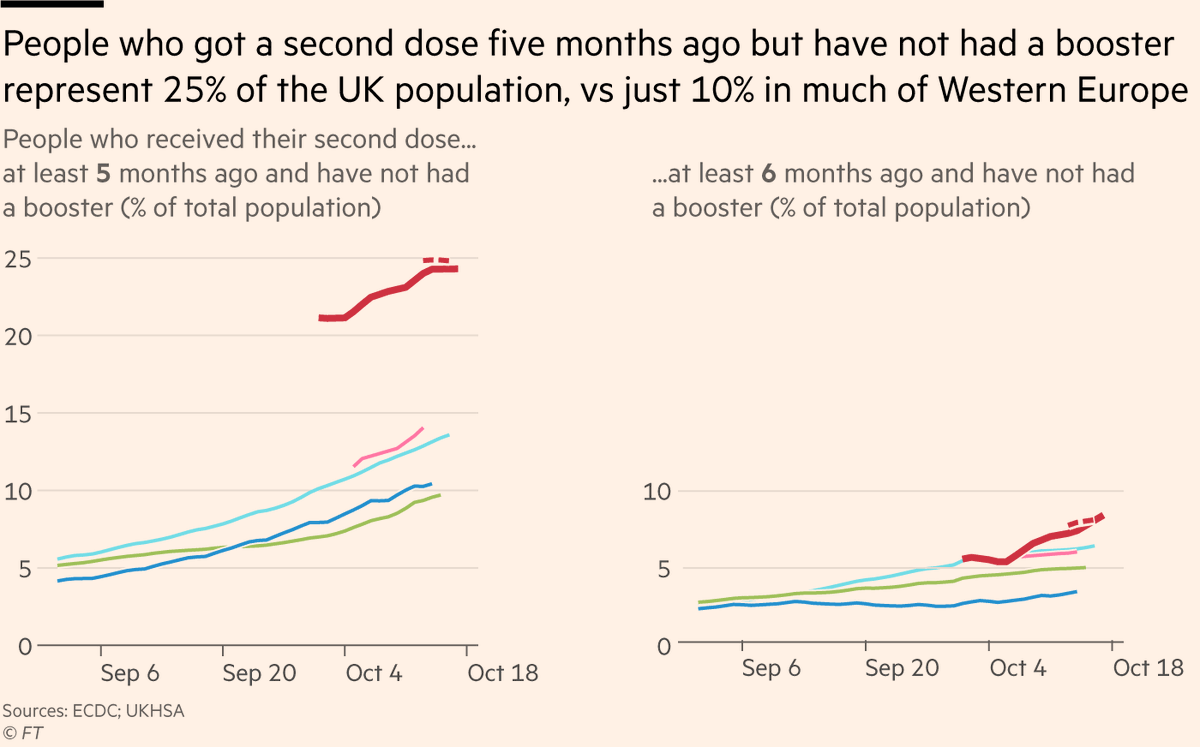
Not good. A far higher share of the UK population is in the "waning but not yet boosted" bracket.
Not good. A far higher share of the UK population is in the "waning but not yet boosted" bracket.

I’m showing both 5 and 6 month versions because waning happens over a range of time, not overnight at x months. But whichever version you look at, UK has ~2x as many people in the "uh-oh" range as rest of Western Europe. UK needs to boost faster and earlier, and it isn’t.
So I hope we can now see that:
• Yes, mask-wearing has plummeted in England and reversing that would help
• But higher rates of crowded indoor mixing are likely a bigger issue
• And both are almost certainly dwarfed by UK’s much more acute waning problem (as seen in Israel)
• Yes, mask-wearing has plummeted in England and reversing that would help
• But higher rates of crowded indoor mixing are likely a bigger issue
• And both are almost certainly dwarfed by UK’s much more acute waning problem (as seen in Israel)
Oh, and two brief related additions as a reminder that we shouldn’t forget about structural issues either:
UK has far worse sick pay than other Western European countries, making it much harder for people who do get sick to stay home and protect others
UK has far worse sick pay than other Western European countries, making it much harder for people who do get sick to stay home and protect others
https://twitter.com/sarahoconnor_/status/1321142964723290115
Older people are far more likely to be in poverty in the UK than elsewhere, which can increase their risk of both catching and dying from the disease. 

Couple more bits based on common feedback:
• UK — and in particular England — late vaccination of children definitely a factor too (we addressed this in the story FWIW). Not so much because of direct risk to kids, but kids spread to older groups ft.com/content/345825…
• UK — and in particular England — late vaccination of children definitely a factor too (we addressed this in the story FWIW). Not so much because of direct risk to kids, but kids spread to older groups ft.com/content/345825…

• Some saying weather/climate could be a factor if it leads to more time indoors in UK (and esp Scotland) than FR/ES/DE/IT. Agreed.
• ...and to pre-empt the "if it’s weather/climate, then why no surge in Nordics?"
a) I don’t know
b) but my guess would be that the same structural factors that have kept most of the Nordics relatively low-Covid for 18 months are still doing their thing
a) I don’t know
b) but my guess would be that the same structural factors that have kept most of the Nordics relatively low-Covid for 18 months are still doing their thing
• • •
Missing some Tweet in this thread? You can try to
force a refresh


