A straight up contrast shootout!
On the left, the existing WCAG 2.x 1.4.3
On the right, the challenger, WCAG 3's APCA
IN THIS TEST: Body text, headlines, and non-text (buttons). Which do you find more readable?
(Note: on the left is WCAG 2 at AA or better, but it fails APCA)
On the left, the existing WCAG 2.x 1.4.3
On the right, the challenger, WCAG 3's APCA
IN THIS TEST: Body text, headlines, and non-text (buttons). Which do you find more readable?
(Note: on the left is WCAG 2 at AA or better, but it fails APCA)

Some questions asked recently: How about CVD (color impaired)? How about about 3 way color? 3 way usually involved a button, text on the button, and body text on the page. 1.4.3 tried to fit a center grey (nope!) APCA is perceptually accurate, allowing full body text contrast..+
-...while still allowing intermediate contrasts for larger shapes like buttons with spatial frequency based contrast easing, giving designers more and truer flexibility AND vastly improving readability.
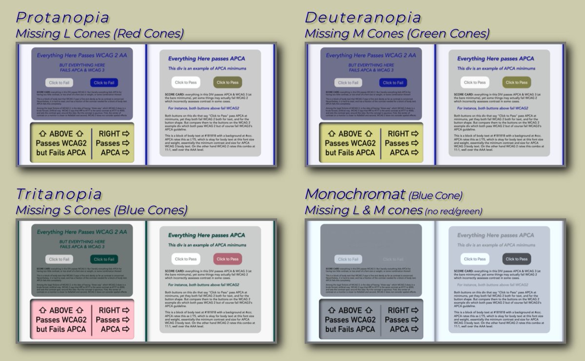
As for CVD? Look at the above example after processing in the CVD sim:
As for CVD? Look at the above example after processing in the CVD sim:

@threadreaderapp unroll
• • •
Missing some Tweet in this thread? You can try to
force a refresh


