Jay Alto Profile picture
Oct 29, 2021 10 tweets 3 min read
MrBeast said he would spend $10,000 to create the perfect thumbnail...

While that isn't possible for most, it's not the only reason his thumbnails are the best around.

Here are 6 tips from @MrBeast himself... (thread) Image
1/ "If people don't click, they don't watch"

You probably knew this already but thumbnails are critical. It's the major reason why people click on your video...

Give them the time they deserve.
2/ "Thumbnails set the expectation for the video"

They can only ever be as good as your video idea. Overpromise and your AVD will pay.

3/ Don't waste space.

Thumbnails are small, use every bit of space you have. Image
4/ Prioritise Elements.

Work out the main part of your thumbnail and make sure it's the focus. What's most interesting to your viewer?

(he also reiterates to not waste space and leverage faces) Image
5/ Preview.

MrBeast uses a Youtube homepage mockup to test how thumbnails will be seen by viewers (both desktop and mobile).

This is a great way to make sure your thumbnail will work. It's always smaller than you think... Image
6/ Switch thumbnails

Even with everything that goes into a thumbnail...

"Typically, we like to create two to three versions of a thumbnail so that if a video doesn't do so well we can swap it out"

Be patient but don't be afraid to switch your thumbnail if it isn't working.
Now go and start making thumbnails like @MrBeast and...

One person who retweets the top tweet will get a free thumbnail strategy call with me!
And while we’re here #TeamSeas is an excellent cause 🌊
Thanks to @KaiGTweets for the retweet, the strategy call is yours!

DM me and let's chat thumbnails (and anything else).

• • •

Missing some Tweet in this thread? You can try to force a refresh
 

Keep Current with Jay Alto

Jay Alto Profile picture

Stay in touch and get notified when new unrolls are available from this author!

Read all threads

This Thread may be Removed Anytime!

PDF

Twitter may remove this content at anytime! Save it as PDF for later use!

Try unrolling a thread yourself!

how to unroll video
  1. Follow @ThreadReaderApp to mention us!

  2. From a Twitter thread mention us with a keyword "unroll"
@threadreaderapp unroll

Practice here first or read more on our help page!

More from @theJayAlto

Apr 7
Clickbait.

While the blatant clickbait from a few years ago has gone

There's a new type of 'clickbait'...

And it's actually very effective.

Here are 4 ways top YouTubers are doing it perfectly... (thread) Image
Exaggerate don’t misrepresent

Exaggerating situations creates more tension and curiosity

and therefore, increases the likelihood of getting the click.

BUT...

Too much will eventually start to misrepresent your idea.

🔲 Keep the actual content in mind and don't sway too far Image
Exaggerate AND overdeliver

Some thumbnails misrepresent certain situations in the video.

But if the content as a whole overdelivers on the expectations...

Viewers tend to be satisfied.

🔲 Create content that overdelivers on expectations Image
Read 8 tweets
Mar 31
4 reasons this thumbnail is an absolute banger... (thread) Image
Text

While it breaks ‘traditional rules’
• 6 words
• Light font
• Lower case

It still works. Why?

• Repetition makes it simple and easy to read
• White font contrasts against the background making it clear

It's also a unique style that is quite refreshing... Image
Simplicity

Ryan is a master at making simple thumbnails...

And this one is no different.

Ryan works out how to effectively visually represent his idea

And makes that the focus of the thumbnail with no distractions. Image
Read 6 tweets
Mar 28
WAIT! STOP SCROLLING...

Good thumbnails MUST get your viewer's attention...

If they don’t, the viewer won’t even know your video exists.

But how?

Here are 6 ways... (thread)
But first, where did these tactics come from?

Thumbnails are just adverts for your video

And there is a tonne of research on advertising.

These tactics are from a study looking at consumers’ attention to advertisements...
1/ Human Figures

In environments full of distractions (other videos, ads etc)

Human figures are a great way to attract a viewer's attention

🔲 Our attention is drawn to humans above most other things
Read 11 tweets
Mar 17
What do all of these thumbnails have in common?

They're all designed by @venturepsd

I got to ask him 4 questions about making better thumbnails.

And he didn't disappoint... (thread)
How did you learn how to design thumbnails?

I’m entirely self-taught.

Specific thumbnail tutorials on Youtube are pretty rare.

In the end, I learned by doing.

I've been fascinated by design since I was 13.

I made 1000s of rubbish designs before they started to look good.
What design tips would you give to creators?

LAYOUT:
🔲 Work out a good layout before you start
🔲 Think about your target audience and why they would click

ASSETS:
🔲 Take photos that are as interesting/exaggerated as possible
🔲 Spending time taking unique photos pays off
Read 9 tweets
Mar 14
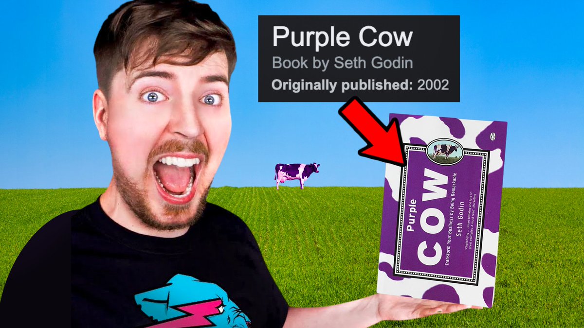
What can a marketing book from 2002 teach you about Youtube?

A lot.

While its fundamentals are applied to business...

It’s incredibly relevant to Youtube

And a lot of the top creators are using it... (thread) Image
The idea for the book came when the author was in France

Where the novelty of fields of cows soon became boring.

He then imagined seeing a purple cow...

Which would definitely get his attention.

He drew comparisons to business

But they can also be applied to Youtube... Image
Think Different:

"Making another brown cow like all the others won’t get you noticed. You need a Purple Cow, something remarkable and exciting, to get the attention."

Youtube:

Making content like everyone else won't get you noticed.

It needs to be remarkable. Image
Read 10 tweets
Mar 10
So, @airrack. The man who grew 1 million subscribers in a year

And now averages over 6 million views a video.

How? His thumbnails.

Here are 6 things you can learn from his thumbnails... (thread) Image
Simplicity:

His thumbnails are always clear and concise.

Most are single images only adding more elements when needed

You can understand the video idea and want to click at a glance.

👉 Make it extremely easy for viewers to understand your video Image
Mid action:

The majority of his thumbnails are mid-action shots.

They capture a single moment of tension related to the video.

Helps build trust with the viewer (sneak peek into the video)
+
Gives them a reason to click so the thumbnail can ‘play out’ Image
Read 9 tweets

Did Thread Reader help you today?

Support us! We are indie developers!


This site is made by just two indie developers on a laptop doing marketing, support and development! Read more about the story.

Become a Premium Member ($3/month or $30/year) and get exclusive features!

Become Premium

Don't want to be a Premium member but still want to support us?

Make a small donation by buying us coffee ($5) or help with server cost ($10)

Donate via Paypal

Or Donate anonymously using crypto!

Ethereum

0xfe58350B80634f60Fa6Dc149a72b4DFbc17D341E copy

Bitcoin

3ATGMxNzCUFzxpMCHL5sWSt4DVtS8UqXpi copy

Thank you for your support!

Follow Us on Twitter!

:(