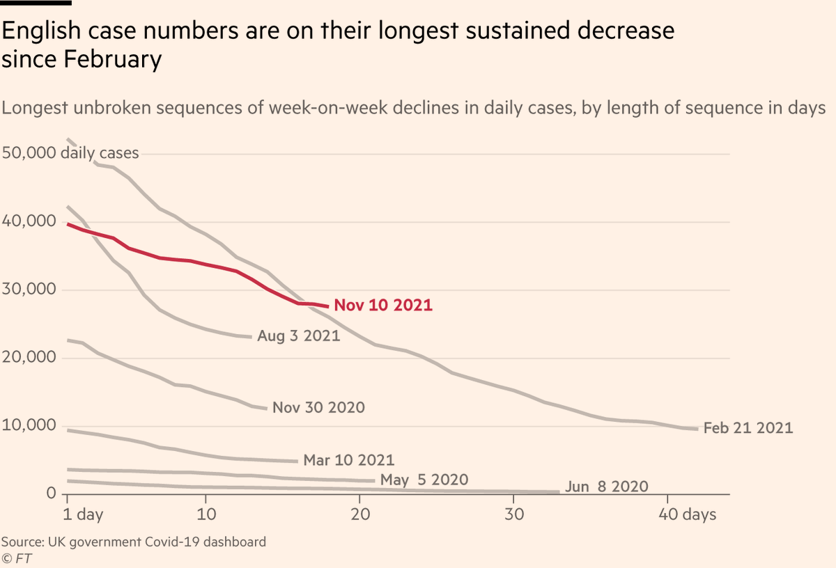
NEW: England has recorded 18 successive days of week-on-week declines in cases, its longest sequence of declines since February, suggesting its autumn/winter wave may have peaked ft.com/content/e11add… 
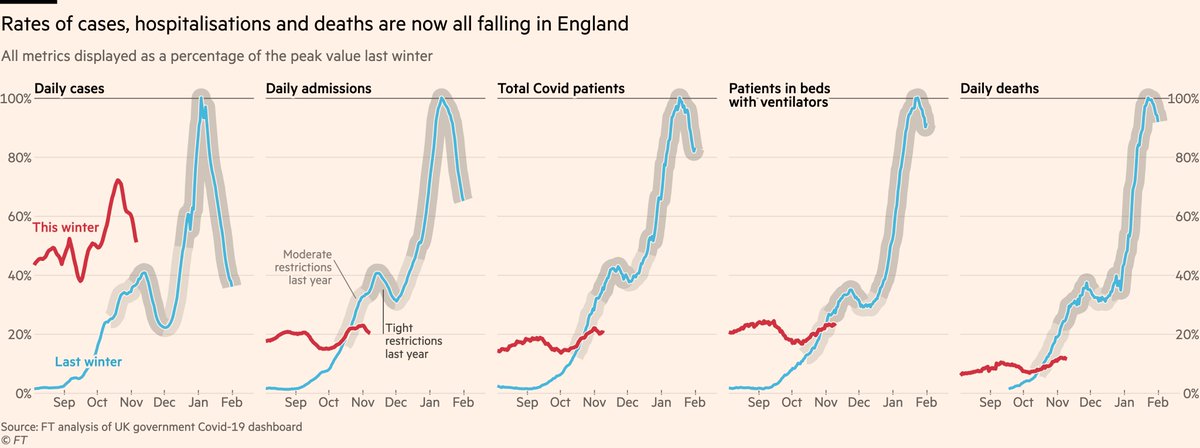
Crucially, hospital admissions, patient numbers and deaths are now also trending downwards, as the fall in case numbers has shifted from being youth-driven into all age groups.
These acute indicators look to be topping out at 10-20% of last winter’s peak levels.
These acute indicators look to be topping out at 10-20% of last winter’s peak levels.
A key factor here has been England’s booster rollout.
Antibody levels in the oldest groups (vaccinated the earliest) had been slowly eroding as the months passed, but in the last 5 weeks they have shot back up as third doses have gone into arms 💉💉💉💪💪💪
Antibody levels in the oldest groups (vaccinated the earliest) had been slowly eroding as the months passed, but in the last 5 weeks they have shot back up as third doses have gone into arms 💉💉💉💪💪💪

The result is that rates in England are now falling fastest for the elderly. This is true both for cases...
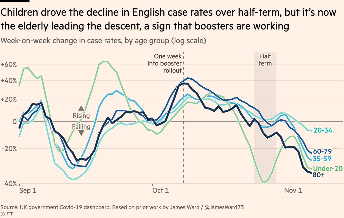
...and for hospital admissions.
Of course, this data is noisy and there are many factors that could explain why rates may fall faster or slower among one group than another, but the combination of third doses, antibodies, cases and admissions paint a persuasive picture.
Of course, this data is noisy and there are many factors that could explain why rates may fall faster or slower among one group than another, but the combination of third doses, antibodies, cases and admissions paint a persuasive picture.

So the situation in England looks promising. What of the rest of Europe?
No country is avoiding the winter wave, with cases climbing right across western Europe, and acute metrics following suit. Several now exceed UK’s peak cases & ICU patients, and may soon exceed on deaths.
No country is avoiding the winter wave, with cases climbing right across western Europe, and acute metrics following suit. Several now exceed UK’s peak cases & ICU patients, and may soon exceed on deaths.
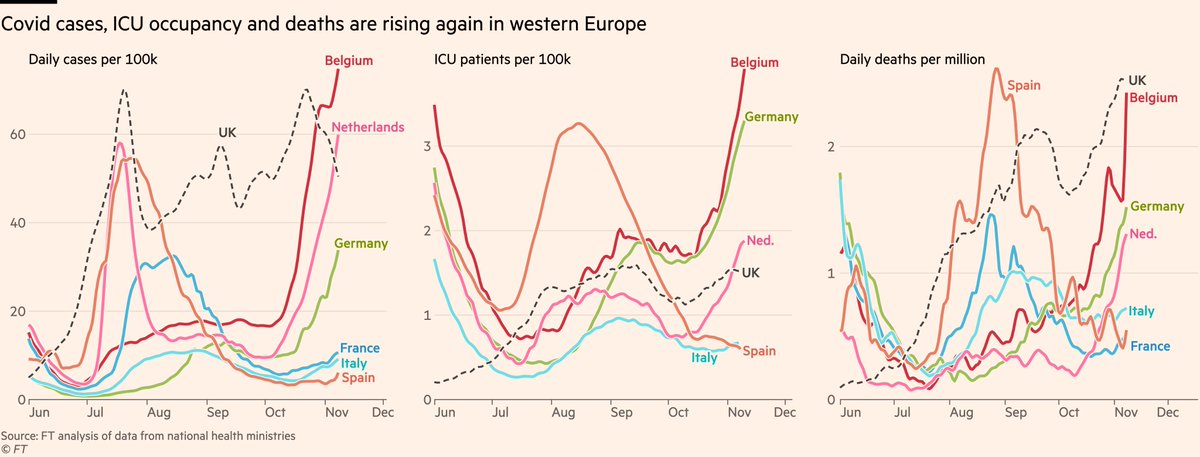
The picture is worse in central Europe, where ICU occupancy and death rates now exceed UK levels in almost all countries, and are still rising fast.

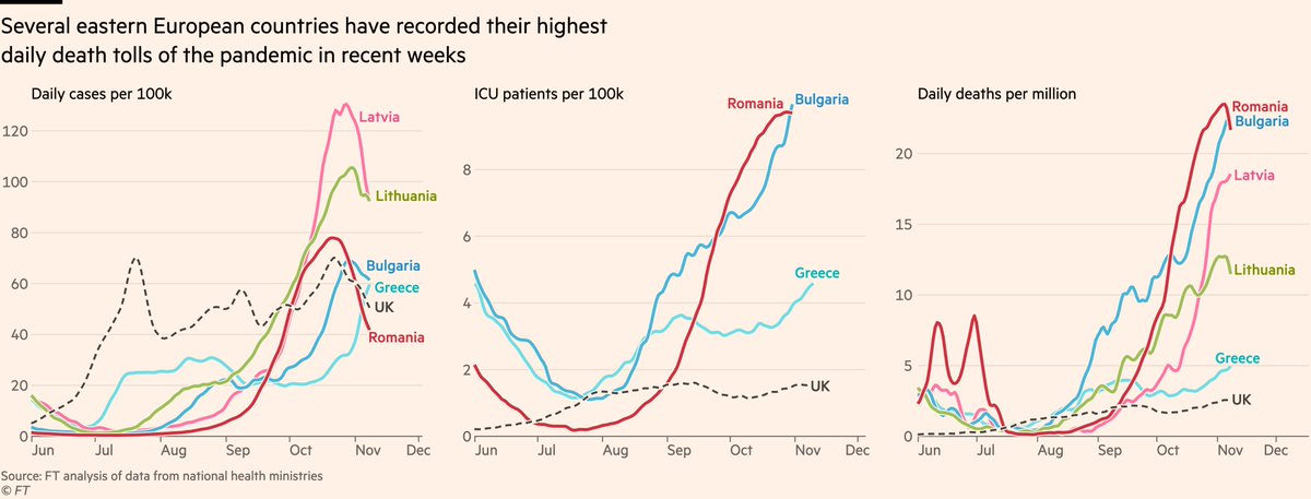
Looking further east, many countries’ waves began earlier and now look to be subsiding, but they’re subsiding from staggeringly high levels, with several nations setting new records for deaths almost two years into the pandemic.
Another way of looking at this is to measure each metric for each country relative to its peak level before this winter.
When we do this, the impact of vaccines is very clear, and shows up in two ways:
When we do this, the impact of vaccines is very clear, and shows up in two ways:
First, the simple height of the current wave.
In countries with high vaccine coverage, cases remain well below past peaks.
Where vax rates are low, peaks have been exceeded, in some cases shattered...
In countries with high vaccine coverage, cases remain well below past peaks.
Where vax rates are low, peaks have been exceeded, in some cases shattered...

...and second, the ratio of the acute metrics to cases.
In well-vaxxed Netherlands and UK, cases have climbed close to past peaks, but hospitalisations & deaths remain at lower levels
But in countries where many are yet to get their 2nd dose, deaths rise in lockstep with cases.
In well-vaxxed Netherlands and UK, cases have climbed close to past peaks, but hospitalisations & deaths remain at lower levels
But in countries where many are yet to get their 2nd dose, deaths rise in lockstep with cases.

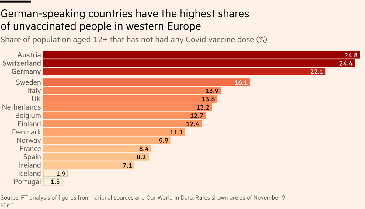
Among richer western European countries, there is growing concern over the situation in German-speaking countries, where numbers of people yet to receive a single dose are much higher than elsewhere.
High levels of vaccine scepticism are thought to be key ft.com/content/f04ac6…
High levels of vaccine scepticism are thought to be key ft.com/content/f04ac6…
I’ll end this roundup with a note of caution for England/UK.
I know I started this thread with good news — and the news is good! — but we need to consider the context in which these numbers are unfolding.
I know I started this thread with good news — and the news is good! — but we need to consider the context in which these numbers are unfolding.
NHS waiting lists soared during the pandemic with 1.5m more people now waiting for treatment, and as hospitals try to work through the backlog, there’s incredibly little headroom in the system.
Any uptick in Covid patients pushes non-Covid patients out ft.com/content/541595…
Any uptick in Covid patients pushes non-Covid patients out ft.com/content/541595…

If we look at critical-care beds only, you can see how the dynamics play out.
Hospitals can repurpose general beds for ICU, but not without cost. Capacity for non-Covid critical-care patients was halved last winter due to the Covid wave.
Hospitals can repurpose general beds for ICU, but not without cost. Capacity for non-Covid critical-care patients was halved last winter due to the Covid wave.

To be clear, there is absolutely no sign that we will see Covid admissions get anywhere near last winter’s levels. But more people in hospital seriously ill with Covid means fewer other people being treated for serious, life-affecting illness and injury.
To conclude:
• Promising signs English/UK wave is receding, aided by boosters
• Rest of Europe’s winter wave in full swing, with particular concern for poorly-vaxxed countries + Germany, Austria, Switz.
• When NHS says current situation is very tough, they’re not making it up
• Promising signs English/UK wave is receding, aided by boosters
• Rest of Europe’s winter wave in full swing, with particular concern for poorly-vaxxed countries + Germany, Austria, Switz.
• When NHS says current situation is very tough, they’re not making it up
As usual, please let me know if you have any questions, comments, feedback, criticism.
• • •
Missing some Tweet in this thread? You can try to
force a refresh