
Humanities friends, stop using Google Maps screenshots in your presentations! Thanks to Technology™ it's easy and free to make maps from scratch that look professional (or at least professional enough), even with my level of extremely limited technical skills. A tutorial thread!
Disclaimer: I’m not a cartographer, this probably isn’t best practice in many ways, but IT’S EASY and that’s my main priority. Also, all of my screenshots have hideous hand-drawn arrows on them, I appreciate the irony that this is about making images look more professional.
Step one: download QGIS. It’s a big programme and it might take a while, but it’s open source and free forever. You can find the latest versions at qgis.org/en/site/foruse…. It doesn’t matter which version, since we’re just going to use super basic features. 

Now set up a folder somewhere easy to find with a clear label like “GIS stuff.” This is where we’re going to store all the data we need to make pretty maps, and all the new data you create while customizing. Don’t use your Downloads folder to store anything!
Speaking of data, go to naturalearthdata.com/downloads and click through to the “physical” large-scale data (1:10m). Download “land,” “ocean” and “rivers + lake centrelines” for now.
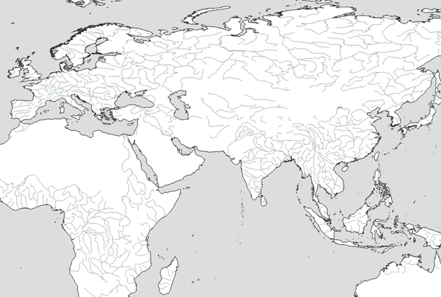
They’ll download as compressed (.zip) folders – just move those .zip files straight to your “GIS stuff” folder *without* extracting them. This image was meant to go with the tweet above, off to a good start already!

It’s time to map some maps! Open QGIS and make a new project (ctrl+n). It will be blank for now, but let’s save it anyway as good practice. I’m calling mine “example_map” (see the top left).

Now to add the files we just downloaded as "layers." These are vector-type files, so open the “Layer” dropdown, then “Add Layer,” then “Add Vector Layer.” The shortcut key is ctrl+shift+v

You’ll see a popup asking for a “source.” Click the three dots to navigate to your “GIS stuff” folder and click on the ne_10m_ocean.zip file. Then click “Add.”

Oceans will appear! Likely in a very strange colour. Don’t worry, we’ll fix that later! Repeat for land and rivers.

Okay, so we have an oddly-coloured world map. It’s… pretty ugly. Let’s make it a bit prettier, in a minimalist (and therefore, conveniently, easy) sort of way.

Double-click the “land” layer (in the bottom left by default) to open the Layer Properties editor.

Head to the “Symbology” tab. You’ll see that there’s a “Simple fill” which has been set to a randomly generated, probably hideous colour. Click that, then click the “fill colour” and drag the opacity to zero in order to make it transparent. Hit “ok,” then “apply”!

Let’s do something similar for the ocean layer – but instead of making it transparent, try make it a light grey colour. Or pale blue, or anything else you want, it’s your map and I’m not your boss. Here’s what I ended up with:
The coastlines look a little too thick to me, so I’m going to open the land Layer Properties, select “simple fill” again and play around with “stroke width” until it’s thin enough. Make sure to zoom in to see what it looks like close up too! I went with 0.1 points (not mm).

Finally, let’s make the rivers the same colour as the water, but perhaps a little darker because they’re so much thinner. Note that these don’t have a fill (because they’re lines), so things will look a little different.
Okay, so how do we customize this? That depends a lot on the kind of map you want to make – but for now let’s assume that you’re just interested in creating a map of some 12th century cities in South Asia you happen to be writing a dissertation on.
We need a new vector layer to put our cities on. This time let’s CREATE rather than ADD a layer, of the “shapefile” type.

We’re going to need to do some set up – give it a file name, with the geometry type “point.” Add a field called “Name,” which we’ll use to keep track of the names of the individual cities we’re going to add.

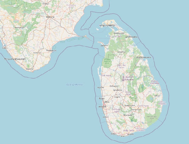
If you know where your cities are, skip this step – but I find it helpful to see some reference points to work out where to put the markers. So from the “Browser” panel (top left), open “XYZ Tiles” and then double-click “Open StreetMap.”

Hey look we’re back to Google! Or something similar anyway.
IMPORTANT: go to your layers tab and click and drag your new “OpenStreetMap” layer so that it’s UNDERNEATH the layer you’re going to add your cities to. Then (single-)click the cities layer so it’s highlighted. It should look like this:

Okay, we’re ready to add things! Click the pencil thingie at the top of your screen to enable editing.

Then click “add point feature.” Your cursor should change to a little target.

Zoom in to wherever you want to add a marker and left-click. A dialogue box will appear with the “fields” you said you wanted in this layer, including the “name” field. Tell QGIS what this marker is called (and give it a unique ID number too as good practice)

Repeat as desired for your other city markers. I’m going to add one each for Poḷonnaruva and Māntai. Once you’re done adding markers, toggle editing off once again using the pencil button and save your changes. Then uncheck the box in the layers panel to hide OpenStreetMaps:

Open layer properties for your cities layer. I’m going to set the Symbology to a simple “dot white” preset out of sheer laziness…

And then open the Labels tab and change the drop-down to “Single labels.” Make sure that the “value” is set to your “name” field and hit apply!

I’m going to pretend as though I know what I’m doing aesthetically and change the font to Cambria, and while I’m at it I’m going to go into formatting and make it all upper-case. If you have a better eye for design than I do, this is where you get to have fun!

The labels get a little lost in the coastlines, so let’s open Layer Properties again, go back to labels and add a “buffer.”

And there we go – something a little more polished-looking, and a lot more customizable, than a Google Maps screenshot.
You can obviously get a lot more fancy – use the print compositor! set up rules-based formatting! do actual geospatial analysis! – but for your basic PowerPoint, I think it’s alright. Happy mapping! #digitalhumanities
• • •
Missing some Tweet in this thread? You can try to
force a refresh


