NEW: detailed thread on Europe’s winter wave and the contrast vs UK
What’s happening? Why the difference? Can boosters help?
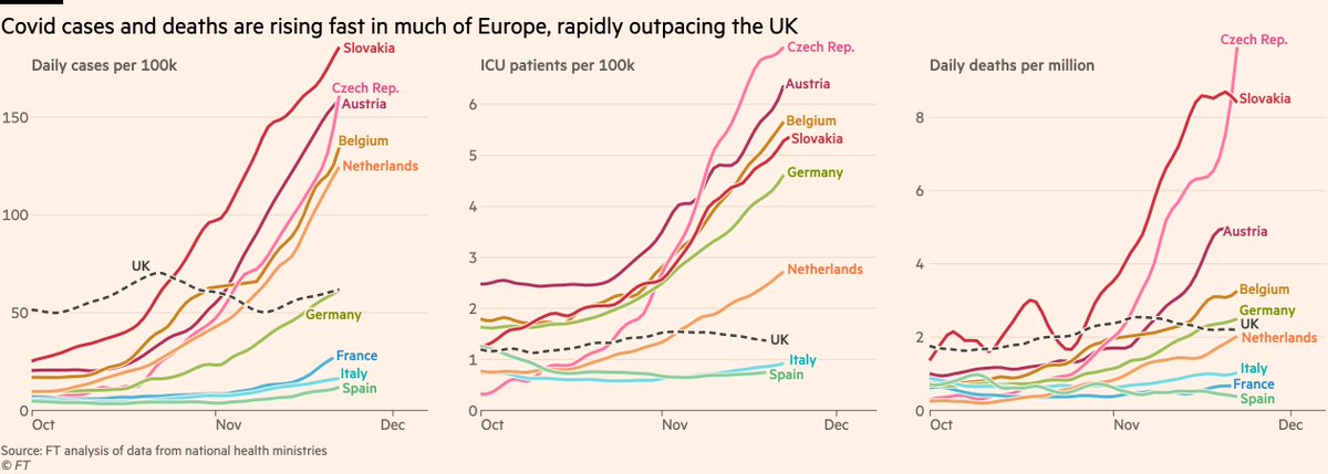
First, the wave itself: cases, hospitalisations & deaths surging in Europe, several western countries shooting past UK 📈
Story: ft.com/content/974487…
What’s happening? Why the difference? Can boosters help?
First, the wave itself: cases, hospitalisations & deaths surging in Europe, several western countries shooting past UK 📈
Story: ft.com/content/974487…
The situation is even clearer when plotted on a log scale:
UK is broadly a flat line, with European countries cutting up steeply through it. France, Italy & Spain all on course to pass UK for cases. Germany now above UK for daily deaths and Netherlands set to follow.
UK is broadly a flat line, with European countries cutting up steeply through it. France, Italy & Spain all on course to pass UK for cases. Germany now above UK for daily deaths and Netherlands set to follow.

So why these exponential surges across Europe but not in the UK?
There’s increasingly little difference in social mixing behaviour between the countries, and where we do see differences e.g in mask-wearing, they’re generally more virus-friendly in the UK 🤔
There’s increasingly little difference in social mixing behaviour between the countries, and where we do see differences e.g in mask-wearing, they’re generally more virus-friendly in the UK 🤔
The answer:
UK’s July reopening led to much more of its population being infected than elsewhere in western Europe. Between vax and infection-acquired immunity, UK has more protection, Europe has more susceptible people.
Source: @lloyd_chapman_ paper medrxiv.org/content/10.110…
UK’s July reopening led to much more of its population being infected than elsewhere in western Europe. Between vax and infection-acquired immunity, UK has more protection, Europe has more susceptible people.
Source: @lloyd_chapman_ paper medrxiv.org/content/10.110…

Despite UK having lower vax coverage than e.g Belgium & France, the difference in share of people previously infected is larger (UK 30%, FRA 15%), meaning that going into this winter, the UK had fewer people still exposed to the virus, less scope for a wave of hospitalisations.

This filled gaps in the UK’s vax coverage, leaving very few completely unprotected.
In Germany, lower vax rates and less infection-acq immunity mean far more ongoing exposure.
In Romania, despite huge numbers of past infections, gaps in elderly vax coverage left huge exposure.
In Germany, lower vax rates and less infection-acq immunity mean far more ongoing exposure.
In Romania, despite huge numbers of past infections, gaps in elderly vax coverage left huge exposure.

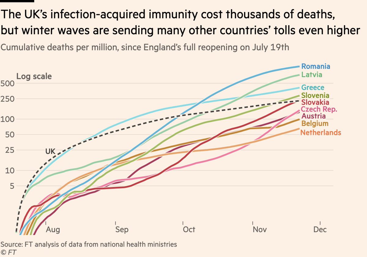
But of course, that infection-acquired immunity comes at a grim cost. The UK has recorded more than 15,000 new Covid deaths since reopening no July 19.
That’s more over that period than any European country except Romania in absolute terms, and now around 10th highest per-capita
That’s more over that period than any European country except Romania in absolute terms, and now around 10th highest per-capita

The big question is how that number will compare once winter is done?
In July UK’s running toll was highest in Europe. Several eastern European countries have since overtaken, and plotting the same on a log scale shows that others further west are heading the same way
In July UK’s running toll was highest in Europe. Several eastern European countries have since overtaken, and plotting the same on a log scale shows that others further west are heading the same way
But will the UK’s western European peers pass that same grim toll, or could they still avoid the worst?
A big part of the answer lies in boosters, where we now have extremely clear signals from the UK...
A big part of the answer lies in boosters, where we now have extremely clear signals from the UK...
Let’s start with cases in England.
Look at the first half of October: all age groups rising in lockstep.
November? Not so much. Cases have risen among under-60s, but fallen fast among older groups.
Let’s take a closer look...
Look at the first half of October: all age groups rising in lockstep.
November? Not so much. Cases have risen among under-60s, but fallen fast among older groups.
Let’s take a closer look...

Here we focus only on the two mini-waves — first half of Oct, and middle of Nov. Spot the difference...
In Oct rates rose in the elderly just like everyone else. In recent weeks, there is a stark divergence.
But what makes me say that this is boosters and not behaviour? Well...
In Oct rates rose in the elderly just like everyone else. In recent weeks, there is a stark divergence.
But what makes me say that this is boosters and not behaviour? Well...

This is a new chart format I’ve been working on for a few days. Lines still show age-groups, but they now change colour as people get boosters.
In October booster coverage was still low even in elderly. But by late Nov you can clearly see how boosters drive cases down 💉📉
In October booster coverage was still low even in elderly. But by late Nov you can clearly see how boosters drive cases down 💉📉

And if you thought that was impressive, take a look at the same thing for hospital admissions:
Admissions in England have been relatively stable among people aged 18-64 in England over recent weeks, but they’re falling precipitously in the mostly-boosted over-65s 💉🏥📉
Admissions in England have been relatively stable among people aged 18-64 in England over recent weeks, but they’re falling precipitously in the mostly-boosted over-65s 💉🏥📉
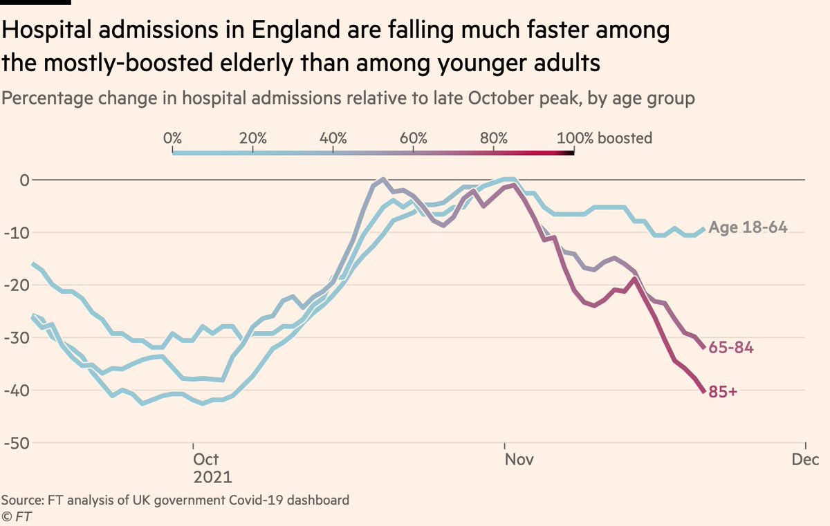
To reiterate, cases among under-60s in England have risen in recent weeks, but among mostly-boosted elderly they have not merely risen more slowly, they’ve *fallen*.
Strong evidence that with a fast rollout, boosters can change the slope of a wave, especially for severe outcomes
Strong evidence that with a fast rollout, boosters can change the slope of a wave, especially for severe outcomes
Here’s a reworking of a brilliant @PaulMainwood chart using the same format:
As boosters roll out, lines turns red, and then arc upwards as waning immunity is reversed.
You can already see early signs of 50-69s beginning to turn as they go from blue to ... I wanna say lavender?
As boosters roll out, lines turns red, and then arc upwards as waning immunity is reversed.
You can already see early signs of 50-69s beginning to turn as they go from blue to ... I wanna say lavender?

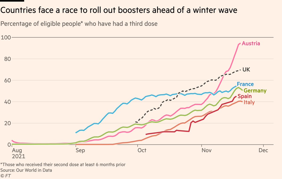
Good news for western Europe is there are early signs of a booster effect there too 🎉
Compare Belgium (started boosters in Sept) to Netherlands (started last week):
Cases among Belgium’s mostly-boosted elderly are no longer tracking younger groups. Netherlands? Not so much...
Compare Belgium (started boosters in Sept) to Netherlands (started last week):
Cases among Belgium’s mostly-boosted elderly are no longer tracking younger groups. Netherlands? Not so much...

So good reason to think that with fast booster rollouts, western European countries should see:
• Cases begin to flatten and fall among the most vulnerable
• Meaning a steep rise in cases no longer necessarily translates into a steep rise in hosp/death
But there are caveats...
• Cases begin to flatten and fall among the most vulnerable
• Meaning a steep rise in cases no longer necessarily translates into a steep rise in hosp/death
But there are caveats...
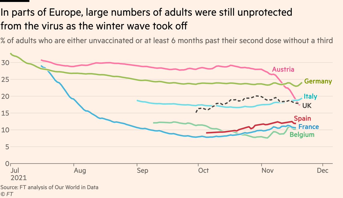
Specifically, boosters can only help those who’ve already had two doses, and in many countries that number is too low.
Austria illustrates this well:
Almost everyone second dosed 6 months ago has had a booster...
Austria illustrates this well:
Almost everyone second dosed 6 months ago has had a booster...
But its high unvaxxed rates mean that this booster surge has merely taken its share of people without vaccination protection down from being far higher than all of its peers, to only far higher than *some*.
Plus rollout was too late to get ahead of the wave.
Plus rollout was too late to get ahead of the wave.
There’s a stark warning here for the US, too.
Whilst the US’ summer wave will have — like the UK — generated a lot of infection-acquired immunity, that is offset by very poor vaccination rates (both second doses and third).
Read @caitlinsgilbert here: ft.com/content/cde3ef…
Whilst the US’ summer wave will have — like the UK — generated a lot of infection-acquired immunity, that is offset by very poor vaccination rates (both second doses and third).
Read @caitlinsgilbert here: ft.com/content/cde3ef…

One key tool for accelerating uptake could be to do what @nicolamlow said to @samgadjones: "we should stop calling them boosters, and start calling them third doses".
As @PaulMainwood has demonstrated, there is a growing body of evidence for that view
As @PaulMainwood has demonstrated, there is a growing body of evidence for that view
https://twitter.com/PaulMainwood/status/1461374201474998275

So to conclude (1/2)
• UK’s July reopening likely generated enough infection-acquired immunity to shield it from continent’s winter wave
• But that came at a cost of thousands of deaths, far higher rate than peer countries [so far]
• Boosters also key to UK’s current successes
• UK’s July reopening likely generated enough infection-acquired immunity to shield it from continent’s winter wave
• But that came at a cost of thousands of deaths, far higher rate than peer countries [so far]
• Boosters also key to UK’s current successes
(2/2)
• If western European countries can accelerate booster rollout they can blunt the wave, esp in terms of hospitalisations & deaths
• But some, like Austria, are hamstrung by low uptake of the primary course. You can’t boosted the unvaxxed, and Austria has a lot of them.
• If western European countries can accelerate booster rollout they can blunt the wave, esp in terms of hospitalisations & deaths
• But some, like Austria, are hamstrung by low uptake of the primary course. You can’t boosted the unvaxxed, and Austria has a lot of them.
A big thanks on this one to my Covid collaborator-in-chief @mroliverbarnes, to @samgadjones & @Sam1Fleming for gathering news on the ground in Europe, and to @robertrcorr for editing.
As always, please share any thoughts, questions, comments, [constructive] criticism etc 🙂
As always, please share any thoughts, questions, comments, [constructive] criticism etc 🙂
• • •
Missing some Tweet in this thread? You can try to
force a refresh