Pulp Librarian Profile picture
Nov 28, 2021 14 tweets 6 min read Read on X
Today in pulp I look back at the simple idea that launched a thousand fanzines: Letraset!

Launched in 1959 by Dai Davies and Fred Mackenzie it heralded a graphic design revolution that brought funky fonts to the masses.

Let's take a look... #fontsunday
Davis and Mackenzie – both experienced designers – created Letraset as a cheaper alternative to phototypesetting, to help speed up the design process. From humble beginnings in an old factory behind Waterloo station Letraset eventually swept across the design world.
Letraset started life as a wet transfer system: you placed the letter into water, carefully slid off the transfer and tried to apply it to the paper without creasing it. Whilst fiddly it was still quicker than hand-painting your letters.
In 1961 Letraset adopted the dry transfer process: letters screenprinted onto a polythene sheet were sprayed over with adhesive. You placed the sheet over the paper and used a pencil to rub over the letter, which detached from the carrier sheet and stuck to the paper. Sometimes.
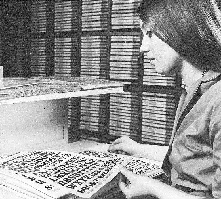
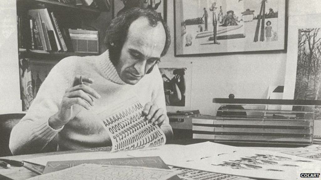
Letraset stencil masters were cut by hand at a cap height of 15cm from sheets of Rubylith film using a razor blade. A steady hand and keen eye was needed, especially as Letraset produced almost 1,200 typefaces. The original stencils are now at London’s St Bride Printing Library.
However it took some time for Letraset to be taken seriously by designers. Phototypesetting was the industry norm. What Letraset did do was popularise and democratise the world of typefaces and encourage many people to start their own careers in graphic design.
That said, Letraset isn't always easy to use: it’s best to start from the middle letter of the text and work outwards, taking care with spacing as letter widths vary. There's also the nightmare of a letter not fully leaving the contact sheet and tearing as you lifted it off.
There's also a limited number of letters on each sheet, so you often had to cannibalise them to finish your project: cutting the centre bar from an A to make a V, or putting F and L over each other to make E.
Letraset experimented with many new fonts and had a reputation as the go-to resource for ‘now’ lettering. They commissioned almost 500 unique typefaces and in 1970 launched the Letragraphica subscription service to give designers early access to the latest stencils.
Letraset also produced various clip art sheets; these had a very Mad Men feel! In the 1970s it was common to see Punk and New Wave fanzines using these ironically. Letraset (along with cheaper photocopying) helped fuel the boom in home-made magazines and album covers.
The Letraset catalogues were strangely addictive things, but part of the success of the brand was its compulsive nature: why not spend a couple of pounds on a sheet? Especially when it could make your poster / advert / schoolbook stand out from the crowd!
Action Transfers were a spin-off from Letraset fonts; a contact sheet full of colourful images and a cardboard background to make your diorama on. These were licenced to various companies worldwide and covered everything from Star Wars to The Sweeney.
Alas the computer did for dry transfers in the early 1990s: desk top publishing replaced manual layout and Letraset faded from the high street. However as it owned the rights to many of its original fonts which you can still buy these in PostScript format online.
Letraset encouraged many people to start a career in design, and even those who didn’t still learnt a lot about typefaces and layout. From professional designers to DIY publishers it helped fuel a creative boom. Letraset - Twitter salutes you!

• • •

Missing some Tweet in this thread? You can try to force a refresh
 

Keep Current with Pulp Librarian

Pulp Librarian Profile picture

Stay in touch and get notified when new unrolls are available from this author!

Read all threads

This Thread may be Removed Anytime!

PDF

Twitter may remove this content at anytime! Save it as PDF for later use!

Try unrolling a thread yourself!

how to unroll video
  1. Follow @ThreadReaderApp to mention us!

  2. From a Twitter thread mention us with a keyword "unroll"
@threadreaderapp unroll

Practice here first or read more on our help page!

More from @PulpLibrarian

Jun 30
Given the current heatwave, I feel obliged to ask my favourite question: is it time to bring back the leisure suit?

Let's find out... Image
Now we all know what a man's lounge suit is, but if we're honest it can be a bit... stuffy. Formal. Businesslike. Not what you'd wear 'in da club' as the young folks say. Image
So for many years tailors have been experimenting with less formal, but still upmarket gents attire. The sort of garb you could wear for both a high level business meeting AND for listening to the Moody Blues in an espresso bar. Something versatile. Image
Read 16 tweets
Jun 29
Time once again for my occasional series "Women with great hair fleeing gothic houses!"

Let's see what's in the library... Image
The Voice of the House, by Margaret Erskine (an Inspector Finch Gothic Mystery). Ace Gothic, 1973.

She'll fall over if she leans like that. Image
The Three Sisters of No End House, by Mona Farnsworth. Ace Gothic, 1972.

I said she'll fall over if she leans like that! Image
Read 10 tweets
Jun 27
Today in pulp I look back at the publishing phenomenon of gamebooks: novels in which YOU are the hero!

A pencil and dice may be required for this thread... Image
Image
Gamebooks are a simple but addictive concept: you control the narrative. At the end of each section of the story you are offered a choice of outcomes, and based on that you turn to the page indicated to see what happens next. Image
Gamebook plots are in fact complicated decision tree maps: one or more branches end in success, but many more end in failure! It's down to you to decide which path to tread. Image
Read 22 tweets
Jun 18
Time for a pulp countdown now, and today it's my top 10 public relations campaigns! Image
At no 10: prunes! Let's get this party started. Image
At no 9: butter! Don't suffer from a lack of it. Image
Read 12 tweets
Jun 15
You know what I haven't done in a while? Bad book covers!

Let's change that... Image
Ooh you little lyre... Guardian Angels, by Joseph Citro. Zebra Books, 1988. Image
How I answer the door in the mornings... Encounters With Aliens, by George W. Earley. Charter House, 1978. Image
Read 13 tweets
May 11
He was the terror of London; a demonic figure with glowing eyes and fiery breath who could leap ten feet high. The penny dreadfuls of the time wrote up his exploits in lurid terms. But who was he really?

Today I look at one of the earliest pulp legends: Spring-Heeled Jack! Image
London has always attracted ghosts, and in the 19th Century they increasingly left their haunted houses and graveyards and began to wader the capital's streets.

But one apparition caught the Victorian public attention more than most... Image
In October 1837 a 'leaping character' with a look of the Devil began to prey on Londoners. Often he would leap high into the air and land in front of a carriage, causing it to crash. It would then flee with a high-pitched laugh.

The public soon named him "Spring-Heeled Jack." Image
Read 14 tweets

Did Thread Reader help you today?

Support us! We are indie developers!


This site is made by just two indie developers on a laptop doing marketing, support and development! Read more about the story.

Become a Premium Member ($3/month or $30/year) and get exclusive features!

Become Premium

Don't want to be a Premium member but still want to support us?

Make a small donation by buying us coffee ($5) or help with server cost ($10)

Donate via Paypal

Or Donate anonymously using crypto!

Ethereum

0xfe58350B80634f60Fa6Dc149a72b4DFbc17D341E copy

Bitcoin

3ATGMxNzCUFzxpMCHL5sWSt4DVtS8UqXpi copy

Thank you for your support!

Follow Us!

:(