🧵
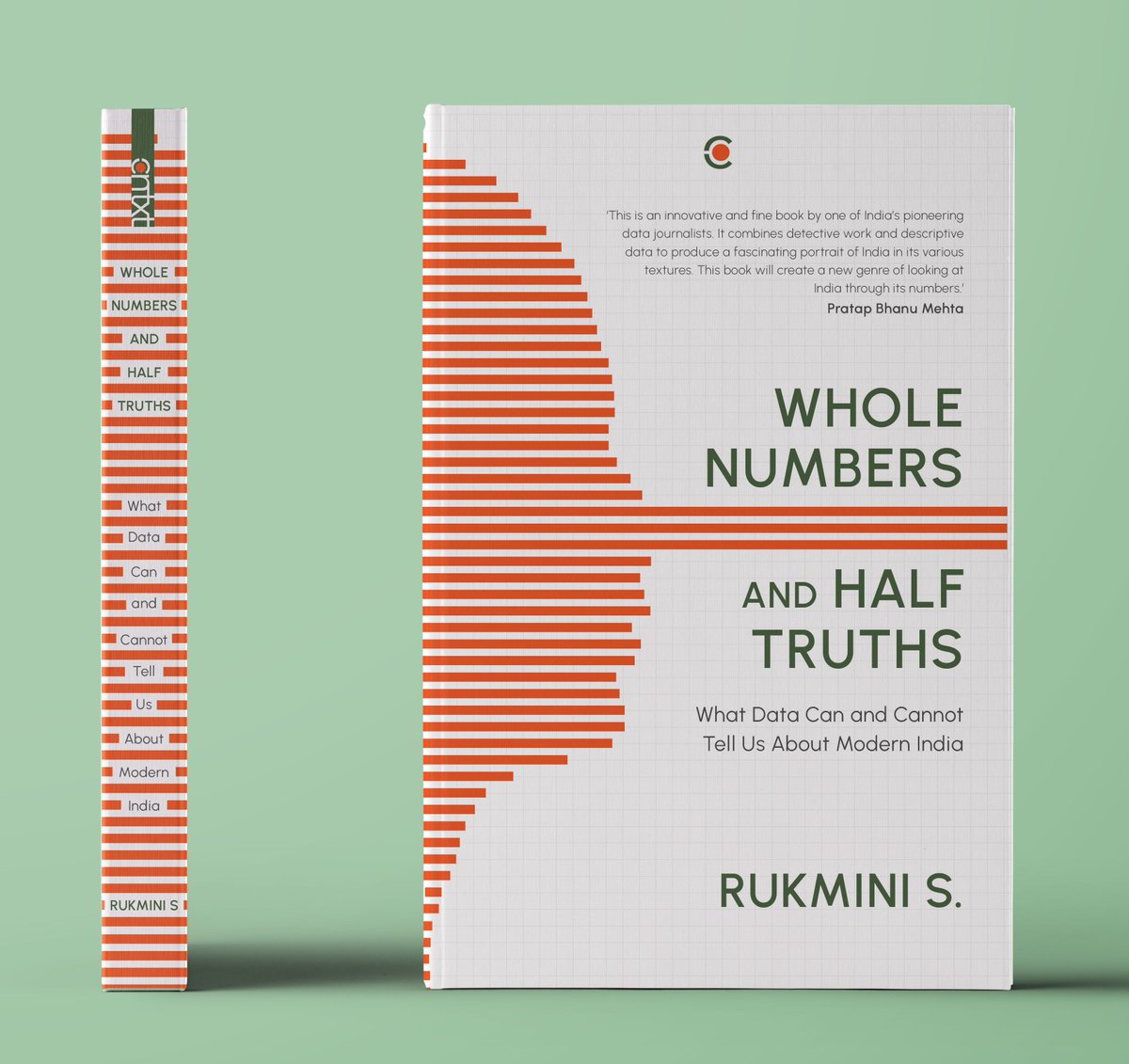
I’m thrilled with how the cover for @Rukmini's book turned out. It was a wonderful collaboration with her, with art direction by @saurabhgarge and @karthikavk's feedback. The spine was Saurabh’s idea, and has become my favourite feature.
#BookCoverDesign #GraphicDesign
I’m thrilled with how the cover for @Rukmini's book turned out. It was a wonderful collaboration with her, with art direction by @saurabhgarge and @karthikavk's feedback. The spine was Saurabh’s idea, and has become my favourite feature.
#BookCoverDesign #GraphicDesign

Here’s a concept note I wrote about the jacket design. You all got it, but I still want to tell you about it again. 

This was the very first rough version of the cover I made. I got the idea after seeing a Twitter poll. 

It underwent, as you can see, several evolutions. I tweaked the fonts, arrangement, lines, colours and sizes several times, till we were satisfied. I’m superstitious about labelling any version as “Final” but I did at some point lose count and label one “Oof”.
While I think the final cover was the strongest, I grew fond of several other concepts I pitched.
It's hard to kill your darlings.
This one was a variation on the Pinocchio: Two faces, white lies.
It's hard to kill your darlings.
This one was a variation on the Pinocchio: Two faces, white lies.

Raised and depressed lines forming words. This was cool to make, and I had to stop myself from pulling at the lines to create evermore distortions. 

This was a variation of the same idea. You see the title from a distance, but when you go close, all you see is the distortion. 

I was rather fond of this concept, though it didn’t get past this rough sketch, and it didn’t quite suit the tone of the book. 

@Rukmini's book is available for pre-order. I do hope you buy a copy.
When you do, I hope you know that we spent a lot of time thinking of how you would hold it and read it, and how it would look on your shelf, with all the other books you love.
<End>
amazon.in/Whole-Numbers-…
When you do, I hope you know that we spent a lot of time thinking of how you would hold it and read it, and how it would look on your shelf, with all the other books you love.
<End>
amazon.in/Whole-Numbers-…
• • •
Missing some Tweet in this thread? You can try to
force a refresh


