John Burn-Murdoch Profile picture
Dec 23, 2021 9 tweets 3 min read Read on X
NEW: weekly breakdown of hospital patients being treated *for* Covid vs those *with* Covid as an incidental finding is out.

Here’s London:

Though incidentals are still rising at unprecedented rates, there is also a clear and steep rise in patients being treated for severe Covid
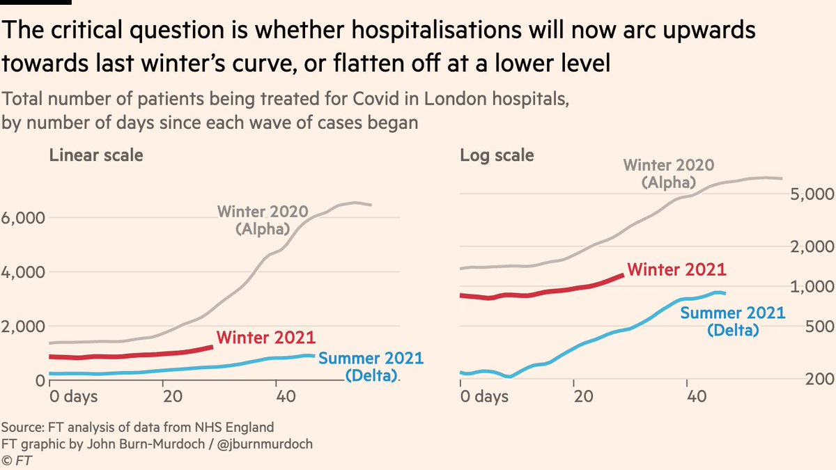
Comparing the current rise to the Delta wave side-by-side, we can see that although there are far more "with, not for Covid" incidentals this time around, the number of patients being treated for Covid is rising faster than it did in the summer
But the summer Delta wave never came close to overwhelming the NHS, so key question is how this stacks up vs last winter

Numbers still well below last Christmas, and recent uptick is clearest on a log scale. Long way to go to approach Alpha wave, but direction of travel is clear
Here’s another way of looking at it:

The total number of Covid-positive patients does slightly overstate the severity of the current wave as far as hospitals go, but the "for Covid" line is still clearly bending upwards
We’ll have more on the hospital situation later today
All in all, I’d say this is a decent illustration of what people have meant by "a small percentage of a large number can still be a large number".

We’re still way off last winter, but numbers with severe disease are growing, and not especially slowly.
("for vs with" data only starts in Jun 2021, so for Alpha wave I’m assuming fixed proportion of patients were being treated primarily for Covid, and that it was in line with the share seen over autumn. This could be wrong, but is unlikely to change the overall picture shown here)
Another bit of context here for considering the Omicron hospital situation over winter:

Hospital staff absences due to Covid have risen very steeply over the last week in London.

(no historical data to compare this with, to my knowledge)
An important addition here from @VictimOfMaths [and the brilliant Dan Howdon, formerly of Twitter]:

These figures undercount the total number or "with Covid" incidentals. Doesn't change the overall message but adds important context

• • •

Missing some Tweet in this thread? You can try to force a refresh
 

Keep Current with John Burn-Murdoch

John Burn-Murdoch Profile picture

Stay in touch and get notified when new unrolls are available from this author!

Read all threads

This Thread may be Removed Anytime!

PDF

Twitter may remove this content at anytime! Save it as PDF for later use!

Try unrolling a thread yourself!

how to unroll video
  1. Follow @ThreadReaderApp to mention us!

  2. From a Twitter thread mention us with a keyword "unroll"
@threadreaderapp unroll

Practice here first or read more on our help page!

More from @jburnmurdoch

Jul 15
Essential chart from the new mega report on the general election by @Moreincommon_

The vast majority of people — including Reform voters — said the Tories lost because they were incompetent, not because they were too left or right wing. Image
And to the extent that people thought they were either too left or right wing, equal shares gave each answer.

There’s one very clear message and anything else is a distraction.

Full report here: moreincommon.org.uk/media/e3in12zd…
Another great chart:

When asked what were the biggest mistakes the Conservatives made in government, the common themes are not left or right, but:
• Mismanagement
• Lack of integrity
• Incompetence
• Dishonesty
• Corruption
• “They are chaotic” Image
Read 4 tweets
Jul 10
Under-appreciated stat from last week’s election:

Labour won its lowest ever share of the vote in deprived areas (<50% for the first time), and its highest ever share in affluent areas.

The result is a dramatic flattening of the class gradient in Labour support. Image
Here’s the same thing laid out as a timeline so you can see specific elections.

Interesting how Blair 1997 and Corbyn 2017 had similarly steep class gradients.

And shows how Starmer’s landslide was quite different to Blair’s. Image
This is all another side-effect of the hyper-efficient distribution of the Labour vote last week.

Very large margins in safe seats (many in very deprived areas) were squeezed, while gains in more affluent areas won seats from the Tories.
Read 5 tweets
Jul 3
The lack of enthusiasm for Labour at this election really is striking.

Among those who plan to vote Labour tomorrow, the party is much less well-liked than in 2019, 2017 or 2015 (no data before that).

Quite a flimsy voter coalition that could unravel in the absence of results. Image
The Conservatives weren’t especially popular with their backers in 2019 (mainly a vote for Brexit and against Corbyn), and this was a big part of why they fell so far since then, but Lab voters this time are even less enthusiastic about their party than Tory voters were in 2019.
Of course, all that matters tomorrow is winning more seats than the opponents, and Starmer’s Labour will manage that very easily.

But if they don’t start delivering tangible results, it wouldn’t be at all surprising to see Labour start bleeding votes in all directions.
Read 6 tweets
May 17
NEW 🧵: how Britain became gripped by the worst homelessness crisis in the developed world Image
Here the column in full

Now let’s get into the detail:ft.com/content/24117a…
Some people have responded to that chart with "That can’t be right", or "We can’t be worse than America".

I’m afraid the chart is right. 15 years ago the UK’s record on homelessness *was* not too dissimilar to other developed countries, but things have rapidly deteriorated. Image
Read 23 tweets
May 10
NEW:

There has long been a gap between people’s views of crime locally (not a big issue) vs nationally (it’s terrible out there!), but there are signs this is now happening to economic perceptions too.

My finances? Going okay. The economy? Awful.

What’s going on? Image
My column this week asks whether the media (both mainstream and social) and its incentives to maximise engagement could be playing a key role ft.com/content/8cd76c…
With crime, it’s widely accepted that the main reason for this decoupling is media coverage.

People’s sense of crime levels is based mainly on what they see on TV and read in newspapers, and much less on what they or the people they know actually experience. Image
Read 17 tweets
Apr 12
NEW: my column this week is about the coming vibe shift, from Boomers vs Millennials to huge wealth inequality *between* Millennials.

Current discourse centres on how the average Millennial is worse-off than the average Boomer was, but the richest millennials are loaded 💸🚀 Image
That data was for the UK, but it’s a similar story in the US. The gap between the richest and poorest Millennials is far wider than it was for Boomers. More debt at the bottom, and much more wealth at the top.

In both countries, inequality is overwhelmingly *within* generations, not between them.Image
And how have the richest millennials got so rich?

Mainly this: enormous wealth transfers from their parents, typically to help with buying their first home.

In the UK, among those who get parental help, the top 10% got *£170,000* towards their house (the average Millennial got zero).Image
Read 9 tweets

Did Thread Reader help you today?

Support us! We are indie developers!


This site is made by just two indie developers on a laptop doing marketing, support and development! Read more about the story.

Become a Premium Member ($3/month or $30/year) and get exclusive features!

Become Premium

Don't want to be a Premium member but still want to support us?

Make a small donation by buying us coffee ($5) or help with server cost ($10)

Donate via Paypal

Or Donate anonymously using crypto!

Ethereum

0xfe58350B80634f60Fa6Dc149a72b4DFbc17D341E copy

Bitcoin

3ATGMxNzCUFzxpMCHL5sWSt4DVtS8UqXpi copy

Thank you for your support!

Follow Us!

:(