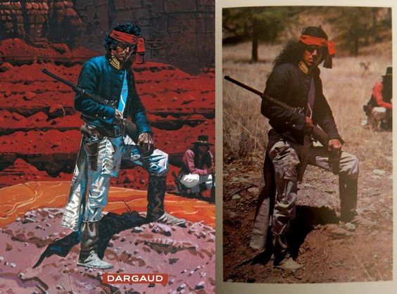
Some folks were wondering about the "Apologies to Darcy" on the cover to Human Target 2. That's a reference to Ernest "Darcy" Chiriacka, a mid century illustrator I swiped from for the cover.
The man peeking out from behind the woman is a motif I've seen before in 50/60s illustration (this one is Coby Whitmore) but Darcy's was just too perfect not to steal from.
I also get questions about the models for Ice and Chance. There's no one specific model other than the 3D sculpts I made myself using Sculptris. I try to steer clear from obvious actor likenesses as I ultimately found that to be distracting for readers.
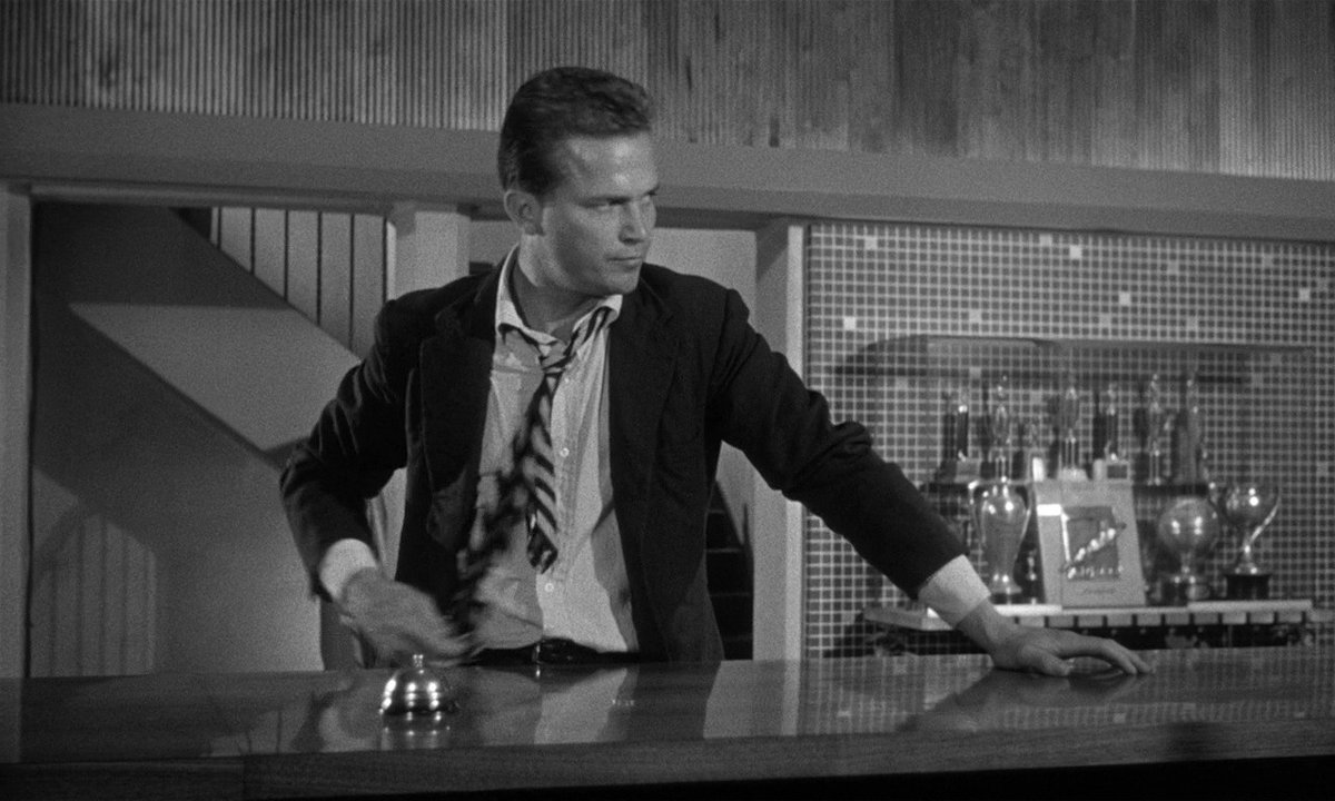
That said - the swagger, abrasiveness, and disinterest I draw in Chance is hugely influenced by Ralph Meeker's Mike Hammer in Kiss Me Deadly. I think of his performance a lot when I'm drawing Chance.
Back to the cover for issue 2. How about some process? The Bewitched vibe is intentional. In addition to Darcy, I was also inspired by the work of Al Parker, especially his covers for Ladies' Home Journal.
Here are my 3D models superimposed on my original concept for the cover. When tracing over reference, I stay zoomed out in order to prevent getting bogged down in details. The reference is a guide to save time, not something to be chained to.
Once I have the basic framework, I get rid of the reference, finesse the line art, and start rendering/shading on another layer. After that's done, I add some flat color.
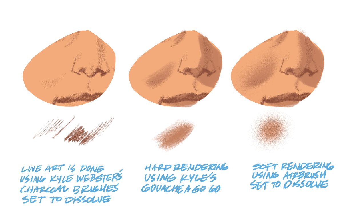
Here's my basic approach to coloring and the brushes I use for rendering. God bless @kyletwebster and his brushes!
Next step is to do some color holds on the line art and render the colors a bit more where needed. Final step is to add the trade dress back in and clean things up.
Thanks for sticking to the end. Later today, I'll be doing a thread on ALL of my influences for The Human Target. Stay tuned.
• • •
Missing some Tweet in this thread? You can try to
force a refresh
My covers for the EC Comics/Oni Press anthology, CRUEL UNIVERSE (with amazing trade dress by @rianhughes ). Process thread incoming!
The issue 2 cover seems to be everyone's favorite so I'm going to breakdown how I did it. Hope it helps with your future artistic endeavours.
First, I need to explain my formula for a good EC Comics cover. My initial approach to the issue one cover was fine but it didn't feel EC enough to me. Here's the sketch and the final.
With the new issue of Human Target hitting stands next week, I thought it would be a good time for another process thread. This one concerns what I consider the most important element of my work on HT - contrast.
I've experimented a lot with the traditional forms of contrast - color, shape, texture, etc but after really studying mid century illustration, I realized that there was a very powerful contrast technique that I wasn't taking advantage of - style contrast.
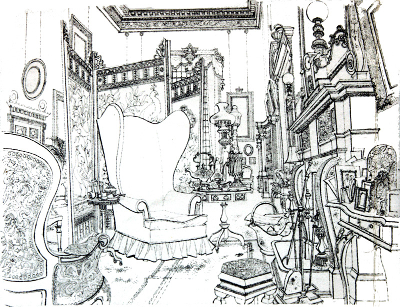
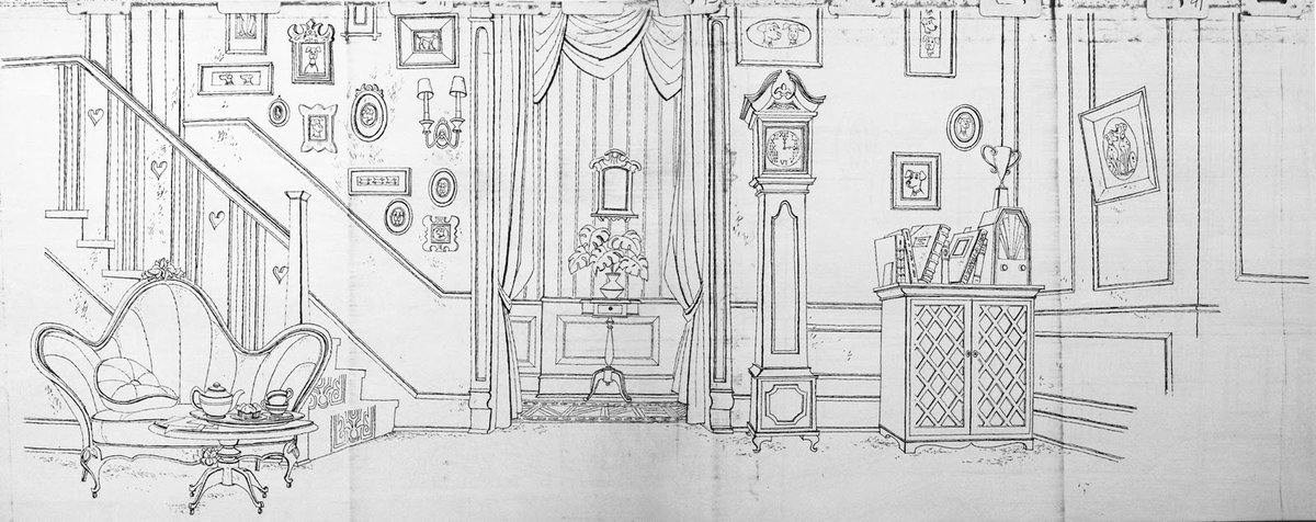
Since I've discussed it before, let's start with 101 Dalmations. Notice the precision of these line drawings for the backgrounds of the film? If we were tasked with coloring them, our first instinct would probably be to match that precision and detail.
Here's my variant cover for issue 14 of THAT TEXAS BLOOD (out this week!) by @ChristophCondon & @jacobr_phillips . For you digital artists out there, I thought I'd share a few things in Photoshop that I used to make this cover.
I usually start my cover paintings at 200 DPI because A) it helps reduce lag on a lot of the big brushes but also, B) many brushes look better when you're using them at a smaller resolution. Compare these two examples using @kyletwebster brushes.
Simply enlarging the brushes won't work in most cases. Once I've blocked in the big shapes and textures, I raise the DPI to 400 or 600 and get to work on the details.
There is still a persistent myth out there that you can achieve photo realism in art without the use of photo reference. If your goal is realism, here's a thread to remind you that the best artists used reference so you can, too.
Let's start with comics. Here's the creator of the Rocketeer, Dave Stevens posing for Cliff Secord himself. Fellow comics artist Doug Wildey was Dave's model for Peavey.
Richard Corben used a lot of models (fellow creator Bruce Jones is recognizable in some of Corben's work) but he also went the extra mile and sculpted stylized heads for realistic lighting ref.
Here's my cover for Tales of the Human Target, an anthology one-shot that drops Aug 23. I handle a lot of design for the HT series but I had no formal training so everything I've learned is thanks to the amazing resources that are available out there. Here's a thread about them.
My #1 resource for logo design is Logo-a-gogo by @rianhughes . Rian covers it all, from a general approach to design all the way down to how he handled kerning on a specific logo. Amazing book.
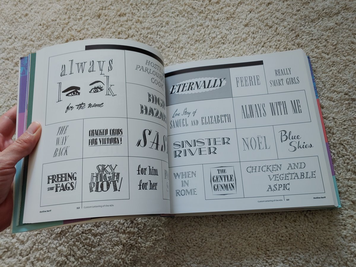
Rian also put together an amazing series of books that compile custom lettering over the decades. Custom Lettering of the 40s and 50s is my favorite. These books are out of print so I recommend you set up an eBay alert and keep your eyes out.
I thought it would be a good time for a process thread about the Photoshop brushes I use for Human Target.
I'm not sure anyone has noticed but the cover art solicited for 5 is different than the printed cover. I had no idea how to approach Emra's coat in time for the catalog so I turned it in as is. I also hadn't figured out her hair yet.
Shortly thereafter, @kyletwebster came out with his Concept Brush Soft in the Fall 2021 update and I immediately fell in love with the lines it laid down. The brush and I are inseparable now and I look for any excuse to use it. Went back and redrew Emra's coat with it.