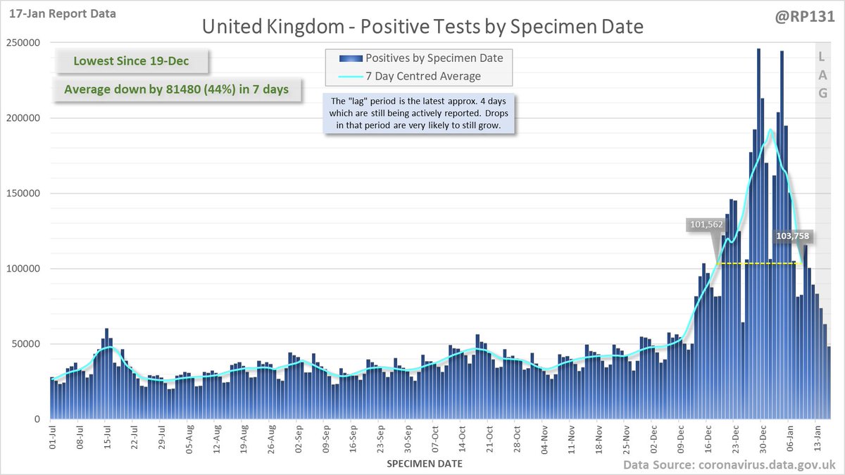
84,429 new #covid19uk positive tests reported today (17-Jan).
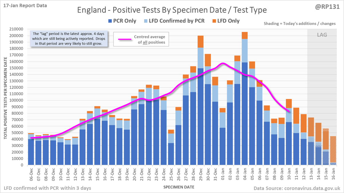
England down 36% on previous Monday - that's now 11 consecutive days of week-on-week drops. Interestingly, day-1 lateral flow positives are up 60% on last Monday which I think reflects the change to testing approach.
England down 36% on previous Monday - that's now 11 consecutive days of week-on-week drops. Interestingly, day-1 lateral flow positives are up 60% on last Monday which I think reflects the change to testing approach.
Animated chart to show LFD-only positives being either converted into PCR confirmed positives or removed due to negattive confirmation, over the last 14 days of reports.
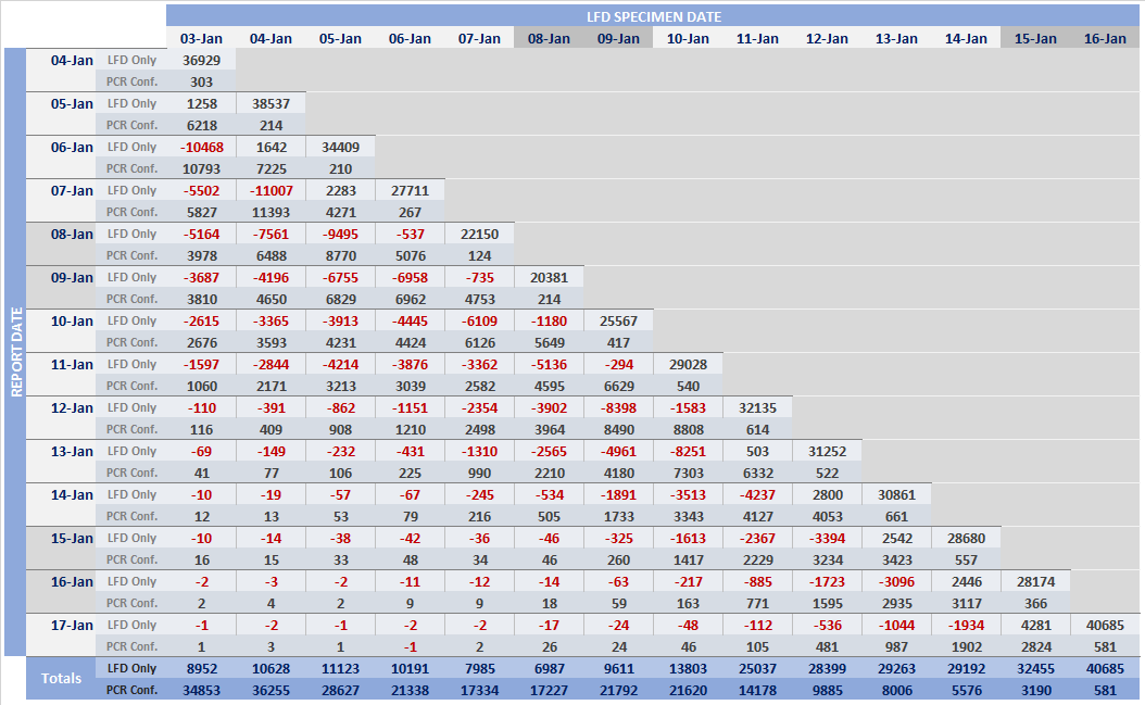
Pivot table of daily changes to LFD Only and LFD Confirmed by PCR figures to see if we can identify where LFDs are now being removed due to negative follow-up PCRs.
Longer term view. 84,429 new #covid19uk positive tests reported today (17-Jan). This brings the rolling average by specimen date (allowing 4 days for lag) to 103,758, equivalent to around 19-Dec (i.e. 22 days ago), a reduction of 81480 (44%) in the last week.
Closer look at the latest 45 days, with today's added numbers highlighted in yellow. Individual nations and animated England charts further down the thread.
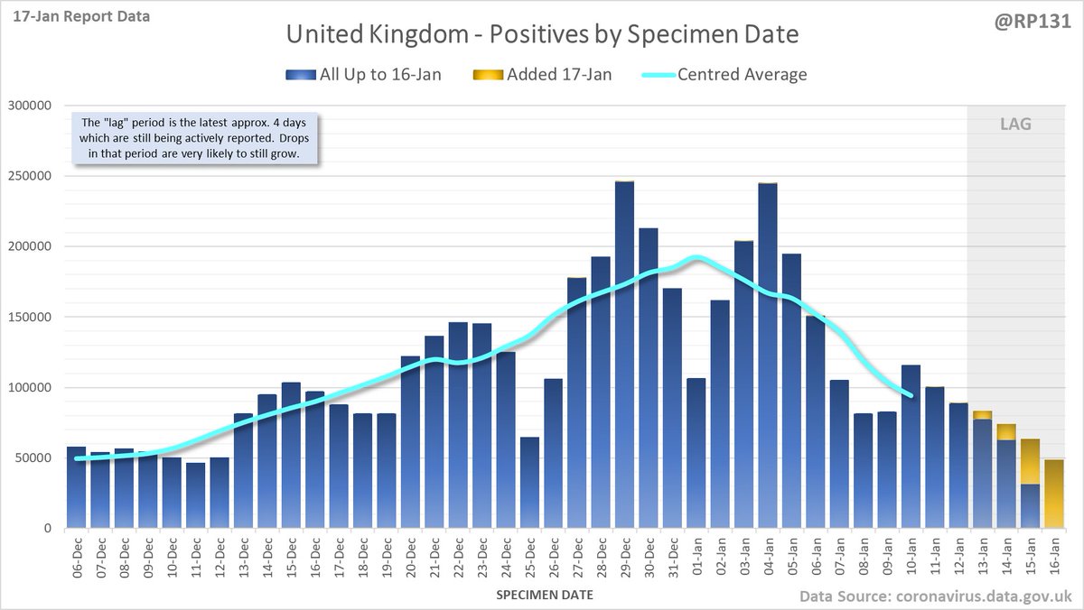
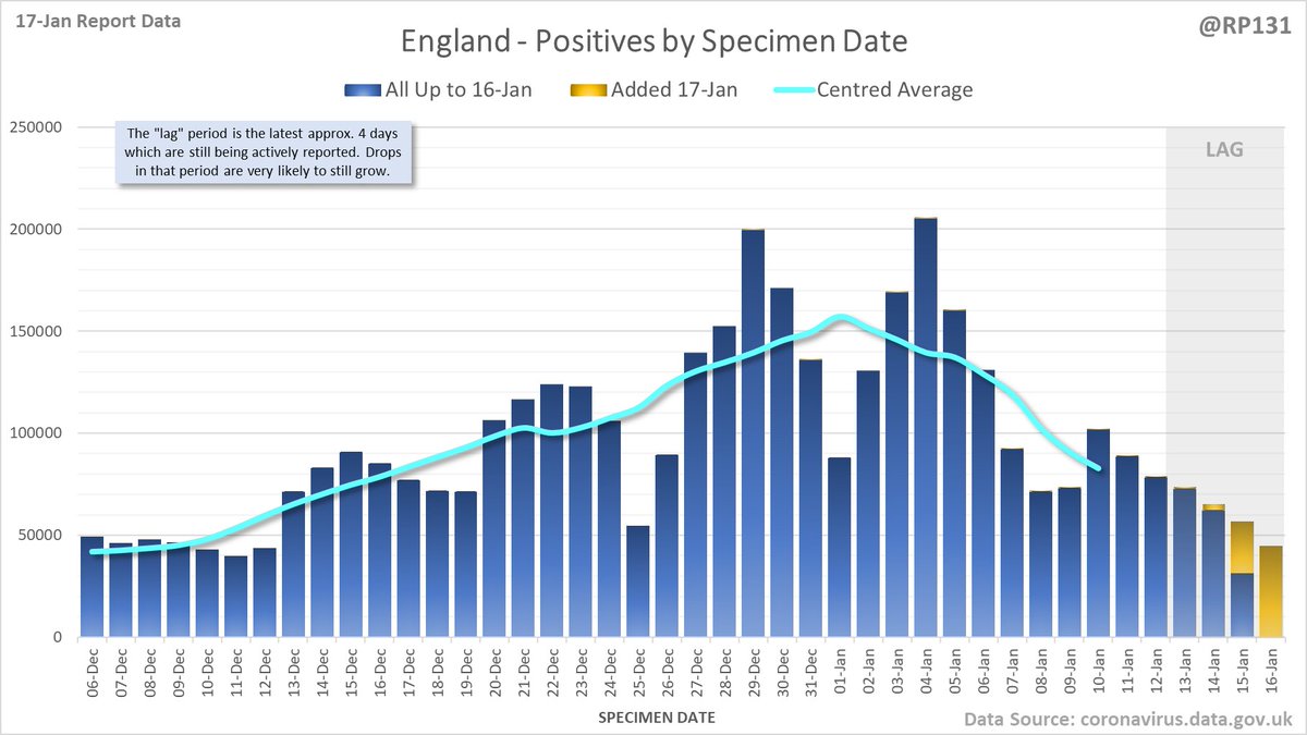
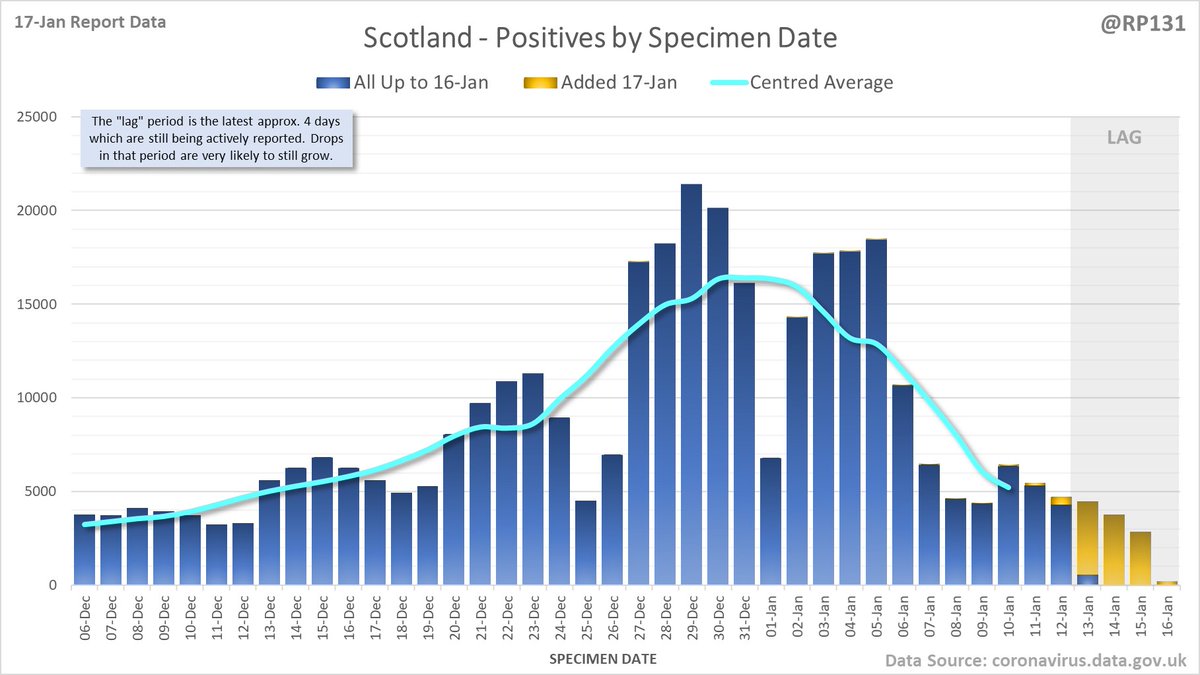
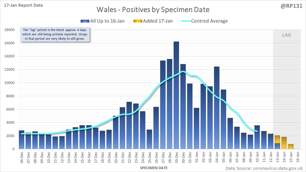
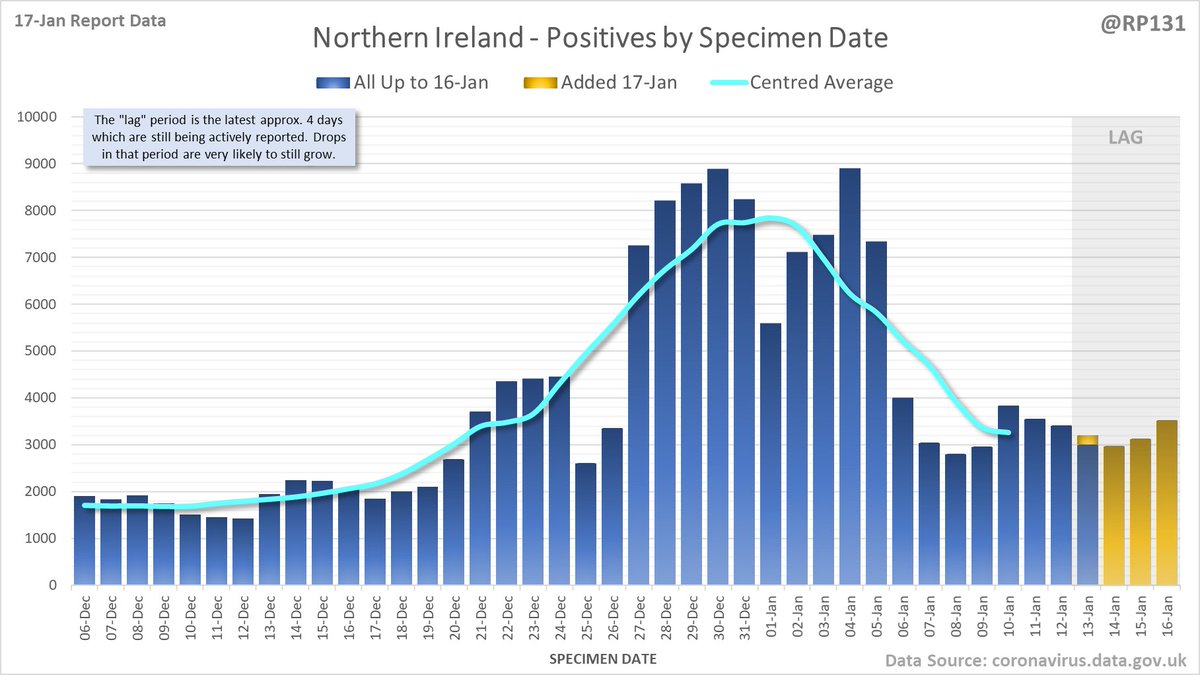
Separate charts for England (74249) Scotland (2910) Wales (3975) and Northern Ireland (3295). Note the different scales. Also on certain days the specimen-date data for Scotland/Wales/NI doesn't get updated so the yellow bars may be mising or include multiple day's numbers.
Animated chart to show how the #covid19uk positive tests by specimen date have been contributed to by reports over the last 7 days. Note this just includes England numbers as other nations don't always publish their specimen date numbers every day.
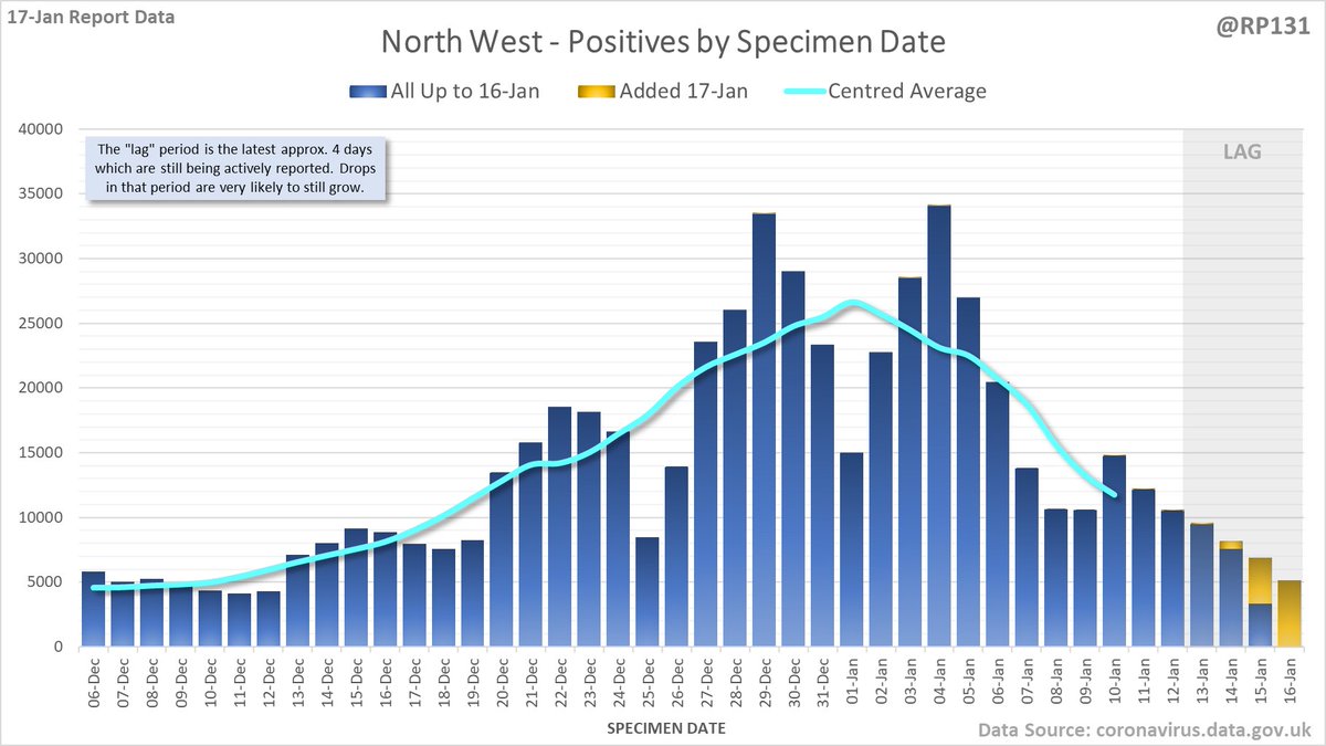
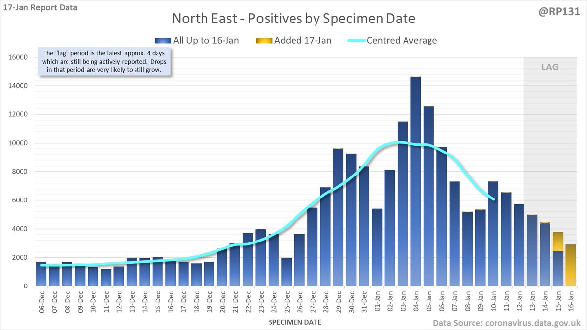
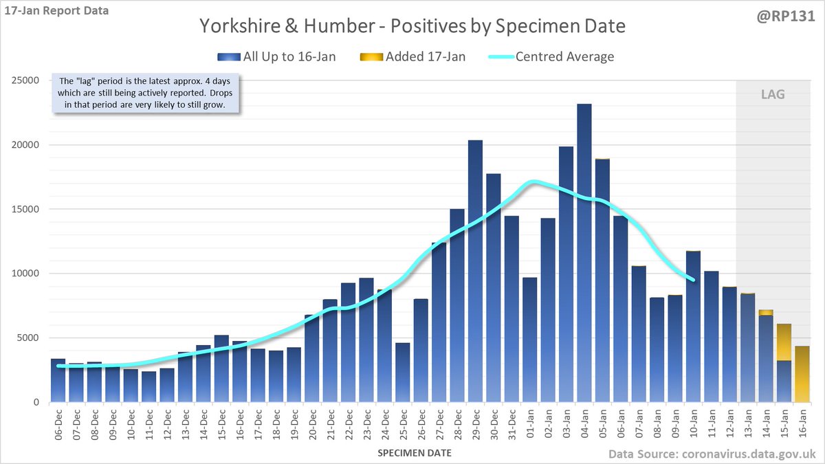
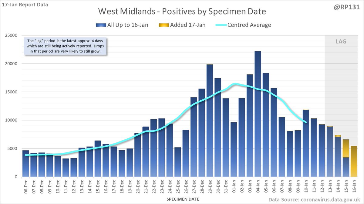
And England regions, starting with North West, North East, Yorkshire & Humber and West Midlands. Again, note the different scales.
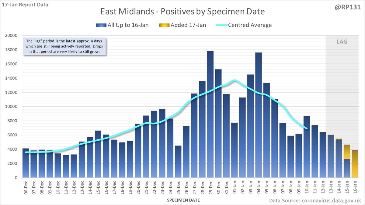
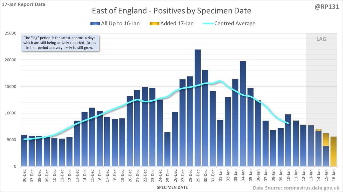
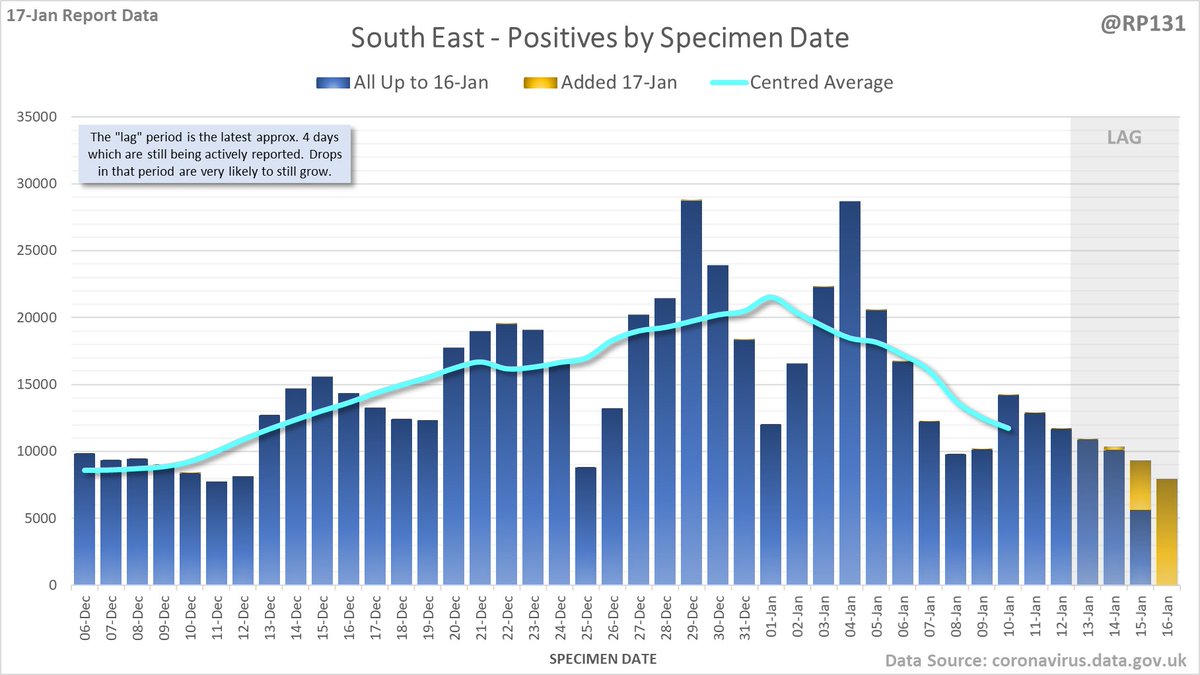
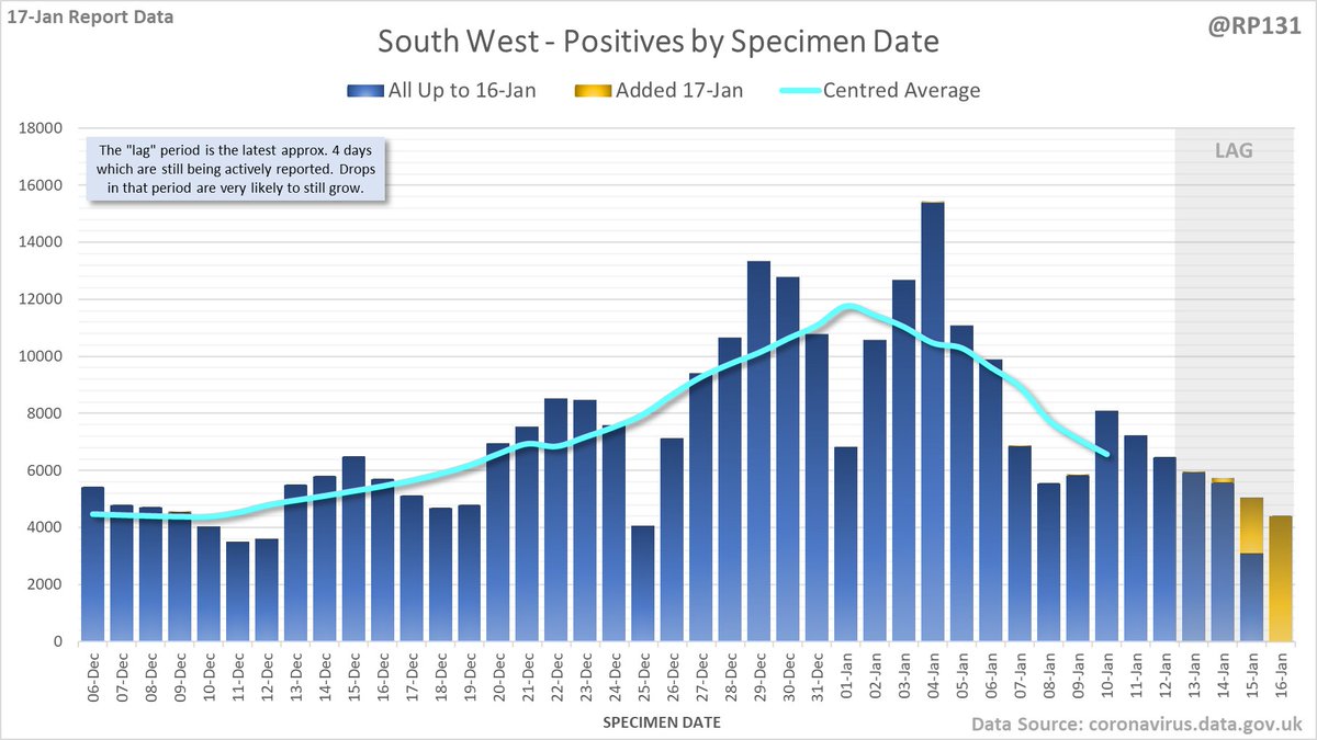
Plus East Midlands, East of England, South East and South West. Again, note the different scales.
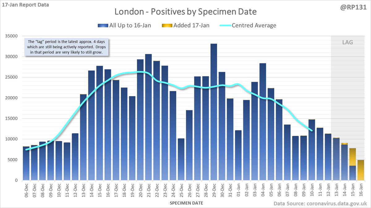
And finally, London.
Some additional content (mainly variations of the above charts) is available in the full version of the thread here: …ddatashare.s3-eu-west-1.amazonaws.com/Addition/Addit…
• • •
Missing some Tweet in this thread? You can try to
force a refresh